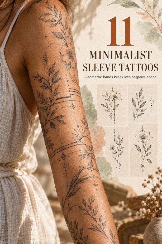
A minimalist sleeve tattoo stays private when you control scale, placement, spacing, and the direction of each mark before your appointment. You don’t need a solid black arm. You need a personal map that reads clearly under clothing, heals cleanly, and still feels meaningful when the novelty wears off. Start small, then build with intent.
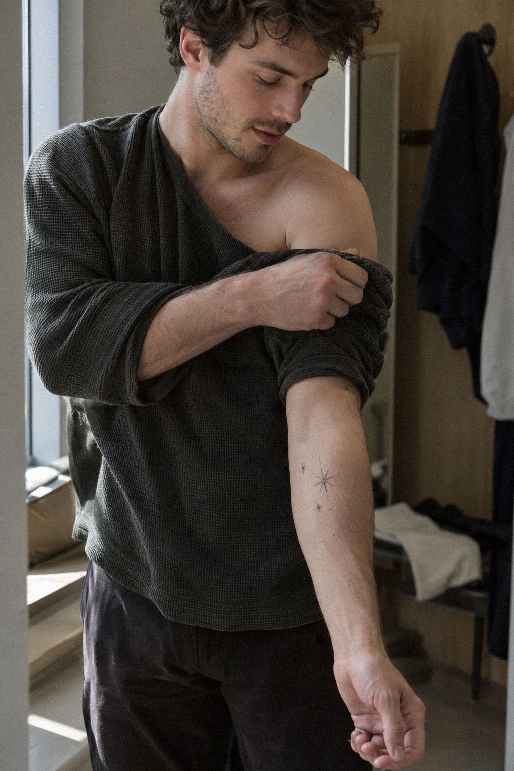
Don’t overthink: Pick tiny celestial symbols along the forearm.
Editor’s note: The most successful private sleeves usually have one symbolic anchor, generous negative space, and a few crisp marks that reveal themselves slowly. That restraint can feel elegant, powerful, and surprisingly personal.
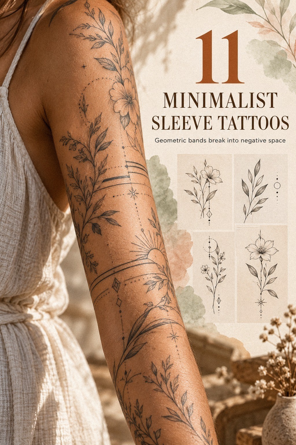
- Start with fine-line botanical sleeve motifs
- Pick tiny celestial symbols along the forearm
- Place geometric bands around natural arm contours
- Keep negative space between delicate ink elements
- Plan a flowing single-needle nature story
- Blend miniature animals into minimalist linework
- Choose symbolic constellations with crisp outlines
- Arrange meaningful script beside subtle icons
- Add bold accents to an understated sleeve
- Balance fierce shapes with graceful botanical details
- Map unique personal symbols from shoulder to wrist
1Start with fine-line botanical sleeve motifs
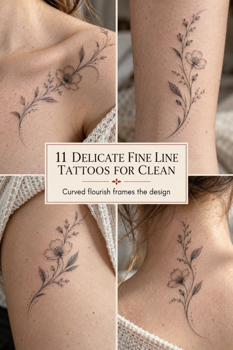
Begin with one botanical subject that carries personal meaning, then let its stem guide the rest of your sleeve. A fern, olive branch, or wildflower can look delicate without becoming vague.
I’d choose one dominant line direction first, because your forearm won’t look intentional if every leaf points somewhere different. A terracotta, stone-gray, and olive palette can make the design feel striking without becoming loud.
Look for references with crisp black contours rather than muddy gray shading. Your artist can show how the design may look at a smaller scale, but you’ll want enough breathing space around each leaf. A tiny cluster near the inner forearm can stay private under a cuff, while a longer stem can peek out near the wrist.
That’s a striking balance.
And don’t copy a botanical flash sheet line for line. Save several examples, then explain what you like about the shape, density, and symbolism. I’ve found that a meaningful plant story becomes more expressive when the artist simplifies it instead of tracing every vein.
For more context, compare your idea with these small sleeve tattoo ideas.
A single-use stencil helps you test the placement before ink touches skin. Ask to see the stencil from the front, side, and with your arm relaxed.
You’re checking whether the stem bends naturally with your body, not whether it looks elegant only with your elbow locked. If the lower leaves disappear under your sleeve, move them upward!
2Pick tiny celestial symbols along the forearm
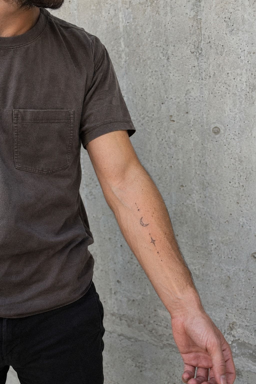
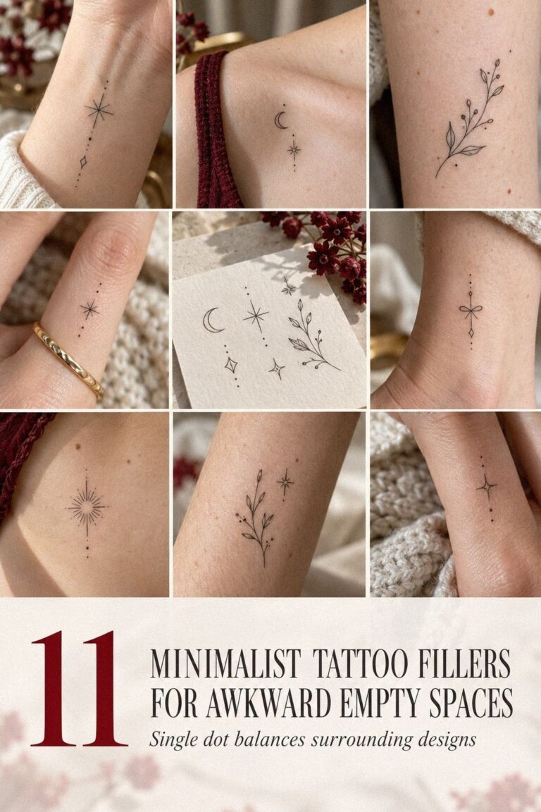
Tiny celestial symbols work well when you want an understated celestial sleeve that doesn’t announce itself from across a room. Think one crescent, a few uneven stars, or a small sun with crisp rays. You’ll get a more personal result if each symbol has a reason, even if nobody else knows it.
That private meaning can make a minimal design feel powerful.
Keep the symbols visually related. A black ink crescent beside thin star points can create rhythm, while five unrelated moons may look scattered.
I’d skip copying a complete zodiac strip unless astrology is central to your story. It’s popular, but repeated icons can feel generic once the novelty fades.
One unusual constellation usually has more emotional weight.
And place the symbols along the natural length of your forearm instead of forcing a perfectly straight column. Your skin curves, your wrist turns, and the marks should still look balanced while you move. You can study examples in this guide to unique minimalist tattoo ideas before choosing your final arrangement.
A fine-line star stencil should be checked at normal standing distance, not only close to a mirror. Ask yourself whether you can still distinguish the moon from the stars after the design is reduced.
If you can’t, the symbols may need more spacing or slightly heavier outlines. That’s where a skilled artist protects the idea without making it loud!
3Place geometric bands around natural arm contours
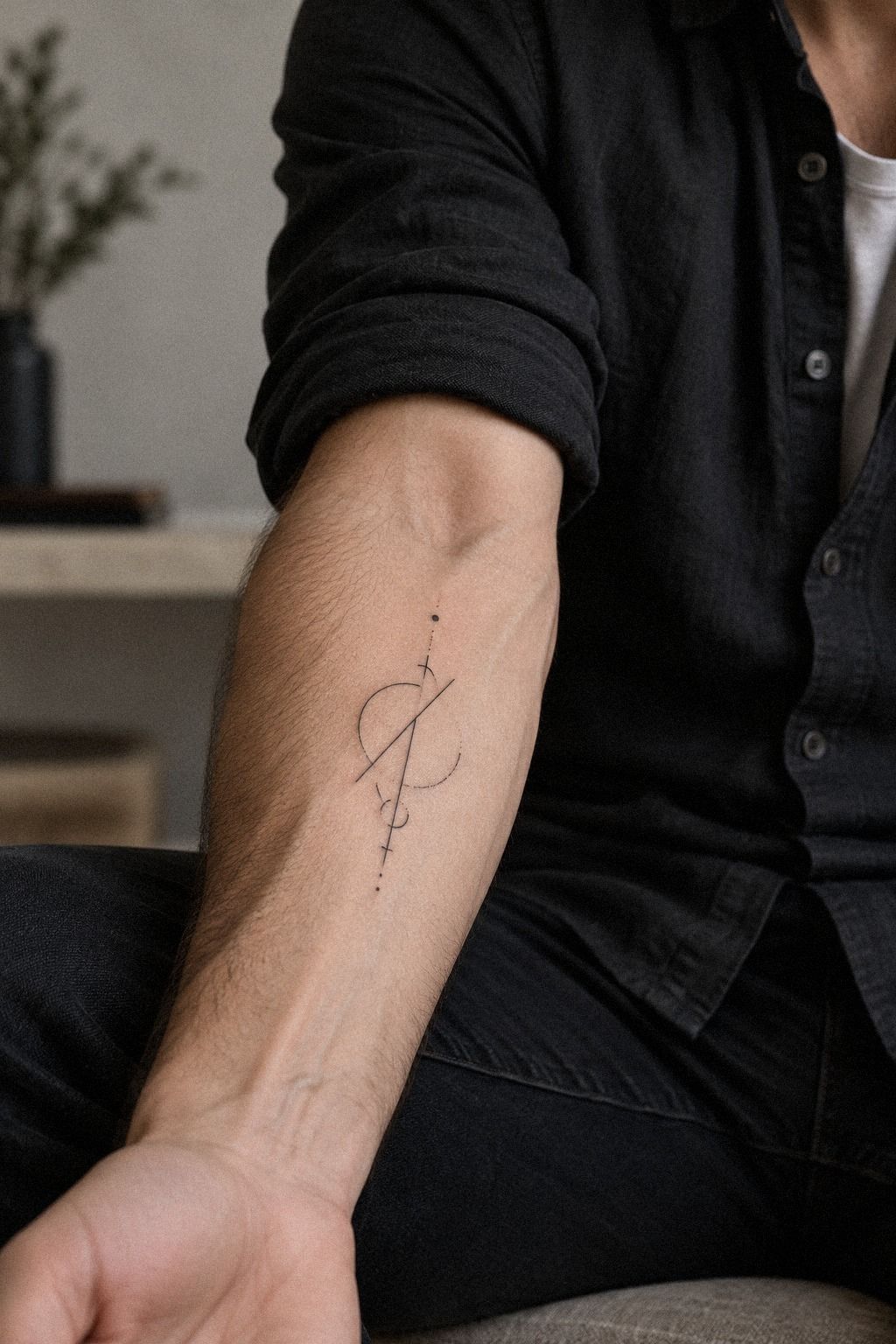
Use geometric bands as anchors, especially if your sleeve includes several small motifs. A narrow circle around the forearm can separate a botanical section from celestial marks, but it shouldn’t look like a rigid bracelet unless that’s your intention. The contour band method follows the arm’s shape and keeps the composition sharp.
Your artist should place the band while your arm hangs naturally. A line that looks level with your wrist bent may tilt when you relax.
I learned this after seeing a stencil that seemed flawless on paper but looked slightly crooked on skin. You’ll want to check it in motion, because bodies aren’t flat drawing paper.
But don’t use multiple thick bands to solve every spacing problem. They can dominate a delicate sleeve and make the rest of your motifs seem incidental. I’d choose one crisp geometric ring over three competing lines, especially if your goal is private coverage.
A quarter sleeve tattoo meaning guide can help you compare partial coverage before committing.
Choose a thin black circle stencil and inspect where it passes over the inner arm, outer arm, and elbow crease. Your artist may adjust the curve slightly so it ages more evenly.
That small correction won’t ruin the geometry. It will make the finished mark feel sleek, balanced, and attached to your body instead of pasted onto it.
4Keep negative space between delicate ink elements
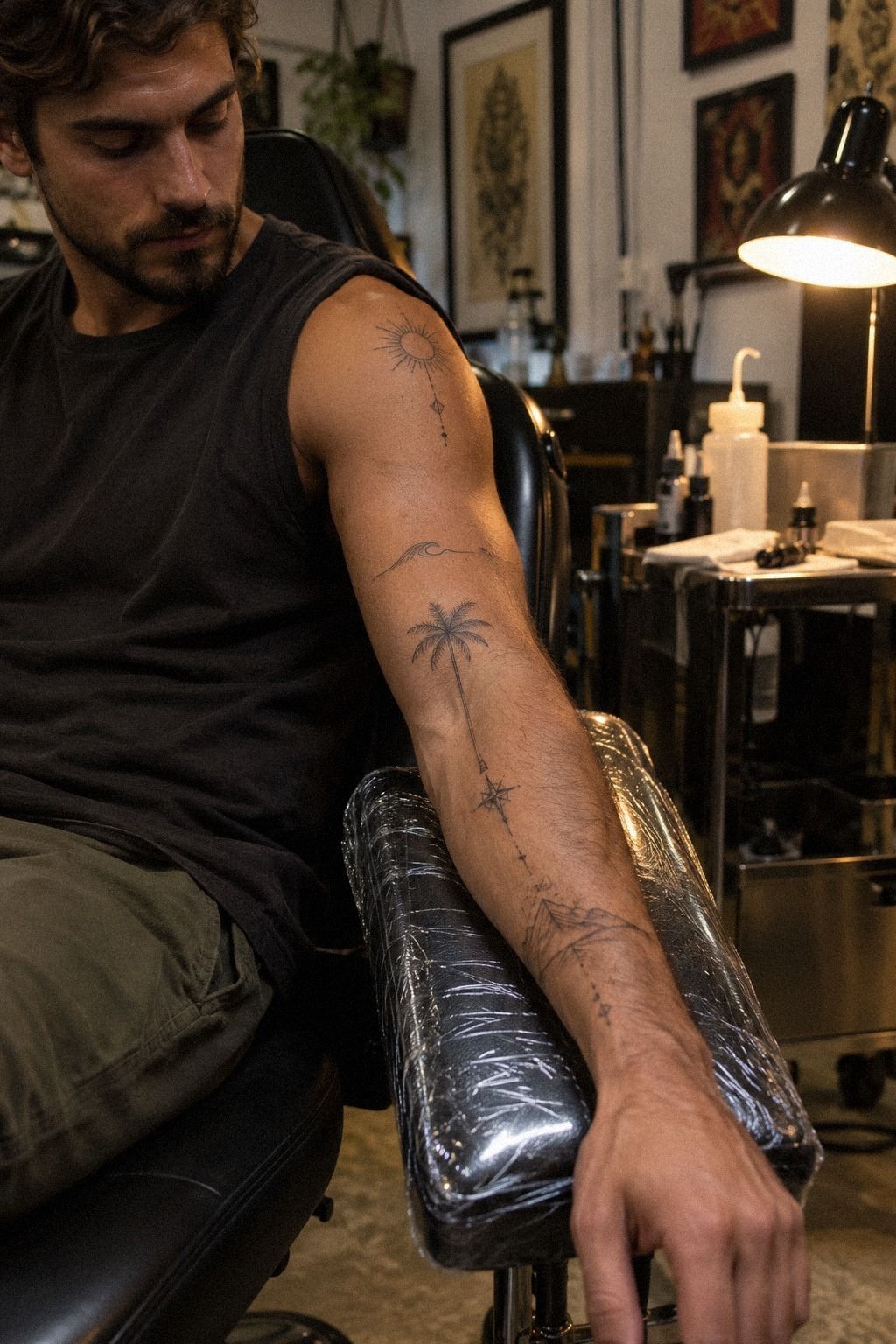
Negative space is what lets a minimalist sleeve stay readable. Leave visible skin between motifs instead of filling every open area because the design feels unfinished.
Your eye needs pauses. Without them, even delicate symbols can merge into one dark, confusing strip.
The private spacing rule keeps the sleeve expressive without making it immediately obvious under short sleeves.
I’d rather see four carefully separated marks than ten tiny elements competing for attention. Use the inner forearm for the more personal symbols and keep the outer edge quieter if privacy matters.
You’re deciding what appears first when your sleeve shifts, not just arranging pretty shapes. That distinction is important.
And remember that fresh ink can look sharper and darker than healed ink. Ask your artist to show healed examples of negative-space linework, especially on skin tones similar to yours. If you’re designing on deep ebony skin, request healed examples rather than relying on a fresh-session example.
The result should remain crisp after the surface settles.
Avoid placing a miniature symbol directly beside another miniature symbol without a clear visual pause. Your sleeve needs a few quiet stretches.
Those gaps can feel ethereal and intentional, especially around the elbow where movement already creates visual change. If you’re unsure, compare the spacing with the examples in this minimalist water lily tattoo collection.
5Plan a flowing single-needle nature story
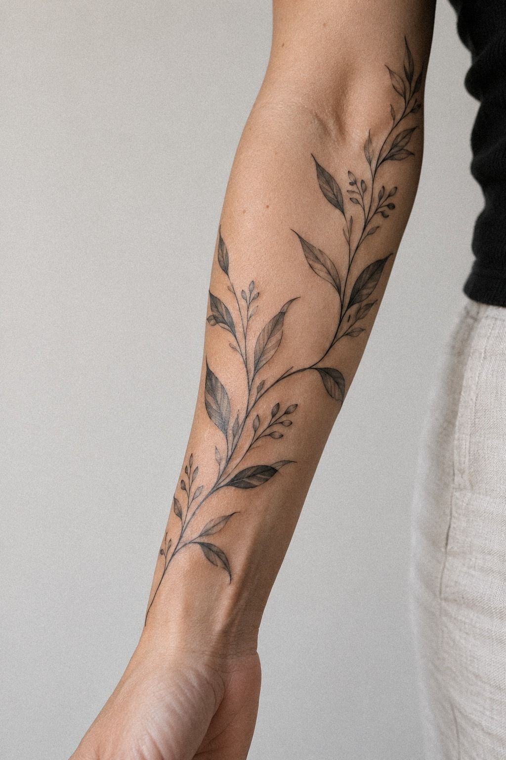
Build a story before you build a sleeve. A small river line can lead into a mountain, then into a moon or leaf, creating a flowing path from shoulder toward wrist.
You don’t need every symbol to match. They need to share a direction, a level of detail, or a personal thread.
That’s the single-needle story method.
A reference sheet can help you see the full idea before your appointment. Look for aged-paper references, hand-drawn black motifs, and enough separation between designs to study each one. I like seeing the whole family of marks together because it reveals when one symbol feels too ornate or too fierce beside the others.
But don’t mistake a connected story for a literal scene. A river, animal, and constellation don’t need to touch.
Let one curved line echo another, or repeat a small point of light across the forearm. You’ll get a more timeless sleeve when the connection is felt rather than explained.
This sleeve artist tattoo meaning guide may help you think through the personal thread.
Ask your artist to prepare black stencil paper for the complete arrangement, not just individual motifs. See it from different angles and cover part of it with a sleeve cuff.
If the story still feels clear when half-hidden, you’ve designed for privacy well. If one symbol carries the entire meaning, give it the best placement.
6Blend miniature animals into minimalist linework
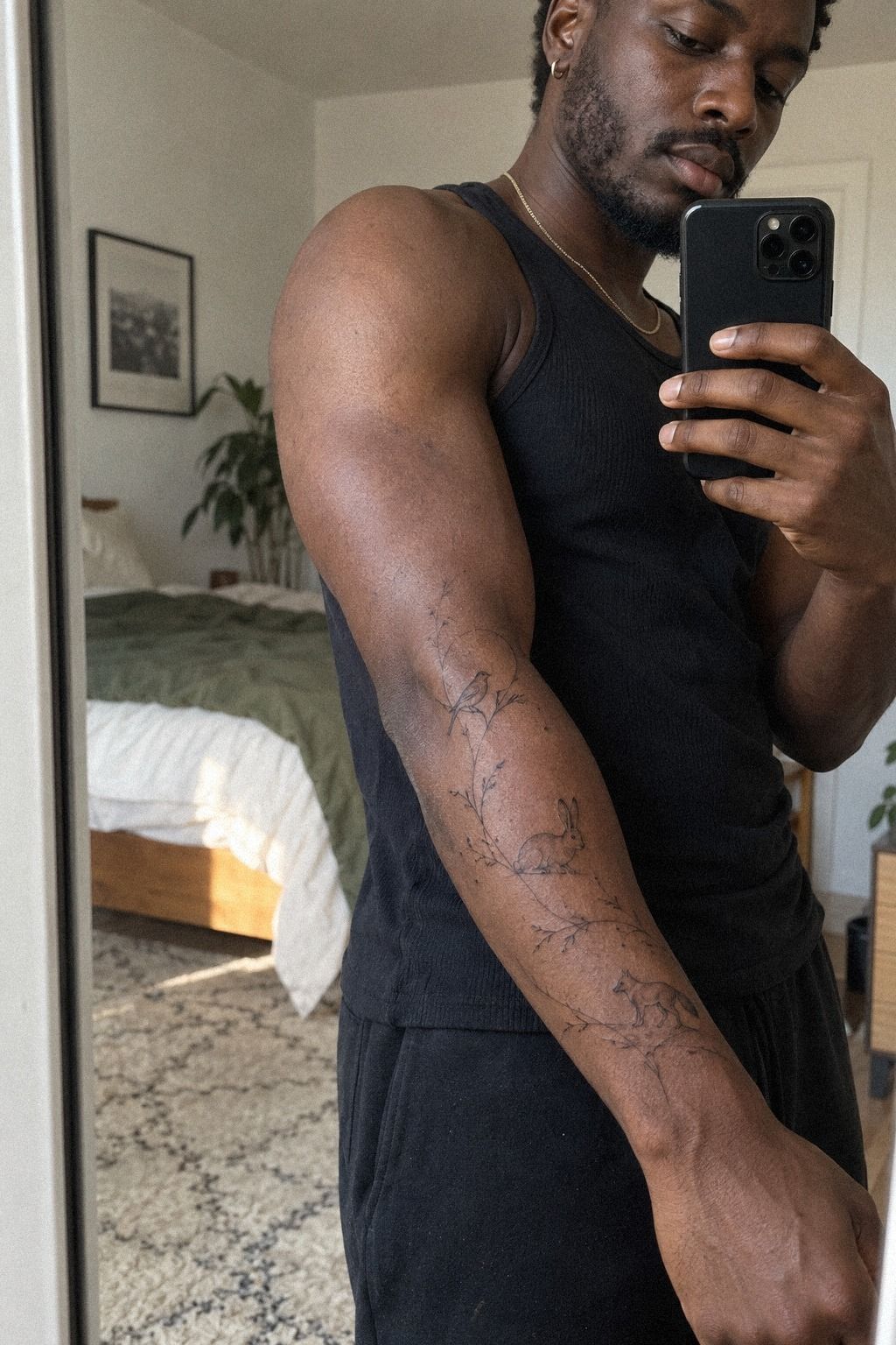
Choose one animal with a silhouette that survives at a small size. A fox, swallow, moth, or small cat can feel symbolic and expressive when the artist removes unnecessary interior detail.
Keep the animal’s outline crisp and give it room from nearby leaves, stars, or script. Forest green, rust, and natural brown accents can add a vibrant animal detail without overwhelming delicate black lines.
I’d choose an animal whose movement supports the sleeve’s larger direction. A bird can lead toward the wrist, while a curled fox or moth can settle into a quieter inner-arm space. The strongest choice usually feels personal and understated, not merely cute.
7Choose symbolic constellations with crisp outlines
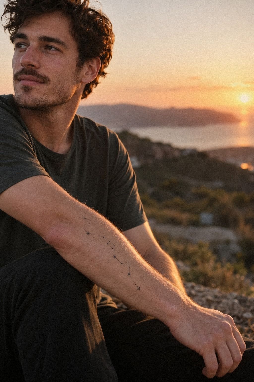
Pick a constellation that means something specific to you, then simplify it until the pattern reads at a glance. You can use small points, short connecting lines, or one unusual star as the focus. The constellation clarity rule prevents a meaningful symbol from becoming a faint cluster that only makes sense with an explanation.
Your artist should keep the connecting lines crisp and avoid overloading the design with decorative dots. I’d choose three or four strong points over a crowded star map.
The sleeve will feel more elegant when the constellation has a little tension and asymmetry. Perfect symmetry can make a personal mark feel strangely impersonal.
Ask to see the design on the actual forearm area where you’ll wear it. A crisp black constellation can look sharp on paper but lose clarity near a crease or curved edge.
You’ll want the artist to adjust the angle so the stars remain visible when your arm rests naturally. That’s a practical change, not a compromise.
But don’t place the constellation where a watch, bracelet, or cuff will constantly rub over it during early healing. Plan around the way you dress. Your private sleeve should reveal itself selectively, not because clothing accidentally hides half the design.
This womens forearm sleeve tattoo meaning resource can help you compare symbolism and placement.
8Arrange meaningful script beside subtle icons
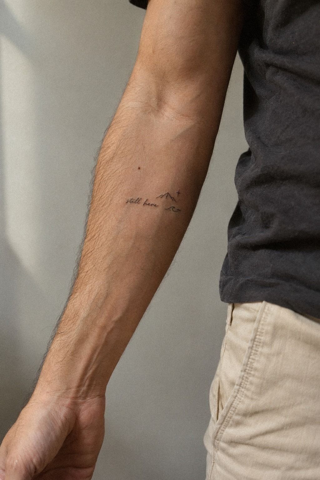
Keep script short. One word, a date, or a few letters can work beautifully beside a small icon, while a full sentence may shrink into an unreadable line. The script-and-symbol pairing gives your sleeve a clear emotional center without turning the forearm into a block of text.
Choose lettering that matches the line quality of your other motifs. A delicate handwritten style beside a bold geometric mark may feel intentionally edgy, but random font changes can make the sleeve look disconnected.
I’d ask the artist to write the phrase by hand rather than selecting a generic digital font. Their natural mark often feels more expressive.
And proofread everything twice, including accents, dates, and names. You’re not just checking spelling.
You’re checking whether the letters remain legible at the size you want. A fine handwritten script stencil should be viewed from arm’s length and from the side. If the words vanish, enlarge them or shorten the phrase.
Place the script along the inner forearm if privacy is the priority. It can face you rather than everyone else, which makes the tattoo feel intimate and personal.
Pair it with one subtle icon, such as a tiny star or leaf. For more symbolic ideas, compare it with this minimalist tattoo artist guide.
9Add bold accents to an understated sleeve
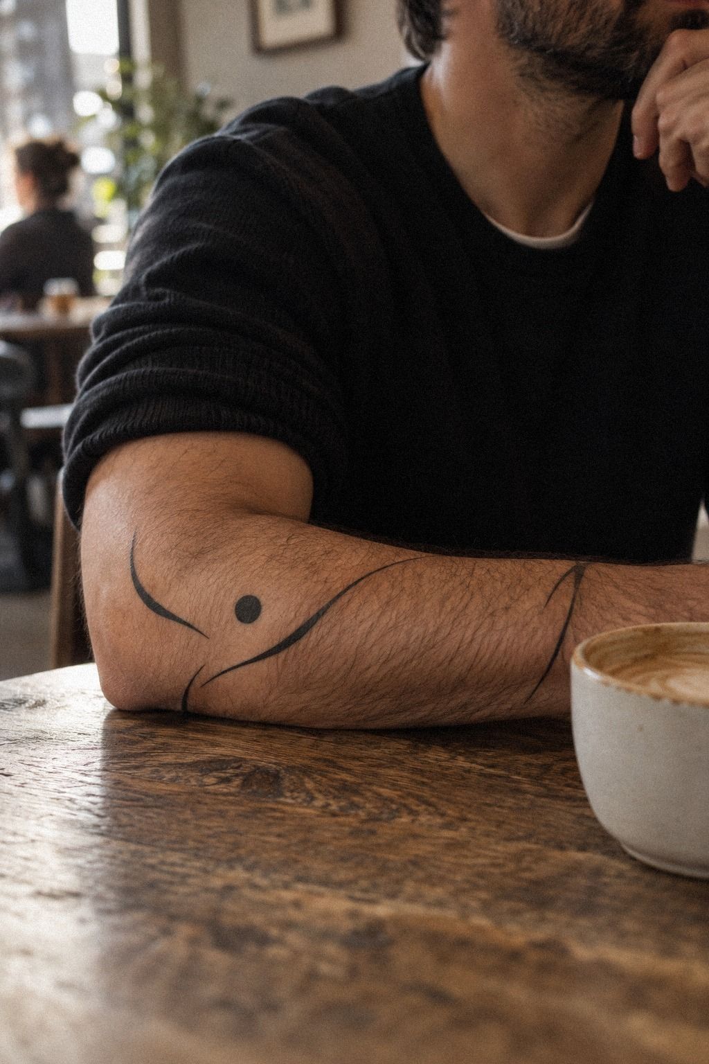
Use one bold accent to give a quiet sleeve a stronger pulse. A filled crescent, dark dot, or compact black shape can keep fine-line motifs from feeling too faint. The one-accent rule is useful because it gives your eye a place to land without changing the entire character of the design.
I’d choose a bold accent near the center of the sleeve, not at every transition. Too many dark marks will compete with your delicate work and may make the sleeve more visible than you planned. A small solid black symbol can be enough to connect separate motifs while preserving the understated quality.
Midnight blue, copper, and ivory can create a daring color accent if your artist works with color safely and consistently. Keep the strongest tone compact so the sleeve remains crisp rather than visually crowded.
Ask your artist how the accent will age beside fine lines. Solid black usually remains legible, but placement and sun exposure still matter.
You’ll want to protect the tattoo from UV after it heals, especially if the design sits on the outer forearm. That care helps the contrast remain sharp.
But don’t add an accent simply because one section looks empty on the stencil. Empty skin may be doing important work.
Leave the design for a few days and view it under ordinary lighting. If the accent still feels meaningful, keep it.
If it only fills space, remove it.
10Balance fierce shapes with graceful botanical details
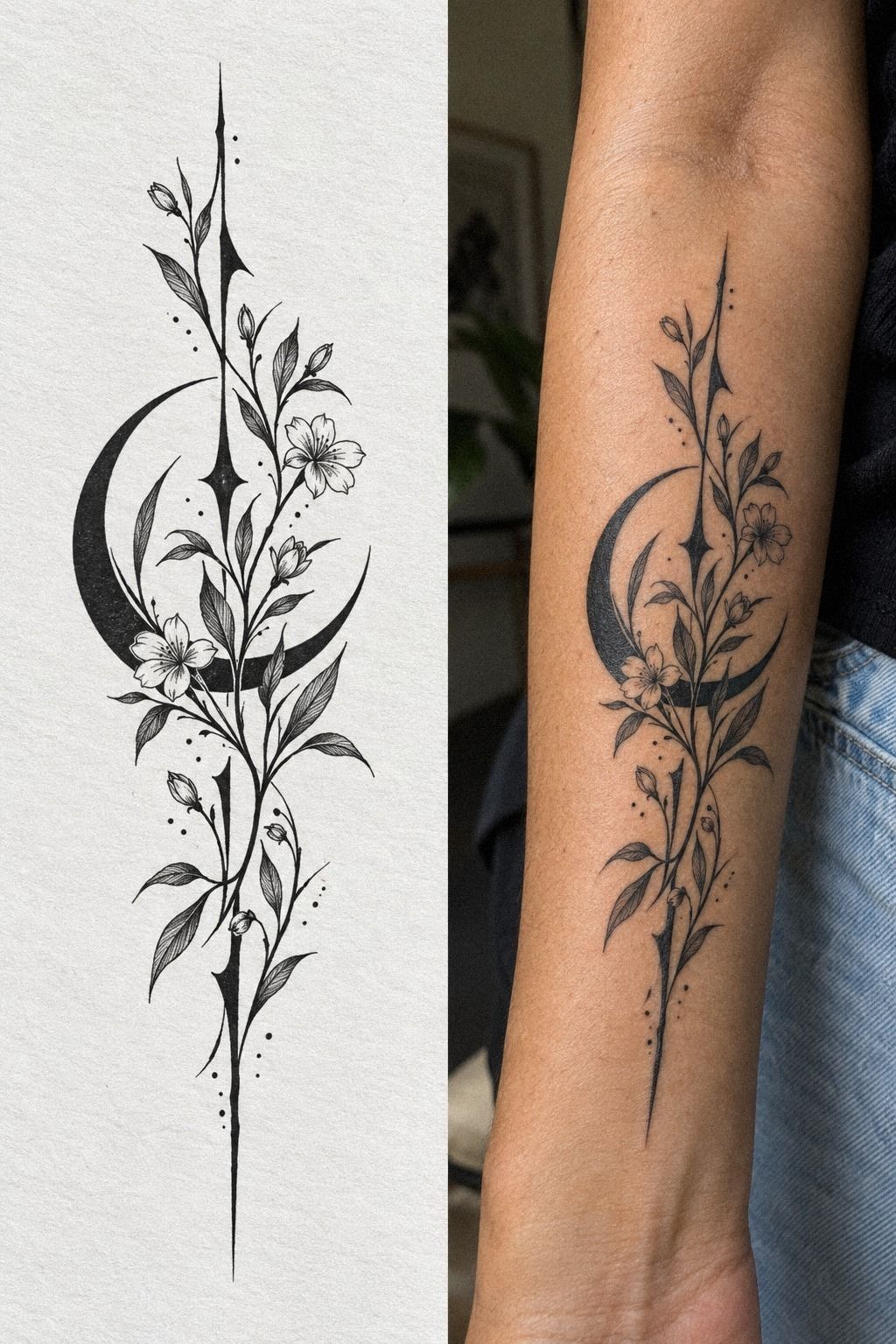
Pair one fierce shape with one graceful detail so the sleeve has contrast without losing control. A small arrow, claw-like curve, or angular flame can sit beside a soft leaf or stem. The contrast pairing method gives your design energy while keeping the overall composition minimal.
Use a printed stencil comparison to study the design alone, then compare it with a healed reference. You’ll notice how line weight, skin tone, and spacing change the impression. I’d rather choose a slightly simpler shape that stays readable than a dramatic design that depends on tiny interior marks.
A white paper tattoo stencil makes this decision easier because you can see the negative space before the appointment. Hold it against your arm and relax your hand.
If the fierce element draws all attention, reduce its size or move it closer to the center. Your sleeve should feel bold in one moment and delicate in the next.
Sage green, warm cream, and natural brown can soften a fierce botanical pairing while keeping the contrast memorable. Let the angular shape sit several inches from the botanical mark, with a symbolic bridge between them. You can compare the effect with small tattoo prices before deciding whether the sleeve needs another accent.
11Map unique personal symbols from shoulder to wrist

Map the sleeve on your body before you finalize any single motif. A terracotta, stone-gray, and olive thread can connect the symbols while keeping the overall design personal and flowing.
Mark the shoulder, upper arm, elbow, forearm, and wrist as separate zones. The most meaningful symbol may deserve the clearest position, while smaller accents can remain understated and private near the inner arm.
A Private Sleeve Starts With a Map
Privacy isn’t only about hiding ink under clothing. It’s also about controlling the order in which someone understands the design. Start with a private placement map that shows your relaxed arm, bent elbow, and natural wrist position.
You’ll notice that a symbol can be visible from one angle and almost disappear from another. That selective reveal is often more interesting than total secrecy. It gives the sleeve a quiet, haunting quality without making it feel secretive for the sake of being secretive.
I’d mark three zones: the first reveal, the hidden center, and the personal anchor. The first reveal might be a dainty star near the wrist. The hidden center could hold script or a sacred symbol.
The anchor deserves the clearest placement because it carries the emotional weight.
Questions I Ask Before Booking
I’d ask whether the artist has healed examples of minimalist sleeve work on skin similar to yours. Fresh work can look vibrant and flawless, but healed lines tell you much more about spacing, contrast, and longevity. Don’t be embarrassed to ask direct questions!
I’d also ask how they handle revisions, stencil placement, and future additions. If your artist wants to start immediately without discussing scale or movement, I’d pause. A thoughtful consultation is part of the design, not an obstacle before it.
Ask whether they can explain which details may soften over time. That answer reveals whether they understand the difference between a crisp, durable mark and a fragile one. You’re looking for honest guidance, not a promise that every tiny detail will stay unchanged.
Bring your clothing preferences, work requirements, and personal boundaries into the conversation. A private sleeve consultation should include what you’re comfortable revealing, when you want it visible, and whether future additions need to connect cleanly.
The Quiet Difference Between Fine-Line and Faint
Fine-line doesn’t mean barely visible. Your fine-line tattoo design still needs enough contrast to remain readable after the surface settles. If every mark is whisper-thin, your sleeve may look delicate at first and unclear later.
Ask your artist where slightly stronger lines would protect the composition. A crisp outline around a moth or leaf can support much finer interior marks. That contrast often feels more stylish than making every line identical.
I’m cautious about designs that depend on gray haze to look intricate. Black linework can feel raw, sharp, and timeless when the artist uses restraint. If a shape needs heavy shading to make sense, it may not belong in a minimalist sleeve.
A healed line-weight sample can answer more than a dozen reference pictures. Compare fresh and settled versions at the same size. You’ll see which marks remain vibrant, which gaps stay open, and whether the composition still feels polished.
Symbol Hierarchy, According to My Eye
Every successful sleeve has a lead, a supporting cast, and pauses. Your symbol hierarchy might place a meaningful animal first, a constellation second, and tiny dots or leaves third. The result can feel polished without appearing overly planned.
I’d remove anything that competes with the central symbol. A sleeve becomes more expressive when each mark has a job.
Good placement matters! The strongest design may be the one that leaves one tempting idea out.
Use size, contrast, and position to create order. The largest motif doesn’t always need the darkest lines. Sometimes a small sacred symbol deserves the clearest location because its meaning is more important than its visual weight.
A supporting motif should echo the lead through shape, direction, or spacing. That connection keeps the sleeve feeling flowing rather than random. You can still include whimsical or playful details, but give them a reason to be there.
When Should You Leave a Gap?
Leave a gap whenever two symbols begin competing for the same glance. A deliberate pause can separate a romantic script fragment from a fierce animal or keep an ornate flower from overwhelming a constellation. The negative-space interval gives every mark room to breathe.
The gap doesn’t need to be mathematically equal. Natural variation often feels more expressive than a perfectly measured grid. I’d place the widest opening near the most private symbol so it remains distinct when the sleeve is partly covered.
If you’re unsure how much skin to leave visible, study the arrangement at arm’s length. Small details merge faster than you expect. A minimalist water lily tattoo can show how a delicate subject stays legible when its surrounding space is carefully protected.
Inside Versus Outside: Which Side Stays More Private?
The inner forearm usually gives you more control over visibility because you can turn the design toward yourself. The outer forearm is easier for others to see, but it can give a bold symbol more presence. The inner-versus-outer placement should reflect your daily movement, clothing, and comfort.
An inward-facing script may feel personal and understated. A sharp geometric band on the outer arm may feel more iconic and polished.
You don’t have to choose one side for every motif. Use the contrast to decide what appears first.
I’d test both angles while wearing the sleeves you actually use. Lift your arm, reach forward, and let it rest naturally.
If the design is visible in every position, it may not be as private as you intended. This minimalist tattoo artist guide can help you think through placement with an experienced artist.
The Movement Test Before Booking
Your arm is never still for long. It bends, rotates, reaches, and changes shape while you work. The movement test shows whether your sleeve remains balanced outside the frozen position of a stencil appointment.
Check each major mark with your elbow bent and your wrist relaxed. Then turn your palm upward and downward. A flowing stem may need a slight adjustment, while a script line may need to follow the forearm rather than cut across it.
I’d also test the design under a cuff and short sleeve. The first visible fragment should look intentional, not like a random leftover piece. For smaller starting concepts, revisit these small sleeve tattoo ideas and compare how different anchors behave in motion.
What I Learned About Keeping a Sleeve Private
I used to think privacy depended mostly on choosing a hidden placement. It doesn’t.
A tattoo can sit on the forearm and still feel private if the symbols face inward, the gaps stay generous, and the design reveals meaning slowly. A loud sleeve isn’t always large.
Sometimes it’s simply too dense, too dark, or too easy to read from six feet away.
The first mistake I’d avoid is approving a stencil while standing perfectly still. Your arm moves constantly.
It turns when you open a door, rests differently while you work, and changes shape when you carry a bag. I’d check every important mark with the elbow bent and the wrist relaxed. That small pause can prevent a striking daily design from looking awkward in ordinary life.
I’m also cautious about chasing ultra-thin lines just because they look delicate in a reference. Fine-line tattoos can age well, but lines may soften or widen, especially with repeated UV exposure.
I’d rather have a crisp, slightly stronger outline than a fragile mark that disappears. Ask for healed examples, not only fresh work.
The second mistake is adding symbols before deciding what deserves emphasis. Your sleeve needs hierarchy. One motif should lead, two or three should support it, and the rest should create rhythm.
That’s why I like the single-needle black ink approach for this style. It can feel raw and expressive without filling every inch of skin.
Finally, respect the healing period. Surface healing often takes about 2 to 3 weeks, while complete healing can take about 2 to 3 months. Follow your artist’s aftercare instructions, wash gently, moisturize as directed, and avoid sun and swimming during the early stage.
Your patience protects the crisp, timeless quality you planned for.
What a Minimalist Sleeve Usually Costs and Needs
A minimalist sleeve can cost less than a dense full-color project, but the artist’s skill still matters more than the amount of ink used. A studio may have a minimum around $50 to $100, while an hourly rate may sit around $100 to $250 in the United States. Region, artist experience, design complexity, and session length all change the final quote.
You’ll want to ask whether the estimate includes the consultation, stencil revisions, and any later additions. A fresh black linework sleeve may look simple, but careful placement takes thought.
I’d be wary of choosing an artist only because the quote is low. Clean linework, strong hygiene, and healed results are worth more than a rushed appointment.
Bring a small reference folder, your placement preferences, and a clear explanation of what must remain hidden under clothing. You don’t need to arrive with every symbol finalized. You do need to tell the artist whether the sleeve should feel feminine, masculine, sacred, gritty, or quietly personal.
That language gives them direction without forcing a copied design.
Before booking, review the artist’s portfolio for healed minimalist work on varied skin tones. Look for single-use cartridges, a clean setup, and real healed lines. If your concept leans nautical or classic, compare the symbolism with this Sailor Jerry tattoo sleeve meaning guide, even if your final design stays minimal.
Ask for a written estimate before the appointment. It should explain the expected session length, hourly rate or project price, deposit, touch-up policy, and whether future additions are charged separately. This sleeve artist tattoo meaning guide can help you think through the story before discussing the quote.
The Questions I Get Asked Most
How much does a minimalist sleeve tattoo usually cost?
A minimalist sleeve tattoo usually starts around $50 to $100 for a studio minimum, while hourly rates often fall around $100 to $250 in the US. Your final price depends on the artist, region, design density, and session length. Bring references, but ask for a consultation estimate rather than guessing from size alone.
You’ll get better value from an artist with clean healed work than from the lowest quote. A written studio estimate can clarify whether revisions or future additions cost extra.
Prices vary widely, so treat those ranges as typical reference points, not a promise. You can also compare general expectations through this small tattoo prices guide.
Are minimalist sleeve tattoos a good idea for a first tattoo?
Yes, minimalist sleeve tattoos can be a good first choice when you begin with a small, manageable section and choose an experienced artist. The style can feel personal, symbolic, and understated, while forearm placement is often more tolerable than ribs, feet, hands, or sternum.
Start with one small botanical symbol rather than booking a full sleeve immediately. You’ll learn how your skin responds, how you handle the session, and whether you still like the design after healing. That information is useful before adding more marks.
How do I choose a tattoo artist for minimalist sleeve tattoos?
Choose an artist whose portfolio shows crisp linework, healed examples, varied skin tones, and strong hygiene practices. You’re looking for consistent spacing and confident shapes, not only attractive flash designs. A specialist in minimalist work may understand how much detail must be removed.
Ask to see healed linework examples and request a clear explanation of aftercare. I’d skip an artist who refuses to discuss healing or only shows fresh tattoos. Your design deserves a calm consultation, careful stencil placement, and honest advice about longevity.
How much do minimalist sleeve tattoos hurt?
Pain varies by person and placement, but ribs, feet, hands, and sternum are commonly more sensitive, while the forearm, thigh, and shoulder are often more tolerable. Your session may still feel intense near bone, creases, or thinner skin.
A forearm placement is often a practical starting point because you can see it and many people tolerate it well. You’ll want to eat beforehand, stay hydrated, and tell your artist if the sensation becomes too much. Breaks are normal.
How long does a minimalist sleeve tattoo take to heal?
The surface usually heals in about 2 to 3 weeks, while complete healing can take around 2 to 3 months. During early healing, wash gently, moisturize as directed, and avoid swimming and direct sun. Your artist’s instructions should take priority over general advice.
Don’t judge the final line quality while the skin is still changing. A healed tattoo surface may look softer than fresh ink, and that’s expected. You’ll want to wait until the skin settles before deciding whether any small touch-up is needed.
What’s the best placement for a minimalist sleeve tattoo?
The forearm and shoulder are practical placements when you want visibility, tolerable sessions, and room for clear spacing. The inner forearm can keep symbols more private, while the outer forearm reveals them more easily. Your choice should reflect clothing, work, movement, and pain sensitivity.
Use a temporary placement stencil before booking the final session. Bend your arm, wear your usual sleeves, and check whether the design remains readable. If the tattoo only works in one pose, ask your artist to adjust the angle.
This womens forearm sleeve tattoo meaning resource may help you compare options.
Where I’d Start First
If I had to pick one step, I’d start with the negative-space map. It protects every delicate mark from merging, keeps the sleeve private under clothing, and gives future symbols somewhere to breathe.
Pin the guide for later, then test the stencil for a full day before booking your appointment. Trust that pause!