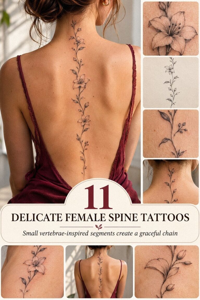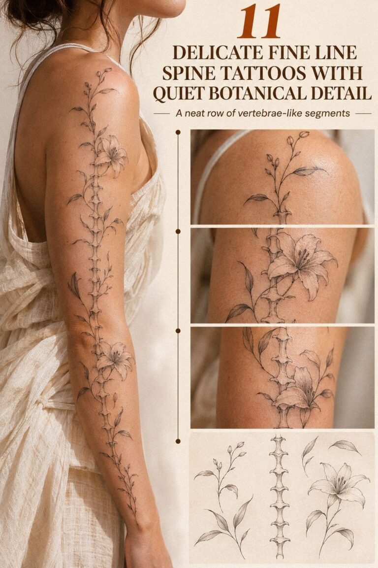
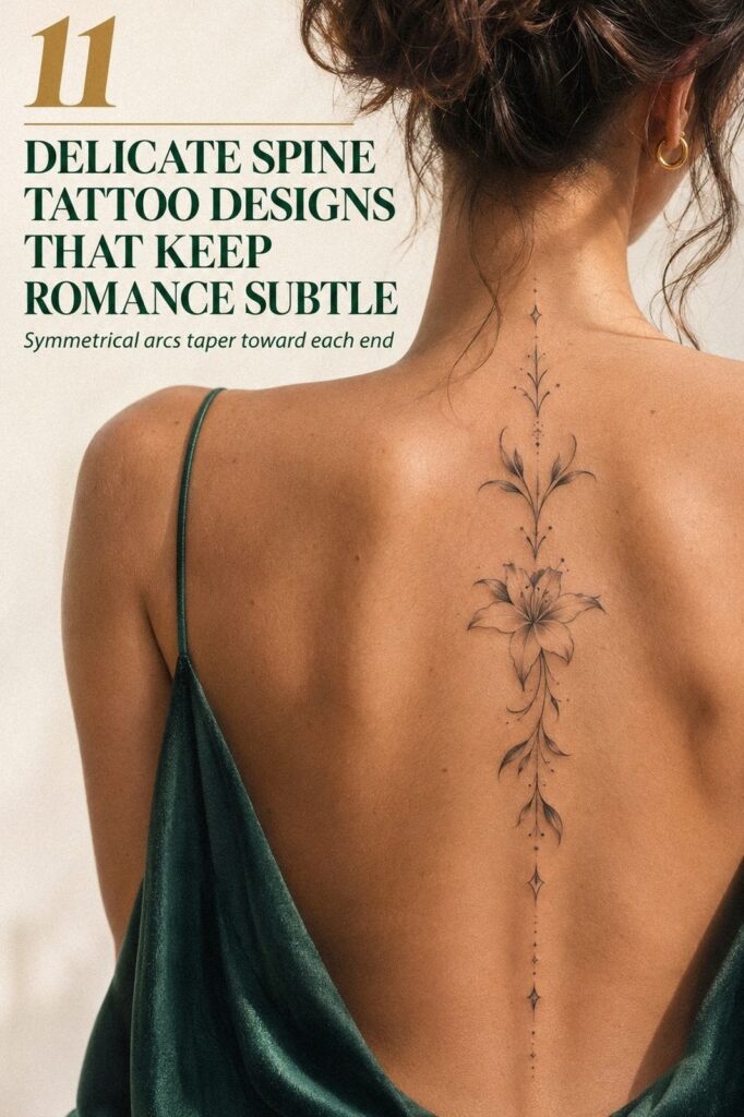
Delicate spine tattoos can stay crisp for years when placement, contrast, and aftercare work together. I got mine after saving the same patch of skin for months, then chose a terracotta-and-olive botanical that felt personal, striking, and small enough to live with. I’d do it again!
- I Started With a Small Vertical Shape
- I Built the Concept Around Spacing
- I Sketched a Single Flowing Vine
I didn’t want a loud statement piece. I wanted something minimal, symbolic, and visible when I chose an open-back top, yet understated beneath everyday clothing. The decision took longer than the appointment because the tattoo needed to feel meaningful now and timeless later.
My One Rule
My one rule was simple: choose the design for my body, not for the trend. I studied healed examples, compared different skin tones, and paid attention to how each composition moved along the vertebrae. A striking idea can still fail when its spacing ignores posture.
I also decided that every mark needed a reason. My artist helped me remove details that looked intricate on paper but would have crowded the final shape.
That editing made the tattoo feel more elegant and expressive. A design doesn’t become stronger just because it contains more.
Honest Take
A spine tattoo can be graceful, powerful, and surprisingly private. You control when it appears, which made the placement feel more personal than a visible forearm piece. Still, the location demands patience because the skin sits close to bone and receives friction from clothing.
The style I wanted was delicate, but delicate doesn’t mean fragile. With thoughtful spacing, strong enough contrast, and sensible aftercare, fine lines can remain crisp.
The result depends on the artist’s judgment as much as the original sketch. That restraint matters!
Start Here
Before booking, save several references with different proportions. Look for minimal stems, symbolic marks, ornate compositions, and simple vertical shapes. My collection of small spine tattoo designs helped me notice which ideas felt genuinely personal instead of merely popular.
Then write down what you like about each one. Is it the curve, the scale, the symbolism, or the amount of open skin?
If you can answer that, your consultation will be far more useful. Keep that question close!
- I Started With a Small Vertical Shape
- I Built the Concept Around Spacing
- I Sketched a Single Flowing Vine
- I Compared Fine Line and Dotwork
- I Placed Tiny Stars Along the Spine
- I Added Meaningful Botanical Symbols
- I Tested the Vertical Layout in Motion
- I Considered Pain Across Each Vertebra
- I Selected a More Individual Motif
- I Planned Healing for Crisp Linework
- I Loved My Finished Minimal Tattoo
1I Started With a Small Vertical Shape
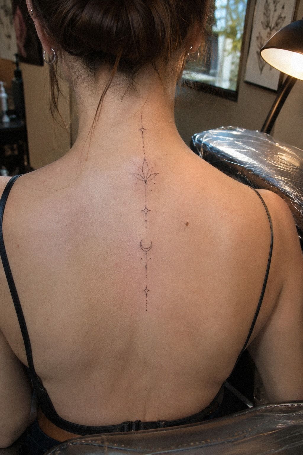
I started with a small vertical shape because I wanted the tattoo to follow my body instead of competing with it. The design needed to feel fine-line botanical without becoming so faint that the central motif disappeared after healing.
My artist placed several stencil options from the upper back toward the waist. I rejected the widest version because it looked daring on paper but lost its dainty quality on my body. The narrower option felt more graceful, and every leaf remained easy to read.
I checked the stencil while standing, sitting, and turning slightly. Your spine bends, so a perfectly rigid drawing can look awkward in motion. I’d choose a crisp, flowing path over a straight column every time.
The moment that settled it was quiet. I saw the stencil in the mirror and recognized myself in it. If you’re comparing proportions, look at minimalist spine tattoo designs before deciding whether your idea needs more length or more breathing room.
2I Built the Concept Around Spacing
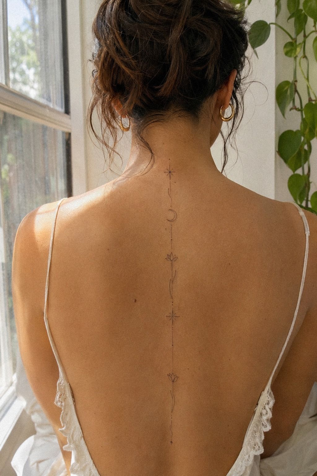
I built the concept around spacing rather than collecting disconnected motifs. The saved references that held my attention used short marks, tiny gaps, and a controlled central rhythm. They felt stylish without becoming overly precious.
I brought my notes, a printed sketch, and carbon stencil paper to the consultation. I didn’t ask for an exact copy. Instead, we changed the distance between each element so the composition would sit naturally along my vertebrae.
You’ll get a better result when you explain what attracts you, not just which picture you saved. Maybe the appeal is the sharp curve of a stem or the quiet symbolism of a single bud. Those details give an artist something useful to interpret.
I kept one rule in mind: each mark needs enough clearance to age independently. When details are packed together, they can blur into a darker shape. My artist removed two decorative dots, and the final tattoo looked sharper because it had less.
For your own board, include healed examples and different skin tones. A design that reads crisp on one person may need stronger contrast or wider spacing on another. These delicate tattoo designs helped me compare scale without losing the personal feeling.
3I Sketched a Single Flowing Vine
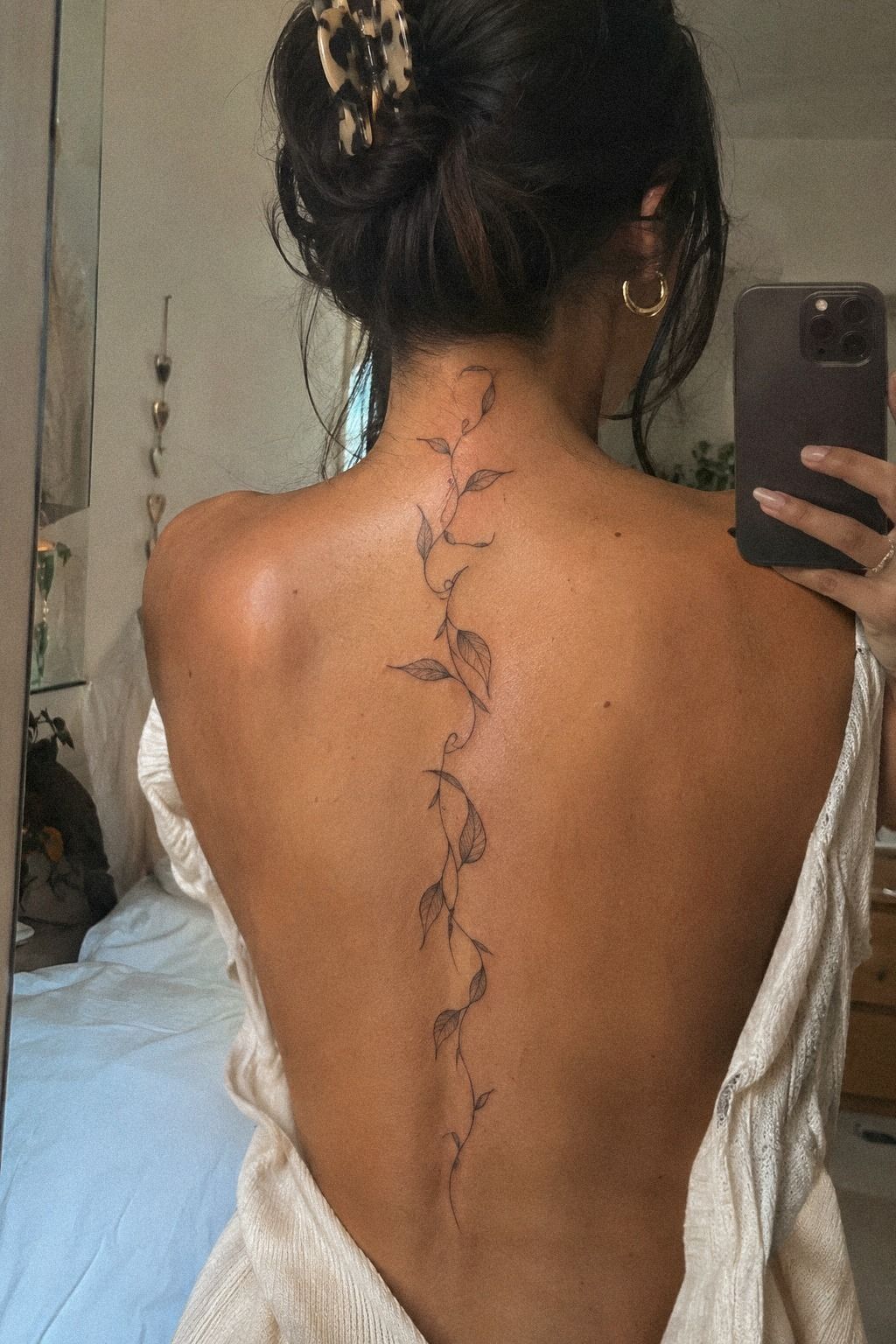
I sketched a single flowing vine after realizing that a long spine tattoo didn’t need repeated symbols from neck to lower back. One continuous gesture felt more romantic than a stack of separate icons.
The first sketch was too busy. I removed a second leaf, shortened the lower curve, and let the central stem carry the composition. That gave the design a more plum, grey, and rose-gold line path, so it followed the body instead of looking pasted onto it.
I’d rather see one expressive shape executed carefully than ten meaningful symbols competing for attention. The vine still suggested growth and memory, but it didn’t force either idea into an explanation. Sometimes the most personal design is the one that leaves a little unsaid.
4I Compared Fine Line and Dotwork
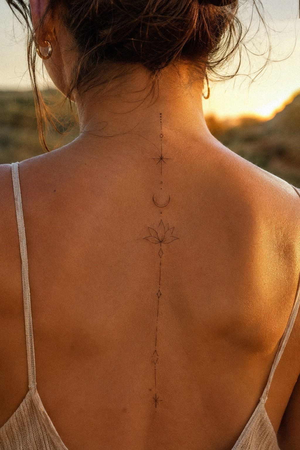
I compared fine line and dotwork because the two approaches created completely different visual weights. Fine line looked sleek and light, while dotwork felt more textured and graphic. Both were striking, but they supported different moods.
My artist showed me navy and white dotwork shading beside a single-needle sample. I chose fine line for the central design, then kept a few tiny dark-brown dots near the leaves. That small contrast gave the tattoo dimension without turning it into a dense black column.
Would a fully dotted design have lasted better? Not necessarily. Placement, ink saturation, sun exposure, and technique all matter.
Very fine marks can spread over time, while solid areas often hold their visual strength better.
I didn’t want to overcorrect for the future and lose the delicate style I loved now. A tattoo should age responsibly, but it should also look like something you genuinely wanted. I refused to choose a style only because it seemed safer.
Ask to see healed work from the same artist. Your skin’s texture and undertone matter, so you’ll want evidence that the artist understands both. I also asked how the artist adjusts ink saturation for lighter and deeper skin tones.
5I Placed Tiny Stars Along the Spine
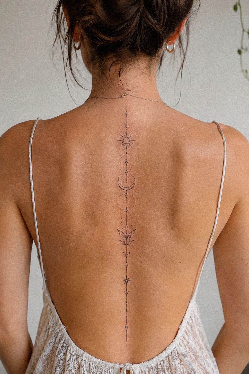
I placed tiny stars along the spine only after testing whether they supported the botanical shape. On their own, stars felt playful and classic. Along the vine, they became small points of emphasis rather than random decoration.
The first arrangement had too many. I kept three and removed the rest because the emerald and gold star placement looked more intentional when the marks weren’t evenly repeated. Perfect symmetry would have made the tattoo feel mechanical.
I also considered how the stars would age beside the leaves. Small isolated dots can remain readable when they have enough separation, but they can disappear into nearby marks when placed too close. The final pattern felt whimsical without overwhelming the main idea.
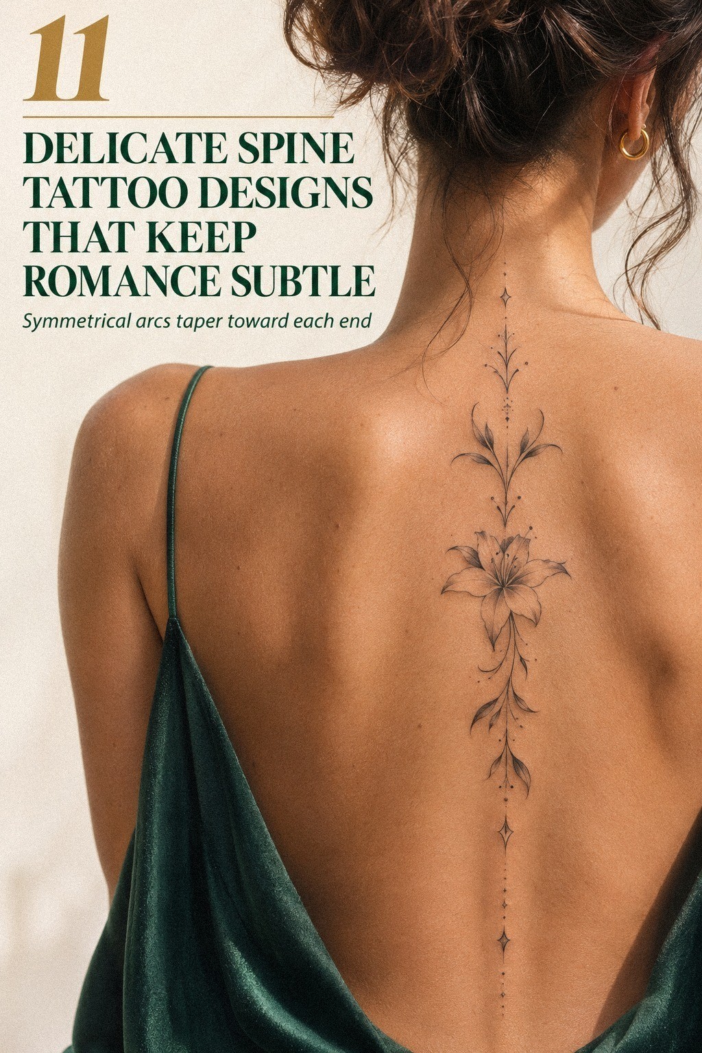
6I Added Meaningful Botanical Symbols
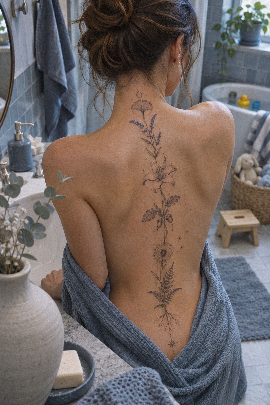
The botanical concept felt meaningful without turning the symbolism into a paragraph of explanation. A small leaf can represent growth, memory, or a person, but the image still needs to look good on your body.
I chose forest-green and rust botanical linework with one open leaf and one closed bud. Contrast against deeper skin mattered, so my artist adjusted the design instead of making every mark thinner. The result looked elegant and expressive, with enough definition to remain visible after healing.
I wrote the meaning down before the appointment. That helped me separate what I truly wanted from symbols I liked only because they were popular online. Your tattoo doesn’t need a complicated story, but it should have a reason that still feels true when the trend moves on.
I also considered placement around the upper and middle vertebrae. The upper section gave the botanical shape more visibility, while the lower section made it more private. If you’re drawn to symbolic work, compare it with these unique female tattoo designs for ideas that leave room for individuality.
7I Tested the Vertical Layout in Motion
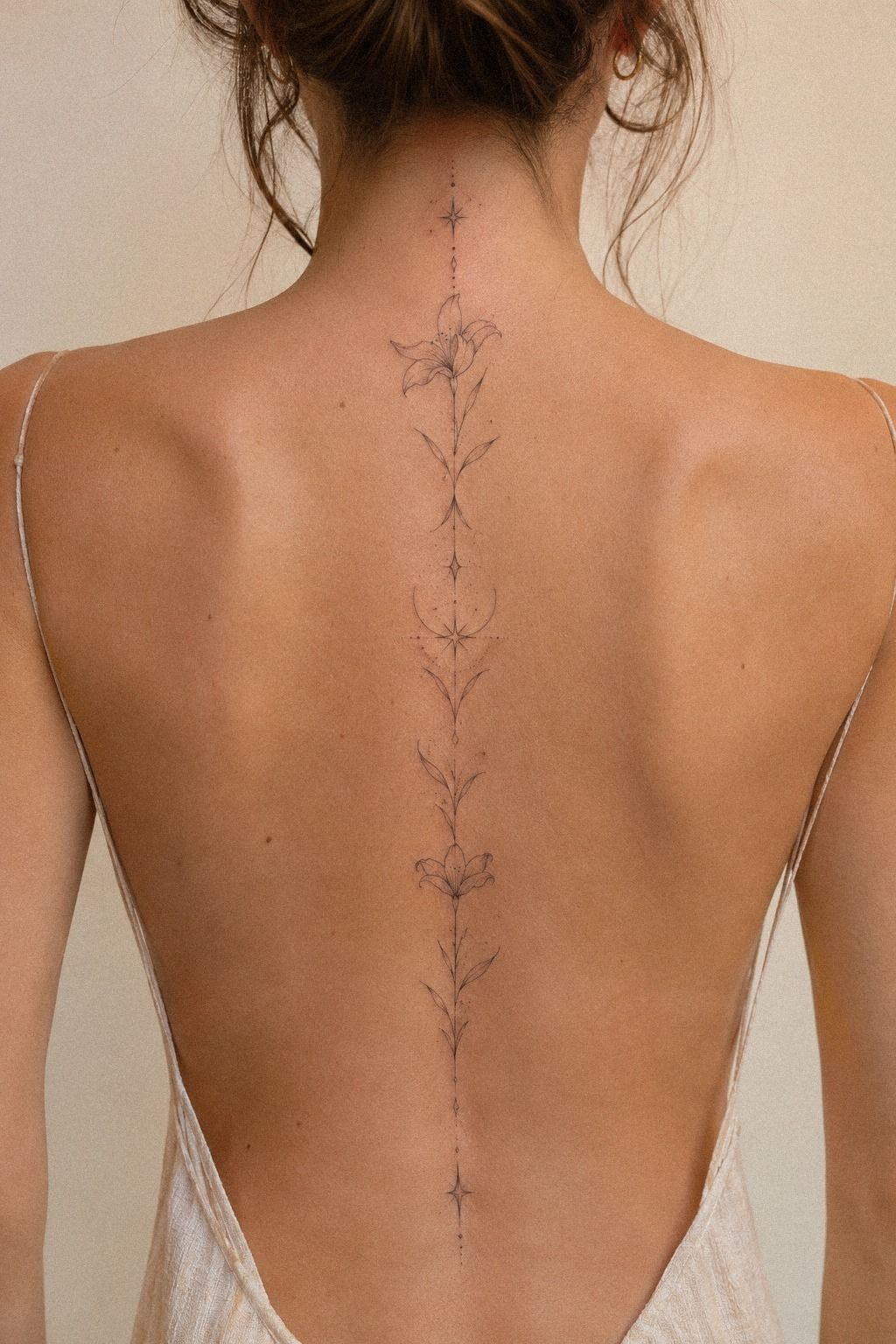
I tested the vertical layout in motion instead of judging it only from a stationary stencil. The central line looked almost like a drawn ribbon, but the curve changed subtly whenever I twisted or leaned forward.
That movement helped me choose a dusty-rose and charcoal spine placement with slightly irregular spacing. The design didn’t need to be perfectly mathematical. A little asymmetry made it feel more organic, while the overall direction still looked polished.
I also checked how much of it would show above different necklines. I wanted the tattoo to be visible when I chose, not constantly announced. That balance made the placement feel understated and empowering at the same time.
8I Considered Pain Across Each Vertebra
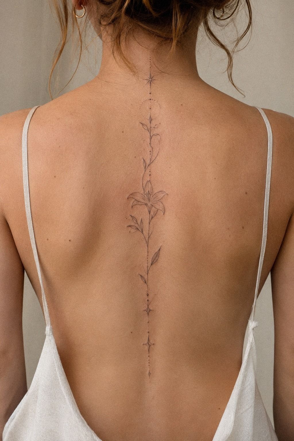
The design decision wasn’t the only thing I considered. Spine tattoos sit close to bone, so the sensation can be sharper than it looks. I wanted a graceful tattoo, yet I also needed a realistic plan for the appointment.
My artist used sterile tattoo needles and worked in short passes. The center of my back felt intense, especially over prominent vertebrae, while the skin beside the spine was easier. Pain varies widely, but ribs, feet, hands, and sternum are often more demanding than the forearm, thigh, or shoulder.
I ate beforehand, brought water, and wore clothing that wouldn’t rub against the stencil. Those choices made the appointment feel more manageable. If you’re nervous, ask how long the session should take and whether breaks are normal.
I’d avoid booking your first tattoo on a rushed day. You’ll want enough time to settle your breathing and listen to aftercare instructions. A meaningful design shouldn’t be paired with unnecessary pressure.
The session felt much less daunting once I had a clear appointment length in mind.
9I Selected a More Individual Motif
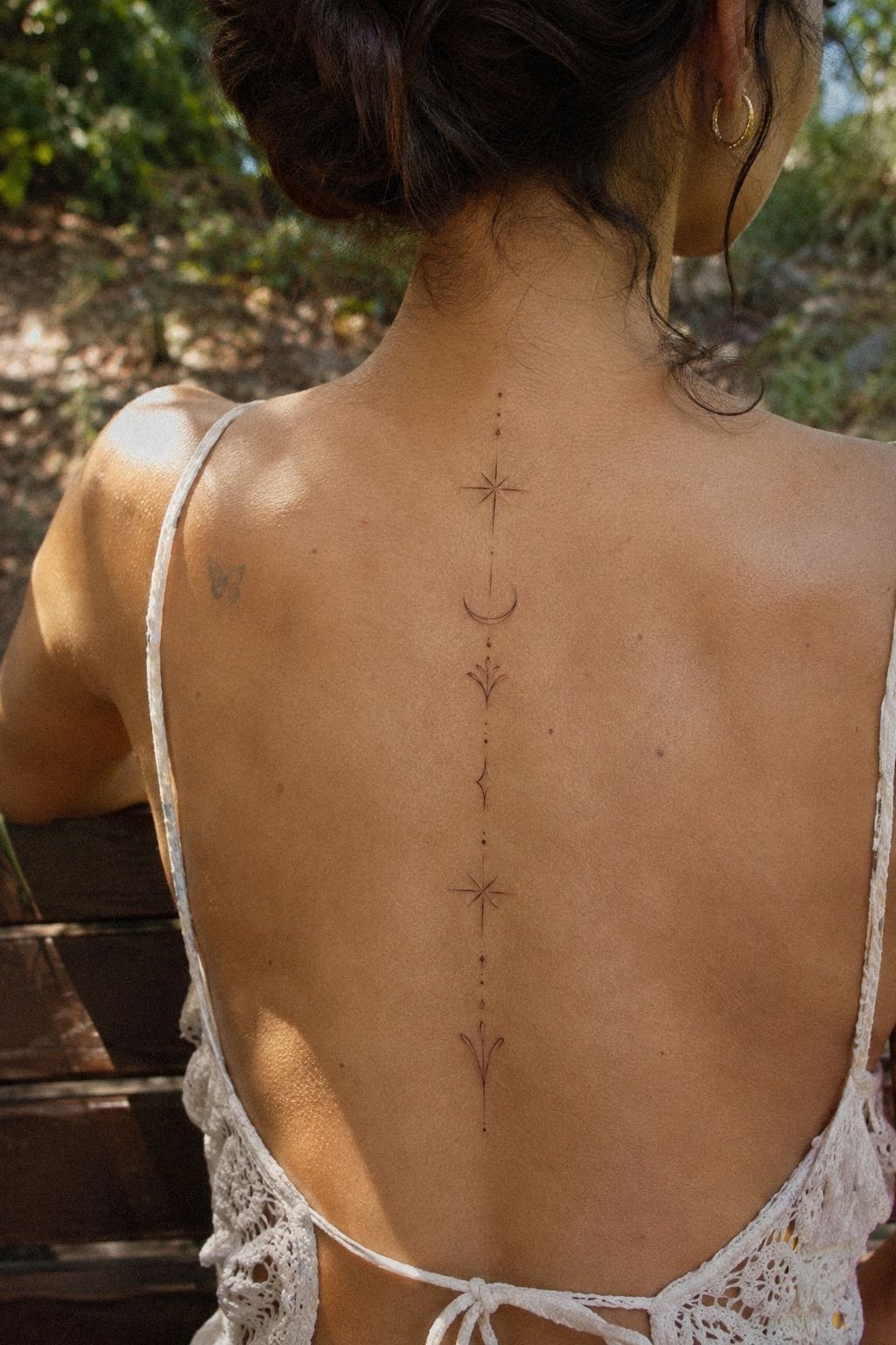
The final concept needed to feel distinctive without becoming strange for the sake of originality. I liked designs that avoided the usual wings, quotes, or symmetrical flowers. A slightly edgy detail gave mine personality, while the fine-line execution kept it elegant.
I chose midnight-blue, copper, and ivory ink for the smallest filled shapes. The rest stayed open and light, which gave the design contrast. My artist explained that solid details can keep their visual presence better than extremely faint marks, especially when the tattoo receives sunlight over time.
The unique part wasn’t a rare symbol. It was the way the pieces were arranged for me. Your tattoo can feel original through scale, spacing, and placement, even when the individual elements are familiar.
That’s more meaningful than forcing an unusual image you don’t connect with.
I didn’t add detail just to make the piece more impressive. The final design had fewer elements than my first sketch, and it looked more refined because of that. You can browse top rated tattoo designs and then edit the strongest idea into something personal.
10I Planned Healing for Crisp Linework
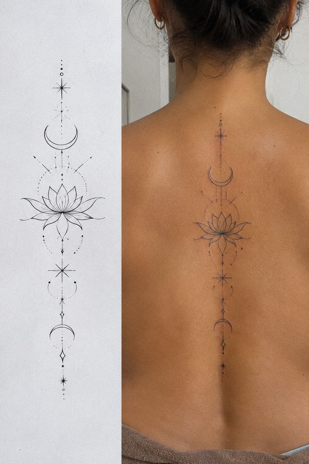
Fresh ink can look darker and sharper than healed ink, so I didn’t judge the final result too early. I expected the surface to change and planned to follow the instructions even when the tattoo looked dry or uneven.
My artist gave me aftercare film and simple instructions: wash gently, moisturize lightly, avoid swimming, and protect the area from direct sun. The surface usually heals in about two to three weeks, while complete healing can take about two to three months.
I kept my clothing loose enough to avoid constant friction. Peeling and mild irritation can happen, but picking at the area can interfere with the finish. Your goal is to leave the skin alone while it does its work.
I took photographs at several stages, although I didn’t compare them obsessively. The linework looked calmer after the surface settled. If you’re planning a similar piece, read this guide to delicate fine line spine tattoos before your appointment.
11I Loved My Finished Minimal Tattoo
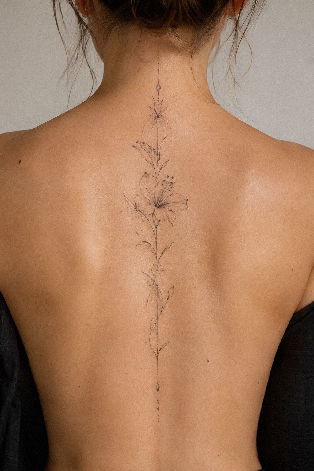
The finished tattoo followed the center of my back without asking to be noticed first. That restraint reminded me why I’d chosen a feminine, polished, and personal design instead of a larger statement.
My final piece used terracotta, olive, and black linework with a few pale stone-toned highlights. Years later, it still looks crisp from normal viewing distance. The thinnest marks have softened slightly, which is natural, but the main shape remains clear.
I’m glad I didn’t choose a larger tattoo just to make aging less stressful. You’ll get better long-term results when the design suits your skin, lifestyle, and willingness to protect it from UV exposure. Sunscreen matters once the tattoo has healed, especially if your back is regularly uncovered.
When I see it in the mirror, I still notice the feeling before the technique. That’s the part that makes it timeless. If you’re choosing between several references, start with the one that feels meaningful before you optimize every line.
The Cost Question Is Really a Tradeoff
My artist priced the tattoo by the shop minimum rather than a long hourly session. In the United States, shop minimums often fall around $50 to $100, while hourly rates commonly land around $100 to $250. A delicate spine tattoo may cost about $100 to $300 depending on size, placement, artist, and region.
The useful question isn’t simply, “What’s the cheapest option?” It’s whether the quote includes enough time for careful stencil placement, consultation, and precise execution. I’d rather choose a smaller design from an experienced artist than a larger design from someone whose healed work I couldn’t verify.
If your budget is close to the minimum, simplify the composition before lowering the artist standard. Remove extra dots, shorten the design, or choose one botanical element instead of several. That keeps the shop minimum manageable without sacrificing the parts that make the tattoo meaningful.
If you’re considering a sought-after artist, ask whether the estimate is hourly or fixed. Confirm the deposit, cancellation policy, touch-up policy, and expected session length before booking. I also asked whether a second appointment might be needed for stencil adjustments.
The cost can rise when the design requires a longer session, multiple placements, or dense black details. I treated the quote as a decision about judgment and execution, not just ink. That approach made the financial choice clearer and less mechanical.
Why Did I Keep Choosing Fine Lines?
I kept choosing fine lines because the style matched how I wanted the tattoo to live on my body. I didn’t want a loud statement that would dominate every outfit. I wanted something striking when I looked for it, yet understated when I didn’t.
My mistake was assuming delicate automatically meant fragile. It doesn’t.
Fine lines can soften, and they need thoughtful spacing, skilled application, and protection from UV exposure, but the style isn’t doomed to vanish. The crisp result came from several quiet decisions made before the needle touched my skin.
I also learned that a tattoo can be feminine and powerful without becoming ornate. The central placement gave mine structure.
The open skin kept it graceful. The black details gave it enough contrast to remain expressive.
If I were starting again, I’d spend more time studying healed examples and less time saving endless fresh photographs. Your best reference answers three questions: does the shape suit your body, does the meaning last, and can the artist execute it cleanly?
That’s why I still recommend looking at delicate tattoo designs and watercolour tattoo designs even if you plan black ink. Comparing different approaches helped me understand what I didn’t want.
The Questions I Get Asked Most
How much does a spine tattoo cost?
A delicate spine tattoo usually costs about $100 to $300 in the United States, although shop minimums may be around $50 to $100 and hourly rates commonly range from $100 to $250. Artist experience, region, size, and placement can shift the estimate, so I’d ask before paying a deposit.
Could a spine tattoo work as a first tattoo?
Yes, it can be a meaningful first tattoo if you understand the placement and healing process. I’d keep the composition manageable, choose an artist with healed work, and plan breaks if needed. A clear stencil matters because the central placement makes alignment especially noticeable.
How do I choose an artist for this style?
I’d look for clean linework, healed photographs, safe studio practices, and experience with spine placement across varied skin tones. A portfolio should show consistency rather than one impressive result. A healed portfolio tells you more than a fresh photograph, so don’t skip that review.
How much does a spine tattoo hurt?
Spine tattoos can feel sharp because the needle works close to bone, especially over prominent vertebrae. Ribs, feet, hands, and sternum are often more painful, while the forearm, thigh, and shoulder may feel more tolerable. Pain varies widely, so I’d eat beforehand and plan breaks.
How should I plan placement and healing?
I’d choose the upper or middle spine when I wanted more visibility and a lower placement when I wanted privacy. The surface usually heals in two to three weeks, while complete healing may take two to three months. Patient aftercare means gentle washing, light moisturizing, no early swimming, and UV protection after healing.
For more placement references, compare women’s shoulder tattoo designs with spine layouts. You’ll notice how movement changes the way a vertical tattoo reads.
Where I’d Start First
If I had to pick one, I’d start with the single flowing vine. Its open spacing gives fine lines room to age, and the curve follows your back instead of fighting it. Pin it for later, then ask an artist to show you healed work before you commit!