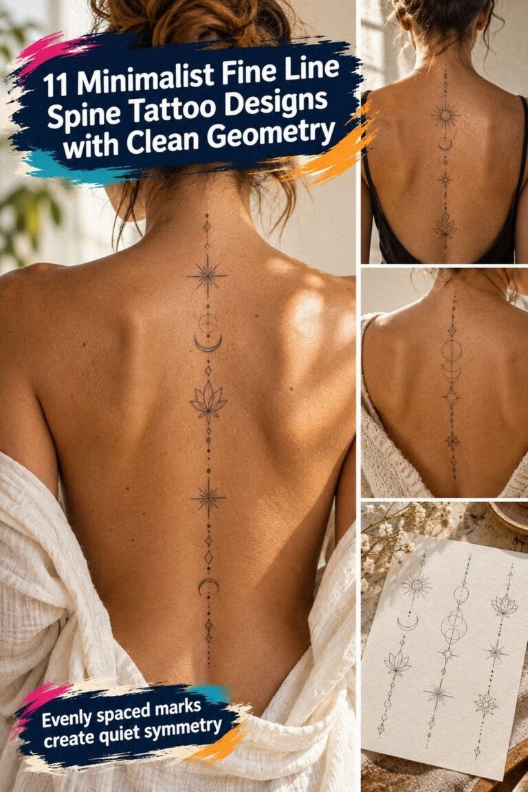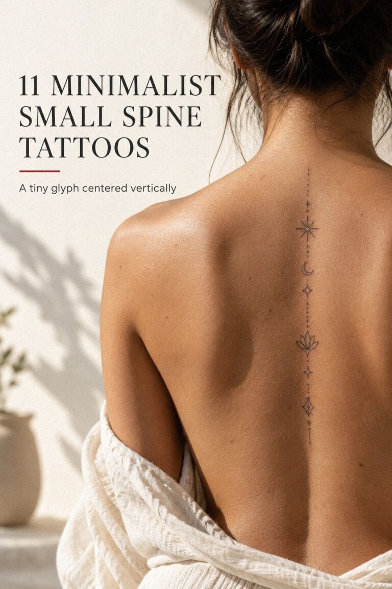
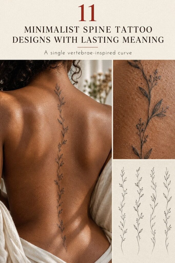
Minimalist spine tattoo designs can stay low-pain and fit one sitting when the linework, size, and placement are planned together. I once chose a reference that was too dense for the narrow center line, and the whole idea lost its clarity. You’ll find cleaner, more personal options here, with choices that can still feel striking and intentional!
My rule is simple: let the spine guide the design instead of forcing the design onto it. A small spine tattoo can be delicate, graceful, and meaningful when every mark has a reason.
Quick answer: choose an open design, limit the details, and ask for a standing stencil before the appointment. If you’re still comparing ideas, start with this small spine tattoo designs collection and notice which references remain readable at a glance.
- Follow a Small Botanical Stem
- What Makes Moon Phases Read Clearly?
- Vertical Script: Keep the Message Legible
- Let Celestial Symbols Breathe
- Build a Geometric Spine Tattoo with One Shape
- A Tiny Wildflower Trail That Stays Light
- Why the Serpent Works Along the Spine
- Sun and Stars, Kept Crisp
- Chakra Symbols with Sacred Restraint
- Meaning First: Dainty Spine Designs
- Bold Blackwork, Minimalist Intent
1Follow a Small Botanical Stem
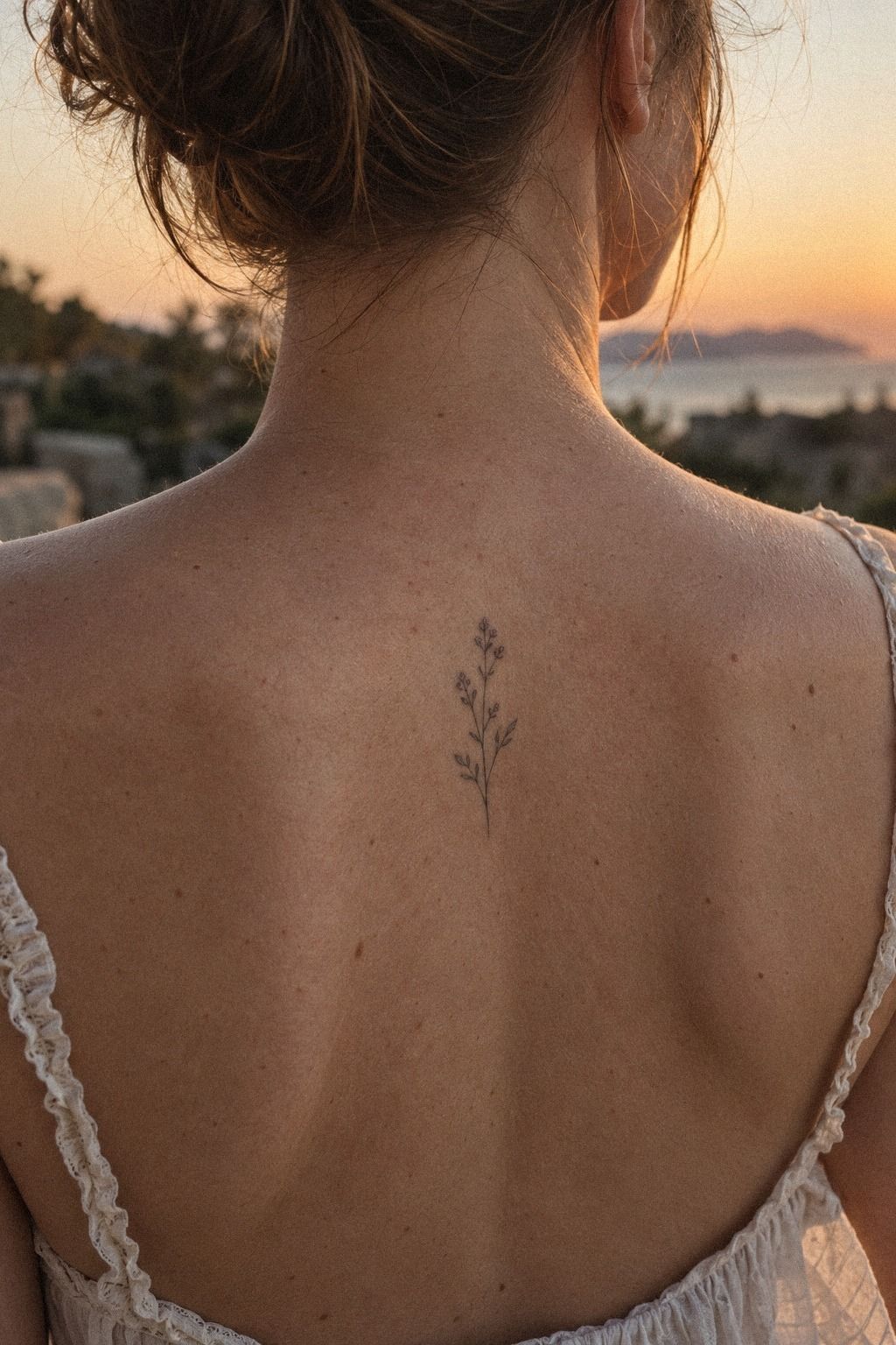
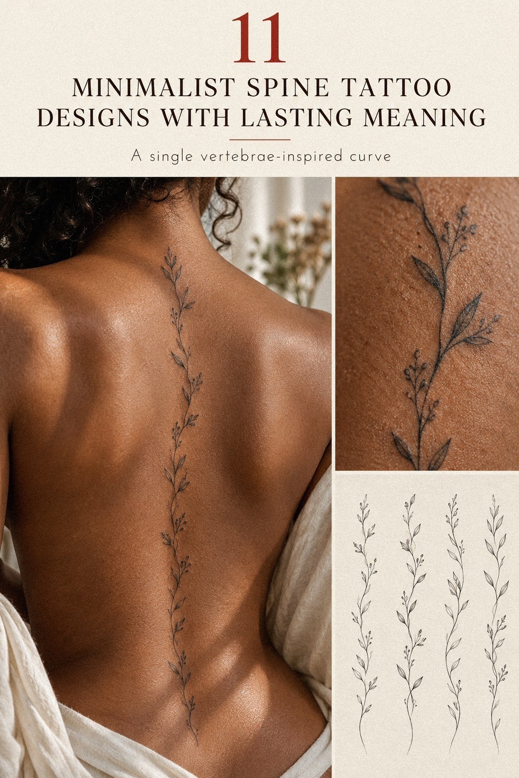
A small botanical spine tattoo works best when one stem follows the natural center line instead of fighting it. Think of a single fern, olive branch, or tiny sprig with three to five leaves. The result can feel delicate and personal without overwhelming the back.
I’d choose a single-needle line for the stem and leave visible skin between each leaf. A design about 3 to 5 inches long gives your artist enough room to keep the curves crisp.
You don’t need heavy shading here. A few precise marks will read more clearly than a crowded cluster.
Keep the botanical reference symbolic. An olive branch can suggest peace, while a thorned stem feels fierce and expressive. For this palette, terracotta ink with stone-grey and olive touches can add warmth without making the stem busy.
I’d keep the colored accents limited to the leaves or one small bloom.
Your low-pain plan matters, too. Ask for a short appointment with breaks, and don’t arrive dehydrated or hungry. A clean botanical line usually takes less time than a dense piece, so you may leave with an understated tattoo that still feels personal.
For your stencil, request a centerline check while standing. Your spine curves when you sit, bend, and breathe, and a placement that looks straight on paper may shift on skin. That small pause can protect the entire design from looking accidental.
2What Makes Moon Phases Read Clearly?
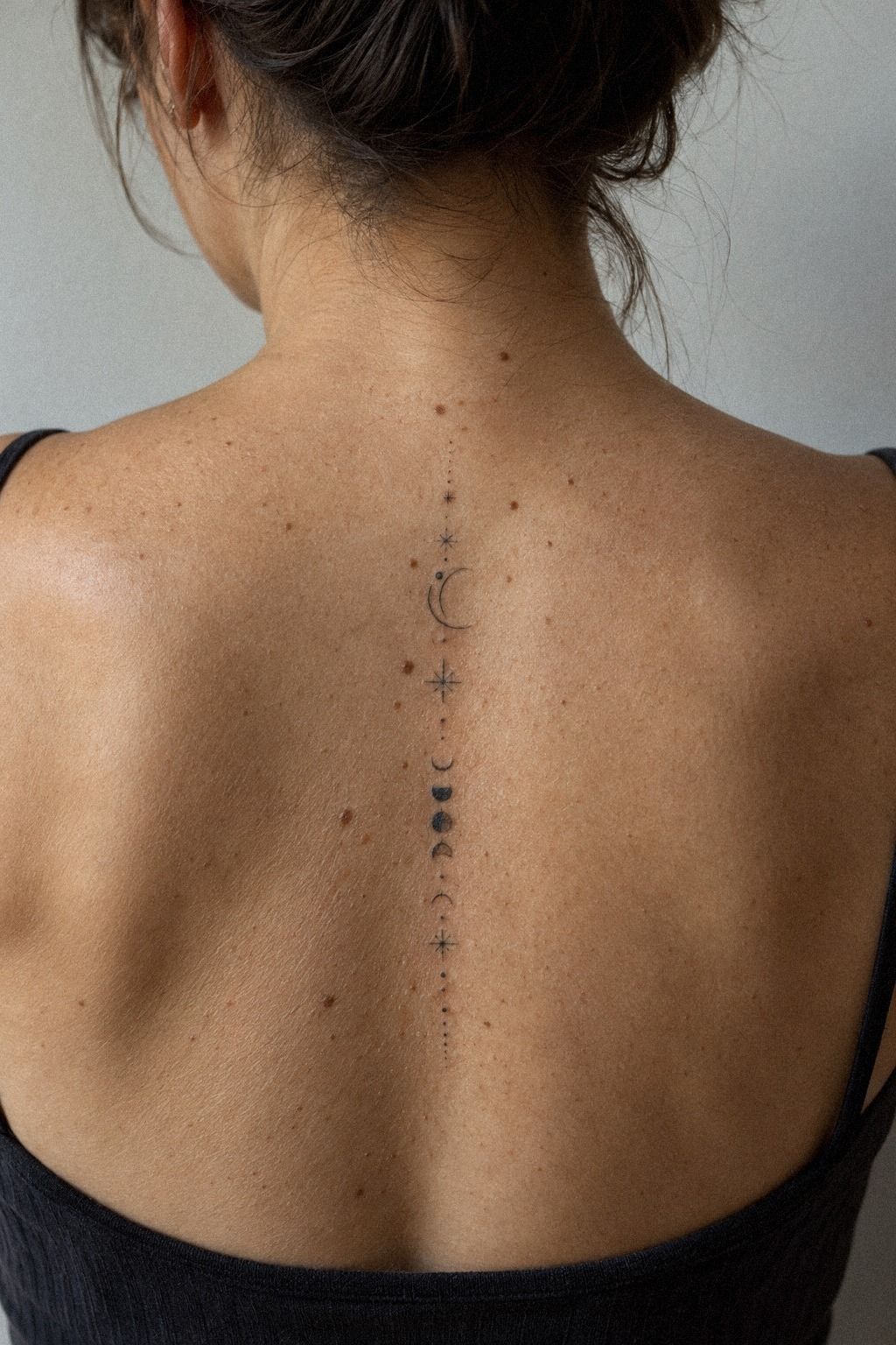
Moon phases make a striking vertical design because each symbol gives your eye a resting point. A crescent, two tiny stars, and a few open circles can feel ethereal without becoming ornate. If you’re drawn to celestial tattoos, keep your reference crisp and let the negative space do most of the work.
I’d ask for fine-line clay ink with one crescent near the upper spine and smaller phases descending toward the waist. Linen-white and aged-brass accents can work as restrained details if your artist confirms they suit your skin tone. The spacing should be deliberate, not perfectly mathematical.
A tattoo like this can stay dainty if each moon is small enough to hold its shape. Your artist might use a fine outline and a tiny dot grouping for the stars.
Don’t ask for a bright white highlight in every moon. It can look sharp on day one, but it may not remain visible as the skin settles.
The pain is usually more about the exact vertebrae than the moon motif. The center line can feel sharper than the surrounding back, so you’ll want a calm breathing rhythm. I’ve found that a low, steady conversation helps more than trying to ignore every sensation.
Choose a warm ivory or deep brown skin reference that resembles your own tone. This makes the stencil and contrast easier to judge.
Your final tattoo should feel romantic and polished, not copied from a random screenshot. Save this minimalist fine line spine tattoo guide for comparison!
3Vertical Script: Keep the Message Legible
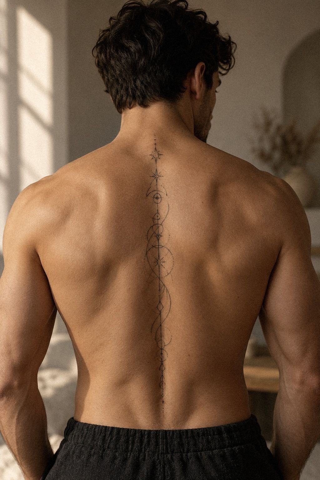
Vertical script can be meaningful, but the lettering needs room to breathe. A short word, date, or two-word phrase will age more cleanly than a full sentence squeezed down the spine. Your best lettering reference should show the exact height, spacing, and direction so the artist can test the stencil honestly.
I’d pick a rounded plum script stencil with gentle terminals rather than razor-thin flourishes. Grey shading or one rose-gold detail can support the lettering, but the word should remain easy to read. Tiny loops are risky.
They can merge as the tattoo settles and make a crisp word hard to read.
Ask your artist to place the standing stencil while you stand naturally. Your shoulders may sit unevenly, and the spine isn’t a ruler.
If you’re choosing between a straight vertical word and a subtle curve, I’d choose the curve when it follows your body better. A rigid line can look less elegant once you move.
Black ink gives the strongest long-term contrast, especially for a masculine, understated design. You could add one tiny symbolic mark, such as a star or dot, but don’t crowd the lettering. The word should remain the focal point.
And yes, spelling matters more than the font trend!
A short script session can fit easily into one sitting, but your artist still needs time for placement and sanitation. Bring a printed reference and a backup font. Saniderm protective film may cover the fresh work afterward, though your artist will choose the aftercare method that suits your skin.
If you want a wider range of lettering ideas, compare these unique female tattoo designs while checking whether the words remain legible at their actual size.
4Let Celestial Symbols Breathe
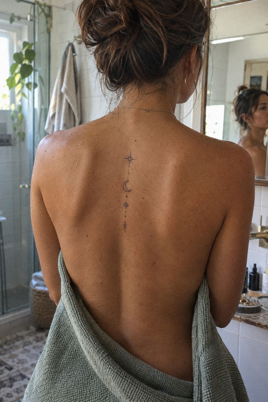
A vertical set of celestial symbols can look expressive without relying on one large image. Navy, white, and walnut-brown details can give the design a graceful contrast while keeping the symbols recognizable.
I’d choose navy celestial symbols with white dots used sparingly between the marks. A tiny walnut-brown accent may soften the sequence, but too many colors can weaken the crisp structure. Leave enough skin visible between each symbol so the arrangement does not become a dense column.
The best placement follows your natural centerline. Ask for one upper symbol, one central mark, and one lower symbol rather than forcing identical spacing from neck to waist. A slightly irregular arrangement can feel personal and whimsical.
This concept works well for someone who wants a sacred but understated tattoo. Keep the symbols simple, especially if the appointment needs to stay short. Your artist can explain which shapes will remain legible at the final size.
5Build a Geometric Spine Tattoo with One Shape
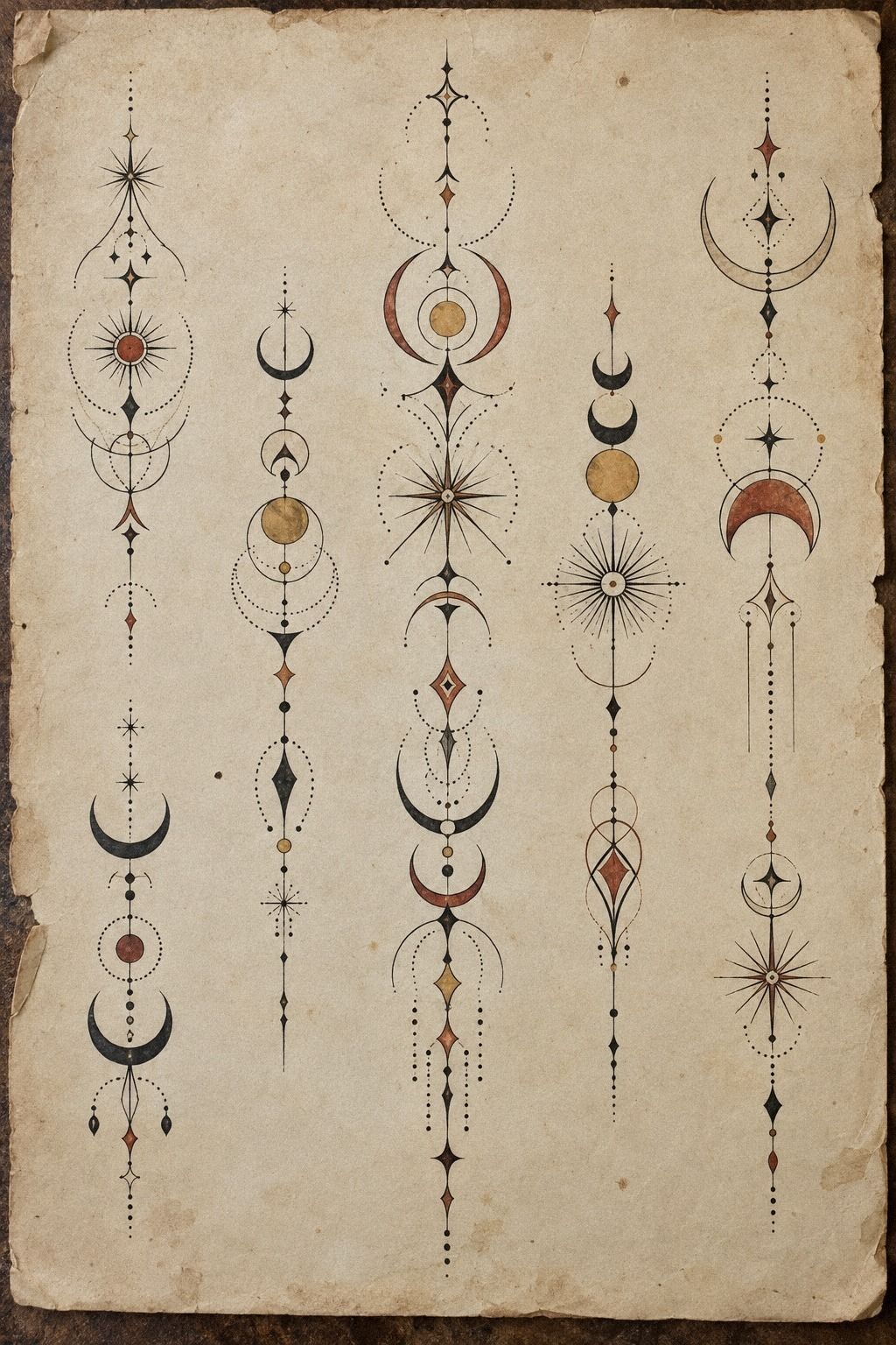
Geometric spine tattoos need structure before decoration. A diamond, narrow triangle, or linked circle can follow the vertebrae in a bold, crisp way, especially when the reference shows clear spacing. For more unusual options, compare these tattoo patterns designs and notice how much open skin surrounds each motif.
I’d choose emerald geometric stencil lines with one repeated shape instead of five unrelated symbols. Gold and cream accents can make the pattern feel vibrant, but the primary outline should remain strong. A single pattern feels iconic and gives your artist a clear alignment system.
Your artist may use a ruler, stencil paper, and a standing alignment check. That’s important because geometric forms expose every tilt.
I once saw a symmetrical design placed while the client was hunched forward, and the tattoo looked fine seated but angled when standing. Don’t let that happen to your back.
A small triangle can feel edgy, while linked circles read softer and more harmonious. You can ask for one tiny gold accent, but I’d stay mostly with dark ink if low maintenance matters to you. Stencil transfer paper lets you inspect the design before any needle touches your skin, so take your time.
Pain depends on the amount of fill and the exact centerline placement. Open geometry usually finishes sooner than solid black shapes. Your session may still need a second look after the stencil dries, because clean linework rewards patience.
That pause is part of the design, not wasted time.
6A Tiny Wildflower Trail That Stays Light
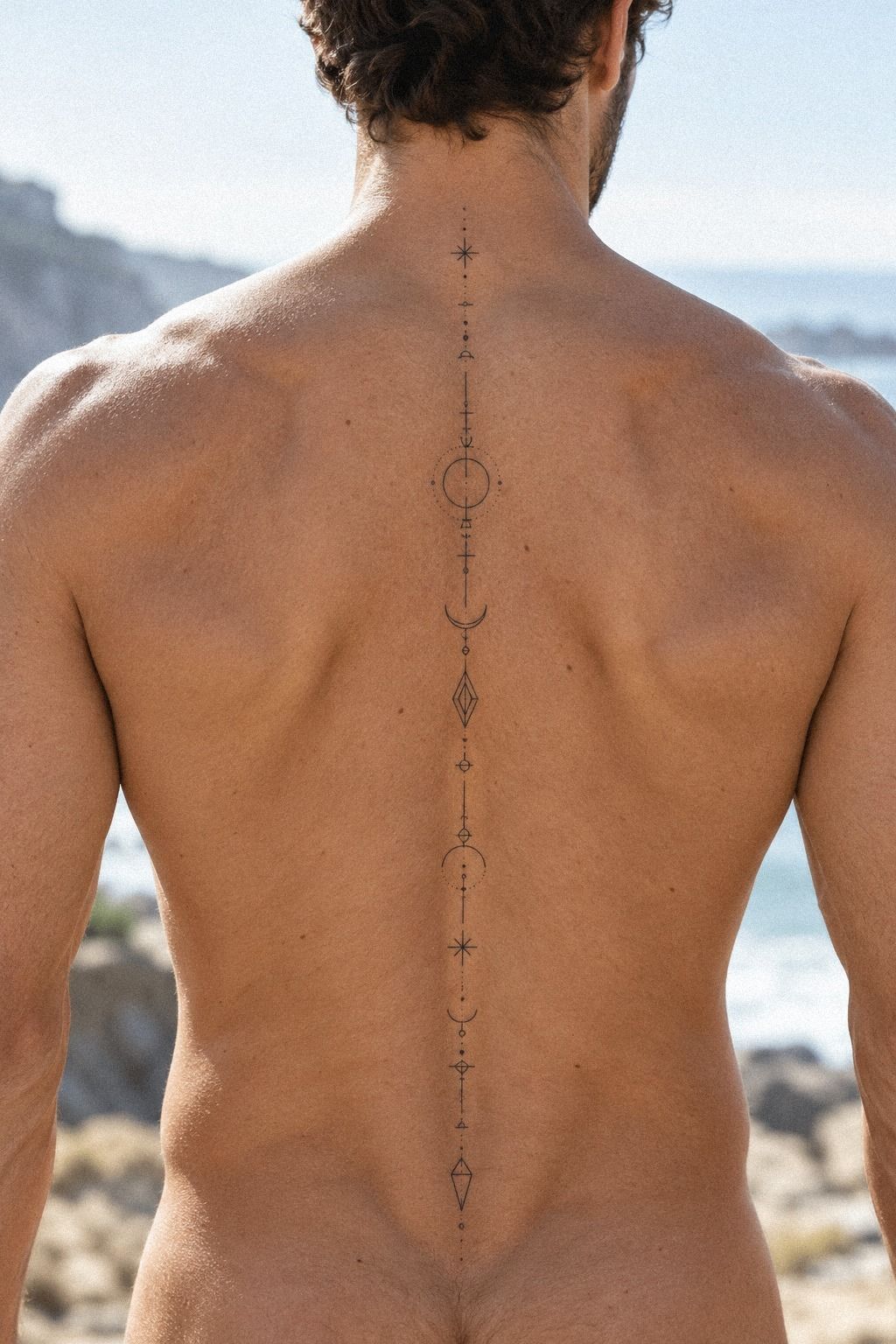
A tiny wildflower trail can be both dainty and empowering when the stem remains narrow and the petals have enough separation. Forest green, rust, and natural-oak brown can make the trail feel vibrant while preserving its botanical character.
I’d keep the forest-green wildflower trail mostly open, with rust reserved for one or two petals. A natural-oak tone can warm the stem, but too much color may make tiny flowers merge. The best version feels intricate without needing heavy fill.
Place the largest bloom near the center and let smaller flowers taper toward the upper and lower back. That creates a flowing path without making the spine look crowded. Ask for enough space between petals to protect their shape as the tattoo settles.
A one-sitting plan works well here if the flowers stay simple. Your artist may recommend slightly larger petals than you first imagined.
Listen to that advice. A dainty tattoo still needs breathing room to remain crisp.
7Why the Serpent Works Along the Spine
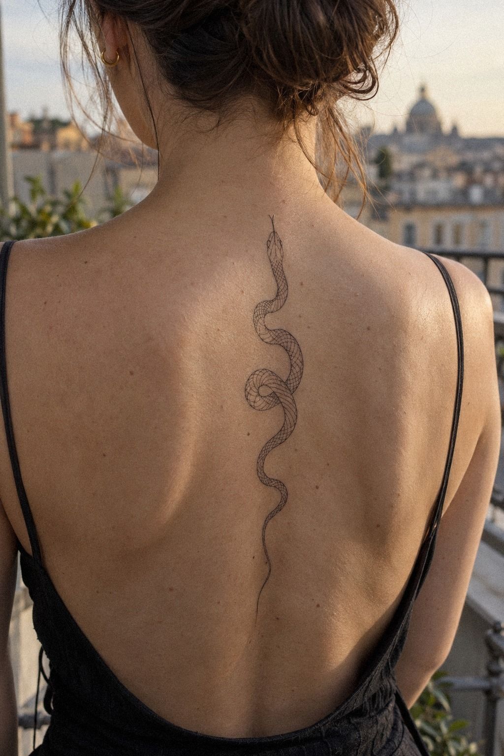
A slim serpent naturally follows the spine, which makes it one of the most striking minimalist choices on this list. A few curved sections, a small head, and restrained scale marks can feel fierce without becoming a full traditional piece. Your reference should show the entire silhouette, not only the head.
I’d choose charcoal serpent linework with a slightly heavier outline around the head and tail. Dusty-rose and brass details can add a stylish accent, but the body should remain readable in dark ink. If you’re drawn to a more symbolic look, leave the eyes as tiny dots and skip bright color.
The curve should respond to your body. A perfectly straight snake can look stiff, while a gentle S-shape feels flowing and personal.
Ask for a standing stencil and a side check before you approve it. You don’t need a dramatic coil to make the design memorable.
I’d avoid packing scales all the way down the body. Those repeated lines may blur together over time, especially if the tattoo is too small. Solid black contour work with open skin inside gives you a sharper, more timeless result.
Your artist may recommend a slightly larger width than you expected. Listen to that advice.
A spine tattoo has to survive movement, friction from clothing, and sun exposure. Save this top rated tattoo designs collection for artists whose healed work shows restraint and clarity.
8Sun and Stars, Kept Crisp
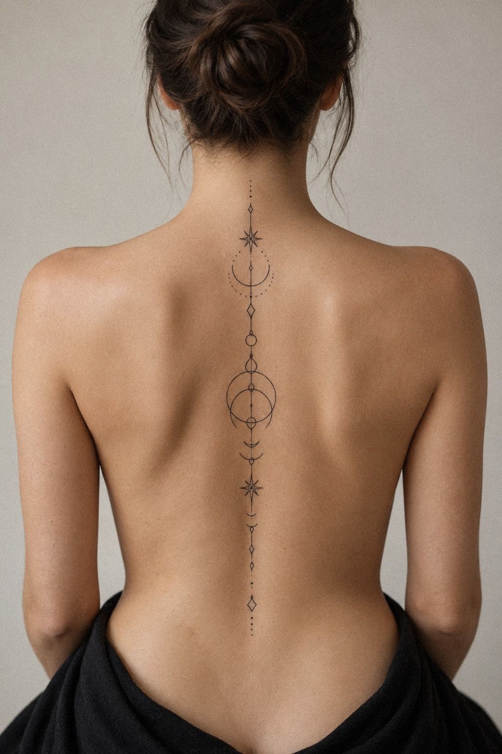
A small sun with short even rays can give your spine tattoo a powerful center without making the entire piece bold. Add two or three stars only if they support the shape. Your design should read as one symbol, then reward a closer look with precise details.
I’d use black sun-and-stars ink with the sun kept open and the rays short enough to remain distinct. Warm white and camel accents can soften the design, but random color patches may make the center feel messy. If you’re choosing between a filled circle and an open center, I’d pick an open center for a lighter, more understated result.
A sun near the upper spine feels visible and empowering, while one lower down feels more private. You can choose based on daily visibility. Stencil film lets you test both positions before your artist begins, and your body will tell you which one feels more natural.
Your artist may suggest tiny dot accents rather than extra stars. That’s a smart trade. Dots create texture without competing with the sun, and they can keep the session short.
I made the mistake of adding too many details to a small celestial tattoo once. Removing them improved it.
For aftercare, expect the surface to look settled in about 2 to 3 weeks, while complete healing can take roughly 2 to 3 months. Wash gently, moisturize as directed, and avoid sun and swimming during the early stage. Protect those crisp rays!
9Chakra Symbols with Sacred Restraint
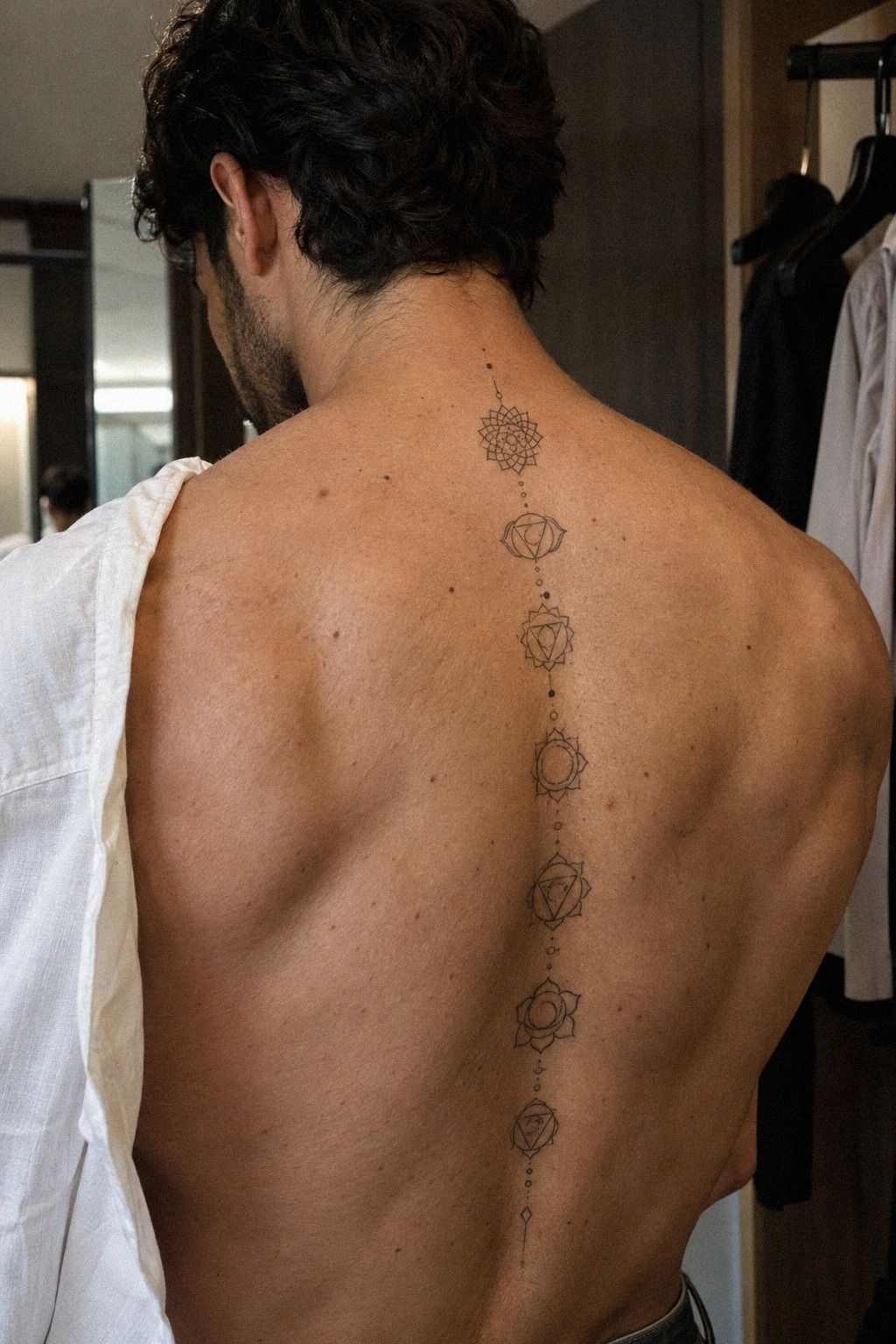
Chakra symbols can create a meaningful vertical sequence, but you don’t need all seven to make the idea work. Three carefully chosen symbols may feel more personal than a full row copied from a chart. Midnight blue, copper, and ivory can create a sacred palette without burying the linework.
I’d choose sacred-symbol linework with one slightly larger center mark. The symbols can feel spiritual and sacred without heavy ornament.
If you’re using Sanskrit-inspired shapes, verify the meaning with a knowledgeable source and show the artist the exact reference. A decorative approximation may look polished but carry the wrong message.
Your artist may recommend 4 to 7 inches for a small sequence, depending on the number of symbols. Don’t force seven marks into a space that only suits four. Stencil paper gives you a chance to remove symbols before the session, and that edit can protect the clarity of your idea.
Before booking, ask what the full price includes. A studio minimum, consultation, stencil work, and aftercare guidance can affect the final quote. The budget range matters, but so does the value of an artist who knows how to preserve delicate meaning.
A healed blackwork reference is more useful than fresh work when you’re judging longevity. If you want another comparison, review this tattoo patterns designs guide and focus on whether the symbols remain legible after settling.
10Meaning First: Dainty Spine Designs
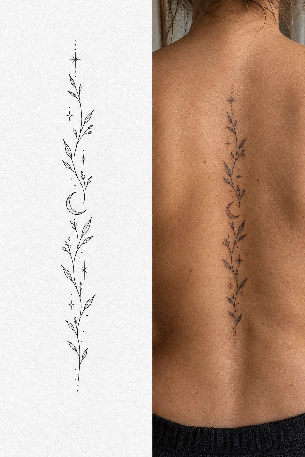
A dainty spine tattoo can be meaningful without explaining itself to everyone who sees it. A small heart, initial, date, or symbolic mark may feel intimate and personal. Sage green, warm cream, and natural-wood brown can support the idea while keeping the result gentle.
I’d choose sage-green healed linework over pale color when long-term clarity matters. Fine lines can widen slightly as they settle, especially if they’re packed too close together. Your artist may recommend a little more spacing than the reference shows, and that adjustment is worth accepting.
Think about the story behind the mark. A tiny key can represent access, while a simple wave can suggest movement or recovery.
You don’t need a complicated explanation. Single-use sterile needle cartridges and clean technique matter more than adding another symbol to fill empty space.
I’d skip copying a sentimental tattoo from a celebrity or influencer. It may look stylish on their body but feel detached on yours.
Ask yourself whether you’d still choose it without showing anyone. If the answer is yes, you’ve probably found the personal thread.
Your one-sitting plan should include consultation time, stencil placement, tattooing, and aftercare instructions. Don’t count only needle time.
A patient artist protects your result, and a short pause can make a delicate tattoo far more polished. That extra planning is often worth the cost.
11Bold Blackwork, Minimalist Intent
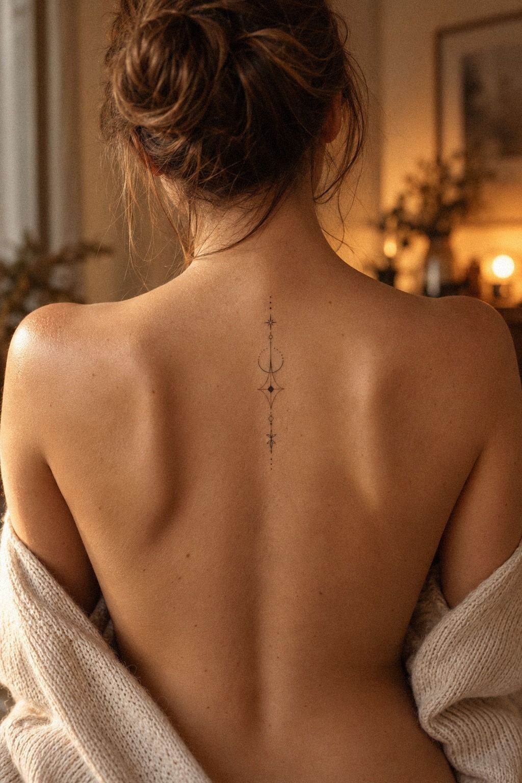
Bold blackwork sounds like the opposite of minimalist, but one solid symbol can create a clean, powerful spine tattoo. A terracotta, stone-grey, and olive palette can soften the surrounding details while keeping the central black mark fierce.
I’d choose bold blackwork ink for one narrow symbol, such as a sun, thorn, or abstract diamond. Avoid combining several unrelated shapes. The strength should come from confident placement and clear negative space.
The image’s dark marble-like contrast works best as a visual idea, not as a reason to add excessive texture. Keep the fill controlled, then let the surrounding skin create separation. A gritty symbol can still feel elegant when its edges are deliberate.
This option may take longer than an open-line design because solid fill requires patience. Ask whether the piece can remain within one sitting without rushing. A slightly smaller blackwork tattoo is better than a larger design with uneven saturation.
Before You Book: The One-Sitting Plan
A one-sitting tattoo is realistic when the concept is compact, the linework is controlled, and the artist has enough time for placement. It isn’t a promise that every idea will fit the schedule. Your appointment plan should include consultation, stencil approval, tattooing, cleaning, and aftercare instructions.
Ask whether the studio charges by the hour or by the piece. A simple tattoo may have a minimum price even when the needle time is short. Knowing the expected quote beforehand helps you decide whether the design is worth the cost.
Eat a proper meal, drink water, and wear clothing that gives the artist easy access to your back. Bring your reference, but stay open to a small size adjustment. A printed reference can keep the conversation focused when the stencil changes.
If you’re booking your first session, review these small tattoo designs and remove any idea that depends on tiny details. Simple doesn’t mean empty. It means every mark has a job.
How I Compare Size, Pain, and Value
I don’t judge a low-pain design by size alone. The exact vertebrae, line density, appointment length, and your own sensitivity all matter. A tiny tattoo with repeated detail may feel more demanding than a larger open symbol.
My preferred balance is a clear silhouette, moderate spacing, and no unnecessary fill. That combination can reduce the time under the needle while keeping the design sleek and readable.
If your budget is limited, simplify the concept before lowering the artist’s price. Removing three tiny symbols may improve the tattoo more than rushing the session. The best value often comes from editing.
Here’s the cost range I’d use for planning in the United States. Prices vary by region, artist experience, design density, and studio policy, so treat these figures as a conversation starter.
The table isn’t a promise. The written quote should confirm the minimum, deposit, expected duration, and touch-up policy before you pay anything.
For another reference point, save this minimalist fine line spine tattoo guide and compare the amount of detail, not just the advertised price.
Stencil Checks That Protect the Centerline
A stencil should be checked while you’re standing naturally, not only while bent forward on a table. Your shoulders shift, your breathing changes, and the spine isn’t perfectly straight. Those details can alter the final alignment.
Ask to see the design from behind, from the side, and with your shoulders relaxed. A centerline tattoo may look balanced in one position and slightly angled in another. This is where a calm, precise placement check earns its value.
Don’t approve the stencil just because you’re excited to begin. Take a minute.
If something feels off, say so before the needle starts. That pause is much cheaper than trying to correct a placement you never loved.
A standing stencil check is especially important for a narrow botanical stem, script, or serpent. The design should follow your body rather than forcing your body to imitate a flat drawing. That’s the point!
Saniderm and Other Aftercare Choices
Your artist may cover the fresh tattoo with Saniderm protective film or recommend another method. Follow the specific timing and cleaning instructions you receive, because adhesive sensitivity and skin type vary.
Wash gently with clean hands, pat dry, and apply only the product your artist recommends. Don’t pick flakes or soak the area during early healing. Protecting the fresh tattoo helps delicate lines settle with less irritation.
The surface may look calmer within a few weeks, but deeper healing takes longer. Avoid judging the final result too soon. A crisp tattoo can look temporarily dull, shiny, or uneven while the skin recovers.
Fragrance-free aftercare is usually easier to tolerate than a heavily scented product, but your artist’s instructions should lead. If redness, swelling, or discomfort seems unusual, contact a qualified medical professional rather than guessing.
Questions Worth Asking Your Artist
Ask to see healed linework, not only fresh work. You can also ask how the artist handles uneven shoulders, centerline placement, small lettering, and designs that may need a slight size increase.
Discuss the studio minimum, expected session length, deposit, touch-up policy, and aftercare products before booking. These questions help you compare value without treating the cheapest quote as the best option.
If the artist says your reference is too small, ask what they would change and why. A thoughtful explanation usually tells you more than a confident promise.
Bring questions about healed portfolio examples, line weight, and how the artist works over the centerline. If the answers feel rushed, you don’t have to book that appointment. A good consultation should leave you informed, not pressured.
For more artist comparison ideas, browse these unique female tattoo designs and judge the healed examples by clarity, consistency, and placement.
When a Larger Design Is Worth It
A larger spine tattoo can be worth it when the design includes lettering, repeated geometry, or botanical details that need breathing room. Size isn’t automatically more dramatic. Sometimes it simply gives the linework enough space to remain readable.
I’d consider increasing the width when the smallest details are disappearing at stencil stage. That adjustment can improve the long-term clarity and may prevent an expensive cover-up later.
The right size depends on your body, your reference, and the artist’s technique. A minimalist design can still be compact while using generous spacing.
A slightly wider stencil may also reduce the need for heavy saturation. That can support a low-pain plan while giving thin curves and small symbols more room to survive.
If you’re comparing larger and smaller references, save this top rated tattoo designs collection and inspect how much open skin surrounds each tattoo.
Why Healed References Matter More
Fresh ink is often darker, sharper, and more dramatic than healed work. That doesn’t make it misleading, but it does make it incomplete. Look for healed examples with similar line weight and placement.
A healed portfolio can show whether fine lines remain crisp, whether circles stay circular, and whether small letters remain readable. Those details reveal the artist’s real technical consistency.
If you’re comparing artists, save this tattoo patterns designs guide for ideas, then judge each artist by healed results rather than popularity alone.
A healed tattoo reference should show natural skin texture and a similar scale to your planned design. One example can’t answer everything, so ask for several pieces from different stages of healing.
A classic black line can remain stylish for years when the spacing and placement are sensible. Don’t let a vibrant fresh result make you ignore softened edges or crowded details in older work.
Why I Think Minimalist Spine Tattoos Work Best When They Stay Edited
I’ve changed my mind about minimalist spine tattoos more than once. At first, I wanted every symbol that meant something to me, so the draft became a narrow column of moons, flowers, letters, and dots.
It looked thoughtful on paper. On skin, it would have looked crowded.
The better version removed half the marks and gave the remaining shape room to breathe.
That editing process matters because a spine is a long visual path, not an empty place for every idea you’ve collected. A bold symbol can feel more personal than seven tiny references that compete for attention. I’d rather see one crisp serpent or one meaningful word than a design that needs a paragraph before anyone understands its shape.
I also think low pain gets discussed too casually. Your experience depends on the exact vertebrae, session length, skin sensitivity, and how relaxed you are.
A smaller design may reduce time, but it won’t erase sensation. When I plan a tattoo now, I ask what can be removed without weakening the idea. That question usually improves both comfort and design.
Longevity is part of the aesthetic, too. Fine lines can spread slightly, and UV exposure can fade black ink. A good artist will protect readability with spacing, sensible size, and a line weight that suits your skin.
Your tattoo doesn’t need to look frozen in its first week. It needs to remain recognizable as it becomes part of you.
My strongest preference is simple: choose the symbol you’d still want if nobody could see it for a year. That test removes trend pressure quickly. Then bring your artist a clear reference, stay open to size changes, and let the stencil earn your approval before the session starts.
That’s where the meaningful decision happens.
What People Always Want to Know
How much does a minimalist spine tattoo design usually cost?
I’d plan for about $100 to $300 in the United States for a compact minimalist design, though a studio minimum may run $50 to $100 and a complex piece can reach $400 or more. Your final quote depends on size, region, artist experience, and the amount of detail in the stencil.
Are minimalist spine tattoo designs a good idea for a first tattoo?
I think they can be a good first tattoo when the design is clear and the session stays short. The spine may feel sharper than an arm or thigh, especially directly over bone. I’d choose an experienced artist, request breaks, and avoid squeezing several tiny symbols into one appointment.
How do I choose a tattoo artist for minimalist spine tattoo designs?
I’d choose an artist with clean linework, healed examples, and experience placing designs along the centerline. Ask how they handle uneven shoulders, small lettering, and size adjustments. Healed portfolio examples will tell you more than fresh work, so don’t skip that review.
How much do minimalist spine tattoo designs hurt?
I’d expect the sensation to vary by vertebra, line density, session length, and personal sensitivity. The centerline can feel sharp, while open symbols often finish faster than saturated blackwork. Eat beforehand, drink water, breathe steadily, and ask for a pause if the sensation becomes too intense.
How long does a minimalist spine tattoo design take to heal?
I’d expect the surface to settle in about 2 to 3 weeks, with deeper healing taking roughly 2 to 3 months. I’d wash gently, moisturize as directed, and avoid swimming and direct sun during early healing. Your artist’s instructions should guide the exact product and timing.
What’s the best placement for minimalist spine tattoo designs?
I’d choose the upper spine for more visibility and the lower spine for a more private feel. The best placement is the one that follows your natural centerline while standing. A slightly wider design may age more clearly than an ultra-tiny mark pressed directly over the vertebrae.
Where I’d Start First
If I had to pick one, I’d start with the small botanical spine tattoo. A single stem gives your artist room to protect line clarity, and the design still feels personal without crowding your back. Pin that reference for later and compare it with this tattoo patterns designs guide before booking.
If your budget is tight, keep the stem simple rather than choosing a weaker artist. If you have more flexibility, the extra investment in strong placement and healed linework is usually worth it. My final reference would be a graceful botanical tattoo with crisp spacing, one clear meaning, and enough room to age beautifully.
You can also revisit these small tattoo designs before your consultation. Keep the idea minimal, personal, and easy to read. Keep it simple!