A minimalist small spine tattoo can be a meaningful first tattoo when you plan the line path before choosing the symbol. The spine moves, bends, and catches attention differently than an arm. I’ve learned that a delicate idea becomes striking only after placement, scale, and healing are considered together. Start slowly!
Editor’s note: Your first tattoo doesn’t need to be loud to feel powerful. A sleek symbol, an understated word, or a flowing botanical mark can become deeply personal when the design follows your body instead of competing with it. Good placement wins!
- Start With Fine Vertical Spine Linework
- Which Botanical Motif Feels Like You?
- Choose a Celestial Spine Tattoo With One Clear Idea
- Tiny Script or No Script?
- Let Natural Curves Lead the Symmetry
- The Meaning Before Motion Test
- Connect Icons Only When the Line Earns Its Place
- How Much Sensation Can You Plan For?
- Design for Healing, Not the Fresh Moment
- The One-Anchor Blackwork Method
- Protect the Minimal Tattoo While It Heals
1Start With Fine Vertical Spine Linework
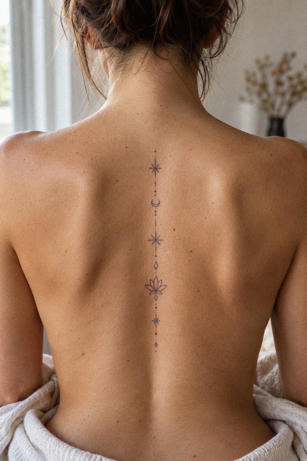
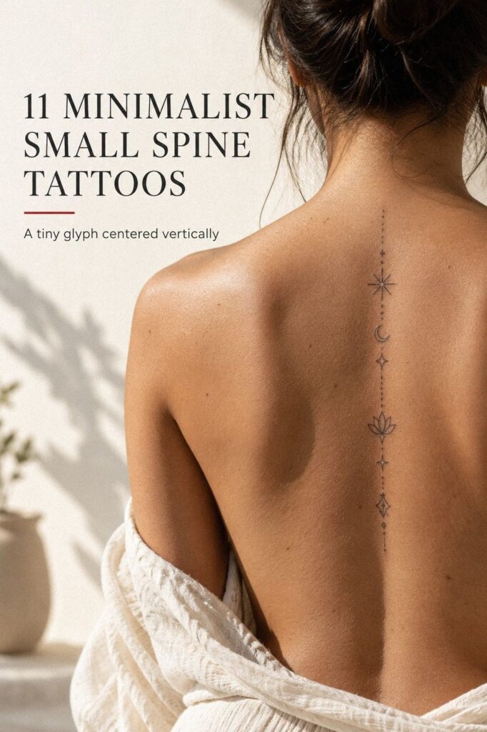
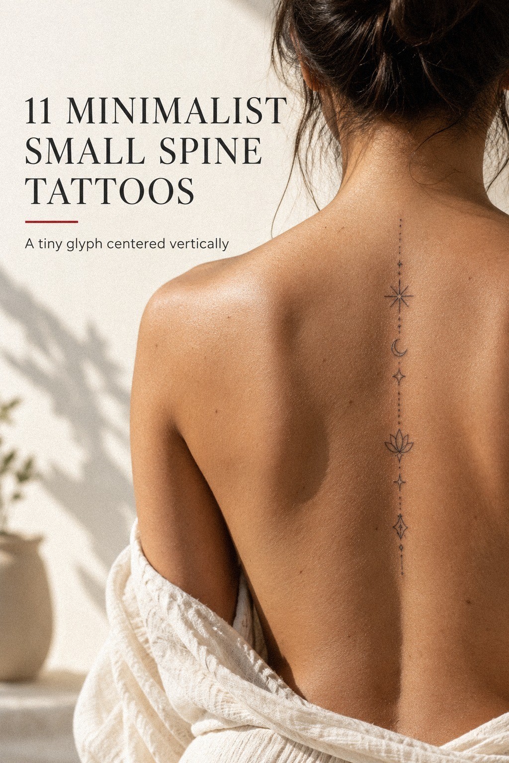
Begin with the path, not the picture. Ask your artist to draw a vertical guide beside the spine, then place the design around that line so it follows your body instead of fighting it. For a few small stars, vary the spacing and size, but keep the marks crisp and understated.
You’ll want the center to feel intentional when you stand naturally, not only when you arch your back.
I call this the Vertical Thread Rule. A fine line should travel with your posture, and you shouldn’t force every mark into perfect alignment. I’ve seen a rigid row look less graceful than a slightly wandering sequence because the softer rhythm follows the vertebrae.
If you’re comparing references, these tiny small spine tattoos can help you study scale and spacing. Look for designs that remain readable without crowding the skin. A small tattoo still needs visual breathing room.
For a terracotta, stone, and olive-toned design, keep the ink relationship restrained and let open skin separate each mark. A few deliberate points are enough. Don’t fill every gap, or the design may lose its delicate quality as the lines soften over time.
Use a healed portfolio to judge whether fine-line work is worth it. I’d skip an ultra-thin sample that looks crisp only when fresh.
Your artist should show healed examples, because that’s where the real cost, value, and design decision become clear. Your first tattoo deserves evidence, not a promise.
2Which Botanical Motif Feels Like You?
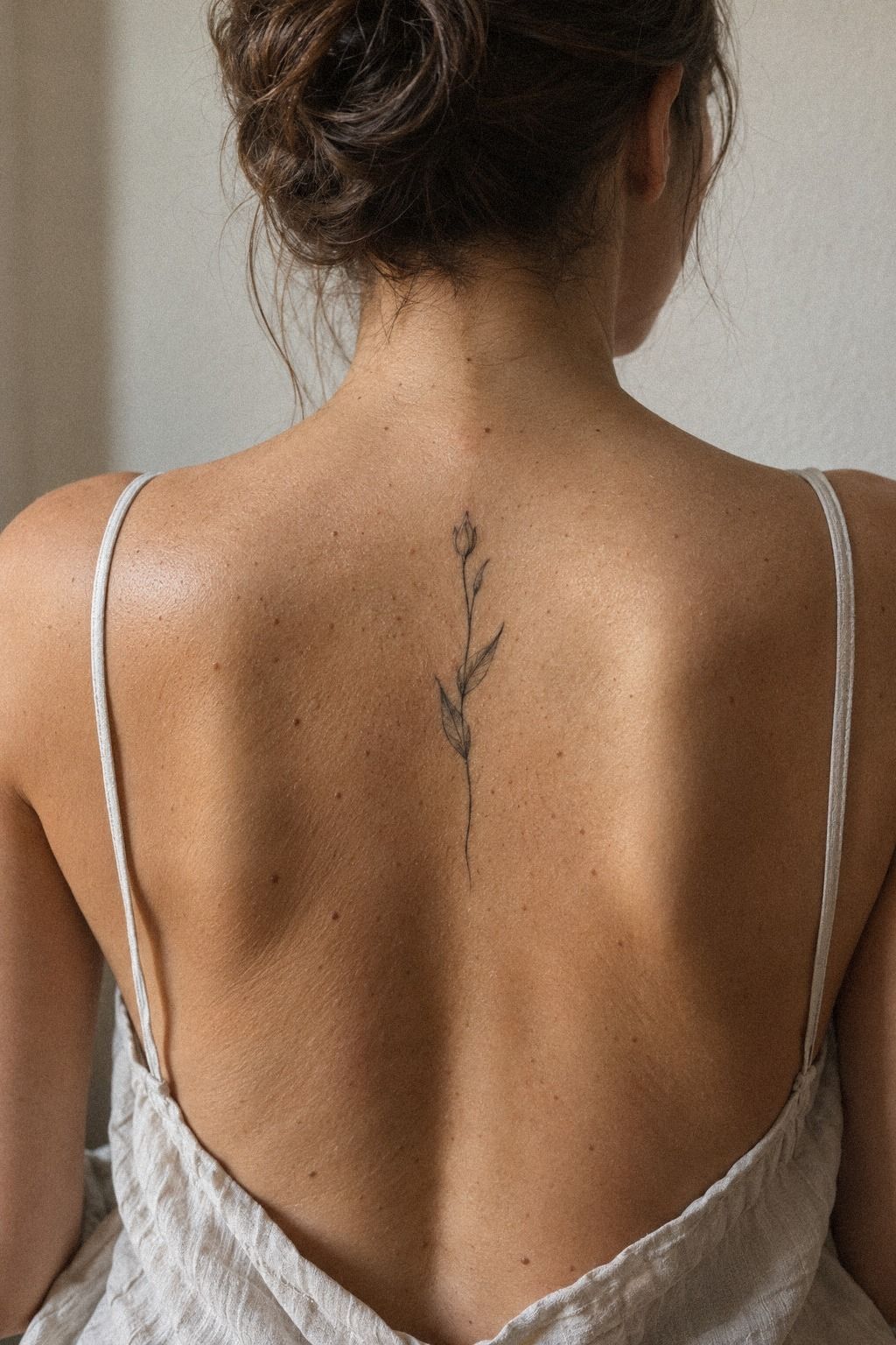
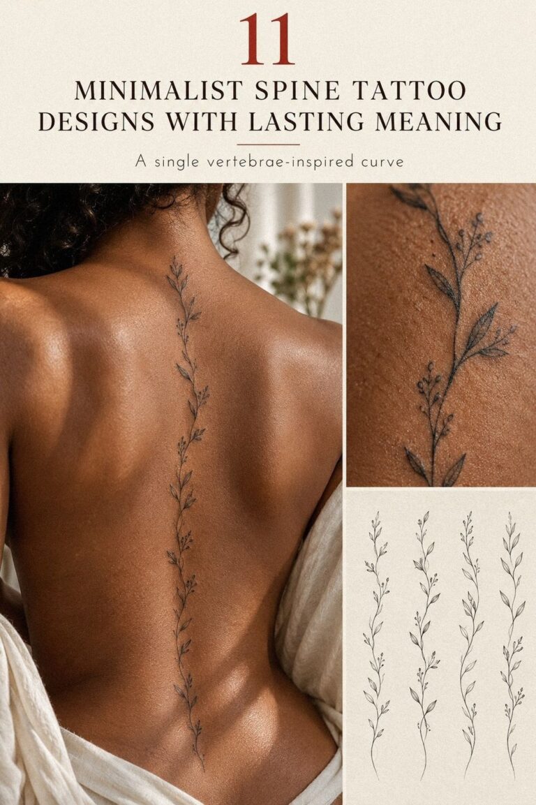
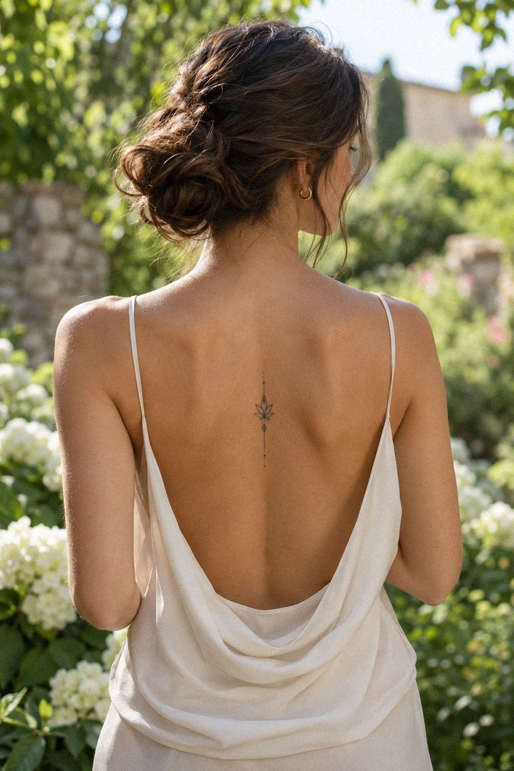
Choose one botanical idea before collecting ten unrelated flowers. A botanical motif can feel symbolic, romantic, sacred, or quietly feminine, but it should have a reason for being there.
A single stem, olive branch, fern, or wildflower may create a more polished result than a crowded bouquet. If you want a meaningful starting point, browse this small tattoos meaning guide and notice which symbols still feel personal after the first impression fades.
For a clay, pale cream, and muted-gold color story, keep the botanical shape graceful rather than overly ornate. You can also compare tattoo ideas for women for shape ideas, but don’t copy a design simply because it looks stylish. I’d choose the flower whose structure suits your spine, then simplify its leaves and petals until the outline feels graceful.
3Choose a Celestial Spine Tattoo With One Clear Idea
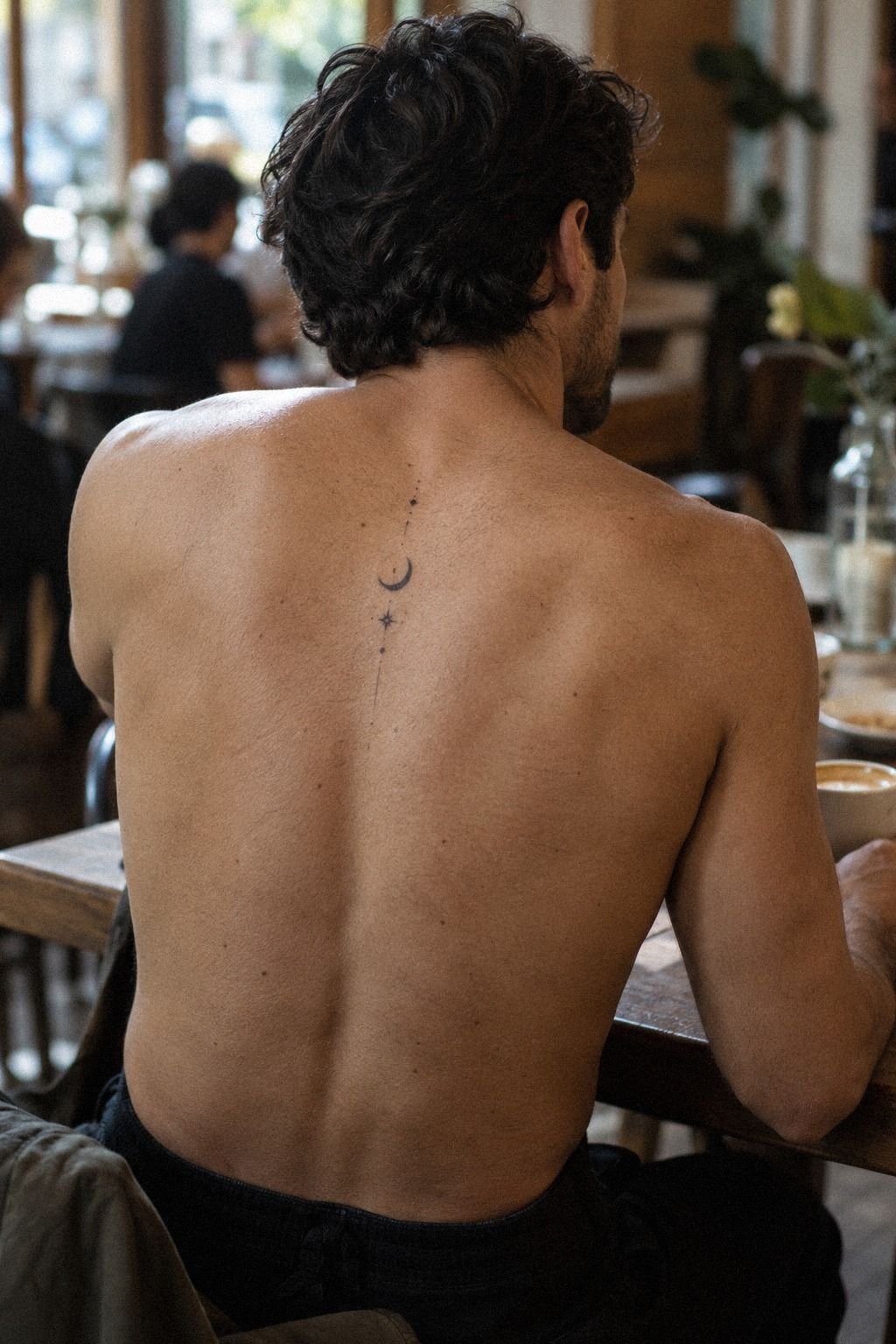
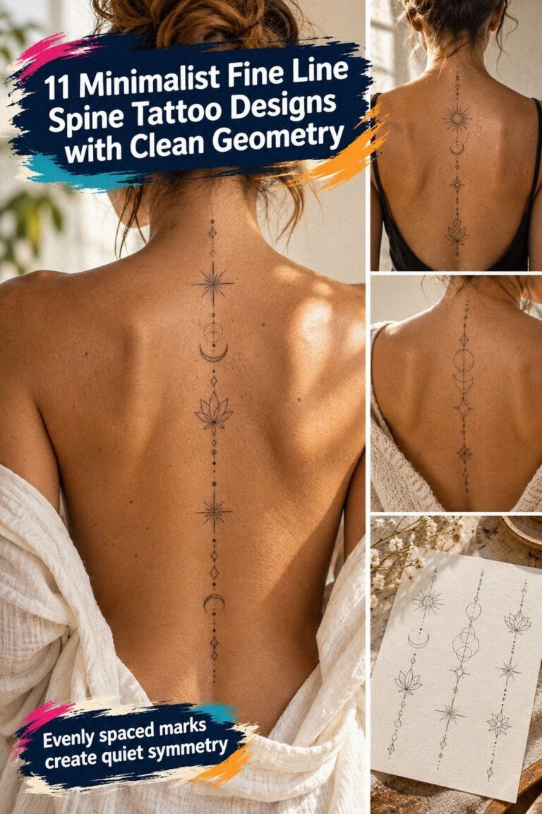
Build a celestial design from two or three shapes, not a complete night sky. A small crescent, one crisp star, and a tiny orbit line can create a captivating vertical composition along the back. You’ll get more impact from spacing than from adding more symbols, especially when the tattoo needs to remain minimal.
This is the Three-Point Orbit. Place one dominant shape near the center, one smaller mark above it, and one quiet accent below. I’ve tried designs where every star had equal importance, and they looked flat.
Your eye needs a pause and a lead.
I’d skip a dense constellation if your goal is a sharp, personal first tattoo. A plum crescent outline with two gray stars and a restrained rose-gold accent can feel expressive without becoming ornate. Ask your artist to test the shape against shoulder movement and the natural dip of the lower spine.
Could a celestial symbol be meaningful without a long explanation? Absolutely.
Your interpretation might be time, direction, grief, or a private joke. Keep the explanation for yourself if you want. These small spine tattoo designs can help you compare spacing, but your final arrangement shouldn’t look traced from someone else’s work.
A stencil can make thin marks look stronger than they’ll appear once healed. Ask your artist to check it in natural light and while you stand relaxed.
If you’re uncertain, reduce one star before increasing the needle width. Minimal work benefits from restraint, and that choice often looks more timeless after healing.
4Tiny Script or No Script?
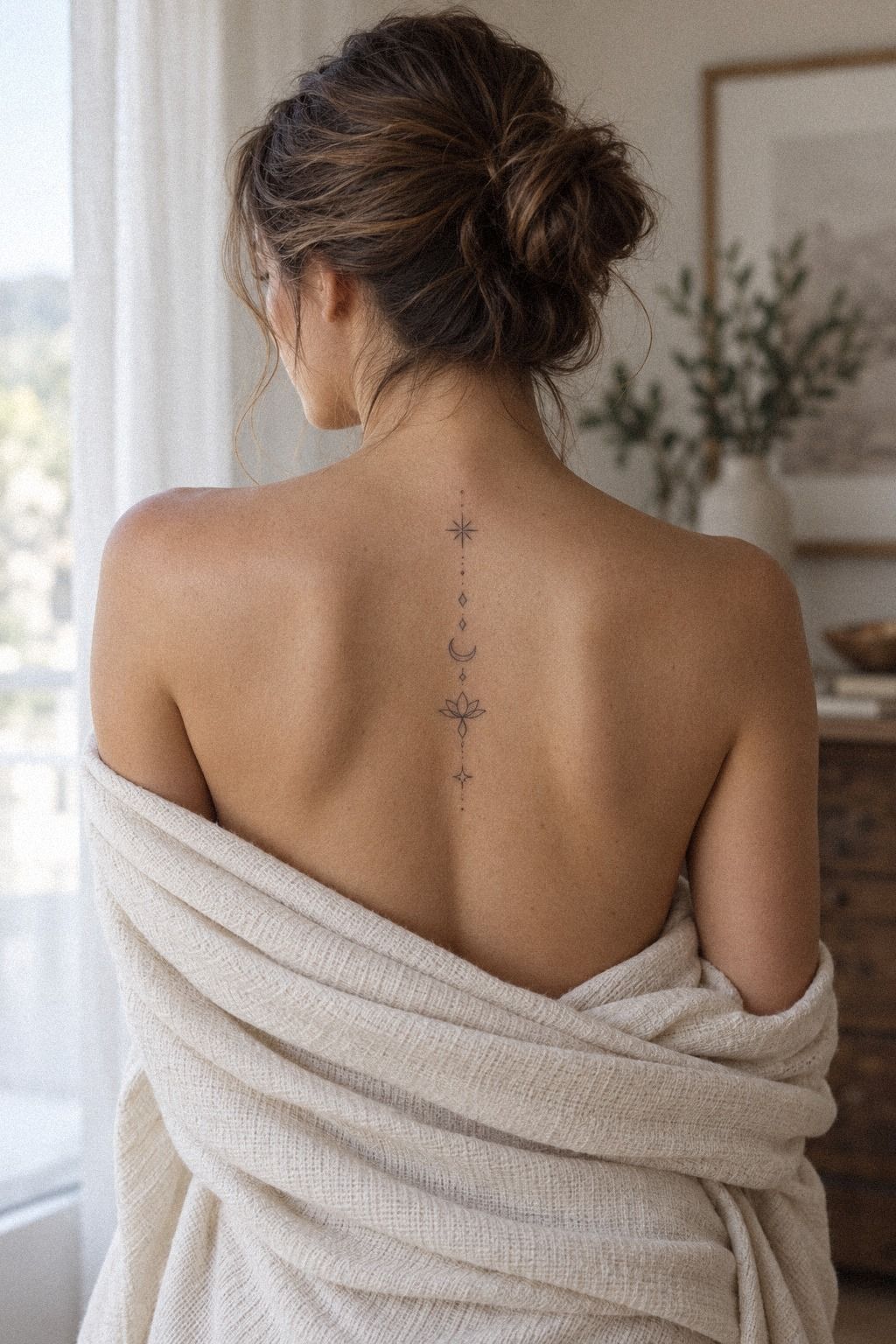
Keep script short enough that each letter has breathing room. One word, two initials, or a brief date can follow the spine in a sleek vertical arrangement, but tiny lettering needs a serious readability check. You’ll want to read it from a normal distance, not only while leaning close to a mirror.
The Letter Breath Rule is simple: every character needs enough open skin around it to survive softening. I’d avoid a long quote on the vertebrae, even if the phrase feels meaningful today. Your artist can redraw the word with crisp, slightly wider strokes so it stays expressive instead of becoming a dark thread.
For a navy, white, and deep-brown design, test the script with a thermal stencil and check it while standing, sitting, and bending slightly. Look at the lower letters in each position. The spine changes shape, and a line that looks graceful upright may bunch when you move.
If you’re drawn to tiny lettering but want a gentler starting point, compare minimalist small wrist tattoos with minimalist small wrist tattoos before deciding. I’d choose the spine only when the word still reads clearly at a modest size.
Use dark navy ink rather than several pale shades for the first version. A muted white accent can be playful, but color adds another aging variable.
If the word matters deeply, let the letters carry it. Your tattoo doesn’t need extra decoration to feel personal.
5Let Natural Curves Lead the Symmetry
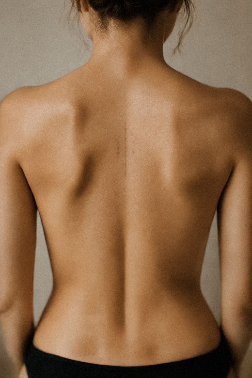
Start with symmetry that bends, rather than symmetry that behaves like a ruler. An emerald, gold, and cream arrangement can remain elegant when the two sides echo one another without matching perfectly.
Ask your artist to follow the natural curves beside the vertebrae. A delicate leaf on one side may need a slightly different angle on the other to look balanced while your body is relaxed. That asymmetry can feel more graceful than forced precision.
6The Meaning Before Motion Test
Choose the visual language after you name the feeling. A sacred symbol may need calm spacing and graceful curves, while a protective mark could use crisp corners and a darker center.
You’re not matching an emotion to a trend. You’re deciding how the tattoo should speak when nobody hears the explanation.
The Meaning Before Motion test helps here. Write three words that describe the reason, then remove anything that doesn’t support them.
I’d avoid an intricate symbol simply because it looks impressive in a saved reference. Your first tattoo should feel personal in six months, not only captivating during planning.
For deep ebony skin, ask to see healed work using forest-green and rust accents on a similar undertone. A natural-brown detail can read clearly beside those tones, while an overly delicate gray line may lose contrast. Your artist should explain how line weight and negative space will work together without guaranteeing permanence.
I’ve changed my mind after realizing that a symbol looked elegant but didn’t feel like me. That hesitation is useful.
If you’re between a botanical design and a small celestial mark, write the private meaning beside each one. You’ll usually see which idea has emotional weight and which one is only visually attractive.
Your tattoo can be raw, empowering, or understated without announcing the feeling. That subtlety is part of the appeal.
Trust that hesitation! For more symbolic references, browse this small tattoos meaning guide and notice which designs still speak to you after the first impression fades.
7Connect Icons Only When the Line Earns Its Place
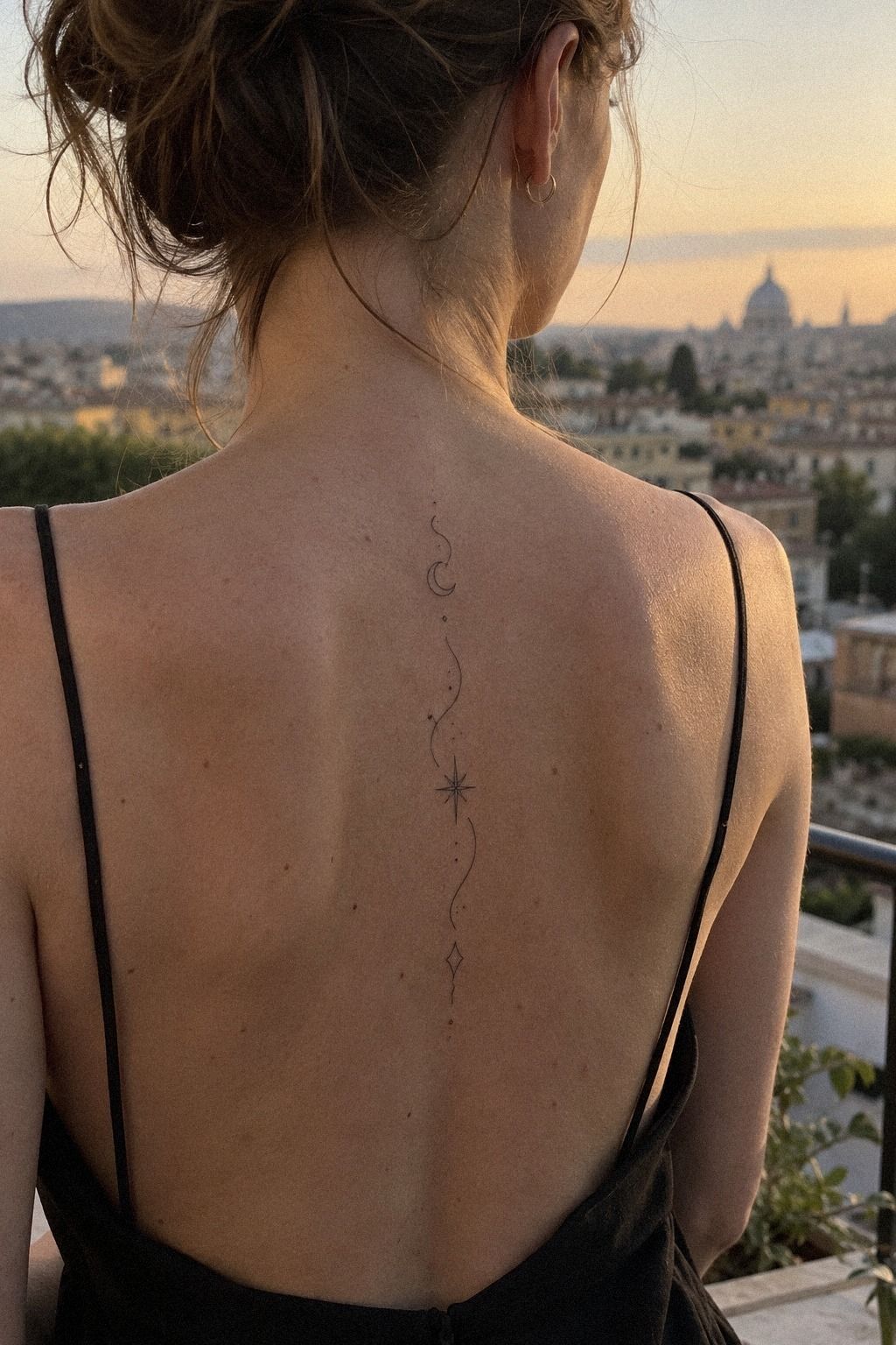
Connect icons only when the connecting line improves the reading. A dusty-rose, charcoal, and muted-gold combination can support a flowing line, but every connector should have a purpose.
If the line only fills empty skin, remove it. Let the symbols remain separate when their independence feels more expressive. The strongest composition may be quieter, sharper, and more personal than the first intricate draft.
8How Much Sensation Can You Plan For?
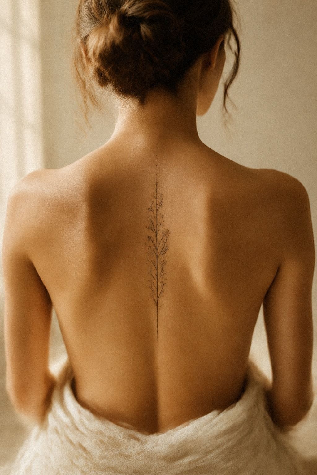
Plan for sensation honestly, especially where the spine feels close to the skin. Bony areas can feel sharper than fleshier placements, and the experience varies with your body, the design, and the session. You’ll want to eat, hydrate, and arrive rested, but you shouldn’t expect a painless appointment.
The Bone Map Check helps you discuss placement without guessing. Ask your artist which parts sit directly over prominent vertebrae and which sections have more natural padding. I’d rather move a design slightly than pretend every inch of the spine feels identical.
A warm-white, camel, and black-accent design can still feel fierce without requiring a larger or longer session. Pain is personal, and your artist can explain what to expect for your exact placement.
Use this table as a typical US planning guide, not a promise. Pain is personal, and your artist can explain what to expect for your exact placement.
If you’re nervous, ask whether the design can be completed in a shorter session. A small tattoo doesn’t always mean zero sensation, but it may keep the appointment focused.
And if you’ve had a difficult experience before, tell your artist before the stencil is placed. Clear communication is empowering, not dramatic.
The session length affects your total cost, so ask what’s included before you book. A lower hourly rate isn’t always better value if the artist needs much longer to place delicate work. Compare healed results, hygiene, communication, and price together.
9Design for Healing, Not the Fresh Moment
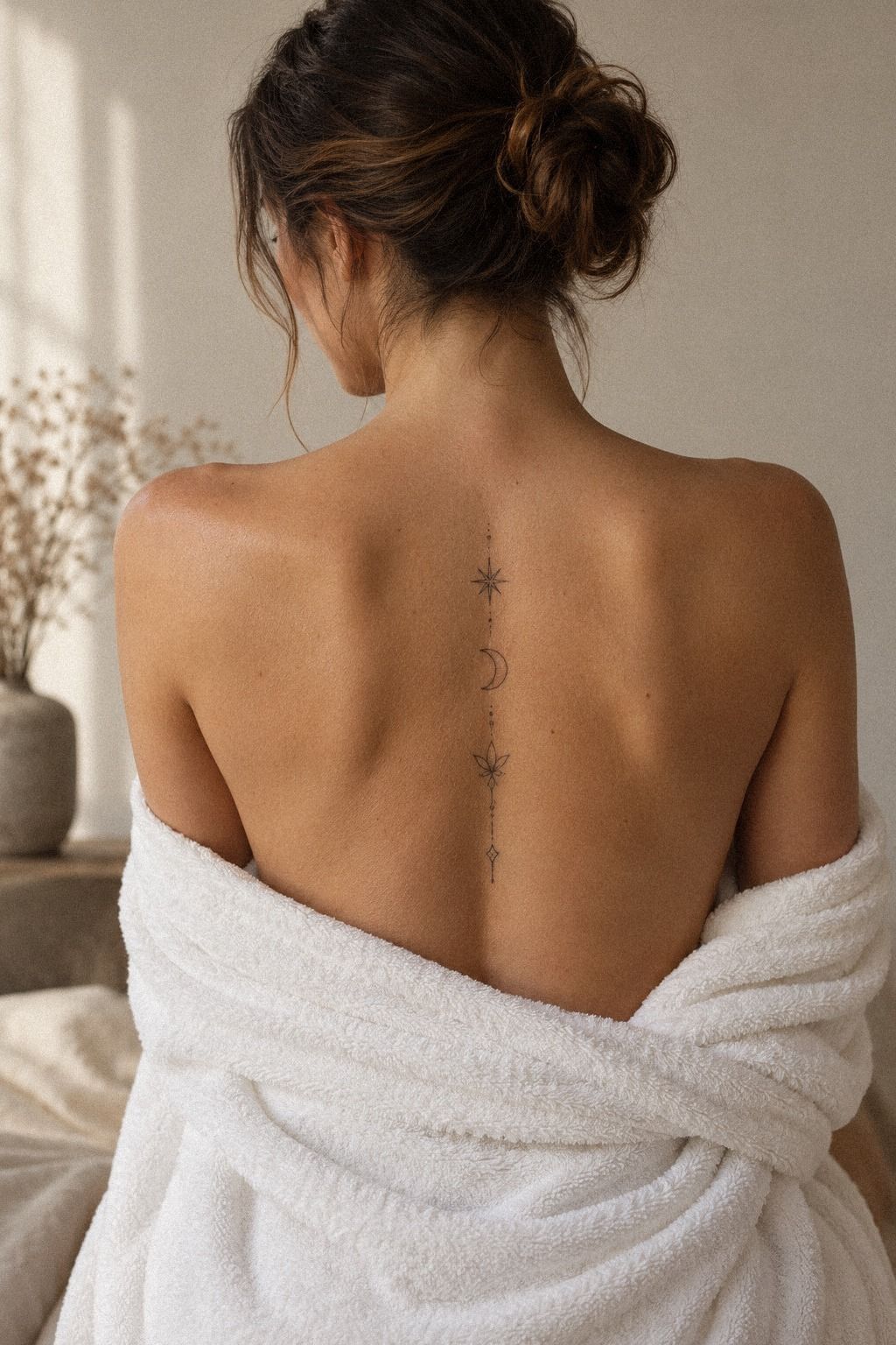
Design for the healed tattoo, not the fresh version. Fine lines can soften, small gaps can close, and dark accents may settle differently once the skin has recovered. That’s why a healing-aware design is worth discussing before you pay a deposit.
Ask whether each letter, dot, and curve has enough space to remain readable. If the composition depends on hairline detail, your artist may suggest a slightly stronger stroke. That can feel less daring at first, but it often produces a sharper, more timeless result.
For a midnight-blue, copper, and ivory design, preserve enough open skin for every tone to remain crisp. For additional scale comparisons, browse tiny small wrist tattoos and small tattoo designs.
Notice how the most successful pieces protect negative space. The tattoo should still have a clear silhouette after the surface settles.
10The One-Anchor Blackwork Method
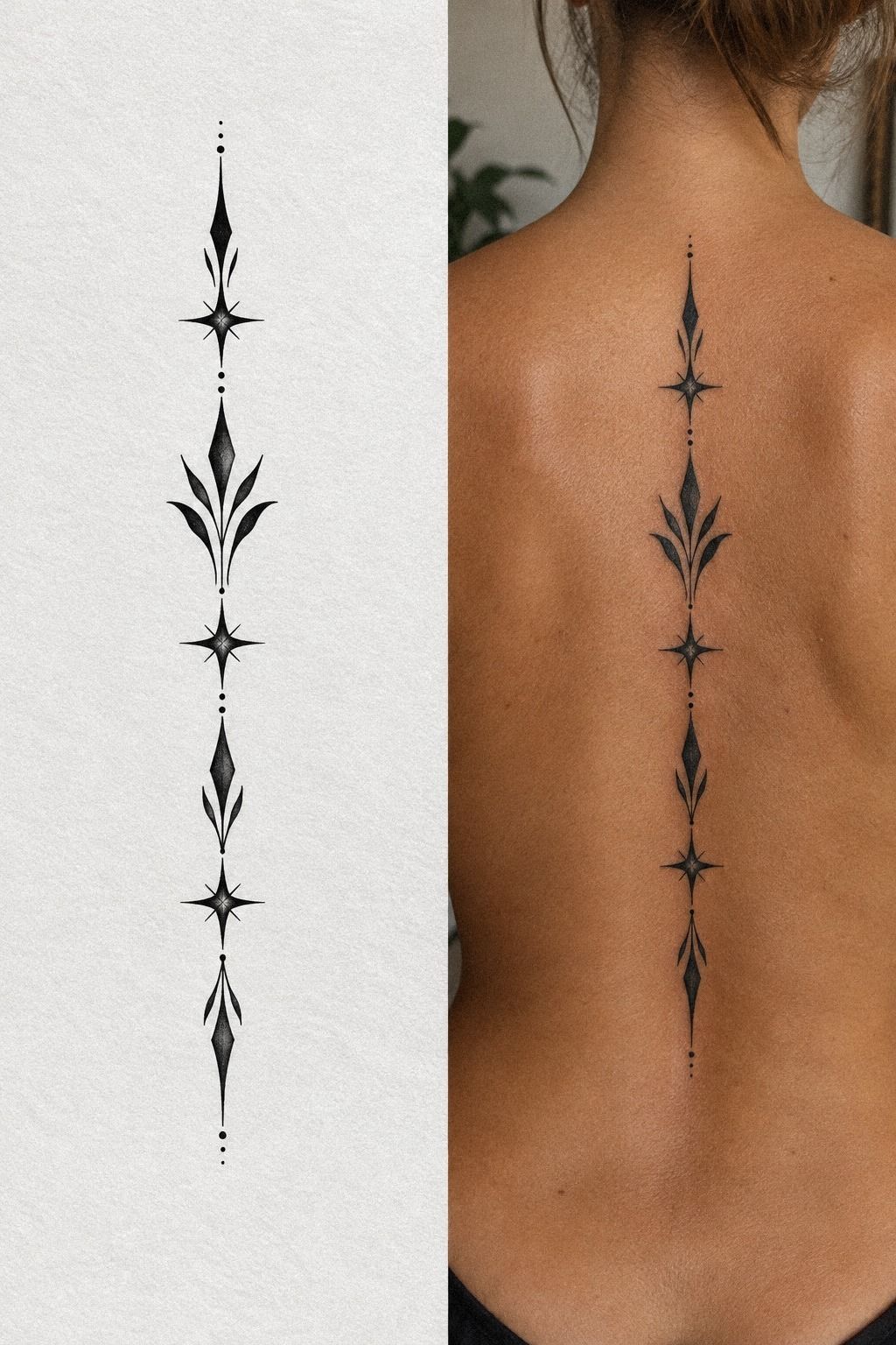
Use one bold accent to anchor a delicate composition. Even within a sage-green, warm-cream, and natural-brown color story, one darker mark can give the design a sharp center without overcrowding the spine.
The anchor might be a crescent, leaf, initial, or small geometric symbol. Keep the surrounding marks lighter and more open. That contrast creates a polished hierarchy and prevents every element from competing for attention.
11Protect the Minimal Tattoo While It Heals
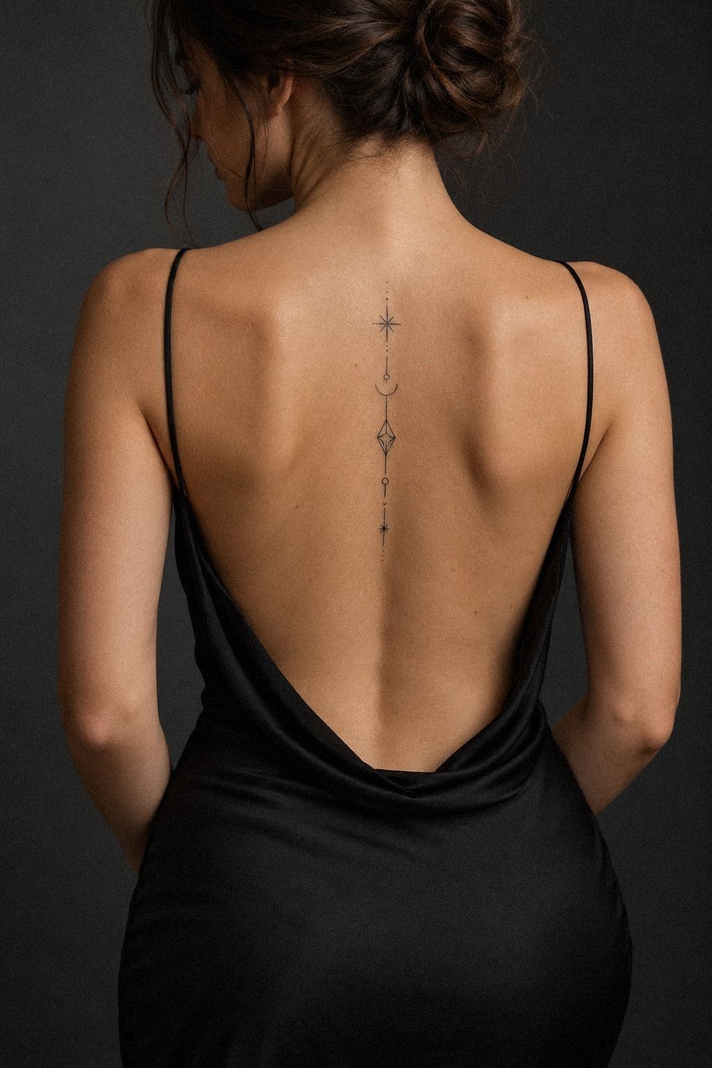
Treat aftercare as part of the design process. A minimalist tattoo needs calm healing so its fine edges can settle cleanly. You’ll want to follow your artist’s instructions, wash gently, use the recommended moisturizer, and keep direct sun away from the area while it recovers.
The Quiet Healing Plan removes unnecessary decisions. Prepare clean, loose clothing, fragrance-free cleanser, and whatever dressing your artist recommends before the appointment. I’d avoid improvising with heavy products or picking at peeling skin.
For a terracotta, stone, and olive-toned tattoo, watch the skin’s response rather than comparing it to someone else’s timeline. A fragrance-free moisturizer may be recommended once the artist says it’s appropriate, but those instructions come first. Don’t submerge the tattoo in a pool, and avoid sun exposure while it heals.
Your surface may look settled after 2 to 3 weeks, but complete healing can take 2 to 3 months. That difference matters. If you’re planning travel, swimming, or intense workouts, schedule the appointment when you can give your skin a quieter window.
And don’t rush a touch-up because the fresh version looks lighter or uneven. Let the tattoo fully heal before judging it with your artist.
This minimalist small wrist tattoos collection can help you compare scale, while your own artist can decide whether any adjustment is needed. Protecting the piece is part of making the bold idea last.
A Quick Design Brief Before You Book
Write down the design brief before you contact an artist: preferred symbols, approximate height, line style, skin location, and the feeling you want. Keep it short. A clear brief gives your artist room to create instead of forcing them to decode a long collection of saved references.
Add one sentence about what you don’t want. Maybe that’s ornate detail, heavy blackwork, visible lettering, or a fierce graphic style. Knowing the limits can make the final concept more personal and polished.
What I’d Ask at the Consultation
Ask to see healed tattoo work with fine lines, small lettering, and similar placement. Fresh work can look vibrant and sharp, but healed examples tell you much more about the artist’s judgment, technique, and consistency.
I’d also ask how the artist handles stencil movement, undertone, line weight, and touch-ups. These questions don’t make you difficult. They show that you’re treating the tattoo as a lasting decision rather than an impulsive purchase.
Cost, Value, and a Sensible First-Tattoo Budget
A small tattoo may still have a studio minimum, so set a realistic tattoo budget before you schedule. The cheapest option isn’t automatically the best value, and a higher price isn’t proof of quality. Look at healed results, hygiene, communication, and design skill together.
Ask whether the quoted cost includes consultation time, stencil revisions, aftercare guidance, and a possible touch-up. I’d rather spend more on a thoughtful artist than save money on a rushed design that needs correcting later. That’s a practical investment in your first tattoo.
Placement Checks That Catch Awkward Spacing
A placement test should happen while you stand, relax your shoulders, sit, and turn slightly. The design may look centered when you’re perfectly upright but shift when your posture becomes natural.
Check the upper, middle, and lower spine separately. A higher placement can feel more visible and graphic, while a lower placement may feel more private and personal. The right choice depends on your movement, clothing, and comfort with attention.
My Rule for Choosing Fine Line
My rule is simple: choose fine line only when the artist has proven healed work that supports it. A delicate style can be elegant and sharp, but it still needs enough contrast and spacing to remain readable.
If the design is too small for its details, simplify it. Removing one leaf or widening one gap may preserve the symbolic idea better than forcing every intricate feature into a tiny space.
The Personal Test: Would You Still Want It in Six Months?
Print or sketch the symbolic concept and revisit it after a week. I’d ask whether the idea still feels meaningful when the novelty has faded. If you keep returning to it, that’s useful information.
Try explaining the symbol in one sentence. If you need a long defense, you may be responding to someone else’s expectations. A personal tattoo can be private, haunting, playful, or romantic without needing a perfect explanation.
When a Small Spine Tattoo Is Worth It
A small spine tattoo is worth it when the placement, meaning, and artist all make sense together. The design doesn’t need to be extravagant. It needs to feel like a personal mark you’ll recognize as yours.
If you’re still unsure, wait. Delaying the appointment costs nothing, while correcting an unwanted tattoo can cost far more. Patience is part of the value, especially for a first piece.
Why Minimalist Spine Work Rewards Patience
I’ve learned that the best minimalist spine tattoos usually begin with a pause. People often choose the symbol first, then try to force it into a narrow vertical space.
I prefer the reverse. I study the movement of the back, the natural center line, and the amount of skin the design needs before deciding whether the symbol belongs there.
That approach can feel slower, but it saves you from a common disappointment: a tattoo that looks delicate in a saved design and crowded on your body. Your spine isn’t a flat page.
It bends when you sit, stretches when you reach, and changes shape when your shoulders relax. A striking design respects those shifts instead of pretending they aren’t there.
I also think fine line has been misunderstood. Delicate doesn’t mean fragile by default, and bold doesn’t mean oversized.
The important choices are spacing, contrast, placement, and the artist’s healed portfolio. I’d choose a slightly wider crisp line over a barely visible one if the design depends on readability. That decision may feel less daring at first, but it’s often more timeless.
The most personal tattoo I’ve seen wasn’t the most ornate or technically complicated. It was a small, meaningful mark placed with care, using a shape the wearer could explain without borrowing someone else’s story.
If you’re still uncertain, wait a week, test the stencil, and look at it while standing and moving. Your hesitation may reveal the exact adjustment the design needs.
A Few Things Worth Answering
How much does a minimalist small spine tattoo usually cost?
A minimalist small spine tattoo typically costs about $50 to $100 at a studio minimum or about $100 to $250 per hour in the US. The final tattoo price varies by artist and region. Small size doesn’t always mean a lower minimum, so ask for an estimate before booking.
Are minimalist small spine tattoos a good idea for a first tattoo?
Yes, they can be a good first tattoo when the design is simple and the placement suits you. Clear linework and a meaningful symbol make planning easier. You’ll still need to consider bony sensitivity, healing, clothing, and whether you’re comfortable with a less visible placement.
How do I choose a tattoo artist for minimalist small spine tattoos?
Choose an artist with clean linework, healed portfolio images, and strong studio hygiene. Healed examples are the best evidence. Ask how they approach fine lines, spacing, stencil placement, and your skin’s undertone before you pay a deposit or confirm the design.
How much do minimalist small spine tattoos hurt?
Pain varies, but bony areas can feel sharper than fleshier placements. Spine sensitivity may be more intense than the forearm, thigh, or shoulder for many people. Tell your artist if you need a pause, and ask whether the design can be completed in a shorter session.
How long does a minimalist small spine tattoo take to heal?
The surface usually heals in about 2 to 3 weeks, while complete healing takes about 2 to 3 months. Gentle aftercare includes appropriate moisturizing and avoiding sun and swimming. Follow your artist’s specific instructions if they differ.
What’s the best placement for minimalist small spine tattoos?
The best placement is the section of the spine where the design stays readable during natural movement. A centered upper or mid-spine placement often gives a clean vertical path, while a lower placement can feel more private. Your artist should test the stencil while you stand and relax.
For more placement comparisons, browse these minimalist small wrist tattoos and small spine tattoo designs before choosing. Your body’s movement should decide the final location.
Where I’d Start First
If I had to pick one step, I’d start with the stencil and line path. A clear placement protects every later choice, from symbol to line weight, and it catches awkward spacing before the needle does. Save your favorite design, test it standing, and let your artist refine what your body is already doing.
Then ask yourself one final question: would you still choose this first tattoo design if nobody else saw it? If the answer is yes, you’re probably close.
That kind of certainty is quiet, personal, and worth waiting for. That pause matters!