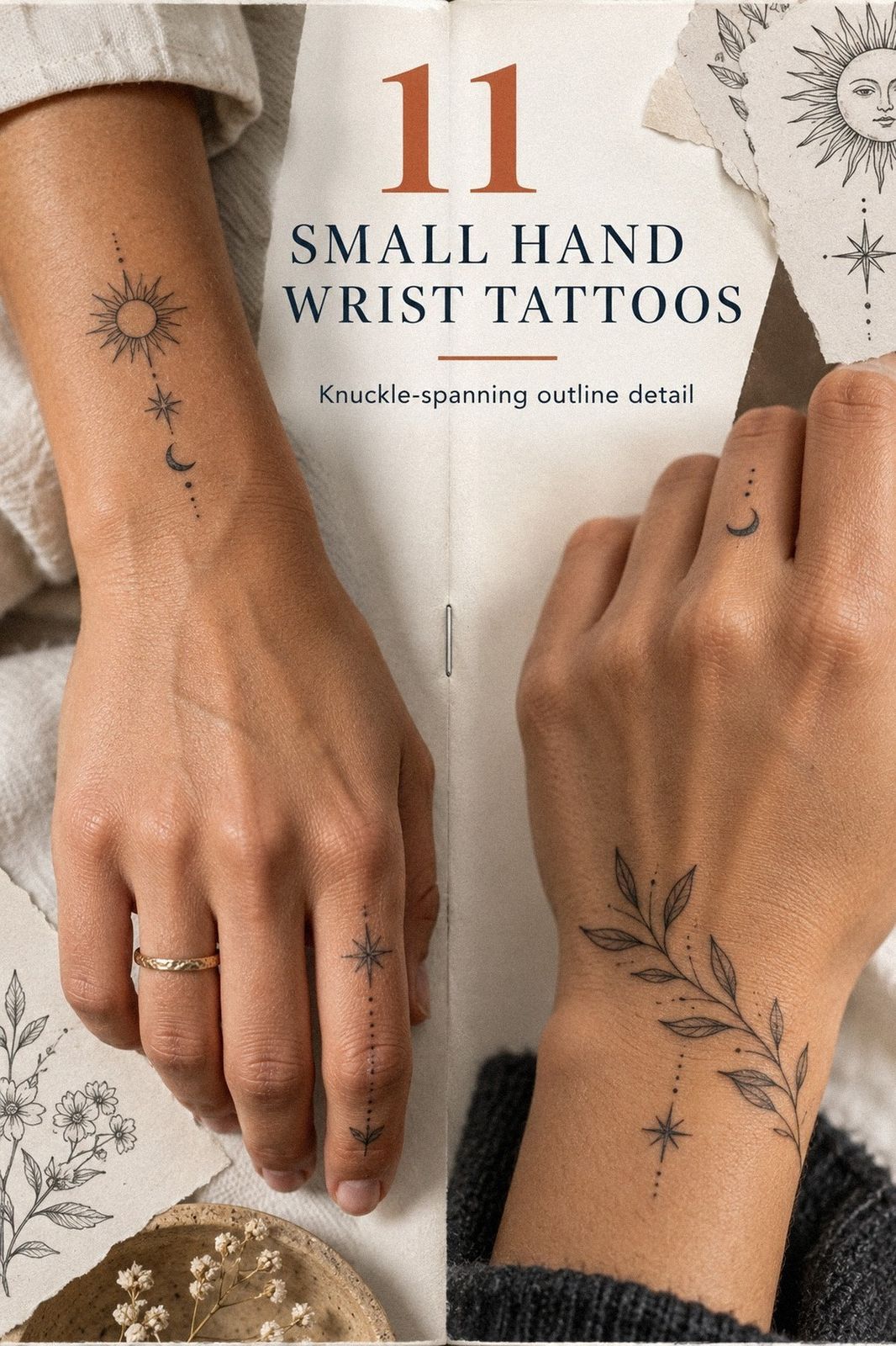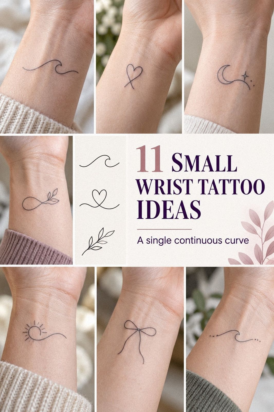
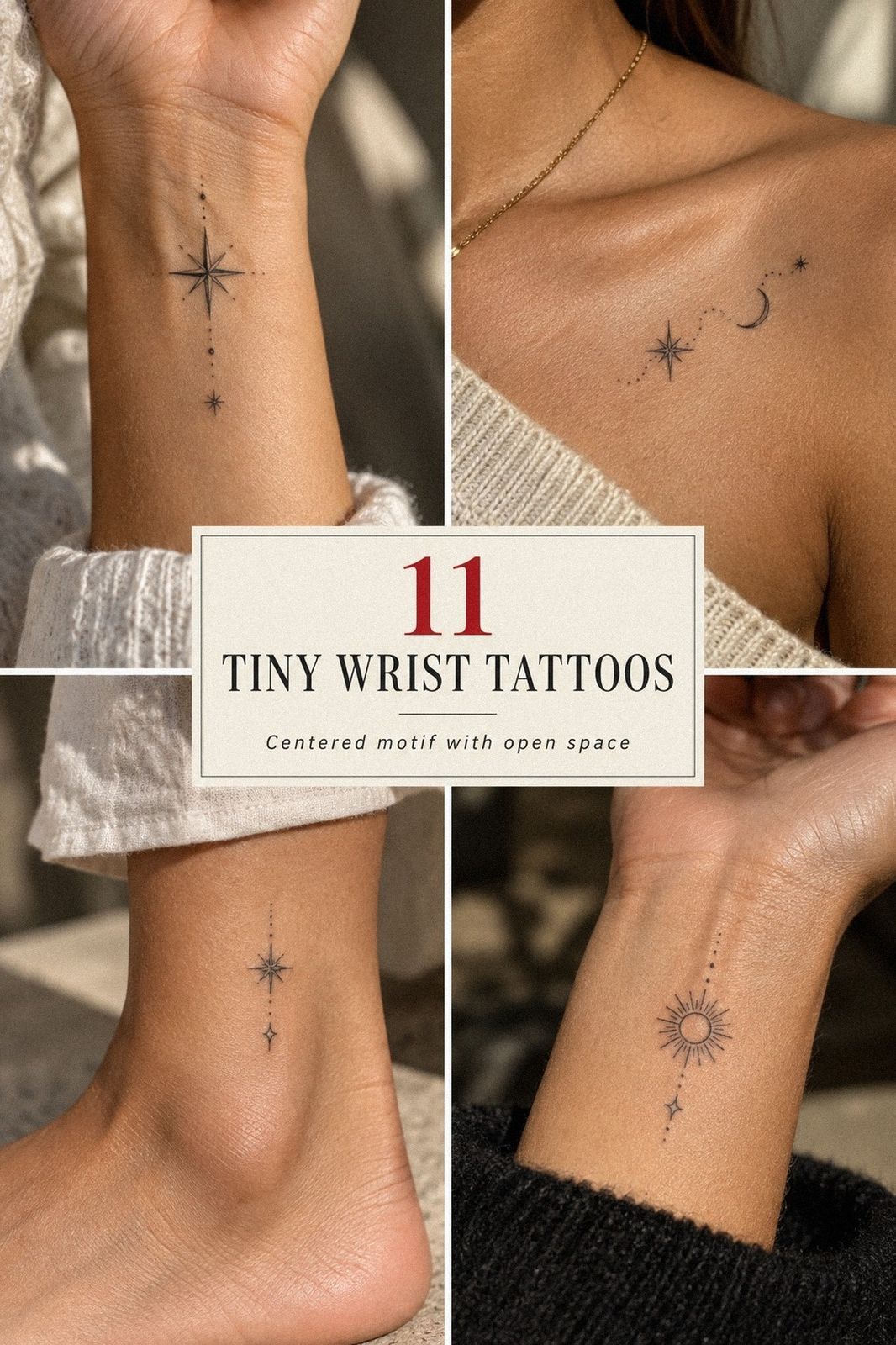
The wrist is a narrow canvas, but it can hold a striking idea. Fine lines catch the light when your hand moves, while open spacing keeps a delicate design readable after the initial excitement fades. I’ve chosen concepts that feel personal without turning a small tattoo into a crowded puzzle.
Design note: My strong opinion is to choose one clear symbol before adding clever details. The best wrist tattoos are minimal in structure but still meaningful enough to make you pause. This guide focuses on readable designs, realistic pricing, thoughtful placement, and choices that can remain elegant over time!
- Start With Fine-Line Stars
- Initials That Stay Personal
- Can Minimal Black Ink Stay Readable?
- Let Botanical Linework Follow the Wrist
- The Crescent Moon Choice
- Fingerprints With Real Meaning
- Coordinates, Kept Clear
- Birth Flowers With One Strong Stem
- Is Red Ink Worth the Extra Thought?
- Matching Inner-Wrist Designs: Same Idea, Different Fit
- Choose One Celestial Symbol
1Start With Fine-Line Stars
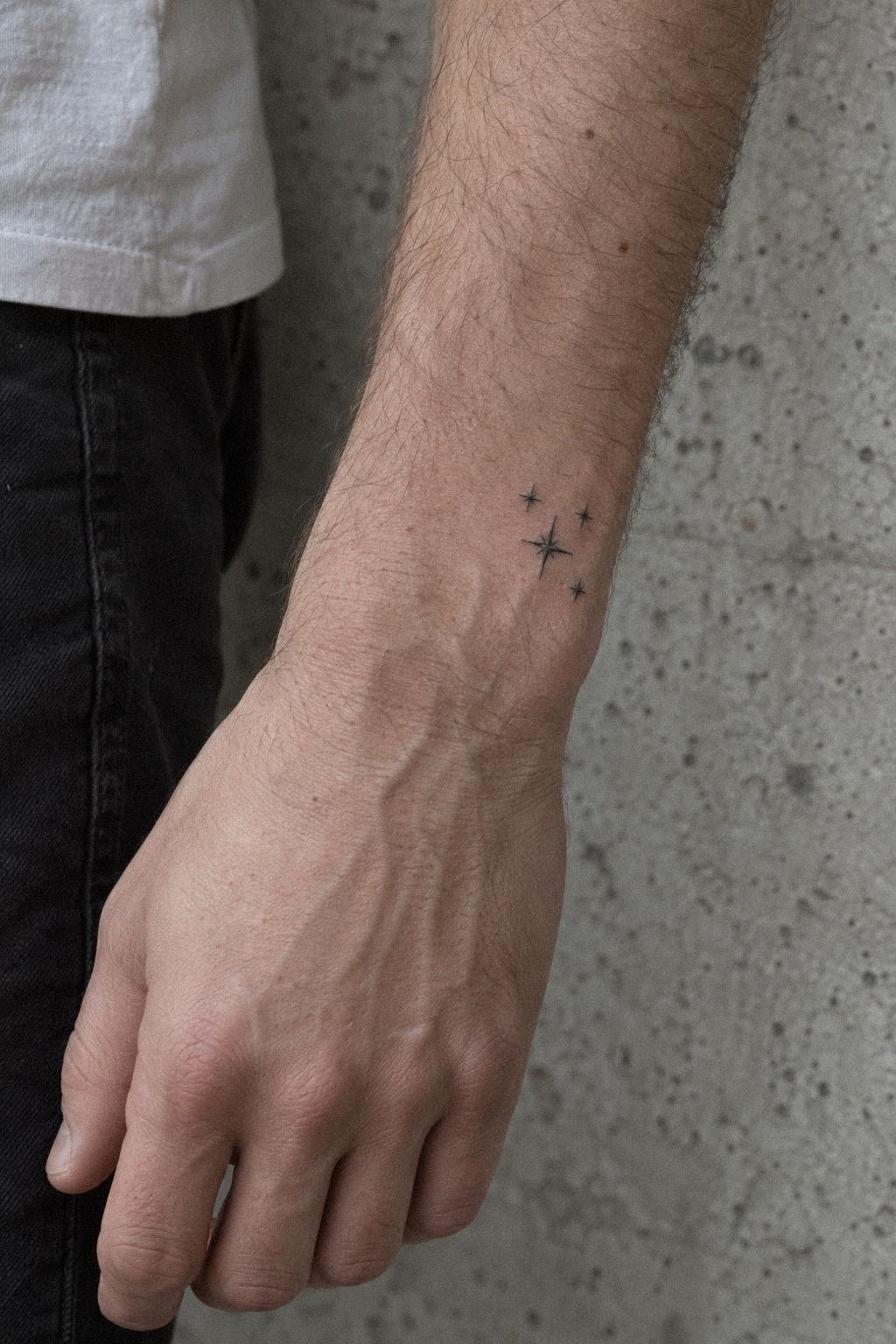
A small constellation can create a sleek rhythm without overwhelming the wrist. One larger star, two smaller marks, and generous skin between them usually look more graceful than a dense cluster.
Keep the star arrangement open and readable. Filled points may feel edgy when fresh, but open shapes often remain sharper as the wrist moves and the lines settle.
I’d place the largest star near the center, then let the smaller marks taper toward each side. That flowing structure feels more personal than six identical symbols.
Bring a final-size stencil to the appointment. A design that looks crisp on a phone can become muddy when reduced to actual wrist scale, so judge it on your skin before committing.
A shop minimum may determine the price more than the tattoo’s size. Check the minimum before booking, and don’t add extra stars simply to make the session feel more worthwhile.
2Initials That Stay Personal
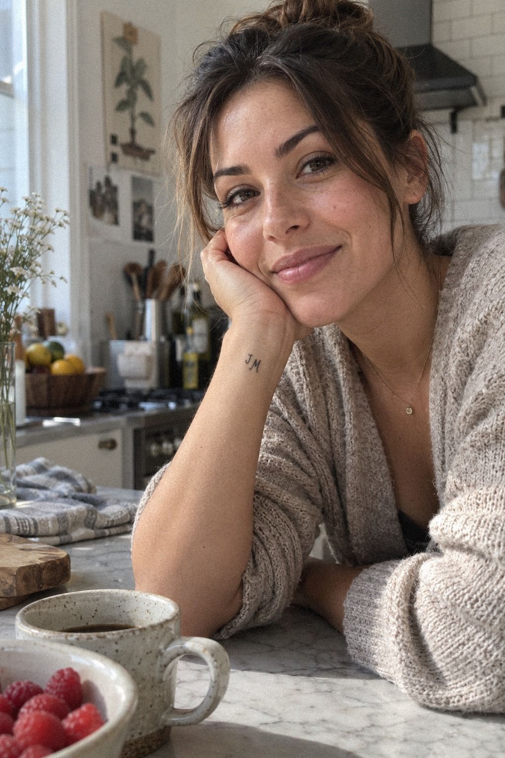
Tiny initials offer an understated mark without requiring a large symbol. The idea can be romantic, familial, or quietly private, but the letterform still deserves careful attention because every curve will be visible.
A single initial in fine-line lettering can look sleek and personal. I’d skip ornate scripts if your wrist is narrow, since too many curls may close together and weaken the elegant shape.
Think about whose initial you’re choosing. Would you still like the letter without the story attached? That question can reveal whether the design is truly meaningful or only romantic in the moment.
The inner wrist keeps an initial visible to you, while the outer wrist makes it easier for others to see. Let your daily habits guide the wrist orientation rather than copying someone else’s placement.
Because the wrist sees frequent sunlight, protect the healed tattoo consistently. The value of a readable initial depends on preserving its fine details, not simply choosing the lowest price.
3Can Minimal Black Ink Stay Readable?
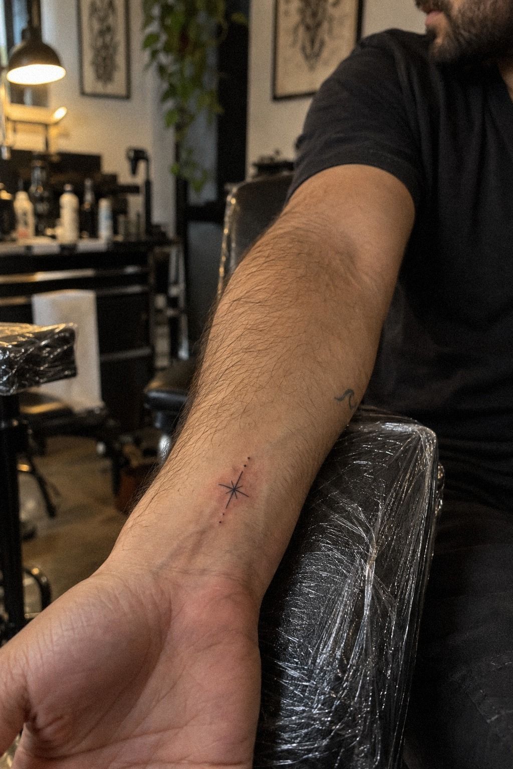
Minimal black ink is one of the most flexible directions for a wrist tattoo. Your design might be a small arc, a dot cluster, or one expressive symbol with no shading.
A solid black mark gives the tattoo a sharp anchor. I’d choose one clear shape over three vague ones because restraint matters more than decoration at this scale.
Use a simple line-weight check before booking. One fine outline, one slightly stronger point, and untouched skin around both can create a polished result.
Your artist may recommend a single-needle cartridge for controlled detail, but equipment shouldn’t be the only deciding factor. Look at healed work, especially when the design depends on line readability.
If you want the tattoo to read from a short distance, choose a silhouette with enough contrast. If you want something private, an understated mark near the inner crease may feel more appropriate. A thoughtful consultation is worth it when the concept is this small.
4Let Botanical Linework Follow the Wrist

A small botanical design can feel bold when the stem follows the natural direction of your wrist. One plant shape usually looks more elegant than an entire garden compressed into a few centimeters.
Start with a single-stem design showing one stem, two or three leaves, and an open bud. Intricate detail can be beautiful, but too many tiny leaves may lose their crisp edges over time.
Study the wrist contour before finalizing the angle. Leaves can point toward the hand for a visible gesture or toward the forearm for something more private.
Choose a birth flower, olive branch, lavender sprig, or fern because you like its actual silhouette. Meaning can deepen the design, but the shape is what you’ll see every day.
A useful reference should show the feature that makes the plant recognizable. Let the artist simplify that feature into a bold, expressive outline rather than copying every botanical detail.
5The Crescent Moon Choice
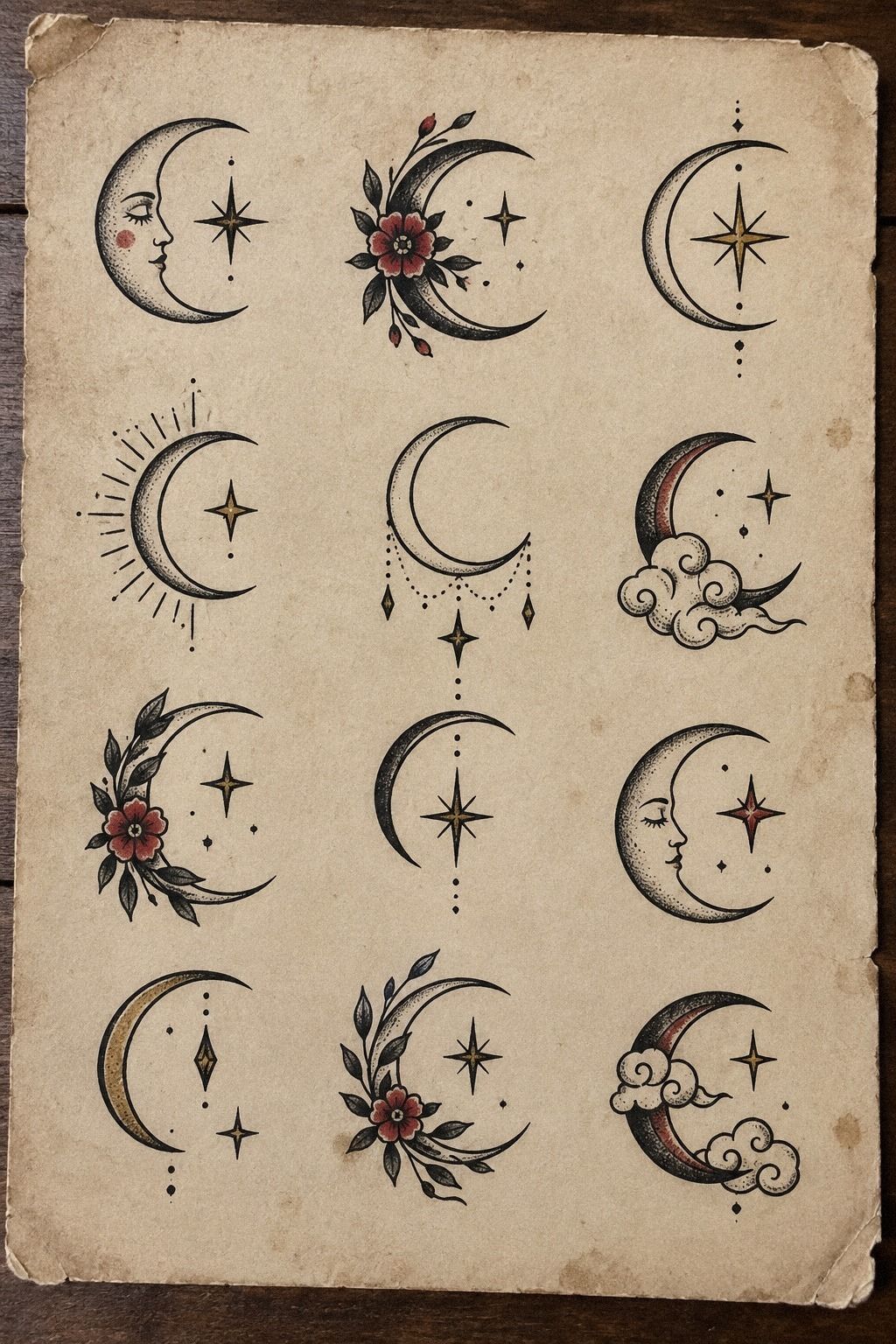
A crescent moon can feel sacred, romantic, haunting, or playful depending on its angle. It also works well when you want a symbol with personality but not too much visual noise.
The crescent silhouette should have enough open skin inside the curve. A thickened inner edge may look powerful when fresh, yet a clean, balanced curve is more likely to stay legible as the pigment settles.
Point the tips toward the hand for a graceful, upward gesture, or rotate them toward the forearm for a quieter look. I prefer a slight angle rather than a perfectly vertical moon because it feels less generic.
You can add a dot, star, or tiny initial, but I’d resist turning the moon into a miniature night sky. One symbolic shape often has more impact than several competing details.
If the moon represents change, protection, or a private ritual, let that meaning guide the size and orientation. The strongest version is usually the one you recognize immediately without needing a caption.
6Fingerprints With Real Meaning
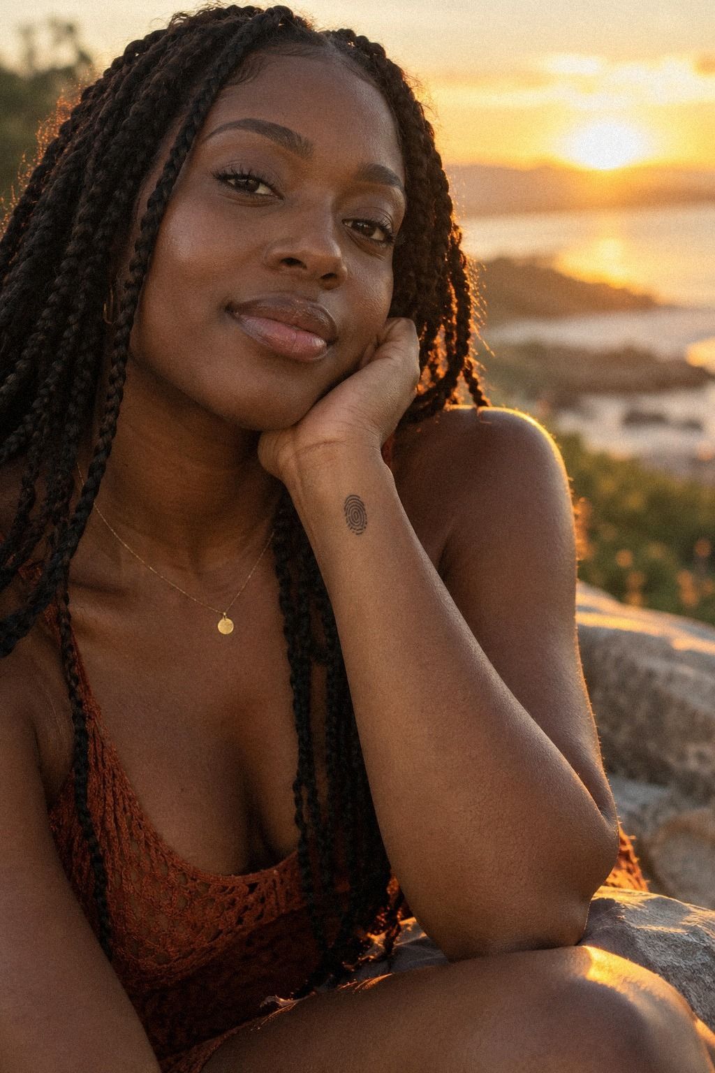
A fingerprint tattoo has an intimate reason to exist. It can honor a child, partner, family member, or personal milestone without explaining itself to everyone who sees it.
Start with a clear fingerprint pattern. The artist can simplify the ridges, but they’ll need enough information to preserve the curves and breaks that make the print yours.
The pattern shouldn’t include every microscopic line. Too much detail can create a dark knot, while a simplified version can remain expressive and legible.
Inspect the transfer while your wrist rests naturally. Skin shifts when the hand stretches, so judge the design in the position you’ll actually use most.
Aftercare matters when the tattoo depends on fine lines. Wash gently, avoid swimming during early healing, and protect the settled design from sunlight. The cost is small compared with losing the detail that gives it personal value.
7Coordinates, Kept Clear
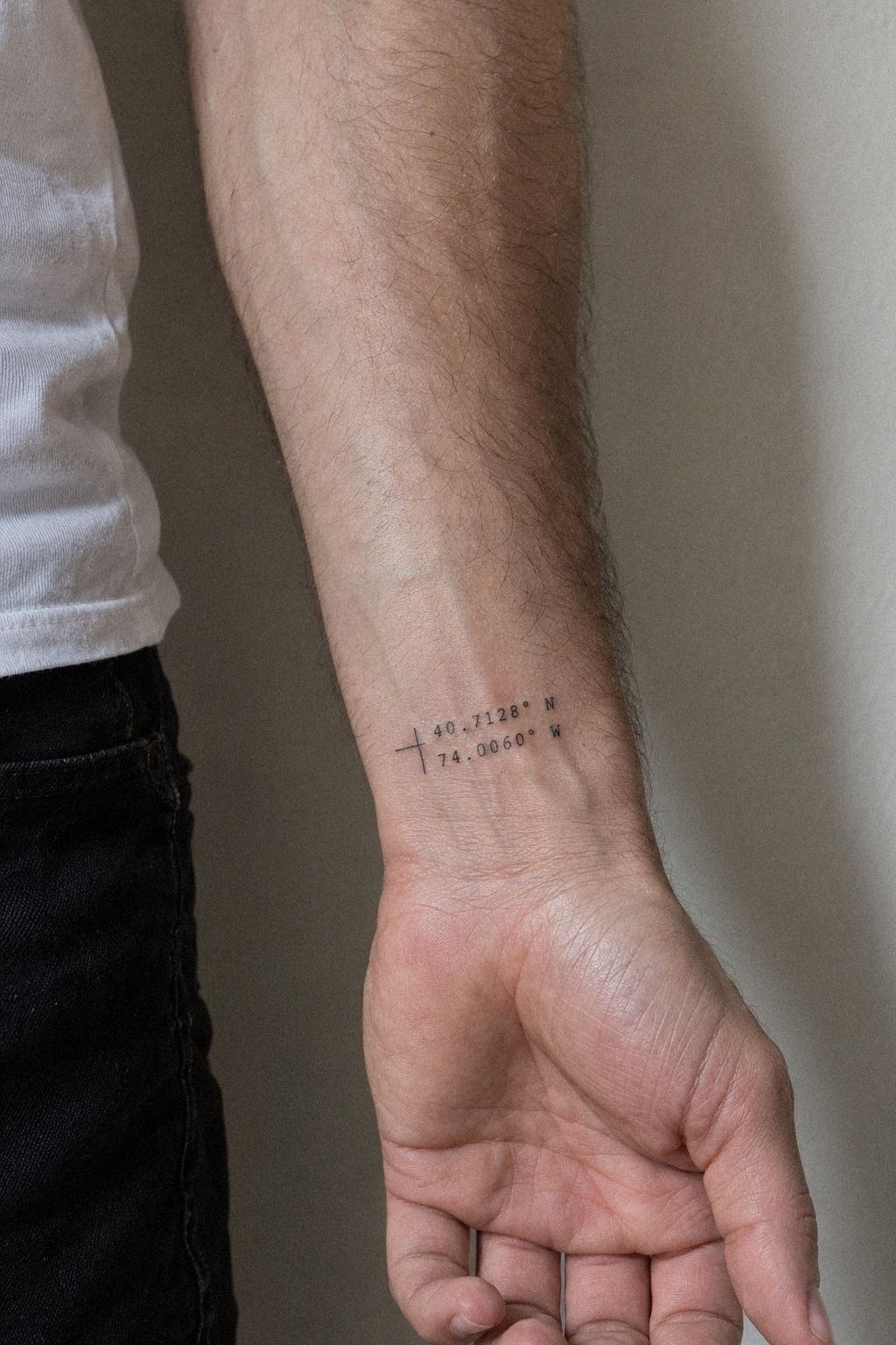
Coordinates turn a meaningful location into a sharp personal code. They can mark a birthplace, a first meeting, a favorite journey, or a private turning point.
The coordinate lettering needs enough space between numbers and punctuation. I’d choose a clean typeface instead of decorative script because compressed digits can become difficult to distinguish.
Use a realistic printout before the appointment. Check both lines from a normal viewing distance, then confirm that the direction letters don’t compete with the numbers.
You may want to add an arrow, date, or tiny symbol. I’d resist unless the extra element genuinely strengthens the story. Coordinates already carry information, so the most polished version may be the simplest one.
Compare the minimum price and hourly rate before deciding on size. A slightly larger design may offer better long-term value than ultra-small lettering that becomes hard to read.
8Birth Flowers With One Strong Stem
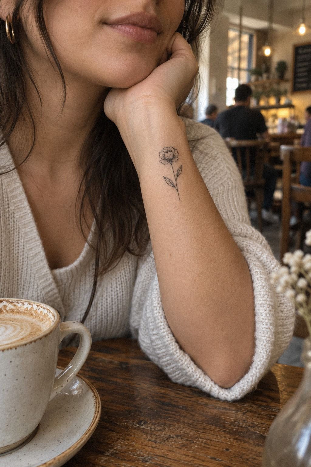
A birth flower can represent a month, person, or turning point while remaining dainty and personal. The concept feels classic, but the stem shape can make it look completely individual.
Choose the birth-flower silhouette first. A poppy, carnation, violet, or marigold each has a recognizable structure, and that structure matters more than adding decorative leaves.
I’d keep the bloom open and let one stem create the movement. Several blossoms may sound meaningful, but they can quickly turn a petite wrist design into a cramped botanical chart.
Consider whether the flower should face the hand or the forearm. Facing the hand makes the symbol easier for you to see, while the opposite direction can create a more discreet, elongated line.
The most successful version usually preserves one defining detail, such as a petal notch or curved sepal. That small decision keeps the tattoo expressive without demanding excessive detail.
9Is Red Ink Worth the Extra Thought?
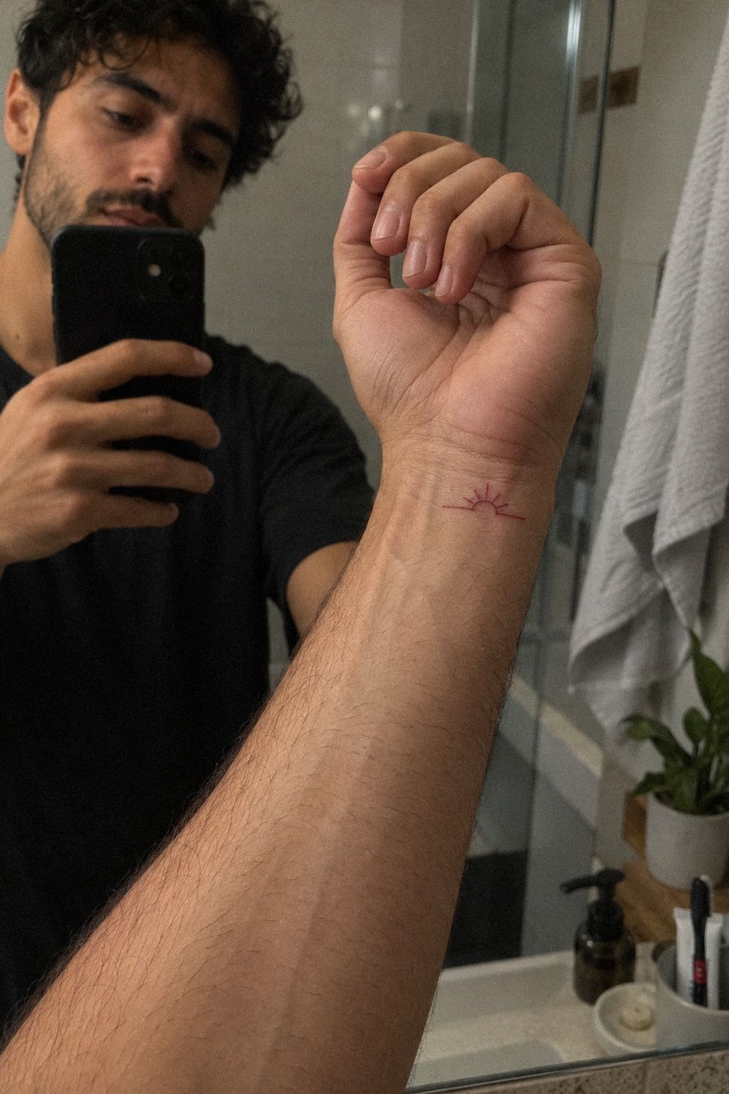
Red ink changes the mood immediately. A heart, star, flame, or abstract mark can feel vibrant and daring without needing several colors.
The red pigment choice should be judged through healed work, not only a fresh photograph. Color can settle differently from what you expect, and skin tone affects the final impression.
A single-color design is usually the clearest direction for a tiny wrist. One hue, one shape, and enough untouched skin can look polished without becoming loud.
I’d be cautious with ultra-fine red lettering. It may appear stylish at first, yet black often offers stronger long-term readability. If you choose red, prioritize a clear symbol over a fragile phrase.
Your sun-protection routine matters after healing. Gentle washing, appropriate moisture, and consistent UV protection help preserve the vibrant effect. Red work can be worth the extra planning when you understand the maintenance first!
10Matching Inner-Wrist Designs: Same Idea, Different Fit
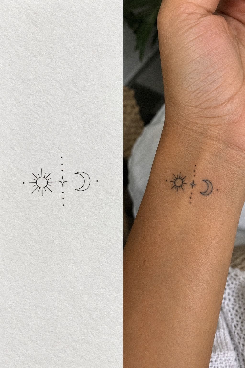
Matching tattoos don’t have to be identical. The strongest pairs share one meaningful idea while allowing each person’s wrist shape, style, and visibility preferences to guide the final version.
A matching concept should be tested at its intended size before the appointment. Look for clean alignment if the design includes two related symbols.
Check both wrists while the hands rest naturally. One person may have a different curve, skin texture, or preference for visibility, and those differences should shape the final result.
The same symbol can change slightly in scale, direction, or line weight. That variation makes the tattoos feel personal instead of mechanically copied.
Discuss healing, visibility, and budget before booking a shared appointment. Matching ink feels empowering when the decision is mutual rather than pressured.
11Choose One Celestial Symbol
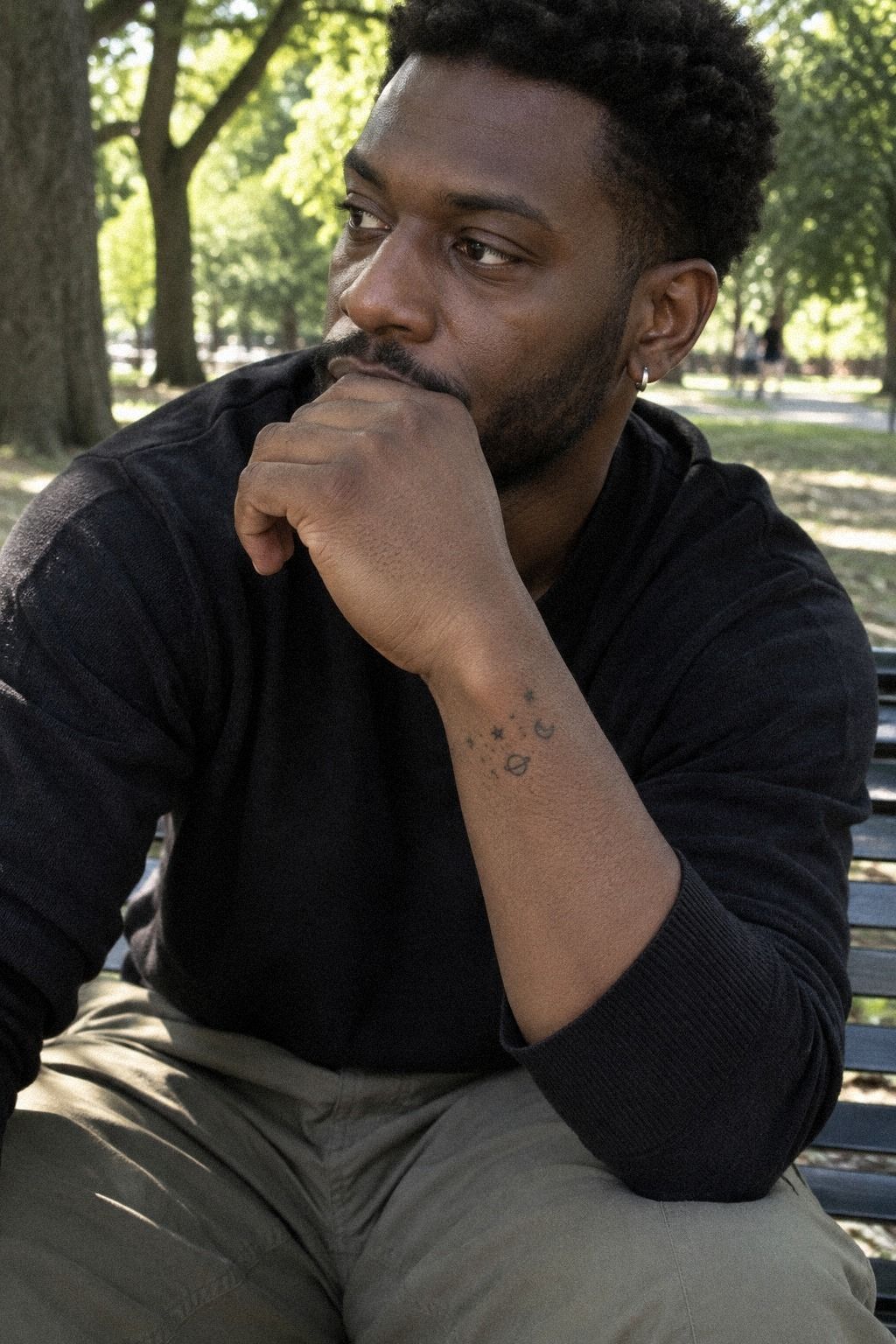
A tiny sun, star, or planet can carry a powerful idea without needing a crowded composition. Pick one central shape and let its silhouette do the work.
A celestial symbol might be a small sun with short rays, a ringed planet, or one star beside a dot. I’d avoid combining every sky symbol into one wrist.
Check the design while your wrist curves naturally. A slight rotation may help the mark remain balanced when your hand hangs at your side.
Look at healed examples across several skin tones. Contrast and line visibility should be judged from real results, especially when the tattoo is very small.
A celestial tattoo can feel ethereal, iconic, playful, or timeless. Confirm the aftercare plan, then choose the mark you’ll still recognize years from now!
Before You Book: The Stencil Test
Request a consultation stencil at the exact size you’re considering. Wear it briefly, move your wrist, and notice whether the design still feels balanced when your hand is relaxed.
Your reference should show the symbol at realistic scale, along with the preferred angle and orientation. Clear information gives the artist room to make useful adjustments instead of guessing.
Try writing, typing, opening a door, and resting your hand normally. A design that feels perfect in one pose may look awkward when the wrist bends.
Give yourself at least a day if the idea is emotionally important. A striking concept should survive a quiet second look, not only the rush of choosing it.
Cost, Value, and the Shop Minimum
Request a written quote explaining the shop minimum, expected session length, and whether a small redraw is included. Tiny tattoos aren’t automatically cheap because setup, sterilization, and professional time still matter.
The best estimate is based on the actual design, placement, and local rate. Compare healed results and communication quality, not only the lowest number.
A simple tattoo may take less time, but precision still has value. Saving money by choosing an inexperienced artist can cost more if the design needs correction later.
If the price feels beyond your budget, simplify the concept rather than rushing the appointment. Remove an extra symbol, shorten the lettering, or wait until the right artist is affordable.
Aftercare for Crisp Fine Lines
Follow the healing instructions closely. Gentle washing, light moisture, and avoiding swimming during early healing help protect the surface while it settles.
A fragrance-free moisturizer may be recommended once the skin is ready. Don’t pick flakes or judge the final appearance too quickly because fine lines can look softer before healing is complete.
Avoid friction from watches, tight bands, and repeated rubbing while the tattoo is fresh. The wrist moves constantly, so small habits can affect comfort and recovery.
Once healed, use sun protection whenever the tattoo will be exposed for long periods. Preserving readability is an ongoing part of choosing a small design.
A Quick Wrist Check
Use a wrist comfort test before deciding between inner and outer placement. Notice how often the design catches sunlight, rubs against clothing, or faces toward you during the day.
The inner wrist gives you frequent visibility and a more private viewing experience. The outer wrist may make the tattoo easier for other people to see.
Think about your routine rather than relying on a universal rule. A musician, office worker, athlete, and person who wears a watch may all experience the same placement differently.
Placement affects aging and comfort, but it also affects how connected you feel to the mark. Choose the position that makes sense for your actual life.
The Three-Check Decision I Use
When I’m helping someone choose a wrist tattoo, I use three checks: readability, personal weight, and comfort. If a design passes only one, I’d pause. A fierce reference can still be wrong for your wrist or your reasons.
First, I use a readability check at the final size. I want to know whether the symbol, initial, flower, or coordinate remains crisp without relying on enlargement.
Second, I use a meaning test. There’s nothing wrong with choosing an iconic moon or classic star, but you’ll feel more connected when you know why that shape belongs to you.
Third, I use a comfort check. Inner wrists are visible and easy to inspect, while outer wrists may receive more rubbing and sunlight. Your routine should influence the decision.
Finally, review the cost breakdown before booking. Ask about the minimum, hourly pricing, and any consultation fee. The right design should feel personal, readable, and financially sensible.
My Editorial Take on Choosing a Wrist Tattoo
I like wrist tattoos when they feel edited rather than merely reduced. Small doesn’t mean you have to remove all personality; it means every mark has to earn its place. A bold silhouette with open skin can say more than an ornate design that asks the eye to work too hard.
Readability is the first test I’d use. Fresh ink can look crisp, sharp, and exciting under studio lighting, but the design has to make sense when your wrist is relaxed, slightly bent, or viewed from a normal distance. Tiny gaps matter.
So does the space between letters, leaves, stars, and numbers.
I’m also skeptical of designs chosen only because they are trending. A popular crescent, initial, or botanical stem can still become meaningful, but the reason should come from you. If the symbol has no personal weight, give it a stronger angle, simplify it, or choose something else entirely.
Ageing is part of the design conversation, not an afterthought. Fine details soften, pigment settles, and sunlight gradually changes the contrast.
That doesn’t make a tattoo unsuccessful. It means a clear composition, sensible spacing, and realistic expectations matter more than chasing a flawless first photograph.
For the motif, I’d choose the shape before the explanation. Notice whether you are drawn to the curve of a crescent, the rhythm of coordinates, or the uneven character of a flower stem. Meaning can deepen later, but visual instinct is often the honest starting point.
Budget matters too. A small tattoo may still meet a shop minimum, and a careful artist may recommend a slightly larger scale for better longevity. I’d rather wait for a polished, personal result than force an ultra-small design that loses its identity.
The best wrist tattoo should feel personal without becoming precious, readable without becoming severe, and expressive without collecting every idea you like. That balance is the real goal!
The Questions I Get Asked Most
How much do small wrist tattoos usually cost?
I’d budget about $50 to $300 in the US, depending on the artist, region, size, and detail. The shop minimum often matters most for very small work. Before booking, I’d confirm the minimum, hourly rate, expected session length, and whether the quoted price includes a small adjustment.
Are tiny wrist tattoos a good first tattoo?
I think they can be a good first tattoo because the design is manageable and easy to discuss. A clear symbol keeps the decision focused. I’d still choose placement carefully, consider visibility at work, and select an artist with healed examples rather than relying only on fresh photographs.
How do I choose an artist for a small wrist design?
I’d look for clean linework, healed portfolio photos, consistent hygiene, and designs similar to mine. Healed results are the strongest evidence. I’d also pay attention to how clearly the artist explains scale, spacing, aftercare, and whether the chosen motif will remain readable on my wrist.
How much do wrist tattoos hurt?
I’d expect discomfort to vary because the wrist has thinner skin and areas close to bone. The exact placement changes the experience more than the design itself. I’d eat beforehand, stay hydrated, and tell the artist if I need a short pause during the appointment.
How long do small wrist tattoos take to heal?
I’d expect the surface to heal in roughly two to three weeks, while complete healing can take two to three months. Gentle aftercare matters during that period. I’d wash softly, moisturize as directed, avoid swimming early on, and protect the healed tattoo from prolonged sun exposure.
Where I’d Start First
If I had to pick one, I’d start with the fine-line stars. Their varied sizes keep the wrist from looking crowded, and the open spacing gives delicate ink room to remain readable.
Pin the star idea for later, then compare it with more small wrist tattoo ideas before booking. Start with the design you still want after the excitement fades!