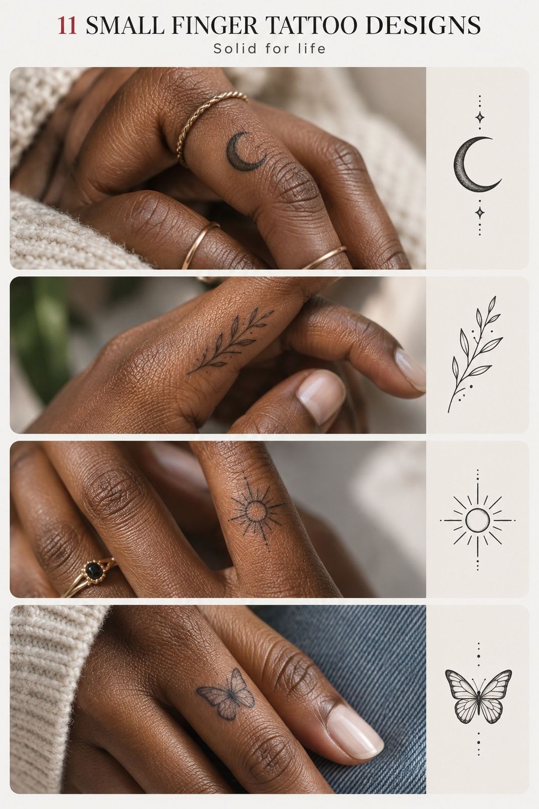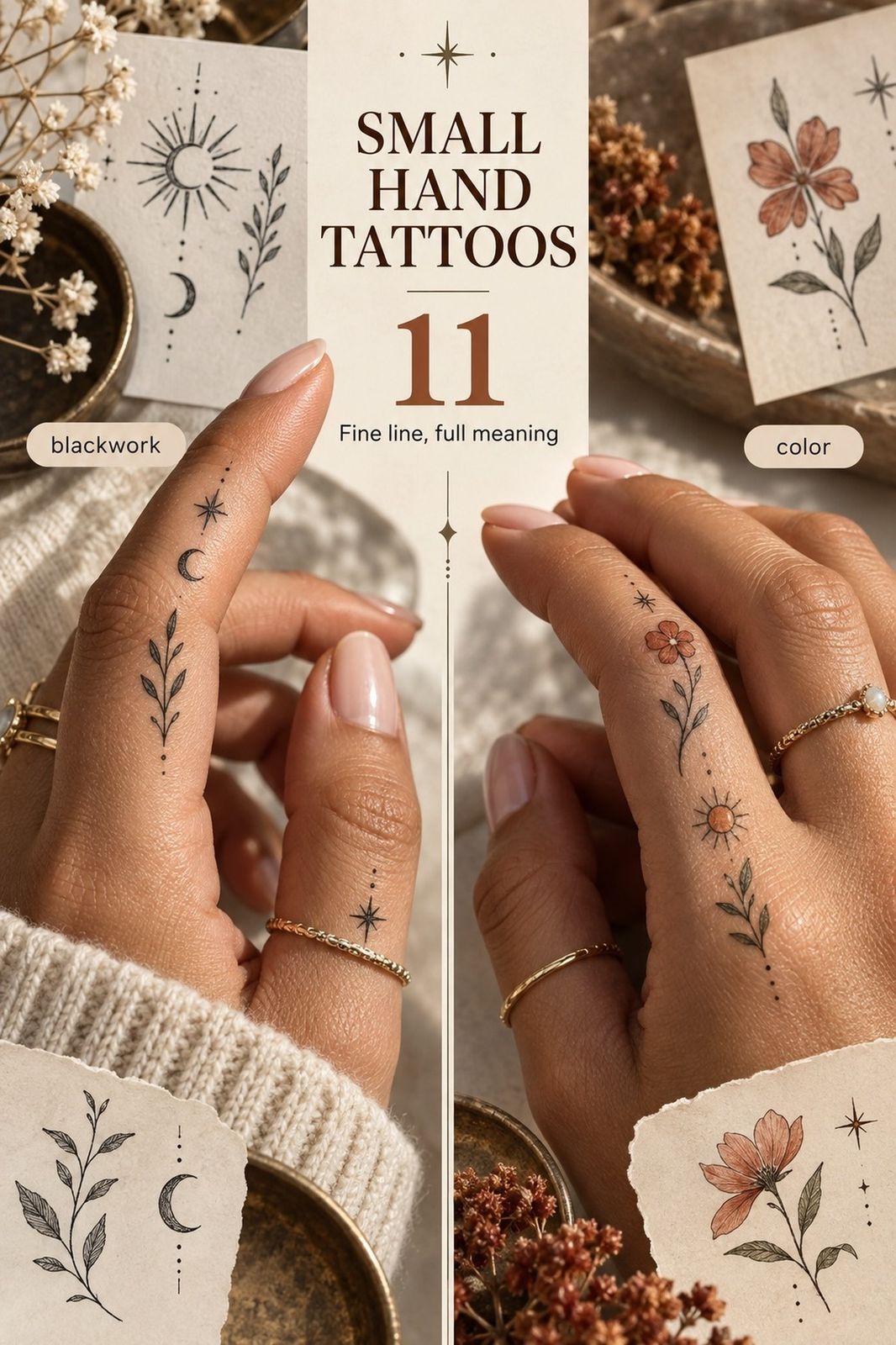
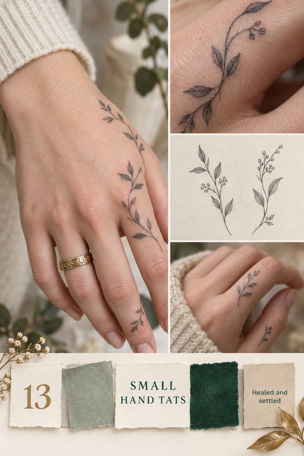
The first thing I notice is the drag of a sleeve across fresh ink, the slight stiffness when my fingers curl, and the way a tiny mark suddenly feels louder than expected. I learned that after choosing a delicate botanical symbol that blurred faster than I wanted. Now I look for open spacing, confident line weight, and a design that respects how a hand actually moves. That’s the difference!
Editor’s note
Start with the idea you’d still love after the novelty fades. A small tattoo can be meaningful without becoming crowded, and the strongest designs usually leave more skin untouched than beginners expect.
My one rule is simple: let the hand participate in the design. A flowing stem, a short script line, or a compact symbol should bend with your gestures rather than look pasted onto a flat template.
If you’re collecting references, begin with these small tattoo designs and pay attention to healed examples, not only fresh appointments.
- Trace a Tiny Botanical Branch Across the Hand
- Build a Symbol Set Across the Knuckles
- Let Handwritten Script Travel the Side
- Reduce an Animal Portrait to One Gesture
- Map Fine-Line Stars Across the Fingers
- Use Thumb Placement for Bold Blackwork
- Follow Natural Hand Lines with Florals
- Start a Playful Collection Between the Fingers
- Choose One Color Accent
- Let Negative Space Do the Work
- Test Placement in Motion
- Match Line Weight to the Design
- Plan for Visibility and Healing
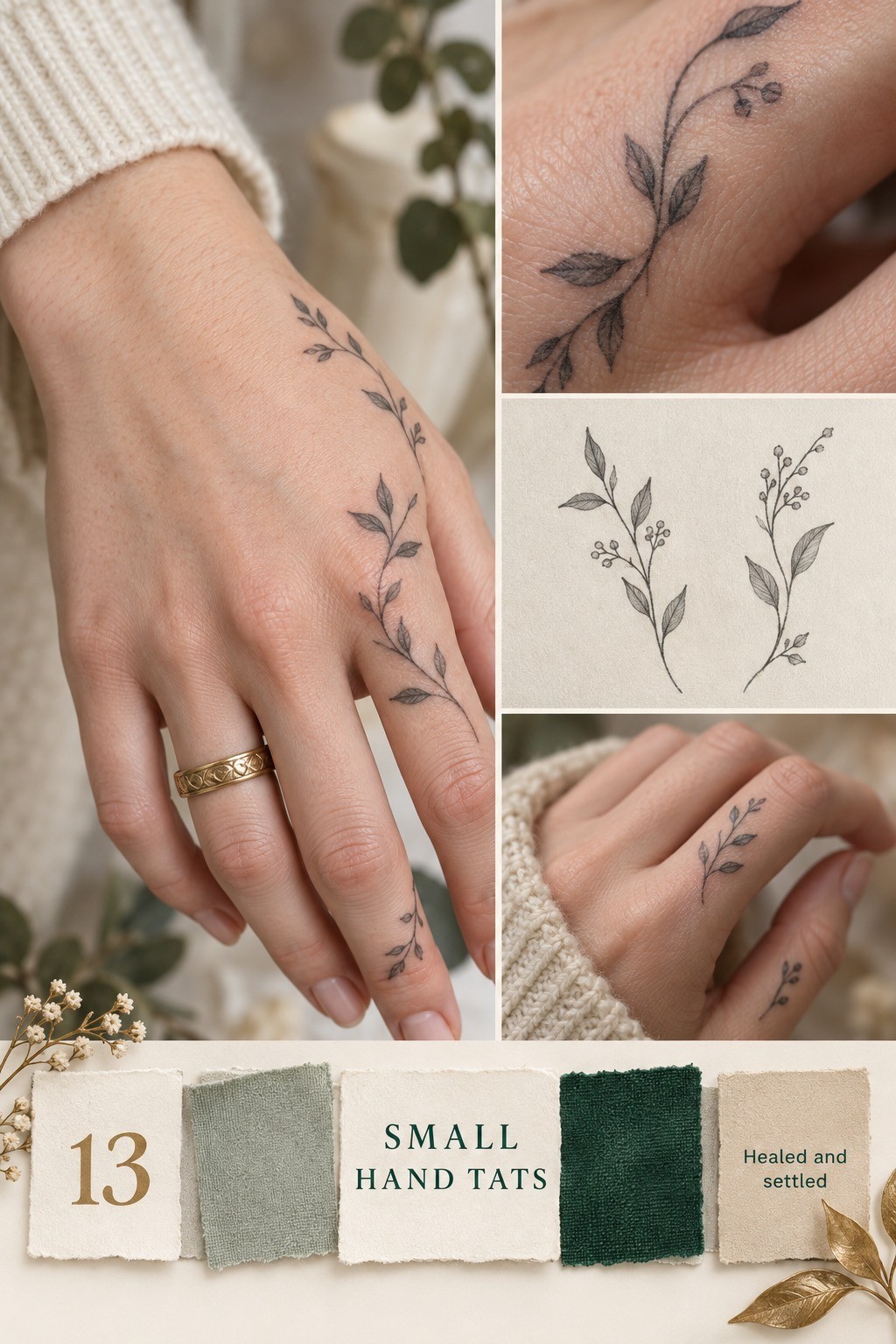
1Trace a Tiny Botanical Branch Across the Hand
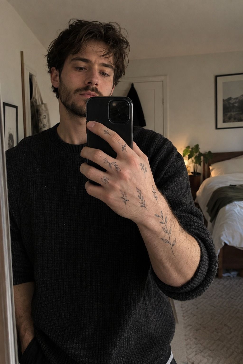
A tiny branch can look striking when its stems travel along the hand instead of cutting straight across every crease. The leaves should feel intentional, with enough separation for each shape to remain readable after healing.
I prefer a botanical branch with three or four leaves over an overloaded sprig. A few crisp angles create a more elegant result than dozens of veins competing for attention.
Fine detail needs restraint. A single-use 3RL cartridge or another setup suited to fine linework may work well, but the equipment matters less than the artist’s healed results and control.
Keep the branch slightly away from the deepest creases. That small adjustment gives the design room to move when you bend your fingers. You can compare related small tattoo designs before settling on the final silhouette.
I’d keep the color limited here. Black ink gives the leaves a crisp read and lets the open skin carry some of the visual weight. Let the negative space stay visible!
2Build a Symbol Set Across the Knuckles
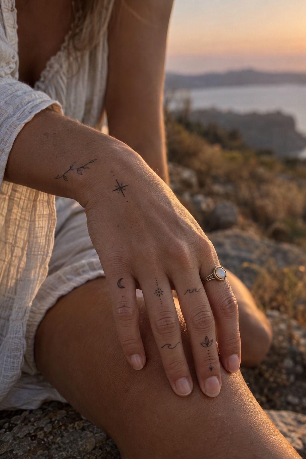
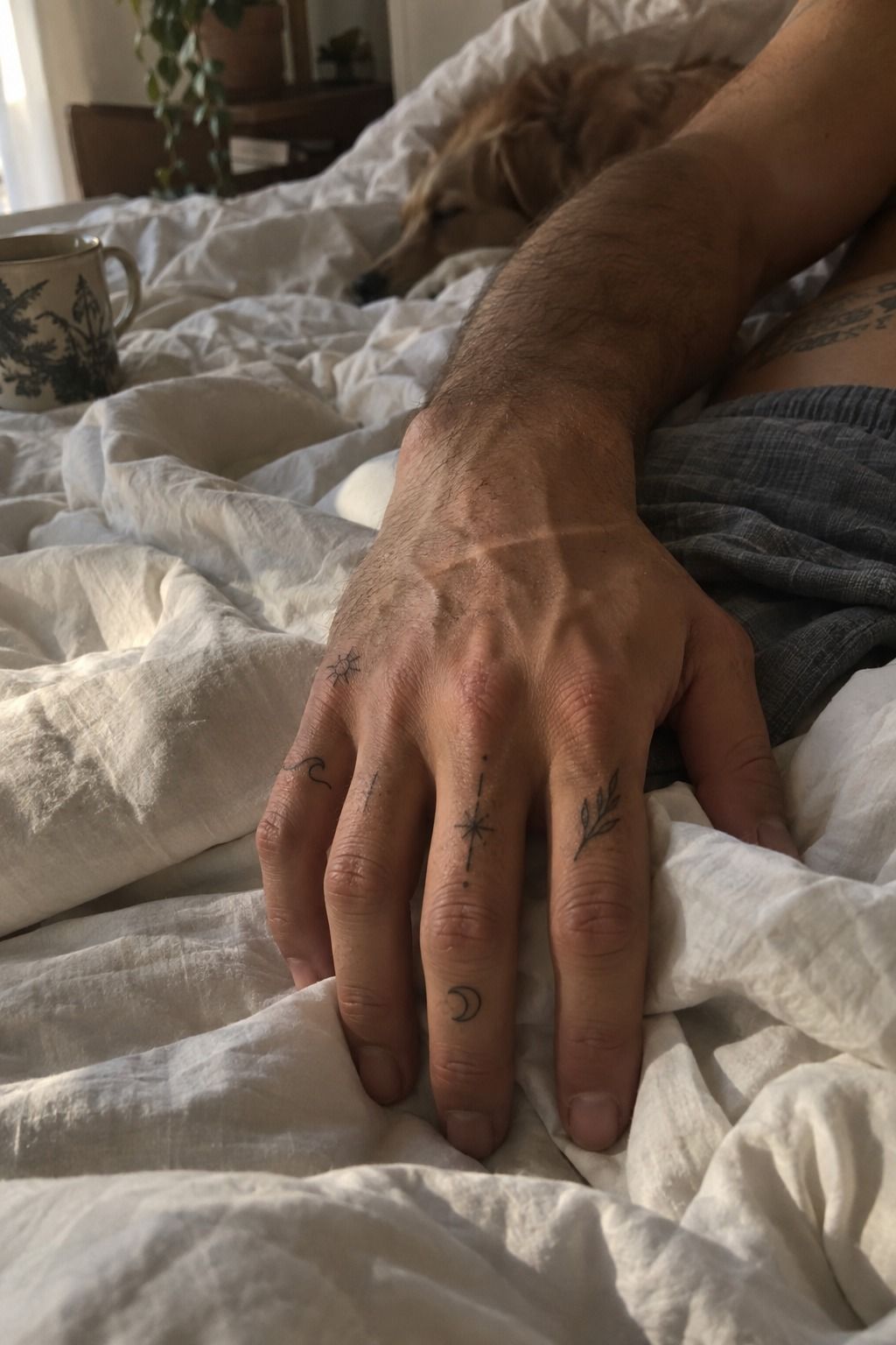
A knuckle set can feel bold without becoming heavy when every finger carries one compact mark. Think of the design as a sequence rather than four identical stamps.
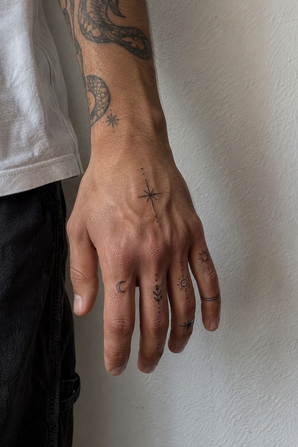
The best knuckle symbols have varied shapes but a shared visual language. A diamond, a short vertical line, and a tiny star can feel connected without looking mechanical.
Selective fill creates contrast. Use solid black ink only where a symbol needs weight, then let fine outlines handle the lighter marks.
Stencil placement deserves patience because the skin shifts around every joint. A relaxed stencil can reveal whether the marks stay centered when the fingers spread, curl, and rest naturally.
Finger length changes the rhythm of the set. Before booking, browse these small finger tattoos for ideas, then adapt the spacing to your own hand instead of copying a reference exactly.
Visibility is part of the decision. Knuckle placement is expressive and edgy, but it won’t disappear during work, family photographs, or ordinary errands.
3Let Handwritten Script Travel the Side
Short script can look romantic along the side of the hand because the lettering has a natural horizontal path. A name, date, or single word often carries more emotional force than a crowded sentence.
Choose handwritten lettering with enough width between characters to survive healing. Tiny loops may look graceful in a fresh photograph, then close into an unreadable line.
A slightly taller letter height usually serves the design better than an ultra-small phrase. I’d rather see a clear word with fewer flourishes than an ornate line that becomes tangled.
The side of the hand offers length, but it still experiences bending, rubbing, and frequent washing. Side-of-hand placement works best when the phrase stays short and the baseline remains confident.
Read every letter slowly before the stencil goes on. If you’re considering a personal name or date, inspect the spelling twice and compare it with other small hand tattoos for women.
The strongest script feels timeless because it sounds like you, not because it follows a trend. Skip flourishes that cross through several letters unless the artist has healed examples in that exact style.
4Reduce an Animal Portrait to One Gesture

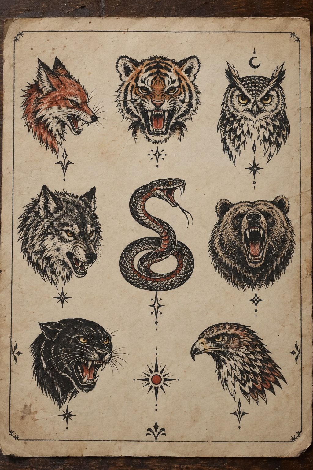
A miniature animal portrait becomes more expressive when it captures one unmistakable gesture instead of trying to reproduce every feature.
Think about the tilt of an ear, the curve of a nose, or the posture of a tail. That single animal gesture can carry more personality than a tiny face packed with shading.
The face needs breathing room. A simplified fine-line muzzle or eye shape may remain clearer over time than a realistic portrait with microscopic fur marks.
I’d choose the animal first, then decide how much detail the available skin can support. A fox, bird, cat, or hound can all become recognizable through silhouette alone.
A good consultation should include healed examples at a similar scale. Fresh ink can look polished and precise, but healed work shows whether the artist understands how small marks settle.
If you want more references, explore these small tattoo designs with an eye for silhouette, spacing, and the amount of untouched skin around each portrait.
5Map Fine-Line Stars Across the Fingers
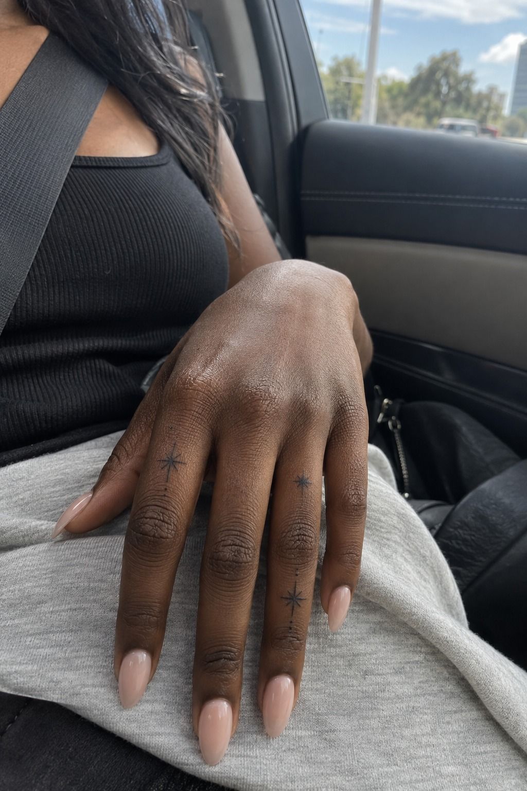
Stars can feel ethereal when their sizes change gently across the fingers. The design gains energy from spacing, not from filling every available gap.
Start with star spacing before adding dots or tiny orbit lines. If every mark sits too close together, the constellation may lose its crisp identity as the edges soften.
A larger star near the hand can anchor several smaller points toward the fingertips. This creates a clear visual path without forcing every symbol into the same angle.
Use black linework confidently enough that the points remain distinct. Timid, overly thin marks can disappear sooner than a clean line with a little more presence.
Skin tone affects contrast, but it doesn’t dictate one single approach. A thoughtful artist can adjust saturation, spacing, and scale while preserving the design’s delicate character.
Look at healed work on skin tones similar to yours. Fresh photographs tell only part of the story, while healed examples reveal how the stars actually age.
Sun exposure matters too. A practical touch-up plan should account for fading, placement, and how often your hands are outside.
For additional placement references, browse these small finger tattoos before deciding whether the stars belong on the fingers, side of the hand, or closer to the wrist.
6Use Thumb Placement for Bold Blackwork
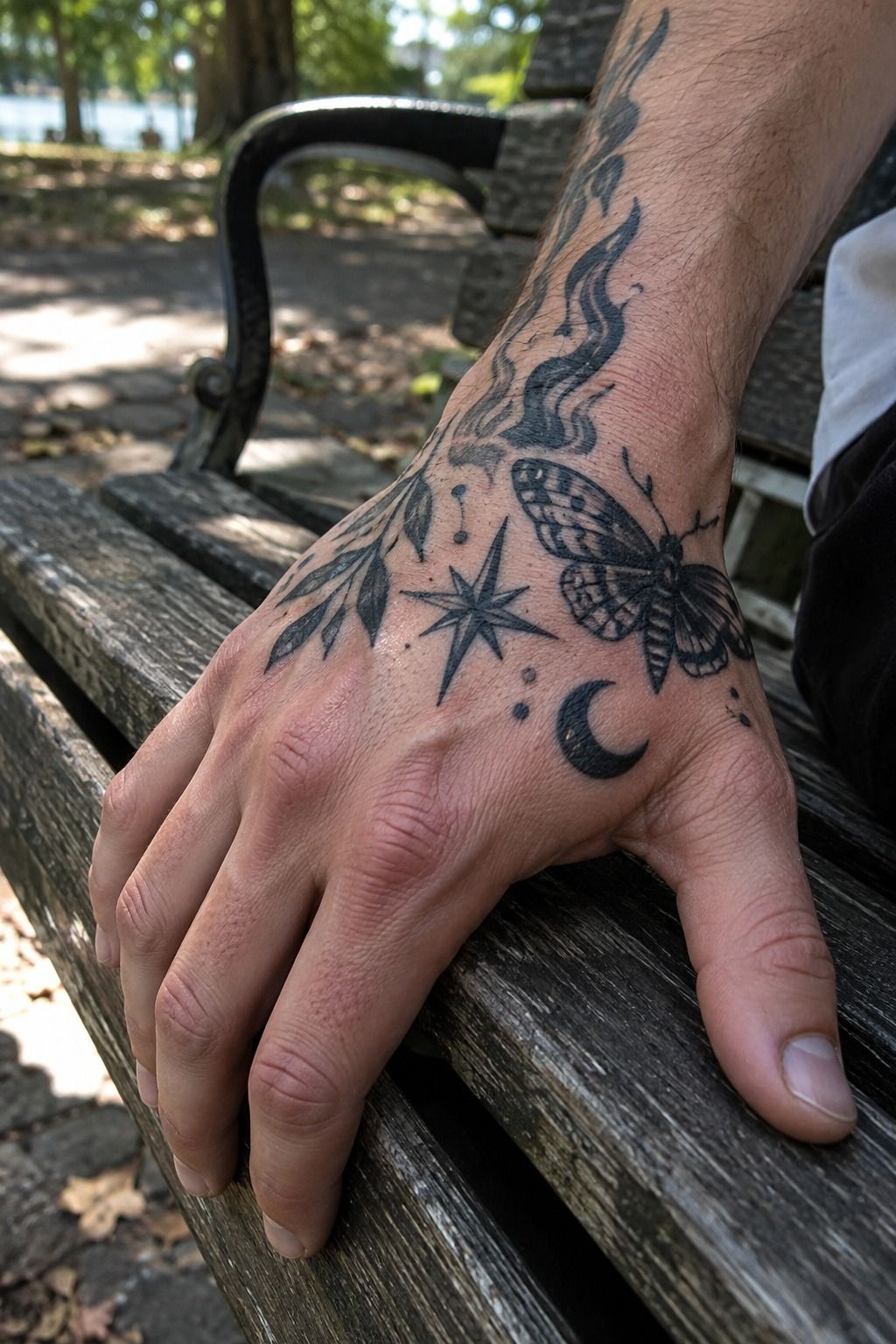
The thumb area can support a fierce symbol because it has enough visual presence for saturated blackwork without demanding a large composition.
A compact crescent, flame, animal mark, or abstract shape can feel powerful when its outer edge stays clean. The design shouldn’t need ten separate details to make its point.
I like thumb placement for people who want visible ink with a little more flexibility than a knuckle set. The hand still reveals it, but the symbol can read as one complete gesture.
Saturated areas need careful proportions. A bold symbol may look tiny on paper, yet become dominant once placed beside the fingers and thumb joint.
Leave a clear border around the blackwork. That margin keeps the mark sharp and prevents it from merging visually with nearby creases.
A fierce design can still be understated. The most successful blackwork often uses one strong shape, one clean edge, and no unnecessary filler.
If you’re weighing visibility, compare the thumb with other small hand tattoos for women and masculine or neutral references. Placement matters more than the label attached to the idea.
7Follow Natural Hand Lines with Florals
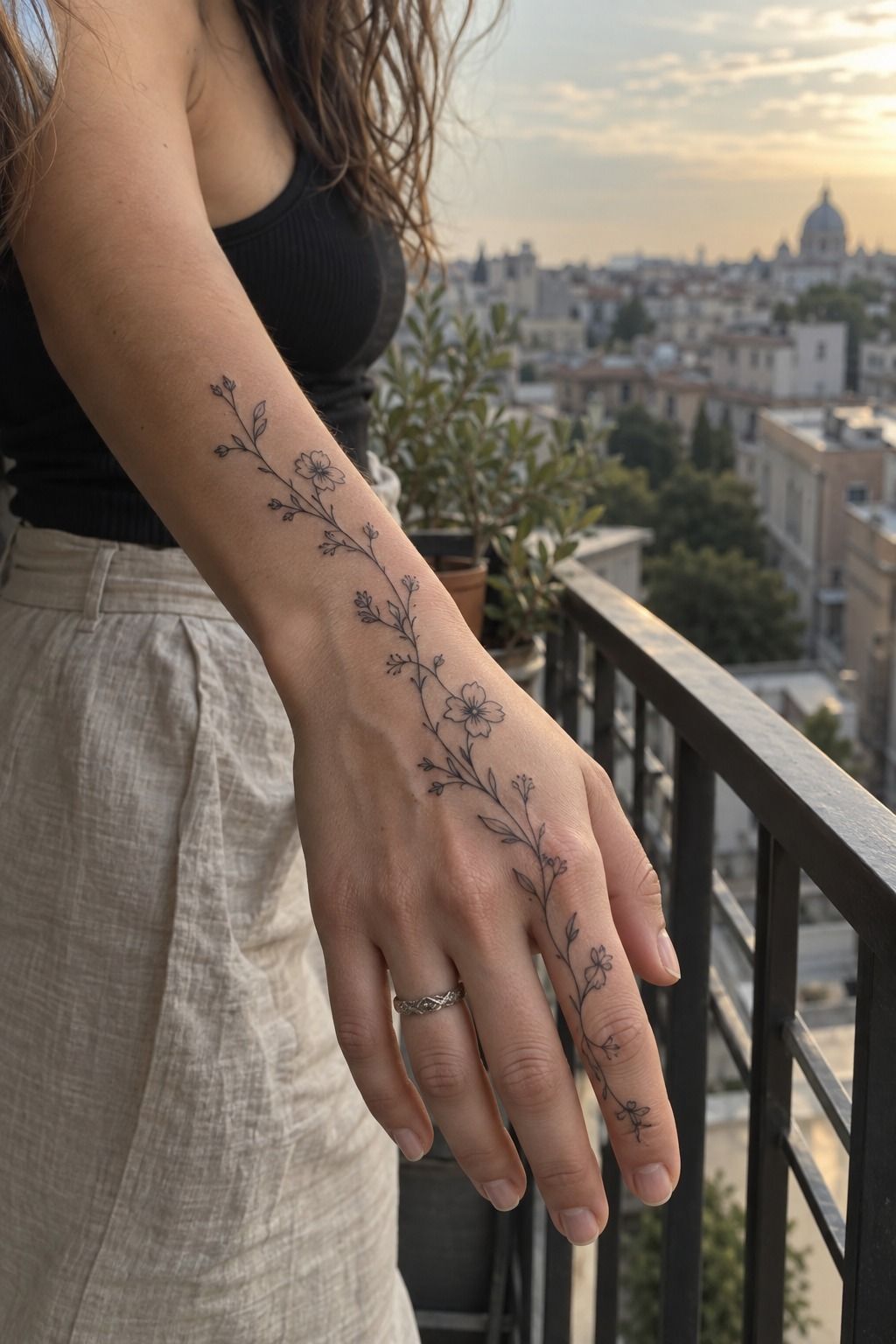
A wildflower sprig can feel graceful when the main stem follows a natural line of the hand. The flower should appear to move with you rather than sit rigidly across the skin.
Choose a wildflower sprig with a clear direction. A stem angled toward the wrist, thumb, or fingers will usually feel more deliberate than one floating in the center.
The most readable petals are often simplified. Botanical linework with visible gaps can age more cleanly than dense shading squeezed into every bloom.
I once chose too many tiny petals for a floral design, and the healed result lost the sharpness of the original sketch. That experience made me much more protective of open skin.
Color can work, but it should support the shape. A restrained red accent may look vibrant, while several competing pigments can make a small flower harder to read.
A meaningful flower doesn’t need a long explanation. Choose one connected to a season, memory, or person, then keep the composition small enough that your hand still looks like your hand.
For more floral references, compare the relevant small tattoo designs and focus on healed petals rather than fresh color intensity.
8Start a Playful Collection Between the Fingers
Tiny marks between the fingers can feel whimsical because each one appears unexpectedly when the hand moves. A dot, lightning shape, miniature heart, or small letter can become a private group of symbols.
The best between-finger marks are simple enough to survive a difficult placement. They don’t need intricate borders or several layers of shading to feel personal.
Use consistent proportions across the set. A needle grouping suited to the marks may help, but the design still needs enough room to avoid looking microscopic.
Between-finger skin bends constantly and meets plenty of friction. A mark that seems dainty on paper may need slightly more scale than you first imagined.
Two or three symbols usually feel more polished than a full set squeezed into every gap. I wouldn’t copy someone else’s exact arrangement because finger length and crease patterns change the balance.
A playful collection doesn’t have to feel childish. Choose symbols that still mean something after the first burst of excitement fades.
If this would be your first tattoo, read the practical notes in these small finger tattoos before committing to a placement that stays visible while it heals.
9Choose One Color Accent
A single red mark can look daring when it has enough open skin around it. A heart, star, line, or small symbol often feels more intentional than a crowded multicolor arrangement.
Start with the shape, then choose the color. Red ink should strengthen the symbol rather than become the entire reason for choosing it.
Healed saturation varies with placement, skin, sun exposure, and individual healing. A red pigment consultation should include comparable healed work, not only fresh photographs.
I wouldn’t mix several bright colors into a tiny hand tattoo. One accent can feel vibrant and raw without competing with the design’s main silhouette.
Color needs protection after healing. Once the surface has settled, follow practical advice about sunscreen and exposure rather than assuming a bright fresh result will stay unchanged.
A color accent can look feminine, masculine, classic, or completely neutral depending on the mark. The symbol carries the meaning; the pigment only changes its temperature.
For planning costs and options, compare the information in this small tattoo prices guide before choosing an elaborate color treatment.
10Let Negative Space Do the Work
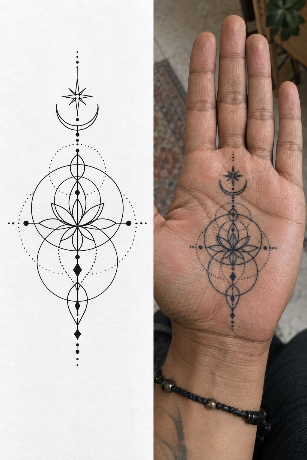
Negative space is not an absence of design. In a small hand tattoo, it can be the element that keeps every line crisp and every symbol recognizable.
Leave visible gaps between petals, stars, letters, or geometric edges. Open spacing gives softened lines somewhere to remain distinct as the tattoo settles.
The hand already contains natural breaks through creases and joints. A smart design uses those breaks instead of covering them with extra detail.
I’m especially cautious with tiny circles inside larger shapes. A clear central shape usually ages better than a geometric mark filled with multiple nested lines.
A meaningful tattoo doesn’t need to prove its complexity. Minimal can still feel iconic when the silhouette is strong and the placement is intentional.
Before adding filler, look at the design from arm’s length. If the main mark already reads clearly, the extra dots may only create visual noise.
This is where references such as small tattoo designs can help. Notice how the strongest examples use untouched skin as part of the composition.
11Test Placement in Motion

I always test a hand tattoo in three positions: relaxed, curled, and gripping something. The hand position test reveals whether a symbol tilts, disappears into a crease, or suddenly feels too large.
Take a photograph from each angle. A design that looks sleek with the palm flat may become distorted when the thumb crosses the fingers.
Check the wrist angle as well. A wrist-facing placement can make a mark easy for you to see, while a side-facing design may be more visible to other people.
Consider how often the area meets soap, sunlight, fabric, and friction. A personal idea still needs a practical location if you want its understated character to last.
Move slowly during the stencil review. Bend, grip, relax, and turn the hand before deciding that the placement works.
For a wider comparison of hand and finger positions, look through these small hand tattoos for women and adapt the references to your own anatomy.
12Match Line Weight to the Design
Line weight should serve the symbol, not compete with it. A sharp outline may suit a geometric mark, while a softer botanical idea may need a lighter, more delicate approach.
The thinnest possible line is not automatically the best line. A readable mark needs enough presence to remain visible after the skin has healed.
Large contrast changes can make a small composition feel uneven. Keep the main outline clear, then reserve the finest lines for details that truly need them.
Skin tone, placement, and personal healing all affect the final appearance. Ink saturation should be discussed through healed examples instead of guessed from a screen.
A graceful design can still have a little edge. I like an expressive line that looks confident at arm’s length rather than one that disappears in pursuit of extreme minimalism.
If you’re comparing styles, use small tattoo designs to study the relationship between line weight, empty skin, and scale.
13Plan for Visibility and Healing
Hands are exposed, and that changes the commitment. A visible tattoo may appear in photographs, interviews, family gatherings, and everyday conversations even when you haven’t planned to show it.
Think about your work, your comfort with questions, and whether you want the design facing you or facing outward. This isn’t about fear; it’s about choosing with clear eyes.
Healing also deserves realistic expectations. The surface may settle in a few weeks, while deeper skin continues recovering longer. That healing timeline can vary by placement, size, color, and individual response.
Follow the aftercare guidance provided for your tattoo. Gentle washing, appropriate moisturizing, and avoiding unnecessary sun or swimming during recovery are sensible basics.
The FDA’s consumer guidance on tattoo inks and permanent makeup is worth reading when you want a broader view of ink safety, contamination concerns, and the importance of choosing a reputable professional.
A responsible aftercare plan won’t guarantee a perfect result, but it gives the skin a better chance to recover without avoidable irritation.
Price matters, though it shouldn’t be your only filter. Small work may still meet a studio minimum, and a low quote won’t help if the design needs correction later.
A small hand tattoo range can shift considerably between cities and artists. Use this small tattoo prices reference while comparing quotes, then confirm what the fee includes.
I’d rather wait for the right artist than squeeze a meaningful symbol into a rushed appointment. A clear consultation should cover scale, placement, healing, and realistic limitations.
When a Touch-Up Makes Sense
A touch-up can restore a faded edge, but it can’t rescue every overcrowded design. I’d first consider whether the issue came from placement, healing, sun exposure, or too much detail in the first tattoo pass.
Wait until the skin has fully settled before judging the result. A tattoo can look uneven while it is still recovering, then become much clearer after the surface calms.
If a line remains inconsistent after complete healing, return to the original artist or seek someone with a strong healed portfolio. The goal is correction, not automatically adding more ink.
A good touch-up plan respects the original design. More saturation isn’t always the answer, especially when the problem is crowding or movement around a joint.
The Meaning Should Survive the Trend
A trend can still be personal if it connects to your life. I’m more interested in the story behind a tiny mark than whether it is currently popular online.
A symbolic tattoo gains staying power when you would choose it without an audience. Meaning doesn’t have to be dramatic; it can belong to a person, place, memory, or private promise.
Ask yourself whether you’d still want the design if nobody else saw it. If the answer is yes, you’re probably closer to the right idea.
Personal style can be classic, vintage, minimal, or ornate. The category matters less than whether the design feels honest when it sits on your hand.
What I’ve Learned About Choosing Small Hand Tats
I’ve become more careful with hand tattoos because the smallest design still has to survive movement, washing, sunlight, and ordinary friction. A reference can look fresh and crisp because it was photographed minutes after the appointment. The healed tattoo is the real test.
The first question I ask is whether the design has enough open skin. Fine-line work needs breathing room, especially across fingers and creases. If every leaf, star, or geometric line is packed tightly together, the tattoo may lose its sharp character as the edges soften.
I also consider the artist’s relationship with the specific style. Someone who makes excellent saturated blackwork may not be the right person for tiny handwritten script, and a fine-line specialist may not be the best choice for dense palm work.
Look for an artist’s healed portfolio, close-up photographs, and examples that resemble your preferred scale. Fresh appointments can be beautiful, but healed work tells you whether the artist understands restraint.
I want the consultation to feel honest. A good artist will explain line weight, placement, and healing without making guarantees or pretending every idea will age identically.
The personal meaning still comes first for me. A small mark can be empowering, sacred, or quietly haunting without looking dramatic to anyone else.
If you’re comparing ideas, use these small tattoo designs as a starting point, then remove details until the central shape still feels complete.
Cost matters, but it shouldn’t be the only filter. A studio minimum may apply even when the tattoo takes only a short appointment, and a low quote won’t help if the design needs correction later.
If you’re choosing between fingers, knuckles, the thumb, or the palm, think about visibility and discomfort. Hands, feet, ribs, and sternum are often more sensitive, while the forearm, thigh, and shoulder tend to be more tolerable.
The most elegant placement is the one you can live with comfortably. It should suit your movement, your work, your pain tolerance, and the amount of attention you want the tattoo to receive.
A careful consultation can prevent many regrets. Bring references, explain what you love about them, and stay open to reducing the design if the scale demands it.
Your surface may look healed in two or three weeks, but complete healing can take longer. Follow your artist’s aftercare instructions, wash gently, moisturize as advised, and avoid unnecessary sun or swimming while the tattoo recovers. Good ink rewards patience!
The Questions I Get Asked Most
How much does a small hand tattoo usually cost?
A small hand tattoo often costs about $100 to $300 in the US, though a shop minimum may run about $50 to $100. The final price depends on the artist, region, placement, color, and detail. This small tattoo prices guide can help you compare general ranges.
Are small hand tats a good idea for a first tattoo?
They can be, provided you’re comfortable with visible ink and a sensitive placement. A first tattoo should be simple enough to heal clearly, but hands require realistic expectations about exposure, fading, and possible touch-ups.
How do I choose an artist for small hand tats?
Choose an artist with healed hand tattoos, clean close-ups, and experience with your preferred style. Look for consistent lines, readable spacing, and healed results on skin tones similar to yours. A thoughtful portfolio matters more than a dramatic appointment photograph.
How much do small hand tats hurt?
Pain varies, but hands can feel sharper than areas with more padding because of their bones, joints, and sensitive skin. Feet, ribs, hands, and sternum are often uncomfortable, while the forearm, thigh, and shoulder tend to be easier for many people.
How long do small hand tats take to heal?
The surface often settles in about two to three weeks, while complete healing may take two to three months. Wash gently, moisturize according to your artist’s instructions, and avoid unnecessary sun and swimming during recovery.
What’s the best placement for small hand tats?
The best placement depends on visibility, movement, pain tolerance, and design. The side of the hand can suit short script, the thumb can support a bold symbol, and the fingers can hold tiny marks when the spacing is generous.
Where I’d Start First
If I had to pick one, I’d start with tiny botanical linework. It feels personal, it can follow the hand without crowding the creases, and the open spacing gives the design a better chance of staying readable.
I’d compare a tiny botanical linework idea with the references in these small tattoo designs before booking. Keep the stem simple, protect the negative space, and choose an artist whose healed work makes you want the same mark on your own hand. Keep it personal!