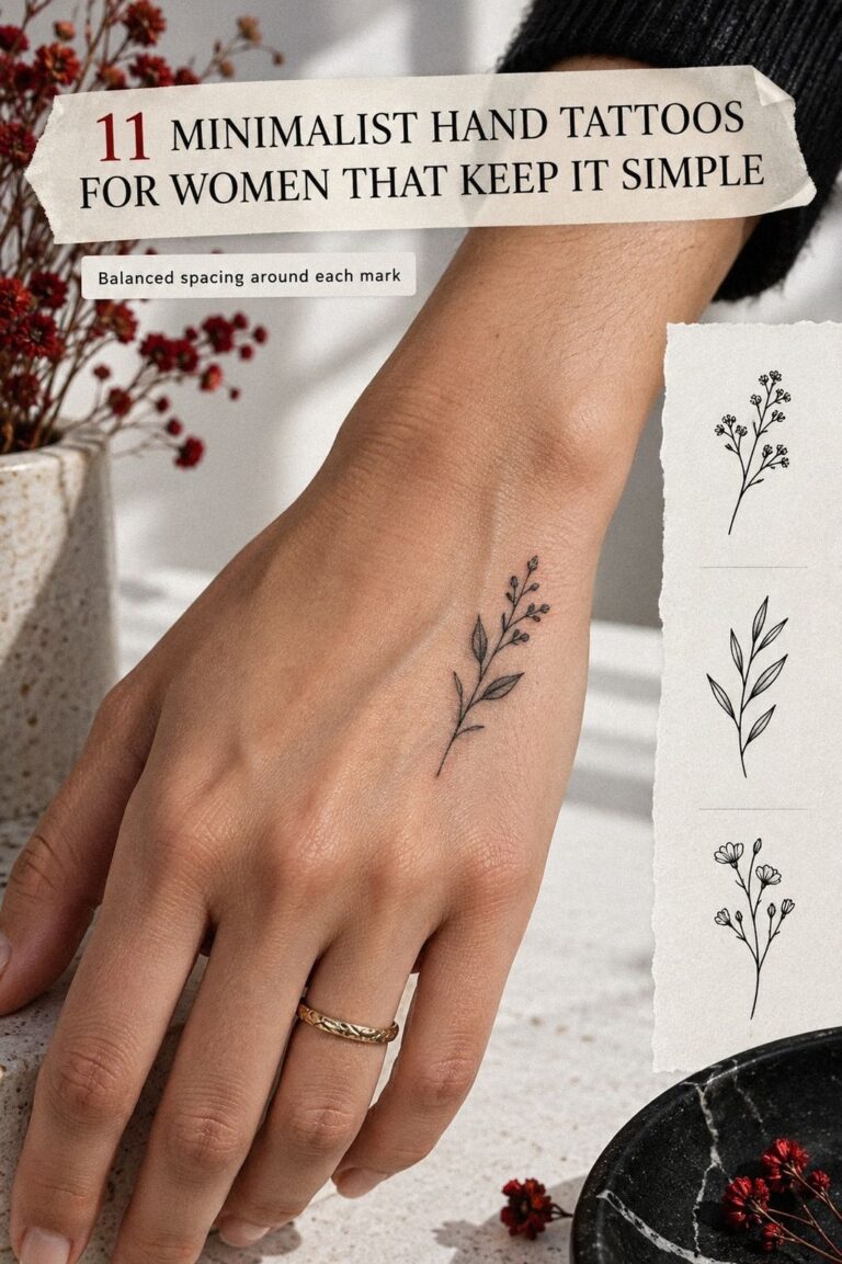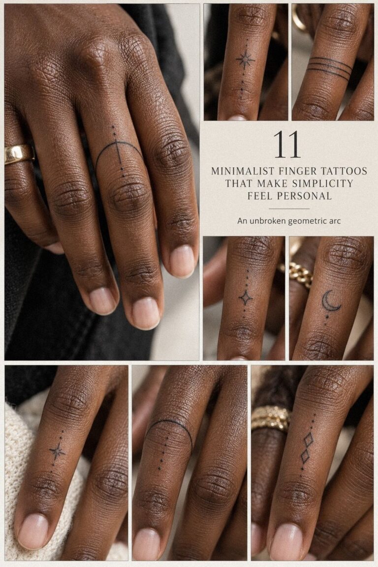
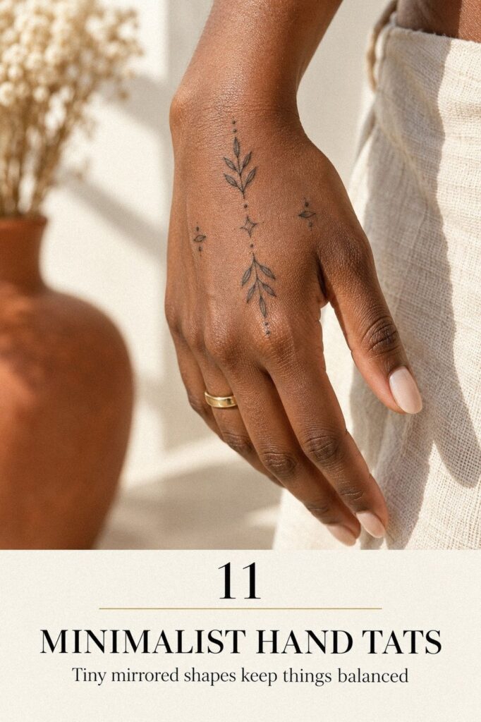
Minimalist hand tats can look crisp for years, but only if you choose the placement before the picture. I learned that after sketching a tiny star where my knuckle bent constantly. Start smaller, check movement, and give your artist room to make the linework breathe. Your first decision matters most!
Why Hand Placement Changes the Decision
Your hand is visible, active, and constantly exposed to friction. A hand placement that looks striking in a saved photo may feel awkward when you grip a cup, type, wash your hands, or curl your fingers.
Choose the location before you polish the artwork. That one change can improve the value of your idea, protect your budget, and keep you from forcing a meaningful symbol into the wrong space.
Before You Start: The Three-Check Rule
Before you book, run your idea through three checks: meaning, movement, and visibility. Ask yourself whether the symbol still feels personal meaning when you see it without the excitement of a new tattoo.
Then bend your fingers, grip a cup, and look at your hand from the side. If your design disappears into a crease, you’ll want another placement.
Your hand is a high-contact area, so your reference should show clean spacing and a design close to the scale you want. A 0.5-inch star won’t read like a 1-inch botanical mark. Save several small hand tats examples, but don’t copy one blindly.
Use this as a practical starting table. These are typical US reference points, not a studio quote.
A small hand tattoo can still be symbolic, timeless, and quietly empowering. It doesn’t need to be dramatic to carry real meaning.
A Practical Cost Check
The cost is only one part of the decision. Ask what you’re receiving for the price: careful sizing, clean stencil work, healed examples, and an artist who understands how hand skin behaves. A slightly higher quote may offer better long-term value than the cheapest available appointment.
Set a realistic budget before you fall in love with a design. If the tattoo is worth it, you’ll want enough room for a consultation, a possible touch-up, and proper aftercare. Good decisions begin with clear numbers!
- Start with Tiny Botanical Hand Linework
- Can One Symbol Carry Enough Meaning?
- Place Crisp Script Along the Hand Edge
- The Knuckle Grid
- Matching Symbols vs. Mirror Copies
- Choose Negative-Space Hand Motifs
- Sketch Flowing Wrist Lines Instead of Hard Stops
- Test Bold Blackwork vs. Fine Linework
- Skin Tone, Line Weight, and Scale
- Is Hand Tattoo Pain Worth the Trade-Off?
- Protect Fresh Ink Through Healing
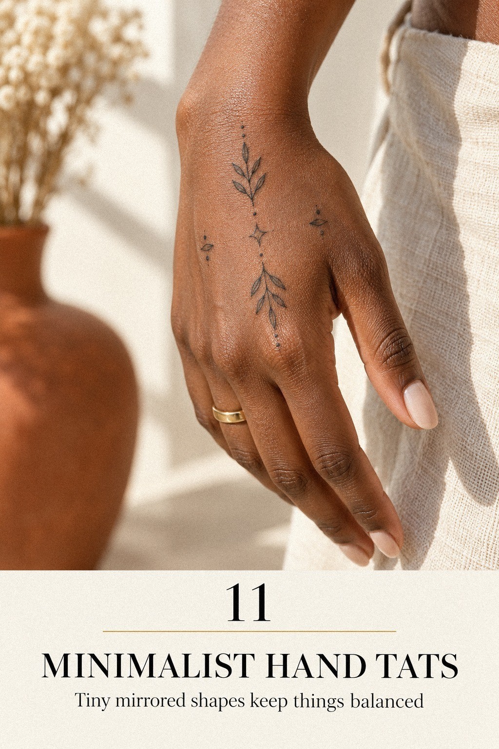
1Start with Tiny Botanical Hand Linework
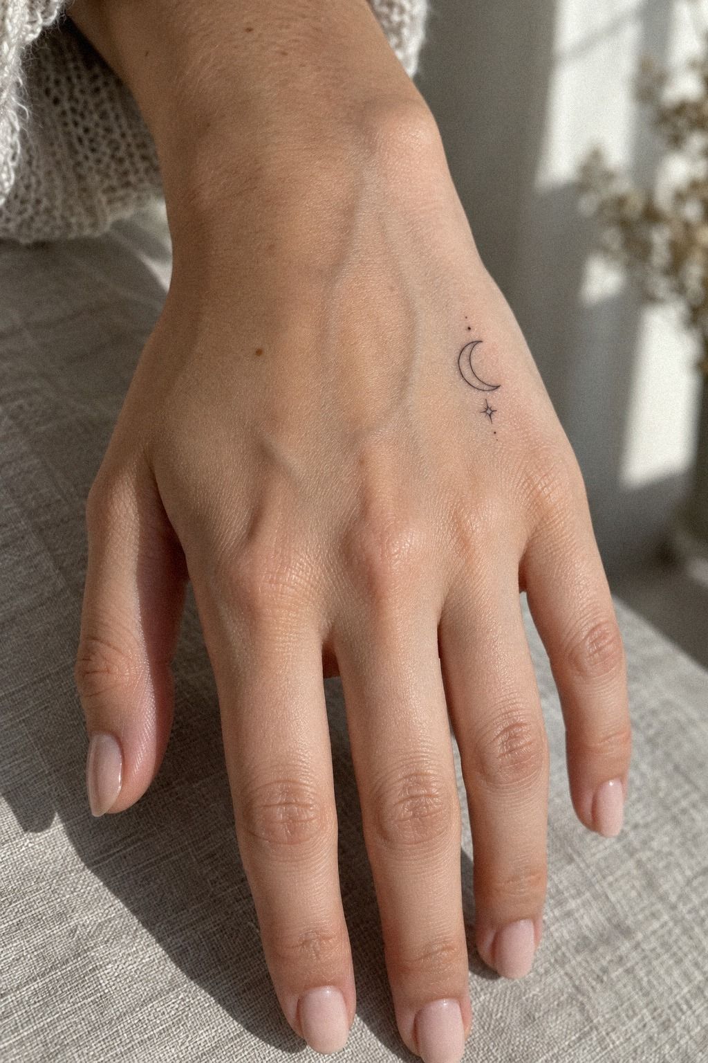
Begin with the smallest idea that still has a recognizable shape. Three or four marks, placed with intention, can look more delicate than a full sprig packed into one spot. Compare the scale and spacing in these small tiny hand tattoos before you settle on a cluster.
Ask your artist to sketch the design directly on your hand before any stencil is applied. You’ll notice whether the stars sit comfortably beside your thumb joint or drift toward a crease. I’d skip a dense leaf bundle because tiny interior gaps can blur with movement and daily friction.
For scale, think in inches rather than vague words like “tiny.” A design around 0.5 to 1 inch may suit a small hand placement, but your artist should judge the actual anatomy. Your knuckle width, finger length, and skin texture all change the result.
A soft black star beside a warm-gray botanical dot can feel whimsical without becoming childish. Keep the open skin intentional, and make sure the design still has value when viewed from a normal distance.
2Can One Symbol Carry Enough Meaning?
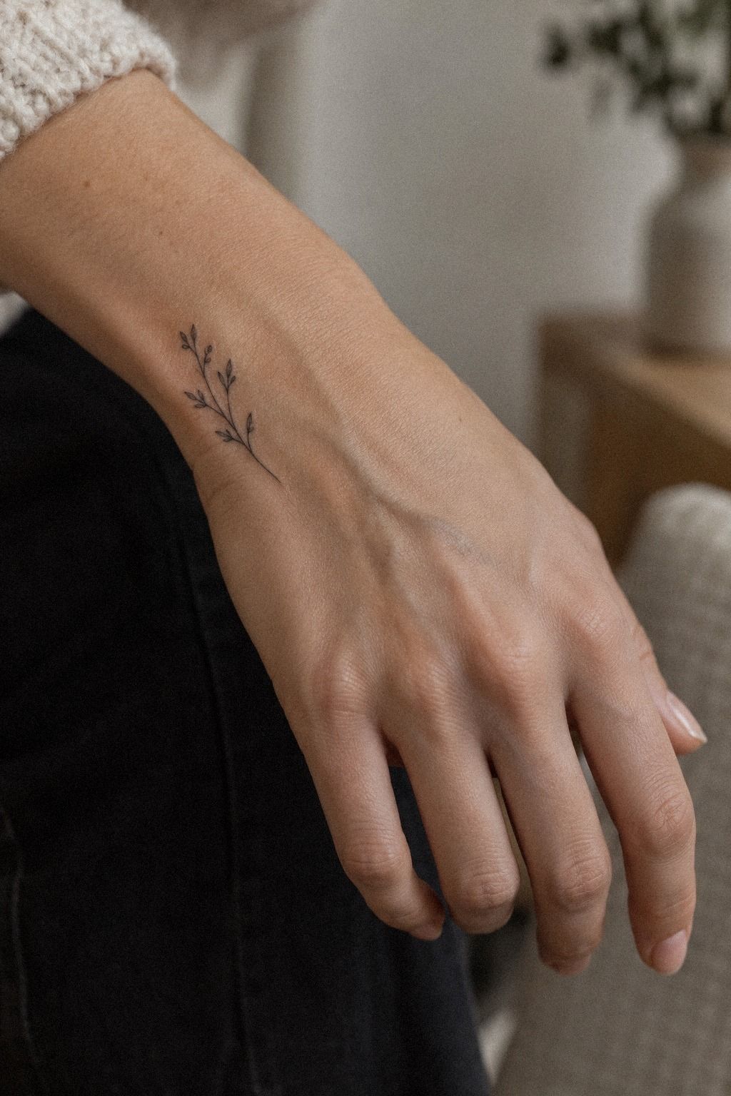
Choose one symbol first, then decide whether it deserves a finger. A tiny crescent, initial, or botanical sign can feel meaningful when you can explain it in one sentence. If the idea needs a long explanation, the outline may need to become simpler.
Your finger moves constantly, touches water, and meets friction from pockets, handles, and phones. I’d avoid intricate interior detail in this spot because the design may need more room than you expect. A crisp black ink symbol with one strong contour usually reads more clearly than a miniature scene.
Before booking, write down the symbol’s private meaning and its public appearance. You’ll want both answers. If you’re choosing a family mark, check whether it still feels personal without the story attached.
A washable-pen test can reveal more than a saved photo. Wear it for a day, wash your hands, and see whether your eye keeps returning to it. For more ideas, browse minimalist hand tattoos for women, then bring your own interpretation to the consultation.
3Place Crisp Script Along the Hand Edge
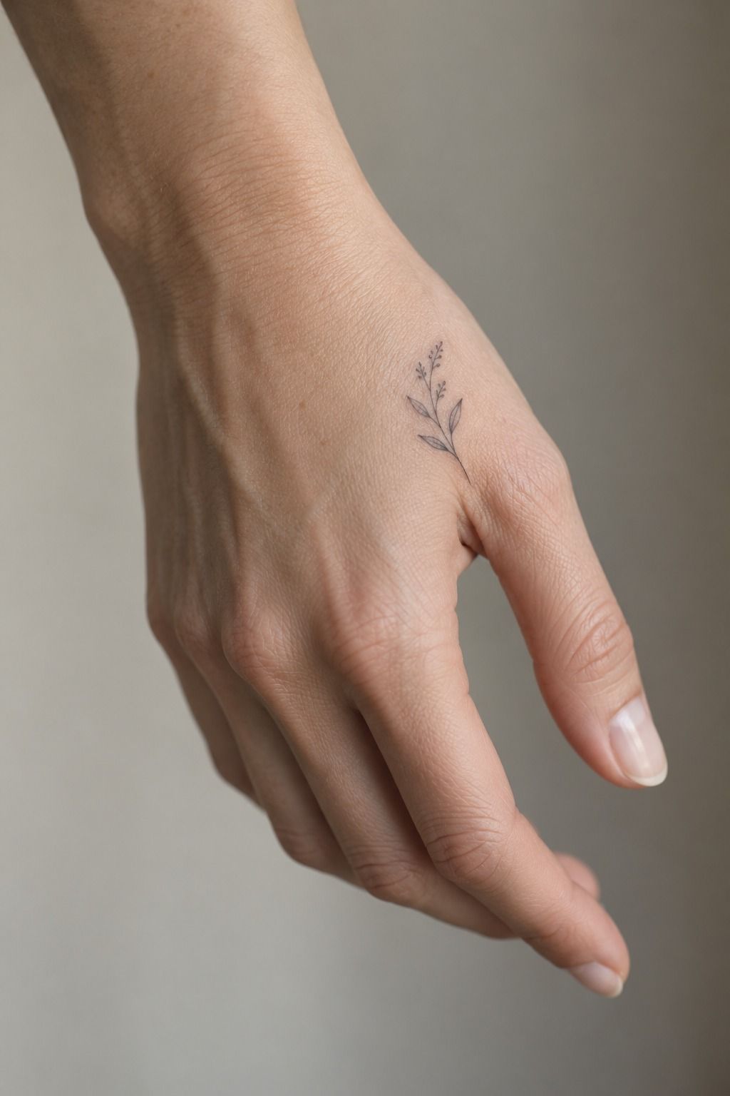
Keep script along the hand edge only when the lettering can stay open and legible. You’ll need enough room between letters for the phrase to remain expressive, not turn into a dark stripe.
Ask your artist to print the phrase at several sizes and hold each version against your hand. A one-word design may need more width than you think, especially if the letters include loops or thin crossbars. I’d skip a long quote on the side of the hand because it can make the placement feel cramped.
Choose a lettering style with a clear baseline and modest flourishes. A thermal stencil should show every letter without broken edges, and your artist can rotate your hand to check the phrase from more than one angle.
The best script feels sleek and understated, not like a paragraph squeezed onto skin. Try your phrase with a temporary marker first, then compare it with small side hand tattoos that use generous spacing.
4The Knuckle Grid
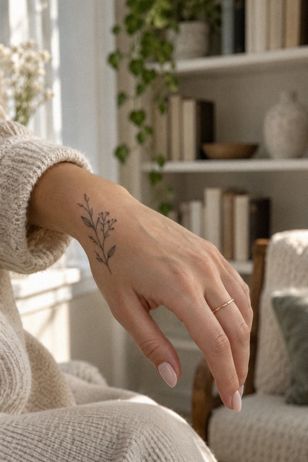
Treat the knuckles as a small grid, not four empty boxes.
5Matching Symbols vs. Mirror Copies
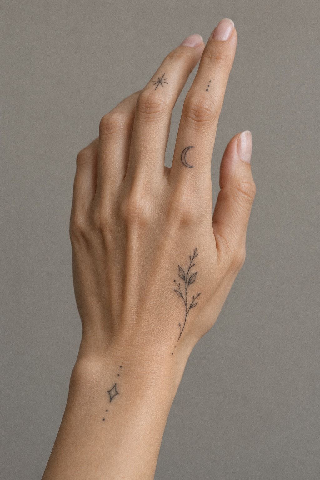
Matching symbols work best when they share an idea, not when they look mechanically duplicated. You might pair a tiny sun with a moon, two different leaves, or mirrored initials. The result can feel romantic when each symbol keeps its own personality.
Ask to see both symbols on paper at their intended size. A black flash drawing may look strong at full scale but lose clarity when reduced to the hand. Your choice should survive that reduction without heavy shading or miniature texture.
I’d skip perfect mirror images if your hands have different proportions. The result can look forced when you place the marks side by side. A slight variation often feels more playful and personal.
If you’re planning a pair with someone else, agree on the concept but let each person choose their own placement. Save the strongest pair from minimalist hand tattoo references, then leave room for personal differences.
6Choose Negative-Space Hand Motifs
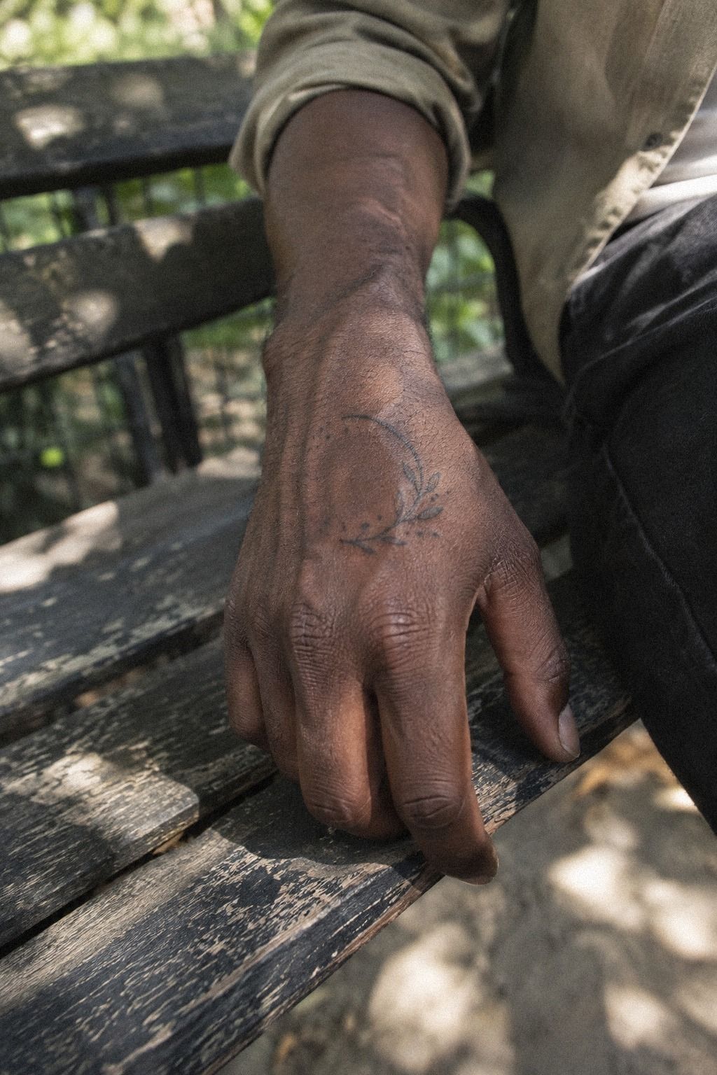
Use negative space as part of the drawing, especially on deeper skin tones where contrast and placement deserve careful attention. The open areas are not empty; they create the shape and give the motif a bold but controlled presence.
Ask your artist to show the design as a solid black outline on paper first. You’ll understand which parts will be ink and which parts will remain skin. I’d avoid pale ink to imitate empty space because untouched skin often creates the cleanest contrast.
Your artist should show healed work on a range of skin tones, not only fresh tattoos under bright studio lighting. A fresh blackwork stencil can look sharp, while the healed result may soften slightly.
A negative-space symbol can feel edgy, powerful, and raw without becoming oversized. If you’re unsure, draw the dark portions with a marker and wear the shape for a full day. More unique minimalist hand tats can help you compare open motifs before you settle on one.
7Sketch Flowing Wrist Lines Instead of Hard Stops
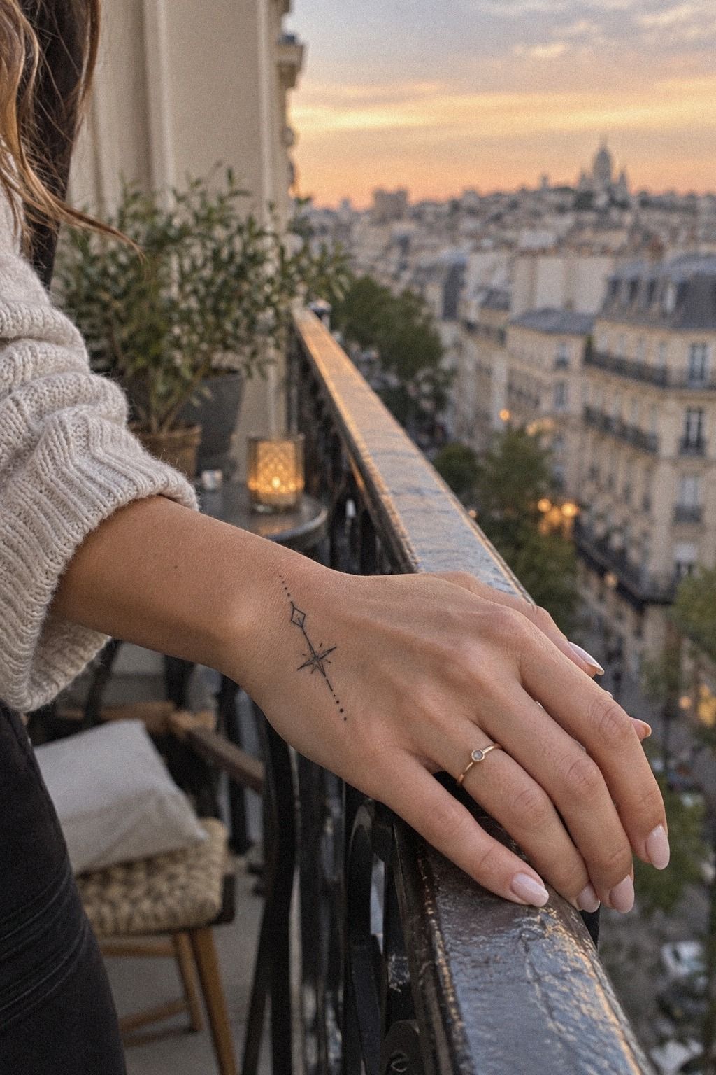
Let the line travel with your anatomy instead of stopping abruptly at the wrist.
8Test Bold Blackwork vs. Fine Linework
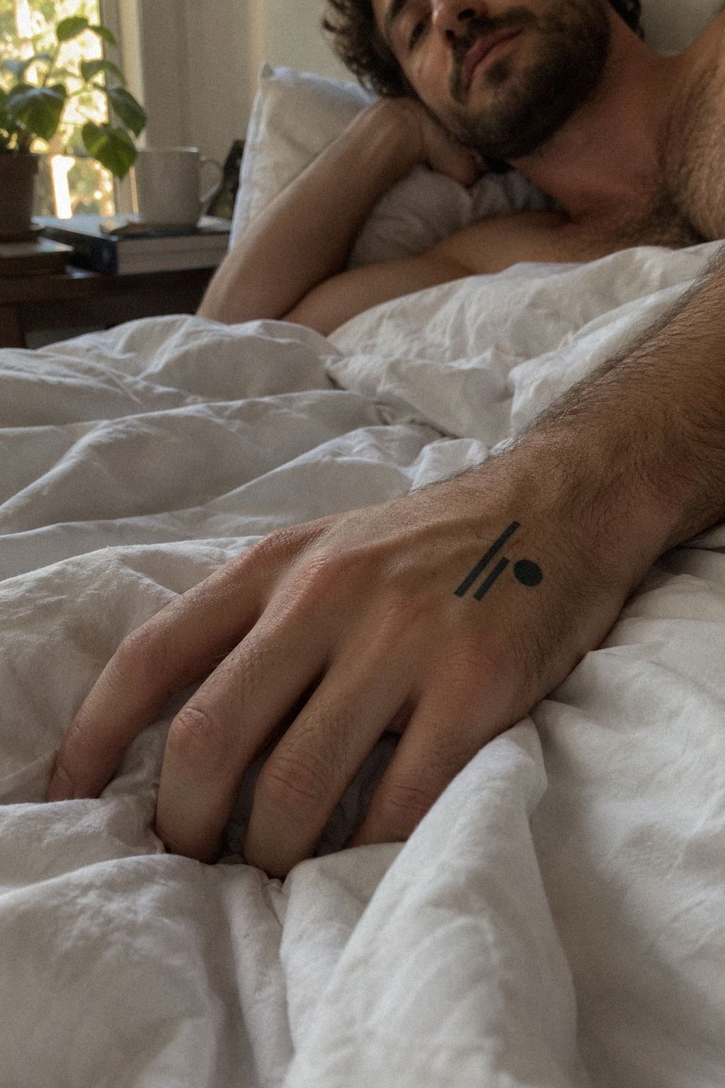
Try bold blackwork on paper and temporary skin before you decide it belongs on your hand. A heavier symbol can feel fierce, but it needs enough room to keep its edges readable.
Use a stencil at the exact size your artist recommends, then photograph it in daylight and indoor light. You’ll notice how a solid shape changes your hand’s visual balance. I’d skip filling a very small finger mark just because you want it to look strong.
Ask your artist whether a solid black fill or an outlined version suits the design better. Solid ink can age more clearly than extremely thin detail, but placement and aftercare still matter.
Bold doesn’t have to mean oversized. A compact, striking mark can be sharp and stylish when the edges have room around them. If you’re comparing styles, look through small hand tats for women and notice which designs remain readable from several feet away.
9Skin Tone, Line Weight, and Scale
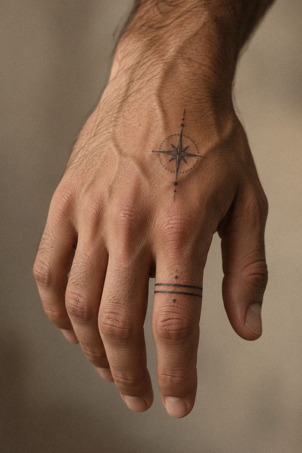
Choose fine linework by studying healed results on skin similar to yours, not by judging a fresh photograph. Hair-thin lines can look intricate and refined, but they need careful sizing and realistic expectations.
Ask your artist how the line may soften over time and whether the design has enough separation between details. You’ll want open gaps around tiny leaves, letters, or stars. I’d skip a miniature portrait on the hand because facial features usually need more room.
Your consultation should include ink density, placement, and sun exposure. A single-needle grouping may suit some details, while another design needs slightly more visual weight. Your artist should make that call from the drawing and your skin.
Fine linework can be minimal, delicate, and deeply personal when the composition is honest about scale. If a simple design feels too plain, add meaning through placement instead of stuffing in extra detail. Browse minimalist hand tattoos for women for spacing ideas.
10Is Hand Tattoo Pain Worth the Trade-Off?
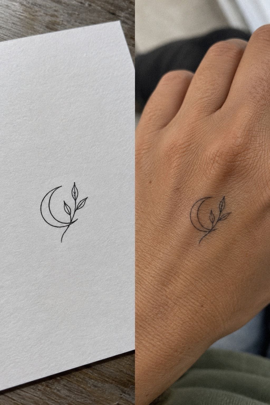
Plan for hand tattoo pain with honest expectations, not bravado. Hands, feet, ribs, and sternum are often more painful because they have less cushioning and more sensitive structures. Forearms, thighs, and shoulders are generally more tolerable for many people.
Bring water, eat beforehand, and wear clothing that lets your artist reach the area easily. A paper stencil can make the appointment feel more predictable because you’ll approve the placement before the needle begins.
I’d skip numbing products unless your artist specifically discusses them with you. Pain doesn’t make a tattoo more meaningful, and you don’t need to prove anything. A short appointment may still feel raw, intense, or surprisingly manageable.
You can ask for a pause. That’s part of a professional session, not a failure. If the cost, discomfort, or visibility no longer feels worth it, you’re allowed to wait.
11Protect Fresh Ink Through Healing
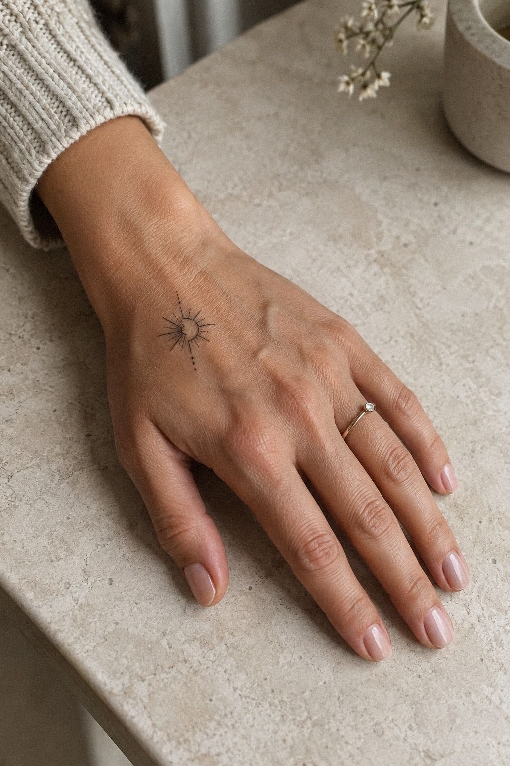
Treat fresh hand ink gently during the first few weeks.
Questions Worth Asking Your Artist
Ask how the design will be adapted to your knuckles, creases, and skin texture. A portfolio of healed work can tell you more than a page of fresh appointments.
Also ask about minimum pricing, touch-ups, hygiene, stencil approval, and realistic line weight. Clear answers help you judge the value of the appointment before you commit your budget.
What I Learned Before Choosing a Hand Tattoo
I used to think the hardest part was finding a symbol I liked. It wasn’t.
The harder decision was admitting that a design could be meaningful and still be wrong for a particular crease, finger, or work routine. I’ve seen people fall in love with a reference, then discover that its charm depended on a scale their hand couldn’t support.
My strongest rule is simple: choose the placement before you polish the artwork. That order keeps you from squeezing a favorite symbol into an unsuitable space.
Your hand has movement, texture, and daily contact that a flat screen doesn’t show. A healed tattoo portfolio tells you more than a page of fresh studio shots.
I also changed my mind about boldness. I once assumed a finer line would always look more sophisticated, but extremely thin marks can lose their quiet clarity if the spacing is too tight. A slightly stronger line may be the more timeless and polished choice.
Then there’s meaning. I don’t believe every tattoo needs a dramatic story, but I do think you should know why your hand is the right place.
Your hands are visible during ordinary moments, from signing your name to holding a train rail. A small symbol can become sacred through repetition, not spectacle.
If you’re still torn, wait one week with the temporary stencil. Wear it through work, sleep, washing, and errands.
Notice whether you keep adjusting your hand to show it or forget it’s there. The second response is often more trustworthy.
A temporary stencil gives you evidence before permanence!
What People Always Want to Know
How much does a minimalist hand tats usually cost?
A minimalist hand tattoo usually costs about $100 to $300 in the US, depending on the artist, region, size, and placement. Some boutiques have a minimum of about $50 to $100, while hourly rates may run around $100 to $250.
Small hand tattoos can still meet a shop minimum. Review the studio minimum before you book.
Are minimalist hand tats a good idea for a first tattoo?
Yes, minimalist hand tats can work for a first tattoo if you’re comfortable with visibility and daily hand friction. A small, clear design gives you simple decision-making, but you should still review healed work and choose a placement that fits your routine.
How do I choose a tattoo artist for minimalist hand tats?
Choose an artist whose portfolio shows clean minimalist linework, healed photographs, and consistent spacing. Ask about hygiene, stencil approval, and hand placements specifically.
Your artist should explain what may soften over time and show work on skin tones close to yours. That portfolio has real long-term value.
How much do minimalist hand tats hurt?
Hands can hurt more than forearms, thighs, or shoulders because the area often has less cushioning and more sensitive structures. Your experience depends on the exact spot and session length. Eat first, bring water, and ask your artist for a pause if you need one.
Pain tolerance varies widely.
How long do minimalist hand tats take to heal?
The surface commonly heals in about 2 to 3 weeks, while complete healing can take about 2 to 3 months. Follow your artist’s aftercare, wash gently, moisturize lightly, avoid swimming during healing, and limit sun exposure after the skin closes. Your healing timeline may vary.
What’s the best placement for minimalist hand tats?
The best placement depends on visibility, movement, and the design’s size. The side of the hand suits short script or narrow symbols, while the upper hand may give a small motif more breathing room.
Compare small side hand tattoos before choosing. The right placement is worth it.
Can I design minimalist hand tats myself?
You can sketch the concept yourself, but a professional should adapt the final design to your anatomy, scale, and skin. Bring your drawing, test it with a temporary stencil, and let the artist adjust line weight so your idea remains readable after healing. That process protects the final tattoo design.
One Last Visibility Test
Hold your hand naturally while looking at the stencil. Check it from the palm side, the back, and the angle other people will usually see. A design can feel understated in one position and surprisingly visible in another.
Then test your normal routine. Type, open a door, carry a bag, and wash your hands. If the placement still feels right after those ordinary movements, you’ve gathered better evidence than a quick mirror check.
Where I’d Start First
If I had to pick one step, I’d start with the temporary stencil. You can test movement, visibility, and spacing before a permanent decision, and your hand will expose problems that a phone screen hides.
Wear it for a week, then book only if you still want the same mark. Your first tattoo should feel empowering, considered, and worth the commitment.