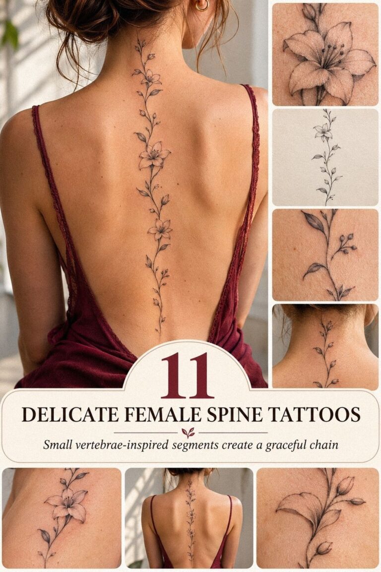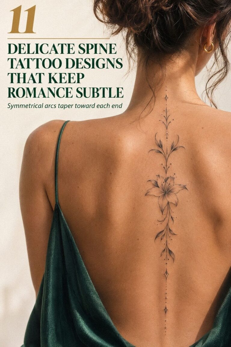
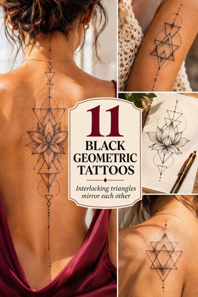
Black geometric tattoos can stay crisp for years when placement, line weight, and aftercare work together. I learned that after choosing a striking spine mandala, then watching its sharp angles settle without losing their shape. The process wasn’t flawless, but the result still feels personal, bold, and worth the planning!
Here’s what it looked like before:
Before the appointment, I had clear skin and too many saved references. I wanted something meaningful, but I didn’t want a crowded design that would blur into visual noise. My skin was untouched, the idea was still loose, and the final tattoo placement hadn’t earned its shape yet.
I kept returning to black geometric tattoos because the structure felt timeless. A clean circle, a balanced triangle, or a precise band can look expressive without relying on color. If you’re collecting references, these small geometric tattoos helped me compare scale and spacing before I committed.
The hardest part was accepting that the design couldn’t stay perfect on paper. Skin moves, bodies change, and every line has to live with that. I wanted an understated beginning, but I also wanted the finished piece to feel polished and unmistakably mine.
That negative space mattered more than I expected.
The Placement Trade-Off
A tattoo can be visually striking and still be the wrong choice for a moving part of the body. I compared the spine, forearm, ribs, ankle, and upper back before choosing a placement plan. Each area changed the way the geometry stretched, tilted, or caught attention.
The spine gave me a strong centerline, while the forearm offered easier visibility and a steadier surface. The trade-off was personal. I didn’t need the most visible option; I needed one that would keep the design readable and meaningful.
- I Chose a Spine Mandala
- I Tested the Forearm Placement
- Fine Lines or a Bold Frame?
- The Collarbone Triangle
- I Prepared My Skin Before the Appointment
- What Did the Black Fill Feel Like?
- I Watched the Linework Heal
- When Symmetry Got Too Rigid
- The Constellation Map
- I Edited the Reference
- After the Tattoo Settled
1I Chose a Spine Mandala
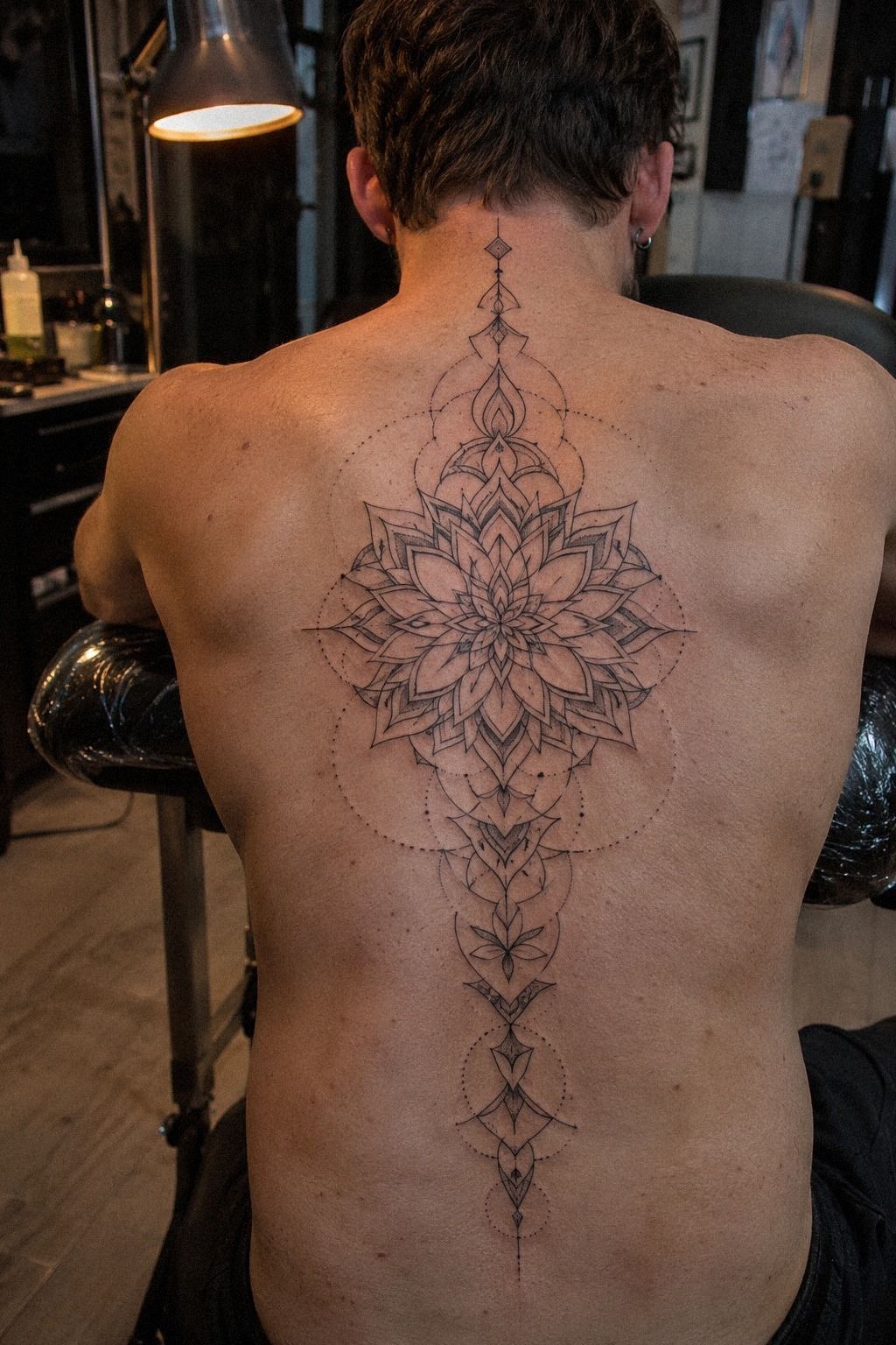
I chose a mandala for my spine because the placement gave the design a natural centerline. The pattern had an intricate outer ring, crisp radial marks, and a small dark core that kept the whole piece from feeling delicate. I asked for black ink with precise ruled lines, not soft shading, because I wanted the structure to stay legible as my skin moved.
The spine isn’t the easiest place to plan from a flat reference. Your body curves, so your artist has to adjust the spacing instead of copying a circle without thought. I used a temporary stencil first, and I could see the lower points pulling slightly toward one side.
That’s when I knew the placement needed patience.
The Spine Compass Rule
My rule was simple: the centerline had to follow your spine, while the outer marks could respond to your body. I didn’t want a rigid stamp.
I wanted a symbolic, timeless design that still looked balanced when I turned. If you’re comparing scale, a tiny small spine tattoo guide can help you judge whether your reference has enough breathing space.
I also avoided making the mandala too small. A dainty version looked attractive on the stencil, but the narrow gaps would have been difficult to preserve.
My final choice was more ornate, and that extra breathing space between the rings is what keeps the pattern readable. You can choose minimal lines, but don’t sacrifice the definition that gives them strength.
2I Tested the Forearm Placement
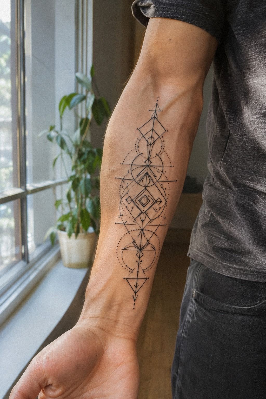
Before committing to the spine, I tested a second geometric idea on my inner forearm. The placement felt sleek and practical because I could see the design every day, yet your forearm also gives an artist a relatively steady surface. I chose a vertical arrangement with a dark center, two open triangles, and black stencil paper that showed the proportions clearly.
I spent several minutes moving my wrist, turning my arm, and checking the design from both directions. It looked graceful when my palm faced up, but it became awkward when my hand rotated inward.
That small test changed my opinion. A tattoo has to work during movement, not only in one fixed position.
The Rotation Check
You should test your placement while your arm is relaxed, bent, and hanging naturally. I marked the top and bottom points with a temporary pen, then checked whether the design still looked sharp in different positions. My first version was too long, and it made the wrist feel visually heavy.
I chose a compact arrangement instead. The result was more personal and less showy, with enough open skin around the forearm linework to keep the geometry clean. If you’re drawn to this kind of placement, compare it with black fine line tattoos before deciding whether your reference needs thicker borders.
3Fine Lines or a Bold Frame?
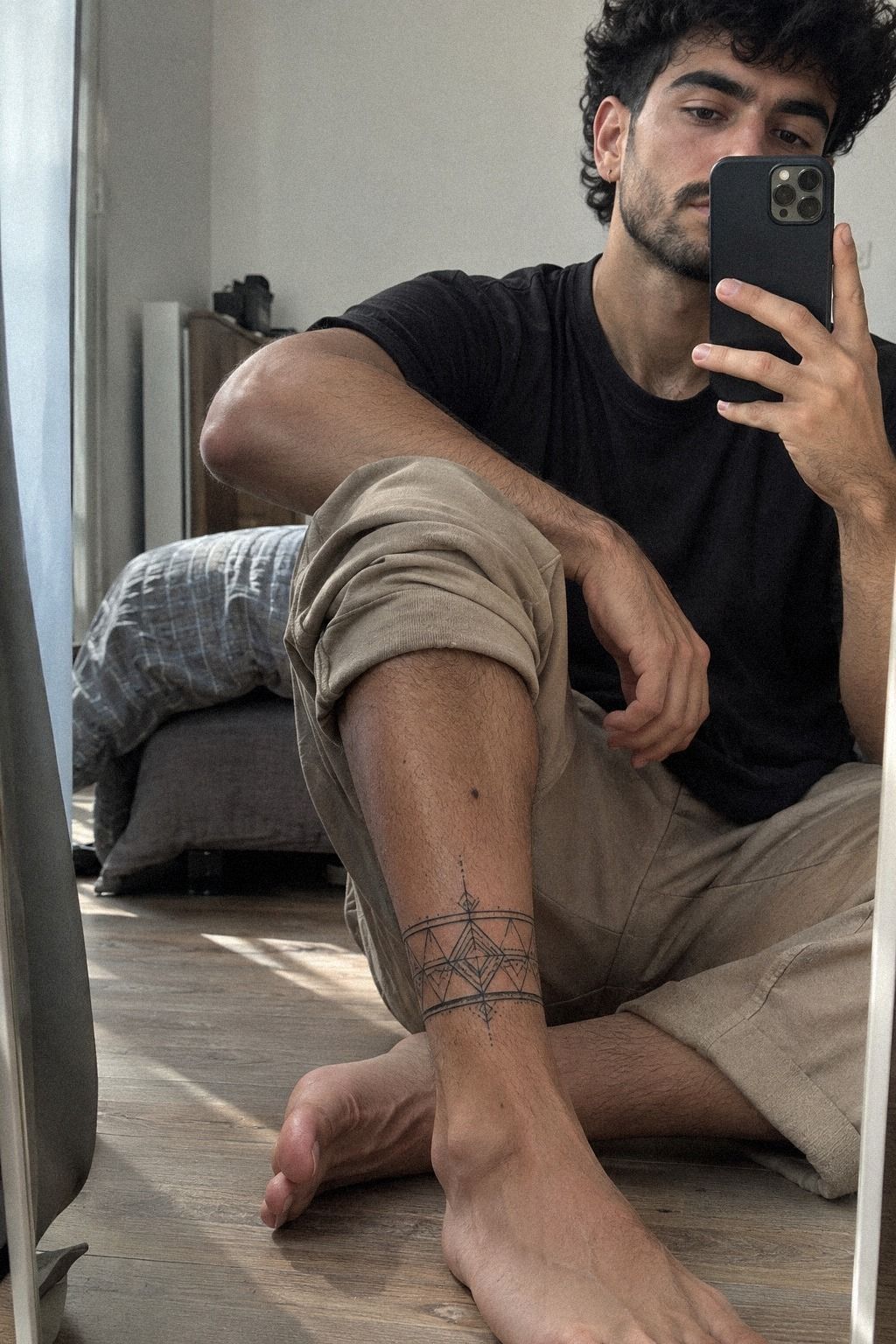
On the ankle, I compared delicate lines with a bolder outer frame. The ankle placement made every spacing decision more important, because the available skin was limited and the design needed to stay readable.
4The Collarbone Triangle

The triangle under the clavicle became the most meaningful part of the design. I chose it as a personal marker for direction and change, not because every triangle needs a fixed meaning. The shape was clean, powerful, and slightly edgy, with a narrow point aimed toward the shoulder.
I tested the stencil while standing normally, then again with my shoulders relaxed. Your collarbone changes the angle more than you might expect, and a triangle that looks centered on paper can drift when your posture shifts. I kept the collarbone version compact, surrounded by deliberate blank skin rather than extra decoration.
The Collarbone Breathing Rule
My artist suggested leaving space around the black triangle stencil so the symbol wouldn’t compete with the clavicle itself. That was the right call. I had wanted a more ornate border, but the added marks made the design feel busy and less personal.
The final triangle looked understated from a distance and more intricate up close. You can make a symbolic piece feel stronger by removing one detail instead of adding three. If you’re considering a nearby placement, the geometric hand tattoos guide shows how exposed areas change the balance between visibility and aging.
5I Prepared My Skin Before the Appointment
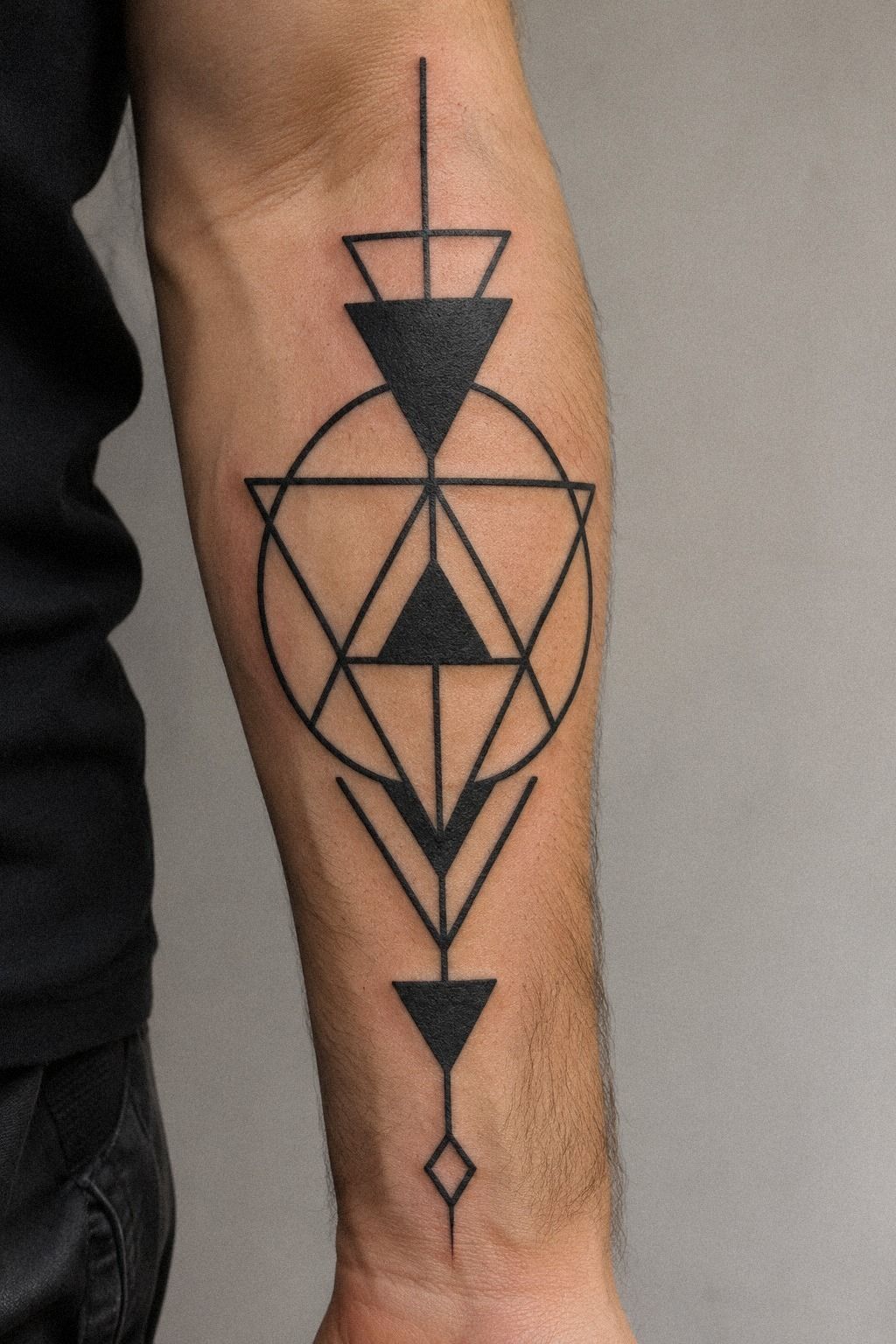
My preparation started with the design sheet, not the appointment itself. I collected several black geometric tattoo references, then asked which details would still read if the piece were smaller than the original image. The flash sheet included circles, arrows, diamonds, and carbon transfer paper sketches, each with a different balance of black fill and open skin.
I didn’t scrub aggressively or arrive with irritated skin. I kept the area clean, moisturized it normally, and avoided turning preparation into a complicated ritual. Your best contribution is showing up with healthy skin and a clear decision about placement.
The Three-Point Aging Test
For every stencil, I checked three things: line spacing, exposed placement, and the amount of solid black. A design could be vibrant and polished on paper yet fail the test if the gaps were too narrow. I rejected one ornate version because several tiny shapes sat almost on top of each other.
I also asked to see healed tattoo examples from the artist, not only fresh results. That’s where the difference between a stylish reference and a reliable design became obvious.
A classic shape with clean spacing will usually give you more confidence than a complicated pattern that only looks crisp on day one. I saved tribal tattoos designs and meanings as another reference for comparing strong silhouettes.
6What Did the Black Fill Feel Like?
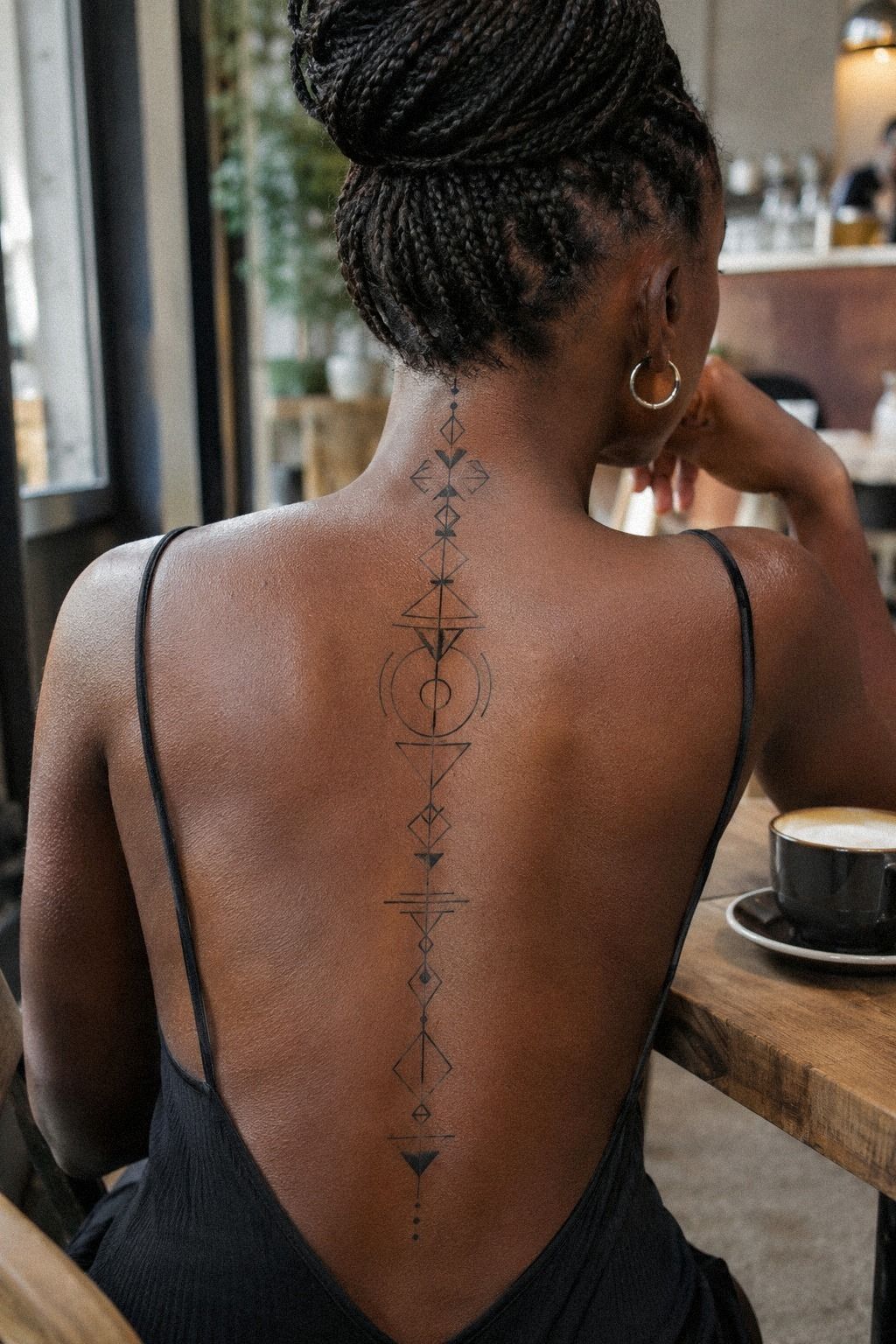
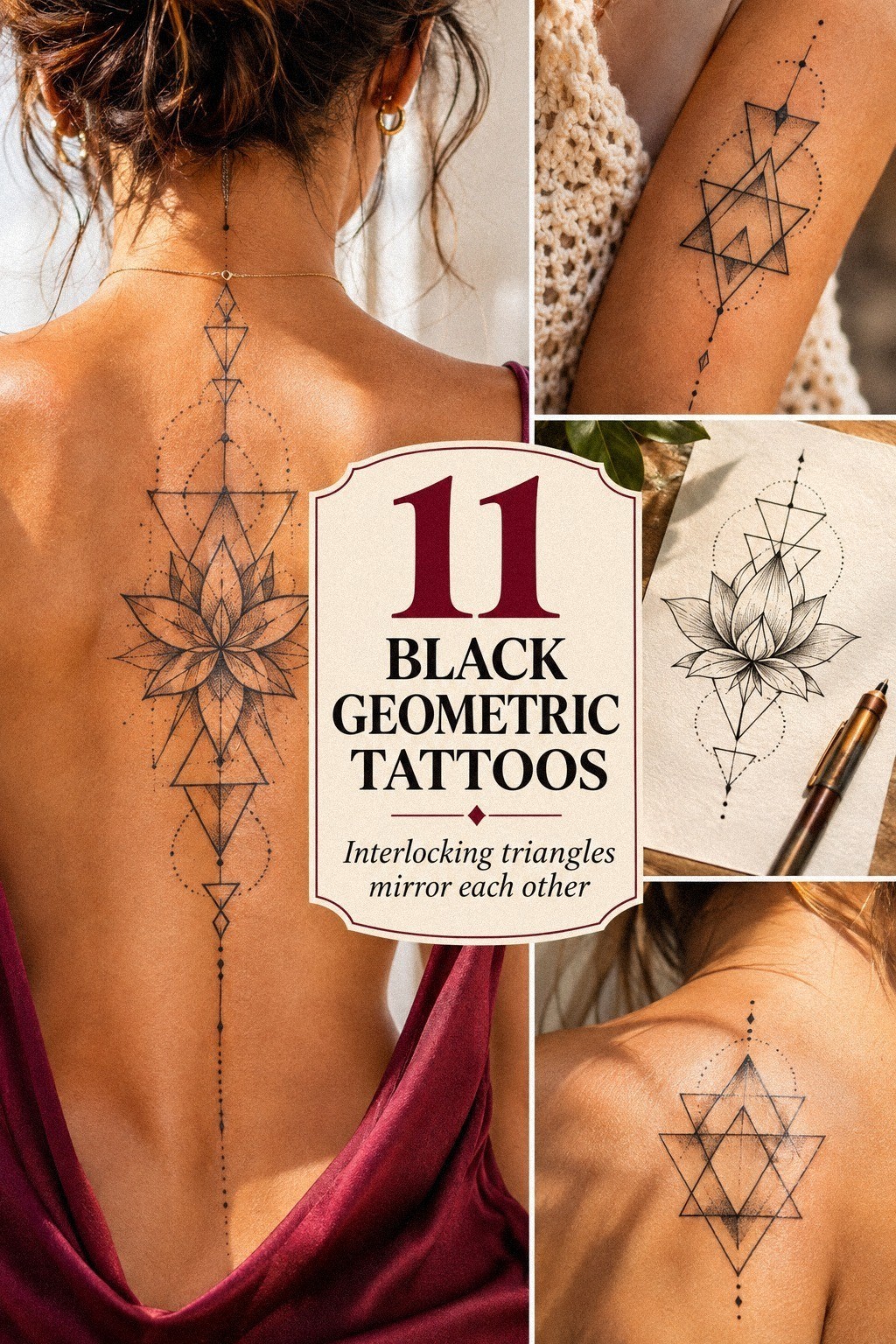
The black fill on the spine was the most intense part of my session.
Fresh Ink Versus Healed Definition
Fresh tattoos often look darker and sharper than the settled result. I didn’t want to judge the design only by its first-day appearance, because swelling can make the lines seem thicker and the fresh tattoo surface can hide small spacing differences.
After the initial stage, the design became quieter but more defined. The black stayed strong, while the open areas made the pattern feel more graceful. If you’re tempted to add more detail immediately, wait until the tattoo has settled and you can see what actually needs improvement.
That patience protects the settled definition.
7I Watched the Linework Heal
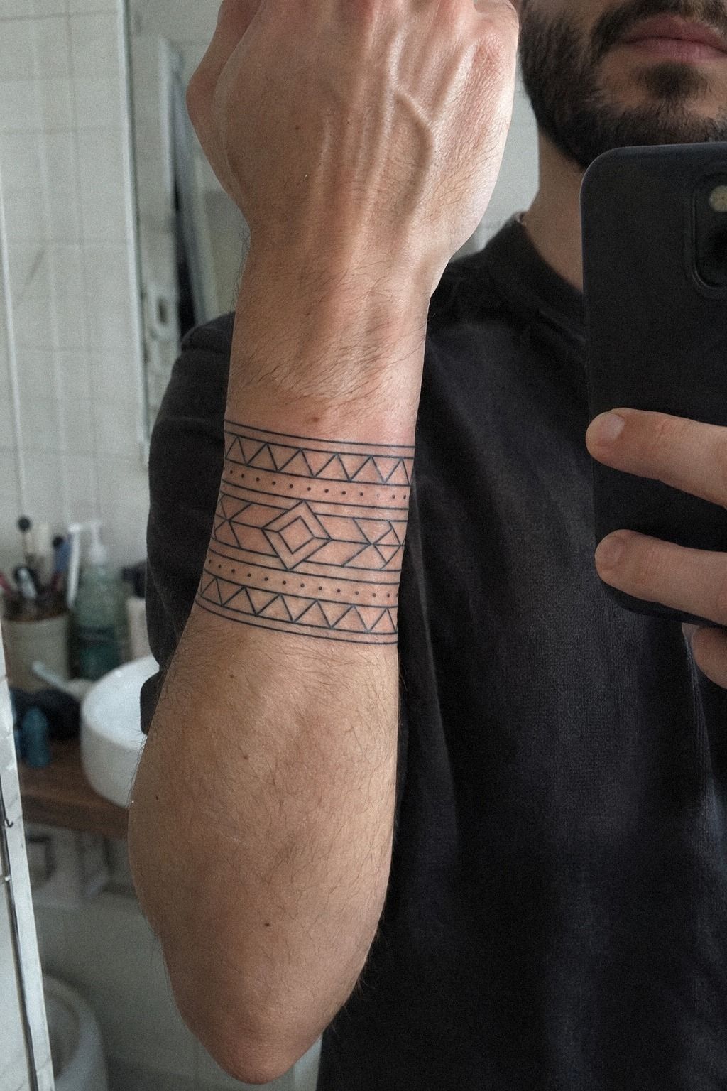
The wrist design changed quickly during healing. On the first day, the lines looked dark and slightly swollen.
A few days later, the surface became dry and dull, which made me worry that the crisp geometry had disappeared. It hadn’t.
The skin was simply doing its work.
Surface healing often takes about 2 to 3 weeks, while complete healing can take about 2 to 3 months. I washed gently, applied a light layer of fragrance-free aftercare lotion, and avoided picking at flakes. Your tattoo can look uneven during this stage, so don’t judge the final result too early.
The Soft-Surface Check
I checked the wrist once a week in similar light. That helped me notice the healing progress rather than obsessing over every change. I didn’t soak it in a pool, expose it to strong sun, or cover it with tight fabric.
If you’re choosing a visible placement, the tiny small wrist tattoos reference is useful for comparing scale. A small design needs enough open space to remain legible, and your wrist gives you less room than a forearm. The healed result looked understated but still sharp, with no need for extra shading.
8When Symmetry Got Too Rigid
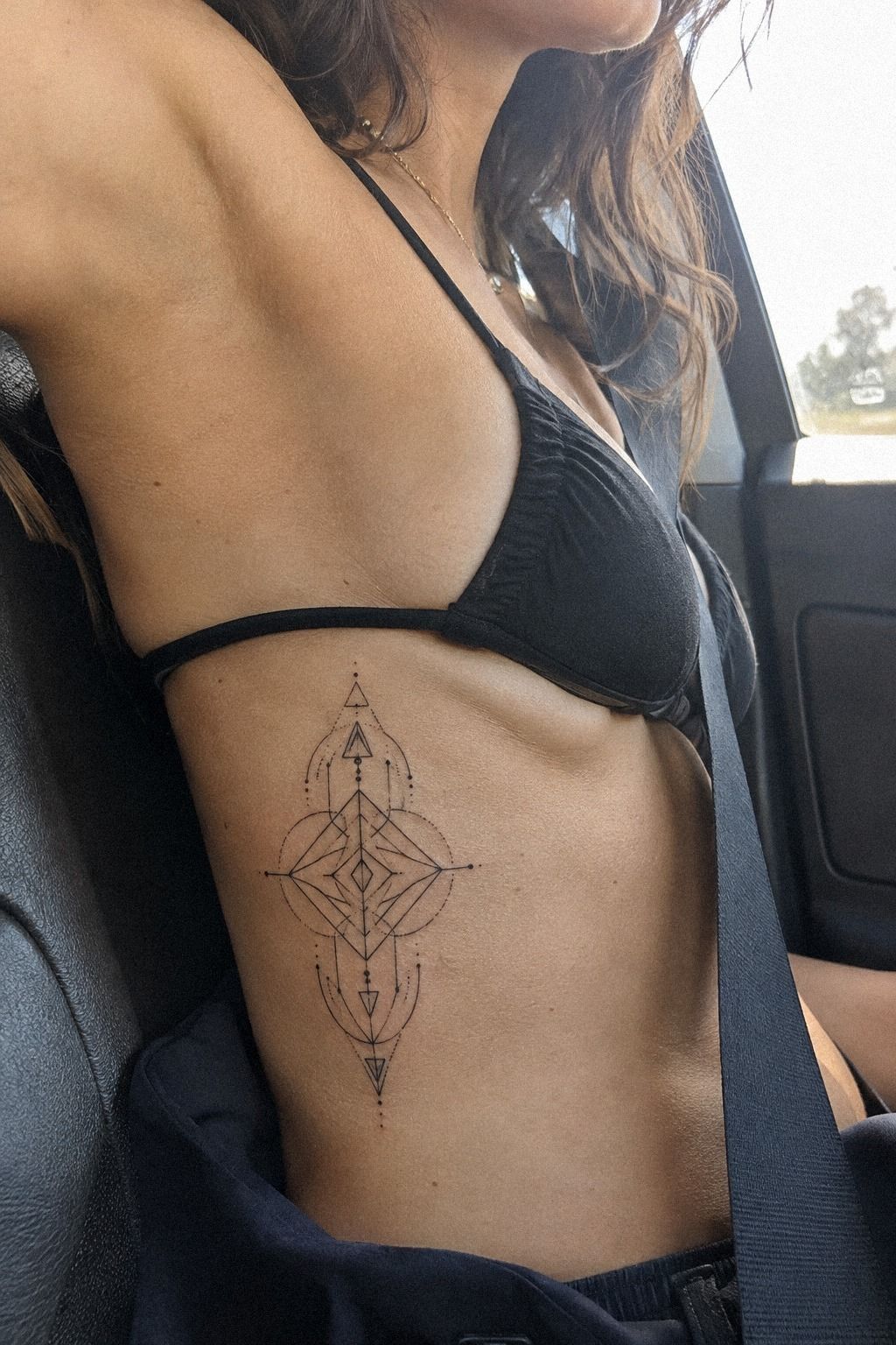
The rib design looked precise in the stencil, but the symmetry became too rigid once I moved. Every point matched perfectly, and somehow that made the tattoo feel less natural. I asked my artist to shift two outer lines so the design could follow the ribcage symmetry instead of fighting it.
That adjustment created a more flowing pattern. The central shape stayed balanced, while the side marks became slightly different in length. Your body doesn’t have mathematical symmetry, so forcing every detail to match can make a tattoo look stiff.
The Human-Symmetry Rule
I kept the black geometric stencil centered, then allowed the outer edges to respond to the curve. That small change made the result feel daring and personal. I would skip perfect mirror symmetry on a moving surface, especially around ribs, shoulders, and hips.
The correction didn’t require adding more ink. It required removing pressure from the design.
If you’re comparing compact references, small geometric tattoos can show how a reduced shape often feels more refined than a crowded one. You want the geometry to support your body, not erase its natural lines.
9The Constellation Map
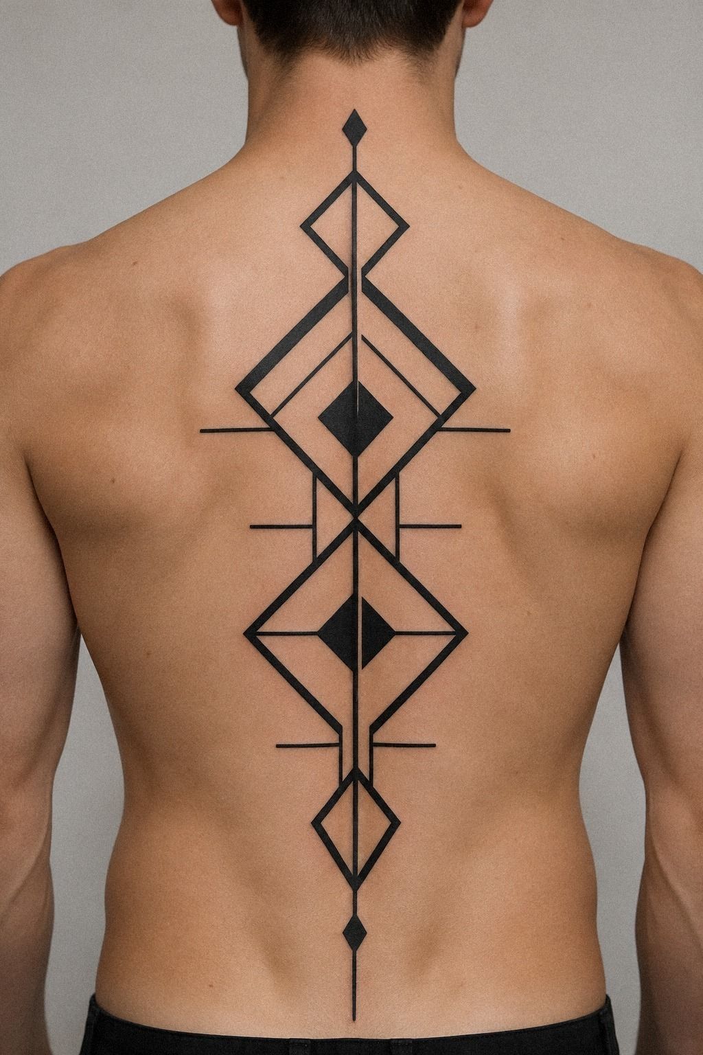
For the upper-back piece, I borrowed the logic of constellations without copying a specific star map. I used connected points, narrow arcs, and one larger central diamond. The result felt ethereal and slightly haunting, but it still belonged to the black geometric family because every mark had a clear relationship to the next.
The constellation map felt personal without becoming literal.
I wanted the motif to feel symbolic without explaining itself to everyone who saw it. That’s important to me. A personal tattoo doesn’t need a long caption or a fixed public meaning.
Your reason can stay yours, especially with an upper-back tattoo.
The Three-Point Aging Test
I checked each connection at normal viewing distance, then asked whether the design would still read if a few fine lines softened. The thicker anchor points gave the tattoo a stronger visual spine. I chose black constellation linework over a fully delicate version because the upper back can carry a little more structure.
If you’re collecting references, black fine line tattoos can help you compare delicate marks with heavier anchors. I wouldn’t make every line equally thin. Contrast is what keeps an intricate design alive, and a little boldness gives your eye somewhere to land.
10I Edited the Reference
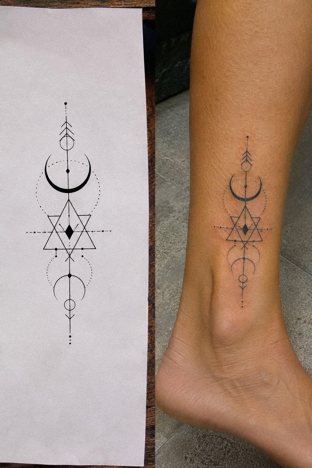
The split reference helped me compare a stencil with the final placement. On paper, the design looked flat and graphic.
On skin, the same pattern followed the body, and the spacing felt more natural. That difference reminded me that a unique tattoo isn’t always a strange tattoo.
Sometimes it is a familiar shape adjusted intelligently.
I searched for black geometric tattoo ideas with strong silhouettes, then removed details that felt borrowed. The final design used thermal stencil film, black fill, and a few open triangles. It looked iconic without becoming overly ornate.
The Reference-to-Skin Test
You should ask what changes when the design leaves paper. Does the line cross a fold?
Does a circle become oval? Does the placement make the symbol visible or private?
Those questions helped me choose a more personal version.
I rejected one fashionable reference because it depended on extremely thin marks packed together. It was stylish, but not forgiving. For your own comparison, small tiny hand tattoos can help you see how exposed placements need bold, readable choices.
The best idea isn’t the loudest one. It’s the one that still feels like you after the novelty fades.
11After the Tattoo Settled
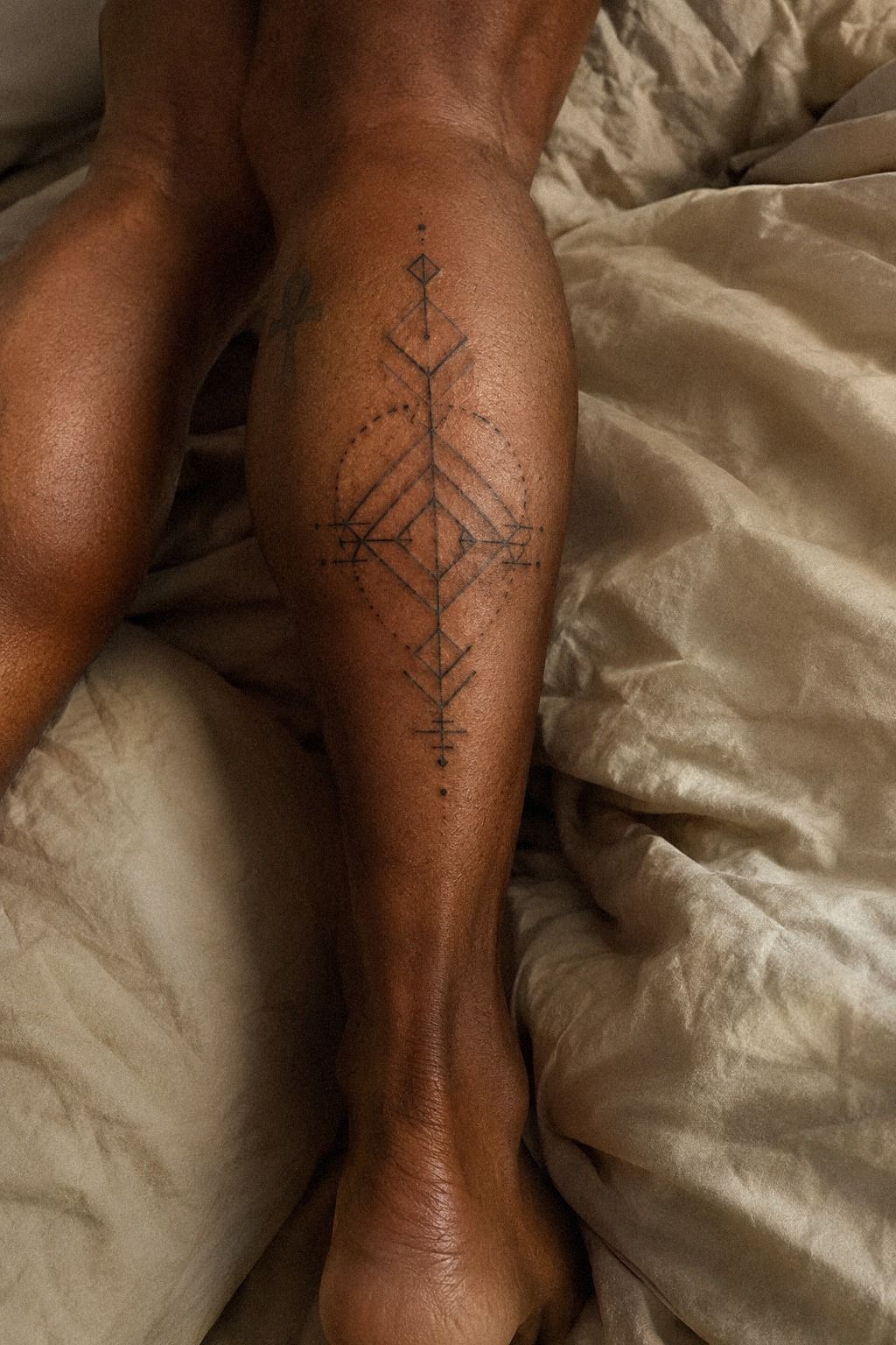
I checked the calf tattoo after the surface and deeper layers had fully settled.
The Budget Check
Before booking, I wrote down the details that could change the final cost: size, placement, artist experience, session length, and the amount of solid black. This helped me separate a low price from genuine value. A precise design can be worth it when the artist understands spacing and healed results.
I also decided what I could comfortably spend without rushing the choice. If the quote had exceeded my budget, I’d have reduced the size or delayed the appointment rather than choose an artist based only on price. Good geometry earns its space!
How Much Does It Cost?
My budget depended on size, placement, artist experience, and session length. I didn’t treat the lowest number as the best deal, because precise geometric work can require careful setup, stencil adjustments, and slower line placement. Your artist may quote a shop minimum or an hourly rate, and the region can change both.
Typical US reference points are a boutique minimum of about $50 to $100 and an hourly rate of about $100 to $250. A small black geometric tattoo may fall near a shop minimum, while a spine or rib piece can require more time.
Ask for the estimate before your appointment, including deposits and touch-up policies. Ask before you book!
A Low Quote Versus Lasting Precision
I would rather spend more time choosing an artist with a healed portfolio than rush toward a low quote. You can ask how they handle crisp linework, how they document healed tattoos, and whether their portfolio includes your skin tone. The cheapest appointment isn’t always the most economical choice if a crooked line needs correction later.
A strong artist should explain what can be simplified, where spacing may fail, and how the tattoo might respond to movement. That conversation is more valuable than being promised a flawless result. You want clear judgment, steady technique, and an honest plan.
What I Learned After Living With Black Geometric Tattoos
I expected black geometric tattoos to be mostly about clean shapes. They aren’t. The real decision is how those shapes behave on moving skin, through healing, changing light, and ordinary life.
A circle can look precise on a page and awkward on a shoulder. A delicate triangle can feel elegant on an ankle but disappear if the spacing is too tight.
I learned that bold doesn’t mean heavy everywhere. My favorite pieces combine solid anchors with open skin, then let the body create part of the composition.
That balance feels more expressive than filling every gap. You can choose an ornate reference, but your artist should know which marks carry the design and which ones only add clutter.
The first mistake I made was trusting the fresh result too much. The second was assuming symmetry would always look better.
Both ideas sounded logical until I saw the designs moving with my body. Now I ask for healed examples, test the stencil from several positions, and pay attention to how the tattoo feels when I stop posing.
For me, the best black geometric work is personal without being overly literal. It can feel sacred, masculine, feminine, romantic, or completely private, depending on why you chose it.
I don’t think every tattoo needs a dramatic explanation. Sometimes the meaning is simply that you wanted a sharp, timeless mark that would stay with you.
That personal meaning can remain private.
The practical side matters just as much as the emotional side. Your skin needs gentle aftercare, your placement needs honest planning, and your reference needs enough space to survive real life. I’ve become more patient because of that.
A polished result comes from small choices made before the appointment begins.
What People Always Want to Know
How Much Does a Black Geometric Tattoo Usually Cost?
A black geometric tattoo usually costs about $100 to $300 for many small or medium pieces, while a boutique minimum may be about $50 to $100 and hourly rates often run about $100 to $250 in the US. Your artist, region, placement, and session length will affect the estimate.
Are Black Geometric Tattoos a Good Idea for a First Tattoo?
Yes, black geometric tattoos can be a strong first choice because clean shapes are easy to understand and many placements are manageable. Forearm, thigh, and shoulder placements are often more tolerable than ribs, feet, hands, or sternum. Choose a meaningful design you won’t outgrow quickly.
How Do I Choose a Tattoo Artist for Black Geometric Tattoos?
Choose an artist with a portfolio showing clean linework, balanced spacing, and healed examples. You should also check studio hygiene and ask whether they regularly tattoo your skin tone. A healed portfolio matters more than fresh work when you’re judging long-term crispness.
This geometric hand tattoos guide can help you compare exposed placements.
How Much Do Black Geometric Tattoos Hurt?
Pain depends on placement, size, session length, and your own tolerance. Ribs, feet, hands, and sternum can feel more intense, while forearms, thighs, and shoulders are often more tolerable. A short session with solid preparation may feel easier than a long appointment with too little rest.
How Long Does a Black Geometric Tattoo Take to Heal?
The surface usually heals in about 2 to 3 weeks, while complete healing can take about 2 to 3 months. Wash gently, moisturize as directed, and avoid strong sun and swimming during early healing. Patience protects the final line quality, especially when your design includes fine spacing.
What’s the Best Placement for Black Geometric Tattoos?
Forearm, upper arm, shoulder, calf, and upper back placements offer useful space and visibility. Your ribs, feet, hands, and sternum may feel more sensitive, while exposed areas need careful sun protection. The best placement balances your pain tolerance, desired visibility, and the amount of space your design needs. For a smaller option, compare tiny small wrist tattoos.
Where I’d Start First
If I had to pick one, I’d start with a medium black geometric mandala on the upper back. It gives your artist enough space for clean gaps, holds bold anchors without crowding, and stays easier to protect from daily friction than a hand or foot tattoo. Save black fine line tattoos for contrast, then choose the reference that still feels personal after the trend moves on.