My first black fine line tattoo looked crisp on day one, but the real test came later: placement, sun, and patience mattered more than the tiny design. I chose a moon, changed the size twice, and watched the lines settle over three months. The result still feels personal and unmistakably mine.
Here’s what it looked like before:
Before the appointment, I had a blank patch of skin on my upper arm and too many saved references. Some were ornate.
Others were so delicate that they disappeared at thumbnail size. I kept tracing the same circle on paper, then crossing it out.
My skin was fair with a cool-pink undertone, so I tested a black stencil beside my wrist before committing. The contrast looked striking without feeling loud. I also checked how the mark looked under daylight and softer indoor light, because your tattoo has to work outside the studio too.
The first sketch was almost weightless. I wanted something symbolic, but I didn’t want a crowded constellation or an extra border. That distinction mattered.
If you’re choosing your first piece, give yourself a few days with the stencil before you decide. Your first reaction is useful, but your third reaction is usually more honest.
- J’ai choisi une lune noire minimaliste
- J’ai testé trois placements sur mon avant-bras
- J’ai dessiné une rose aux lignes nettes
- J’ai comparé des idées de tatouages uniques
- J’ai retenu un serpent fin autour du poignet
- J’ai ajouté une date sous le motif
- J’ai vérifié la lisibilité des détails minuscules
- J’ai affronté la douleur près des côtes
- J’ai protégé mon tatouage pendant la cicatrisation
- J’ai observé l’évolution des lignes noires
- J’ai personnalisé un symbole vraiment significatif
1J’ai choisi une lune noire minimaliste
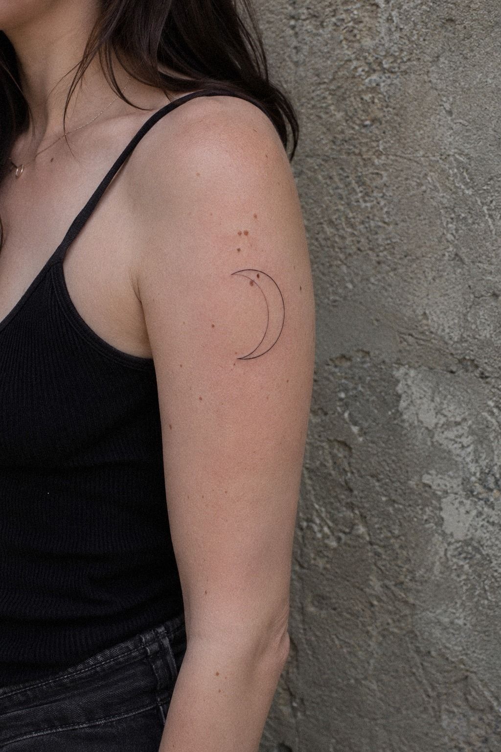
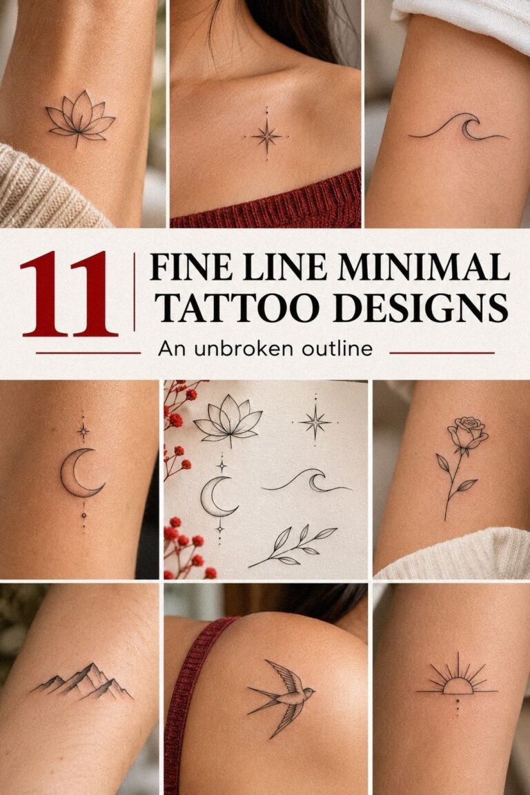
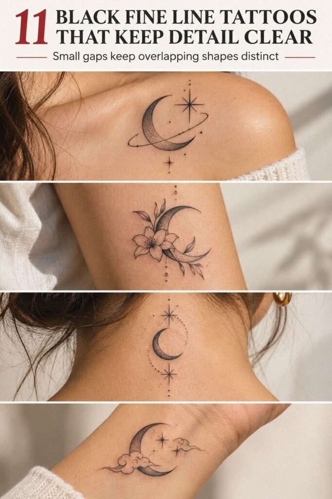
I started with a crescent moon because it gave me a clear shape without forcing a dramatic story. The final crescent moon stencil sat high on my upper arm, with a narrow curve and two short interior marks. It was minimal, but the silhouette still looked expressive at a normal distance.
I asked the artist to keep the outline hair-thin and the small shadow completely black. That contrast gave the design a crisp edge while keeping the open skin visible. I’d skip a fully shaded moon for a first tattoo, because the heavier fill would make this particular idea feel less delicate and less personal.
The artist used sterile transfer paper, black tattoo ink, and a single-needle liner. You’ll want to see the stencil from several angles before the needle touches your skin. I moved mine about 2 cm higher, and that tiny change made the curve follow my arm instead of fighting it.
I saved several small fine line tattoo ideas before the appointment, but I didn’t copy one exactly. Your reference should help you explain scale and mood, not replace your own decision. The final mark felt timeless, understated, and quietly bold!
2J’ai testé trois placements sur mon avant-bras
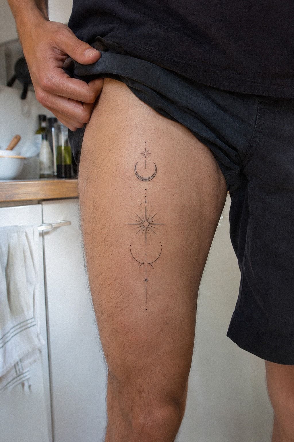
I tested the forearm placement, outer thigh, and shoulder before choosing the spot that felt most natural. The forearm made the stencil easy to judge for visibility, movement, and everyday comfort.
I also checked how the design changed when my arm was relaxed, bent, and turned slightly. A placement can feel right in one position and awkward in another, so take your time before approving the stencil.
3J’ai dessiné une rose aux lignes nettes
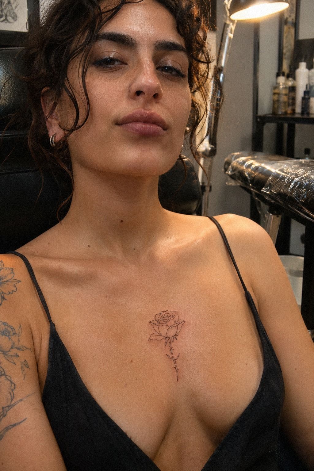
My second drawing was a profile rose on the sternum, with layered petals and one clean stem. I wanted a fine-line rose that looked intricate without becoming fussy.
The first version had six petals, but I removed two after seeing the stencil. The simpler outline had more breathing space.
The sternum is a meaningful location, but it isn’t the easiest one. The skin sits close to bone, and every breath makes you aware of the artist’s hand. I chose a moderate size so the petals wouldn’t collapse into a dark knot.
You’ll want the center to stay open, especially if your reference depends on tiny overlaps.
I tested the rose in black ink on white stencil paper, then looked at it from a standing distance. The profile was more romantic than a front-facing bloom, but it also felt less generic. I’d choose this angle over a symmetrical rose if you want something expressive and slightly edgy.
For more restrained references, I compared delicate fine line tattoos with larger botanical sketches. My final rose felt elegant, feminine, and sharp without trying to look perfect. That balance was the whole point!
4J’ai comparé des idées de tatouages uniques
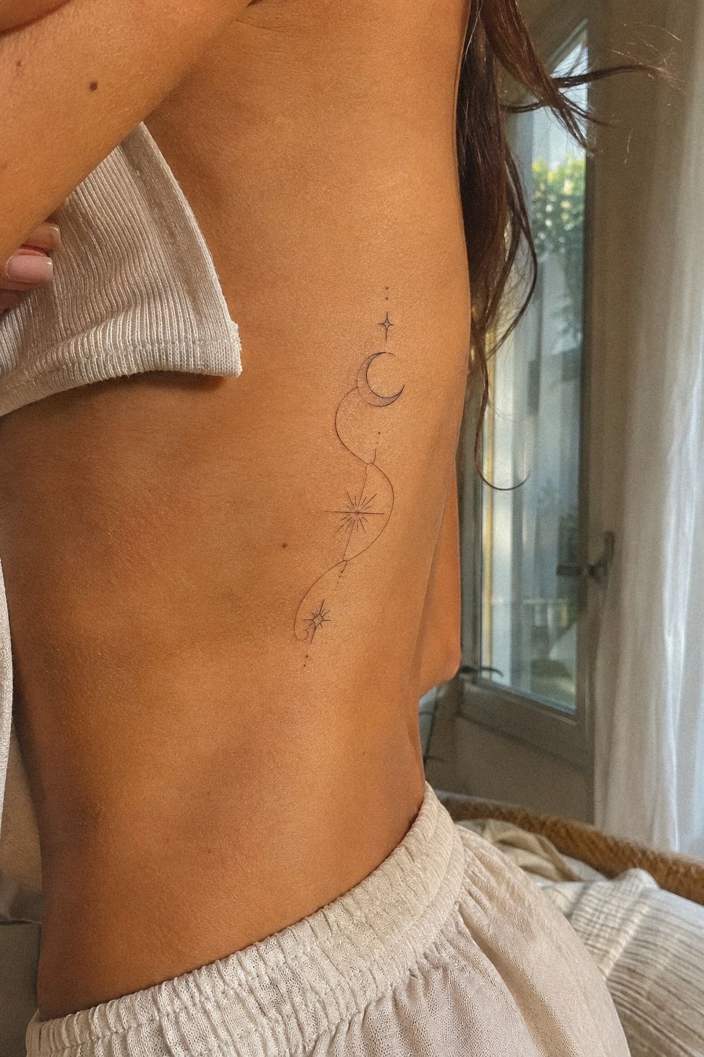
The rib design helped me understand why “unique” doesn’t have to mean complicated. I compared a tiny key, a narrow wave, a small star map, and one abstract line. The abstract line looked the most daring, but the star map carried a stronger memory for me.
On golden-tan skin, the black line looked clear against the warm undertone. I asked for single lines with no gray wash, since gray shading would have softened the clean graphic quality. Your artist can show the difference on stencil paper before starting, and you should ask to see it in the actual size.
I’d skip adding words beneath a design just to make it meaningful. If the mark already connects to a person or moment, the explanation can stay private. A black star map made me think of late walks with my sister, and that was enough.
The tattoo didn’t need a caption.
I also browsed small single line tattoos to see how open shapes hold up at smaller scales. The best option felt symbolic, vibrant, and slightly haunting. You’ll know a design works when you stop trying to explain it to yourself.
5J’ai retenu un serpent fin autour du poignet
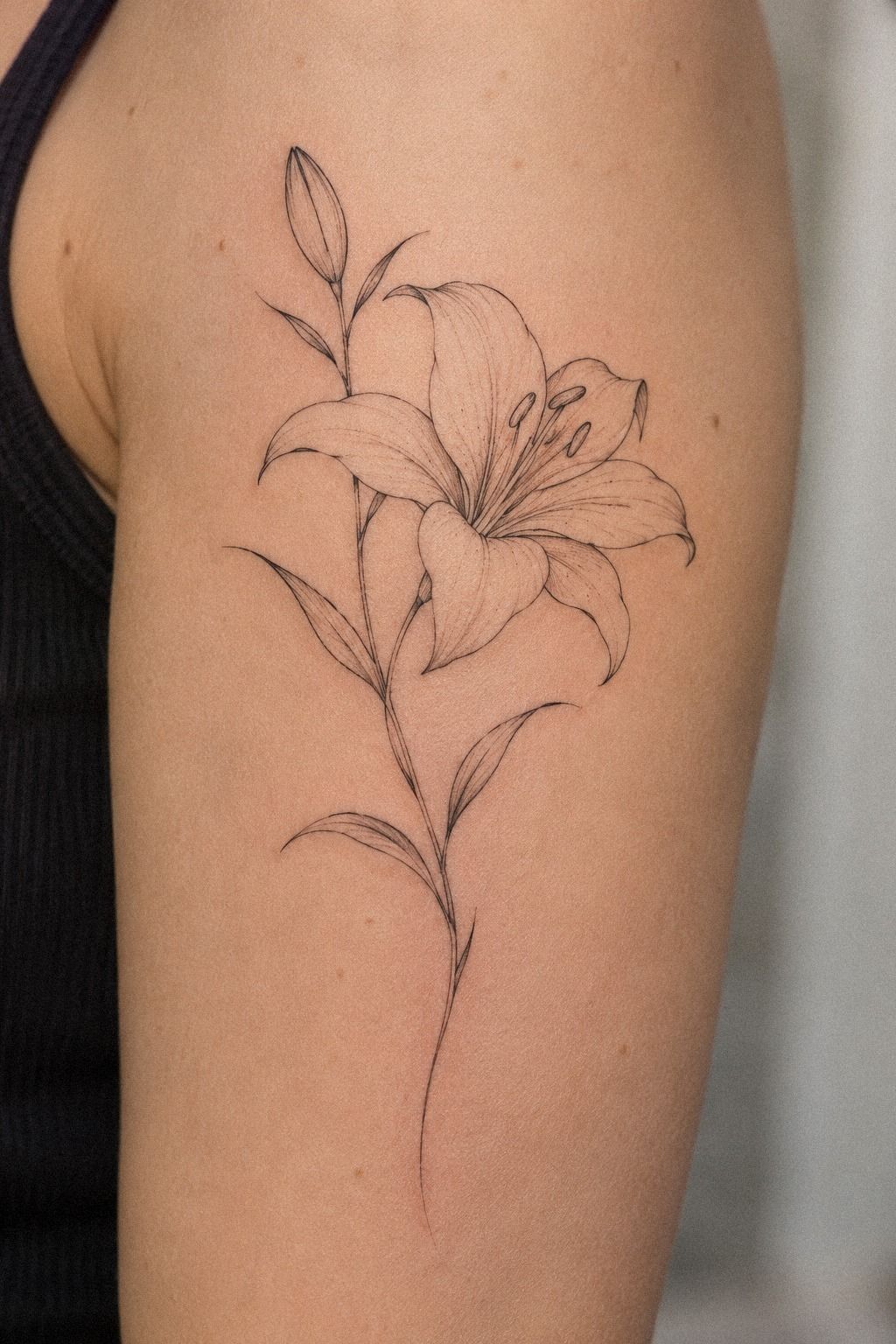
I wanted a fine serpent that could follow the wrist without becoming crowded. I kept the curves open and let the body carry the movement.
6J’ai ajouté une date sous le motif
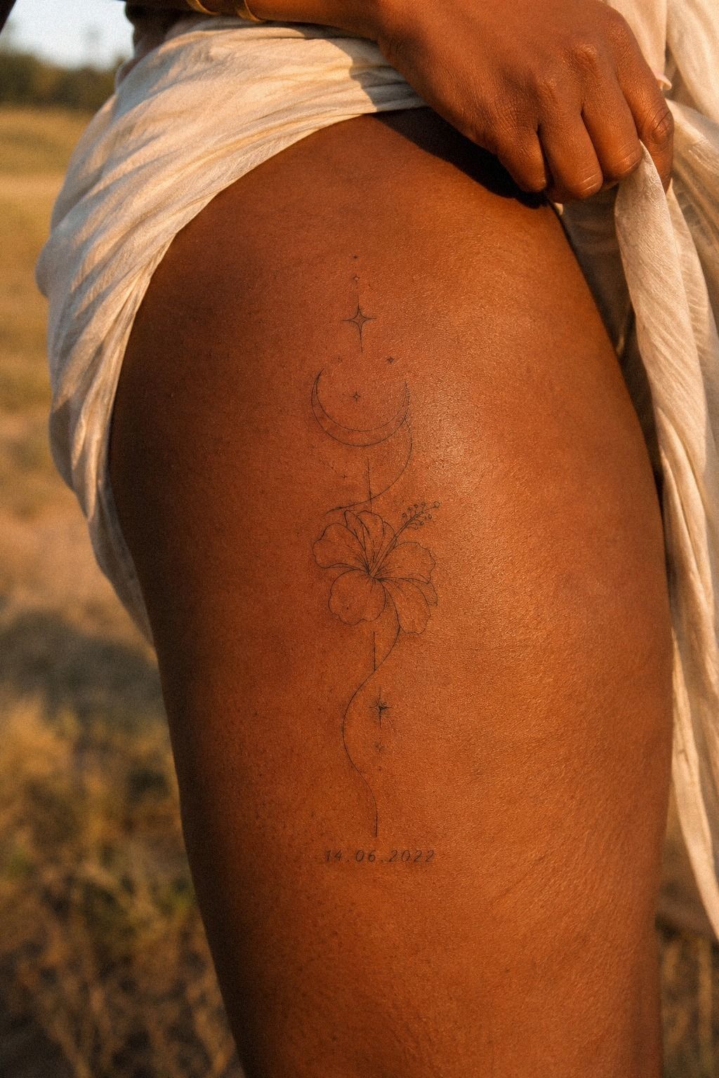
I added a small date beneath the thigh design, but I nearly made the date lettering too small. On deep ebony skin, clear spacing mattered more than extra flourishes. The final date used simple numerals with enough distance between each character to stay readable as the tattoo settles.
My artist showed me two versions on stencil paper: one at 2 cm wide and one at 5 cm wide. The smaller one looked dainty for a few seconds, then the numerals began to crowd. I chose the wider version because you’ll want the date to remain legible without magnification.
The date itself was personal, but I didn’t want it to dominate the image. We placed it below the main symbol and kept the line weight consistent. I’d avoid a script font here, because the swashes would compete with the clean black drawing.
The result looked meaningful, polished, and quietly empowering. If you’re considering a hand detail, these fine line tiny hand tattoos show why scale decisions matter. Your date can be intimate without becoming the first thing everyone notices.
7J’ai vérifié la lisibilité des détails minuscules
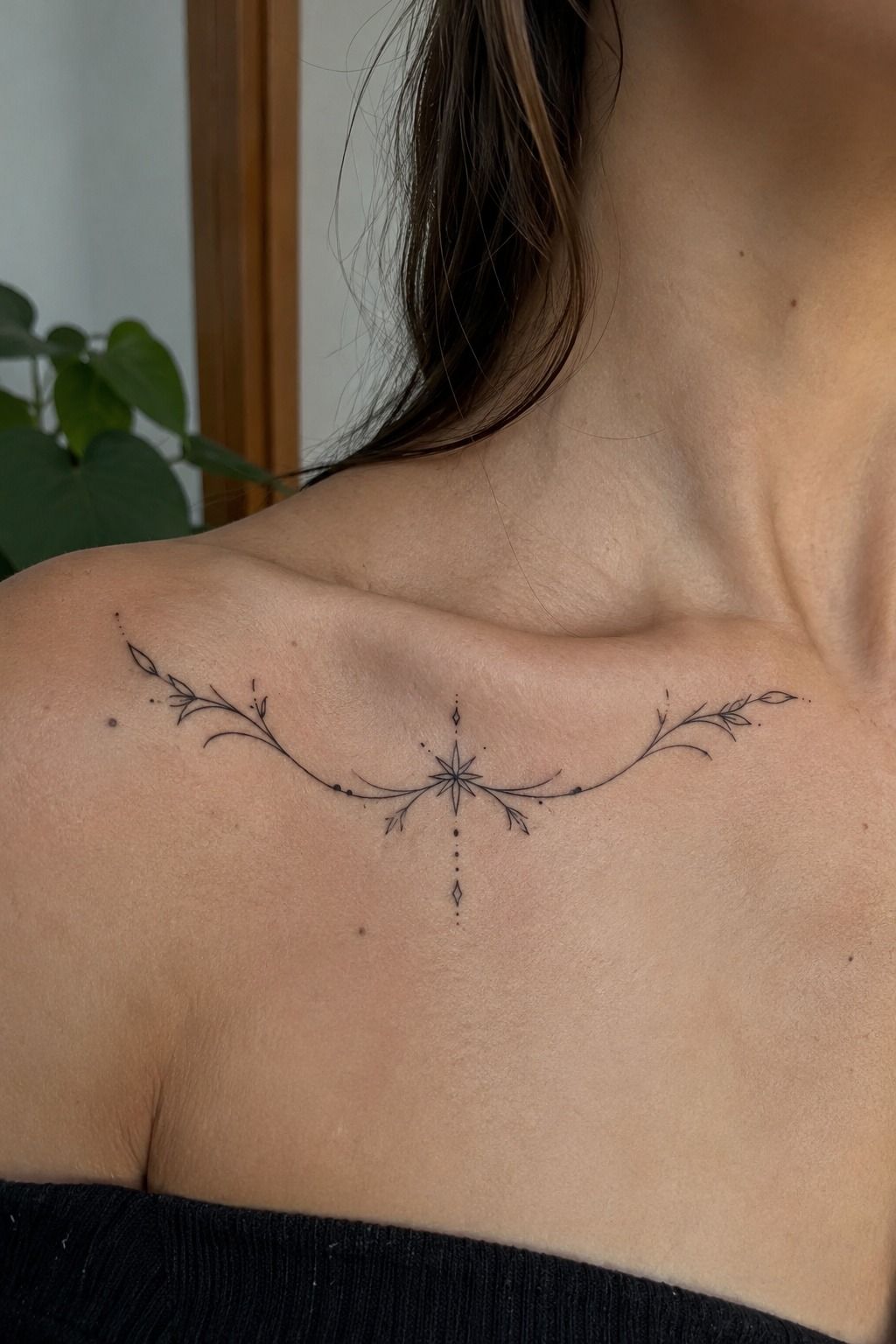
The collarbone design showed me why small black work needs honest testing. I placed the stencil under different lighting, then stepped back several feet. The smallest interior marks vanished first, even though they looked impressive up close.
I removed three dots and one tiny crosshatch from the original drawing. That made the collarbone linework less ornate, but the shape became easier to read.
You don’t need every detail your reference contains. A clean silhouette will usually serve you better than a crowded one.
I also asked how the artist’s single-needle work might settle after healing. Fine lines can soften or widen over time, especially with repeated sun exposure.
Your artist can’t promise frozen lines, and anyone who claims that can’t be trusted. The honest answer helped me choose a slightly stronger outer contour.
The final result felt crisp, refined, and iconic without looking overworked. For more examples, I returned to fine line simple hand tattoos.
And yes, I removed the detail I loved most on paper. It made the tattoo better on skin.
8J’ai affronté la douleur près des côtes
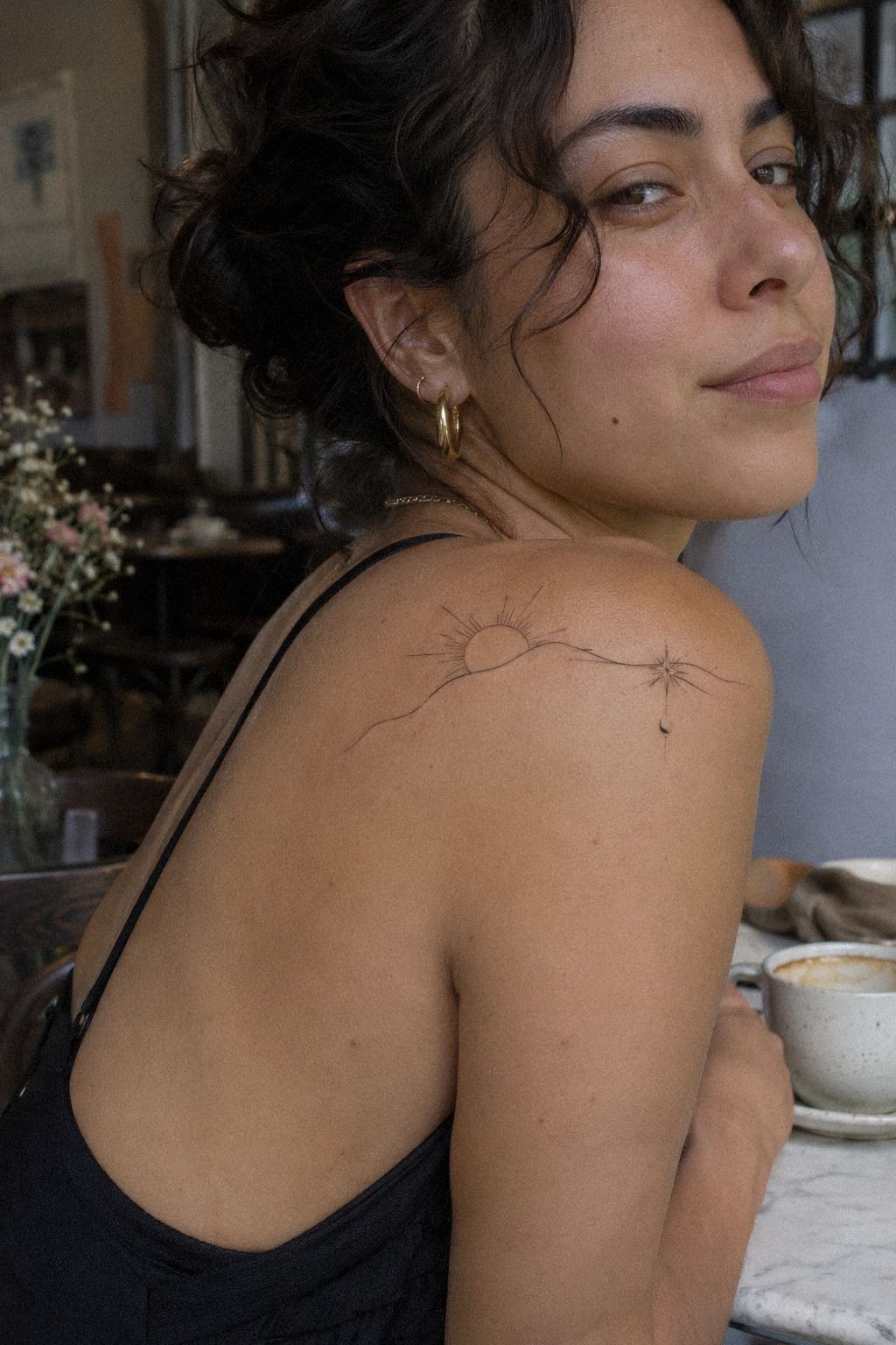
The ribs were the placement I worried about most. The design itself was small, but the skin sat close to bone, and the sensation was sharper than it had been on my thigh. I kept my breathing slow and asked for short pauses instead of pretending I felt nothing.
Rib, foot, hand, and sternum placements are usually more painful than the forearm, thigh, or shoulder. That doesn’t mean you should avoid them. It means your first appointment should include a realistic plan for breaks, hydration, and a session length you can manage.
I chose a rib placement with generous open space, because a dense black shape would have made the appointment feel longer. The design was delicate but not fragile, and the final curve looked graceful when I stood naturally. You’ll want to check the placement with your arms relaxed, not only while posing.
Would I choose the ribs again? For the right symbolic design, yes.
For a first tattoo with heavy shading, I’d choose the shoulder placement instead. The finished mark felt raw, feminine, and surprisingly powerful!
9J’ai protégé mon tatouage pendant la cicatrisation
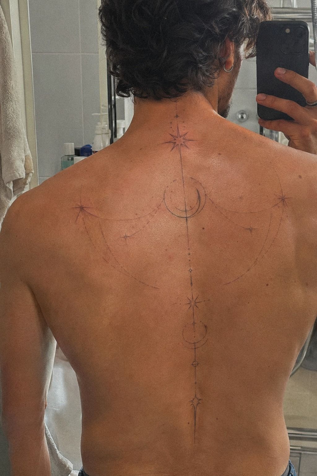
For an upper-back tattoo, aftercare mattered as much as the drawing. I washed the area gently, patted it dry, and used the fragrance-free moisturizer my artist recommended. I didn’t scratch, soak it, or cover it with tight clothing while the skin was settling.
The surface usually heals in about 2 to 3 weeks, while complete healing can take around 2 to 3 months. That difference surprised me. Your tattoo may look calm on the surface while deeper layers are still recovering, so don’t rush back into long sun exposure or swimming.
I kept a clean cotton shirt over the healing tattoo and avoided direct sunlight. The first few days looked less glamorous than the finished result, with mild dryness and a duller black tone. That stage is normal, but you should contact your artist if something looks unusually severe.
I also saved fine line side finger tattoos to compare how exposed placements need extra care. My aftercare routine was understated and boring in the best possible way. The less I interfered, the better the skin behaved.
10J’ai observé l’évolution des lignes noires
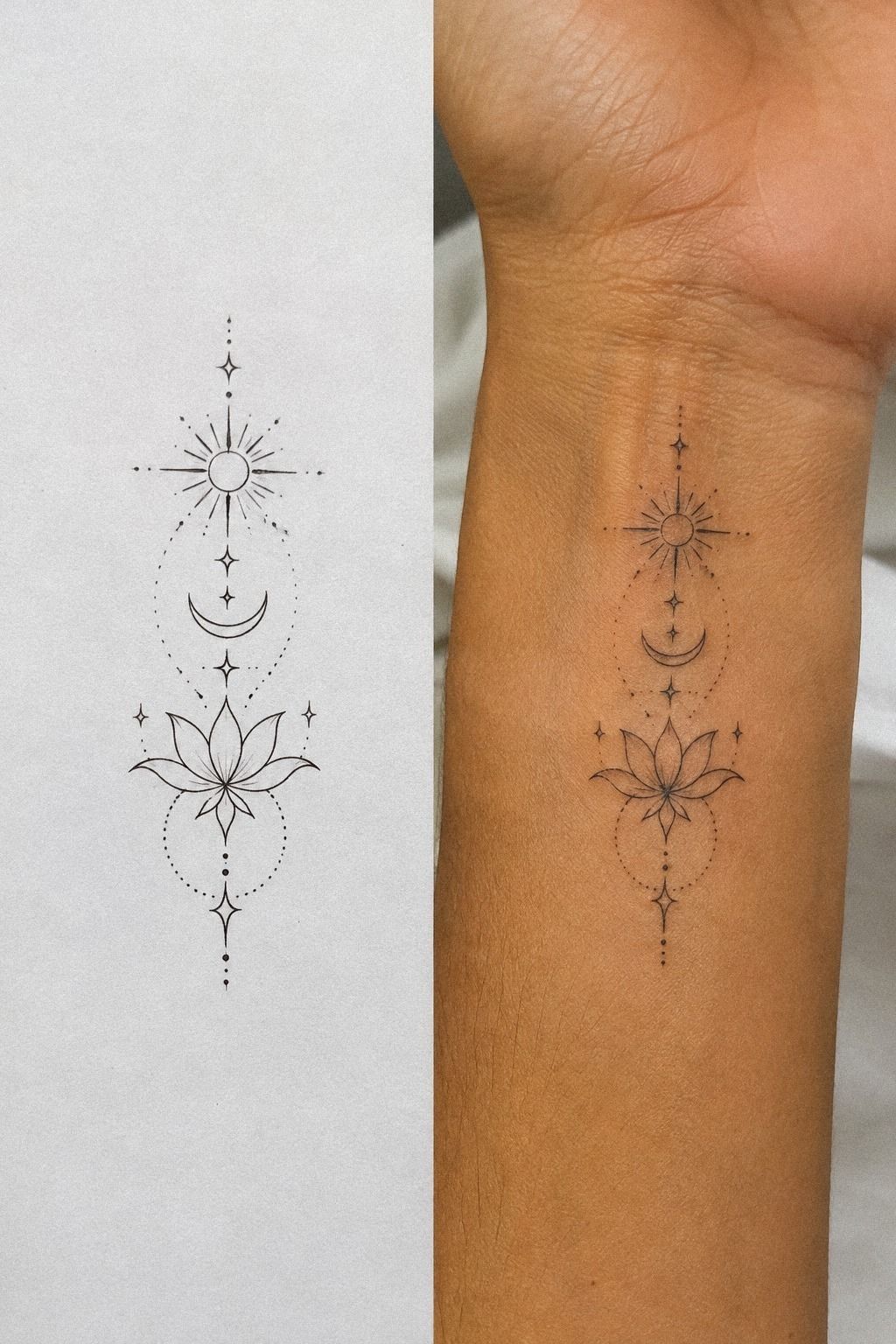
At the three-month mark, the healed design looked softer than it had on day one, but the main curves remained readable. That change is normal, especially with delicate black work and regular sun exposure.
11J’ai personnalisé un symbole vraiment significatif
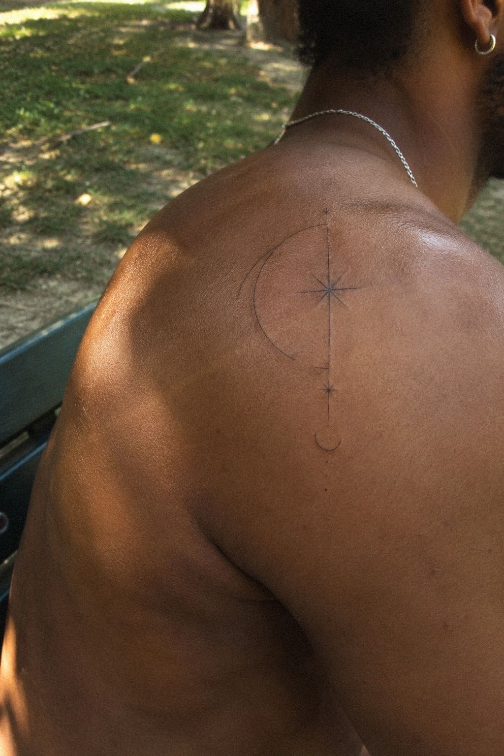
The final shoulder design belonged to a man with deep brown skin and a warm undertone, and the symbol was based on a family gesture rather than a trend. The artist simplified the drawing into three black curves and one small point. It looked personal because the meaning came before the decoration.
I asked for the curves to remain open and the center to stay free of shading. That decision made the black curves more expressive from a distance.
You don’t need a large tattoo to carry a serious memory. Sometimes a restrained mark lets you keep the story yours.
The artist tested the stencil in two positions, one closer to the shoulder cap and one lower on the upper arm. I chose the lower upper-arm placement because the curve followed the muscle instead of cutting across it. Your body’s movement should guide the design, especially with flowing linework.
This was the tattoo that taught me to stop chasing a universally appealing image. The finished piece felt sacred, fierce, and masculine without losing softness. For more symbolic references, I’d compare unique black fine line tattoos before booking.
How much it cost
My artist quoted the shop minimum, and the final price sat within the typical US range for a small black fine line tattoo. Cost changes with the artist, region, size, placement, and time. I’d ask for the full estimate before you arrive, especially if your design includes lettering or several placement tests.
The studio minimum was the number I needed most, because my design was small and took less time than a large custom piece. I didn’t choose an artist by the lowest price. Your artist’s healed portfolio, hygiene standards, and line control matter more than saving a small amount.
I also budgeted for time, aftercare, and a possible touch-up policy later. Fine-line tattoos can soften, and some artists offer a review after healing.
You’ll want to know that policy before the appointment. A cheap quote won’t feel cheap if the design needs correction.
For a first appointment, I’d keep the design focused and leave time for a calm consultation. The final cost felt reasonable because I understood what I was paying for: sterile supplies, drawing time, skill, and a placement decision I wouldn’t regret.
What I Learned About Choosing Fine Lines
I used to think the smallest tattoo would be the easiest choice. It wasn’t. A tiny design can demand more precision because every gap, curve, and corner has to carry the image.
I learned to judge the whole silhouette first, then decide whether the inner details deserved space.
The best reference photos showed healed work, not only fresh black ink. That distinction changed my standards. A healed portfolio told me whether the artist’s lines stayed readable, whether curves spread, and whether the black remained balanced against different skin tones.
I also stopped treating pain as a test of courage. You can choose a more tolerable placement without making the tattoo less meaningful.
Your body isn’t a blank sheet of paper, and your appointment shouldn’t feel like a dare. A good artist will help you make a practical choice.
My biggest mistake was approving the smallest stencil because it looked refined in the mirror. After I saw it from a normal distance, I asked for a little more scale. That adjustment made the design bold and elegant, and easier to live with.
A Few Things Worth Answering
How much does a black fine line tattoo usually cost?
A small black fine line tattoo typically costs about $50 to $100 at a studio minimum, while hourly rates often sit around $100 to $250 in the US. Your artist, region, placement, and design detail can change the quote, so ask before booking.
Are black fine line tattoos a good idea for a first tattoo?
Yes, black fine line tattoos can be a strong first choice because you can select a manageable placement and a clear design. Simple linework also lets you focus on meaning without committing to a large piece. Choose an artist with healed examples.
How do I choose a tattoo artist for black fine line tattoos?
Review the artist’s portfolio for clean healed linework, consistent spacing, and examples across different skin tones. Ask about single-needle experience, studio hygiene, stencil changes, and aftercare. Your artist should answer directly and never pressure you to book quickly.
How much do black fine line tattoos hurt?
Pain depends on placement. Ribs, feet, hands, and sternum are often more intense, while the forearm, thigh, and shoulder tend to feel more tolerable. Short sessions and planned breaks can make the appointment easier for you.
How long does a black fine line tattoo take to heal?
The surface usually heals in about 2 to 3 weeks, while complete healing can take around 2 to 3 months. Wash gently, moisturize as directed, avoid swimming during early healing, and protect the tattoo from direct sun.
What’s the best placement for black fine line tattoos?
The best placement depends on visibility, movement, pain, and how much sun your skin receives. The outer thigh and shoulder are often more tolerable, while the ribs and sternum feel more intense. Your artist can test the stencil first.
Where I’d Start First
If I had to pick one, I’d start with the crescent moon on the upper arm. Its open shape stayed readable after healing, and the placement gave me control over visibility and sun exposure. Pin this article for your consultation, then choose the symbol you’ll still want when the trend moves on.