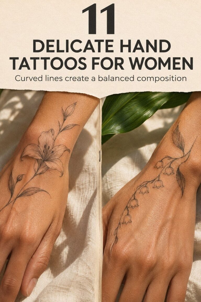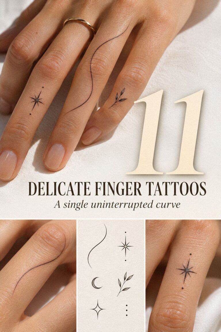
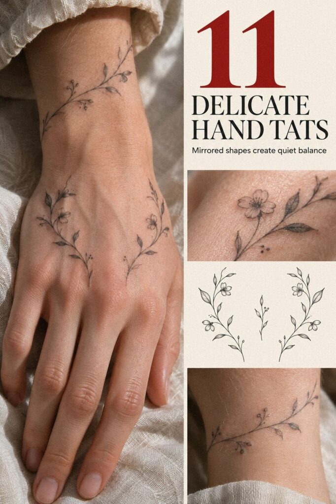
Delicate hand tats can fit into one sitting, but pain depends more on placement than size. I learned that after choosing a bony spot too close to my knuckle and pretending I was fine. Fine-line work, a steady hand, and a practical artist can make the experience far more manageable. You’ll still feel it, but thoughtful planning can make the result worth it.
- Try Tiny Botanical Linework Across the Hand
- Would a Crescent Moon Between Thumb and Index Feel Right?
- Fine Script Along the Side of the Hand
- Keep Dainty Finger Tattoos Private
- Balance Minimalist Knuckle Symbols in Crisp Ink
- Let a Delicate Wrist-to-Hand Vine Flow
- Find the Personal Detail in Unique Hand Tats
- Are Ethereal Finger Stars Too Delicate?
- Make Ornate Lace-Inspired Ink Across the Palm
- Bold Blackwork Versus Delicate Contrast
- Choose Meaningful Matching Hand Tattoos for Two
1Try Tiny Botanical Linework Across the Hand
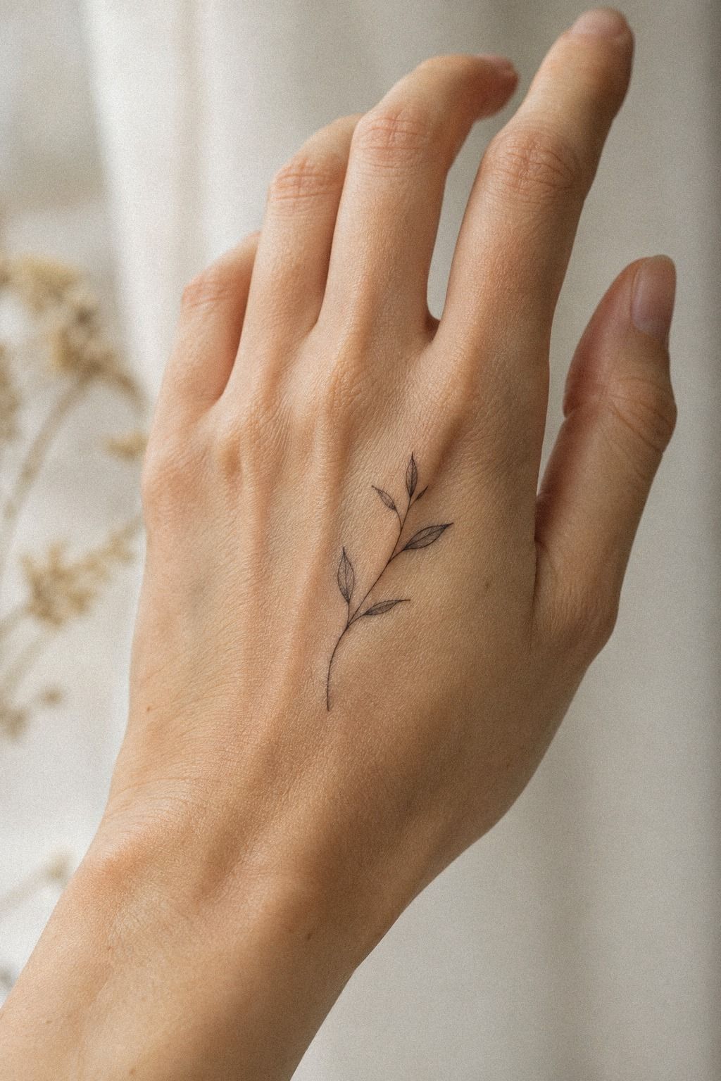
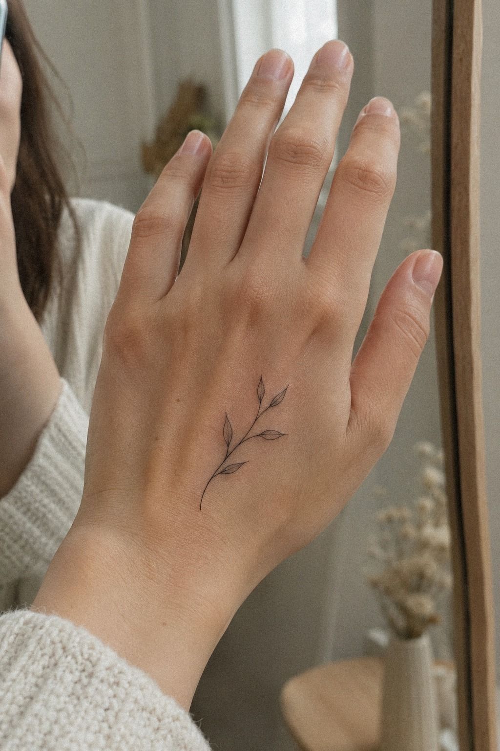
Tiny botanical linework gives you a striking design without filling every inch of skin. I’d choose one slender stem, two leaves, and a small bud across the back of your hand, keeping the composition flowing toward the wrist. A single-needle configuration can create that crisp look, but your artist should explain how the lines may soften over time.
Ask for graceful spacing between each leaf instead of a crowded branch. You’ll want the negative skin to stay visible, especially if your hands see plenty of sunlight.
I’d skip a dense black bouquet here. It’s bold, but the heavier fill can make a small hand piece feel less delicate and more demanding during the sitting.
For a cool-pink complexion, terracotta ink can create the warmest contrast in this design, while muted olive may feel softer and more personal. Your artist’s healed portfolio matters more than any ink brand. Look for settled examples that show how the botanical colors behave after healing, not only freshly completed work.
If you’re comparing tiny placements, browse these delicate tiny hand tattoos before you book. You’ll notice that the most timeless examples leave breathing space around the wrist crease and knuckles. That little gap keeps the botanical idea polished rather than fussy.
2Would a Crescent Moon Between Thumb and Index Feel Right?
A crescent moon between the thumb and index finger feels symbolic, personal, and slightly ethereal.
I’d keep the crescent slim, with a soft clay-colored accent or a tiny aged-gold detail if your artist works with color. The space between the fingers is small, so the symbol should remain crisp without competing with the natural fold. A simple crescent outline gives you enough clarity for a short sitting.
Ask your artist to place the stencil while your hand is relaxed. The shape can tilt when you stretch your thumb, and that can change the emotional balance of the design. A slightly uneven crescent may feel more expressive than a rigid geometric one.
This is a delicate, meaningful choice!
3Fine Script Along the Side of the Hand
Fine script along the side of the hand is expressive without announcing itself from several feet away. Choose one short word or a date that matters to you, then let the artist adapt the lettering to your skin rather than copying a typed font. You’ll need enough spacing for every letter to remain readable.
I’d avoid placing the script directly over the deepest crease. That area bends, rubs, and fades faster, so the lettering may lose its crisp shape sooner than you’d expect. A slim plum tattoo ink formula can give you a distinctive contrast, but the artist’s pressure and hand speed are what make the linework elegant.
Ask to see the stencil from several positions before the needle starts. You’re checking whether the baseline follows your hand or looks tilted when your fingers relax.
I once approved a design while holding my hand stiffly, and it looked different the moment I stopped posing. That mistake was entirely mine.
For more placement references, save these delicate side hand tattoos. You’ll see why short words tend to age more gracefully than long quotations.
A compact phrase gives your artist room to protect each letter, and the result feels personal instead of cramped. That’s a sharp choice.
4Keep Dainty Finger Tattoos Private
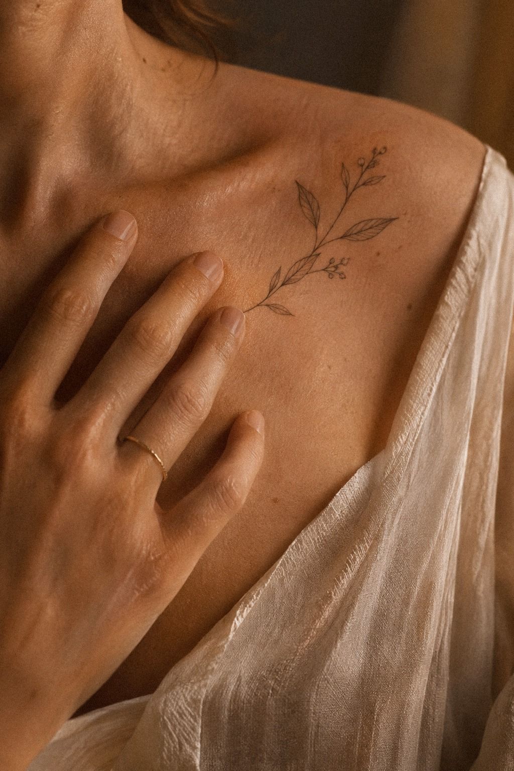
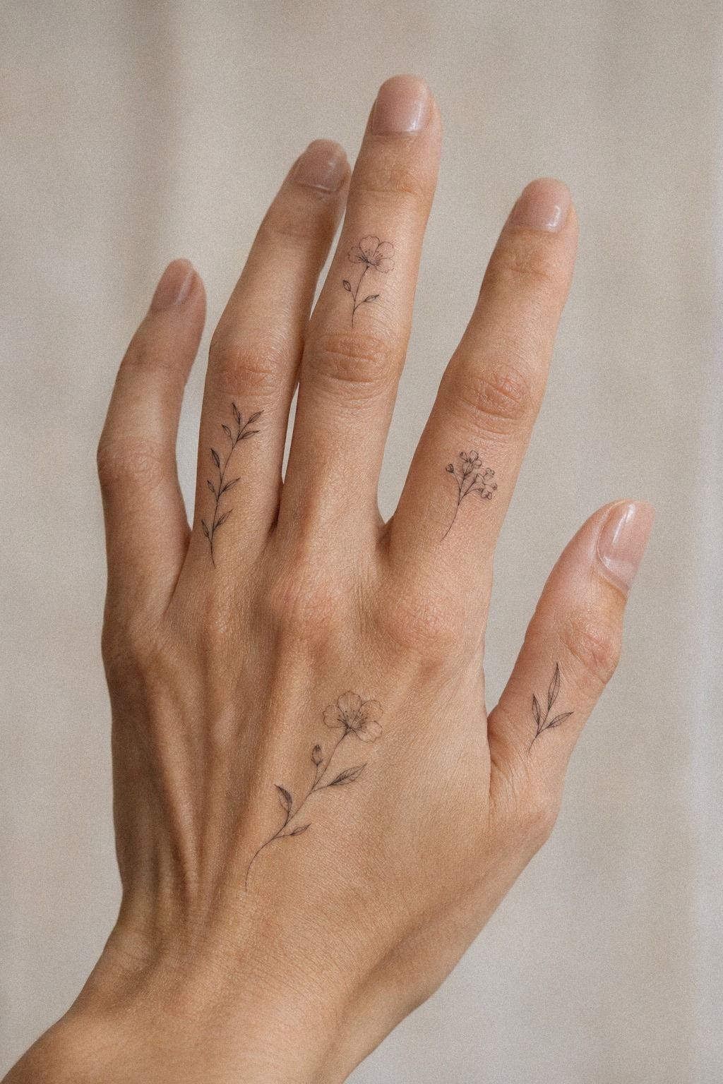
Dainty finger tattoos work when the meaning belongs to you first and the viewer second. A tiny initial, closed loop, or miniature botanical mark can sit along the side of one finger without competing with your rings. You’ll want a symbol that still feels complete when the hand is relaxed.
I’d choose a simple outline over dense shading for this placement. Finger skin sees washing, friction, and constant movement, so delicate lines can spread or fade sooner here. A 3RL needle may give your artist enough control for a small symbol, though the exact configuration should follow the design and your skin.
The strongest version often looks almost private. Small navy symbols can feel sacred without becoming dramatic, and you don’t need a row of matching marks to make the idea work. I’d skip copying a trend you’ve already seen everywhere.
A symbol tied to a place, person, or promise will stay more meaningful.
If you’re planning several fingers, start with one and live with it for a while. You’ll learn how your hand moves, how visible the mark feels, and whether you like that level of attention. These small hand tats for women show how restraint can make a tiny placement feel polished.
5Balance Minimalist Knuckle Symbols in Crisp Ink
Minimalist knuckle symbols have a graphic, almost flash-sheet quality. Think four tiny marks with a shared visual language, such as a dot, crescent, line, and small star. You’ll get a crisp arrangement if each symbol has similar visual weight, even when the shapes aren’t identical.
I’d place the symbols with your fingers relaxed, not stretched wide. Your knuckles change shape as you move, and a stencil that looks balanced when your hand is flat may feel uneven later. Emerald ink with a tiny gold accent gives this idea stronger personality while the symbols remain open and uncomplicated.
A traditional flash reference can help you communicate the mood, but your artist should redraw it for your anatomy. I’d skip copying a vintage design line for line if it doesn’t suit your knuckles. The goal is an iconic rhythm across your hand, not a page transferred without thought.
Don’t assume matching marks need matching pain. The knuckles and finger joints can feel sharper than the back of the hand, so you’ll want a short, focused sitting.
If you’re collecting similar ideas, compare these minimalist hand tats for women and notice how much spacing protects the symbols. That spacing is doing more work than the ink.
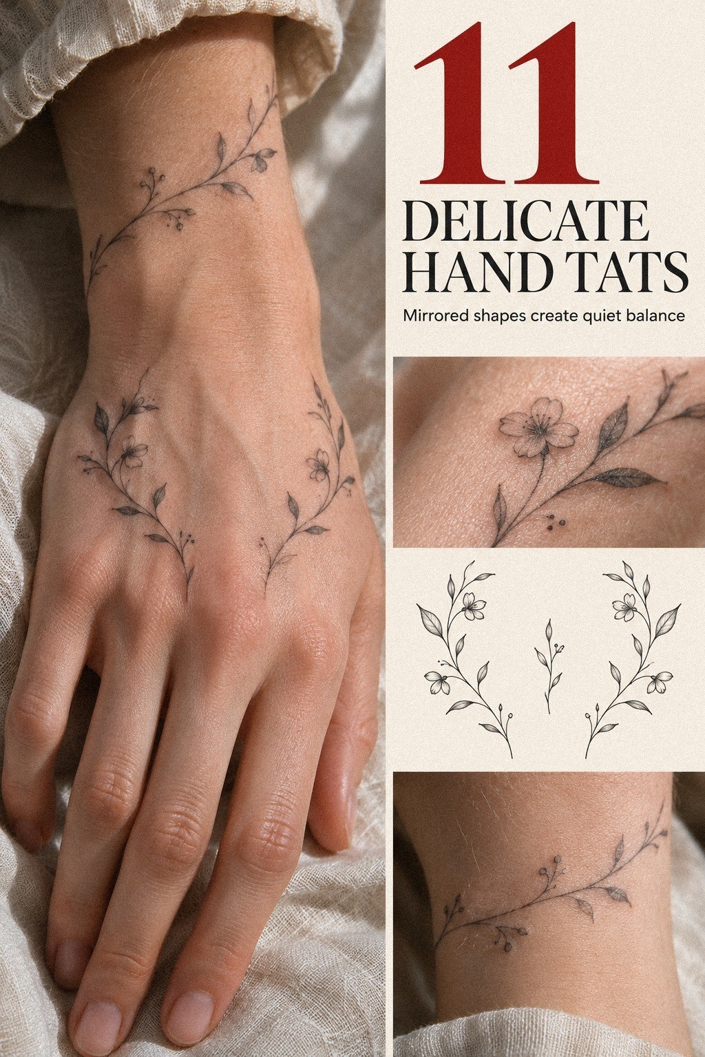
6Let a Delicate Wrist-to-Hand Vine Flow

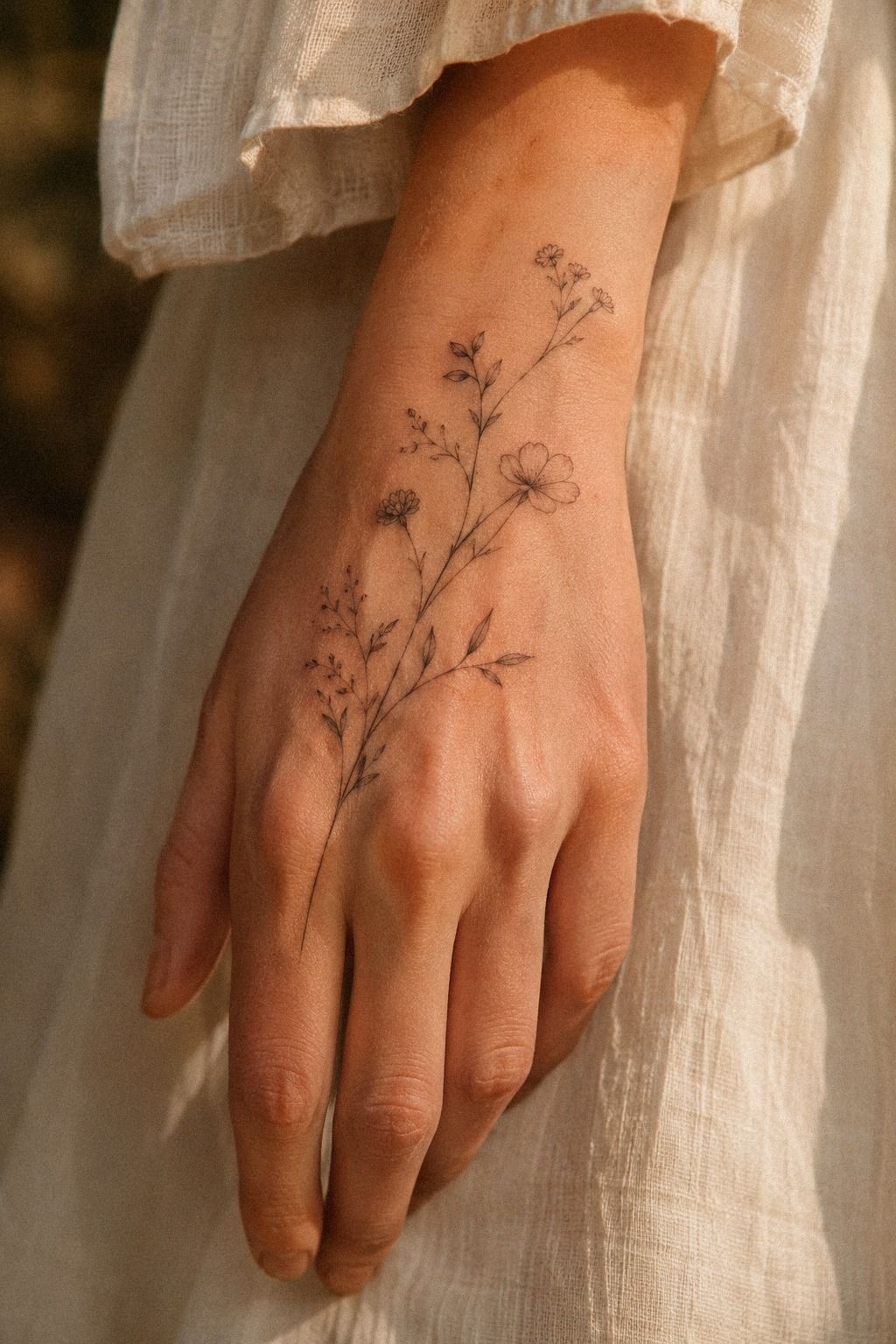
A delicate vine traveling from the wrist onto the hand creates a flowing shape that feels graceful and organic. I’d use one curved stem with small leaves instead of a thick climbing branch. You’ll get movement without asking the artist to pack too much detail into the crease.
The transition matters most. A forest-green line vine should narrow slightly as it reaches the fingers, then stop before the design becomes visually busy.
I’d avoid placing leaves directly inside the wrist fold because repeated bending can blur their edges. A slightly offset path will look cleaner and feel less irritated during healing.
On deeper skin tones, your artist may recommend strong charcoal contrast and careful spacing between lines. That isn’t about making the design harsher.
It’s about keeping every leaf readable once the surface settles. You’ll want to see healed examples on skin close to yours, and you shouldn’t feel awkward asking for them.
I’d also keep the rest of your hand markings quiet if you choose a vine. It’s already expressive, vibrant, and a little romantic.
These delicate hand tattoos for women can help you compare wrist-to-hand flow. And if your artist suggests a shorter stem, listen.
A shorter design may age with more clarity!
7Find the Personal Detail in Unique Hand Tats
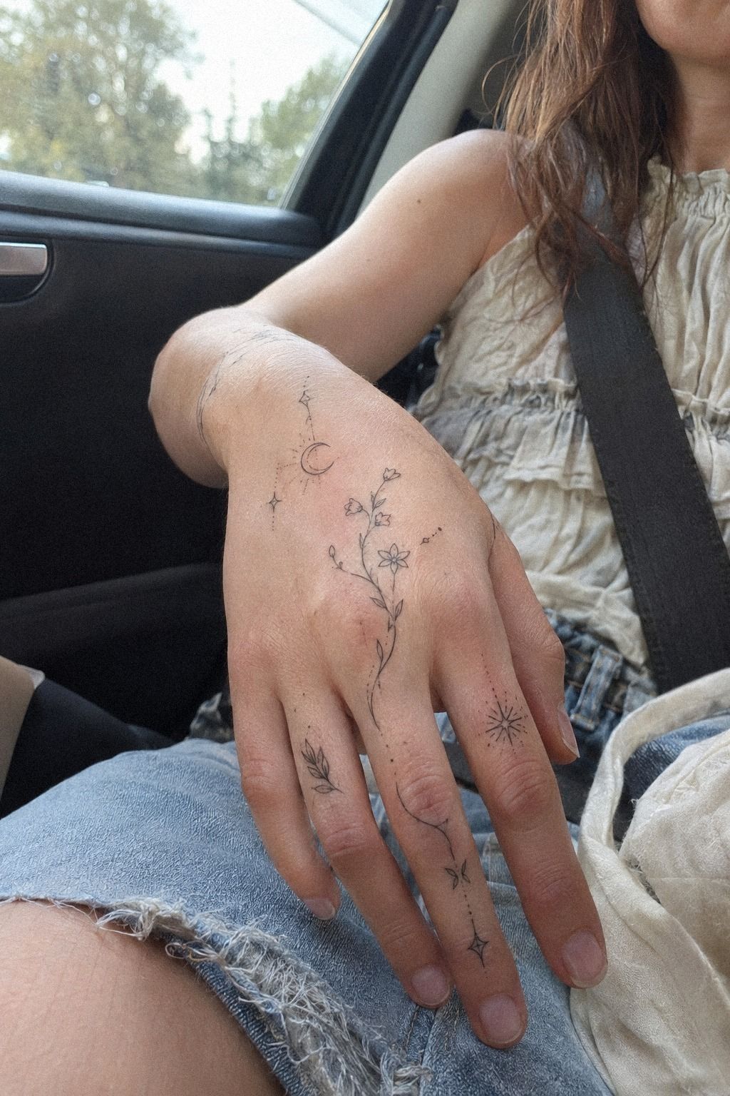
Unique hand tats don’t need an unusual subject to feel original. A tiny anatomical heart, a slender match flame, or a miniature key can become distinctive when the proportions and placement are personal. You’ll get more character from a thoughtful silhouette than from adding five extra details.
Single-needle work can create an intricate effect, but it isn’t magic. I’d ask your artist how the design will be adjusted for the hand’s movement, especially if the piece includes tiny text or parallel lines. Dusty-rose ink may look delicate fresh, while charcoal can give the healed version a quieter outline.
My preference is a small object with one imperfect, human detail. A slightly uneven flame or asymmetrical leaf can feel more expressive than a sterile icon.
I’d skip a design that needs a magnifying glass to understand. If you’re going to carry it every day, you should still recognize the idea from a normal distance.
You can compare scale through these unique delicate hand tats before choosing your stencil. Bring your favorite reference, then let the artist redraw it.
You’re hiring artist judgment as much as technique, and the best result won’t be an exact copy. It’ll be a personal version that fits your hand.
8Are Ethereal Finger Stars Too Delicate?
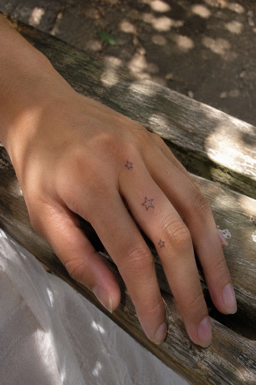
Ethereal finger stars suit anyone who wants a playful design with a softer edge. Use three or four stars in different sizes, leaving enough skin between them to keep each point visible. You’ll get a more polished result if the smallest star doesn’t sit directly on a crease.
I’d choose clean outlines rather than solid fills for most of the stars. Fine black outlines will keep the composition light, while one tiny filled star can create a focal point. Too many solid marks may make the fingers look crowded, and you won’t have much room to correct the balance later.
The stars can symbolize direction, memory, or a private sense of wonder. That meaning doesn’t have to be explained every time someone notices your hand.
I’d keep the arrangement slightly irregular because perfect symmetry can look stiff on moving fingers. A little whimsy makes the set feel more alive.
If you’re wondering whether the placement will hurt, finger tattoos can feel sharper than a forearm design because there’s less cushioning near the bone. You’ll want an artist who works efficiently and gives your skin a chance to settle.
These delicate simple hand tattoos show how a few small marks can still feel complete. It works!
9Make Ornate Lace-Inspired Ink Across the Palm
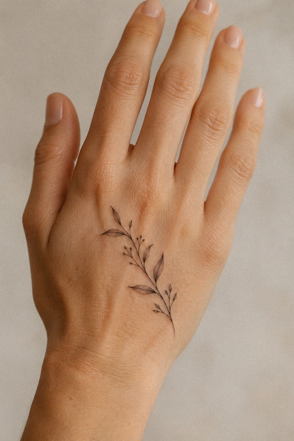
Ornate lace-inspired ink across the palm is the most daring idea in this collection. A midnight-blue design with curved lines, small openings, and repeated motifs can feel feminine, powerful, and almost ceremonial. You’ll need an artist who understands how palm skin behaves, not only someone who draws attractive lace patterns.
I’d keep the central motif bold enough to survive visual wear, then make the outer details lighter. Copper tattoo ink can look vibrant at first, but your artist should discuss how color may settle on your skin. Palm tattoos are exposed to friction and may require a realistic conversation about fading and future touch-ups.
This isn’t the placement I’d choose for a first tattoo if you’re nervous about pain. The palm has sensitive areas, and the experience can be more intense than the back of the hand.
I’d skip a huge pattern that reaches every finger. A contained lace medallion gives you a clearer focal point and a more manageable sitting.
What makes it work is the contrast between ornate detail and open skin. You’ll want the artist to protect those gaps, because they make the pattern readable. If you prefer a gentler version, review these delicate hand tats ideas and look for motifs that borrow lace’s rhythm without covering the whole palm.
That distinction matters!
10Bold Blackwork Versus Delicate Contrast
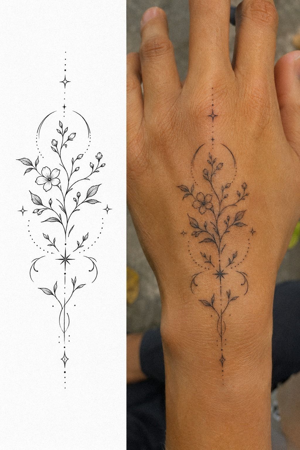
Bold blackwork can look surprisingly delicate when the solid shape is small and carefully placed. A sage-green crescent, narrow arch, or tiny botanical anchor gives your hand a clear focal point without turning the entire design heavy. You’ll need strong edges, consistent fill, and enough skin around the mark.
I’d compare the stencil with a healed reference before choosing this direction. Charcoal tattoo ink usually holds its visual weight better than extremely fine lines, but poor placement can still make it look blurred or cramped. The design should be bold because the shape is intelligent, not because it uses more ink.
A split reference showing stencil and healed work is useful here. It lets you see how the design changes once the surface settles, and you’ll notice whether the charcoal remains even.
I’d skip random shading inside a tiny symbol. A clean silhouette will look sharper and more timeless.
Bold doesn’t mean aggressive. A small charcoal crescent beside a bare knuckle can feel sleek, understated, and personal. These small hand tats offer useful scale references if you’re unsure how much contrast you want.
You can choose one strong mark and still keep the rest of your hand visually quiet.
11Choose Meaningful Matching Hand Tattoos for Two
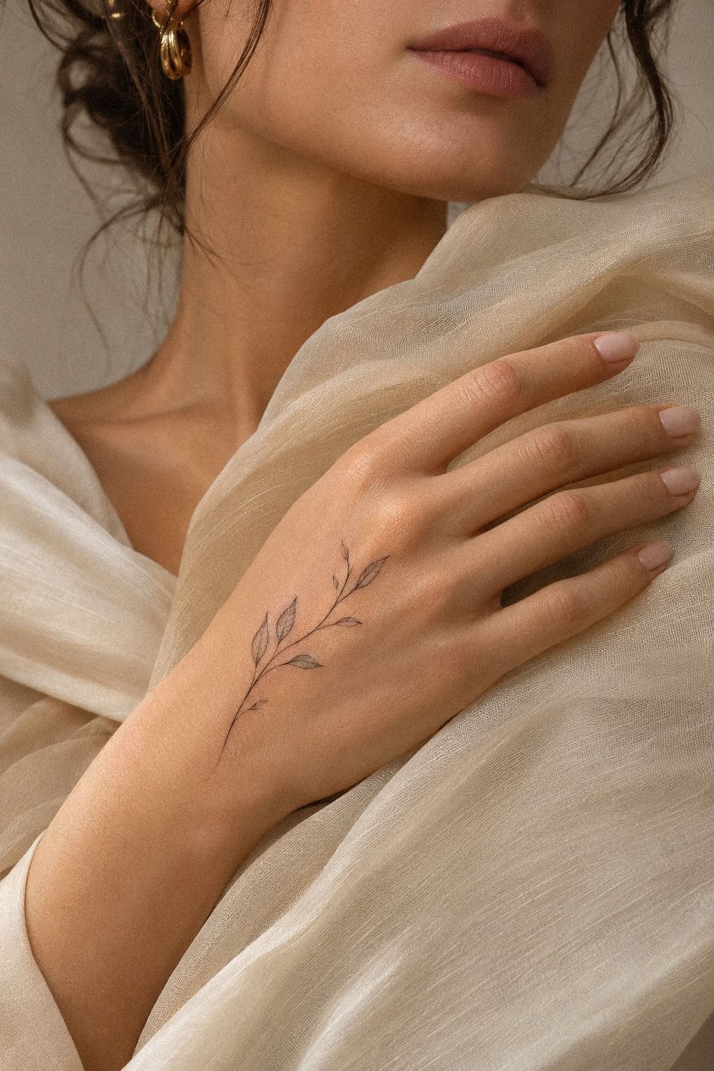
Meaningful matching hand tattoos for two should share an idea, not necessarily duplicate every line. A pair of tiny arches, connected stars, or half-botanical symbols can feel intimate while still looking complete on each person’s hand. You’ll want each version to work alone, because your hands won’t always be side by side.
I’d choose a design with one shared element and one personal difference. Terracotta ink can keep the pair visually connected, while an olive leaf or changed star gives each tattoo its own identity.
I’d avoid a sentence that only makes sense when joined. That choice can become awkward if the relationship or circumstance changes.
Matching tattoos deserve a practical conversation about skin, placement, and pain. Your hands may not respond the same way, even if the stencil is identical.
One person might find the side of the hand manageable while the other feels every pass sharply. You’ll both need to follow the same aftercare basics, including gentle washing and sun protection.
If you’re choosing together, save these small hand tats for women and discuss what still feels meaningful separately. The most empowering pair is one you’d both keep proudly. A shared symbol can be romantic, but personal ownership makes it timeless.
A Practical Cost and Value Check
Hand tattoos can be affordable when the design is small, but the cheapest quote isn’t always the best value. A steady artist with healed work may be worth it if that experience reduces the chance of uneven lines, poor placement, or an avoidable touch-up. A reliable artist is part of the cost.
Ask whether the studio uses a shop minimum or an hourly rate. The shop minimum often covers tiny pieces, while detailed palm or matching work may take longer. You’ll get a clearer answer if you send the reference, placement, approximate size, and color preference together.
A Simple Hand Tattoo Cost Table
These are planning ranges, not promises. A written quote should explain whether the studio minimum includes design time, deposits, or a follow-up touch-up. If the estimate stretches past your budget, simplify the design before you compromise on hygiene or skill.
How I Judge Artist Value
I look for clean healed work before I look at a dramatic fresh tattoo. Fresh ink can seem flawless under studio conditions, while healed skin shows whether the artist understands spacing, saturation, and movement. That healed work tells you far more about long-term value.
I’d also ask direct questions about gloves, single-use supplies, and surface cleaning. Professional hygiene standards should feel ordinary and easy to explain.
If the artist becomes vague when you ask, I’d keep looking. Clear hygiene answers should never feel like a special request.
Finally, compare several examples from the same artist, not just one perfect reference. A consistent portfolio gives you a better sense of what you’ll receive. It’s a smarter choice than choosing only by a low quote, especially when you want a consistent artist portfolio.
Would a Smaller Piece Be Worth It?
A smaller piece can be worth it when you want a manageable sitting and a design that leaves the rest of your hand open. It may also be easier to place away from the sharpest knuckle or palm areas. The trade-off is that tiny details need enough separation to remain readable.
I’d protect the smaller design by removing details that don’t carry meaning. One clear symbol usually has more design value than a crowded miniature scene. If your reference only works at a larger scale, resize the idea rather than forcing every detail into a tiny outline.
Aftercare That Protects Crisp Lines
Your artist’s aftercare instructions should take priority over generic advice. In general, wash gently with clean hands, avoid picking peeling skin, and keep friction low while the surface settles. Hands are difficult to protect, so plan around work, exercise, and frequent washing.
Use a mild cleanser and moisturize only as directed. Don’t soak the tattoo in a pool, bath, or open water during early healing. A thin layer is usually easier to manage than heavy coverage that leaves the skin damp.
Gentle washing is the simple part people often rush.
Once it has healed, sun protection matters. Hands see daylight constantly, and repeated exposure can soften contrast over time. A small habit now can help delicate linework stay crisp longer.
Broad-spectrum sunscreen belongs in your routine once the skin is fully healed.
The Healed-Portfolio Test
Before booking, ask to see at least one healed example of a comparable hand or finger tattoo. Look for readable gaps, even curves, and lettering that hasn’t collapsed into a dark mark. You’re not searching for untouched skin.
You’re checking whether the result still communicates.
Pay attention to how the artist handles surface settling. Some softening is normal, especially with fine lines, but the main shape should remain clear. If every example is fresh, ask when healed work will be available before you commit.
A healed comparison can change your decision quickly.
The Three-Pass Placement Rule
I’ve changed my mind about hand tattoos more than once. My first instinct was to choose the prettiest reference and fit it wherever the stencil landed.
That’s backwards. Your artist should evaluate the skin at rest, while you move, and from the position other people will see most often.
Those three views can reveal a crooked baseline, a crease cutting through a symbol, or a design that looks larger than expected. Three-view placement catches problems early.
The first pass is anatomy. You’ll check bone, folds, tendons, and the way your fingers naturally rest.
The second is movement. Make a fist, open your hand, hold your phone, and turn your wrist. If the design collapses during those ordinary actions, it needs a new position.
The third is longevity. Ask whether the lines have enough space to soften without merging.
Natural hand movement matters more than a perfect pose.
I’m firmly against choosing a hand tattoo only because it looks good in a reference. Fresh ink has sharp contrast and clean swelling, while healed skin tells the more honest story. Look for healed examples from the same artist, especially on hands or fingers.
Healed fine-line work may appear softer, but it should still read clearly.
Pain belongs in this decision too. Hands, feet, ribs, and sternum are often more painful because they’re bony or sensitive, while the forearm, thigh, and shoulder are generally more tolerable.
You can’t guarantee a painless sitting, but you can choose a smaller design, a sensible placement, and an artist who works efficiently. That’s where control comes from.
The Questions Worth Answering First
How much do delicate hand tats usually cost?
I usually see a delicate hand tattoo start around a $50 to $100 shop minimum, while many artists charge roughly $100 to $250 per hour. The final quote depends on region, detail, placement, and the artist’s experience.
Send a clear reference and approximate size before asking for a quote. I’d also ask whether the deposit, design time, and possible touch-up are included. A complete price estimate saves you from guessing later.
Are delicate hand tats a good idea for a first tattoo?
Yes, I think delicate hand tats can suit a first tattoo if you understand the visibility, healing, and touch-up considerations. A small, meaningful design gives you a focused introduction to tattoo care.
I’d choose a less sensitive section of the hand and a simple design first. A first tattoo should feel manageable rather than overwhelming, especially if you’re still learning how your skin responds.
How do I choose a tattoo artist for delicate hand tats?
I’d choose an artist with clean linework, healed examples, and strong hygiene practices. You’ll want to see work on skin rather than relying only on polished studio materials.
Look for consistent spacing, calm outlines, and clear communication. These delicate hand tattoos for women can help you define your preferred style before you contact an artist. A healed portfolio is your most useful filter.
How much do delicate hand tats hurt?
I’d expect hand tattoos to hurt more than tattoos on the forearm, thigh, or shoulder, especially near knuckles, joints, and thin skin. Your tolerance, placement, and artist’s technique all matter.
You may feel sharp vibration, heat, or tenderness rather than one steady sensation. Short focused sessions can feel easier, and you’ll want to tell your artist if you need a pause.
How long do delicate hand tats take to heal?
I usually allow about two to three weeks for the surface to heal, while complete healing can take around two to three months. Your artist’s surface healing instructions should guide the process.
Wash gently, moisturize as directed, avoid swimming during early healing, and protect the tattoo from strong sun. You’ll help preserve crisp lines by leaving peeling skin alone.
What’s the best placement for delicate hand tats?
I’d start with the back of the hand or outer wrist when you want visibility with slightly more space. Finger sides and knuckles are more exposed to friction and may need future touch-ups.
You’ll get the strongest result when the design follows your anatomy instead of fighting it. Compare these minimalist hand tats before you finalize the stencil. Anatomy-friendly placement usually wins.
Where I’d Start First
If I had to pick one, I’d start with the tiny botanical linework across the hand. Its open spacing gives botanical linework room to soften without becoming muddy, and the shape still looks complete when your hand is relaxed.
I’d save the idea, compare healed examples, and ask for a quote before booking. It’s a personal choice, but careful placement gives this final choice the best chance of staying crisp, meaningful, and easy to live with.