Minimalist small wrist tattoos can be quick, personal tattoo designs with surprisingly manageable discomfort. I once chose a placement before checking how the design would age, and the fine line spread more than I expected. Your best defense is a crisp silhouette, sensible placement, and an artist who shows healed work. Start here!
- ✓ Why Start with Tiny Botanical Linework?
- ✓ Artemis’ Crescent Moon and Single Stars
- ✓ When Do Delicate Initials Stay Readable?
Editor’s note: the most meaningful wrist tattoos aren’t always complicated. A tiny mark can still feel powerful and expressive!
- Why Start with Tiny Botanical Linework?
- Artemis’ Crescent Moon and Single Stars
- When Do Delicate Initials Stay Readable?
- Let a Unique Wave Follow the Wrist Bone
- The Serpent’s Fierce Clarity
- How Does a Minimalist Sunburst Mark the Pulse?
- Geometric Heart, Not a Sugary Symbol
- Choose a Dainty Birth Flower with a Personal Stem
- Roman Numerals for a Bold Private Date
- What Makes Matching Symbols Feel Complete?
- Follow a Sharp Lightning Bolt with Meaning
1Why Start with Tiny Botanical Linework?
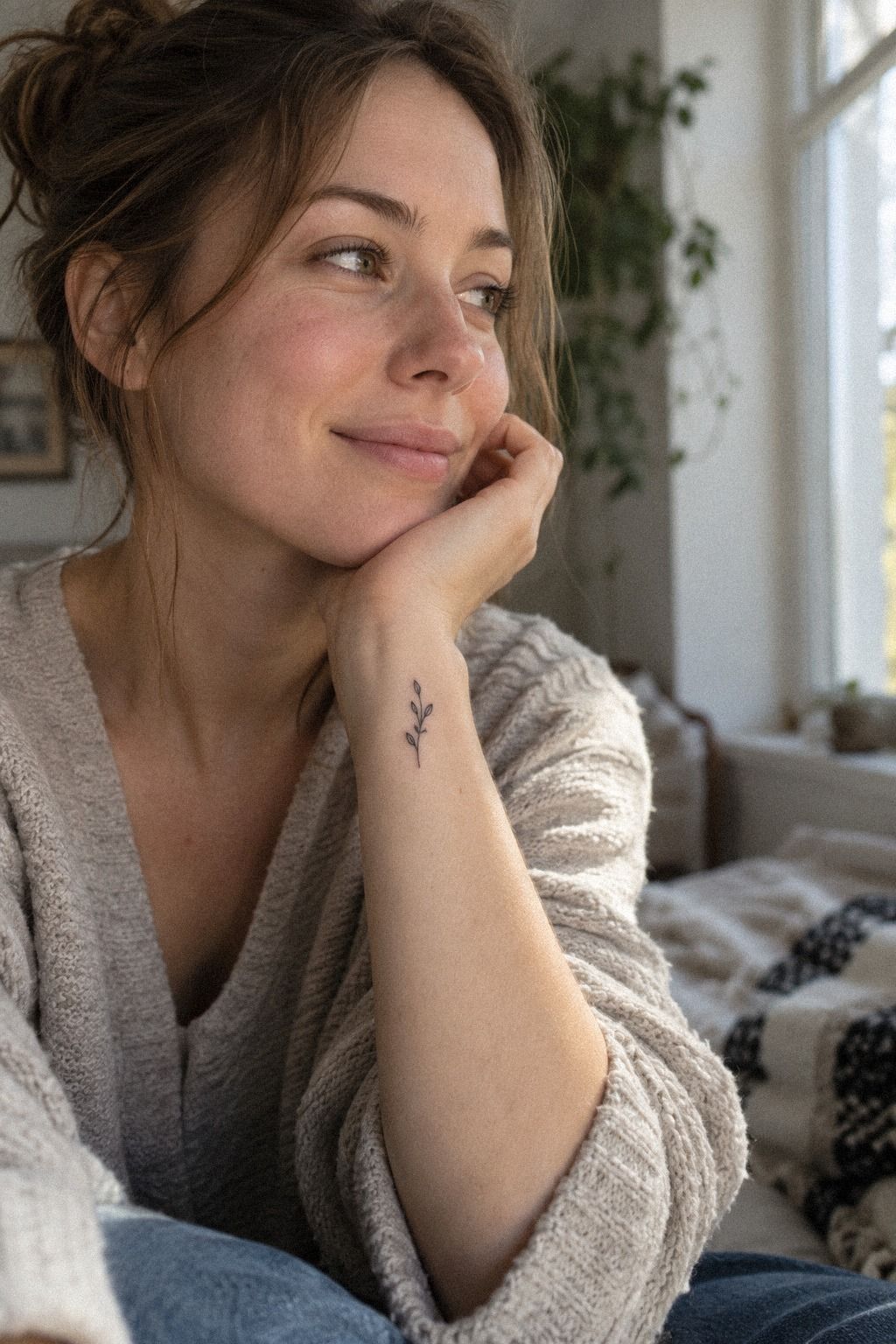
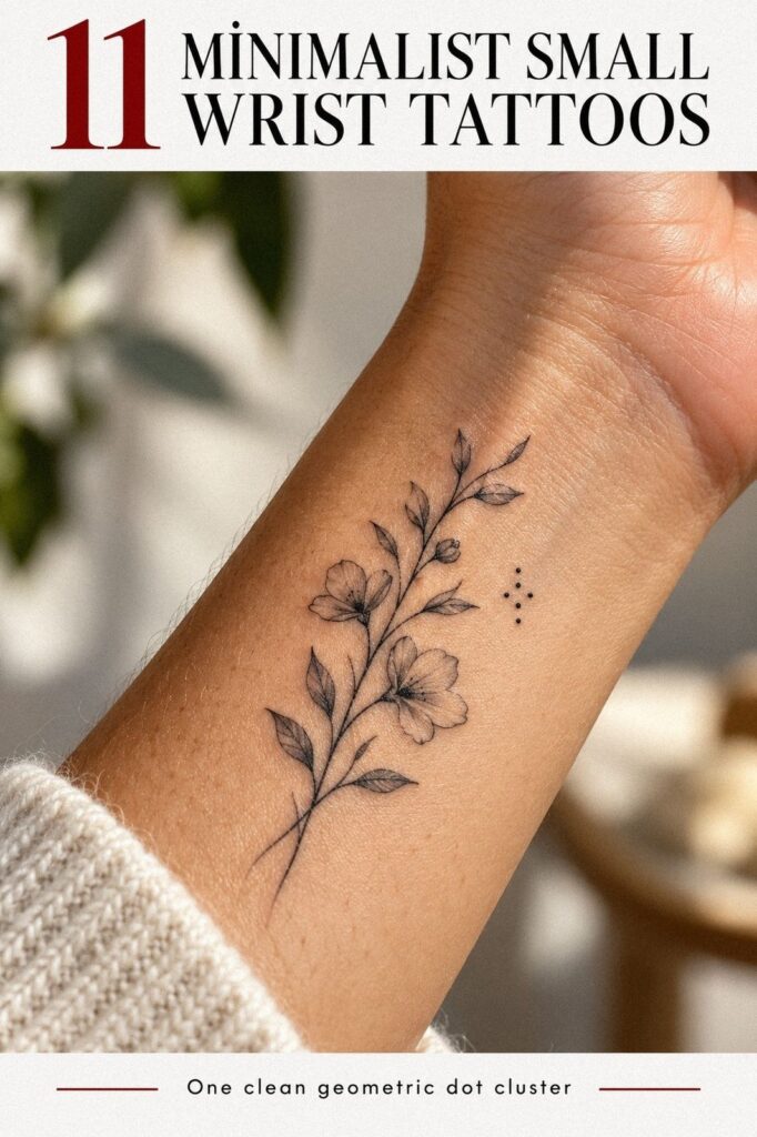
A tiny botanical design feels delicate without disappearing. The inner wrist gives you a close, personal placement, so a single stem, two leaves, or a small sprig can carry real meaning without becoming loud.
I’d choose olive botanical ink with a few open gaps rather than shading every petal. That keeps the piece understated.
Your artist can angle the stem toward your hand or forearm. I prefer a slight diagonal because it follows the natural movement of the wrist and looks less stamped on. An olive botanical tattoo can be striking against many skin tones, but your artist should adjust contrast to your undertone.
– Tiny botanical stem with two or three leaves. – Single-needle grouping for small details. – Open negative space around the central mark.
If you’re collecting small pieces, compare this with our tiny small wrist tattoos for placement ideas. You’ll notice that the strongest designs leave breathing room around the central mark.
The main risk is over-detailing. An intricate flower shape can look gorgeous on a stencil and muddy after years of sun exposure.
I’d skip a full bouquet at this scale. A personal sprig will read more clearly, and you won’t need to keep checking whether every tiny vein survived.
For value, this is often worth the cost because the design uses fewer technical details and a shorter session. You’re paying for artist judgment, hygiene, and placement, not only the amount of ink.
2Artemis’ Crescent Moon and Single Stars
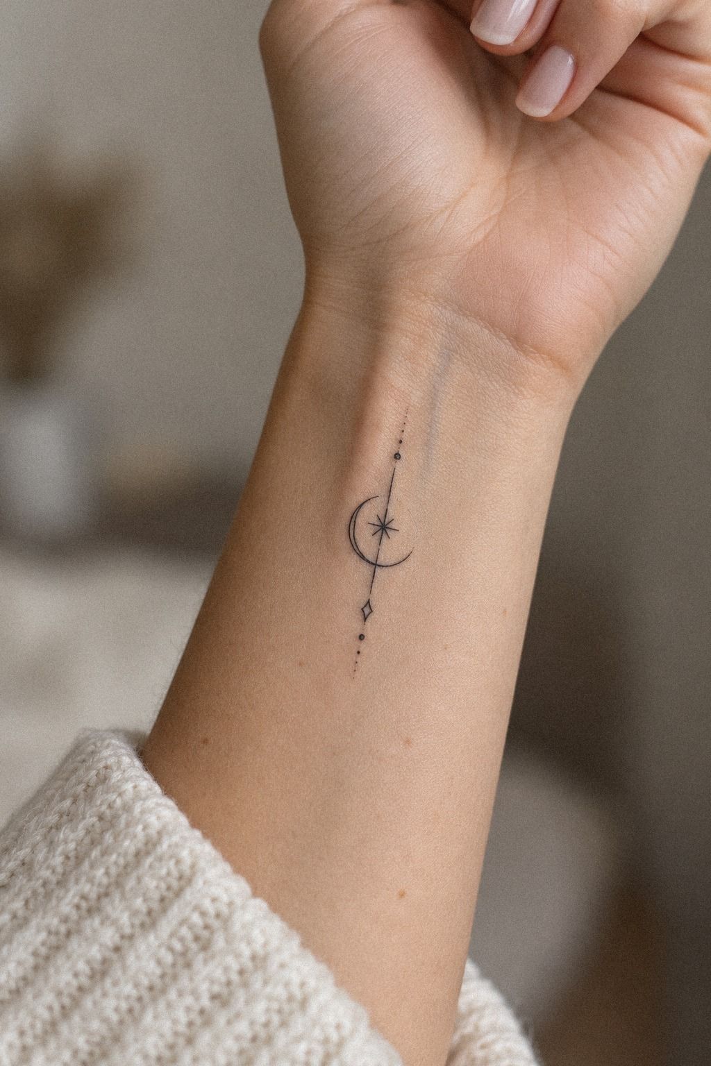
A clay crescent tattoo gives you a symbolic design with very little visual weight. The curve can feel sleek and mysterious, while one or two stars keep the composition from looking unfinished. I’d avoid filling the entire crescent if you want a lighter, ethereal mark.
Use open crescent spacing so the shape remains legible as the skin settles. A tiny star can sit inside the curve, beside it, or slightly away from the main symbol. The best version feels intentional rather than crowded.
– One crescent and stars with clear separation. – Small star outlines with consistent points. – Crease-safe placement away from the deepest fold.
Our small wrist tattoo ideas can help you compare curved symbols with compact geometric marks. I’d save several options, then bring only the strongest one to your appointment.
A moon can feel haunting, romantic, or quietly significant. Decide whether it represents time, intuition, a person, or simply a visual preference before you book. You’ll want the symbolism to feel personal, not borrowed.
3When Do Delicate Initials Stay Readable?
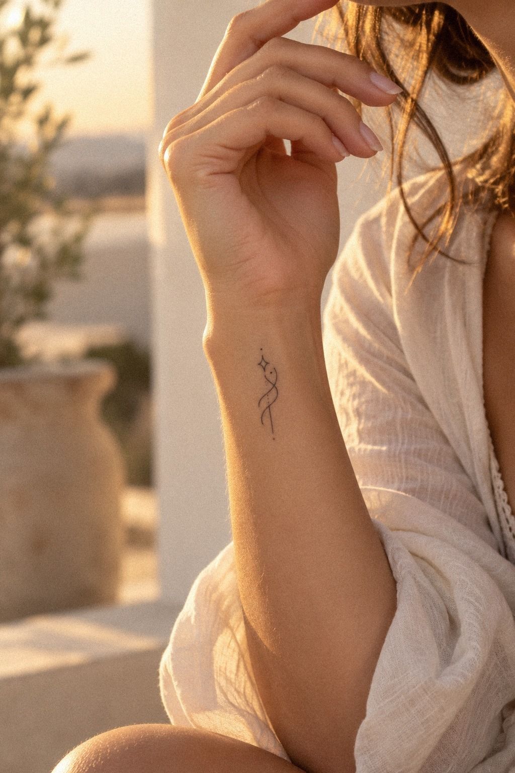
Initials are personal, but they’re only meaningful if you can still read them later. A delicate initials tattoo needs enough separation between letters to remain graceful after healing.
For this design, plum ink with a subtle rose-gold accent can feel elegant without making the script hard to follow. I’d keep the flourishes limited and give each character its own breathing room.
– Short initial pair with one clear focal letter. – Fine script lettering simplified for wrist scale. – Readable letter spacing between every character.
Our small wrist tattoo ideas include compact lettering references. Bring the chosen type style to your artist, but expect a small adjustment if the original script is too compressed.
The biggest risk is copying a font that looks beautiful at full size but collapses on skin. Ask for the initials at their actual tattoo size. A readable mark will feel more meaningful than an ornate monogram nobody can decipher.
4Let a Unique Wave Follow the Wrist Bone
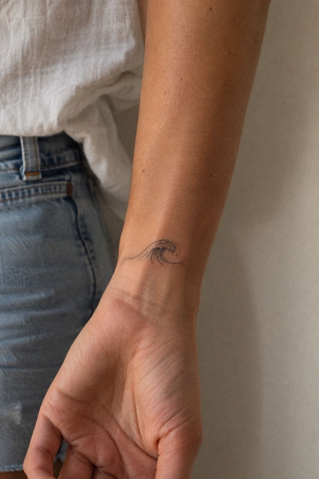
A navy wave tattoo follows the wrist bone beautifully because the line already has a natural direction. The flowing foam keeps the ocean shape expressive without turning it into a full illustration. I’d let the wave rise toward the thumb side, where the curve feels active.
Your artist may simplify the foam into two or three short marks. That’s enough. If the flowing foam marks become too intricate, the tattoo loses its sharp silhouette and starts reading like a dark knot.
– Curling crest with two foam marks. – Navy line tattooing with restrained density. – Bone-following placement that doesn’t fight the wrist.
For another placement comparison, save these small wrist tattoo ideas and look for designs that use the body’s movement. You’ll see why a wave often looks better slightly off-center.
The wrong choice here is a perfectly horizontal wave. It can look flat when your hand turns.
I’d choose a diagonal wave with one deliberate peak instead. It feels daring, and your eye follows the shape naturally from the hand toward the forearm.
This design can feel raw, peaceful, or deeply personal. Keep it tied to a place, person, or season. That connection will hold more meaning than a random ocean symbol you selected five minutes before the appointment.
5The Serpent’s Fierce Clarity
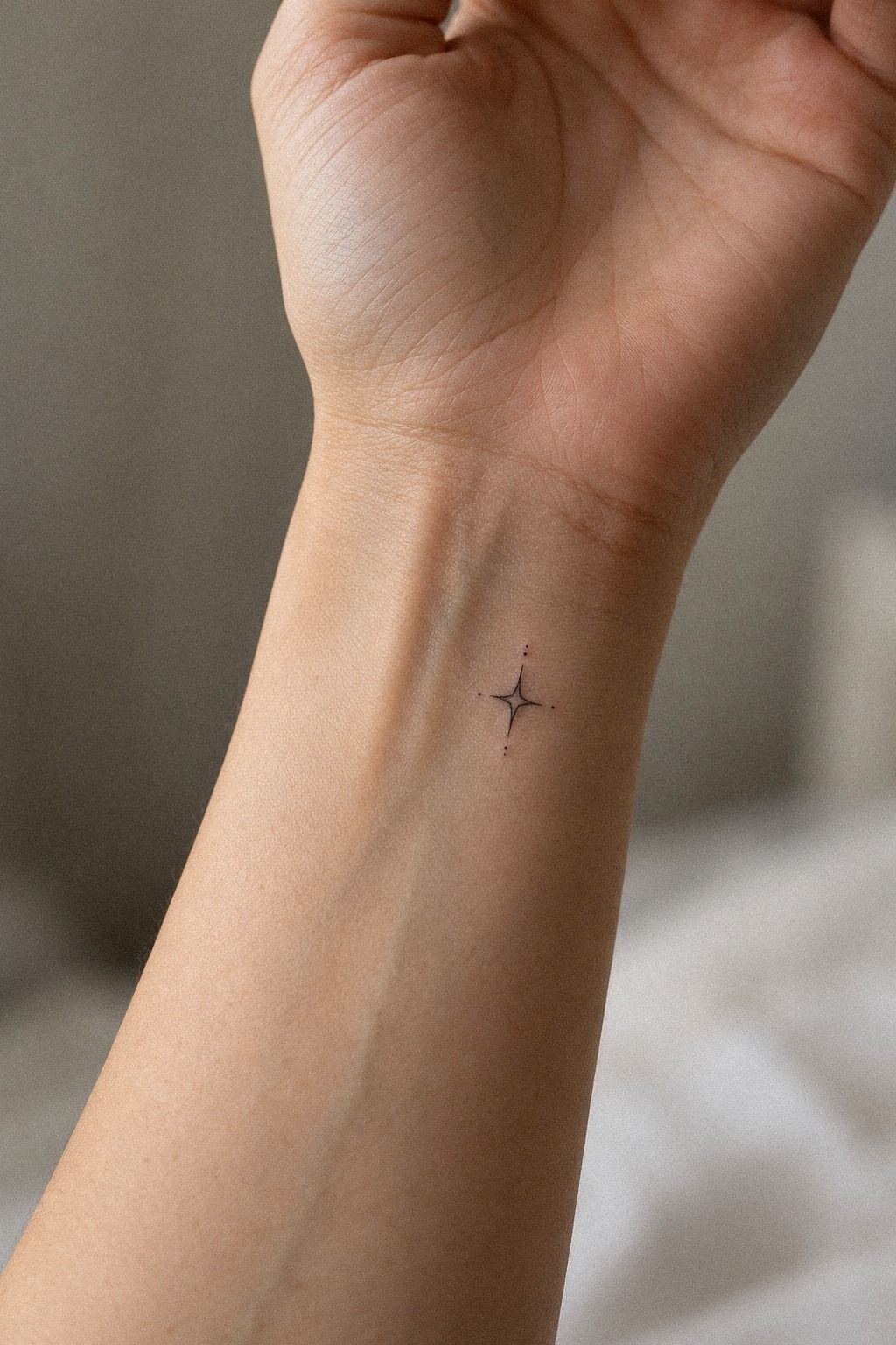
A tiny snake has an edgy silhouette that reads quickly, even in a compact design. Its body can curve along the wrist bone, wrap slightly toward the hand, or sit in a simple S shape. I’d use an emerald snake tattoo with a clear pose rather than forcing scales into a tiny area.
The head matters most. A pointed snout, small eye, and one controlled bend can make the snake profile recognizable without extra decoration.
– Clean body curve with one controlled bend. – Crisp emerald lines with enough separation. – Minimal internal marks instead of dense scales.
A snake can feel fierce, symbolic, or transformative. Ask yourself whether you want a literal animal, a protective emblem, or an abstract shape before deciding.
The budget should reflect tattoo complexity. A simple snake may be a short session, while tiny scales and heavy shading raise the price without always improving the final result. You don’t need every texture to make the symbol bold.
6How Does a Minimalist Sunburst Mark the Pulse?
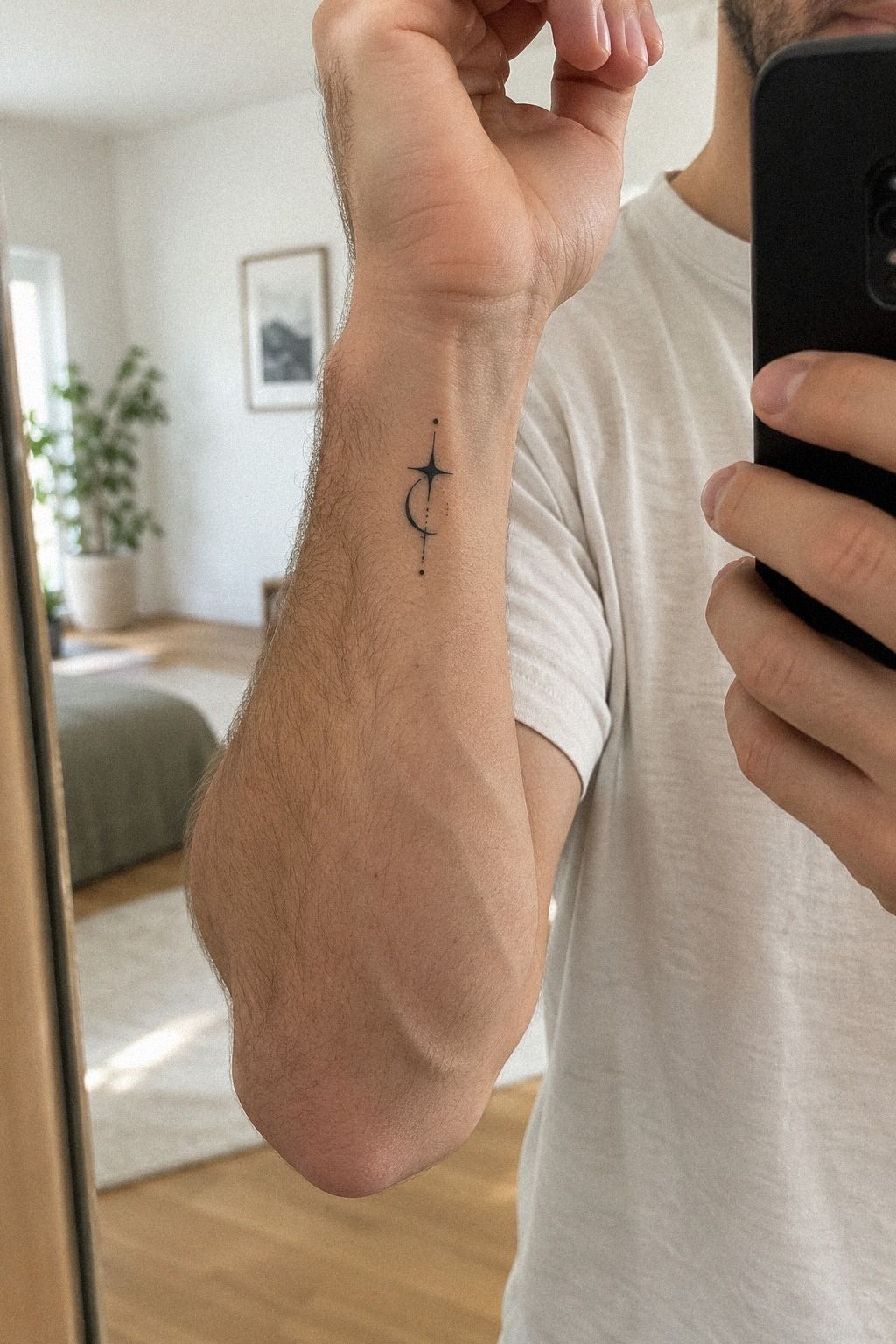
A forest-green sunburst above the pulse has immediate visual clarity. The short, even rays create a crisp rhythm, while the open center keeps the mark light. I’d place the circle just above the pulse rather than directly across the crease, where constant movement can make the design look uneven.
Use forest-green pigment for the center and rays. Your artist should check the stencil under different lighting because contrast can look different in person. The design feels vibrant because the rays are controlled, not because they are numerous.
– Small open circle with eight or fewer rays. – Solid center without a heavy outer halo. – Pulse-safe gap from the wrist crease.
If you’re drawn to sun imagery, our small sunflower tattoos guide gives you a different floral direction without losing the same symbolism. Both designs need clear spacing to stay readable.
And yes, the pulse placement can feel more sensitive for some people. Your tolerance is personal, so tell your artist if you need a pause. A short session is still a real session, and there’s no prize for pretending discomfort feels fine!
I’d avoid long rays that reach toward the hand. They can make a small sun look stretched and less timeless. A compact burst keeps its recognizable shape if the thinnest lines soften with age.
7Geometric Heart, Not a Sugary Symbol
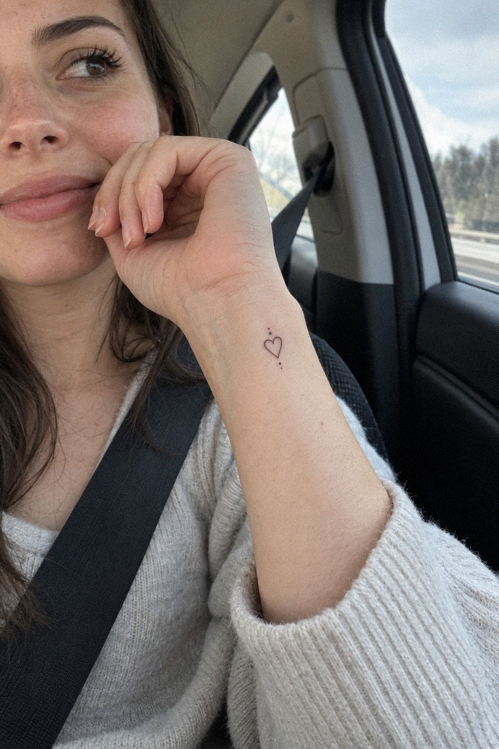
A dusty-rose heart gives you romance without a sugary finish. Start with a clear heart outline, then decide whether the interior needs dots, a split line, or one small symbol. Too many details can weaken the shape.
Charcoal dotwork can add texture, but it should support the heart rather than compete with it. I’d use a short row of dots near the center or along one edge instead of filling every section.
– Balanced heart outline with two even sides. – Dotwork pattern with deliberate spacing. – Open heart edges around one focal detail.
This is a strong choice if you want something romantic but not overly literal. A heart can be meaningful, empowering, or playful depending on the geometry.
Before booking, look at healed dotwork tattoos. Fresh dots often appear darker than they will after the skin settles, so healed work tells you more than a new stencil.
8Choose a Dainty Birth Flower with a Personal Stem
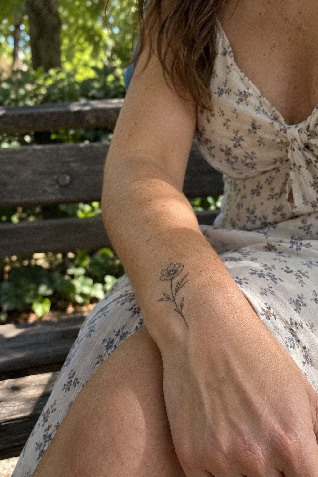
A dainty birth flower works well on the wrist because one stem can carry a whole story. I’d use warm-camel ink for the main line and reserve darker accents for the center or a few defining petals.
The stem should remain readable when your wrist bends. Your artist can simplify the flower into a few graceful petals instead of reproducing every botanical detail.
– Single flower stem with a clear direction. – Delicate petal marks kept open. – Personal birth symbol sized for the wrist.
Our small hand tattoos for women page includes more compact placement references. Compare the wrist with the hand side before choosing the final location.
The flower’s meaning matters more than botanical accuracy. Choose the month, person, or memory behind it first, then let the artist create a graceful version that will remain legible.
9Roman Numerals for a Bold Private Date
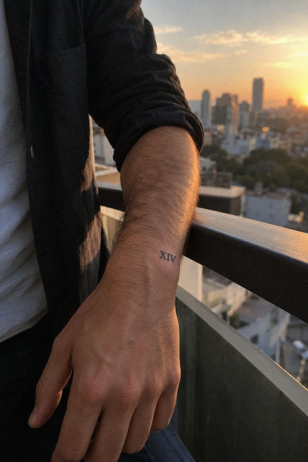
Midnight-blue numerals give you a structured way to mark a date, year, or private milestone. On the outer wrist, the direction is easy to see when your arm rests naturally. A Roman numeral layout works best when the spacing is carefully measured.
Your artist should print the numbers in several sizes before applying the stencil. Tiny numerals can become difficult to distinguish, while oversized ones may dominate the outer wrist. I’d choose a Roman numeral tattoo with enough room between each character.
– Short date with a clean baseline. – Even baseline across every character. – Clear serif details that won’t merge after healing.
Our small hand tattoos for women page includes more compact placement references if you’re deciding between the outer wrist and hand side. You’ll want to see how visibility changes when your arm turns.
Don’t choose Roman numerals only because they look classic. Know the date and what it represents. A stylish tattoo can still feel empty if the meaning arrives afterward.
I’d skip copper flourishes around the numbers. The date is already the focal point, and extra marks make the design less understated. A clean line of numerals feels timeless and personal.
10What Makes Matching Symbols Feel Complete?
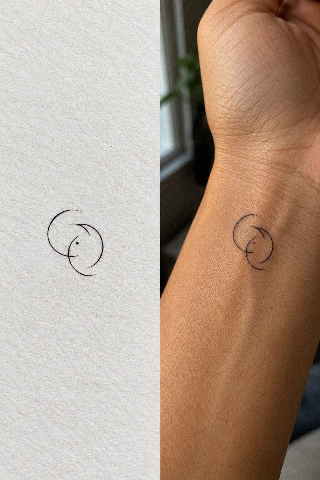
Matching symbols work best when each person receives the same essential shape, not two designs that only make sense when pressed together. Each person should receive a complete symbol that still feels right when viewed alone.
Choose a symbol that remains significant by itself. A small star, wave, initial, or abstract mark can feel intimate without becoming overly literal. The outline should retain a readable structure after healing.
– One shared symbol. Two individual placements. – Simple outlines with consistent scale. – Matching proportions with slight placement flexibility.
You can use our minimalist hand tattoos for women to compare matching ideas that don’t depend on exact alignment. Your wrists won’t bend identically, and that’s fine. The tattoos should belong to each person first.
Please look at healed work, not only fresh tattoos. Fresh ink often appears darker and sharper than it will later. A significant design deserves an artist who can show how fine lines settle over time.
I’d avoid an elaborate split image that becomes confusing when separated. Simple symbols are more expressive here. They give both people a complete tattoo and still create a connection when the wrists meet.
11Follow a Sharp Lightning Bolt with Meaning
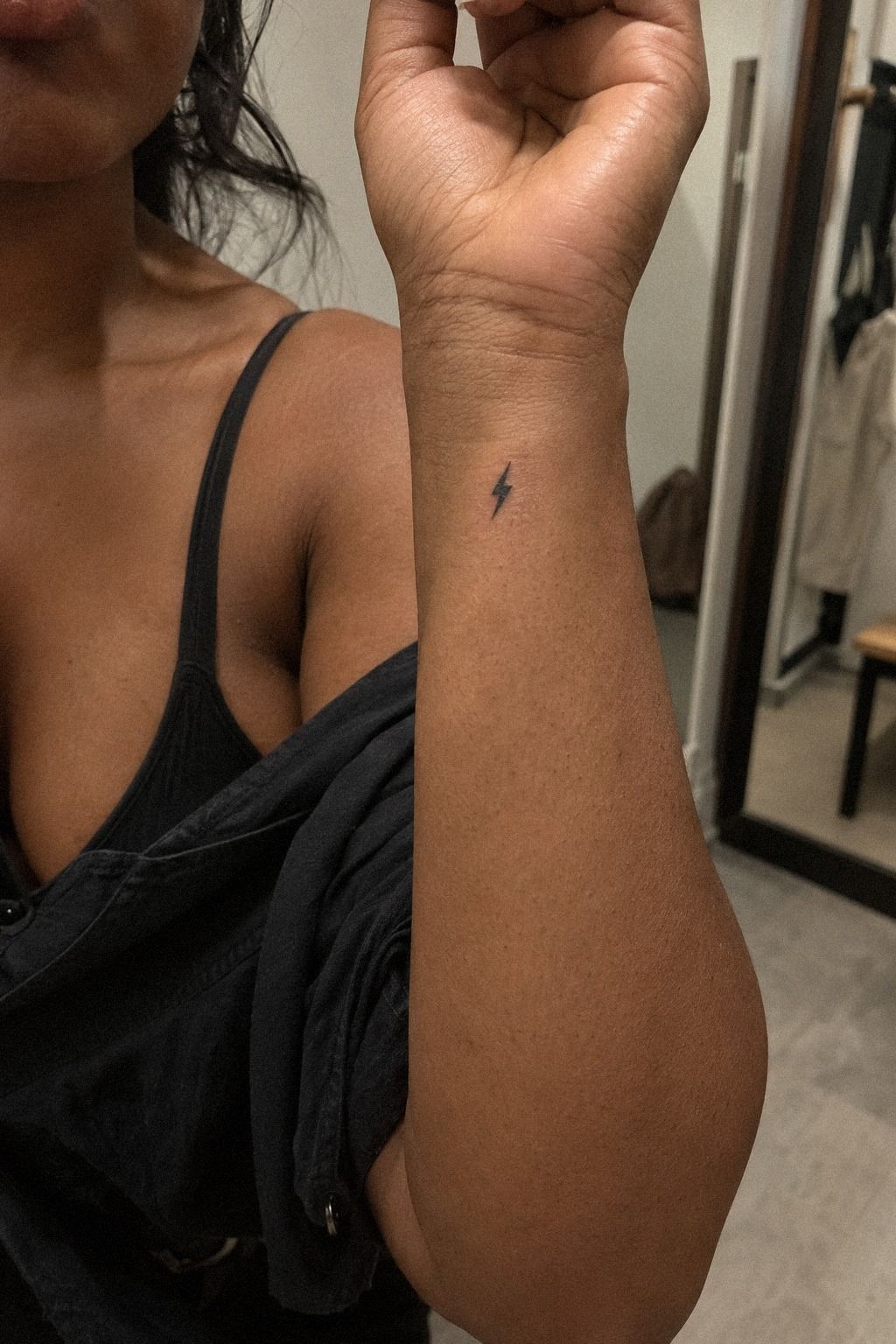
A tiny lightning bolt is compact, recognizable, and full of energy. Its sharp angles make it feel daring without requiring a large footprint. I’d use a terracotta bolt with a slightly irregular shape if you want a more expressive mark.
The central zigzag needs enough width to remain clear. A lightning bolt silhouette with thin internal cuts may look striking at first, but those cuts can blur as the tattoo ages.
– Three or four clean angles. One strong point. – A sharp outline with limited fill. – A diagonal direction that follows the forearm.
A lightning bolt can feel fierce, daring, or playful. It may represent speed, change, resilience, or simply a favorite visual language. The meaning doesn’t have to be dramatic to be personal.
For a more polished result, ask your artist to show the design at its actual size. A tattoo that looks elegant when enlarged can become cramped when reduced to the wrist.
Test Your Wrist with Three Clear Questions
I’ve changed my mind about minimalist tattoos after seeing how many designs looked better on paper than on skin. The three things I now check are shape, placement, and aging. A striking stencil can still fail if it crosses the crease, relies on fragile detail, or ignores how sunlight reaches the wrist.
First, ask whether the silhouette reads from a short distance. If you need to zoom in to understand the symbol, simplify it. Second, bend and rotate your wrist while the stencil is on.
Your design should still feel balanced when your hand moves, because you won’t spend your life holding it perfectly still.
The third point is the artist’s healed portfolio. Healed black lines may look softer than fresh work, and very fine lines can widen over time.
Solid pigment and sensible placement generally age better than delicate detail packed into a tiny area. That doesn’t mean every tattoo needs to be thick.
It means your design needs enough breathing room to survive real skin.
The wrist is visible, personal, and sometimes more sensitive than people expect. I’d choose a small symbol you’ll enjoy seeing repeatedly, then let the artist adjust the technical details. Your favorite design is a starting point, not a command.
What Makes a Small Wrist Tattoo Worth It?
The best small wrist tattoo has a readable shape, a reason to exist, and a placement you can live with. That sounds obvious, but it’s easy to chase an intricate idea because it looks impressive in a saved post.
I’d prioritize readable tattoo proportions over extra decoration. A minimal crescent, clean initial, or single botanical stem can feel more iconic than a crowded miniature scene.
If you’re comparing designs by value, ask what will still look good after the novelty fades. A lasting symbol usually gives you more long-term value than a trendy detail that depends on perfect line sharpness.
Cost Versus Value: A Realistic Tattoo Budget
The cost of a small wrist tattoo usually depends on the shop minimum, the artist’s experience, the design complexity, and whether you’re booking a custom appointment. A sensible budget is often more useful than searching for the lowest possible quote.
These figures are planning ranges, not promises. The cheapest option may not be worth it if the artist can’t show healed work.
The highest price isn’t automatically better either. Look for transparent pricing, strong hygiene, and a portfolio that matches the style you want.
For a wider comparison, review our small tattoo prices guide before contacting studios. A clear quote helps you judge whether the appointment is worth it for your budget.
Read an Artist’s Healed Portfolio Like a Professional
Fresh tattoos show contrast. Healed tattoos show judgment. Look for fine lines, consistent spacing, clean curves, and designs that still make sense after the skin has settled.
Pay attention to whether small lettering remains readable, whether dark areas healed evenly, and whether the artist adapts designs to different skin tones. You’re not looking for one perfect result. You’re looking for repeated quality.
Ask how the artist handles touch-ups, sun exposure, and placement near the wrist crease. A polished portfolio should include more than fresh work.
Which Wrist Placement Fits Your Life?
The inner wrist feels more private and personal, while the outer wrist is easier to display. The side near the thumb can make curved designs feel more dynamic, while the flatter outer area suits numerals, initials, and compact symbols.
Before choosing, test the relaxed wrist position and the position you use while typing, driving, or holding a phone. A design can look perfect when your hand is flat and awkward when your wrist bends.
Our small wrist tattoo ideas and small hand tattoo guide can help you compare visibility. Keep the design away from the deepest crease when possible.
What Should You Check Before Booking?
Bring the exact size you’re considering, but stay open to a small adjustment. Your artist may widen a line, simplify a curve, or shift the placement by a few millimeters so the tattoo ages more reliably.
Check the studio’s hygiene standards, deposit policy, revision process, and aftercare instructions. Ask to see healed examples, confirm the estimated price, and make sure the artist understands whether you want a delicate, bold, or understated result.
A worthwhile appointment should leave you feeling informed before the needle starts. If the consultation feels rushed, keep looking. Your skin deserves an artist who can explain the choices clearly.
The Questions I Get Asked Most
How much does a minimalist small wrist tattoo usually cost?
A minimalist wrist tattoo typically costs about $100 to $300 in the United States, depending on the artist, region, size, and placement. Many shops set a minimum around $50 to $100, while hourly rates often fall near $100 to $250.
Compare portfolios and healed work before comparing prices. Our small tattoos meaning guide offers useful planning context.
Are minimalist small wrist tattoos a good idea for a first tattoo?
Yes, a small wrist design can be a significant first tattoo because the session is limited and the placement is easy to see. The area isn’t painless for everyone, but many people find it manageable. Choose simple linework, a personal symbol, and an artist whose portfolio matches your preferred style.
How do I choose a tattoo artist for minimalist small wrist tattoos?
Look for clean linework, healed examples, strong stencil placement, and a hygienic studio. Your artist should explain line weight and placement rather than copying an image without adjustment. Browse our minimalist hand tattoo guide for style comparisons, then ask to see recent healed examples.
How much do minimalist small wrist tattoos hurt?
Pain varies, but wrists are often more tolerable than ribs, feet, hands, or sternum areas. Forearm, thigh, and shoulder placements are commonly easier for many people.
Your session may still feel sharp near bone or the pulse, so tell your artist when you need a pause. There’s no prize for enduring discomfort silently!
How long does a minimalist small wrist tattoo take to heal?
The surface usually heals in about 2 to 3 weeks, while complete healing can take about 2 to 3 months. Wash gently, moisturize as directed, and avoid sun and swimming during early healing.
Don’t judge the final line quality while the skin is still settling. Our tiny small wrist tattoo collection can help you compare designs that use fewer fragile details.
Start with the Tiny Botanical Linework
If I had to pick one, I’d start with the tiny botanical linework. Its open stem gives fine lines room to age, and the inner-wrist placement keeps the meaning personal without hiding it. Save the design, check healed portfolios, and plan your next small wrist tattoo before booking.
Keep the meaning yours. A small tattoo doesn’t need to explain itself to anyone else!