Small inside finger tattoos became my first ink because I wanted something personal without making my whole hand impossible to ignore. I was nervous about pain, fading, and choosing a design I’d regret. I compared delicate linework, tested placement, and left with a meaningful mark I still notice every day!
Here’s what it looked like before:
Before the appointment, I had one clean patch of skin beneath my finger knuckle and far too many saved references. I’d circle tiny hearts, initials, moons, and symbols, then delete half of them because they felt too ornate or too loud for my first tattoo.
The blank space looked ordinary, but I knew I’d see it constantly. You can study tattoo photos for weeks, yet your own hand behaves differently in sunlight, while typing, and when your fingers bend. I wanted an idea that would still feel personal after the novelty wore off.
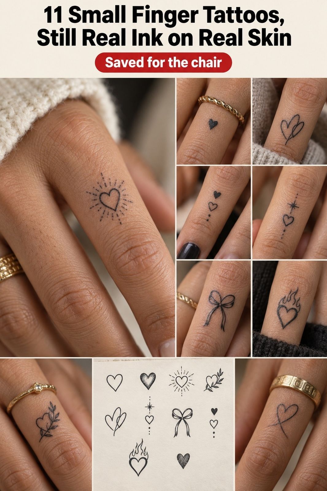
I Chose a Tiny Inner Finger Heart
I started with a tiny heart because the shape felt meaningful without needing an explanation. My artist sketched a fine-line heart with a clean outline and a narrow opening at the top, and I knew it had the crisp, understated quality I wanted.
The design was placed on the inner finger placement, where you can see it when your hand turns inward. You’ll want to check the shape with your finger relaxed and bent, because a heart that looks balanced on paper can look slightly tilted on moving skin.
I almost chose a filled heart, but I skipped it. Solid black fill would’ve looked bolder, while the outline felt more delicate and personal for a first piece. You can compare more options in these small finger tattoos before deciding how much ink you want.
My favorite part was the tiny asymmetry. It wasn’t perfectly geometric, and that made it feel more expressive. I still catch the single-needle outline when I reach for my keys, and the little mark feels intimate rather than decorative.
I Compared Fine Line Tattoo Ideas
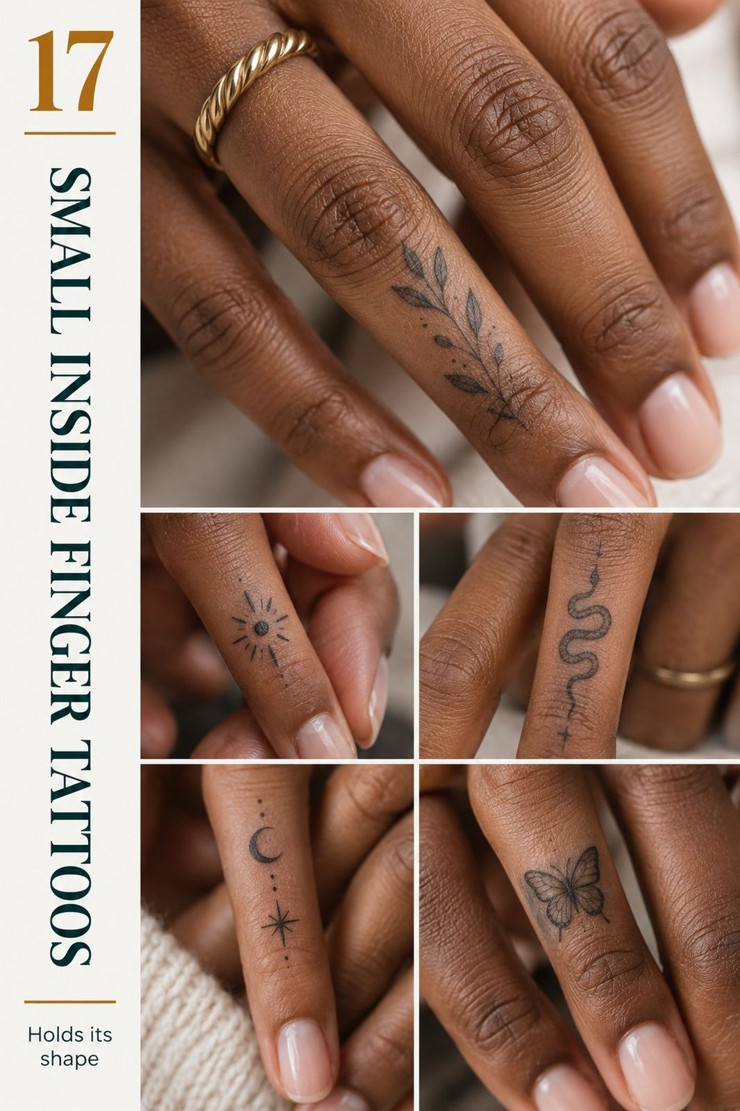
I saved several small inside finger tattoos ideas before choosing the heart. One was a symbolic star, one was a narrow botanical stem, and another was an initial drawn in a sharp serif style. My artist helped me compare how each fine-line design would read at a small scale.
The botanical option looked graceful in the reference image, but the botanical stem crowded together on the stencil. You’ll want to avoid details that only work when enlarged, especially if your finger is narrow or your knuckle folds directly over the design.
I liked the initial because it was meaningful, but it felt less private. Anyone could ask what letter it was. The heart gave me the same emotional weight without making the story obvious, which felt more empowering for my first appointment.
The serif initial was stylish, but not personal enough.
And I learned that the best reference isn’t always the most intricate one. A single-needle stencil with fewer curves gave my artist more room to make every line readable. If you’re still collecting references, this guide to small finger tattoo ideas helped me sort ideas by scale and mood.
I Measured the Inner-Finger Scale
Before committing, I made a half-inch test on paper. I drew the heart at the size I thought I wanted, then reduced it slightly and compared both versions against my finger.
The smaller version looked striking from a distance, but its point disappeared when I bent my hand. The slightly larger small-scale silhouette kept the heart recognizable without feeling loud.
I also watched how the design changed with skin movement. Fingers flex, curl, grip, and straighten constantly, so a design that only works in one position isn’t practical. That was my first real test!
I Positioned Ink Beneath My Knuckle
I placed the tattoo beneath my knuckle instead of directly inside the crease. That small decision mattered. The inner knuckle placement stayed visible when my finger was relaxed, but it didn’t sit directly where the skin folded hardest.
You’ll want to flex your finger during the stencil check. Ask your artist to show you the design straight, bent, and from the side, because your hand changes shape constantly. I found the angle that looked sleek in all three positions.
The lowest part of my first stencil touched a natural crease, and I asked for it to move a few millimeters. That was the right call. The tattoo still feels bold enough to notice, but it doesn’t disappear every time I grip a cup or close my hand.
For comparison, I looked through examples of small hand tattoos for women and noticed how hand shape changes the whole impression. Inner finger ink feels more discreet than a design across the top of the hand, even when both pieces are tiny.
I Picked a Meaningful Initial Symbol
After the heart, I considered an initial because letters can carry a sharp emotional charge. I tested a serif initial based on someone important to me, then changed it into a small abstract symbol so the meaning stayed mine.
The first version had too many interior strokes. It looked polished on the tablet, but the lines merged when reduced to finger size. You’ll want to view any lettering at the approximate size of your final tattoo, not just on a bright phone screen.
I chose a curved mark inspired by the initial instead. It became more personal, more minimal, and less obvious to everyone else. My artist kept the outer loop open, which gave the abstract symbol a graceful movement instead of making it look like a tiny printed character.
That choice taught me something useful: a meaningful tattoo doesn’t need to explain itself. If you’re choosing a symbol, ask whether you’ll still connect with it when nobody else recognizes the reference. My answer was yes, and the abstract letterform stayed on the final shortlist.
Maya’s Fine-Line Rule
My artist, Maya, had one crisp rule: if a tiny tattoo needs several explanations, it probably needs simpler lines. Her line weight test helped me remove one interior curve from the heart.
She also checked the negative space between the opening and the lower point. That gap made the symbol feel more elegant and kept the outline from becoming a dark knot over time.
The final version looked less intricate than my first sketch, but it felt more expressive. Maya’s flowing adjustment gave the mark room to breathe without making it dainty or fragile.
I Tested a Delicate Crescent Moon
The crescent moon was the most haunting idea I tested. I liked the shape because it felt timeless, but the first version had three interior stars and a cluster of dots that made the design too busy for my finger.
My artist placed the crescent moon flash on aged off-white paper beside the heart and initial. Seeing the options together made the difference obvious. The plain crescent looked sharp and iconic, while the decorated version lost its clean silhouette.
You can test ideas on paper before booking. Draw the design at roughly half an inch, cut it out, and tape it to your finger for a day.
You’ll notice whether it catches on fabric, feels too visible, or still looks meaningful after several hours. That paper template made the choice easier.
I didn’t choose the moon, but I kept the simplified version in my notes. It’s a daring option for someone who wants symbolism without text, and it could work beautifully with solid black rather than gray wash. This small tattoos meaning guide gave me more ways to think about symbolism.
Black Ink or Gray Wash?
I chose black ink because I wanted the design to stay crisp as it aged. My artist showed me a black ink sample beside diluted gray, and the black version had more contrast against my skin.
Fine-line tattoos can soften or widen over time, especially on hands that face frequent washing, friction, and sunlight. You’ll want to ask how your artist balances thin lines with enough pigment density to keep the design legible.
I skipped pale gray because it looked elegant on the day, but the pale gray would’ve given me less visual strength later. My choice was more classic than trendy, and the result felt polished without becoming harsh.
The final line was sharp, not heavy. That balance mattered to me.
A small tattoo doesn’t need to shout, but it does need enough contrast to survive real life. The crisp linework felt elegant without looking severe.
I also saved examples of small arm tattoos for ladies to compare black linework on less demanding skin.
I Considered Matching Inner Finger Tattoos
Matching tattoos sounded romantic at first, especially for a close friend or sibling. I pictured two paired symbols that could stand alone but form one image when our hands met. It was sweet, but I also knew matching ink adds emotional pressure.
You’ll want to choose a design that still works if the other person’s tattoo changes, fades, or sits at a different angle. Fingers aren’t identical, and the same matching stencil can look more delicate on one person and more graphic on another.
My friend preferred a bold sun, while I wanted something dainty and quiet. We didn’t force the idea. That was a relief, because a matching tattoo should feel playful and empowering, not like a promise you’re afraid to revise.
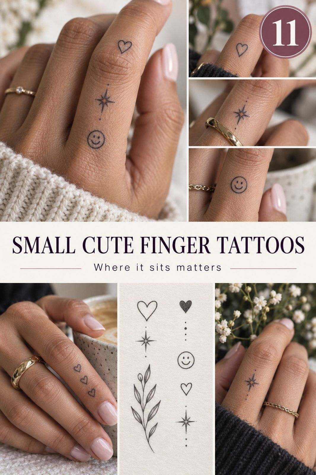
If you’re planning a pair, compare the skin tone, hand shape, and preferred line weight first. These small cute finger tattoos helped us find symbols that could coordinate without becoming carbon copies.
I Asked About Finger Tattoo Pain
I expected the pain to be fierce because fingers have little padding, and I wasn’t completely wrong. The single-needle session felt sharp and hot for a few minutes, but the appointment was short enough that I could stay relaxed.
Pain varies by person and placement. The ribs, feet, hands, and sternum are commonly more painful areas, while the forearm, thigh, and shoulder tend to feel more tolerable. You’ll want to eat beforehand, drink water, and tell your artist if you need a pause.
The sensation was more irritating than dramatic. I noticed the buzzing, the pressure, and the occasional sting near the crease. My artist kept the controlled pace steady, which made the experience feel polished rather than chaotic.
And yes, I tensed my hand once! That tiny movement was enough to remind me to keep breathing. If you’re comparing pain across placements, this guide to small female arm tattoos shows why a finger tattoo can feel more intense than a larger piece elsewhere.
I Selected Crisp Black Linework
I chose black ink because I wanted the design to stay crisp as it aged. My artist showed me a solid black pigment sample beside diluted gray, and the black version had more contrast against my skin.
Fine-line tattoos can soften or widen over time, especially on hands that face frequent washing, friction, and sunlight. You’ll want to ask how your artist balances thin lines with enough pigment density to keep the design legible.
I skipped pale gray because it looked elegant on the day, but it would’ve given me less visual strength later. My choice was more classic than trendy, and the result felt polished without becoming harsh. The pale gray wash simply lacked the same confidence.
The final line was sharp, not heavy. That balance mattered to me.
A small tattoo doesn’t need to shout, but it does need enough contrast to survive real life. The crisp linework felt bold without looking harsh. I also saved examples of small arm tattoos for ladies to compare black linework on less demanding skin.
I Planned Around Natural Finger Creases
Finger creases became part of the design instead of a problem I tried to hide. The natural skin crease ran below the heart, so my artist left a small gap that made the outline look intentional.
You’ll want to avoid placing the most important detail directly inside a deep fold. Movement and friction can make that area harder to heal, and the design may look broken when your finger bends.
I watched my hand move while the stencil stayed on. Typing, gripping, pointing, and making a fist showed me how the tattoo would behave in ordinary moments. That test was more useful than staring at a flat reference photo.
But I didn’t obsess over total stillness. Hands move. A tattoo that only looks correct when your finger is straight isn’t a successful placement.
My placement stencil gave the heart enough breathing room to remain readable from several angles.
I Prepared For Careful Finger Healing
The healing plan was simple, but my finger needed more attention than I expected. The healed linework looked darker at first, then became calmer as the surface settled.
A typical surface healing period is about 2 to 3 weeks, while complete healing can take roughly 2 to 3 months. You’ll want to wash gently, pat the area dry, use the aftercare instructions recommended by your artist, and avoid swimming and strong sun during the early stage.
I kept my hands clean and resisted picking at flakes. The tattoo looked slightly dull for a few days, which can be normal while the skin repairs itself. It wasn’t a sign that the design had failed.
The left side of my reference sheet showed the stencil, and the right side showed the healed result. That comparison made the change easier to understand. If you’re considering another placement, small forearm tattoos male meaning offers a useful contrast because forearm healing is often easier to manage during the healing stage.
I Revealed My Unique Personal Tattoo
When I finally showed the tattoo to friends, I expected a bigger reaction. Instead, people leaned closer, asked where it was done, and wanted to know why I chose a heart. That quiet response suited me.
The finished inner finger tattoo felt personal because I had made every decision myself. I picked the scale, rejected the crowded moon, moved the stencil, and chose black linework after seeing how gray looked on the skin.
You’ll notice the tattoo more during ordinary actions than dramatic ones. I see it while opening a notebook, washing my hands, and holding my phone.
It feels intimate, expressive, and easy to live with because it doesn’t dominate my appearance. The personal mark still feels like mine.
I wouldn’t call every tiny finger design low-maintenance. Hands experience friction, sunlight, and constant movement. But a crisp, meaningful mark with sensible spacing can age in a way that still feels elegant.
That’s why I’d start with small female arm tattoos if you want to compare a more forgiving placement before committing to those friction points.
How much it cost
My cost planning focused on the artist minimum, the design consultation, and the possibility of a future touch-up. Typical US pricing varies by artist and region, but a small finger tattoo often falls within these broad ranges:
I planned around a small tattoo minimum rather than assuming the piece would be priced only by size. You’ll want to ask for the shop minimum before booking, because a tiny design can still require consultation, sterilization, setup, and drawing time.
I also kept money aside for a future touch-up instead of treating the first appointment as the entire cost. Finger ink is exposed to friction, soap, and sunlight, so maintenance can be part of the decision. You can compare broader placement ideas in this small tattoos meaning guide before setting your budget.
The least expensive option isn’t always the wise one. I’d rather pay an experienced artist for clean placement than choose a lower quote and spend more correcting blurred or uneven linework later. That choice felt practical, not dramatic!
Why I’d Choose This Placement Again
I used to think a first tattoo had to be hidden or large enough to feel important. My experience changed that.
A small inner finger piece can carry a powerful meaning while staying understated in professional settings and daily photos. Visible hand ink can still feel private.
The key is accepting the tradeoff. Fingers are visible, active, and prone to friction.
You may need a touch-up, and extremely fine lines may soften with time. If you want something that ages with less maintenance, your forearm or upper arm may be a more forgiving placement.
I also learned that small doesn’t mean effortless. The design has less room for error, so every curve, gap, and placement choice matters. My artist consultation was where the tattoo became realistic, rather than just attractive on a screen.
If you’re choosing your first piece, I’d ask three questions: Will you still understand the symbol in five years? Can the design be simplified?
Can you accept the care and possible maintenance? Those questions kept me from choosing a more ornate idea that didn’t feel like me.
The heart worked because it was personal, crisp, and easy to recognize. It didn’t need extra stars, shading, or lettering to become meaningful. You’ll get more confidence from a simple design you understand than from a complicated one you’re trying to justify.
A Heart or a Crescent?
For me, the heart outline won because it carried emotion without needing extra decoration. It felt personal, symbolic, and easy to recognize when my hand was relaxed or bent.
The crescent option was more haunting and daring, but its smallest details competed for attention. That made it better as a future idea than as my first ink.
The final decision came down to meaning and maintenance. I wanted something crisp enough to age clearly, but still expressive enough to feel like a real choice. The symbol choice had to work for me even when nobody asked about it.
What I’d Ask Before Booking
Before booking, I’d ask to see a healed portfolio, not only fresh tattoos. Fresh ink can look striking, while healed examples show how the lines settle after real use.
I’d also ask about hygiene practices, touch-ups, line weight, and how the artist handles finger creases. A confident artist should be able to explain the risks without making the appointment feel frightening.
Finally, I’d request a clear aftercare plan. You should know how to wash the tattoo, what products to use, when to avoid water, and what changes deserve a message to the studio.
A Few Things Worth Answering
How much does a small inside finger tattoo usually cost?
I’d budget about $100 to $300 in the US, though studio minimums may begin around $50 to $100 and hourly rates may run about $100 to $250. Artist experience and location affect the quote most.
– Boutique minimum – Short single-needle session – Regional pricing – Possible touch-up
For more placement references, browse these small finger tattoo ideas before contacting an artist.
Are small inside finger tattoos a good idea for a first tattoo?
Yes, I think they can work well if you’re comfortable with visible hand ink and possible fading. The placement is compact, the design can stay meaningful, and a simple symbol is usually easier to live with than crowded detail.
– Discreet inner placement – Short appointment – Clear symbolism – Possible maintenance
You can compare less exposed options through small hand tattoos for women.
How do I choose a tattoo artist for small inside finger tattoos?
I’d choose an artist with clean linework, healed tattoo photos, strong hygiene practices, and experience working on fingers. Healed portfolio images matter because fresh ink can look sharper than it will later.
– Fine-line examples – Healed photographs – Sterile studio – Clear aftercare
Ask how the artist handles creases, fading, and touch-ups before you book.
How much do small inside finger tattoos hurt?
I found the pain sharp because the area has little padding and sits near bone and joints. Pain is brief but noticeable, and many people find the session manageable because the design is small.
– Hands, feet, ribs, and sternum: often more painful – Forearm, thigh, and shoulder: often more tolerable – Short appointment – Individual pain differences
Eat beforehand, hydrate, and tell your artist if you need a pause.
How long does a small inside finger tattoo take to heal?
The surface usually heals in about 2 to 3 weeks, while complete healing can take roughly 2 to 3 months. Gentle aftercare supports the process: wash carefully, moisturize as directed, and avoid swimming and strong sun during early healing.
– Mild washing – Patting dry – No picking – Reduced sun exposure
Your artist’s instructions should guide the exact products and schedule.
What’s the best placement for a small inside finger tattoo?
I’d usually choose just beneath the knuckle or along the inner finger, away from the deepest crease. A small gap from the fold can help the design stay readable as your hand moves.
– Beneath the knuckle – Inner side of the finger – Away from deep creases – Visible but discreet
Ask your artist to check the stencil with your finger straight and bent.
Where I’d Start First
If I had to pick one, I’d start with a tiny black heart beneath the knuckle. The open outline gives your artist room to keep the shape readable as the skin moves and ages. Pin this idea for later, then take your time choosing the symbol that still feels personal when nobody asks about it.