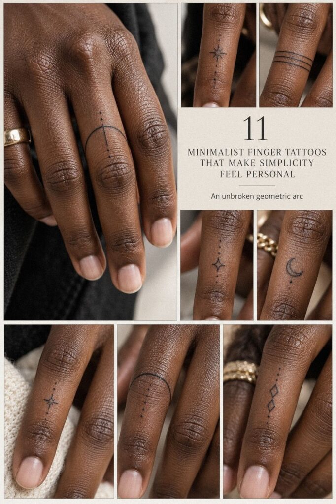
Minimalist finger tattoos gave me a private mark without taking over my hand. I compared line weight, symbols, placement, pain, healing, and cost before committing to the first sketch. The result is small, crisp, and meaningful. You’ll see what changed my mind, what I’d skip, and what I’d choose again!
Before I Chose: The Unmarked Skin Rule
Before the appointment, I had a patch of blank skin reserved for the right idea. It wasn’t crowded or damaged; it was simply unused, and I had spent months looking at references without finding anything that felt personal enough to keep.
The space looked almost too clean beside my rings and short nails. I liked that restraint, but every temporary stencil felt either too ornate or too forgettable, so I started saving examples with black tattoo ink and narrow shapes instead of collecting random designs.
I didn’t want a loud statement. I wanted an understated mark that could disappear beneath a ring and reappear when I turned my palm. If you’re beginning from the same blank starting point, give yourself time to notice which symbols keep returning.
That repetition matters. My favorite references were striking but never flashy, delicate without feeling weak, and expressive without explaining everything. I’d rather wait for one meaningful idea than pay for a stylish mark I’ll outgrow.
The First Decision: A Fine Line or a Stronger Shape?
I started with a single fine-line tattoo because I wanted the design to feel delicate, crisp, and almost handwritten. I compared it against terracotta, stone, and olive tones rather than cool pink references, and the warmer combination made the narrow black stroke look striking without becoming harsh.
My artist showed me several versions on sterile stencil paper, including one curve that wrapped too tightly around the side. I skipped it. It looked polished on paper, but I knew the cramped shape would lose clarity whenever I bent my finger.
You’ll want to check the design from the front, side, and palm view. I held my hand naturally, then curled it.
The best version stayed readable in all three positions, and that was the point! If you’re drawn to small finger tattoos, study how each design behaves when the hand is relaxed.
I kept the final mark minimal rather than adding dots, shading, or a second outline. That choice made the minimal design more elegant and personal. A fine line doesn’t need decoration to carry feeling, and yours shouldn’t be forced into extra detail simply because the stencil looks empty.
The narrow stroke also gave me better long-term value. I wasn’t paying for visual noise. I was paying for a controlled shape that could stay readable through daily hand movement, washing, and ordinary wear.
Which Symbol Actually Felt Like Mine?
I compared several small minimalist finger tattoos against muted clay, soft beige, and antique-gold tones before choosing one. The first was a tiny star, the second a curved botanical stroke, and the third a short geometric symbol. Each looked different when scaled to the finger, even though the drawings were nearly identical on paper.
The star felt playful but generic. The botanical mark was graceful, yet its narrow stem looked fragile beside the knuckle.
The geometric option had a stronger silhouette, so I kept returning to it. A design can be symbolic in theory and still feel wrong once it touches your hand.
My artist printed the options at roughly one-half-inch scale, then moved each stencil between the inside and side of the finger. I liked the smallest version, but I didn’t choose the tiniest one. A mark needs enough space for its edges to remain readable over time.
If you’re comparing small inside finger tattoos, look for healed tattoo photos, not only fresh work. Fresh ink can look bold and polished. Settled ink tells you whether the original shape still feels sharp, balanced, and timeless.
I also asked which version would be worth the cost if I still loved it after the novelty faded. That question removed several fashionable options immediately.
The best choice wasn’t the most intricate one. It was the one I could recognize as mine years later.
Test the Ideas Before You Commit
I tested several ideas against plum, grey, and rose-gold tones because I wanted to understand contrast, not just style. A small dark crescent looked bold, while a delicate open circle felt softer and more expressive. Both were minimal, but they carried different energy.
The open circle won because it looked calm without becoming bland. I tested it beside a single-needle cartridge, and the narrow line gave the symbol a refined edge. I wouldn’t choose pale grey ink here; it can look gentle at first, but the contrast may not give you the clear shape you wanted.
You should test your favorite design at the actual angle people will see. Finger tattoos appear while you’re holding a phone, reaching for a cup, or resting your hand at your side. Natural movement changes the shape, and a design that only works when your fingers are straight isn’t finished.
I also tried a tiny dot inside the circle. It was cute, but I removed it.
The open-circle symbol felt more timeless without that extra detail, and the empty center gave the mark enough breathing space. Minimal doesn’t mean unfinished.
It means every stroke has to earn its place.
For compact references, I compared small cute finger tattoos with cleaner geometric examples. The cute options were whimsical and playful, but they didn’t carry the same weight. That contrast helped me choose with more confidence.
One Quiet Symbol, One Private Meaning
I chose a discreet but private symbol because I wanted the tattoo to hold a story rather than announce one. It wasn’t meant to function as a conversation starter, and I liked that its strongest layer would remain invisible to everyone else.
I wrote the meaning down before the appointment, then shortened it to one sentence. That exercise removed decorative ideas that were there only because they looked fashionable. A symbol can be sacred without being literal, ornate, or easy for another person to decode.
The final mark uses dark navy linework and one small open section. That opening represents a decision I made to keep moving without pretending the difficult part never happened. You’ll see a simple shape, but I know what it carries, and that private layer makes it feel empowering to me.
Let Anatomy Decide the Placement
I placed the tattoo near the joint because I wanted the design to move with my hand. The flash sheet included curved marks, tiny stars, and narrow bands, but I traced each option over my finger before deciding where the bend felt natural.
The strongest position sat just below the joint rather than directly across it. That gave the emerald-toned flash design enough distance from the crease, which mattered because constant bending and friction can make a tiny mark harder to keep crisp.
You’ll want to consider rings, hand washing, and the way your skin folds. I wear a simple band on the neighboring finger, and the first stencil touched it visually. Moving the tattoo a few millimeters gave both pieces their own space.
I’d skip a design that crosses the deepest crease just because it looks centered when your finger is straight. A centered tattoo isn’t automatically the best tattoo. The side view, folded hand, and daily habits should decide.
For more references, I compared small hand finger tattoos for women, even though placement matters more than gendered styling. A feminine idea may need bold spacing, and a masculine symbol can still work beautifully at a dainty scale.
I also checked the inside of the finger before choosing the side. The inside felt more secretive and sacred, but it faced more friction. The side gave me a clearer view without making the symbol feel public.
The Thumb Is a Different Conversation
I briefly imagined a thumb tattoo motif because the broader surface allowed a more confident shape. I decided against it for this design, but the comparison clarified something useful: not every small tattoo needs the same scale or density.
The thumb can support a bolder, more graphic idea, while the narrower fingers reward restraint. If your concept needs several details to read properly, the wider surface may be the more graceful choice.
What Did the Appointment Really Feel Like?
I checked the pain before the finger tattoo appointment because I didn’t want to arrive with a dramatic fantasy about how easy it would be. Finger tattoos are small, but hands have thin skin, bone close to the surface, and plenty of movement.
The sensation was sharp, brief, and more intense near the side. My artist worked in short passes, which helped me stay relaxed. Anticipation felt worse than the tattoo itself, but your experience can change with placement, pressure, and your own pain response.
The palm-side skin felt more sensitive than the top of the finger. Hands, feet, ribs, and sternum are often described as more painful areas, while the forearm, thigh, and shoulder tend to feel more tolerable. That comparison helped me set a realistic expectation instead of expecting no discomfort.
I brought water, ate beforehand, and kept the rest of the day simple. No rushed errands afterward.
The session was short, but I still felt relieved when it ended. It felt right!
I also considered other sensitive placements, but the comparison only confirmed that size doesn’t determine discomfort. Anatomy, pressure, and location matter more than the number of minutes involved.
Ask for Crisp, Delicate Linework
I asked for crisp linework because the design depended on clean edges rather than shading. Against warm white, camel, and black accents, the mark looked polished and clear, but only when the line stayed consistent from beginning to end.
My artist showed me a settled example made with fine-line blackwork, not newly done work. That distinction changed my decision. Fresh lines can look impossibly sharp, while settled work reveals whether the shape spread, softened, or lost its smallest details.
You’ll want to ask how your artist handles tiny curves and whether they can show work after it has settled. I also asked about placement, needle depth, and aftercare instructions, because line quality isn’t only about the drawing.
Skin, technique, healing, and sun exposure all influence the final result. I rejected a thinner version that looked elegant on the stencil but nearly vanished in normal light. Delicate isn’t the same as invisible.
The final line was still dainty, but it had enough strength to remain readable. That small increase made the design more timeless and less fussy. If you’re comparing portfolios, prioritize consistent curves over dramatic examples.
Shape Before Symmetry
I adapted the design to the shape of my finger instead of treating it like a flat strip of paper. I compared midnight-blue, copper, and ivory accents before deciding how much contrast the final mark needed, then curved the lower edge slightly and kept the top line straighter.
The stencil used smooth black transfer paper, and I asked to see it from every direction. From the front, the symbol looked symmetrical.
From the side, one corner sat too close to the crease. Moving it slightly made the whole mark feel more balanced.
You should check whether your finger tapers, widens near the knuckle, or bends toward one side. Those details affect how a straight line appears. A design that looks centered on a screen may look tilted once it follows real skin.
I nearly chose a perfect circle, but the shape looked uneven whenever I moved my hand. The edited oval worked better because it followed my anatomy. That isn’t a flaw in the body or the design.
It’s a reminder that an elegant tattoo often cooperates with your shape.
The strongest examples I studied weren’t always the boldest. They were adjusted to the actual knuckle, taper, and movement. That is where a sleek idea becomes wearable rather than merely attractive in a sketch.
Protect the Mark While It Settles
I treated the stencil and the finished tattoo as two different stages. The design could look sharp on appointment day and still need time before I judged the result.
My artist covered the area and explained the healing routine clearly. I washed it gently, used a light layer of recommended moisturizer, avoided picking, and kept unnecessary friction away from the fresh skin.
The first few days were visually unpredictable. Peeling, dryness, and temporary dullness can make a new tattoo look strange.
No panic! I waited instead of trying to assess the final result too early.
I also protected the mark from direct sun once the skin had settled. Frequent washing and UV exposure can affect hand tattoos, especially when the design depends on a narrow line and clean negative space.
The surface usually settles within a few weeks, while the deeper changes can continue longer. Your artist’s instructions should guide your routine, particularly if your skin reacts easily or the area remains irritated.
When the Lines Tell a Different Story
The settled tattoo looked softer than it had on appointment day, but it didn’t look ruined. The edges became less startling and more integrated with my skin. That change was expected, and I’m glad I had studied examples beyond newly done work.
My settled tattoo kept its open center and overall curve. The dark, earthy ink softened into a less intense finish, but the symbol remained polished. It no longer looked like a stencil; it looked like something that belonged to my hand.
I wouldn’t judge the result during the first few days. A fresh tattoo can appear unusually dark, while peeling skin can make it look faded or uneven. Give it time before deciding whether anything needs attention.
The final effect was more timeless than trendy. That mattered because I wasn’t choosing a temporary accessory. I wanted a symbol that could remain expressive even after the initial boldness softened.
Measure the Cost Before Booking
I asked for the full price before putting down a deposit. The quote included the consultation, setup, hygiene, drawing time, and tattooing, not merely the minutes the needle touched my skin.
The studio explained its minimum charge clearly. That helped me judge the value instead of assuming a tiny design should be cheap. A small tattoo can still require careful planning, controlled technique, and precision.
I compared portfolios, communication, studio cleanliness, and settled examples before comparing numbers. The lowest cost wouldn’t have been worth it if the artist couldn’t show consistent hand work.
My budget was firm, but I left room for quality. I’d rather postpone a personal tattoo than choose a rushed appointment because the price looked convenient.
Small-Ink Budget: What I Paid For
My budget depended on the artist, region, placement, and whether the studio used a minimum charge. A tiny design isn’t automatically inexpensive, because you’re paying for consultation, setup, hygiene, drawing, and skill.
These are typical US reference points, not a guaranteed invoice:
I’d rather pay for a polished, hygienic appointment than chase the cheapest number. My working $300 budget was a limit, not a target, and the final quote should come from your artist.
You’ll also want to ask whether a future touch-up is included or charged separately. That touch-up policy affects the real cost and helps you compare one studio’s offer with another’s fairly.
The part worth paying for was the consultation. We adjusted the shape, position, and line weight before the needle touched my skin. If you’re comparing artists, look at settled work and hygiene first.
A striking portfolio means less if you can’t see how the lines hold up. For me, the best value came from an artist who explained limitations honestly and didn’t push a larger or more complicated idea.
Why I Kept Small Ink Private
I used to think a meaningful tattoo needed an obvious symbol, a larger scale, or a story other people could understand immediately. I changed my mind after noticing how often I touched my finger while thinking.
The tattoo became part of my private gestures, not a public explanation. That is why I prefer a discreet mark over a crowded composition. A larger design might feel more dramatic, but it would have changed the relationship I wanted with my hand.
You don’t need strangers to recognize your symbol for it to matter. I also learned that fine-line tattooing asks more of the artist than a busy design does. A single uneven curve has nowhere to hide.
I spent more time comparing line weight than I expected, and I’m glad I did. The final mark is clean dark ink, but the decision behind it wasn’t simple.
My one mistake was assuming the first sketch was nearly finished. It wasn’t.
I kept the symbol, changed the proportions, moved the position, and removed two dots. Those edits made it feel less fashionable and more like mine.
If you’re still undecided, wait a week and notice which version you remember without looking. That test is free, and it can save you from spending your budget on an idea that only felt exciting for one afternoon.
The trend may change, but my reason for choosing the tattoo won’t. That’s the standard I’d use again. Pick the design that still feels right when nobody else is watching.
The Private Meaning Test
I tested the symbol by asking whether I’d still want it if nobody ever asked about it. The answer was yes. That was enough.
The tattoo concept didn’t need a dramatic backstory or an obvious image. It only needed to connect to something I had carried, learned, or decided for myself.
I was wrong to think a meaningful tattoo had to look instantly meaningful to someone else. Its strongest quality is that it keeps a private layer intact. That made the choice feel empowering rather than performative.
I also asked whether the design still felt like me without its explanation. It did. A symbol should survive the caption, the trend cycle, and the moment when the original excitement wears off.
My Editorial Take: Small Does Not Mean Casual
Finger tattoos are often treated as easy decisions because the designs are small. I think that is exactly backward. A small mark has less room to disguise weak spacing, uncertain line weight, or a symbol chosen only because it looked stylish for five minutes.
My strongest opinion is simple: the idea should come before the aesthetic. I would rather see a plain, personal shape with excellent proportions than an intricate design that has no reason to exist on the hand. The quiet option usually asks more of you because there is nowhere for excess detail to hide.
I also think the internet encourages people to compare finished tattoos as though every hand were the same. They are not.
Finger width, knuckle shape, skin tone, daily work, rings, washing habits, and sun exposure all change the decision. A design that looks bold and elegant on one person can look cramped or faint on another.
The most important comparison is not newly done versus settled, or dark versus light. It is intention versus impulse.
If you can explain why the symbol belongs to you, you have a starting point. If you only know that it looks cool, wait.
My own choice became better when I removed details. The open center, the adjusted oval, and the extra space around the crease did more for the tattoo than another decorative line would have. Restraint made it sharper.
I don’t regret choosing a private symbol, and I don’t think every tattoo needs to announce a biography. Some marks are strongest when they stay quiet. Let the design be bold in its decision, even if it remains understated on the skin!
The Questions Worth Answering First
How much does a minimalist finger tattoo usually cost?
I’d budget about $50 to $300 in the US, depending on the studio minimum, artist, region, size, and position. Many boutiques charge roughly $50 to $100 minimums, while hourly rates often run about $100 to $250. I’d ask for a written quote before booking.
Are minimalist finger tattoos a good idea for a first tattoo?
Yes, they can be a good first tattoo because the appointment is usually short and the design can stay crisp and understated. I’d still respect hand sensitivity and the need for careful aftercare. Start with a symbol you understand, not just a shape that looks stylish in a reference.
How do I choose an artist for minimalist finger tattoos?
I’d choose an artist with clean linework, settled work, and strong studio hygiene. Look for consistent curves, controlled spacing, and designs similar to yours. I’d ask about hand placement and aftercare before paying a deposit.
Their portfolio should make you feel confident, not rushed.
How much do minimalist finger tattoos hurt?
I found that minimalist finger tattoos can feel sharp, especially near the sides, joints, and palm-facing skin. Hands, feet, ribs, and sternum are often more sensitive areas, while the forearm, thigh, and shoulder tend to feel more tolerable. My appointment was brief, but the sensation was still intense.
How long does a minimalist finger tattoo take to heal?
I’d expect the surface to settle in about 2 to 3 weeks, while the deeper result can continue changing for longer. Wash gently, moisturize lightly, avoid swimming and direct sun, and don’t pick at peeling skin. Your artist’s instructions should guide your routine.
What’s the best placement for minimalist finger tattoos?
I think the best position depends on visibility, movement, and friction. The side or upper finger can make a small symbol easy to see, while the inside may feel more private. I’d avoid placing the finest detail directly across a deep crease.
Where I’d Start First
If I had to pick one, I’d start with the private symbol. A meaningful shape will hold your attention longer than a fashionable one, especially when narrow lines soften with time.
I’d save a few references, then remove every detail that doesn’t belong to your own story. Study the design at full size, test how it moves with your hand, and give yourself enough time to change your mind.
Pin this guide for later, then choose the design you still remember after the screen is gone. That choice is worth more than a perfect trend, and it’ll feel like yours.