I thought delicate tattoo filler ideas would hurt more than they did. I planned around a long afternoon, a stiff shoulder, and at least one regret, then chose small terracotta and olive details that slipped between my existing pieces. The session took less time than I expected, and my skin looked more connected without losing its quiet, personal feeling.
The patch between my tattoos had been empty for months. My existing fine line tattoos had different ages, moods, and spacing, so I didn’t want one loud image forcing them into a single style.
I checked my tattoos in ordinary daylight without editing. That mattered. Your skin shows the real distance between each piece, while a filtered view can make every opening look larger or cleaner than it is.
I measured the widest gap with a ruler, then compared it with a pencil mark on paper. The smallest filler could sit inside a half-inch opening, while a larger one needed nearly 1 inch to breathe.
And I was nervous. Not about the art itself, but about the moment when a new mark changes the balance of everything you already love.
My artist studied the healed lines and built the plan around what I didn’t want to lose. That was the first surprise!
- Fine Starbursts Between Floral Tattoos
- Tiny Crescent Moons Along Wrist Gaps
- Delicate Wildflowers Filling Finger Spaces
- Minimal Dots Connecting Fine Line Pieces
- Graceful Vines Wrapping Around Existing Ink
- Could Tiny Ornamental Hearts Connect Script Letters?
- Frame a Minimal Tattoo With Ethereal Sparkles
- What Can Lace Add Around Botanical Ink?
- Choose Small Sacred Symbols for Ankle Gaps
- Flowing Waves Beneath Delicate Bird Tattoos
- The Miniature Charm Set for Sleeve Gaps
1Fine Starbursts Between Floral Tattoos
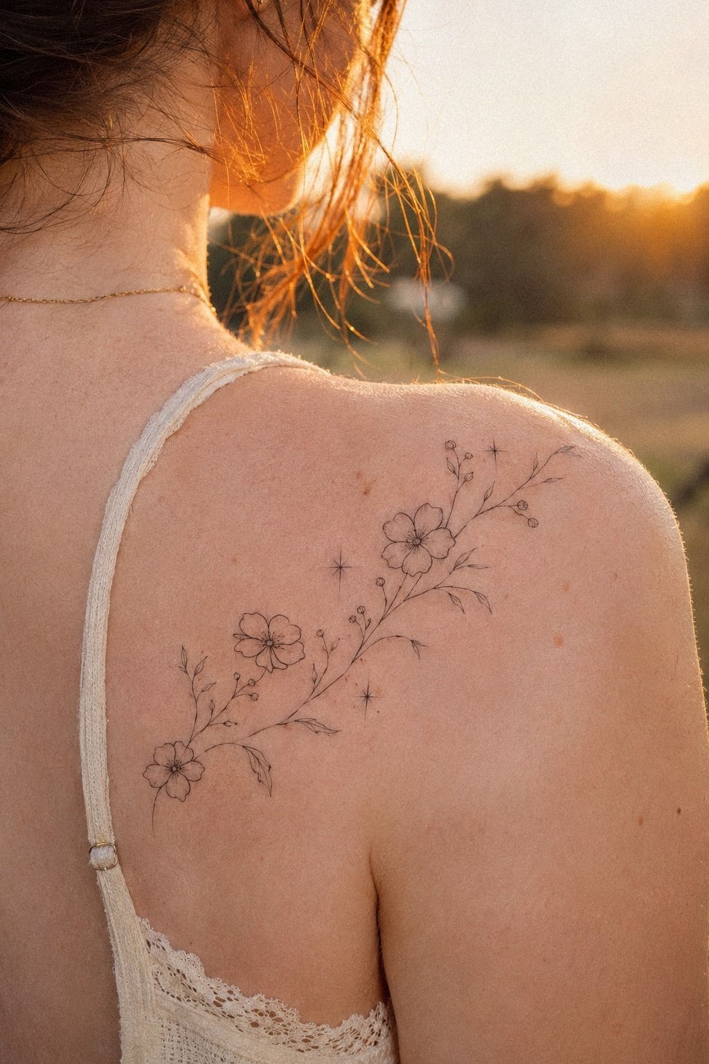
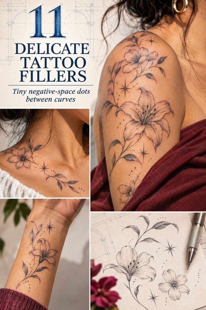
I chose starbursts for the narrow gaps around my wildflower sprig because they echoed the small pointed leaves without copying them. The marks were crisp, terracotta, and touched with muted olive in a way that kept them expressive.
You can place one between two stems, or use three at different sizes when your floral tattoos have irregular openings. The result feels striking when the rays stay sharp but don’t overpower the original piece.
The key is restraint. Your starburst shouldn’t compete with the flower head, so I preferred a tiny center point with four or six fine rays instead of a dense celestial cluster.
My artist called this the Two-Weight Rule: one dominant line, one supporting mark, and enough skin showing around both. It’s a simple way to protect a minimal design from becoming ornate.
I nearly chose gold ink in the planning sketch, but I skipped it. Terracotta ink healed more clearly for this design, and the olive accent gave the delicate mark a timeless edge at a tiny scale.
If you’re comparing options, I’d choose warm color over pale color for a filler this small. The value is better because one crisp mark can do more work than several faint details.
You can see similar spacing decisions in these delicate tattoo designs, especially if your existing pieces already have botanical movement.
2Tiny Crescent Moons Along Wrist Gaps
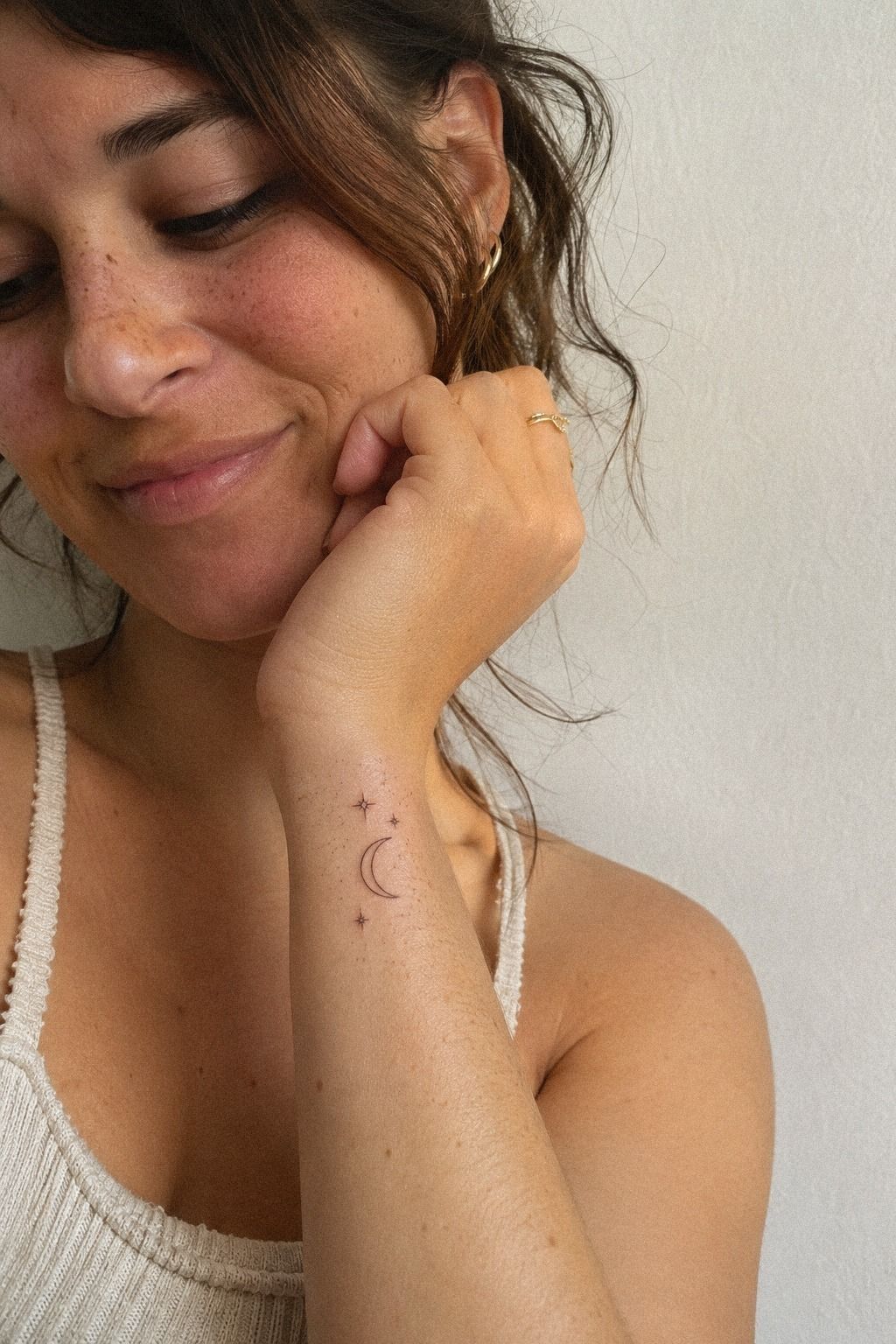
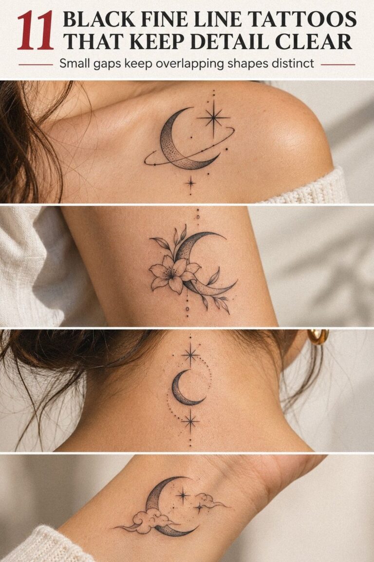
A crescent moon suited my wrist because it could follow the natural curve without making the area feel busy. The crescent moon outline used a muted clay tone, with two tiny aged-brass stars, and the whole group stayed smaller than my thumbnail.
It was delicate, symbolic, and easy to read from a normal distance. That matters when you’re deciding whether a small idea is worth the cost of booking a full appointment.
Wrist skin moves constantly, so I asked my artist to keep the shape clean rather than adding ornamental texture. Your hand bends, stretches, and catches sunlight all day.
The design needed to remain readable when the line softened. I didn’t want an intricate moon that looked stylish on appointment day but became a vague crescent later.
The sensitive part was closer to the bony side of the wrist. I felt a sharp, bright sting there, but the short appointment stayed manageable because the design was small.
For you, that zone may feel more intense than an upper arm or shoulder. A short session can be a powerful first step when you’re unsure about your tolerance.
I used the same placement logic as these minimalist tattoo filler ideas: one clear shape, breathing room, and no extra flourish just because the gap exists.
The tiny stars gave the crescent a playful finish without turning it into a full celestial scene. The mark worked!
3Delicate Wildflowers Filling Finger Spaces
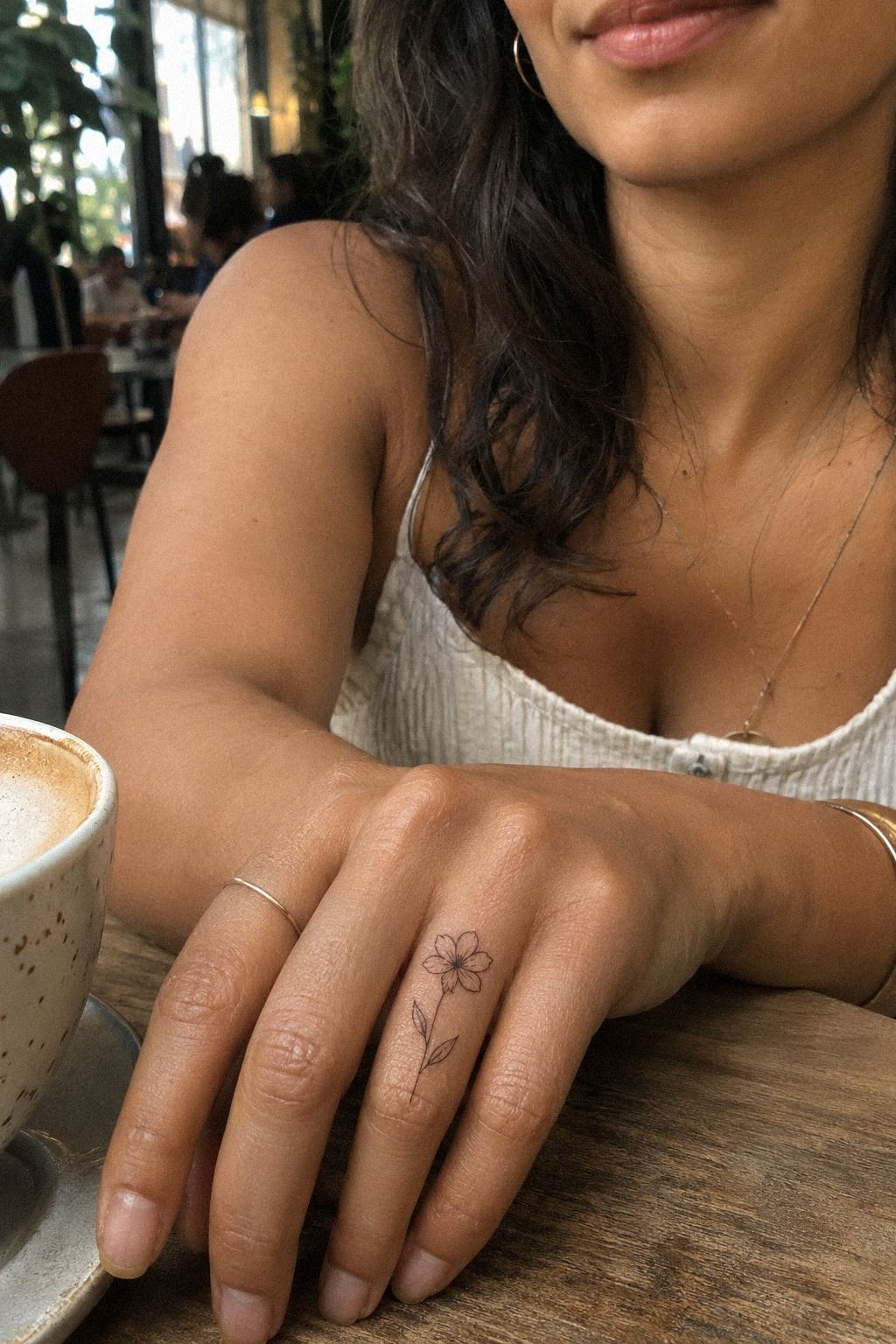
Finger gaps need a smaller visual language. I picked a single stemmed flower in plum with a muted rose-gold detail because a full bouquet would’ve looked crowded against the knuckles.
The line was graceful and personal, but it still had enough shape to survive a quick glance. I wanted something meaningful without forcing a bold statement into a narrow opening.
I asked for the stem to follow the length of my finger instead of crossing it. Your hands look more balanced when the design respects their movement.
My artist left the petals open, which kept the mark sharp rather than filling the skin with a dark patch. The result felt dainty but still expressive.
Finger tattoos can be unpredictable because of friction, washing, and sun exposure. I wouldn’t put a dense ornamental pattern there just to fill one small opening.
A minimal flower gives you a better chance of preserving the original idea, even if it needs a future touch-up. That potential cost belongs in your budget before you book.
If you’re choosing between several delicate hand tattoo ideas, look for shapes that follow your finger instead of fighting its natural direction.
The Negative-Space Ladder
The Negative-Space Ladder is the rule I used to decide whether a gap needed ink at all. Start with the smallest opening, then compare it with the next two nearby spaces.
If each gap gets slightly more visual weight, your eye moves through the tattoos instead of stopping at one crowded patch. That rhythm feels polished without making every mark match.
I marked the spaces with a washable skin-safe pen before the appointment. Your first sketch may look too empty because you’re viewing the tattoo up close.
Step back and check it from several feet away. One mark can feel insignificant in a mirror but become iconic when it completes the movement of an entire arm.
I also checked the arrangement while moving my arm. A placement map helped me see which opening looked intentional and which one only bothered me because I was staring at it.
4Minimal Dots Connecting Fine Line Pieces
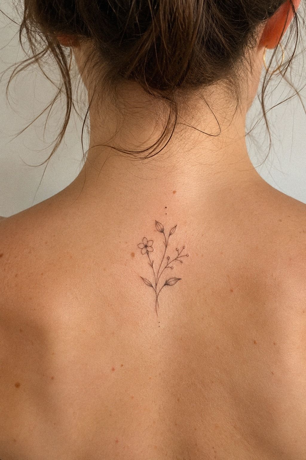
Dots were my answer for the upper-back gaps because the existing pieces already had enough imagery.
I used small navy dots with one pale accent, keeping the spacing irregular so they connected the tattoos without creating a rigid path.
The result was understated and sleek. A dot can feel almost invisible alone, yet it becomes meaningful when it repeats a direction already present in your ink.
I asked my artist to vary the size slightly. Perfectly identical dots looked too mechanical beside my expressive fine-line work.
Your dots should stay smaller than the strongest nearby detail. I wanted the upper-back filler to support the existing tattoos, not become a new focal point.
A sharp stencil made the spacing easier to judge. I would rather leave one gap untouched than force a dot into a place that feels accidental.
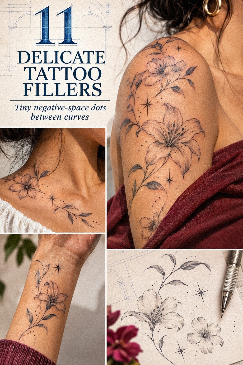
5Graceful Vines Wrapping Around Existing Ink
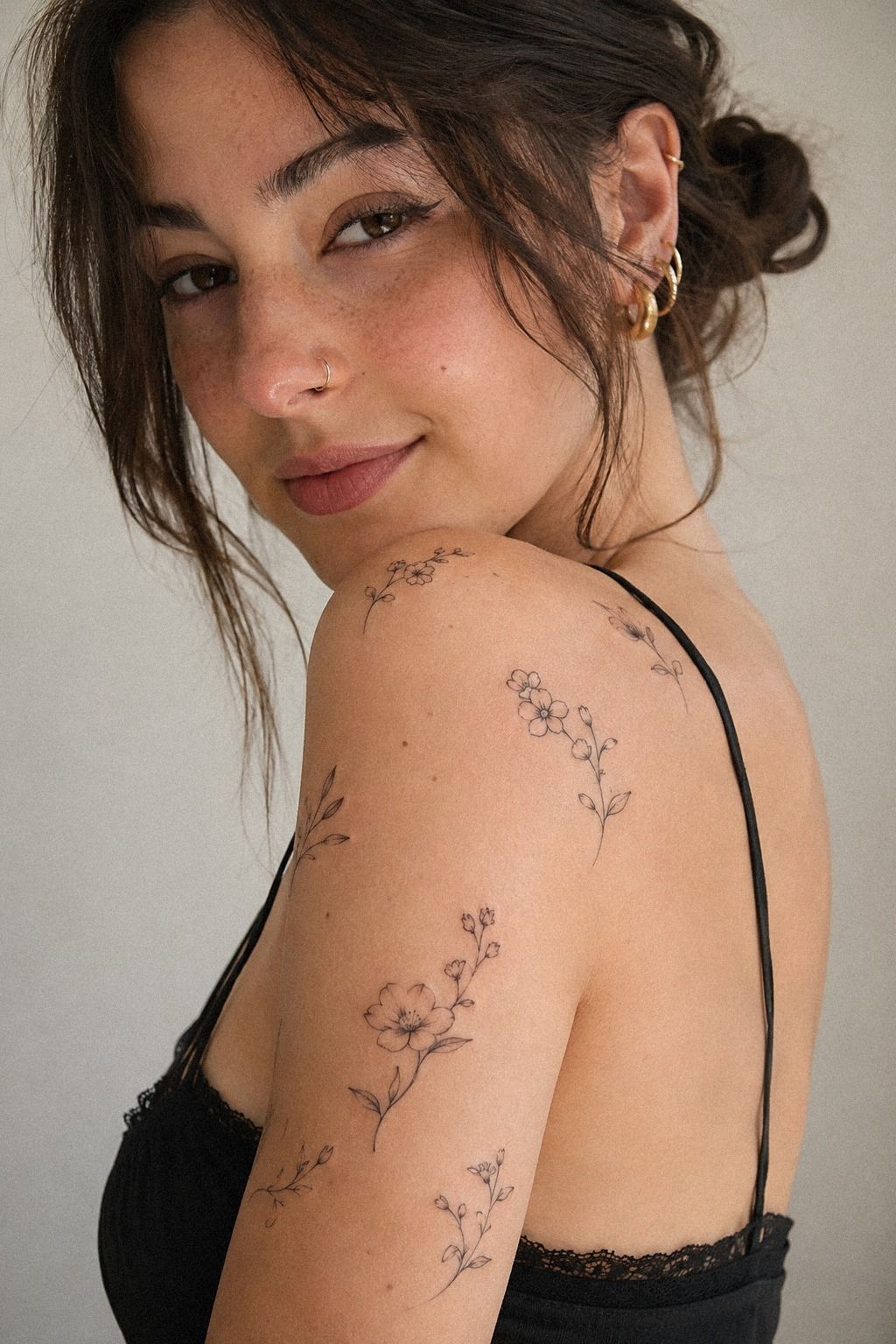
The vine idea came from a green botanical flash sheet with loose stems and tiny leaves. I didn’t copy the entire drawing.
Instead, I borrowed its flowing curve and asked the artist to wrap it around the edge of my older tattoo, stopping before the line became a border. The movement felt romantic but still understated.
This was the most romantic option, but romance can become clutter quickly. Your vine needs a clear beginning and ending, especially if it passes near lettering or a bold symbol.
I left one opening untouched so the stem could taper rather than loop endlessly around the existing piece. That pause made the composition feel more elegant.
I also considered a heavier traditional vine with solid emerald leaves. It would’ve been bolder, but the weight would’ve pulled attention away from my fine-line work.
The delicate version looked more polished because it used the older tattoo as its reference, not as a shape to hide. The balance was worth protecting.
The flash-sheet reference reminded me that hand-drawn lines don’t need perfect symmetry to feel intentional. You can browse unique delicate tattoo ideas if you want movement without adding a large central symbol.
6Could Tiny Ornamental Hearts Connect Script Letters?
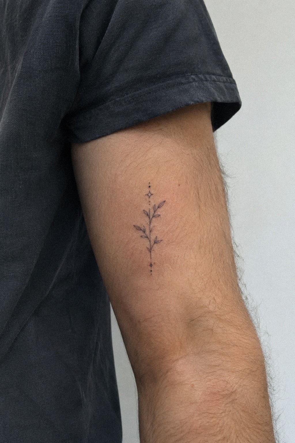
My script tattoo had openings between the letters, so I chose tiny ornamental hearts in forest green and rust, each with an open center.
The hearts were symbolic without becoming sugary. Their small points echoed the rhythm of the lettering and gave the gaps a more personal finish.
I asked for one heart to sit slightly higher than the others. That asymmetry made the arrangement feel expressive instead of stamped into place.
A solid heart would have looked too bold beside the script. The open center kept the mark dainty and let the existing letters remain dominant.
The rust accent was my favorite detail. It gave the tiny symbols a fierce little warmth without turning them into a loud statement.
The Two-Weight Rule
The Two-Weight Rule means your filler should usually sit below the visual strength of the tattoo it supports. A tiny solid symbol beside an open flower can look sharp, while a fine flower beside a heavy black shape may vanish.
You don’t need every mark to match exactly. You need the relationship to feel intentional, which is a better use of your budget than adding detail for its own sake.
I tested each option at the size it would be tattooed, not at the size of a phone-screen drawing. Your eye forgives detail on paper, but skin has texture and movement.
A crisp black ink sample helped me see which shapes would remain readable after the surface softened during healing. I’d rather pay for one strong decision than save money on a design I’ll want changed.
I also asked whether the filler would still look balanced beside older work. A fine-line specialist can explain how weight, spacing, and placement affect the final value of the whole collection.
7Frame a Minimal Tattoo With Ethereal Sparkles
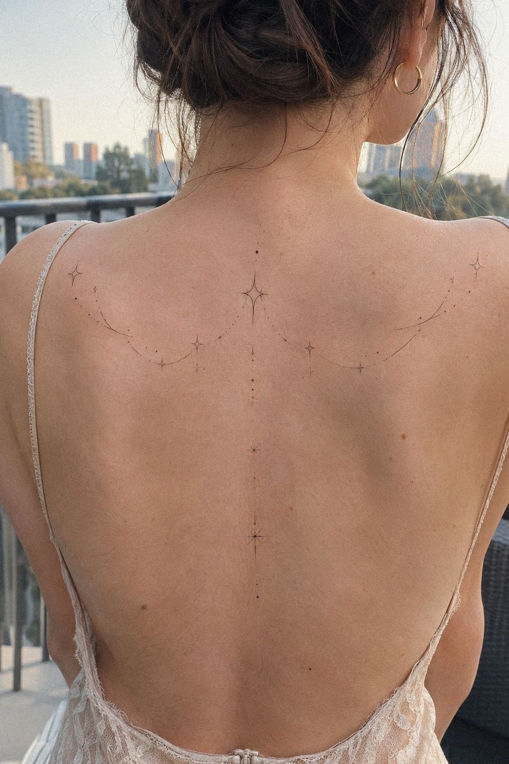
Sparkles worked around my minimal piece because the central tattoo had so much open skin. I used a four-point sparkle in dusty rose on one side and two smaller charcoal points on the other.
The result was ethereal, but it didn’t feel precious or overworked. The marks stayed sleek enough to support the original tattoo.
The best part was the asymmetry. Your eye naturally expects balance, yet perfect mirroring would’ve made the tattoo look like a logo.
I kept one sparkle closer to the edge and let the other drift outward. That gave the design a more organic, expressive quality.
I skipped filled stars because they would’ve created dark interruptions around a soft line. The open star looked sharper and aged more gracefully in the artist’s healed examples.
If you want your filler to stay understated, ask how the marks will read after two or three months, not only on appointment day. That question is worth it.
You can compare this approach with delicate minimal tattoo examples before choosing a framing detail.
During the stencil check, I laughed because the tiny points looked almost silly alone. Then the main tattoo sat beside them, and the relationship clicked.
8What Can Lace Add Around Botanical Ink?
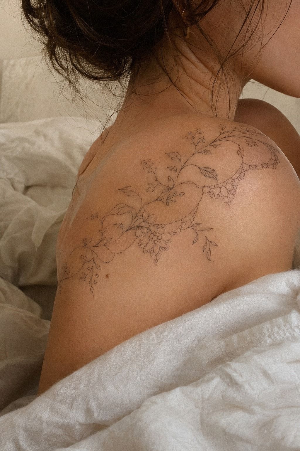
Lace was the most intricate idea I considered, and I used only a fragment of it.
I chose a warm-white and camel lace detail with a few black accents, keeping the pattern open around the botanical lines.
The fragment felt vintage and feminine without overpowering the leaves. I wanted the lace to suggest a pattern, not become a dense patch of ink.
I removed the smallest loops from the draft. They looked stylish on paper but would have blurred the meaning of the design after healing.
A lace filler needs room between its crossings. When every line touches, the delicate idea disappears and the tattoo starts to look muddy.
The Healed-Contrast Test
The Healed-Contrast Test asks one question: will you still understand the filler when the fresh black looks softer? Fine lines can widen over time, and sunlight can fade contrast.
A design with open shapes and solid black placement usually holds its idea better than a pale, crowded one. The healed-contrast test made me remove two intricate options before the appointment.
I reviewed healed examples taken after several weeks. Your artist should explain aftercare clearly and show work that has settled, not only work that looks dramatic immediately after tattooing.
Wash gently, moisturize as advised, and avoid direct sun and swimming while the surface healing stage continues. Surface healing usually takes about 2 to 3 weeks.
Complete settling can take about 2 to 3 months. That’s the point when I’d judge the line, spacing, and whether a touch-up is genuinely worth the price.
9Choose Small Sacred Symbols for Ankle Gaps
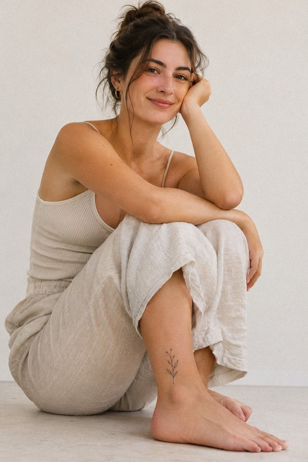
For ankle gaps, I chose small sacred symbols in midnight blue with a copper accent and an open ivory center. The placement felt personal without requiring a large statement.
The symbols followed the curve above the ankle bone. Their scale stayed close to 1 centimeter, which prevented the area from looking crowded.
Ankles can be sensitive because the skin is close to bone, so I planned a short session rather than a long cluster. Your tolerance may differ, but the location deserves a realistic budget of time and discomfort.
I rejected a larger mandala. The mandala design was elegant in the sketch, yet its spoke-like geometry needed more width than my ankle offered.
A small sacred mark gave me the meaning without forcing the placement to carry too much detail. It felt empowering because the symbol remained mine instead of becoming a bold centerpiece.
The stencil looked slightly higher than I first imagined, and that was the right call. Movement changes the ankle’s appearance when you walk.
You can find more placement ideas in delicate first tattoo ideas, especially if you’re choosing a tolerable location for your first small piece.
10Flowing Waves Beneath Delicate Bird Tattoos
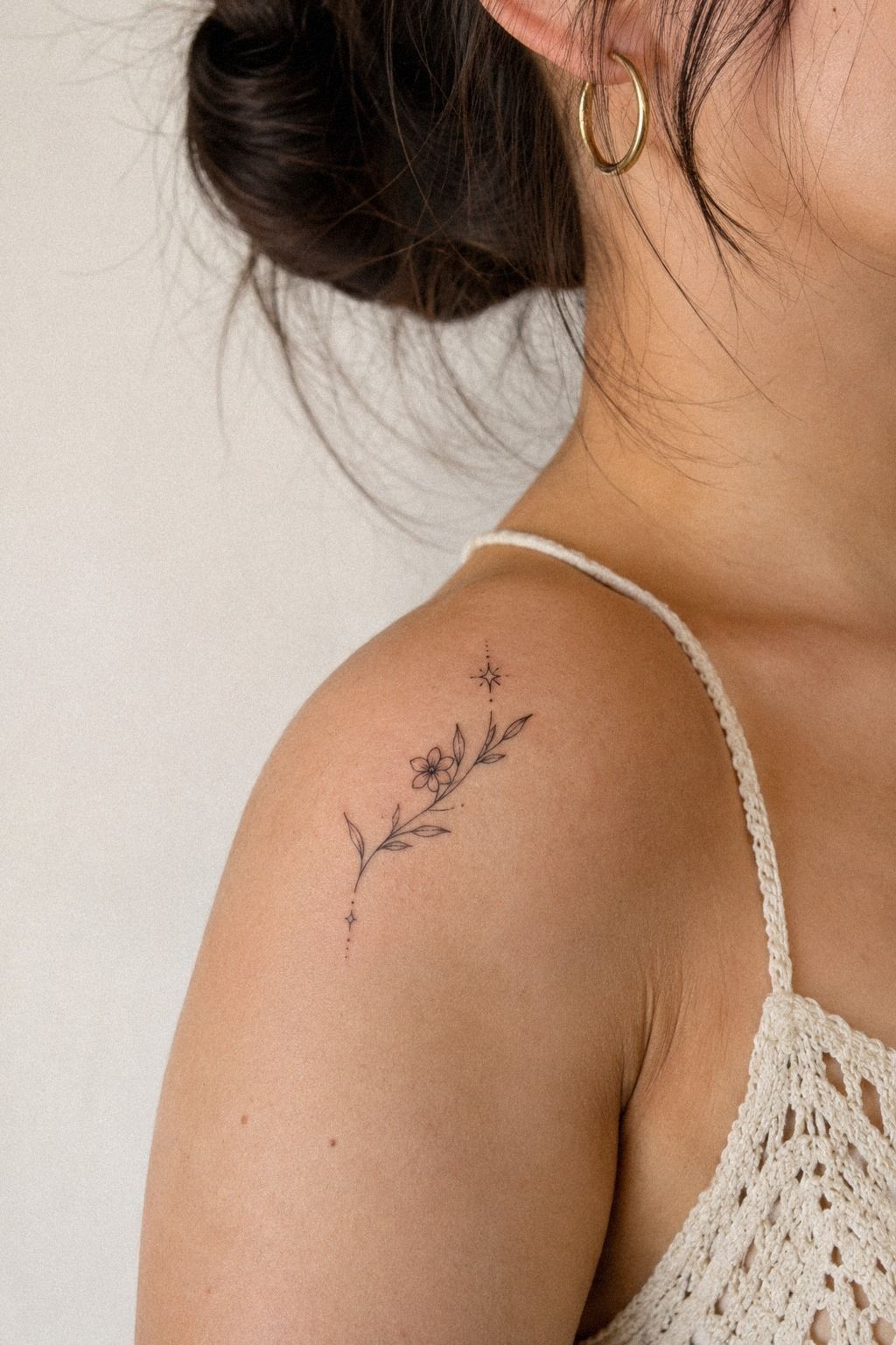
The wave filler came from a split stencil and a healed reference showing how the same design changes over time. The flowing wave lines used sage green with warm cream accents beneath two delicate bird tattoos.
They gave the birds a visual ground without making them look perched on a heavy bar. The movement was graceful and quietly symbolic.
I asked for three low curves with uneven peaks. Your waves should support the direction of the birds, so I avoided a perfect repeating pattern.
The lowest line stayed open at both ends, which let the composition fade naturally into the surrounding skin. That open ending kept the tattoo feeling sleek.
A solid black wave would’ve been faster, but it would’ve looked too bold beside the birds. I preferred the graceful version because it kept the movement visible.
If your existing tattoos are light and open, I’d skip a thick filler strip, even if it looks crisp in the reference. The cheaper option isn’t always the better value.
The split stencil also helped me compare the wave against the body’s movement. A design can look excellent in a flat sketch and awkward when the arm bends.
The healed image reassured me more than the fresh stencil. Fresh ink can look dramatically dark for a few days, while the healed reference shows the real relationship.
I kept the aftercare simple and avoided sunlight and swimming during the early healing window. The birds finally looked as though they had somewhere to move.
For more flowing concepts, I compared these delicate tattoo designs before choosing the lower curves.
11The Miniature Charm Set for Sleeve Gaps

The last idea used miniature charm outlines in terracotta and olive on a forearm sleeve, including a tiny key, a pointed star, and a curved bead-like mark.
The charms felt whimsical without making the sleeve look crowded. Each symbol had a different silhouette, but the shared color kept the set readable.
I left generous skin between the key and the star. That choice made the set feel polished rather than packed.
The pointed star was the most daring mark. It gave the quieter charms a sharp note without becoming a heavy symbol.
A tiny charm set works best when every outline has a reason to exist. I removed one extra bead because it added noise instead of meaning.
How Much Does Delicate Tattoo Filler Cost?
I won’t pretend delicate tattoo filler has one universal exact price. In the US, a small shop minimum often lands around $50 to $100, while hourly rates commonly sit around $100 to $250.
Your region, artist, placement, and number of gaps all matter. If you’re comparing quotes, ask what the minimum includes before deciding whether the appointment is worth the cost.
Ask your artist whether the minimum covers stencil changes, placement planning, and a small touch-up policy. Your hourly rate can matter less than the clarity of the consultation.
The total can change if you add another gap, request more detail, or choose an artist whose portfolio specializes in fine line. A low quote isn’t useful if the line quality doesn’t match your goal.
The cost that mattered most to me was the tattoo consultation. I wanted someone who’d study healed work, explain how fine lines can widen, and tell me when a gap should stay empty.
Those decisions gave me better value than chasing the lowest price. The minimalist tattoo filler ideas collection helped me arrive with a clearer plan.
Small Marks, Larger Meaning in 2026
Delicate filler is having a polished but personal moment because collectors want their tattoos to grow without turning every appointment into a major project. Smaller symbols let you respond to existing work, changing taste, and the way your skin has aged.
I also think people are more honest about longevity now. Fine lines can soften, and some placements are simply harder on ink than others.
Your artist should talk about that openly. I chose black over pale color, open shapes over dense shading, and skin breaks over forced continuity because those decisions felt timeless rather than trendy.
My first instinct was to make everything match. Then I realized a sleeve can be expressive without looking manufactured.
The starburst, crescent, vine, and charm don’t share one story, but they share restraint. That’s why I wouldn’t erase the irregular gaps completely.
Those pauses make the personal history visible. They’re part of the composition, not proof that the collection is unfinished.
If you’re planning fresh ink, save healed references and write down the detail you want most. I’d rather see one striking filler placed well than six rushed marks competing for attention.
The meaningful tattoo ideas collection is useful when you want symbolic options, but your own skin should make the final decision.
I also checked delicate hand tattoo ideas for small-scale movement and delicate minimal tattoo examples for open spacing.
A Few Things Worth Answering
How much does a delicate tattoo filler usually cost?
A small filler usually costs about $50 to $100 shop minimum at a US studio, while hourly rates often run around $100 to $250. Your artist, region, size, and number of gaps all matter, so ask for the minimum before booking.
Are delicate tattoo fillers a good idea for a first tattoo?
Yes, they can be a gentle first choice when you pick a tolerable placement and a clear design. Forearm, thigh, and shoulder areas are often easier than ribs, feet, hands, or sternum.
A small meaningful symbol can feel less overwhelming, especially when you’ve reviewed delicate first tattoo ideas before your consultation.
How do I choose a tattoo artist for delicate tattoo filler?
Look for healed linework, clean healed examples, and a portfolio that includes your desired style. Healed linework should be easy to find, not something the artist avoids showing.
A specialist should explain placement, hygiene, aftercare, and how the design may change as it settles. That information is more useful than a dramatic fresh-ink example.
How much do delicate tattoo fillers hurt?
Pain varies, but ribs, feet, hands, and sternum often feel more intense because they’re close to bone or used constantly. Forearm, thigh, and shoulder placements are usually more tolerable.
A short session can help you understand your own response before spending money on a larger appointment. Worth it? For me, yes!
How long does a delicate tattoo filler take to heal?
The surface usually heals in about 2 to 3 weeks, while complete settling can take about 2 to 3 months. Gentle washing and light moisturizing support aftercare.
You’ll want to avoid direct sun and swimming during early healing. Your artist’s instructions should take priority if they differ from general guidance.
What’s the best placement for delicate tattoo filler?
The best placement is a gap with enough skin to preserve the design and a pain level you can manage. Forearm and shoulder gaps are often visible and tolerable.
Ankle and hand fillers may need more careful sizing because of movement and friction. Compare minimalist tattoo filler ideas before you choose a narrow location.
Where I’d Start First
If I had to pick one, I’d start with the tiny crescent moon along a wrist gap. It’s symbolic, readable at a small scale, and easier to place than lace or a full vine.
Save the idea, check healed work, and bring your artist a little breathing room. Don’t fill every gap just because you can!
For more personal symbols, I’d also browse meaningful tattoo ideas and compare the shapes at their actual intended size. The strongest choice is the one that still feels like you after the novelty fades.