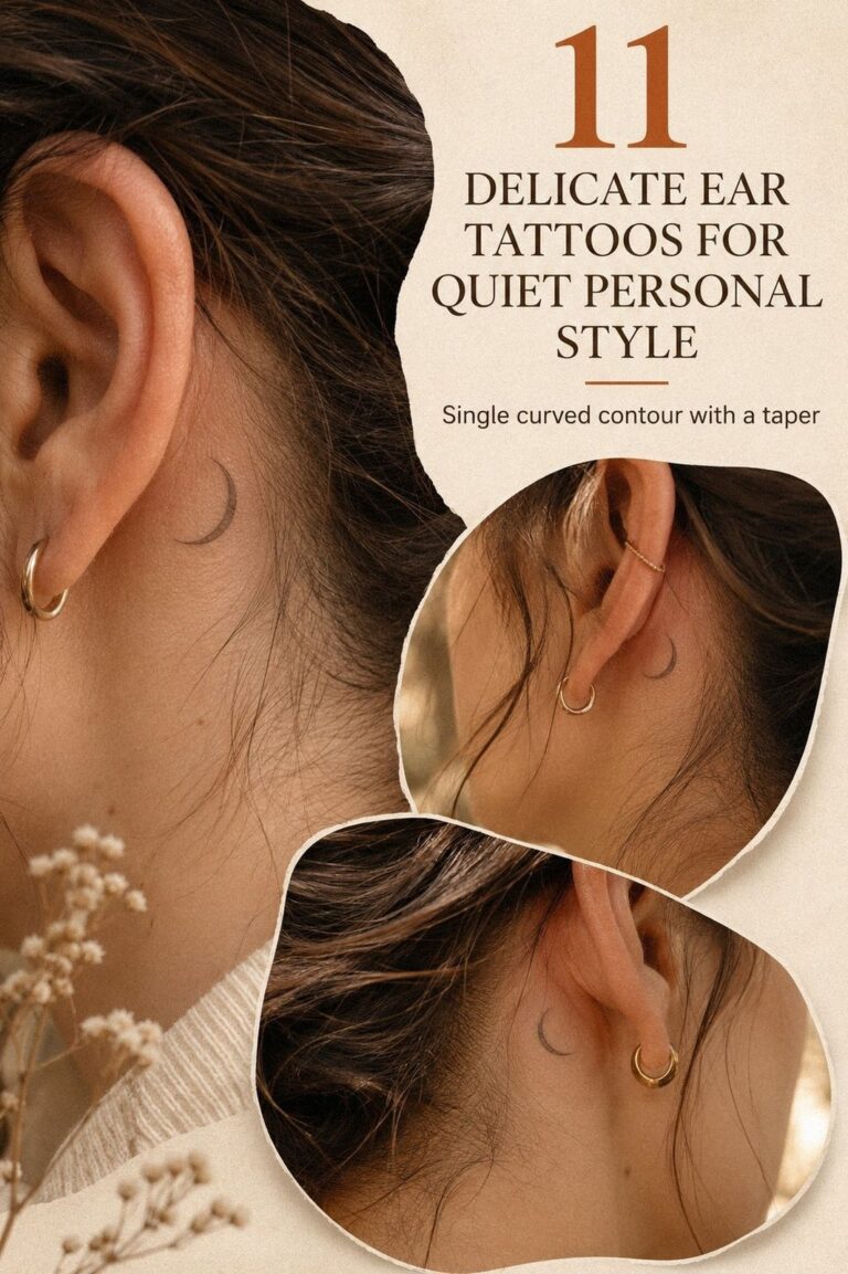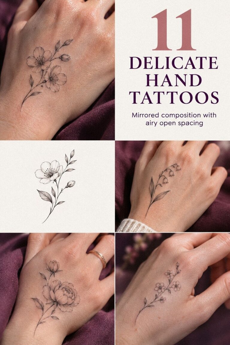

I almost talked myself out of delicate inside finger tattoos because I wanted meaning without a loud announcement. The short answer is simple: a small, clean mark can feel more personal than a large one when it follows your finger instead of fighting it. I chose quietly. I’m glad I did!
- Why I Chose Fine Line Over Heavy Ink
- The Crescent Method: One Symbol Between the Creases
- Follow the Curve: Match the Shape to Your Finger
- Olive Branch or Wildflower?
- Three Angles, One Choice
- The Serif Initial
- Open, Curled, Relaxed
- Prepare Skin and Expectations First
The strongest direction combined a fine-line tattoo, a narrow silhouette, and one symbol I could explain only to myself. I wanted something symbolic and understated, but still recognizable when my hand rested naturally.
Start Here: My One Rule for a Private Design
The inside of my finger had been blank for years. I’d saved it for an idea that felt meaningful, but I didn’t want to choose during a five-minute scroll. The skin was clear, the creases were visible, and every tiny mark would have to earn its place.
I compared small inside finger tattoos with minimalist inside finger tattoos until one rule became obvious: the inner finger placement needed to look intentional when my hand was relaxed, not only when I stretched my finger.
That ruled out crowded lettering, wide shapes, and decorative turns that depended on a perfect pose. I wanted a personal symbol with enough contrast to read, enough skin showing around it, and no unnecessary explanation.
- Why I Chose Fine Line Over Heavy Ink
- The Crescent Method: One Symbol Between the Creases
- Follow the Curve: Match the Shape to Your Finger
- Olive Branch or Wildflower?
- Three Angles, One Choice
- The Serif Initial
- Open, Curled, Relaxed
- Prepare Skin and Expectations First
- The Flex Test
- Fresh or Healed?
- Use the Meaning Filter
- How Much It Cost
- What I’d Budget For Besides the Tattoo
- How I’d Decide on Visibility
- What I’d Ask Before Booking
- When a Tiny Mark Needs More Space
1Why I Chose Fine Line Over Heavy Ink
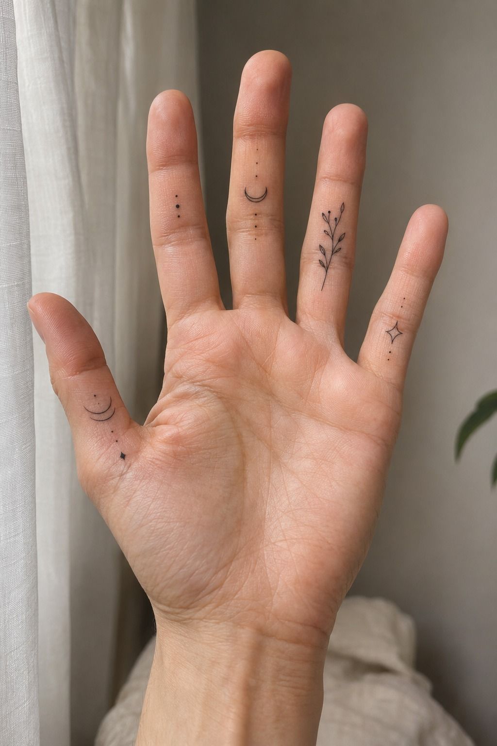
I started with single-needle linework because I wanted the mark to feel intimate rather than dominant. I kept the color direction close to muted terracotta and olive, with a deep line that stayed crisp without becoming harsh.
My artist showed me a fine-line sample beside a solid black sample. The difference was immediate.
The lighter version looked elegant when my finger curled, while the heavier one became a dark stripe. If you’re choosing between the two, ask which version still feels like you after a long day.
I kept the design minimal, but minimal doesn’t mean empty. A single curved mark, tiny star, or narrow botanical stem can carry a meaningful idea when the negative space is clean. My favorite reference was a delicate finger tattoo collection with clear silhouettes and modest scale.
I tested the sketch with my hand open, closed, and holding a cup. That small hand movement test mattered. The line stayed graceful as my hand opened and curled, and I knew I’d found the right direction!
2The Crescent Method: One Symbol Between the Creases

I placed the symbol between the natural skin creases instead of running it directly across one fold. That gave the mark a private quality without making it impossible to notice.
The symbol was a clay-toned crescent with one broken point. I liked the broken edge because it felt raw and expressive, not overly polished. A symbol can be refined without looking emotionally distant.
I printed several versions at the size I was considering and held them against my finger. A design that looks intricate on paper can blur into a speck when reduced. That paper scale test saved me from choosing something too complicated.
I compared a circle, a botanical sprig, and a wave. The circle felt too finished, while the sprig needed more width than my finger could give it. The wave won because it looked flowing when my hand moved.
You can browse delicate cute finger tattoos for symbols that stay readable at a small scale. I didn’t choose the tiniest possible version. The final mark was dainty, but it still had a clear beginning and end.
3Follow the Curve: Match the Shape to Your Finger
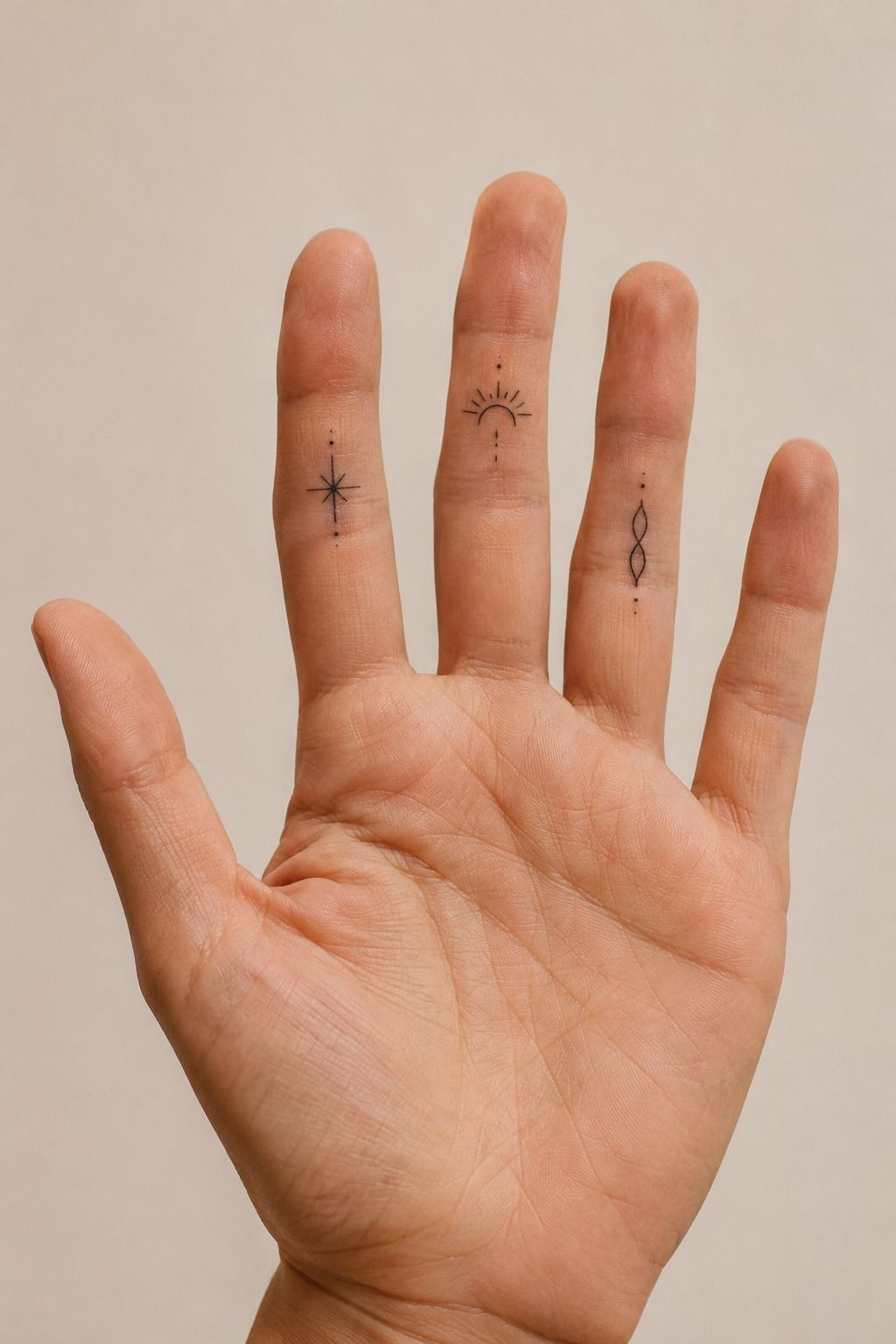
My finger isn’t perfectly straight, so I stopped trying to make the tattoo look centered on a ruler. The sleekest version followed the natural length of my finger instead of crossing it at a stiff angle.
The first sketch was too wide. It looked striking on paper, but it wrapped too far toward the side and made my finger appear shorter. My artist narrowed the design and shifted it slightly toward the center.
I asked to see the finger stencil with my hand open, turned, and bent. That showed me how quickly a narrow shape can change once the skin folds.
I also compared the inside placement with delicate side finger tattoos. Side placement can feel more visible during a handshake, while the inner placement stays quieter when the hand rests naturally.
Neither position is universally better. I preferred the version that revealed itself slowly. The result felt refined and personal, far less generic than a perfectly centered icon.
4Olive Branch or Wildflower?

For the botanical option, I sketched one slender stem with two leaves instead of a full flower. The shape looked organic without becoming ornate. I wanted the plant to suggest growth, not reproduce every vein of a real leaf.
I tested a fern, an olive branch, and a tiny wildflower. The fern had too many fine turns for the available surface, while the wildflower felt familiar in a way I didn’t want.
The olive branch won because its two leaves created a graceful rhythm. I chose a navy botanical line to give the design more presence without making it heavy. You can compare more unique delicate inside finger tattoos before deciding whether your symbol needs detail or simply a strong silhouette.
My artist simplified the leaves into crisp outlines and left the center open. That open leaf shape mattered more than extra texture. On a finger, restraint usually keeps the design readable.
I chose the branch after seeing the branch stencil on a bent finger. It looked almost like a small signature, which made it feel timeless instead of trendy. That was the emotional click I’d been waiting for!
5Three Angles, One Choice

I made a small paper comparison sheet with several fine-line designs, then compared each one with my palm facing me, my hand turned slightly, and my finger naturally curled.
The first option looked polished from the front but disappeared when my hand relaxed. The second was bold enough to remain visible, but the curve felt forced. The third followed the finger and kept its meaning in every position.
That comparison made the choice less romantic and more honest. A private tattoo still needs to function as a mark, not just as an idea.
I chose the third version because it remained recognizable without demanding attention. Its recognizable silhouette was simple, but the placement made it feel distinctive. A restrained emerald accent added color without overwhelming the line.
6The Serif Initial
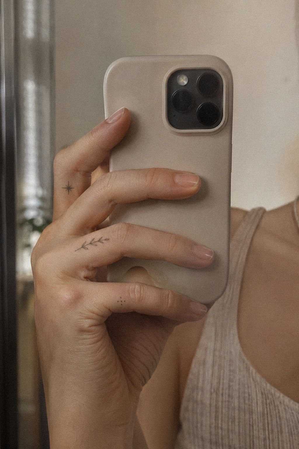
I considered a tiny initial because one letter can hold a whole relationship, memory, or promise. A clear forest-green initial looked powerful when the letter had a simple structure.
The initial belonged to someone important, but I didn’t want the tattoo to feel like a public label. I asked my artist to draw three versions: serif lettering, clean handwritten, and a small monogram.
The serif won because it was classic without looking formal. You can explore small hand finger tattoos for women for lettering references across different hand shapes and skin tones.
I kept the single initial alone. No heart, no date, and no extra flourish. That decision made it more meaningful because the symbol didn’t need an explanation attached to it.
I checked the letter at its actual size before committing. The actual-size stencil remained crisp and recognizable, which gave me confidence that the meaning wouldn’t disappear just because the tattoo stayed tiny.

7Open, Curled, Relaxed
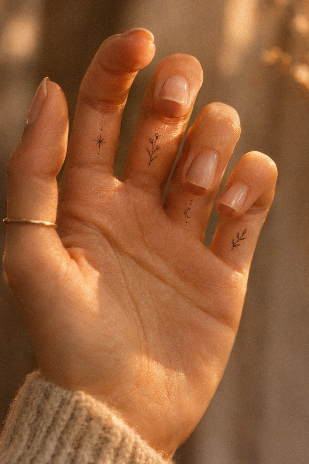
Lettering changes quickly when skin bends, so I checked the lettering stencil with my hand open, half-curled, and fully relaxed. The open position was useful, but it wasn’t the deciding position.
When my finger curled, the first stencil pinched toward the crease. The second shifted slightly but still kept the vertical stroke readable. That small difference mattered more than how elegant the letter looked on a flat hand.
I asked my artist to move the stencil placement by a few millimeters. It seemed insignificant until I flexed again. The shape settled into the finger instead of being dragged across it.
I chose charcoal lettering with a dusty-rose accent. My final movement check was ordinary: reaching for a glass, turning a key, holding a phone, and resting my hand on a table. The tattoo needed to belong to those moments.
8Prepare Skin and Expectations First

Finger skin can be sensitive, and I didn’t want to treat that fact like an inconvenience. I told my artist about finger sensitivity before the appointment, not after the work began.
I also looked for healed portfolio photos, not only fresh tattoos. Fresh work can look vibrant and sharp while the skin is still irritated. Healed examples reveal line spread, fading, and how the design behaves after the surface settles.
For a small piece, the session may be brief, but you still need a clean studio and clear aftercare instructions. Ask how the artist handles hand placement, stencil adjustments, and touch-up policies.
You can use delicate finger tattoos as a style reference, but the artist’s healed work should guide the final decision. A stylish portfolio means little if the relevant work doesn’t hold up after healing.
I didn’t schedule the appointment before travel, swimming, or a week of heavy handwork. My skin needed a quiet aftercare window. That simple choice made the whole experience calmer and more controlled.
9The Flex Test

I chose a narrow design because natural movement changes the visual balance. The midnight-blue line looked longer when my finger extended and more compact when it curled, but the symbol remained readable in both positions.
The test also showed me where the mark should stop. If it traveled too close to the crease, the fold interrupted the shape. If it stopped too early, the tattoo looked unfinished.
I marked the crease boundary with the stencil and watched it move several times. That changed the final length more than any digital sketch could have.
A fierce design doesn’t need to be large. In this case, the strongest choice was a controlled curve that respected the movement of the finger.
10Fresh or Healed?
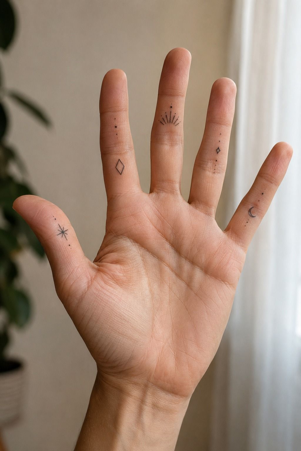
The fresh version looked darker, while the healed version looked softer and more integrated. I needed that reminder before judging the healed result too quickly.
For typical tattoo healing, the surface may settle in about 2 to 3 weeks, while complete healing can take around 2 to 3 months. I followed the artist’s instructions, washed gently, used the recommended moisturizer, and avoided sun and swimming during the early stage.
My first instinct was to inspect the tattoo constantly. I resisted. Peeling, mild dryness, and temporary dullness can be part of the process, but unusual swelling or worsening pain deserves medical advice.
I kept my hands clean without turning aftercare into a complicated ritual. The design looked soft during the middle stage, then regained a crisp, polished quality.
That shift taught me why healed work matters more than a fresh result. The tattoo’s real character appears after the initial brightness settles into the settled linework.
11Use the Meaning Filter
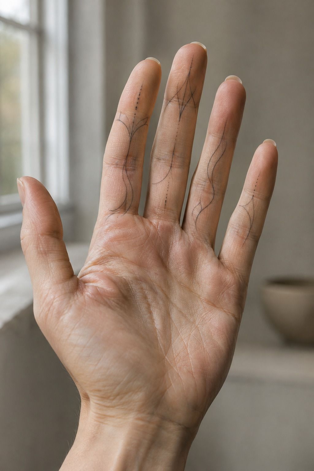
By the final sketch, I had removed nearly everything that didn’t need to be there. The fine-line design looked elegant and visible, while the open spacing kept it gentle. The terracotta and olive direction made the symbol feel expressive without adding visual noise.
I used three questions to refine it: Would I still understand the symbol without a caption? Does the shape follow my finger instead of competing with it? Will I like the idea if the line softens over time?
Those questions separated the meaning filter from fashionable choices. They also stopped me from adding details just because the empty skin made me nervous.
I compared the final concept with small delicate inside finger tattoos and delicate side finger tattoos. The references helped, but I didn’t copy a design.
I borrowed the negative-space discipline: crisp lines, modest scale, and enough skin showing around the mark. The emotional test mattered most. I looked at my hand and felt recognition, not relief that the search was over.
12How Much It Cost
I planned around a realistic US price range instead of pretending every artist charges the same. A boutique minimum is typically about $50 to $100, while hourly rates often fall around $100 to $250.
My own planning number was the studio minimum, not a universal price. A tiny tattoo isn’t automatically cheap because the design is small. You’re paying for consultation, sterilization, setup, skill, and the artist’s time.
If you’re comparing quotes, ask what the total appointment cost includes before choosing based on the lowest number. Clear information is more useful than a suspiciously low estimate.
I’d rather pay a fair rate for professional sterilization and an artist with healed examples than save a little and regret the linework. Ask whether a touch-up policy exists, but don’t treat a free touch-up as a guarantee.
Finger tattoos can fade or soften because hands experience constant friction. The most valuable part of the finger tattoo budget is often the artist’s judgment about scale and placement.
13What I’d Budget For Besides the Tattoo
The quoted price isn’t the only cost worth considering. You may need to account for a consultation, a deposit, aftercare supplies, travel, and a possible touch-up later.
The cheapest quote isn’t always the best deal. If an artist has polished work, strong hygiene practices, and a healed portfolio, the extra cost may be worth it.
Ask whether the artist charges by the piece or by the hour. Ask whether the hourly rate applies even if the session takes only fifteen minutes. Ask what happens if the design needs a small adjustment.
Write down the booking total before confirming. That removes pressure from the booking conversation and lets you decide with a clear head.
14How I’d Decide on Visibility
I’d begin by asking how often I want other people to notice the tattoo. The inner-finger placement is naturally more private, while the side can reveal itself during a handshake or a casual gesture.
If you want a secretive mark, choose an inward-facing symbol that sits between the creases. If you want something more visible, let the shape follow the side without wrapping too far.
You can compare small inside finger tattoos with delicate side finger tattoos before making the call. Use the second reference for placement, not as a reason to copy its design.
I wouldn’t choose placement based only on how striking it looks in a staged hand pose. Test it while your hand is relaxed, curled, holding a phone, and reaching for something. That relaxed hand test is more honest.
The winning design should still feel meaningful when nobody is looking at it. That is what makes a private tattoo empowering instead of performative. Its private meaning matters more than its visibility.
15What I’d Ask Before Booking
I’d ask to see healed finger work, especially fine-line tattoos on fingers and hands. I’d ask how the artist handles fading, whether touch-ups are common, and what their aftercare instructions include.
I’d also ask whether my chosen symbol is large enough to stay readable. A daring artist may simplify an intricate idea, and that can be a good thing.
The goal isn’t to preserve every tiny detail. The goal is to preserve the feeling through thoughtful design simplification.
I’d ask how the artist approaches different skin tones and whether they can show healed examples on skin similar to mine. That skin-tone match conversation should feel direct, respectful, and practical.
Finally, I’d ask for the full quote before confirming the appointment. If the answer feels vague, I’d pause. A clear artist can explain the process without making the decision feel rushed.
16When a Tiny Mark Needs More Space
A tiny tattoo needs enough room for its lines to remain distinct. If the design includes lettering, leaves, stars, or overlapping curves, shrinking it further may make the result less crisp. Clean line spacing protects the shape.
This is where delicate cute finger tattoos and unique delicate inside finger tattoos can help you compare scale. Look at the relationship between the mark and the surrounding skin, not just the symbol itself. That scale comparison is more useful than copying a reference.
I’d rather choose a dainty design with confident spacing than an ornate design squeezed into a narrow strip. A slightly larger symbol can still feel feminine, masculine, edgy, or understated depending on the line and placement.
That was my most useful rule: every line needs a job. If a curve exists only because the reference had one, remove it.
If a gap helps the symbol breathe, protect it. That is line discipline.
The best small tattoos are often more disciplined than dramatic. A sharp silhouette with three intentional lines can feel more iconic than a crowded illustration.
The Part I’d Still Defend
I used to think a meaningful tattoo needed to explain itself to anyone who noticed it. I don’t believe that now. The most satisfying part of my inside-finger tattoo is the pause before someone recognizes it, when the mark belongs entirely to me and my hand is simply resting there.
I’ve learned that delicate work isn’t the same as careless work. A delicate tattoo needs firm decisions about spacing, contrast, scale, and placement. The line may be fine, but the thinking behind it should be bold.
The first sketch carried too much emotion in too little space. I wanted the crescent, the initial, the botanical curve, and a date to coexist. On paper, each element felt meaningful.
On my finger, they competed.
So I removed almost everything. That felt uncomfortable at first.
Then the remaining curve became clearer, quieter, and more expressive. It no longer needed a caption or an explanation to feel personal.
I also stopped treating privacy as the same thing as invisibility. The smallest possible tattoo isn’t automatically the most private.
Sometimes it simply becomes unreadable. A slightly larger mark can remain understated because its meaning is yours, not because its lines are disappearing.
The moment that changed my mind came when I saw the stencil after bending my finger. The symbol shifted with me instead of sitting on top of the skin like a sticker. That movement made it feel alive.
I’d choose a simple mark over an intricate one unless every detail has a job. A tattoo can be haunting, romantic, or sacred without carrying a whole illustration. One curve can hold a memory if you gave yourself time to choose it.
And yes, I still notice mine during ordinary moments. I see it while turning a key, reaching for a glass, or resting my hand on a table. That quiet repetition is what makes it feel timeless.
If I could give one piece of advice, it would be this: hold the stencil longer than feels necessary. Look at it while your hand is doing something boring. Pick the design that still feels right when the excitement fades.
A Few Things Worth Answering
How much does a delicate inside finger tattoo usually cost?
A delicate inside finger tattoo typically costs about $50 to $100 at a studio minimum or around $100 to $250 at an hourly rate. The final price varies by artist, region, placement, and session length, so ask for the studio’s minimum before booking.
Are delicate inside finger tattoos a good idea for a first tattoo?
Yes, they can be a good first tattoo if you want a small, meaningful design and understand hand placement. The compact scale feels manageable, while clean linework lets you choose a personal symbol without committing to a large visible piece.
How do I choose an artist for delicate inside finger tattoos?
Review healed portfolio photos and look for consistent linework on fingers, hands, and varied skin tones. Confirm the studio’s hygiene standards, consultation process, style specialty, and touch-up policy before you schedule.
How much do delicate inside finger tattoos hurt?
Pain varies, but fingers are often more sensitive than areas such as the forearm, thigh, or shoulder. Your tolerance and placement both matter. Tell your artist if you need a pause, especially when the skin feels tender.
How long do delicate inside finger tattoos take to heal?
The surface commonly heals in about 2 to 3 weeks, while complete healing can take around 2 to 3 months. Follow the artist’s instructions, wash gently, moisturize appropriately, and avoid swimming and direct sun early on.
What’s the best placement for delicate inside finger tattoos?
The inner finger works well for a quieter, private design, while the side offers more visibility during a handshake. Your natural hand position matters most. Test the stencil with your finger relaxed and bent before approving the final placement.
Where I’d Start First
If I had to pick one, I’d start with a small symbol between the natural creases. It stays private, but the spacing gives it enough room to remain readable as the line softens.
I’d choose a crisp crescent, a single meaningful initial, or a flowing botanical curve. Each can feel iconic without becoming loud. Start with the emotion, then let the artist help you find the cleanest, sharpest version.
Save your favorite reference and bring it to a consultation. The right design should feel like recognition, not ornament. Pick the mark that stays yours!
The best inside-finger tattoo doesn’t need to perform for strangers. It only needs to keep its meaning when your hand is open, closed, moving, and completely still. That’s the quiet power of choosing something personal.