Minimalist inside finger tattoos can stay striking when you choose a compact design, a steady artist, and realistic aftercare. I once picked a line that was too tiny and too close to a crease. It looked delicate at first, then softened faster than expected. Your best one-sitting idea needs open skin around it. Keep it intentional.
- Start With the Small Moon
- Choose Your Initials Carefully
- Let the Botanical Stem Flow
- Give the Tiny Snake a Fierce Silhouette
- Match Meaning, Not Every Mark
- Build a Delicate Geometric Mark
- Make the Birth Flower Personal
- Blackwork Band: Bold or Too Much?
This guide focuses on inside finger placement, readable shapes, and realistic expectations for intentional ink color. Fingers move constantly, so the right design matters more than chasing the smallest possible mark. If you’re hoping for a low-pain appointment, remember that comfort varies by person, exact placement, and session length.
- Start With the Small Moon
- Choose Your Initials Carefully
- Let the Botanical Stem Flow
- Give the Tiny Snake a Fierce Silhouette
- Match Meaning, Not Every Mark
- Build a Delicate Geometric Mark
- Make the Birth Flower Personal
- Blackwork Band: Bold or Too Much?
- Write a Meaningful Script
- Ask What the Celestial Mark Needs
- Follow the Dainty Wave
1Start With the Small Moon
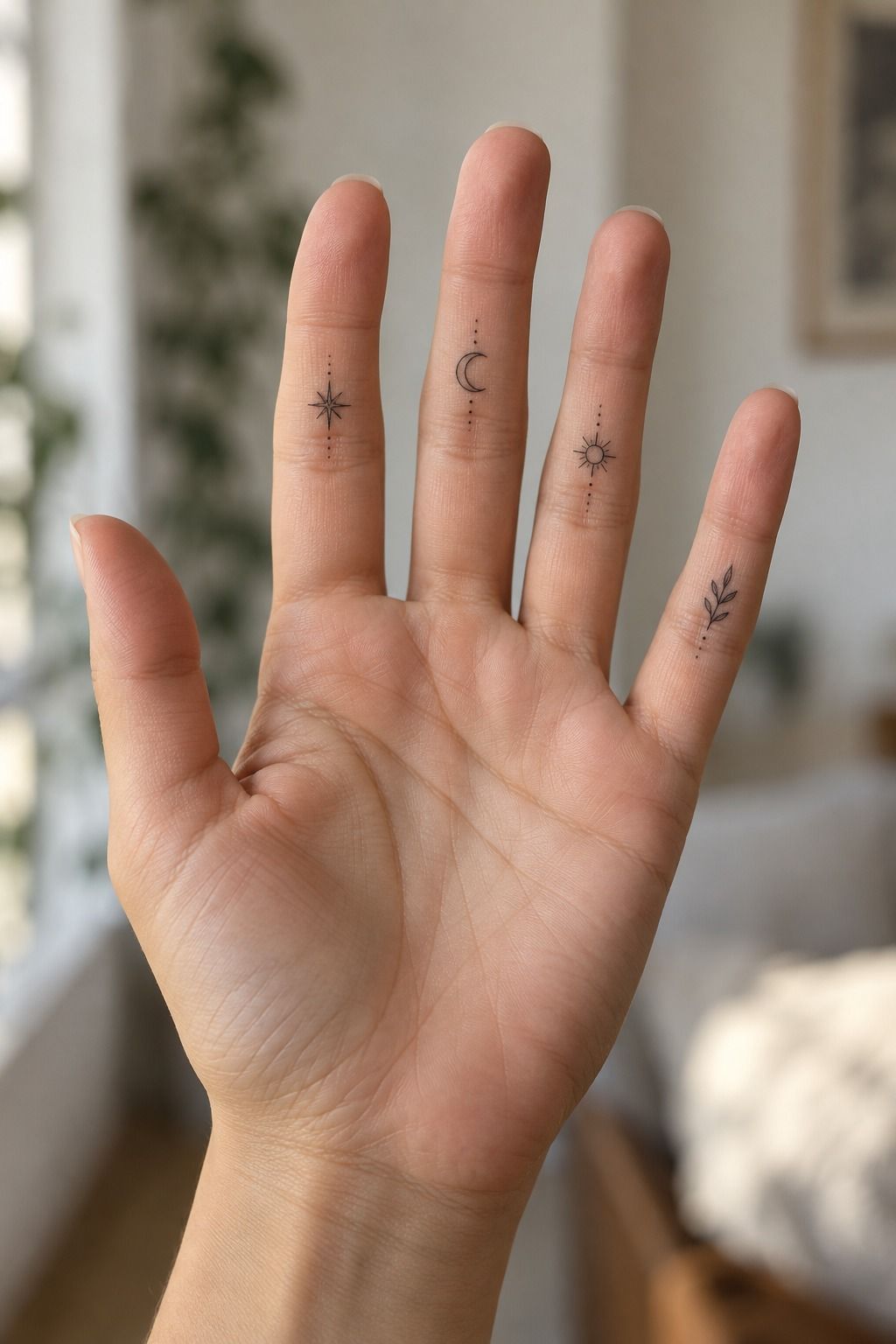
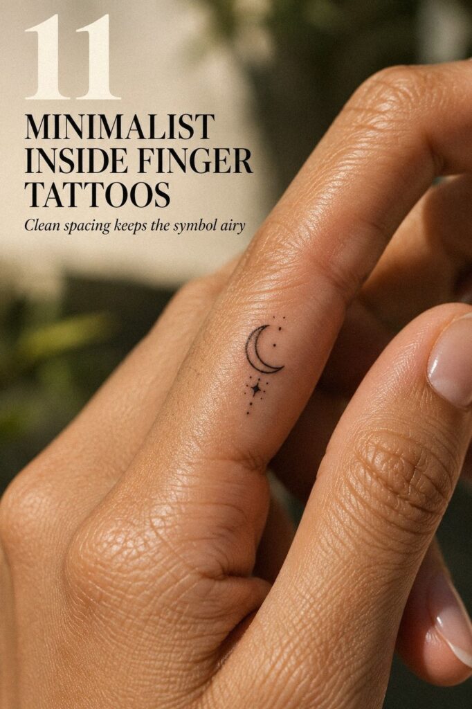
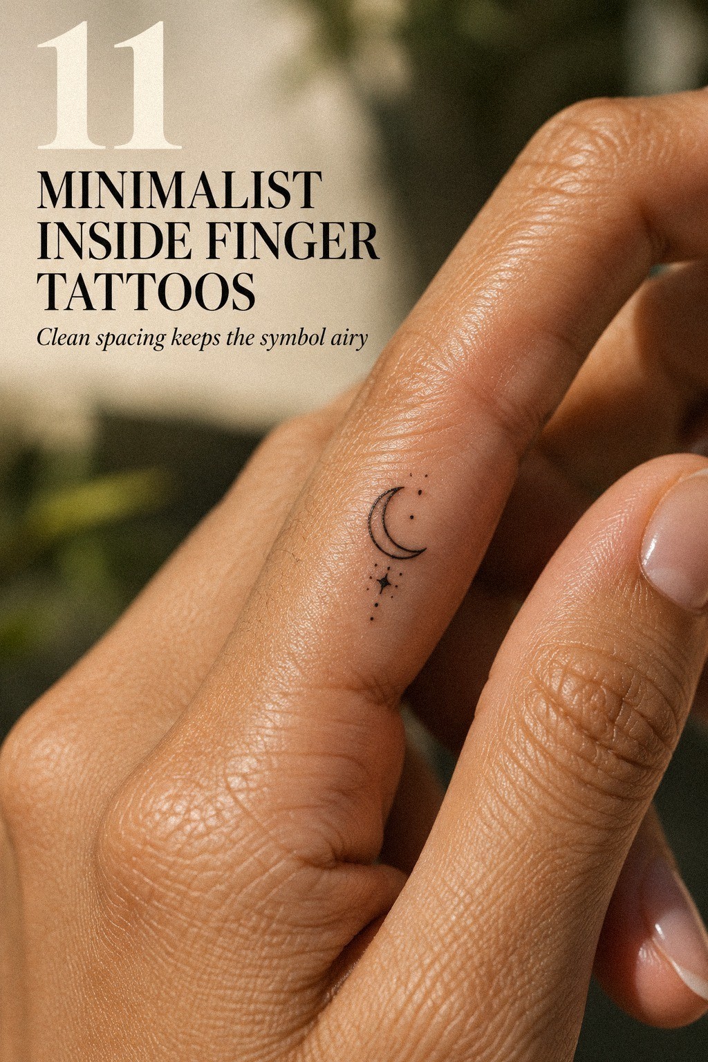
A small crescent moon with a few stars gives you a symbolic design without filling the whole inside finger. The shape feels graceful because open skin does part of the visual work. It doesn’t need a crowded constellation to feel expressive.
Ask your artist to leave clear space between the crescent moon and each star. Fine details can blur when they sit too close together, so I’d skip a cluster of ten tiny stars. Three is enough for a minimal and readable result.
Your placement matters more than the moon’s exact shape. Keep the design away from the deepest crease if you can, and ask whether the artist would shift it slightly toward the side. That small adjustment may help your lines age with less rubbing.
A negative-space gap can make the design look crisp after healing. It also gives the moon visual breathing room when your finger bends. I’d rather see one clear crescent than a packed design that looks muddy six months later.
– Small crescent with rounded tips. – Three stars with visible separation. – Muted terracotta ink with open gaps. – One short sitting, if your artist approves the scale.
If you like this direction, compare it with these small inside finger tattoos before choosing your final reference. You’ll notice that the strongest examples don’t overload the narrow space. They let one shape lead.
2Choose Your Initials Carefully
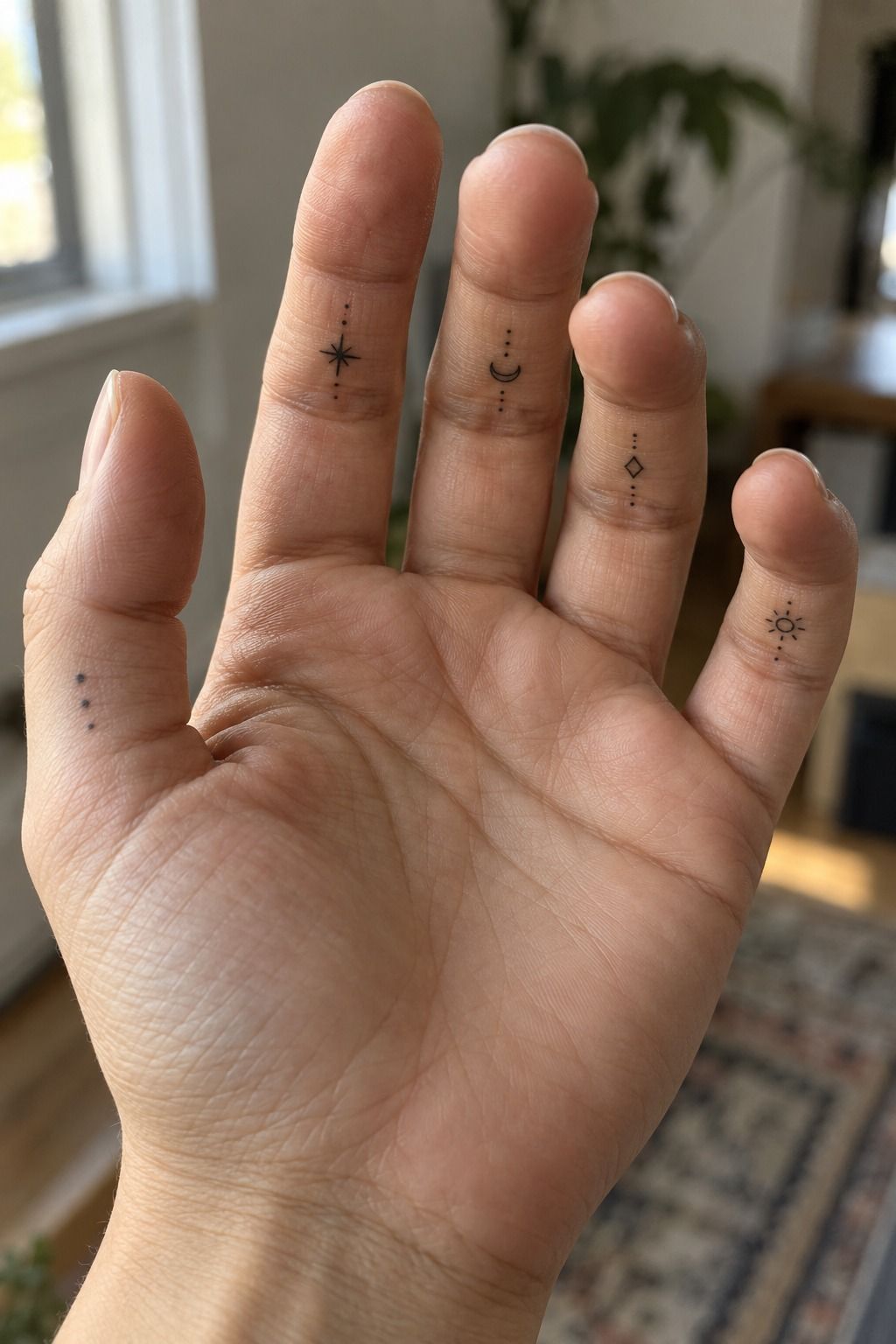
Hair-thin initials in muted clay ink feel personal without announcing a full name.
3Let the Botanical Stem Flow
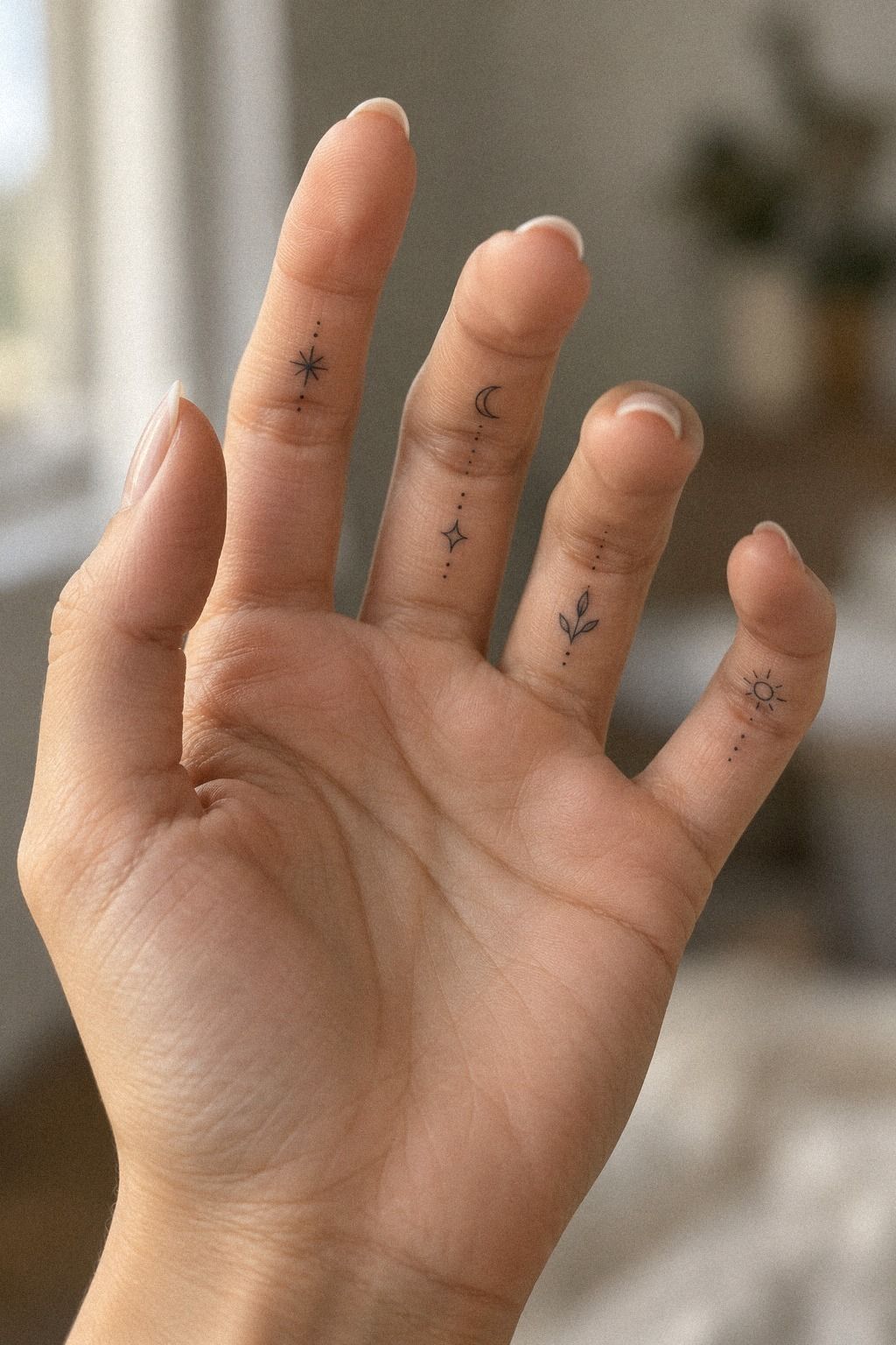
The botanical idea uses a few deliberate stems instead of an ornate bouquet. A single leaf, sprig, or tiny flower can follow the finger’s length and create movement without crowding the skin.
Start with one botanical stem and decide whether its leaves should face toward the knuckle or the palm. That direction changes the mood. A stem pointing upward can feel symbolic, while one that curves along the finger can appear flowing.
Your artist may simplify a reference before making the stencil. That isn’t a loss of detail. It protects the leaf silhouette and keeps the design legible when the finger bends.
A small branch in plum ink can look romantic without becoming overly sweet. Consider a birth flower, olive branch, fern, or wildflower. Choose the plant because its meaning matters to you, not because every leaf looks impressive on a screen.
Leave open skin between the leaves. If the gaps disappear, an intricate botanical reference can become a dark line with a few unclear bumps. I’d rather see three confident leaves than twelve compressed ones.
For more ideas, browse these small cute finger tattoos and small finger tattoo ideas. Bring one or two references, then let the artist adapt the botanical reference to your finger.
4Give the Tiny Snake a Fierce Silhouette
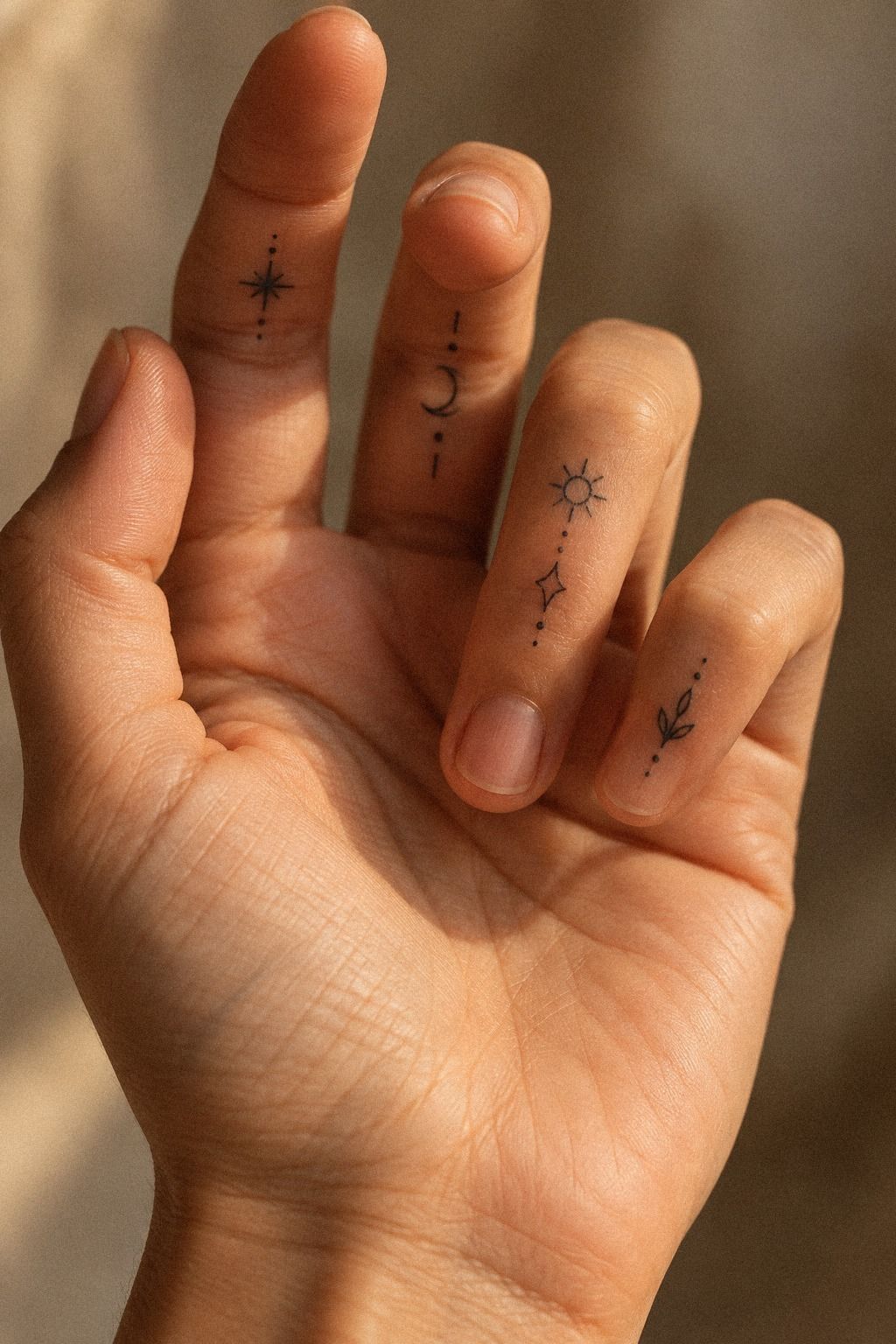
A slim serpent coiling along the inside finger gives you a fierce idea in a very small footprint. The curved body creates movement from knuckle toward palm, while the silhouette keeps the design sleek.
Ask for a clean snake silhouette in deep navy ink first, then only a few scale marks where they won’t merge. I’d skip full scale coverage on a tiny snake. A sharp outer contour will read longer than dozens of hair-thin details pressed into one narrow strip.
Your artist may suggest placing the head near the upper finger and letting the body follow the natural length. That direction feels more intentional than forcing a perfect circle. If you want a ring-like shape, check how the coils look when your finger bends.
The head should be small but recognizable. A tiny snake eye can add character, yet too much facial detail turns a sleek symbol into a dark speck after healing. I’d keep the mouth closed and the curves smooth.
The design can be edgy without becoming aggressive. It may symbolize transformation, protection, curiosity, or private strength. You don’t need to explain the meaning to anyone who asks.
It’s a small creature, but it carries real presence! If you want more compact placement ideas, look through small side finger tattoos and small finger tattoos before deciding whether the snake should sit lengthwise or wrap slightly.
5Match Meaning, Not Every Mark
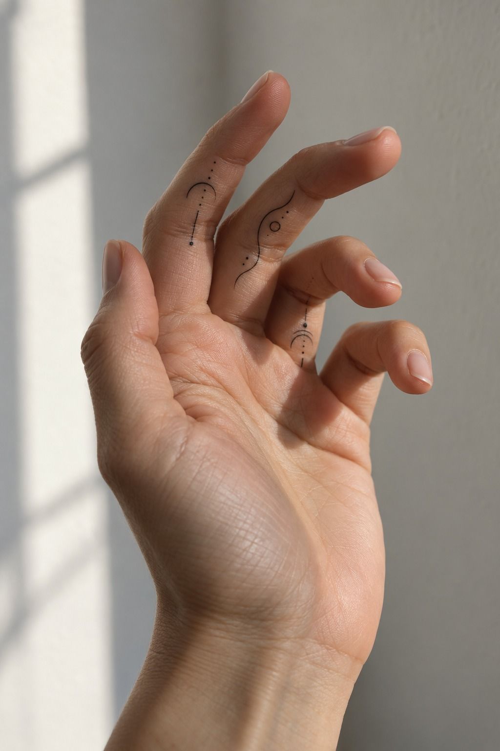
Matching tattoos work best when each person chooses a symbol from the same visual language. Think a moon and star, two linked arrows, or mirrored initials. A meaningful pair doesn’t need to be identical if the line weight and scale connect them.
Choose one matching symbol per person and let the relationship carry the meaning. Copying an entire flash sheet into one tiny placement usually creates clutter. A single emblem can feel more empowering than a miniature collection.
You might select a moon and sun, two halves of a heart, or a pair of simple waves in emerald ink. The design should still look complete when each person is alone. That makes the tattoo feel personal rather than dependent on a photo opportunity.
Your artist can redraw the selected visual language so it fits each finger instead of forcing the same stencil onto different hands. Finger width, crease placement, and natural curvature vary more than people expect.
– One shared motif. – Similar line weight. – Slightly different scale if needed. – Orientation discussed before the appointment.
You’ll also want to discuss whether both tattoos should face the same direction. That detail changes how the pair reads when your hands are together. A sacred symbol can feel more intimate when the orientation has been considered.
For more paired references, visit these small hand finger tattoos for women and small hand finger tattoos for women. Bring your favorite paired symbols, but let the artist adjust them for skin movement, spacing, and long-term readability.
6Build a Delicate Geometric Mark
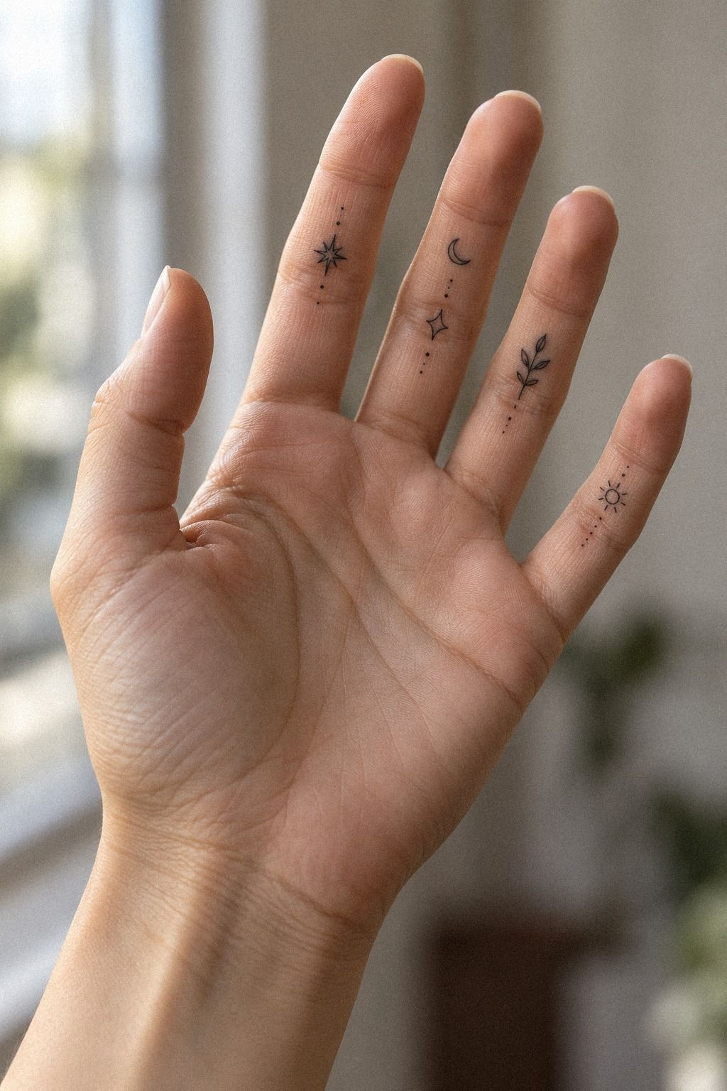
A geometric mark can look powerful when its proportions stay simple. One triangle, arc, diamond, or connected line may be enough for the inside finger.
Start with the outer shape before adding internal lines. A geometric mark needs a clear structure at a glance. If the design only works when someone studies every angle, it’s probably too crowded for this placement.
Ask your artist to test the design while your finger is straight and bent. A circle can become oval, and a parallel line can appear uneven across a crease. That movement is part of the design problem, not something to check afterward.
A single triangle in forest-green ink can feel masculine, feminine, or entirely personal depending on its proportions and symbolism. Geometry doesn’t have to look cold. A softened curve or open center can give it a more expressive quality.
Keep the line weight consistent unless the variation has a clear purpose. Two or three weights in a tiny design can compete quickly. I’d rather see one confident angle than a miniature technical drawing.
Compare these minimalist hand tattoos for women with small side hand tattoos before settling on your geometric reference. Notice how the strongest marks use spacing as part of the design.
7Make the Birth Flower Personal
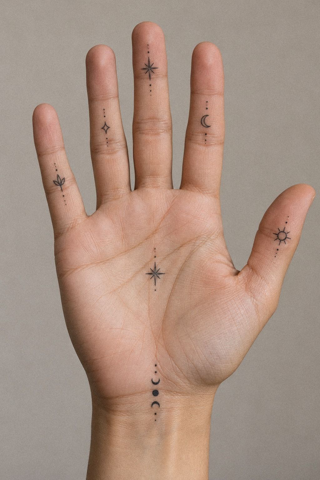
A single stemmed flower with layered petals gives you a dainty option that still feels compact. The design can be feminine, masculine, or entirely personal depending on the flower and the line weight.
Choose a flower with a recognizable silhouette rather than forcing a complicated bloom into a tiny space. A birth flower can use three or four petal layers, but it shouldn’t need every botanical detail to communicate the idea.
Your artist can adjust the stem so it follows the inside finger instead of running directly over the crease. I’d keep the bloom near the upper section and leave the lower stem clean. That gives your eye a clear starting point.
A clear petal count keeps the design readable. Too many overlapping petals can create a dark knot, especially if the bloom is smaller than your thumbnail. Simplicity doesn’t make the idea less meaningful.
– One stem. – Three or four main petals. – Dusty-rose ink outline. – A small open area around the bloom.
The result can feel romantic without becoming overly sweet. If your flower has a more angular shape, ask for slightly firmer line weight so it won’t disappear beside the natural folds of your skin.
You can compare more compact floral references in these small cute finger tattoos and small finger tattoo ideas. Choose the flower because it means something to you, then let the artist simplify the floral reference until it still works at a tiny scale.
8Blackwork Band: Bold or Too Much?
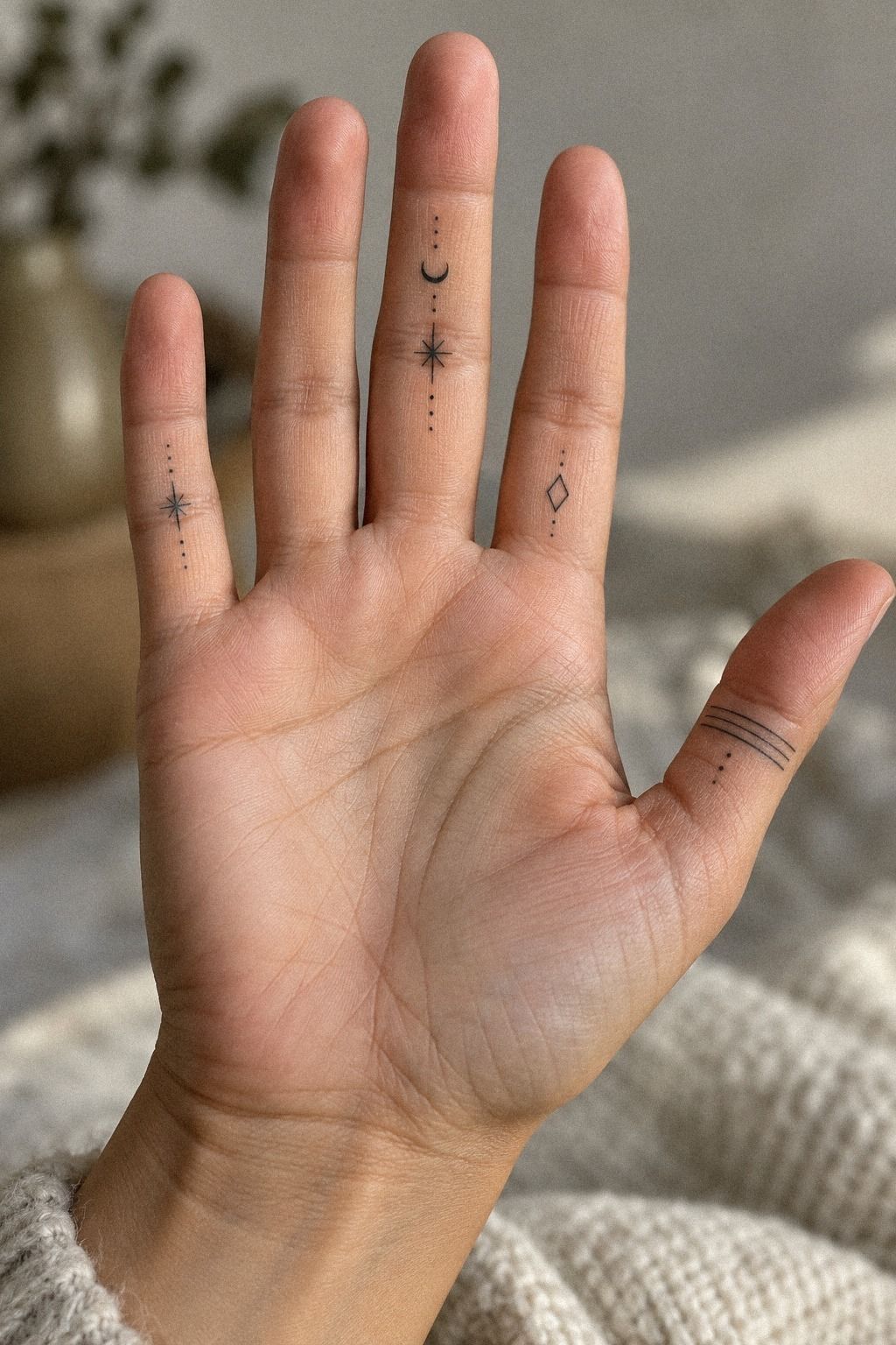
A narrow blackwork band gives you a bold visual anchor without requiring a large image. It can look iconic, but it’s less forgiving than a small symbol because uneven edges are easier to notice around the entire finger.
I’d choose a slim band with one intentional break rather than a completely heavy ring. That interruption creates a clear shape while giving your finger open skin around it. Your artist can show you several widths on the stencil.
A solid fill needs consistent density. Ask whether the artist recommends a solid fill, a broken line, or two narrow parallel marks. The right choice depends on your skin, finger width, and how much contrast you want.
Black ink generally reads more strongly than ultra-fine lines, but placement still matters. Fingers experience friction, washing, and sun exposure, so ask how the band may change as it heals. Raw blackwork needs careful edges to stay polished.
Don’t wrap the band too tightly around the narrowest part of your finger. A slightly more open placement may feel better when you bend your hand. The tattoo should move with you instead of fighting every crease.
This style is iconic for a reason, but it isn’t automatically easy! Review minimalist finger tattoos and small side finger tattoos to compare solid bands with broken lines and partial wraps. It’s a small choice with a visible effect!
9Write a Meaningful Script
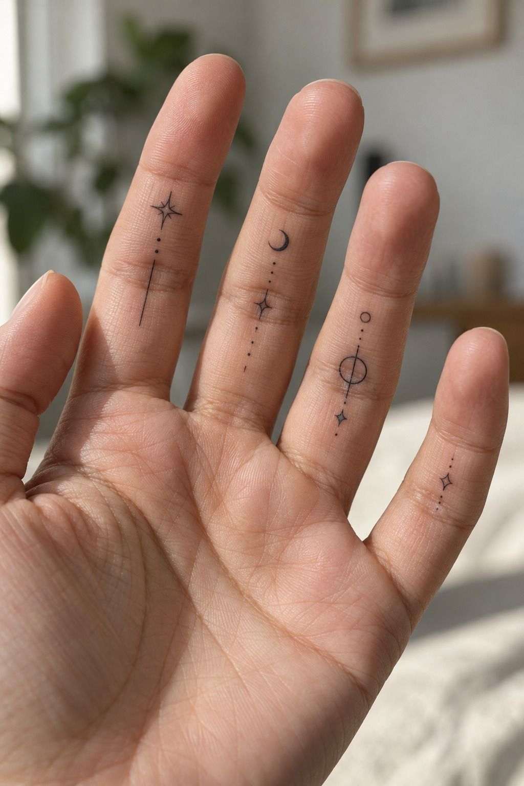
A short handwritten word or phrase in midnight-blue ink can feel expressive without taking over the finger. Names, initials, dates, and single words all need enough space to remain readable.
Choose a phrase that still matters when the lettering becomes slightly softer. A handwritten script can look elegant fresh from the needle, but loops may close as the tattoo settles. Fewer letters usually give the design more strength.
Ask your artist to test the letter spacing at the intended size. Read it with your finger relaxed, bent, and turned sideways. If the letters blur together in any position, the stencil needs editing.
A single word can be timeless, while a date may carry a more private meaning. You don’t have to explain it to anyone. The best script tattoos often work because the wearer knows the full story.
Avoid squeezing text beside another symbol unless both elements genuinely belong together. A meaningful word can lose its impact when it competes with a moon, flower, or decorative border.
If you’re considering script, compare the letter shapes in these minimalist cute finger tattoos and small hand finger tattoos for women. Bring a phrase you’d still choose years from now.
10Ask What the Celestial Mark Needs
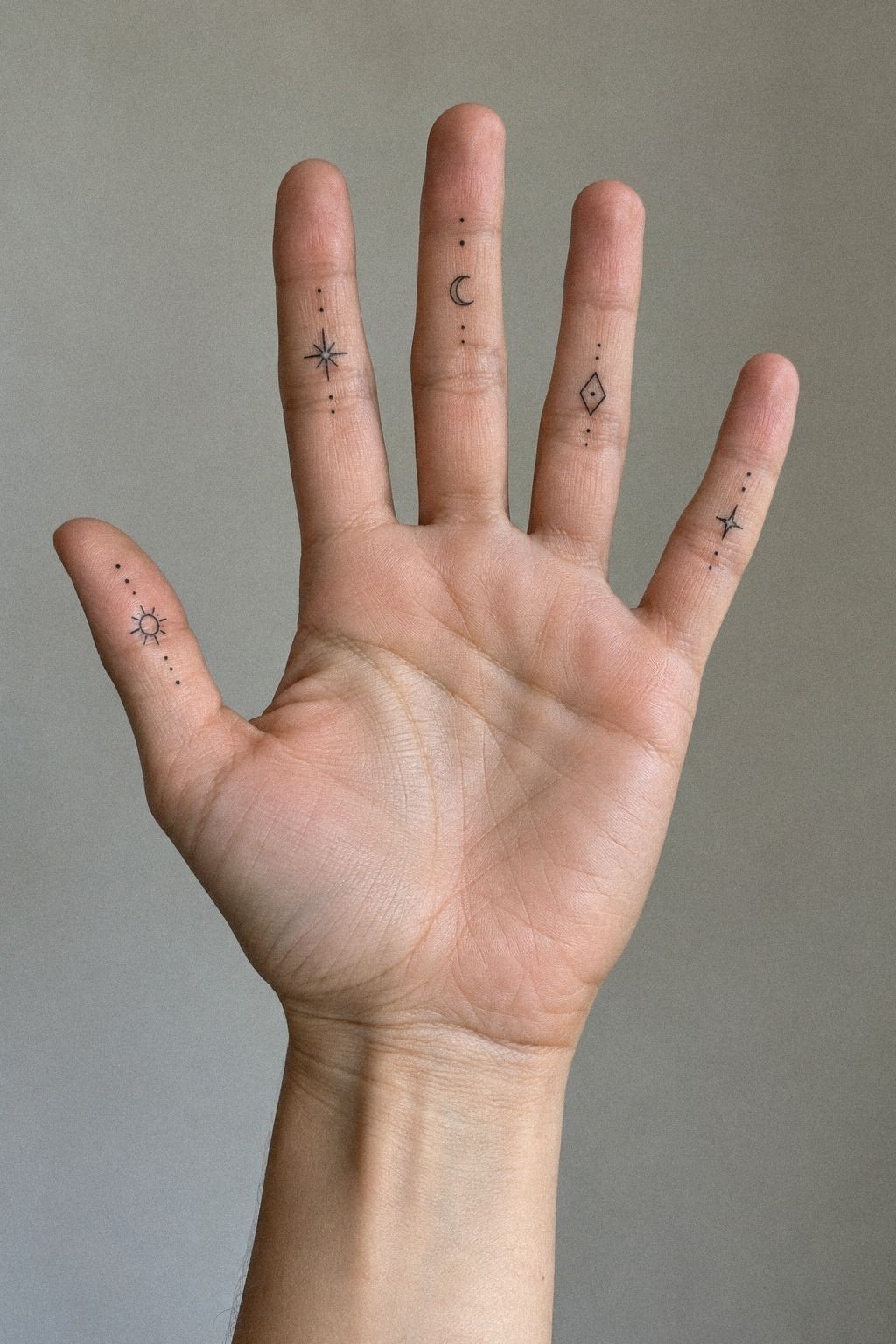
A tiny sun, star, or orbit in sage-green ink can create an ethereal mark with very little ink. The strongest celestial designs don’t rely on a dozen dots. They use one clear shape and a controlled amount of detail.
Use one celestial mark only if the shapes have enough space between them. A daring design doesn’t need many elements. One curved orbit and a single star can create a stronger impression than a crowded constellation.
An orbit should have a readable curve rather than several lines crossing in the same place. A single orbit can wrap slightly around a dot or crescent, but leave enough open skin that the mark doesn’t become a dark knot.
Your artist should show you healed work in a similar placement, not just fresh photographs. Fine lines may widen, and UV exposure can soften contrast. Ask what aftercare your skin needs, then follow it closely during the surface healing period.
– One orbit or crescent. – One star or sun. – Clear spacing between shapes. – A stencil checked while the finger bends.
The finished tattoo can feel whimsical without becoming vague. If you want more small sky-inspired ideas, browse minimalist cute finger tattoos and small hand finger tattoos for women.
A good artist will tell you when a star is too small to age well. Listen to that advice. It protects the sky symbol you liked in the first place!
11Follow the Dainty Wave
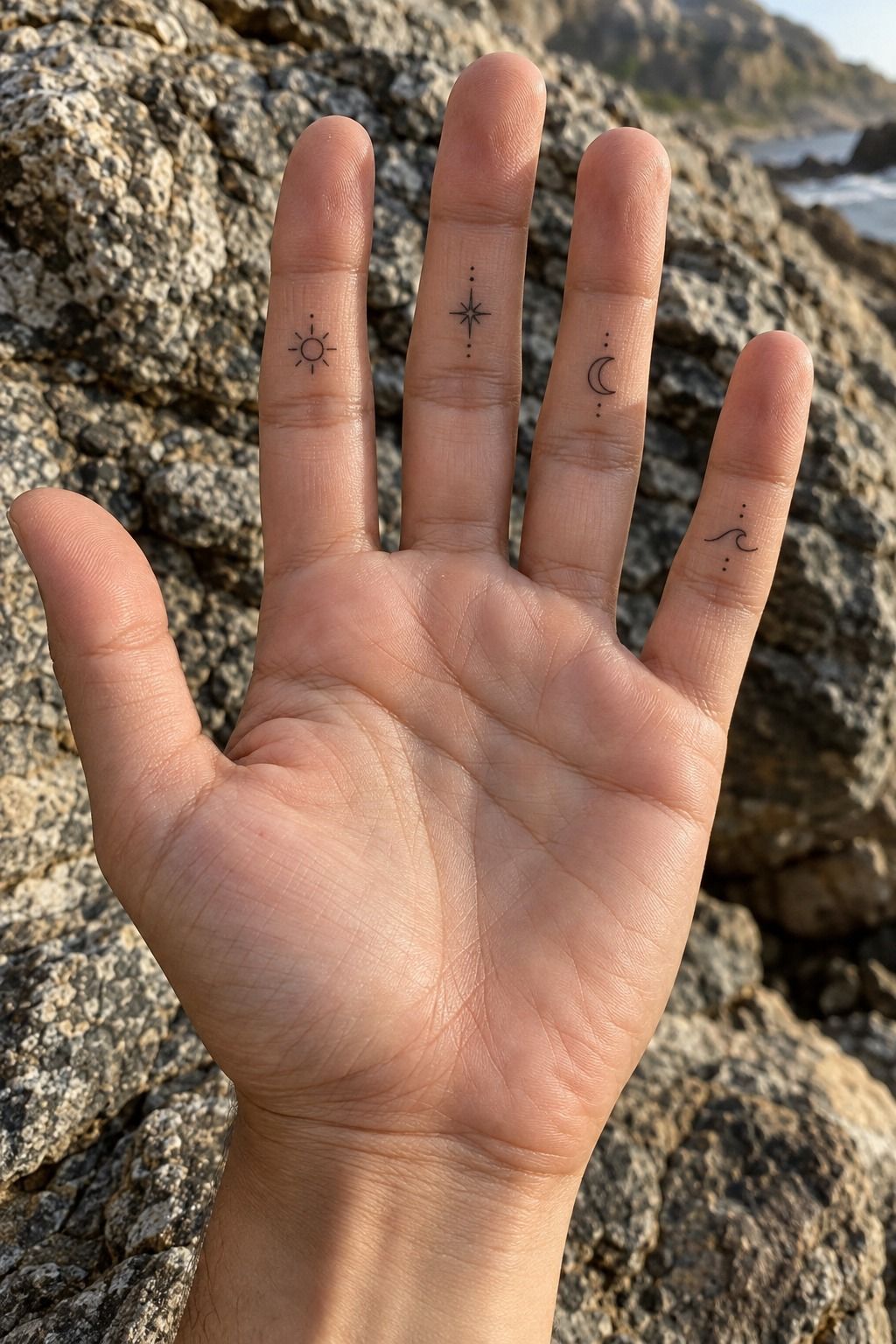
A curling ocean wave in terracotta ink can feel flowing, symbolic, and quietly powerful on the inside finger. It’s a strong choice if you want movement without a dense image.
Start with the main wave line and decide whether it should rise toward the knuckle or curl toward the palm. Both directions can work, but the curve needs to follow the finger rather than fight its natural shape.
A small crest may be enough. Adding foam, a second wave, or a tiny sun can make the idea more intricate, but every extra mark takes up valuable space. I’d keep only the detail that makes the wave unmistakable.
The design can represent change, resilience, travel, or a connection to water. A wave crest may look calm at first glance, yet it can carry a fierce private meaning.
Ask your artist to check the wave stencil while you bend your finger. The curve may compress over a crease, so a slight shift can preserve its flow and readability.
Browse small inside finger tattoo references before choosing your final wave. A simple curve can be more stylish than a crowded ocean scene.
The One-Sitting Filter
Before booking, ask whether the idea can be understood in one glance. If the answer depends on six tiny details, it probably needs editing. A one-sitting tattoo should be compact, but it shouldn’t feel rushed or under-considered.
My favorite designs have one clear silhouette, one supporting detail, and enough untouched skin around them. That formula works for moons, waves, initials, snakes, flowers, and geometric symbols.
A low-pain appointment also depends on preparation. Eat beforehand, drink water, and wear clothing that lets your artist reach your hand easily. You’ll be more comfortable if you aren’t distracted by hunger or a cramped position.
Don’t bargain for the smallest possible design. Ask what size gives the best value over time. A slightly larger mark may cost a little more now but stay readable longer.
The most reliable one-sitting scale is the size your artist can execute cleanly without rushing. That may be slightly larger than your first reference. It’s worth hearing the honest recommendation!
What a Healed Finger Can Tell You
Fresh ink is not the final result. The surface may look crisp and vibrant during the first days, then settle into a softer version. That change is normal, especially on fingers.
Look for healed linework photos taken several weeks or months after the appointment. You’re checking for readable curves, stable spacing, and whether the artist’s small details still have structure.
Finger tattoos can fade or soften faster than tattoos in lower-friction areas. Washing, sunlight, hand movement, and repeated contact all affect the result.
That doesn’t make the placement wrong. It means your expectations need to be realistic.
Ask directly about surface healing and touch-ups. A responsible artist won’t promise that every line will remain identical forever. They’ll explain how the ink may settle and whether a future refresh could be worthwhile.
A tattoo that looks slightly softer after healing can still be elegant and readable. Judge the artist by healed work, not only by the bright first-day photograph.
Cost, Value, and the One-Sitting Trade-Off
A small tattoo can still have a minimum price. The cost reflects the artist’s time, setup, hygiene procedures, design preparation, and experience, not only the amount of ink used.
In the US, a simple inside finger tattoo often lands around $100 to $300, while some studios charge a minimum of about $50 to $100. Hourly rates may range from roughly $100 to $250. Your region and artist will change the quote.
The cheapest option isn’t always the best value. A steady artist with healed finger work may cost more upfront but reduce the chance of blurred lines, awkward placement, or an avoidable correction.
Ask what’s included in the price. Confirm whether the consultation, stencil changes, aftercare sheet, and any scheduled touch-up are part of the appointment. Clear answers protect your budget.
If you’re comparing two artists, review portfolios before comparing numbers. A slightly higher cost can be worth it when the design needs precise line control and careful placement. Value comes from the finished result, not only the lowest quote.
Which Details Should You Cut?
If the stencil feels crowded, cut details in this order: tiny texture, extra dots, secondary outlines, and decorative flourishes. Keep the main silhouette and the meaning behind it.
A simplified stencil can still look stylish when the proportions are thoughtful. Your artist may remove three leaves, reduce a star cluster, or widen a letter counter. Those edits protect the design’s long-term readability.
Don’t let a reference image pressure you into copying every mark. A tattoo has to work on your finger, not only on a screen or another person’s hand.
I’d also avoid adding text to a symbol unless the two elements genuinely belong together. A moon and a word may compete for the same narrow area. One strong idea often looks more polished.
Cut the secondary detail first, not the symbol that gives the tattoo its meaning. The result may become more striking once the unnecessary marks are gone.
Before You Book
Choose an artist who has recent work in finger placement, not only general minimalist tattoos. Ask for healed examples and explain that you want a design suitable for one sitting.
Bring two or three references, not twenty. Tell your artist what you like about each one, such as the curve, scale, or spacing. That gives them useful direction without turning the appointment into a copying exercise.
Discuss the exact location, size, line weight, expected cost, and aftercare before the needle starts. You’re allowed to pause if the stencil doesn’t feel right.
Ask about stencil size while your finger is relaxed and bent. A design that looks perfect on a flat print can shift once it follows the skin.
If the design crosses the deepest crease, ask whether it can shift slightly. That small change may improve comfort, readability, and long-term value.
A thoughtful aftercare plan should be clear before you leave the appointment. If the instructions feel vague, ask follow-up questions.
Aftercare That Protects the Mark
Follow your artist’s written aftercare instructions first. General advice can vary depending on the method used, your skin, and the bandage applied.
During the first days, wash gently and avoid picking, soaking, or unnecessary friction. Keep your hands clean, and don’t apply products that your artist hasn’t recommended.
Surface healing often takes about 2 to 3 weeks, while complete healing may take around 2 to 3 months. The tattoo can look settled before the deeper skin has fully recovered.
Avoid swimming and strong sun while the skin heals. Once it’s fully healed, sun protection can help preserve contrast, especially around fine lines and small lettering.
Don’t judge the final result during peeling or dryness. The skin may look uneven temporarily, then settle into a more stable finish.
The Questions I Get Asked Most
How much does a minimalist inside finger tattoo usually cost?
A minimalist inside finger tattoo typically costs about $100 to $300 in the US, though some shops have a $50 to $100 minimum and hourly rates may run about $100 to $250. Your artist, region, size, and placement will affect the quote.
Is a minimalist inside finger tattoo a good idea for a first tattoo?
Yes, it can be a meaningful first tattoo if you choose a readable design and understand that finger ink may need future attention. Your placement can feel manageable, but hands experience more friction than areas such as the upper arm or thigh.
How do I choose a tattoo artist for minimalist inside finger tattoos?
Choose an artist with a healed portfolio, a clean portfolio, and clear studio hygiene practices. Ask to see similar finger placements, discuss line weight, and make sure your artist will tell you when a design is too small to age well.
How much do minimalist inside finger tattoos hurt?
Pain varies, but fingers can feel sensitive because the skin is thin and the area contains many nerve endings. Your experience will depend on the exact spot, session length, and personal tolerance. A calm artist can make the process feel more manageable.
How long does a minimalist inside finger tattoo take to heal?
The surface usually heals in about 2 to 3 weeks, while complete healing can take about 2 to 3 months. Wash gently, use the aftercare product your artist recommends, and avoid swimming and strong sun while the skin recovers.
What’s the best placement for minimalist inside finger tattoos?
The best placement keeps the design away from the deepest finger crease while preserving visibility. Your artist may shift the mark slightly toward the side or upper inside finger so the lines experience less bending and rubbing.
Where I’d Start First
If I had to pick one, I’d start with the small moon. Its crescent and three stars stay readable without relying on fragile detail, and the open gaps give your skin room as the ink settles.
The best value isn’t always the cheapest appointment. It’s the design you’ll still enjoy when the fresh shine is gone, the lines have softened slightly, and your hand is moving through an ordinary day.
Pin the moon for later and compare it with your small inside finger tattoo references. If the stencil still feels clear after you bend your finger, you may have found your one-sitting idea.
A tattoo can be small without feeling forgettable. Choose the mark that remains timeless to you, then let your artist protect its shape, spacing, and future readability.