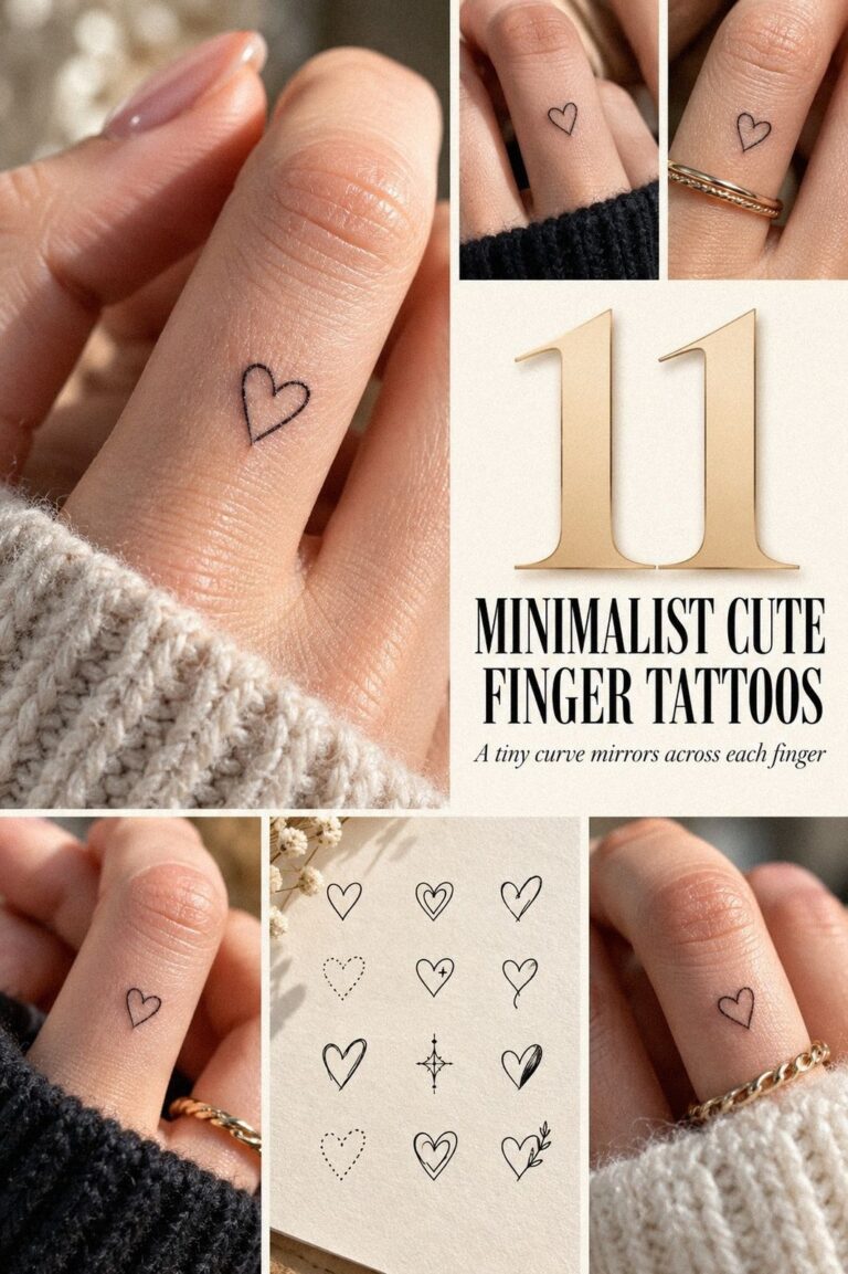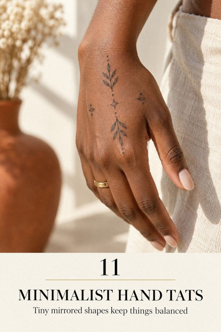
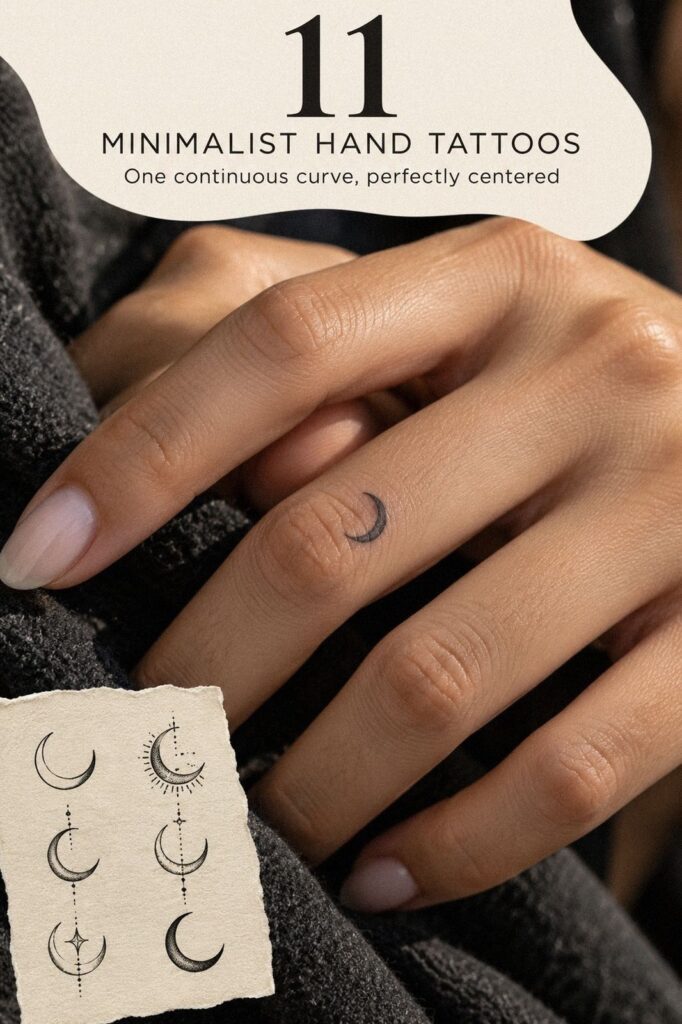
Minimal hand tattoos can fit a careful budget, but placement matters more than size. I priced my piece before booking, chose a 3/4-inch terracotta crescent, and paid $180 for a 50-minute session. The result felt delicate, symbolic, and far less stressful than guessing at the studio chair. Short answer: plan first!
My one rule
Choose the skin area before you fall in love with the design. My favorite symbol looked different between my fingers, beside my thumb, and near my wrist.
Quick answer
I paid $180, including the consultation, stencil adjustments, and tattoo session. A small hand tattoo quote can vary widely by location, shop minimum, and the person doing the work.
Before you book
Start with a healed portfolio, then test the stencil while your hand is relaxed, spread, curled, and holding something. Fresh work can look striking, but healed work tells you much more about line control.
Here’s What It Looked Like Before
Before the appointment, I had a clear patch of skin between two fingers, a saved folder of tiny symbols, and too many opinions from people who weren’t paying for the work. My hand was unmarked. My idea wasn’t.
I wanted something minimal enough for daily life, but not so faint that it would disappear after healing. I also wanted to see the design while typing, washing my hands, and holding a coffee. If you’re collecting minimalist hand tattoo ideas, begin with the actual skin area you have, not the flash image you like most.
- I Chose a Tiny Crescent Between My Fingers
- I Tested Fine Linework Beside My Thumb
- I Matched a Minimalist Star to My Ring
- I Reserved My Knuckles for Simple Symbols
- I Compared Delicate Ink on Both Hands
- I Picked a Meaningful Initial Near My Wrist
- I Added a Sharp Botanical Line Along My Hand
- I Considered Pain Before Choosing Finger Placement
- I Let a Tiny Wave Follow My Palm
- I Checked Healing Advice for Crisp Hand Tattoos
- I Settled on an Understated Symbol With Meaning
1I Chose a Tiny Crescent Between My Fingers
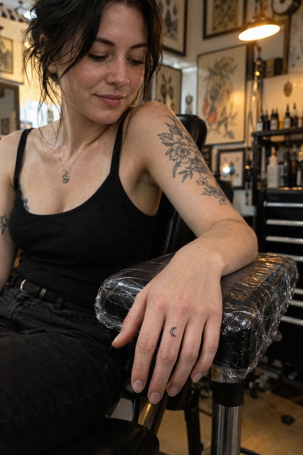
I chose the crescent because it felt personal without spelling out a life story. Between my fingers, it looked almost hidden when my hand was relaxed, then appeared when I reached for something. That small reveal was the emotional moment for me.
The terracotta ink looked warm against my fair, cool-pink skin, and the curved shape followed the natural gap instead of fighting it.
The studio showed me a version with three tiny stars beside it. I skipped that option.
A crescent alone was more understated, and the clear skin around it kept the design readable. My tattooer printed the stencil at 1/2 inch and 3/4 inch, then held both beside my hand.
You should always compare the actual stencil because a design that looks dainty on a screen can look vague on skin.
I liked the larger version. It still read as a delicate symbol, but the line had enough visual weight to stay clear.
If you’re drawn to small hand tattoo ideas, ask to see the smallest readable size and one step above it. The smaller choice isn’t automatically better.
2I Tested Fine Linework Beside My Thumb
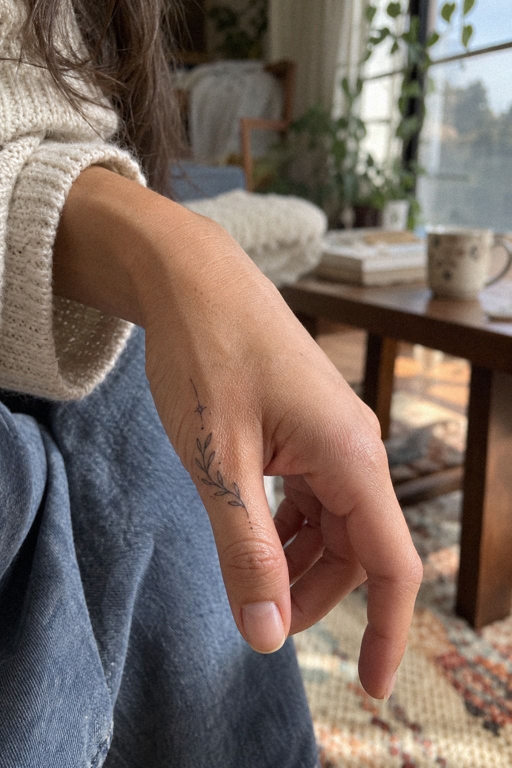
The fine line beside my thumb was the option I tested after the crescent. It used hair-thin single-needle work on medium, warm-ivory skin, with generous clear skin around the mark.
It looked sleek, but that clean appearance depended on restraint. One extra loop would have made the shape muddy.
I placed the stencil just beside the thumb rather than directly on the bend. Your hand moves constantly there, so I wanted the line away from the deepest thumb crease.
The tattooer used a single-needle configuration for the narrow detail, then checked the shape with my thumb both open and curled. That check mattered.
The line looked elegant in one position and cramped in the other.
I went back and forth for ten minutes, then chose the simpler crescent. Fine linework can be graceful, but I wouldn’t choose a dense miniature illustration beside the thumb. If you’re comparing professionals, start with this minimalist tattoo artist guide and look for healed photos, not only fresh close-ups.
3I Matched a Minimalist Star to My Ring
The star idea belonged to a different mood. Several small stars in different sizes sat near my ring rather than crowding around it. That contrast made the design feel playful and expressive, especially when my hand moved and the jewelry caught light.
I tried one large star first, but it looked too formal beside my ring. Three varied marks felt more natural: one solid point, one open outline, and one smaller star set slightly higher.
The tattooer used solid plum fill for the smallest center so the arrangement wouldn’t become a collection of faint scratches. You can see why the mixed treatment works when you compare it with these minimalist star tattoo ideas.
The ring became my scale reference. I didn’t want the tattoo competing with it, and I wouldn’t place the largest star directly beneath the stone.
That would look busy whenever I wore the ring. The final arrangement was bold in shape but still minimal in quantity. And yes, the smallest star was the one I kept staring at afterward!
4I Reserved My Knuckles for Simple Symbols
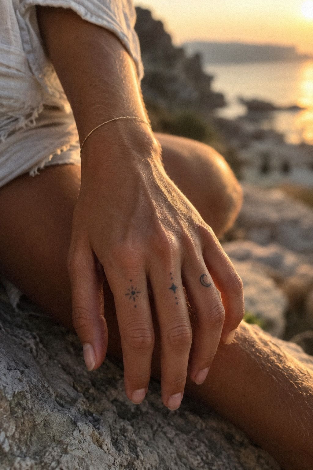
Knuckle placement has a fierce little energy, but it also has less forgiving skin. I preferred a few deliberate strokes spaced across the knuckles instead of one crowded band. Each mark had its own pause, which made the design feel more intentional.
I considered a full set of symbols, then cut the idea to two: a tiny sun on one knuckle and a short arc on the next. The simpler arrangement looked more iconic and gave my hand a cleaner silhouette. Your knuckles bend, rub, and see plenty of sun, so you should expect more visual change than you might see on a calmer placement.
The stencil exposed a problem immediately: one symbol tilted when I made a fist. We moved it slightly toward the side of the knuckle, where the shape stayed readable.
I wouldn’t choose intricate lettering here. A crisp outline or compact symbol has a better chance of remaining legible.
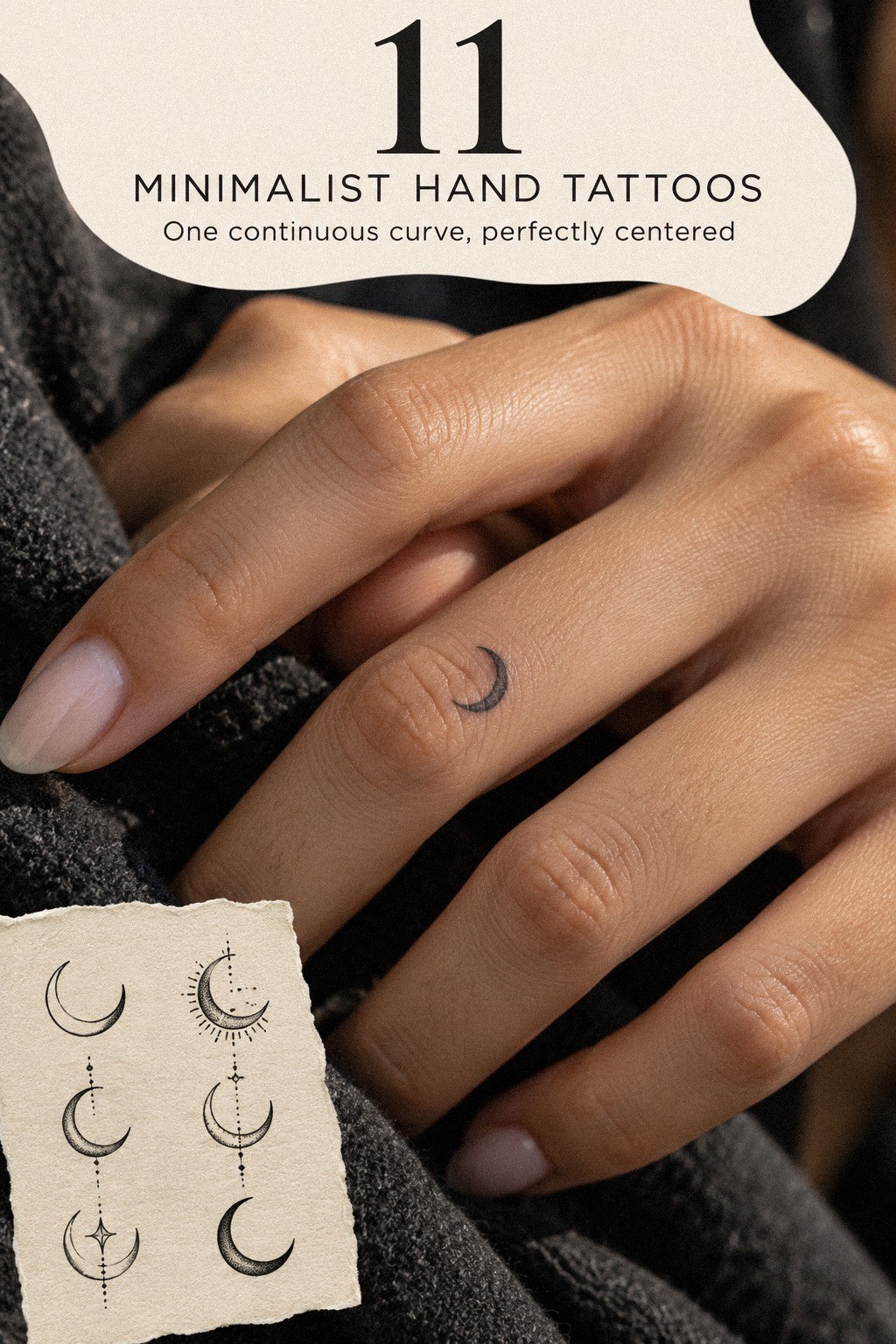
5I Compared Delicate Ink on Both Hands
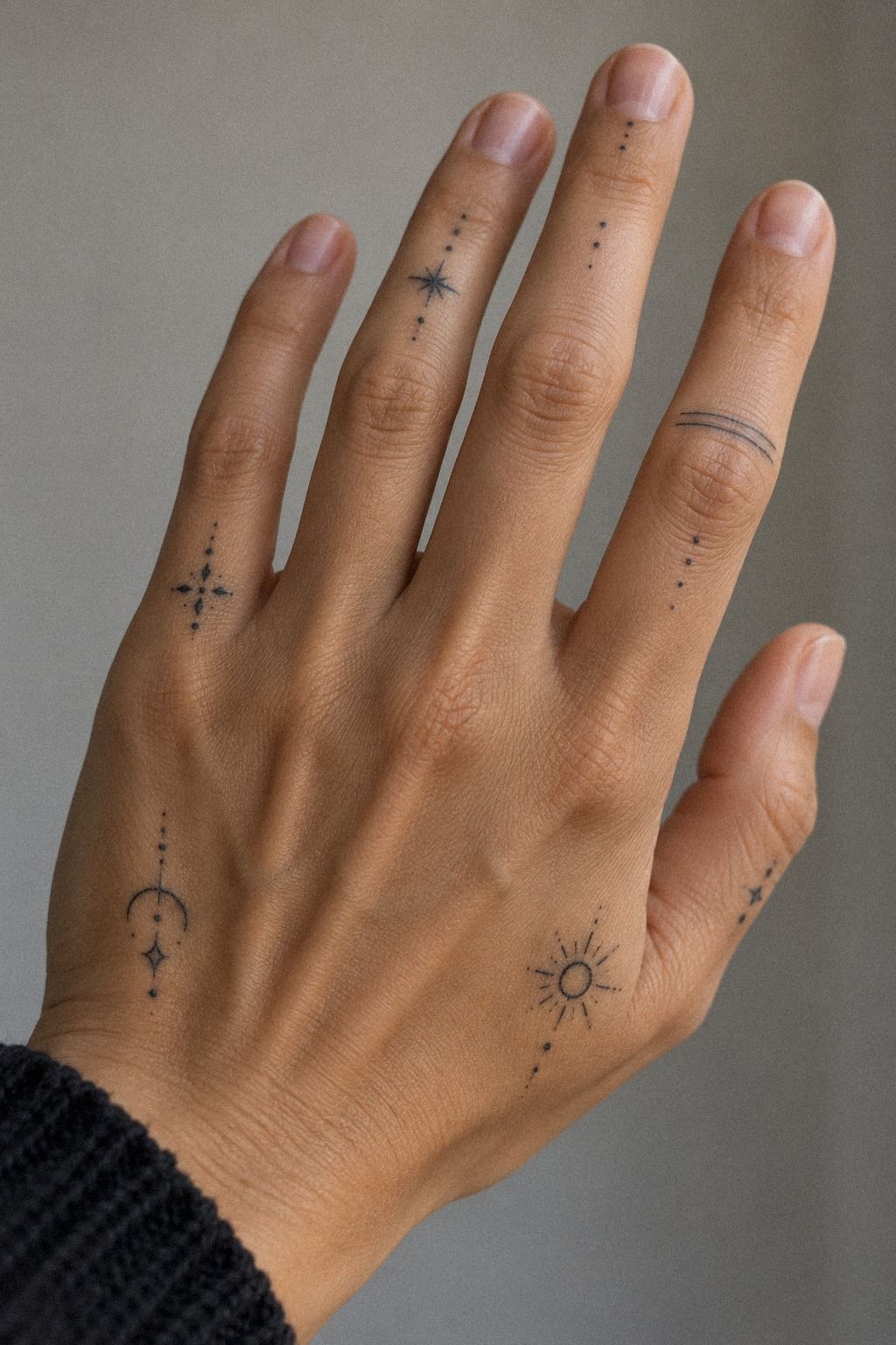
I compared the same small symbol on both hands before choosing a side. The left hand had slightly more visible veins, while the right had a flatter patch near the base of the index finger. The difference was subtle, but the delicate line placement looked more balanced on the right.
I also tested how each hand looked while holding a phone, turning a key, and resting on a table. The symbol disappeared in one position and became surprisingly prominent in another. That experiment helped me understand why small hand tattoo ideas need to be judged through movement, not only from a straight-on view.
My final choice was the hand I use less often. I wanted the tattoo visible, but I didn’t want constant friction from writing, gripping, and washing to dominate the first weeks. A small mark can still feel personal when it isn’t placed in the most obvious spot.
6I Picked a Meaningful Initial Near My Wrist
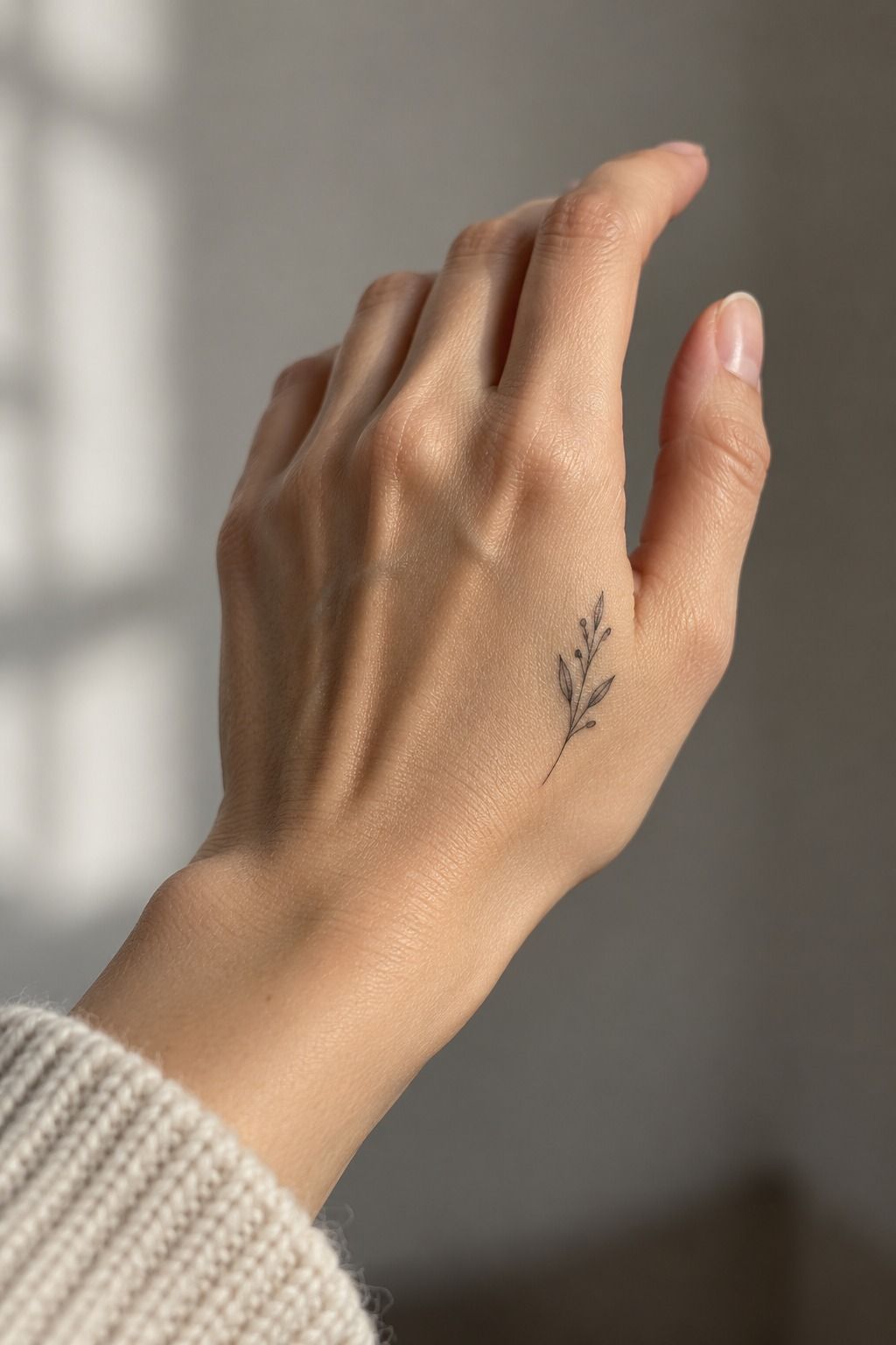
The initial near my wrist was the most meaningful option because it connected to a person without copying their name in full. I wanted the letter to feel intimate instead of loud, so I kept it close to the wrist rather than spreading it across the hand.
I tested a serif initial, a loose handwritten form, and a geometric capital. The handwritten version felt too soft, while the geometric one looked sharp but slightly cold. I chose a narrow serif with a short tail, drawn in forest-green linework that gave the character enough presence without turning it into a block.
My wrist moves less than a finger joint, so the stencil stayed stable when I rotated my hand. Still, I asked to see it with a watch and with a bare wrist.
The watch covered half the letter, which made the placement pointless. I wouldn’t hide a personal initial behind an accessory I wear every day.
If you prefer a botanical meaning, compare it with this minimalist olive branch tattoo.
7I Added a Sharp Botanical Line Along My Hand
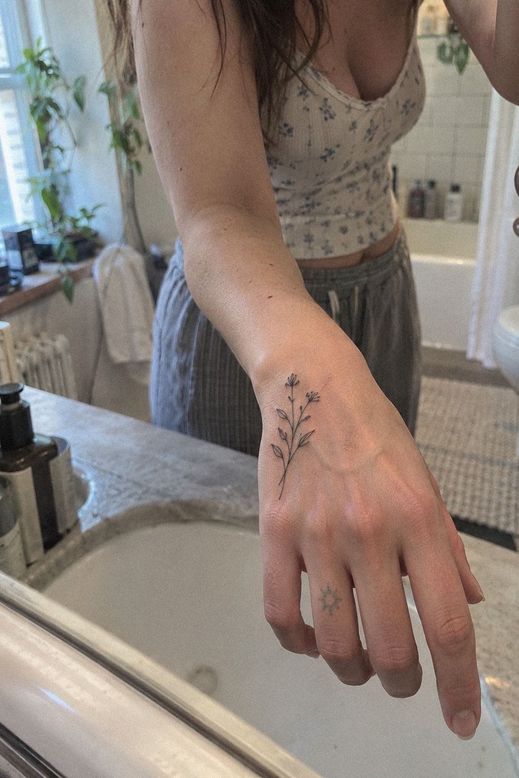
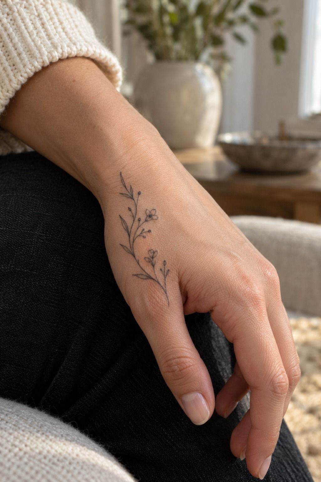
The botanical idea used a single stem that traveled along the side of my hand. I chose one narrow leaf and two short offshoots instead of a full branch. The result felt flowing without becoming ornate, and the line followed the hand’s natural direction.
I moved the stencil several times because the first position crossed a crease when I bent my fingers. The better placement sat slightly higher, where the botanical stem remained readable while my hand opened and closed. That small adjustment made the design feel more graceful and less forced.
I also compared a leafy branch with a bare stem. The leafy version was more intricate, but the bare stem felt more personal to me.
If you like plant symbolism, this minimalist olive branch tattoo helped me compare botanical shapes before I committed. I would keep the leaf count low on moving skin.
8I Considered Pain Before Choosing Finger Placement
Pain was part of my decision, not a reason to pretend I wasn’t nervous. Finger and hand placements can be more painful than the forearm, thigh, or shoulder, especially near joints and sides. My experience was raw and concentrated, but it was also brief.
I asked the tattooer to rank the available spots from most tolerable to least tolerable. The fleshy side of the hand felt easier than the knuckle, while the finger side felt sharper and faster. The session lasted under an hour, but the sensation changed depending on the exact placement.
The design itself helped. A simple terracotta crescent meant fewer passes than a shaded image, so the intense part was brief.
I also asked about breaks before the appointment. I took one after the stencil and one during the final check.
Was I uncomfortable? Yes. Was it unbearable? No.
That honest middle ground is more useful than calling every placement painless. That was my sign!
9I Let a Tiny Wave Follow My Palm
The tiny wave was the most whimsical design in my folder. It used a curling ocean wave with fine-line foam, positioned so the curve followed my palm instead of cutting across it. The shape looked organic because the foam marks weren’t perfectly matched.
I asked for one curling crest and two short foam strokes. The first draft had four, and it looked too illustrative for my taste. The tattooer softened the curve and left a clear pocket of skin beneath it.
That gap became the part I loved most. It gave the wave a vibrant sense of motion without making the tattoo large.
Palm-adjacent skin needs careful planning because friction can be intense. I wouldn’t place the thinnest possible foam lines directly in the deepest crease. Put the fragile detail on a calmer patch, then let the main curve do the emotional work.
If ocean imagery feels right, compare it with a small minimalist hand design before choosing a more crowded wave.
10I Checked Healing Advice for Crisp Hand Tattoos
I asked for specific aftercare instructions before the needle touched my skin. For the first day, I planned to wash gently with lukewarm water, pat dry with a clean towel, and apply only the amount of aftercare ointment recommended by the studio. More product would not make the healing faster.
During the next two weeks, I expected mild peeling, dryness, and occasional itching. I kept my hands clean, avoided picking, and protected the tattoo from unnecessary soaking. Swimming, long baths, and direct sun were easy to postpone while the healing skin settled.
The surface looked calmer after roughly two to three weeks, but I waited longer before judging the final result. Fine lines can look softer as the skin settles over two to three months. I also asked what would happen if a touch-up became necessary.
This minimalist tattoo artist guide helped me make a better shortlist because I wanted someone who could discuss healed work and aftercare honestly.
11I Settled on an Understated Symbol With Meaning
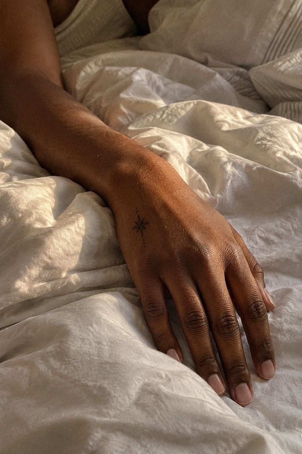
The final choice was an open circle with a short break, a sacred little mark that represented continuity without looking like a logo. I kept it small enough to feel private, but clear enough to recognize at a glance.
The design was understated, but it wasn’t timid. The tattooer used a clean terracotta contour and left the opening wide enough to remain visible after healing. I rejected a shaded version because the extra darkness made the symbol feel heavier than the meaning behind it.
You don’t need more detail to make a tattoo more important. Sometimes restraint is what makes it powerful.
I kept the stencil on for a full ten minutes and moved my hand through ordinary gestures. The mark looked expressive when I opened my fingers and almost private when I relaxed them.
That was the moment I booked it. If you’re still comparing symbols, save your top three and revisit them after a week.
The design that keeps feeling right usually has more staying power than the one that impressed you for five minutes.
How Much It Cost
I priced the tattoo before booking instead of asking for a vague estimate. My personal quote was $180 for the small hand design and a 50-minute appointment.
That isn’t a universal price, and you shouldn’t treat it as one. In the US, a shop minimum commonly lands around $50 to $100, while hourly rates often sit near $100 to $250, depending on the professional and region.
The quote included the consultation, stencil changes, the session, and a small aftercare sample. It didn’t include a tip, so I set that aside separately. You should ask whether the shop charges a minimum even when the tattoo takes 20 minutes.
That one question can change your total.
I also asked whether a touch-up would cost extra. Hand tattoos can be exposed to friction and sunlight, and very fine lines may soften or widen over time. I didn’t book based on the cheapest number.
A polished portfolio, clean healed examples, and clear hygiene practices mattered more than saving twenty dollars.
My Honest Take on Choosing a Hand Tattoo
I wouldn’t tell everyone to get a hand tattoo. Hands are visible, active, and exposed to sunlight, soap, friction, and constant movement.
That combination makes them a serious commitment even when the design is tiny. I chose mine because the symbol had stayed with me for months, and because I understood that a small tattoo isn’t the same as a low-stakes tattoo.
My first mistake was treating size as the whole decision. A 3/4-inch crescent sounded easy until I placed it beside a ring, bent my fingers, and imagined it after the surface softened. The second mistake was looking only at fresh work.
A healed tattoo portfolio told me far more about line control than a dramatic photograph taken ten minutes after the needle stopped.
The professionals I trust tend to make fewer promises. They talk about placement, skin movement, sun exposure, and what may happen to fine lines.
That honesty feels timeless to me. I also like that minimal work can be edgy without being loud.
It can sit beside jewelry, disappear under a sleeve, or show itself when you reach for someone’s hand.
I wanted the decision to feel empowering rather than impulsive. So I waited, tested the stencil, checked the price, and asked uncomfortable questions about pain and fading. That process made the final choice feel more romantic and less like a reaction to a trend.
If you want a hand tattoo because it looks iconic on Pinterest, pause there. Save the image, then ask what you love: the symbol, the placement, the line weight, or the person wearing it.
Those aren’t the same choice. I chose the crescent because I still wanted it after the trend feeling faded.
That’s the test I’d use again.
The Questions I Get Asked Most
How much does a minimalist hand tattoo usually cost?
I would budget about $100 to $300 in the US, though shop minimums may be around $50 to $100 and hourly rates often run $100 to $250. Your professional, region, size, and placement will change the quote. I would always get the total in writing before booking.
Are minimalist hand tattoos a good idea for a first tattoo?
I think they can work as a first tattoo if you’re comfortable with visible placement and possible line changes. A simple design keeps the session short, while a meaningful symbol can feel personal without heavy detail. I would begin with someone who shows healed hand work.
How do I choose a tattoo artist for minimalist hand tattoos?
I would choose someone with clean linework, healed photographs, and clear studio hygiene. I would look for consistent spacing, readable small symbols, and honest notes about fading. A specialist in minimal work may be a better fit than someone with only one tiny tattoo in their portfolio.
How much do minimalist hand tattoos hurt?
I would expect sharp, concentrated discomfort rather than a long session. Hand, finger, foot, rib, and sternum placements can hurt more because the skin is thin and close to bone. My experience was manageable, but I would never treat another person’s pain scale as a promise.
How long does a minimalist hand tattoo take to heal?
I would expect the surface to heal in about two to three weeks, while the tattoo may take two to three months to settle completely. I would wash gently, moisturize as directed, and avoid direct sun and swimming during early healing. Your professional’s instructions should take priority.
What’s the best placement for a minimalist hand tattoo?
I think the best placement depends on visibility, movement, and your tolerance for change. The outer hand or wrist can give a symbol more breathing space, while fingers and knuckles feel more prominent but may fade faster. I would test the stencil with my hand relaxed and moving.
Where I’d Start First
If I had to pick one, I’d start with the tiny crescent between my fingers. It stayed readable without crowding my hand, and the $180 quote covered a short, focused session. Save your favorite stencil for a week, then book only if you still want it.
My checklist would be simple: confirm the placement, ask for healed examples, get the full price, and understand the aftercare. I would rather delay a personal design than rush into a placement I hadn’t tested.
The best small hand tattoo is not necessarily the most ornate or daring one. For me, it was the symbol that remained meaningful after the excitement faded.
I still notice it when I reach for my coffee. Worth it!