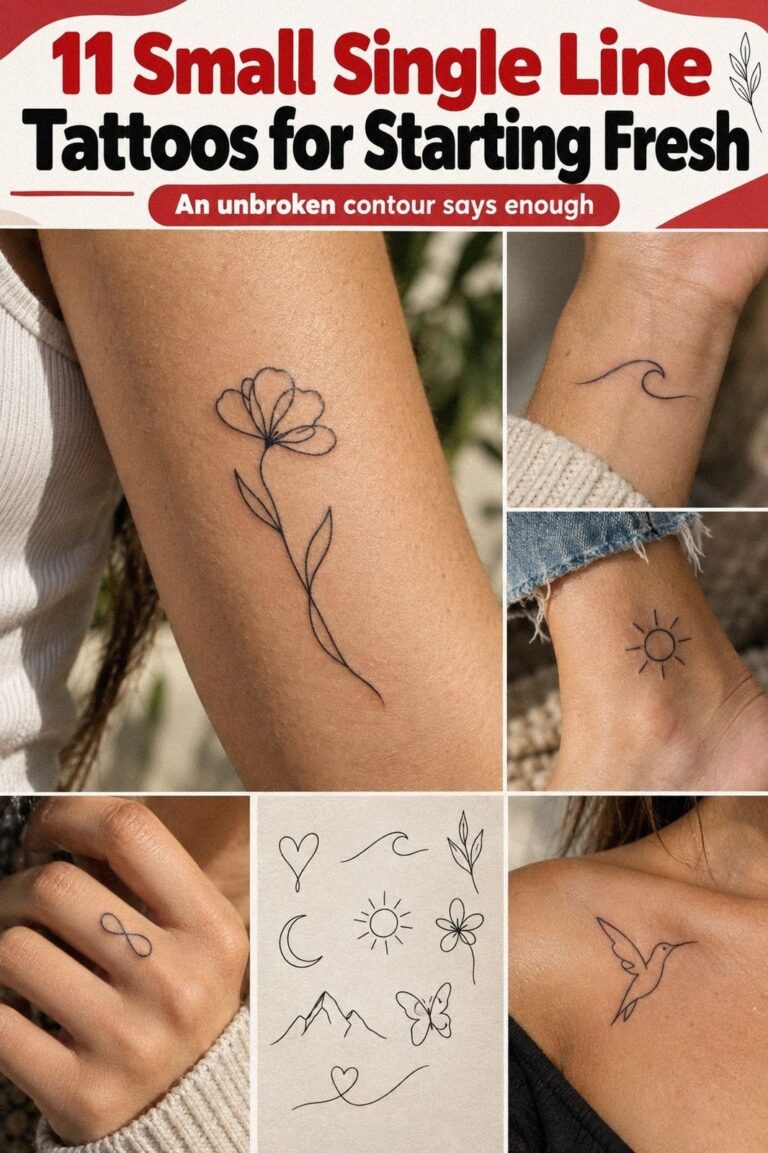
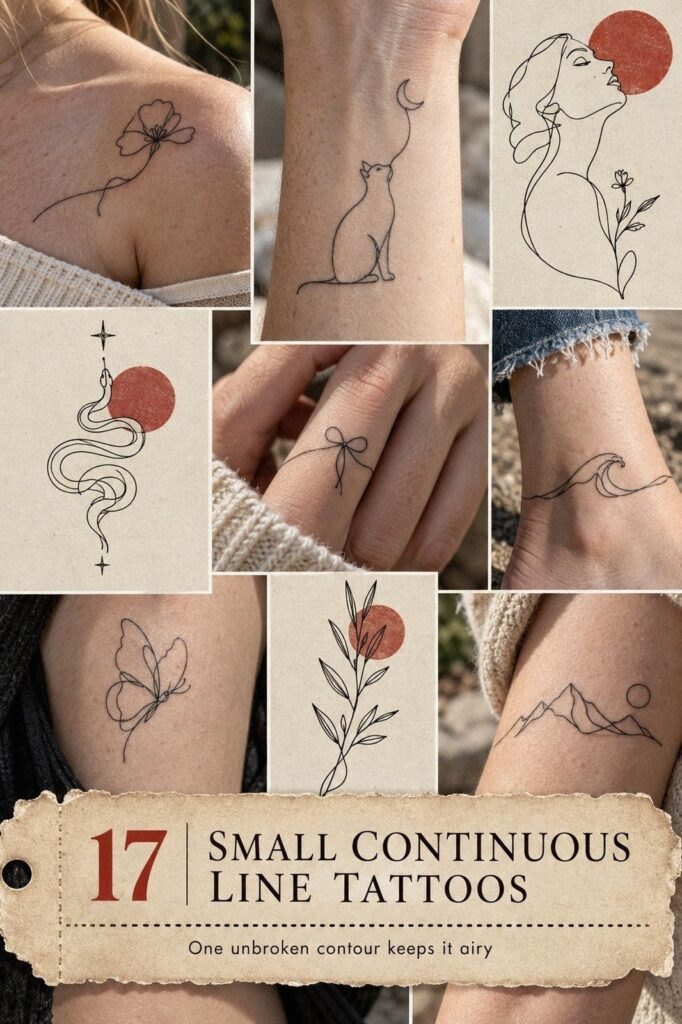
Small continuous line tattoos can stay around a typical $100 to $300 in the US, depending on the artist, placement, and studio minimum. I once chose a wrist design that was too delicate for its size, and the healed result taught me more than the fresh stencil did. You want a crisp shape, readable spacing, and a placement that won’t fight your daily life. That’s the whole game.
I’m drawn to this style because it can feel minimal without feeling empty. A sleek curve, a symbolic animal, or an expressive face can carry real meaning when the line has room to breathe.
Map a Wrist Placement
A wrist placement keeps a continuous line tattoo visible without making the design feel loud. A sleek loop, tiny profile, symbolic wave, or open crescent can sit naturally there. Keep the design close to 1 to 2 inches, because an oversized wrist piece can look crowded quickly.
I’d choose an understated curve over a dense miniature scene. The wrist bends, rubs against sleeves, and sees regular sunlight, so your artist should leave breathing space between turns. The line shouldn’t be so faint that the image loses its identity after healing.
For a personal option, hide a tiny initial inside the continuous path rather than placing a letter beside it. You’ll get a meaningful detail that reads as abstract from a distance. If you’re comparing placements, my guide to tiny small wrist tattoos can help you judge visibility and scale before you book.
Keep the structure simple:
– One hair-thin line, one small oval, and one sharp open break. – One symbolic shape with enough negative space to stay legible.
I’d skip a full wrap around the wrist if you’re new to tattoos. It can look elegant in a stencil, but moving skin makes uneven spacing easier to notice.
A partial arc is more forgiving, and you’ll still get that refined, timeless effect. That payoff is real!
Grow a Botanical Stem
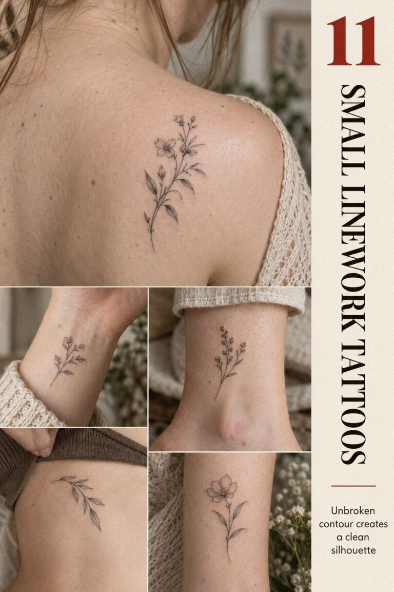
A botanical stem gives continuous linework a flowing direction. Use one curved stem with two or three leaves instead of forcing a whole bouquet into a narrow design. One plant can feel more expressive than a crowded collection of familiar symbols.
I’d ask for a single-needle botanical design with a slightly varied contour. Perfectly even lines can look stiff, while a gentle change in pressure makes the stem feel more graceful. And if you want small continuous line tattoo ideas that won’t look copied, choose a plant with personal meaning.
The best approach is simple: warm clay ink, a clean stencil, and open leaves. Tiny leaf veins are tempting, but they can blur into visual noise when the tattoo is only 2 to 3 inches tall. Your artist can suggest one interior mark where it truly helps the form.
I’d avoid using pale green or brown as the main line if the design needs strong definition. A warm clay or muted charcoal line tends to hold its shape more reliably, while a soft gold accent can fade unevenly under UV exposure. For more botanical placement options, browse small fine line tattoos and compare healed examples, not only fresh work.
Make the design feel elegant through its movement rather than its detail. A longer stem can create presence without making the line thicker. That balance feels organic, personal, and quietly expressive.
Behind-the-Ear Crescent
Behind the ear works beautifully for a discreet, edgy mark because the placement stays hidden until you turn your head. A tiny crescent, abstract face, or trailing leaf can follow the natural curve without competing with it.
Your artist should check the stencil while your head is upright, not tilted. Skin folds change the apparent angle, and a design that looks balanced on paper can shift once it sits behind the ear. I’d choose a plum line with a tiny rose-gold accent to remain readable, but I wouldn’t add dense shading in such a tight area.
Keep the design around 1 inch if you want a subtle result, or move closer to 1.5 inches for a more visible symbol. Small doesn’t automatically mean easy. The limited surface demands a steady hand and clear spacing.
This placement can be more sensitive than the forearm, especially near the bone. You’ll want to ask about the artist’s experience with behind-ear work and look for healed examples. My small tattoos meaning guide is useful if you’re still deciding whether your symbol feels personal enough to keep visible.
I’d skip a realistic miniature animal here. It may look intricate in the drawing, but it can become an indistinct dark spot after a few years. A sharp, understated symbol will age with more dignity and still feel empowering when your hair moves away from it.
Draw Tiny Animals in Motion
Tiny animals give you a playful subject without requiring a large tattoo. An open forearm placement suits a whimsical cat, bird, rabbit, or fox drawn in one uninterrupted path. Keep the silhouette recognizable first, then add one expressive detail.
A deep navy animal outline should rely on the ears, tail, or posture to communicate the subject. Don’t ask the artist to squeeze in fur texture, tiny eyes, and decorative shading. You’ll get a stronger image if one line creates the body and a second small mark defines the face.
I’d choose an animal in motion rather than a stiff front-facing pose. A curling cat, leaping hare, or perched bird gives the continuous path somewhere to travel.
And if you’re worried about the design feeling childish, use a restrained silhouette with one sharp angle. The result can feel playful and polished at once.
The forearm placement is practical because you can see the tattoo during healing and keep it protected from friction. Ask your artist about a size around 1.5 to 2.5 inches, depending on the animal. For compact hand-adjacent inspiration, look through small simple hand tattoos and note how much open skin surrounds each idea.
I’d avoid adding a name beneath the animal unless the lettering is essential. The continuous shape already carries the personality, and extra text can make the composition feel busy. Your favorite detail should be the pose, not a caption.
What Belongs on a Finger?
A small arc, knot, or abstract face can look dainty on a finger, but this placement needs realistic expectations. Hands experience friction, washing, and sunlight every day.
A deep emerald finger design should stay simple and slightly heavier than a line placed on the forearm. Your artist may recommend a short curve rather than a full ring, especially if you want the design to remain readable.
A finger tattoo isn’t a miniature bracelet. The skin moves too much for dense detail to behave well.
I’d pick the side of the finger only if you’re comfortable with possible fading and future touch-ups. The top of the finger is more visible, while the side can feel personal and discreet. You’ll want to ask how the artist handles hand tattoos, because clean application matters more here than an elaborate sketch.
A small continuous line tattoo can still be affordable when the design takes less than an hour, but every studio sets its own minimum. Typical US studio minimums often fall around $50 to $100, while hourly rates commonly range from $100 to $250. Use the small tiny hand tattoos guide to compare placements before you choose.
I’d skip a very pale cream finger tattoo if longevity matters to you. Emerald ink has a stronger visual anchor, while a tiny gold accent can add a delicate finish. It may feel less subtle on day one, but it often looks more intentional once the skin settles.
Choose One Celestial Symbol
Behind the ear, celestial symbols can feel ethereal without becoming overly ornate. A crescent, tiny sun, or four-point star can read beautifully when the surrounding skin stays open.
A forest-green celestial tattoo needs shape more than decoration. Choose one moon with a single rust-colored interior cut, or one star with clean points. Your artist can place the design slightly below the ear so the curve follows the head rather than disappearing into the fold.
I’d avoid packing multiple planets into this placement. The idea sounds romantic, but tiny circles and connecting lines can merge after healing.
One symbolic mark will feel more powerful, and you’ll have a better chance of preserving the intended silhouette. Who needs six symbols when one moon says exactly what you mean?
Ask to see healed work on a range of skin tones, especially if your skin is deep brown or ebony. Strong linework should be visible without looking harsh or overworked. You can also compare celestial placements in small side hand tattoos if you’re considering a more visible location.
The strongest celestial tattoo usually has one clear idea. Let the meaning carry the drama. A moon tied to a real memory will feel more personal than a cluster chosen only because it photographs well.
Use Fine Linework with Room to Heal
Fine linework is less about making every mark as thin as possible and more about giving each mark a job. A clean abstract shape can look delicate without needing heavy fill.
A 3RL single-needle cartridge can create a delicate result, but the tool doesn’t replace judgment. Your artist still needs to select a size that gives the line enough room to heal. If you choose a 1-inch design with six internal loops, you’re asking the skin to hold too much information.
I learned this the hard way with a tiny symbol that looked intricate on paper and muddy after healing. Now I’d rather remove two details than watch the design lose its identity. And if you’re comparing artists, look for healed examples where the line remains intentional rather than only fresh results.
The calf offers more flexibility than the fingers or ribs, and you can often place a 2 to 3 inch design there without crowding. Your session may take less than an hour, though setup, consultation, and studio minimums still affect the final price. See unique small continuous line tattoos for shapes that use negative space wisely.
I’d skip an artist who promises that every line will stay exactly the same width forever. Fine lines can soften or widen as skin ages, and UV exposure can speed that change. A polished tattoo plans for real skin, not just the first day.
Follow the Ribcage Curve
The ribcage gives you a longer canvas, so a small continuous line can travel horizontally or follow the curve beneath the chest. A flowing branch, abstract wave, or narrow face profile can work well there.
A charcoal ribcage tattoo with warm-white or camel accents should be placed with movement in mind. Your body expands as you breathe, and the stencil may look different when you stand, twist, or relax. Ask your artist to check it in a natural posture before committing.
Rib tattoos can feel more intense than forearm or thigh placements because the skin is closer to bone. That doesn’t mean you should choose a smaller design automatically. A slightly longer 2 to 4 inch line may be easier to read than a cramped 1-inch symbol.
I’d avoid placing a tiny cluster directly on the sharpest rib edge if this is your first tattoo. A nearby area may offer a similar effect with more tolerable sensations. If you want another narrow placement, compare tiny small spine tattoos and think about visibility, clothing friction, and aftercare.
The ribcage is a good place for a personal design because you control when it appears. Your tattoo can feel romantic and understated without becoming a public announcement. Choose a shape you’ll still recognize when the body changes.
Faces That Keep Their Expression
A face drawn in one line can feel haunting, expressive, and deeply personal. A profile with one closed eye or a curved nose can be enough.
A midnight-blue portrait line needs a strong silhouette before it needs detail. Ask your artist to simplify the reference into the fewest marks possible.
If the face depends on tiny lashes or lips, it may lose clarity as the ink settles. Your favorite portrait should still read from a short distance.
I’d avoid copying a famous face unless you have a specific reason to carry it. An original profile, self-portrait fragment, or symbolic face often feels more meaningful and less expected.
But don’t confuse complexity with personality. One graceful curve can say more than a crowded miniature portrait.
The sternum can be a sensitive area, especially over the central bone. Your artist may suggest a design around 2 to 3 inches so the line has enough scale without spreading too far across the chest. For hand-based alternatives, small side finger tattoos show how a single facial curve can stay compact.
This style can look feminine, masculine, or entirely neutral depending on the expression. I’d choose the mood first and the subject second. A calm face feels different from a fierce one, even when both use the same continuous technique.
Hide an Initial in the Contour
A hidden initial works best when the letter follows the existing contour. Your artist might tuck an M into a mountain shape, turn an S into a wave, or form a J inside a botanical stem. It should feel like part of the drawing, not a letter added afterward.
A sage-green concealed initial should stay subtle while keeping enough contrast to remain legible. Warm cream can soften the accent, but stronger green usually gives the mark more staying power than a pale wash. If you’re making the tattoo about another person, consider using a shared symbol instead of a full name.
Ask to see the stencil at actual size before the appointment. A design that looks refined at 6 inches on a screen may feel cramped at 1.5 inches on skin. You’ll also want to discuss whether the placement receives regular UV exposure.
I’d place this design on the inner forearm, upper arm, or calf before choosing a finger. Those areas give the line more stability and make future touch-ups easier. Your tattoo can stay personal without being treated like a puzzle everyone must solve.
The most successful hidden initials are personal symbols, not messages that require explanation. If the letter disappears completely, the composition may lose its meaning. If it dominates, the design may feel too literal.
Shape an Ankle Arc
The ankle gives a small design a clean, visible edge. A terracotta continuous line can look bold enough to read clearly while still feeling dainty around the ankle bone. Consider a tiny wave, leaf, loop, or animal profile.
A terracotta ankle tattoo should have a clear endpoint. Full wraps can shift visually around the bone, especially when the ankle moves, so a partial arc may look more polished. Your artist can angle the line to follow the natural curve without forcing it into a perfect circle.
Ankles experience shoe friction, socks, and regular movement, which means placement matters as much as design. You’ll want to avoid a spot where a strap rubs directly over the tattoo. If you’re choosing between the outer ankle and the front, I’d pick the location with less daily abrasion.
Healing usually takes about 2 to 3 weeks at the surface, while the skin can continue settling for roughly 2 to 3 months. During that time, gentle washing, light moisturizer, and avoiding pools and direct sun will protect the result. Small side hand tattoos offer a useful comparison if you’re weighing visibility against friction.
I’d skip an ultra-faint ankle line if you want a lasting visual anchor. A polished terracotta mark with a muted olive accent will look more intentional, and it can remain elegant without being timid. Your placement should support the tattoo, not make the tattoo work twice as hard.
Build an Aging Margin
Small continuous line tattoos are often treated like disposable fashion, but I think that misses the point. A tattoo can be minimal and still deserve careful planning. The strongest designs leave an aging margin, meaning there’s enough space between marks for the line to soften without every shape collapsing into the next one.
I’ve seen a fresh tattoo look exquisite because the artist pushed too much detail into a tiny area. Six months later, the design wasn’t ruined, but it was less crisp than the original result.
That experience changed how I judge linework. I now look for spacing, contrast, placement, and healed evidence before I look at the trend.
Your skin will change. Fine lines can widen slightly, and UV exposure can speed fading.
Solid black tends to hold its visual weight better than pale pigment, but no artist can promise that a hair-thin line will remain frozen forever. A good consultation should include honest discussion of touch-ups.
The choice is rarely between delicate and bold. It’s between a delicate design with enough structure and one made too small to survive real skin. You’ll get more value from a 2-inch tattoo that still reads clearly than a 1-inch blur chosen only because it costs less.
The One-Line Rule Before You Book
Before you book, remove one detail from the design. If the tattoo still feels recognizable and meaningful, the composition is probably strong enough. If removing that detail makes the subject collapse, the design may already be too dependent on micro-detail.
A single continuous contour should have a beginning, a direction, and a deliberate ending. It doesn’t need to create every feature literally. Suggestion often feels more expressive than explanation.
Your artist should be able to describe the design in one sentence. If the brief needs five exceptions, three tiny symbols, and a paragraph of caveats, simplify it. A fierce idea doesn’t need a crowded outline to feel powerful.
That’s the point! Small doesn’t mean forgettable. It means every mark has to earn its place.
Black Ink or Grey?
Black ink usually gives a small continuous line tattoo the clearest anchor. Grey can feel delicate and understated at first, but it may lose contrast sooner, especially in designs that already depend on very thin lines.
A black pigment line can soften over time without disappearing into the surrounding skin as quickly as a pale wash. That doesn’t make black permanent or maintenance-free. Sun exposure, placement, skin behavior, and application still matter.
I’d use grey only when the artist has a specific reason and can show healed examples. You can compare fine-line approaches in small fine line tattoos before choosing a softer palette.
The most stylish result isn’t always the faintest one. A crisp, sharp line can still look delicate when the spacing is thoughtful. If you want a tattoo that remains readable, contrast is part of the design.
How Do You Test a Design at Actual Size?
Print or stencil the design at the exact size you’re considering. Hold it against the intended placement while standing, sitting, bending, and relaxing. A tattoo that looks balanced on a phone screen can feel cramped once it meets real anatomy.
A full-size stencil reveals problems early. You’ll notice whether a loop is too tight, whether an initial dominates, or whether the endpoint lands in an awkward spot.
Look at the design from a short distance, not only inches away. If the shape becomes an indistinct mark from across the room, it may need more scale or fewer internal turns. For compact geometric ideas, small geometric tattoos can help you compare open spacing and proportion.
I’d also take a few ordinary mirror checks while wearing the clothes you usually wear. Visibility changes with sleeves, socks, jewelry, and movement. The right size should work in your real routine, not only during the consultation.
The Matisse Curve: Borrow the Rhythm, Not the Copy
The Matisse curve is useful inspiration for a continuous line tattoo because it shows how a simple contour can suggest a face, body, or gesture. You don’t need to copy a famous drawing to borrow that rhythm.
Use one confident arc, an unexpected turn, and a deliberate gap. The result can feel iconic without becoming predictable. A line that wanders slightly may feel more expressive than one forced into perfect symmetry.
I’d bring the mood to your artist rather than requesting an exact replica. Say whether you want the result to feel romantic, fierce, playful, sacred, or raw. Those emotional cues can guide the shape without turning the tattoo into a copy.
One strong curve can carry surprising personality. It’s a rare amount of character for such a small tattoo!
Placement Changes the Mood
The same symbol can feel completely different depending on where it sits. A wrist design feels visible and conversational. A ribcage piece feels private.
An ankle mark feels sharp and grounded, while a behind-ear tattoo can feel discreet and edgy.
A forearm placement usually gives the artist more stable skin and gives you easier aftercare. A finger or ankle can look striking, but those areas face more friction and may need future attention.
If you’re torn between visibility and privacy, compare the scale advice in tiny small wrist tattoos before deciding. You don’t need to choose the most hidden placement just because the design is small.
I’d choose the placement that matches the meaning. A symbolic mark meant for daily encouragement may deserve visibility. A personal memory may feel more powerful when only you know where it is.
Plan for Touch-Ups, Fading, and Realistic Budgets
A small tattoo can be inexpensive to apply but still deserve a realistic maintenance plan. Fingers, ankles, and areas exposed to friction may soften faster than the forearm or calf.
A future touch-up isn’t automatically a failure. It can be part of living with a tattoo, especially when the placement receives sunlight, washing, or repeated rubbing.
Ask what the artist includes in the initial price and whether their studio offers a touch-up window. For narrow placements and long-term planning, tiny small spine tattoos offer another useful comparison of scale, exposure, and aftercare.
I’d be cautious with anyone promising that a hair-thin line will remain unchanged for decades. A skilled artist can plan for aging, but skin isn’t static. The goal is a design that stays recognizable, not one frozen in its first-day appearance.
The Questions Worth Answering First
How much does a small continuous line tattoo usually cost?
A small continuous line tattoo usually costs about $100 to $300 in the US, though many studios have a $50 to $100 minimum and hourly rates around $100 to $250. Your artist, region, placement, and design detail can change the quote.
Are small continuous line tattoos a good idea for a first tattoo?
Yes, they can be a manageable first tattoo when the placement and scale are realistic. The forearm, calf, upper arm, or shoulder usually feels more tolerable than ribs, feet, hands, or sternum. Choose a subject that still feels meaningful after the trend passes.
How do I choose a tattoo artist for small continuous line tattoos?
Choose an artist with clean healed linework, not only fresh results. You’ll want to see consistent spacing, steady curves, and clear hygiene practices. Ask whether they regularly work with fine lines, then discuss size, placement, pigment, and the possibility of a future touch-up.
How much do small continuous line tattoos hurt?
Pain varies by person and placement. Ribs, feet, hands, and sternum are often more sensitive because of bone, thin skin, or frequent movement.
Forearms, thighs, and shoulders tend to feel more tolerable. Your session may be short, but sensitivity can still surprise you.
What’s the best placement for small continuous line tattoos?
The best placement depends on visibility and longevity. Forearms and calves offer clear skin and easier aftercare, while wrists and ankles feel more visible but experience more friction. If you want discreet symbolism, behind the ear can work, but your artist should check the stencil while you’re standing naturally.
Where I’d Start First: The Placement Tolerance Test
If I had to pick one, I’d start with a small continuous line tattoo on the forearm. It’s visible, easier to protect, and forgiving enough for clean spacing. Compare it with small tattoos with meaning before you book.
My second choice would be the calf, especially for a botanical stem, animal silhouette, or symbolic face. You’ll have enough space for the line to breathe without giving up the striking simplicity that makes this style work.