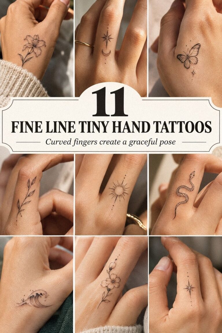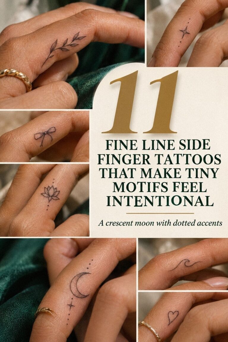
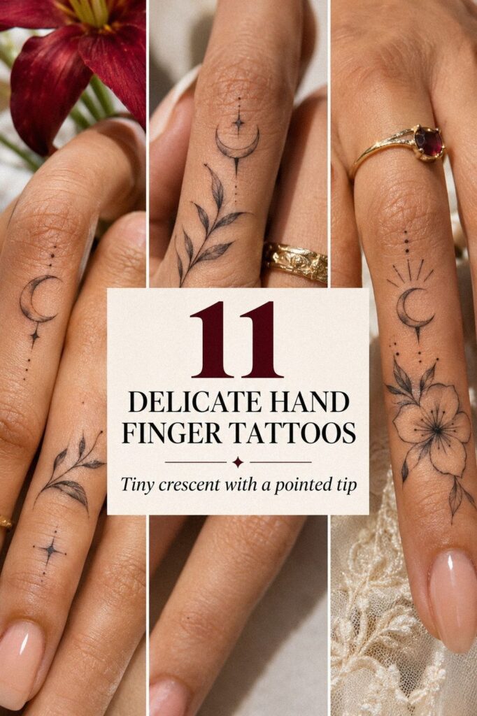
Delicate hand finger tattoos for women can cost about $50 to $300 in the US, depending on the artist, placement, and session. I got mine the week I turned 30, then spent months learning which lines would stay crisp. The result is delicate hand finger tattoos, personal, minimal, and easier to live with than I expected.
- The Botanical Gap Rule
- Can Small Script Stay Legible on a Ring Finger?
- The Open Meaning Test
I didn’t want a design that announced itself before I did. I wanted a private tattoo I could notice while reaching for a glass, turning a ring, or washing my hands. Short answer: yes, but placement matters!
Here’s what it looked like before:
Before the appointment, I had a patch of untouched skin between my fingers that I’d been saving for the right idea. It wasn’t blank in an empty way. It felt like a quiet promise, and I didn’t want a loud symbol taking over my hand.
My notes were messy. A botanical mark, a word, a crescent, maybe an initial. I kept comparing small finger tattoo ideas on paper because the hand moves constantly, and a design that looks graceful at rest can look crowded when you bend your fingers.
I also saved several examples from small hand finger tattoos for women before making a shortlist. If you’re choosing your first piece, you’ll want to study several placements before you book.
The artist showed me how skin near a joint stretches, folds, and sees more friction than skin on the side of a finger. I was looking for something understated, not invisible.
- The Botanical Gap Rule
- Can Small Script Stay Legible on a Ring Finger?
- The Open Meaning Test
- Fine Ink or Slim Rings?
- I Placed a Crescent Beneath My Index Knuckle
- Why I Chose Meaningful Initials
- What My Hand Shape Changed
- Balance Both Hands Without Matching
- What Will Finger Ink Really Do?
- Protect Fresh Finger Linework While It Settles
- A Feminine Collection, Not a Matching Set
1The Botanical Gap Rule
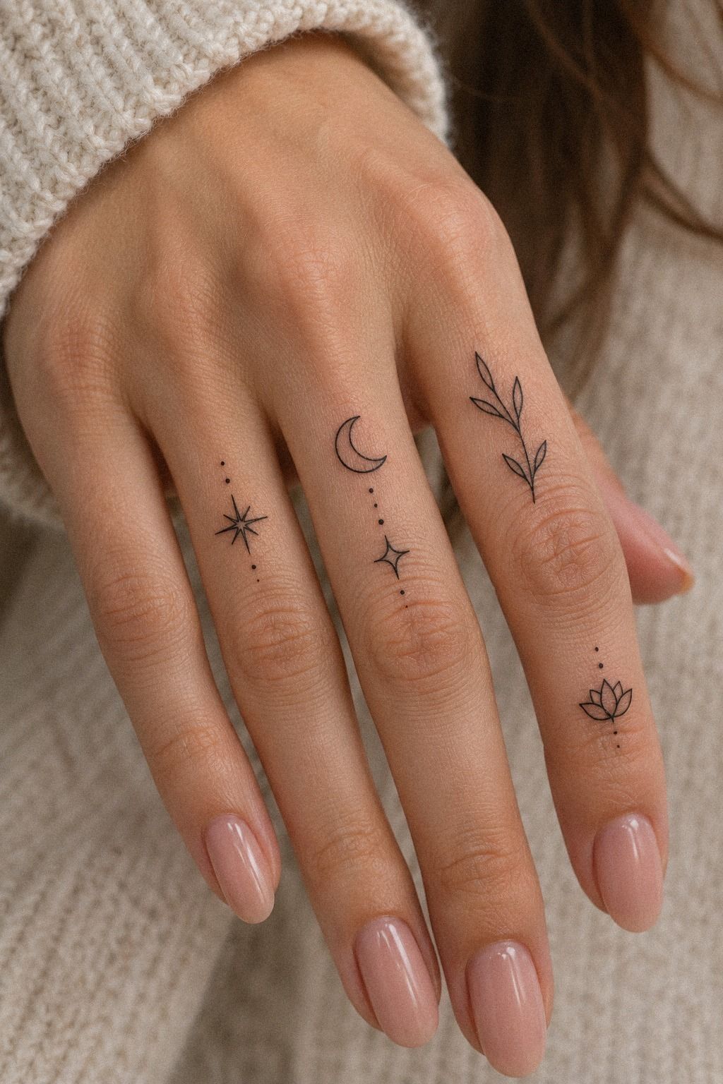
I started with tiny botanical linework because the shape felt meaningful without becoming obvious. I wanted something delicate enough to disappear under a relaxed hand, yet crisp enough for me to find when I looked closely.
A small branch felt striking without becoming theatrical. The first drawing was too ornate, with extra stems, two flowers, and a crescent tucked into the branch. I cut half of it.
That was the turning point!
The remaining design felt sleek, graceful, and easier to read. I named this the Botanical Gap Rule: leave breathing room between marks and joints.
A tiny design can be powerful when the skin around it stays open. My artist used black tattoo ink and kept the branch under one inch, which made the finished mark feel personal instead of ornamental.
That decision also made the piece more timeless. It wasn’t trying to mimic every romantic trend at once. It had one stem, a few leaves, and enough negative space to let my hand remain part of the design.
2Can Small Script Stay Legible on a Ring Finger?
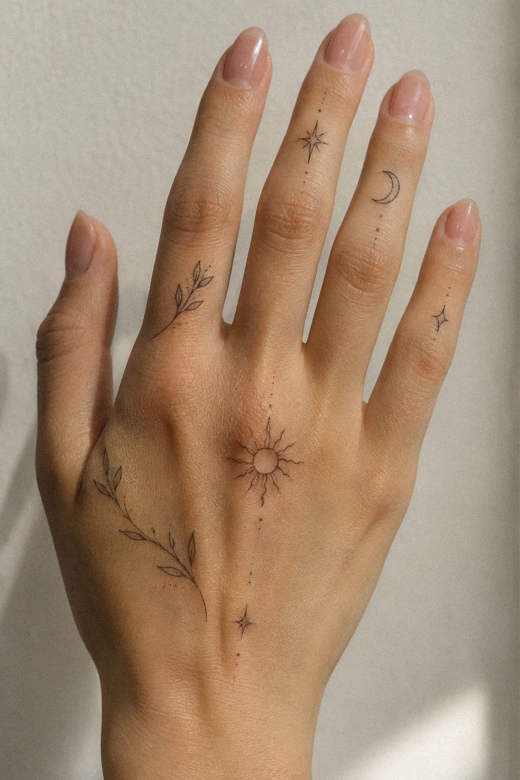
The word “grace” looked romantic on the stencil, but I didn’t trust it immediately. Script can turn muddy when letters sit too close together, especially on a finger that bends and rubs against neighboring skin.
I asked for thin script lettering with a clear opening between the g and r. I tested three versions on my hand first. The first was too playful, the second too bold, and the third had the meaningful quality I wanted.
I read each version from a distance and in a mirror. That simple test exposed every awkward curve. The key was letter spacing.
The word needed room to move with my finger without losing its identity. If you’re considering words, you’ll want to read them from several angles. Your favorite font on a screen might not suit your actual hand.
I skipped dense calligraphy because it would’ve needed thicker lines to stay legible. The final script was understated and sleek, with a polished rhythm that felt expressive without becoming loud.
You can compare minimalist hand finger tattoos for women if you’re drawn to words but don’t want a large statement.
3The Open Meaning Test
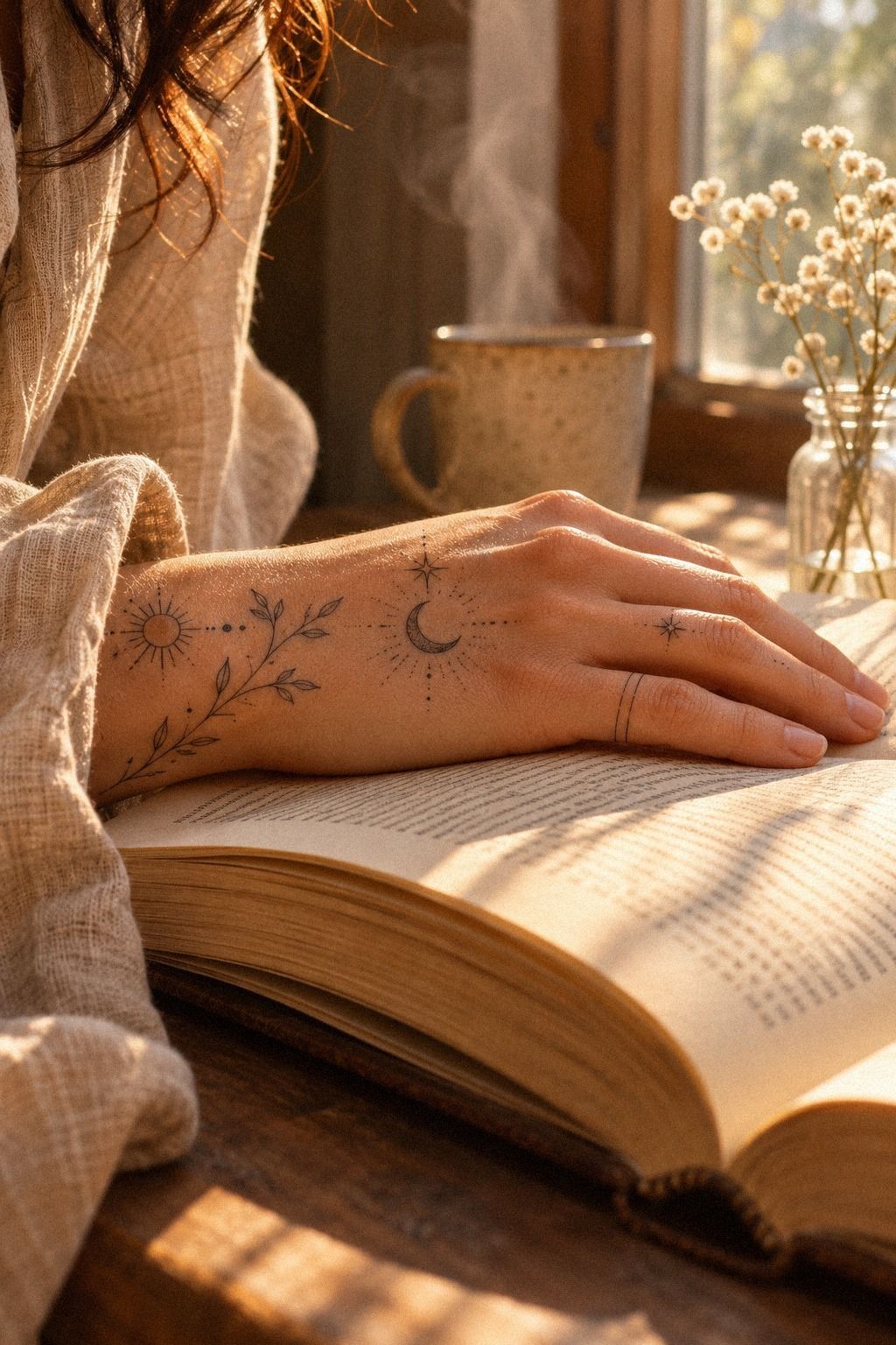
I made a page of symbols before choosing one. A star felt too familiar, a heart felt too obvious, and a tiny key looked edgy in the wrong way.
I kept returning to an open circle symbol because it had a clear shape without forcing one interpretation. The winner was a narrow open circle with one small break.
It felt symbolic without explaining itself. I liked that you could read it as a moon, a boundary, or simply a crisp shape.
Would I choose a fully shaded symbol now? No.
It would’ve overpowered the fine lines around it.
I called this the Open Meaning Test. If you can explain a symbol in five different ways, it usually has more staying power than a trend phrase. My symbolic tattoo doesn’t need to tell everyone a story.
It needs to keep giving me one.
That restraint made the final mark more meaningful. I also considered a tiny arrow, an eye, and a little flame, but each one felt too specific. The circle stayed open, which left room for the meaning to change with me.
4Fine Ink or Slim Rings?
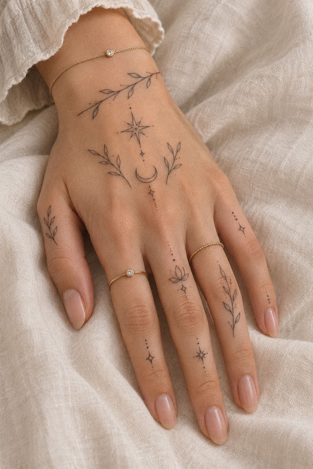
I wear slim rings most days, so I placed my linework where it wouldn’t compete with them.
5I Placed a Crescent Beneath My Index Knuckle
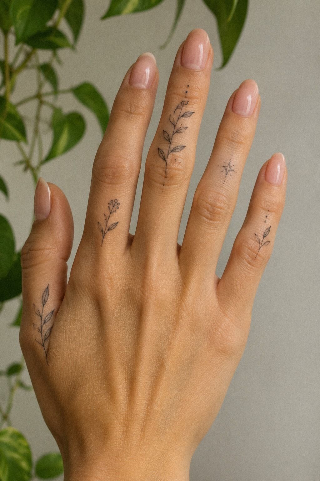
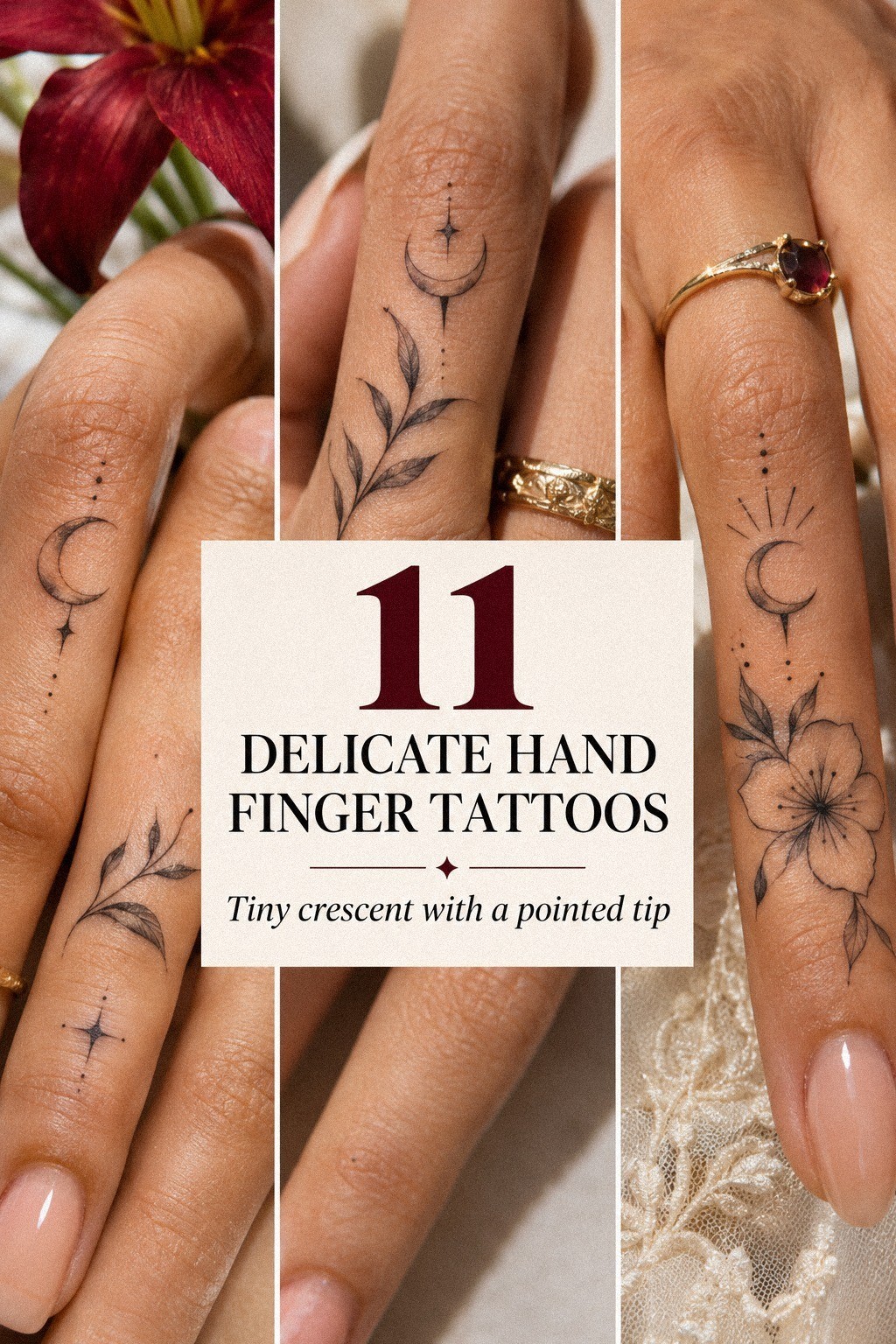
The crescent started as a flash-sheet idea, but I adjusted it for my hand. I placed the outline crescent beneath my index knuckle, slightly away from the deepest fold.
That choice was practical, not just aesthetic. I wanted a bold little shape, but the final crescent stayed dainty. A filled version looked powerful on paper, while the outline felt more elegant beside my other pieces.
The thinner option also left room for the skin to remain visible. The most important detail was knuckle placement.
You can love a design and still regret it if the skin is constantly bending or rubbing. I moved the stencil several times, flexed my finger, and checked how it looked while holding a cup.
If you’re choosing from flash, ask for a clean stencil first. Don’t skip that check! A few minutes of testing your hand shape can save you from a very visible mistake.
You can also compare delicate hand tattoos for women before settling on a scale.
6Why I Chose Meaningful Initials
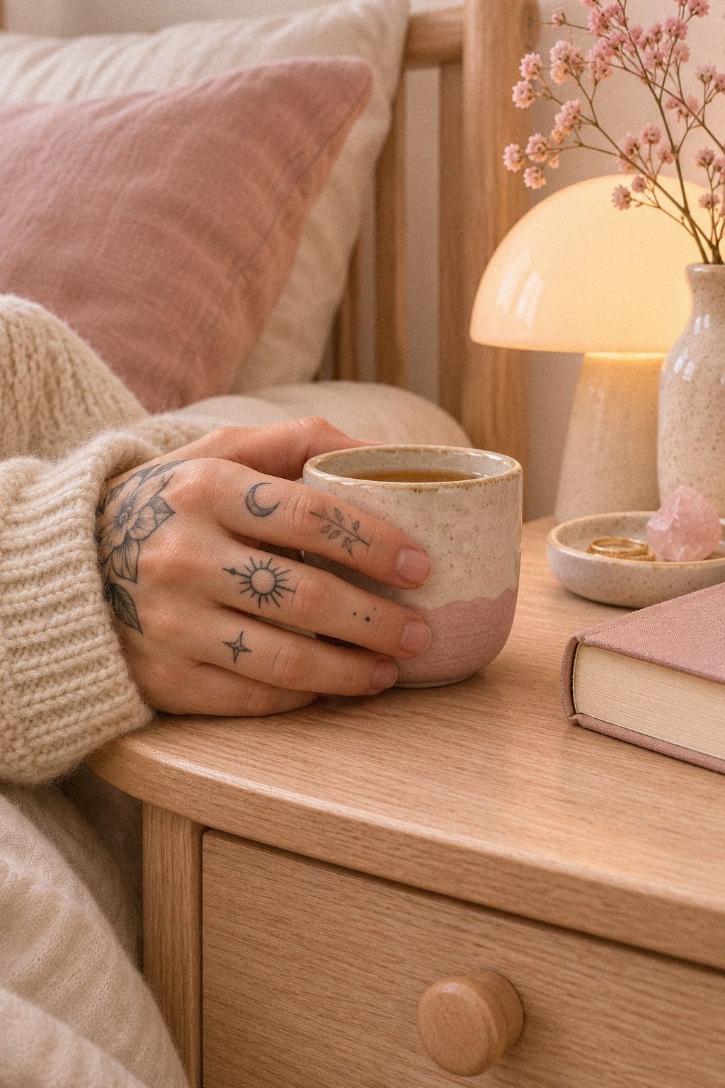
Initials felt more intimate than a full name. I chose initial tattoos for two people who shaped my life, but I didn’t want their names displayed in full.
A single letter gave me privacy and meaning at the same time. I wrote both letters in my own handwriting first. Those sketches felt more personal than a perfect typeface, so I asked the artist to keep some of their natural movement.
The result was flowing without becoming overly romantic. I didn’t mirror the letters perfectly because symmetry looked too formal for the story behind them.
If you’re selecting initials, you’ll want to compare your handwriting with professional lettering styles and think about how each mark feels when your hand is relaxed.
The final marks are meaningful without looking like labels. I asked my artist to keep the consistent stroke weight across both letters.
A whimsical font would’ve made them feel temporary, while a rigid block style would’ve lost the emotional edge I wanted. You can browse small side hand tattoos for placement ideas.
7What My Hand Shape Changed
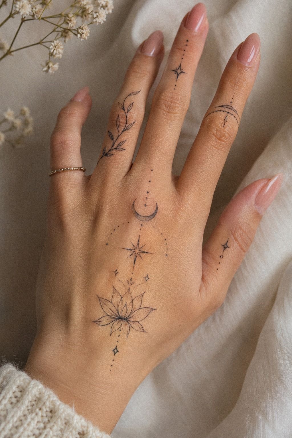
My fingers aren’t identical, and neither are yours.
8Balance Both Hands Without Matching
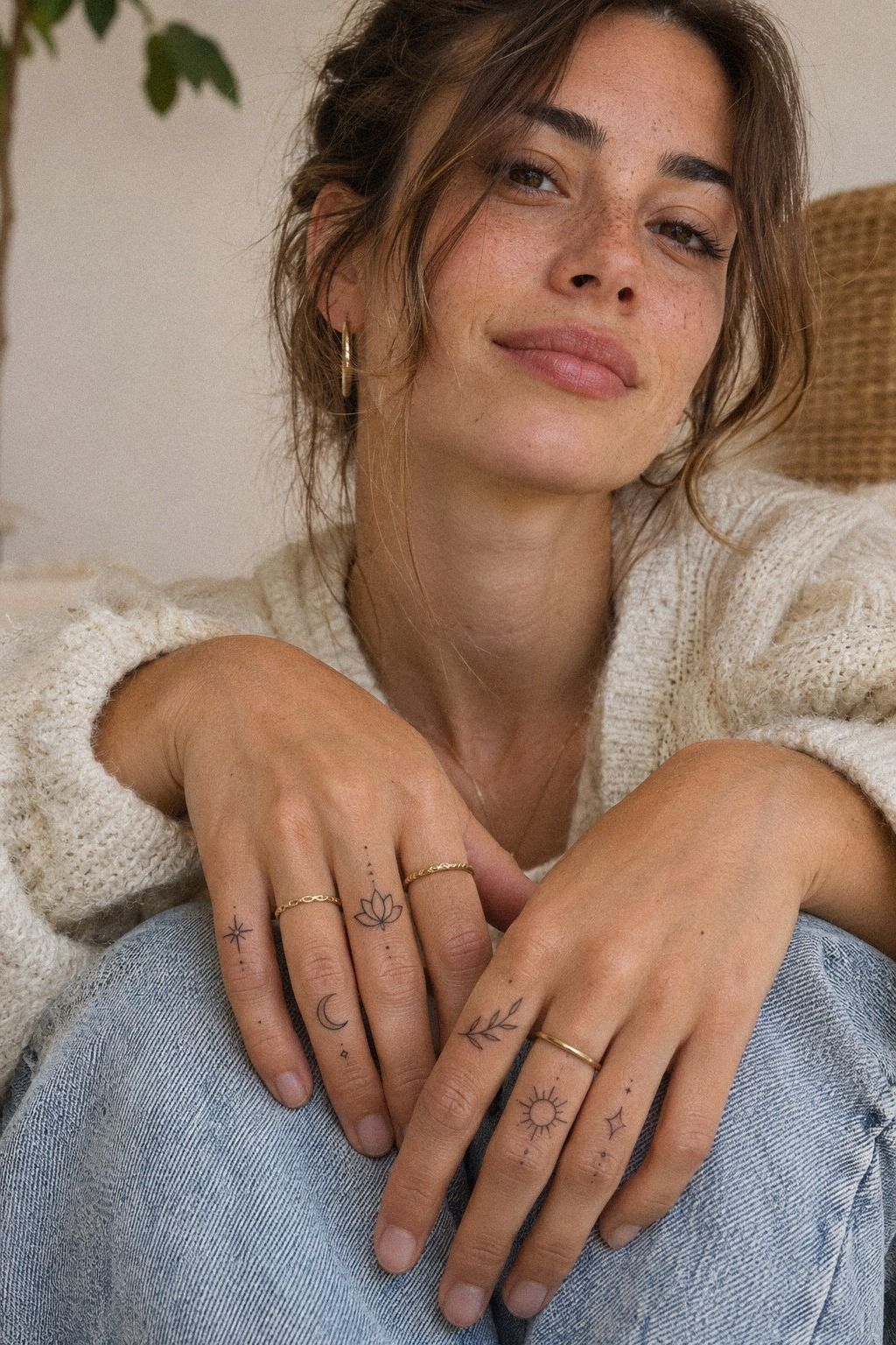
I didn’t want matching tattoos on both hands. Matching can look powerful, but I preferred a quieter relationship between the two.
My approach was asymmetrical balance: similar energy, different marks. I placed the botanical mark on one hand and the crescent on the other.
They share a fine line quality, but they aren’t twins. If you’re balancing both hands, choose one common thread such as line weight, scale, or color.
The fine line style helped connect the pieces without making them repetitive. One hand felt botanical, the other more symbolic. That contrast gave the collection a more expressive rhythm.
I also left one hand almost bare. That was important. Too many tiny marks can become a blur when you gesture or hold something.
The open skin gives each piece room to remain recognizable. If you like that restrained approach, compare small tiny hand tattoos before planning a full set.
I found that one strong mark often felt more striking than five competing ones.
9What Will Finger Ink Really Do?
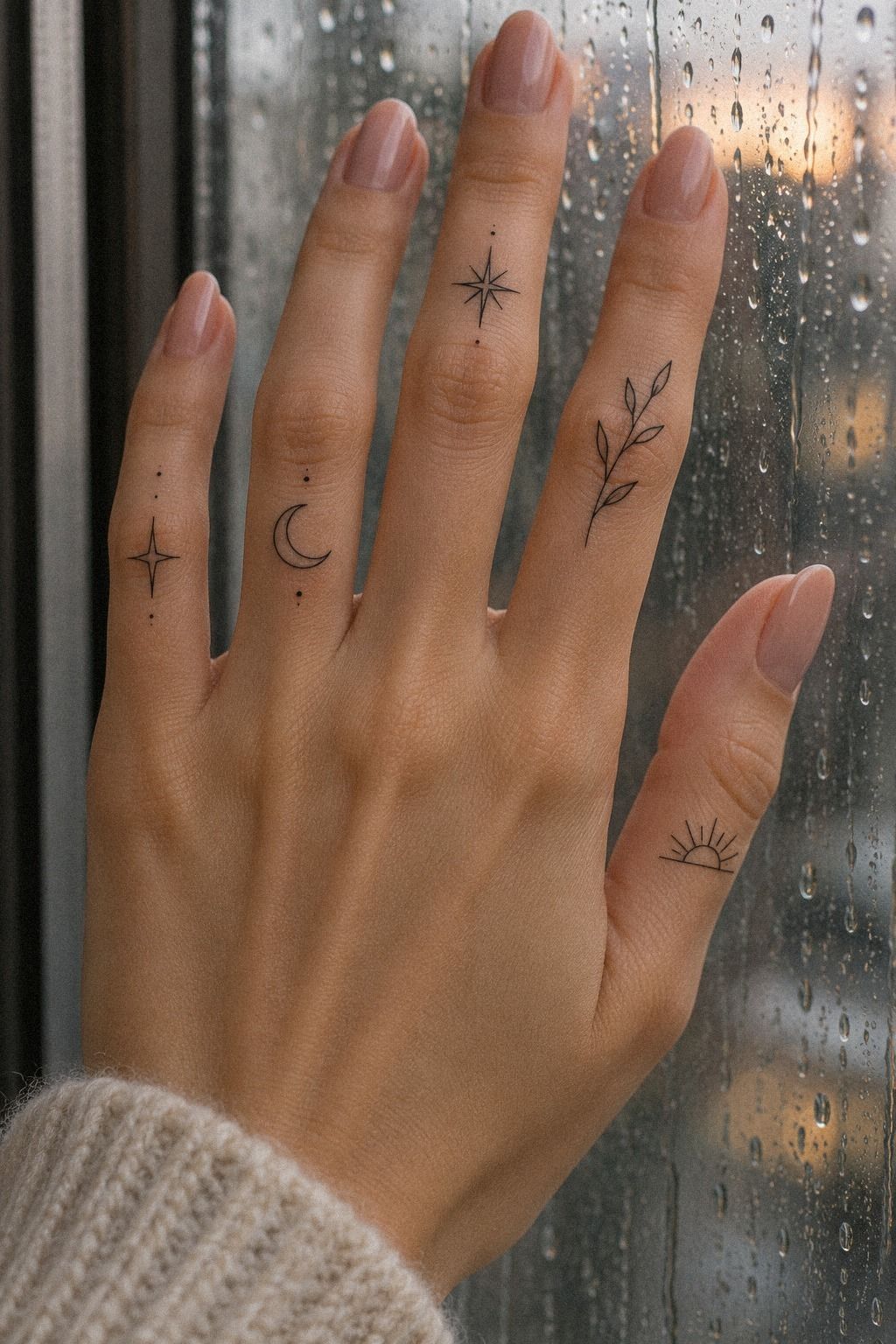
Finger tattoos need realistic expectations. Even excellent work can soften or fade because hands wash, bend, rub, and meet sunlight every day.
I booked with a touch-up plan in mind instead of expecting every line to remain unchanged. I asked my artist about healed work before booking.
Healed work showed me more than a fresh appointment photograph ever could. I wanted to see how the lines settled, especially around folds and side fingers.
The answer wasn’t dramatic: wait until the surface has healed, watch for uneven spots, and don’t judge the final color during the first few days.
If you’re planning yours, you’ll want to keep the appointment flexible instead of expecting every line to look settled immediately.
I skipped the popular idea that every faded mark is a failure. Some softening is part of hand tattoos, especially with very fine lines.
Still, black ink and thoughtful placement usually hold better than pale, crowded detail. Daily sun exposure can affect the appearance of healed ink, so I became more deliberate about covering my hands when I was outside for long stretches.
10Protect Fresh Finger Linework While It Settles
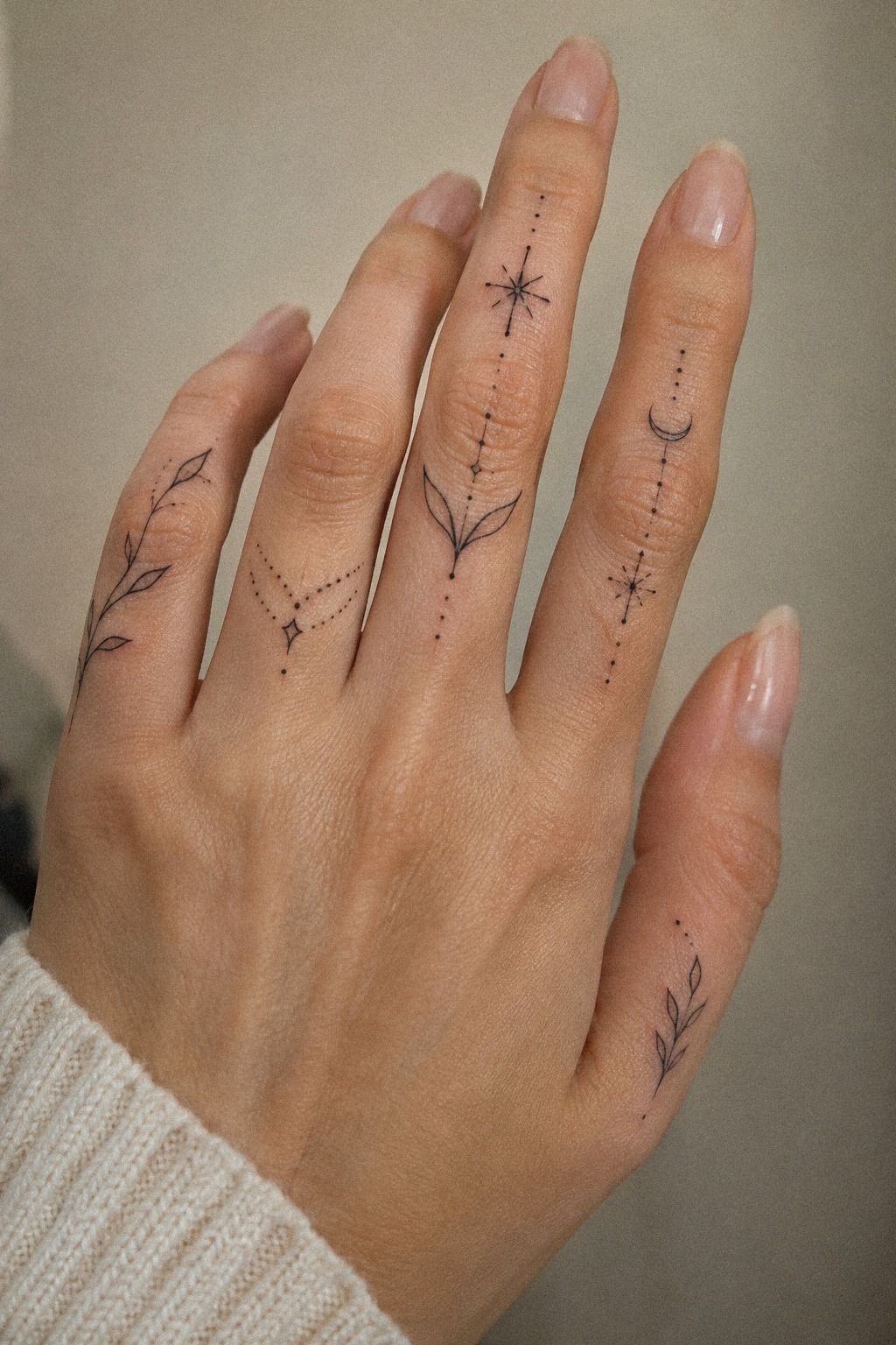
After the appointment, I followed the aftercare instructions instead of improvising.
11A Feminine Collection, Not a Matching Set
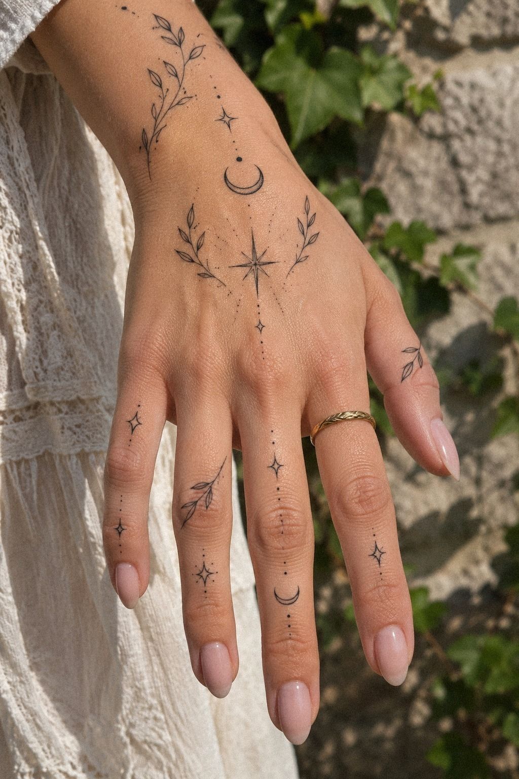
The final piece wasn’t one dramatic tattoo. It was a collection of small choices that became personal over time.
My personal tattoo collection includes a botanical mark, a word, a crescent, and initials that each carry a different memory. They don’t all match, but they share a gentle visual language.
The lines are fine, the scale is restrained, and the placement leaves room for movement. That combination feels feminine without making the collection predictable.
I kept one botanical mark, one word, one crescent, and one initial. They share a visual language without looking copied.
If you’re building a collection, leave time between appointments so you can learn what your hand can comfortably carry. My strongest opinion is to choose meaning before novelty.
A whimsical symbol can still be meaningful, but a trend chosen only because it photographs well may feel flat later. You can compare minimalist hand finger tattoos for women if you want a collection with a classic thread.
These pieces are subtle, bold, and personal in different ways. That’s why I still notice them every day.
Designing the First Draft
My first sketch was much busier than the tattoo I eventually chose. I kept adding leaves, dots, stars, and tiny curves because each detail seemed harmless on its own.
Together, they made the hand look restless. I started editing by asking one question: what should I notice first?
For the botanical mark, the answer was the stem. For the crescent, it was the clean outline. For the script, it was the word itself.
My reference notes became shorter as the design improved. I wrote down the subject, approximate scale, placement, and line quality.
I stopped collecting endless examples because too many options made every decision feel temporary. A single focal idea gave each tattoo more strength.
If you’re creating your own draft, try removing one detail at a time. The right piece may not be the most intricate one. It may be the one that still works after half the ornament disappears.
I also waited before booking. I left the botanical concept on my phone for several weeks and returned to it repeatedly.
It remained meaningful, which mattered more than the fact that it was currently popular. That patience made the final choice feel daring in a quiet way.
Placement Questions I Asked
The biggest question was visibility. Did I want everyone to see the tattoos immediately, or did I want them to reveal themselves slowly?
My answer shaped the finger tattoo placement more than the subject did. I considered the top of the finger, the side, the space below a knuckle, and the area between two fingers.
Each location changed how often the mark appeared during ordinary movement. I preferred placements that felt visible to me without becoming the first thing other people noticed.
The side-finger skin appealed to me because it offered a quieter angle. It also made the tattoo feel more personal when my hand was relaxed.
Still, side fingers can experience friction, so I asked about line weight and long-term readability. I was especially careful with high-friction zones.
Rings, pockets, keyboards, hand washing, and repeated bending all affect how a tattoo experiences daily life. You can explore small side hand tattoos while comparing those practical differences.
The final placement wasn’t the most dramatic option. It was the one I could imagine living with on an ordinary Tuesday.
How I Chose a Line Weight
I wanted fine lines, but I didn’t want fragile-looking marks. My artist explained how a fine needle configuration could create a delicate result while still allowing enough pigment to settle into the skin.
We tested several options on paper first. The thinnest line looked ethereal, but it lacked the visual confidence I wanted.
A slightly stronger line looked crisp and elegant without becoming heavy. That balance came down to line thickness.
The botanical branch needed enough presence to remain readable, while the script required careful spacing so the letters wouldn’t merge.
I also considered how the lines would look beside one another. A very bold crescent next to barely visible initials would’ve felt disconnected.
A consistent range made the tattoos feel like part of one personal system. If you’re comparing examples, look for work that remains clear at normal viewing distance.
Delicate hand tattoos for women can be graceful and striking, but scale alone doesn’t guarantee clarity.
The Details I Refused to Add
I refused extra shading on the crescent because the solid version looked harsher beside the botanical branch. I also removed several dots from the initial design.
They were cute, but they didn’t add meaning. I was tempted by micro-details because tiny marks can feel playful and special.
The problem is that a small hand has limited space. Details that look impressive at first may become visual noise once the skin moves.
I also skipped an ornamental border around the open circle. It would’ve made the symbol more ornate, but it would’ve reduced the open feeling I liked.
The simpler version felt more sacred and personal. In the end, the clean outline won.
It gave the collection a polished, timeless quality without forcing every piece into the same style. If you’re editing your own concept, ask which details support the story and which ones are only there because they look impressive on a screen.
That question saved me from choosing a design that was technically intricate but emotionally empty. The final collection feels more expressive because it has limits.
How much it cost
My planning budget was $180 for the appointment, and I treated that as a personal allowance rather than a universal price. In the US, a small tattoo may have a shop minimum around $50 to $100, while hourly artist rates often fall around $100 to $250.
I asked for the quote before the stencil was prepared. That protected me from adding extra symbols impulsively. If you’re comparing artists, look at the portfolio first and price second.
A lower quote isn’t helpful if the artist’s healed work doesn’t show clean line control.
An artist’s hourly rate may not matter much for a tiny piece if the shop minimum applies. Some designs also take longer because of placement, stencil adjustments, or careful lettering.
Ask what the quote includes before you arrive. For my own plan, I set aside money for the tattoo and added a touch-up budget for later.
You can explore delicate hand tattoos for women for smaller placement ideas before requesting a quote.
What I Learned From Keeping Fine Ink Personal
I used to think a hand tattoo had to make an immediate impression. I was wrong. The marks I still love most are the ones that reveal themselves slowly, when I reach for a glass or notice a crescent near my knuckle.
Their power comes from recognition, not volume. The best decision I made was leaving space.
My first sketch was intricate, but it asked too much from a small area. Once I removed the extra leaves and second outline, the remaining shape became more expressive.
You can create a striking result with fewer lines if each mark has a clear job. I also learned that delicate does not mean careless.
Fine linework needs a steady hand, thoughtful placement, and realistic expectations about aging. Lines may spread slightly over time, especially in high-friction areas.
Black ink, good spacing, and crisp lines give your tattoo a stronger chance of staying readable. My second lesson was emotional.
I thought choosing a symbol would feel like solving a puzzle, but it felt more like recognizing myself. That difference matters. If you’re still comparing ideas, don’t rush because a trend is having a moment.
I became more serious about sun protection after seeing how much my hands experience daylight. I also stopped expecting a delicate tattoo to remain frozen in its first-day form.
A little change doesn’t erase the meaning. Finally, I stopped treating visibility as the measure of success.
Some days I forget the tattoos are there. Then I see the botanical line when I wash my hands, or the script when I turn a ring, and I remember why I chose them.
That quiet recognition is more meaningful to me than constant attention.
A Few Things Worth Answering
How much does a delicate hand finger tattoos for women usually cost?
A small tattoo usually costs about $50 to $300 in the US, depending on the shop minimum, artist, region, and design. Typical pricing may start around $50 to $100 for a shop minimum, while hourly rates often run around $100 to $250.
I compare portfolios before quotes and ask about touch-ups. You can review small finger tattoo ideas before contacting an artist.
Are delicate hand finger tattoos for women a good idea for a first tattoo?
Yes, they can be a good first tattoo if you understand the visibility and upkeep. The small scale can make the appointment feel manageable, but hands experience friction and sun.
I prefer crisp linework, a meaningful subject, and an artist with healed examples of similar work. Minimalist hand finger tattoos for women can help you compare simpler concepts.
How do I choose a tattoo artist for delicate hand finger tattoos for women?
I choose an artist whose portfolio shows clean fine-line work and healed photographs. A strong portfolio matters more to me than a low quote.
I check hygiene practices, ask how the artist handles finger placement, and look for consistent lines across different skin tones. Browse delicate hand tattoos for women before making a shortlist.
How much do delicate hand finger tattoos for women hurt?
Pain varies, but hands, fingers, feet, ribs, and sternum are often more sensitive than the forearm, thigh, or shoulder. Your placement affects comfort more than the word delicate.
I tell my artist if I need a pause, and I don’t compare my experience with someone else’s. A shorter appointment may feel easier, but sensitivity still depends on the person.
How long does a delicate hand finger tattoos for women take to heal?
The surface usually heals in about two to three weeks, while complete settling can take roughly two to three months. Gentle aftercare means washing carefully, moisturizing as directed, and avoiding pools and strong sun while the skin recovers.
I don’t judge the final color too quickly, since the tattoo can look different as the surface settles.
What’s the best placement for delicate hand finger tattoos for women?
The best placement depends on visibility, friction, and how your hand bends. A well-spaced placement gives fine lines more room to remain readable.
I find that side fingers and areas away from deep creases can work well, while knuckles may fade faster. Compare delicate side hand tattoos before choosing.
Where I’d Start First
If I had to pick one, I’d start with the tiny botanical tattoo between the fingers. The open space keeps it readable while the placement makes it feel private.
I’d save delicate tiny hand tattoos for later and choose the mark I still noticed after the trend passed.
My final choice would always come down to three things: a design with meaning, a placement I could live with, and an artist whose healed work I trusted.
That’s enough for me!