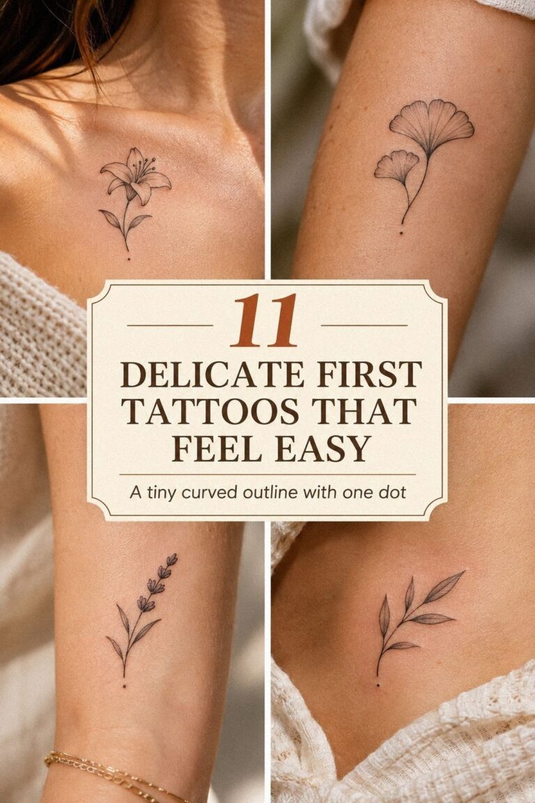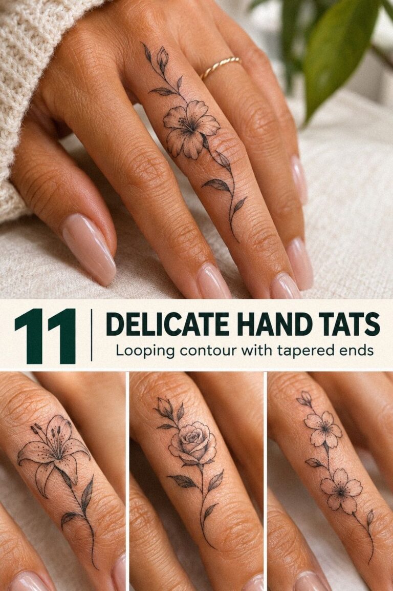
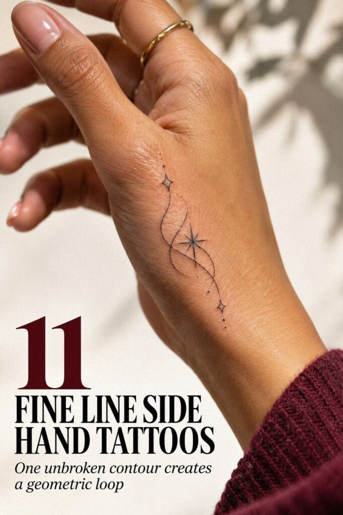
Fine line side hand tattoos look best when the design, placement, and aftercare are planned together. You want delicate linework, a meaningful motif, and enough breathing room for natural hand movement. I’ve seen small stars and simple lettering stay more elegant than crowded pieces. Start small!
Don’t overthink: Pick a symbolic side hand tattoo design.
My one rule: test the stencil while your hand is moving, not only while it’s flat. That quick check can protect your budget, your confidence, and the design’s long-term value. A moving-hand stencil test tells you more than a perfect reference design.
- Start with small fine line side hand tattoos
- Pick a symbolic side hand tattoo design
- Place delicate linework along the hand edge
- Keep lettering crisp on narrow hand skin
- Plan graceful botanical side hand tattoos
- Choose an intricate finger-side tattoo composition
- A Bolder Symbol, a Quieter Line
- Match unique motifs to your personal meaning
- Hand Healing and Daily Friction
- Natural Movement Before the Appointment
- Timeless Details for Side Hand Tattoos
1Start with small fine line side hand tattoos
For a first tattoo, begin with a minimal design that fits the side of your hand without competing with every fold and joint. A small group of stars, dots, or one symbol can feel personal without demanding attention every second. Ask your artist how black tattoo ink will read against your undertone.
Sketch three to five stars, then vary their size slightly instead of making a perfect row. Your largest star can anchor the group while the smaller marks trail toward the edge.
I’d skip identical symbols because repetition can look stiff on moving skin. A little irregularity makes the arrangement more expressive.
Use a star cluster sketch before you commit.
Before your appointment, print or draw the idea on plain paper and hold it against your hand. Turn your palm, relax your fingers, and make a fist.
If the design disappears in one position, you’ll want to shift it before the stencil is applied. The fine line tiny hand tattoos guide can help you compare smaller layouts.
Keep the first draft clean. No shading cloud, no dense border, and no extra symbols added at the last minute. You’re choosing how the tattoo will behave while you type, wash your hands, and reach into a pocket.
That restraint is what keeps the stars sharp and understated. Check the negative skin spacing from every position.
A second paper version can help you compare a shorter mark with a longer one. I’d test both before asking for a final stencil, especially if you’re drawn to a personal symbol that needs room around it. The tiny side-hand layouts are useful when you’re deciding how much of the edge to use.
What Should Stay Open?
Open skin is part of the design. It gives each mark room to breathe and keeps a small tattoo from becoming one dark patch after the lines soften. Your open-skin margin should be intentional.
A simple design can be worth the cost when it remains readable for years. If you’re choosing between extra detail and better spacing, I’d spend the available budget on a thoughtful stencil consultation. That choice often protects a more polished result than adding another tiny detail.
2Pick a symbolic side hand tattoo design
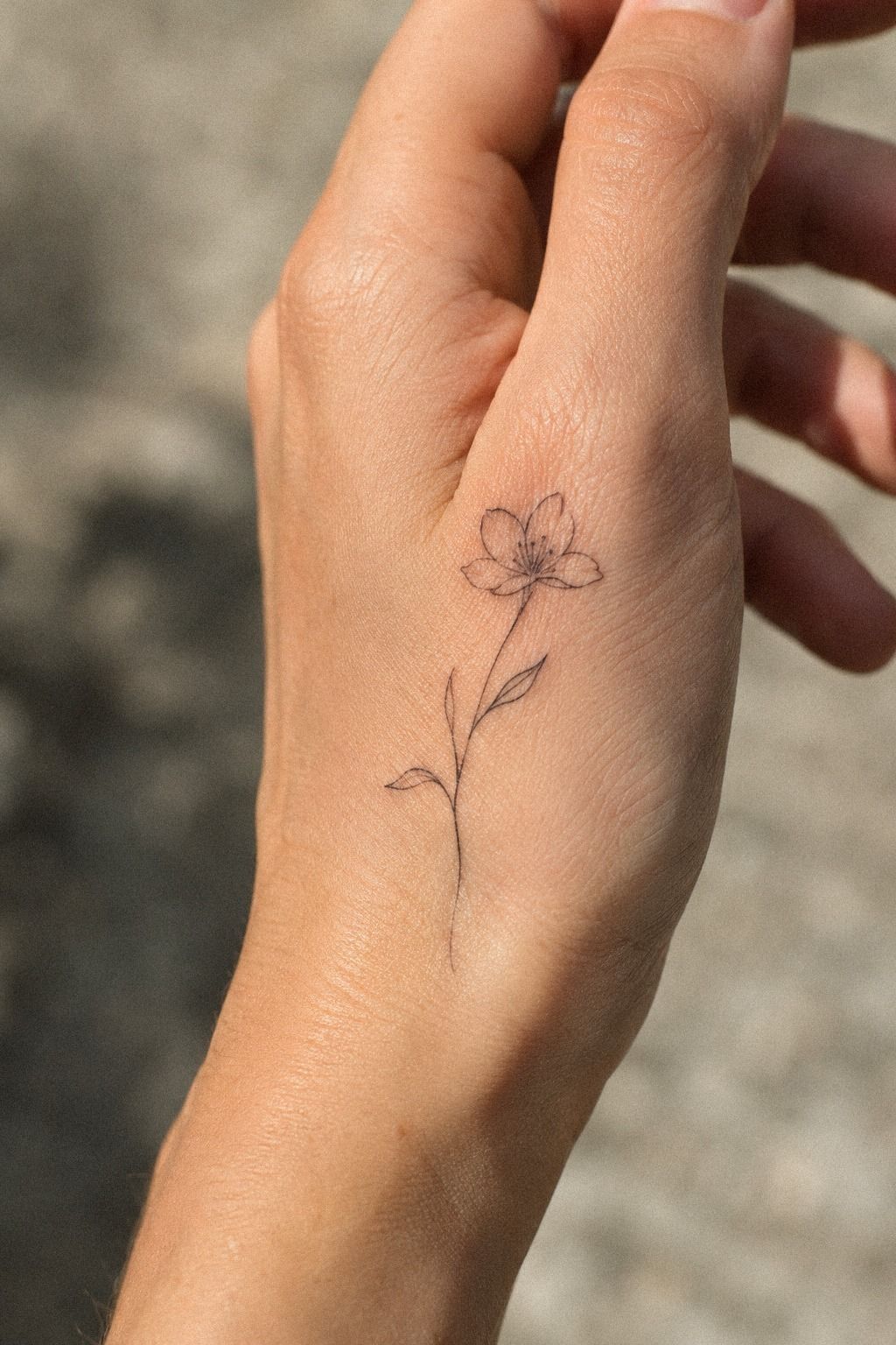
Choose a symbolic design you’ll still recognize when the trend has moved on.
The Meaning Test
Ask yourself what the design means without explaining its entire history. A sacred date, a family symbol, or a private reference can stay intimate while still looking polished. Your meaning note can reveal whether the idea has staying power.
Then ask whether you’d choose it at the same price if nobody else could see it. That question cuts through trend pressure quickly.
Keep the answer honest! If you’re still unsure, wait a week and notice whether the motif keeps returning.
3Place delicate linework along the hand edge
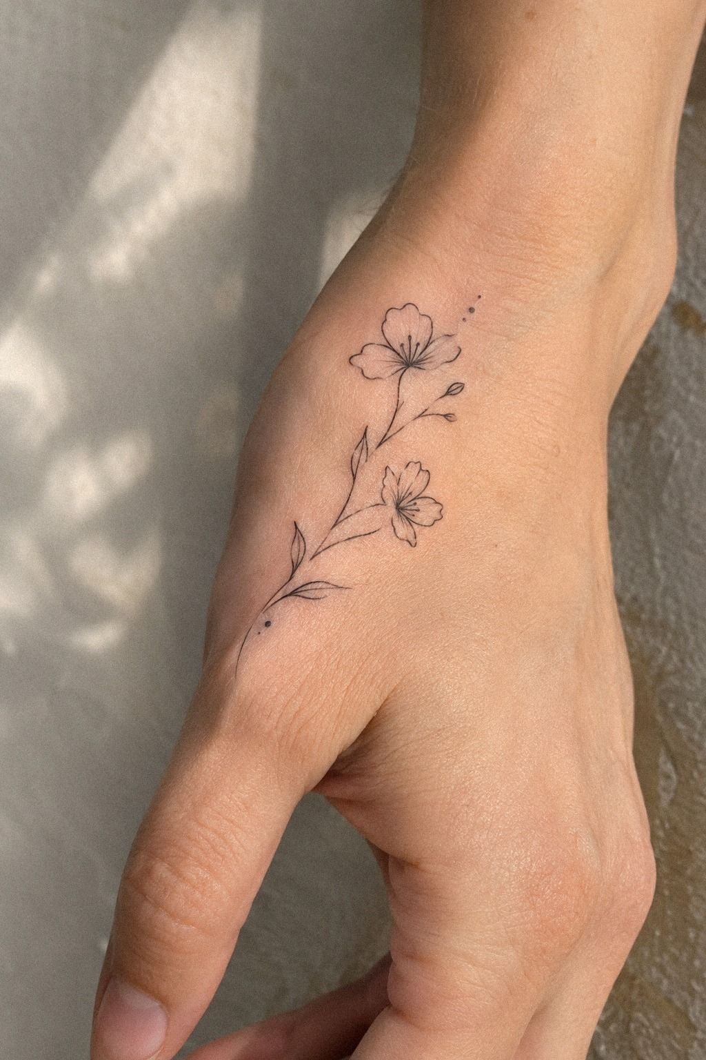
Use the natural side edge as a guide, not a blank strip to fill from end to end. A flowing composition can follow the hand’s narrow contour and feel graceful because it works with the shape instead of forcing a straight mark across it. Your side-edge placement should follow movement.
Ask your artist to map the design while your hand is relaxed. Then check it with your fingers extended and slightly curled.
The line should remain readable in both positions, especially if it passes near a knuckle. I prefer a shorter composition with visible skin around it because cramped linework loses its crisp quality faster.
The sterile transfer stencil should show the beginning, middle, and endpoint clearly. You can use a small dot or star as the visual anchor, then let a thin branch, wave, or abstract curve move beside it. If the edge placement interests you, compare it with these fine line side finger tattoos before choosing your exact path.
Don’t assume the narrowest spot is automatically the best spot. A side hand tattoo can rub against pockets, tools, and phone cases.
Your artist should explain how your specific skin moves and whether the design needs a tiny gap from the crease. That conversation matters!
Side Edge or Finger Side?
The side edge gives a little more visual length, while the finger side creates a sharper, more compact statement. Your choice depends on whether you want the motif noticed immediately or discovered at close range. Compare the finger-side placement with the outer edge.
Compare the two placements at their actual size. A design that looks like good value on a screen can require more adjustment once it reaches a narrow crease. Small changes matter!
4Keep lettering crisp on narrow hand skin
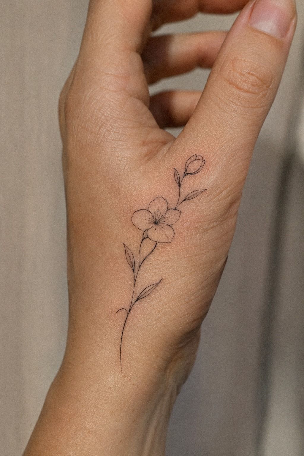
The word “free” can be a beautiful choice when the lettering has enough space between each character. Its crisp lettering needs to remain readable through natural movement.
Lettering That Survives the Gesture
Move your hand while reading the stencil. Bend each finger, grip a cup, and hold your phone.
If the word breaks visually in every natural position, the lettering needs a different path. Your letter spacing has to work with the gesture.
Your artist can adjust spacing, angle, or line strength without changing the meaning. That collaborative step protects the design’s value and can make a narrow word feel surprisingly sleek. I’d rather shorten a word than squeeze it into an awkward curve.
5Plan graceful botanical side hand tattoos
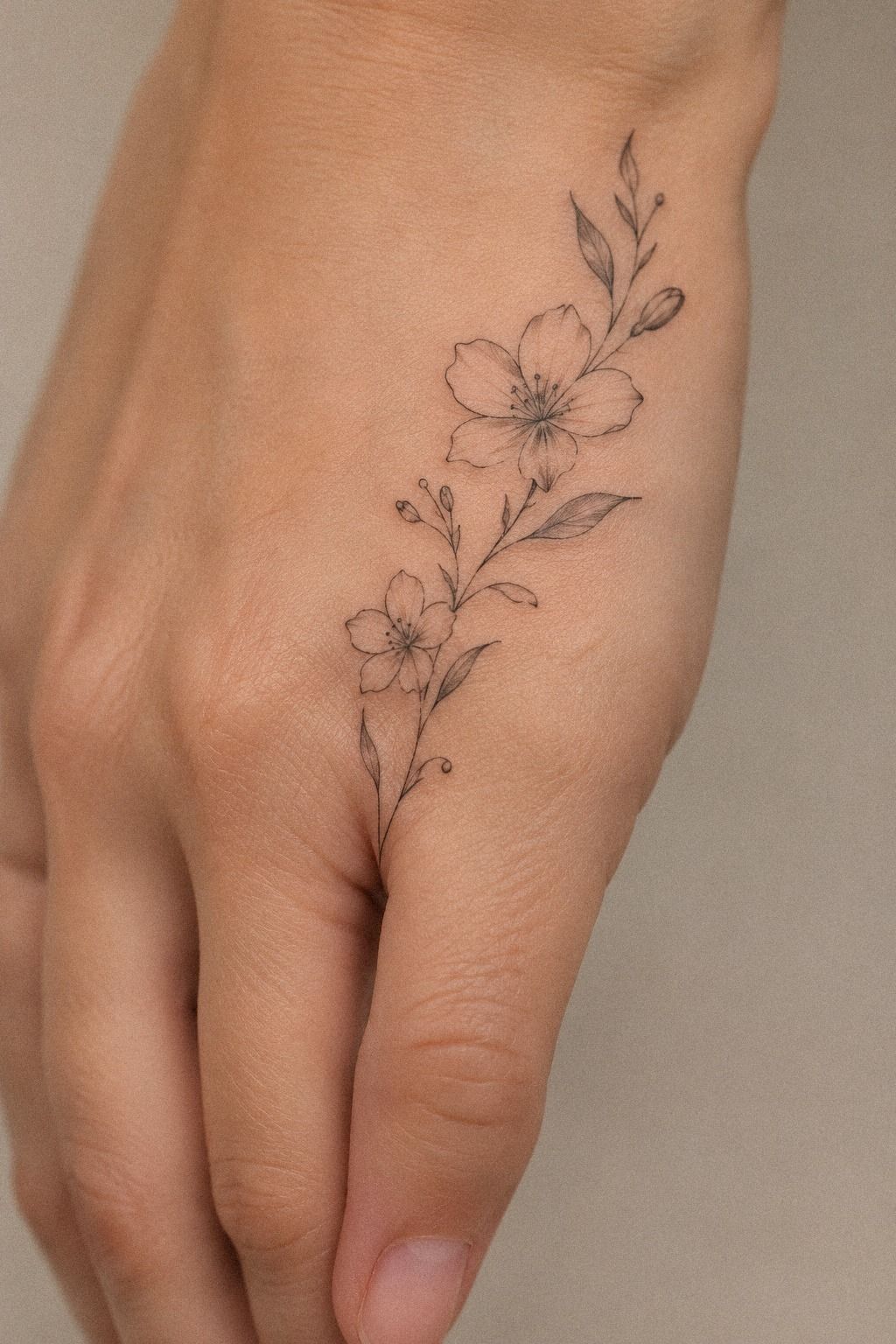
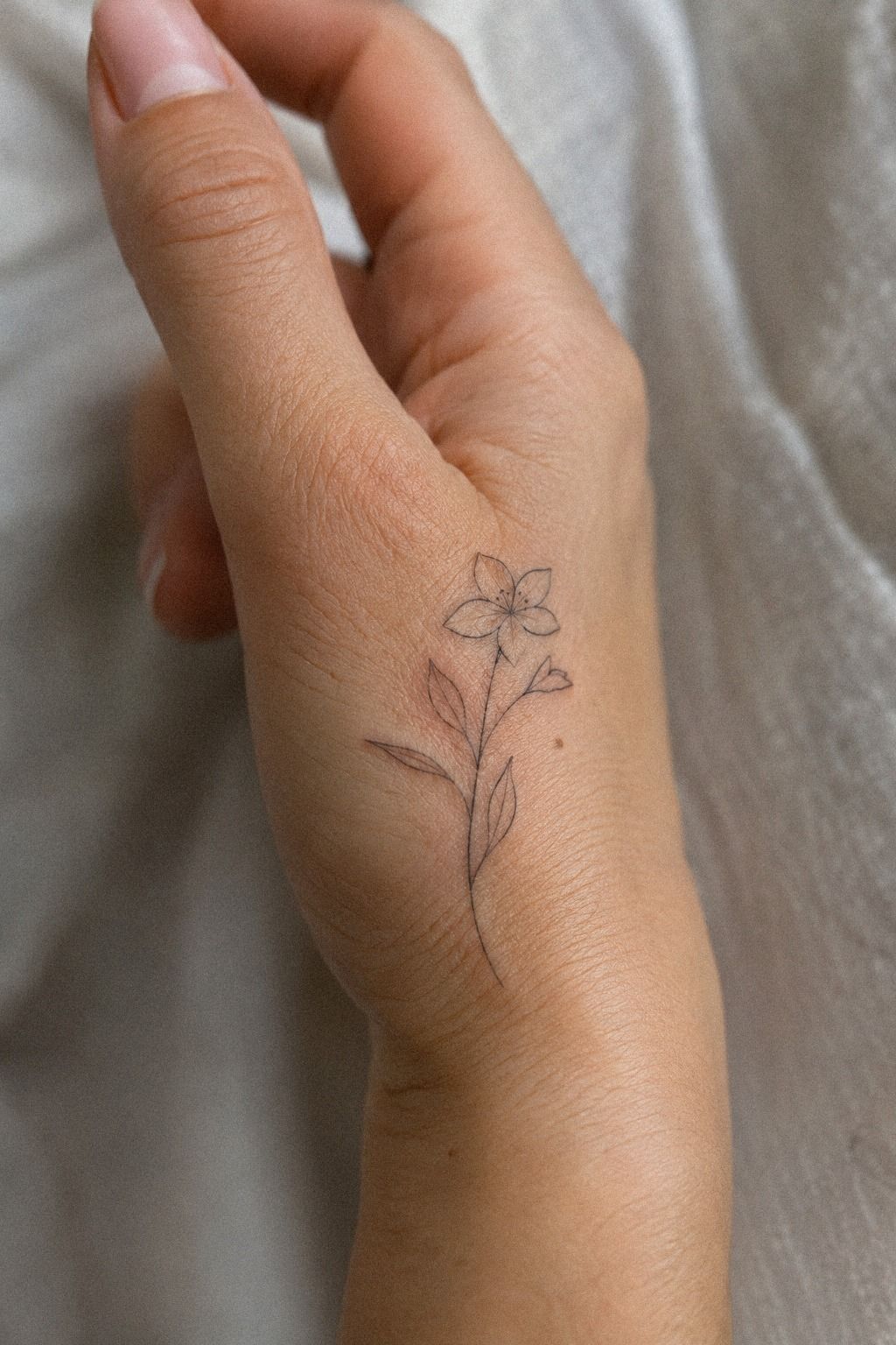
Start with one stem, one leaf shape, or one small bloom before you build a full botanical composition. A single olive branch, fern, or wildflower can look more timeless than a crowded garden. A single-stem reference gives the artist room to redraw the idea.
Use the botanical flash sheet as a conversation starter, not a menu you must copy. Point out the line weight you like, the open areas you want, and the shape that feels personal. Your artist can redraw the motif for your hand instead of shrinking a larger illustration until the leaves become dark marks.
I’d choose a plant with a silhouette you can recognize at a glance. A dainty stem with open leaves will age more clearly than a tiny cluster of overlapping petals. The small side hand tattoos page gives you another range of compact compositions.
Think about direction, too. A stem pointing toward your wrist may feel calm and organic, while one pointing toward your fingers can look more daring.
Try both with a washable marker first. This pause is worth it!
An ethereal branch can work beautifully when it has only a few leaves and one clear curve. If you’re choosing between a detailed flower and a simpler outline, compare how each version reads from a normal standing distance. The washable marker test makes that comparison immediate.
A smaller botanical design doesn’t have to be plain. One unusual leaf, a broken stem, or a single seed detail can give it character without crowding the hand. I’d keep the leaf silhouette recognizable from a relaxed distance.
Botanical or Abstract?
Botanical shapes offer recognizable meaning. Abstract curves give you more freedom and can follow the hand’s movement without looking like a reduced illustration. Your motif category should match the way you want the tattoo to be noticed.
The best option is the one you’ll still enjoy when the first excitement fades. Check the balance, the budget, and the amount of maintenance you’re comfortable with before you commit. A design can be personal without being literal.
6Choose an intricate finger-side tattoo composition
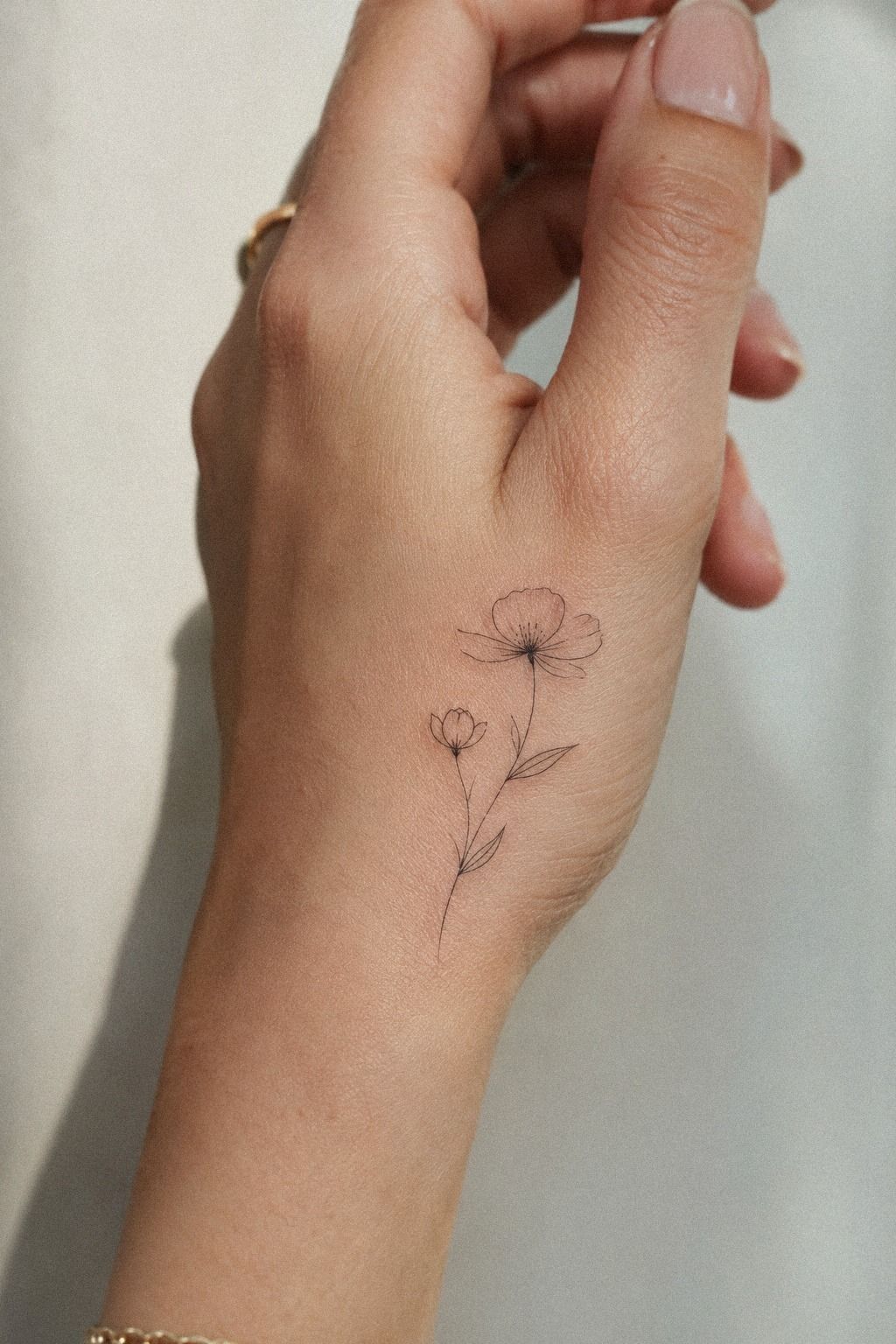
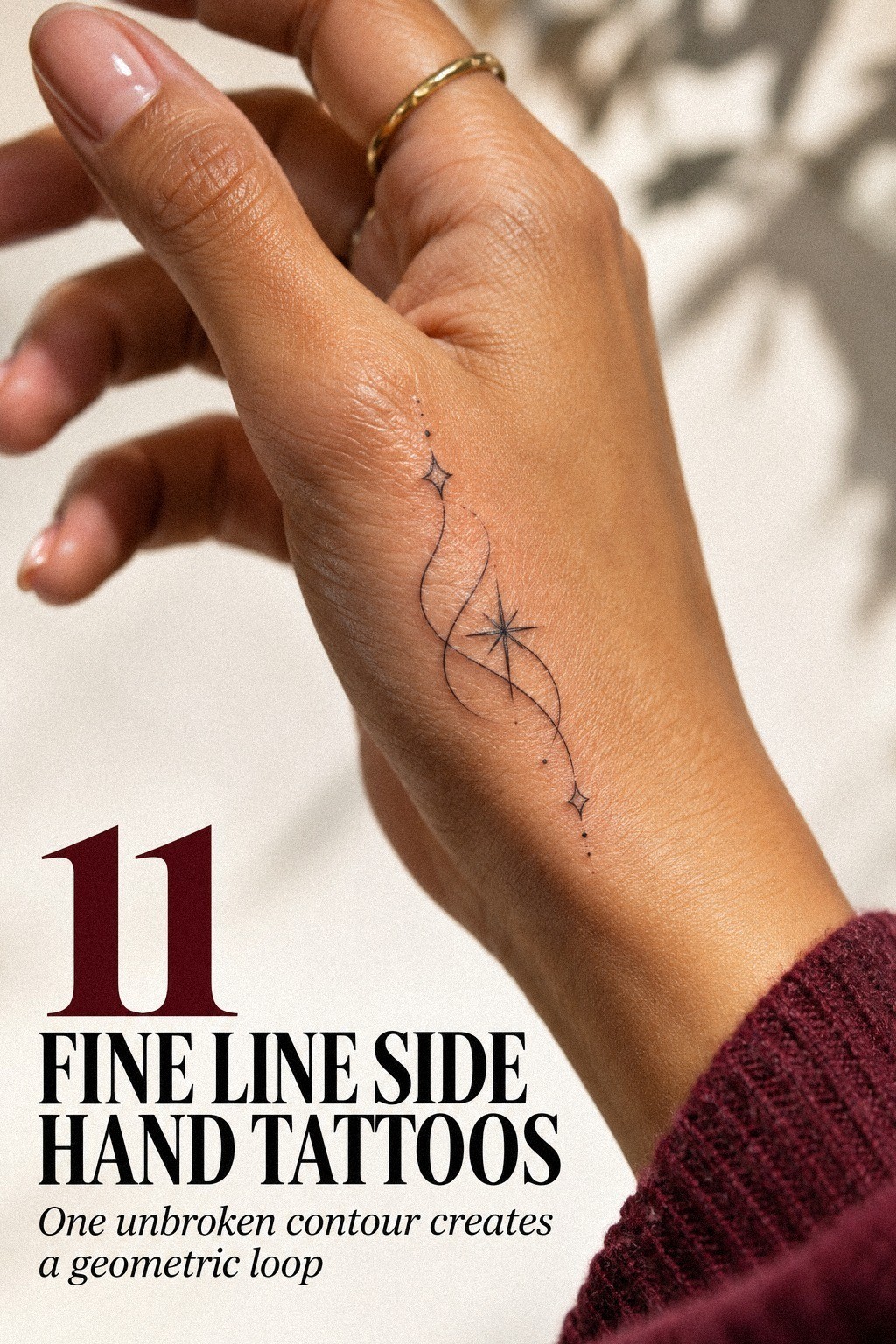
Deep ebony skin can carry striking fine line work, but contrast and spacing need to be planned with care. A narrow finger-side design asks every curve to share limited space, so the composition should stay open enough for each line to remain distinct. Discuss skin-tone contrast with an artist who can show relevant healed work.
Ask your artist to show healed examples on a similar skin tone whenever possible. Fresh ink can look crisp at first, while settled work tells you much more about contrast, placement, and line survival. I’d rather see three clear healed examples than twenty dramatic fresh tattoos.
The fine-line cartridge or needle configuration should match the artist’s approach, not a number you found online. Discuss whether the design needs a slightly stronger outline in its most important areas. Your artist may adjust the line weight so the motif remains readable without losing its intricate character.
For related placements, compare fine line side finger tattoos and notice how the designs handle bends and creases. You’re not searching for an exact copy. You’re learning which shapes keep their identity when the hand is moving or folded.
A vintage symbol can look especially strong on the finger side when its outer contour is clear. Ask what details the artist would remove first.
That answer can tell you whether the design has enough structure to justify its price. Save the outer-contour sketch beside your reference.
Fresh tattoos can look dramatic at first. Healed tattoos show the real value of the artist’s spacing, line control, and aftercare guidance. A healed portfolio should be part of your decision.
Look for healed examples in daylight. You’ll learn more from one honest result than from a gallery filled with freshly completed tattoos. Ask how long the work has been settled and whether the artist has a clear aftercare sheet.
7A Bolder Symbol, a Quieter Line
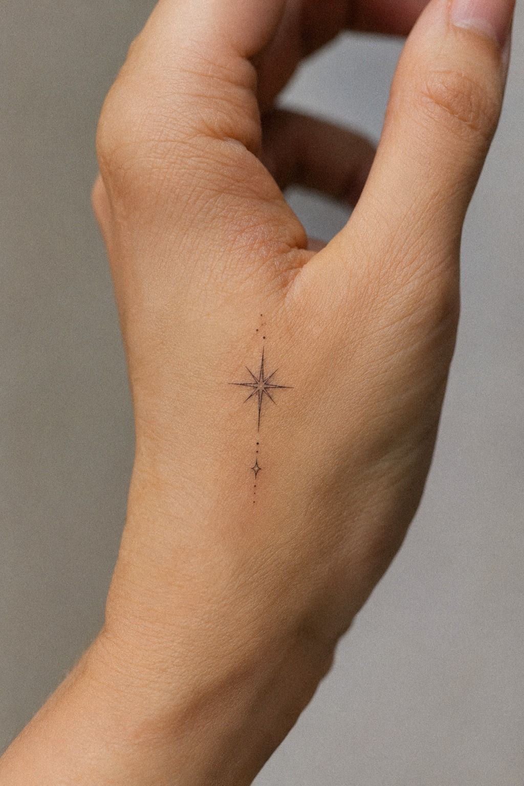
A bold symbol can work beautifully beside understated lines if you give it one clear role. Let the symbol anchor the design while the thinner marks support it. Your visual anchor should be easy to identify.
You might pair a small heart with a single curve, a star with two dots, or an initial with one botanical stem. I’d avoid giving every element equal emphasis because the eye needs somewhere to land. One dominant mark is usually enough for a narrow hand.
If you’re weighing a louder design against a quieter one, ask which choice has better long-term value. The more restrained option may feel less dramatic today, but it can be easier to live with and easier to refresh later. Keep the line-weight hierarchy obvious.
8Match unique motifs to your personal meaning
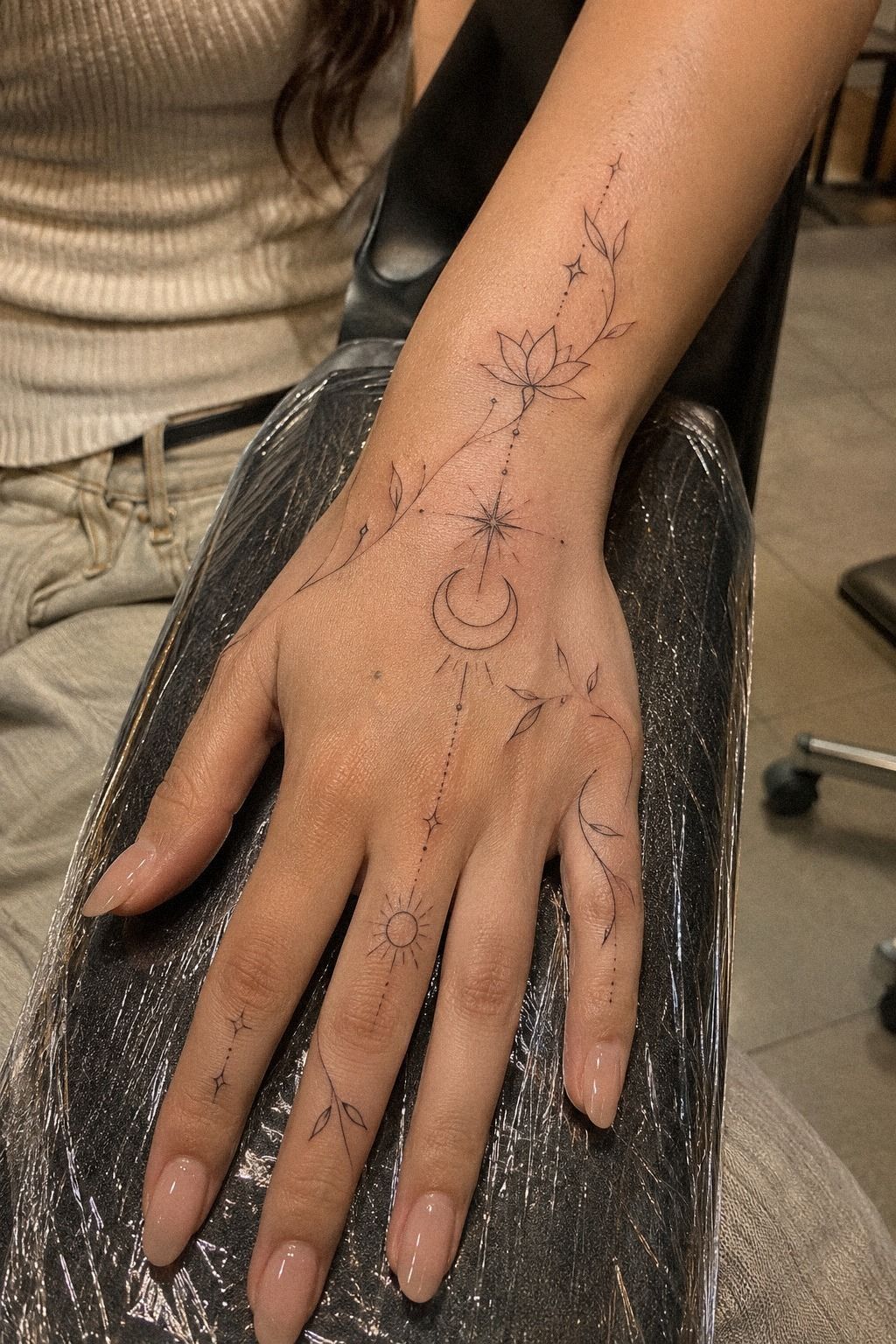
Unique fine line side hand tattoos don’t need to look strange or complicated. An edgy symbol can still feel thoughtful when it connects to a place, person, phrase, or private ritual. A personal motif list can keep the idea grounded.
Make a short list of images you return to without prompting. Maybe it’s a small key, a swallow, a constellation, a ribbon, or a line from a poem.
Then remove anything you chose only because it was popular online. The remaining image will usually feel more meaningful and less disposable.
Bring a printed reference board with no more than five images. Include one for the symbol, one for the line quality, one for the placement, and two that show what you don’t want. This gives your artist useful boundaries without asking them to reproduce someone else’s work.
A romantic motif doesn’t have to be ornate. A whimsical mark doesn’t have to be childish.
An empowering design can stay quiet and still carry real weight. Your reference boundaries should explain the feeling without dictating a copy.
If you’re still comparing motifs, read about what is fine line tattoo and pay attention to how scale affects detail. You’ll want enough visual breathing room that the meaning survives even when the smallest lines soften. Keep the scale comparison beside your stencil.
9Hand Healing and Daily Friction
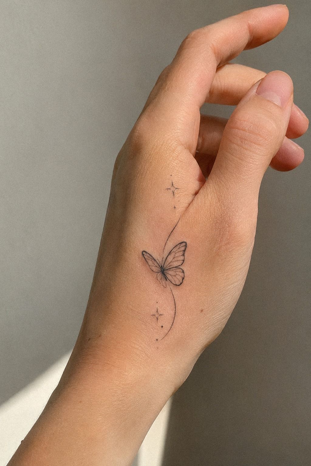
Plan the appointment around the fact that your hand gets used constantly. Fresh-ink protection matters from the first hour.
10Natural Movement Before the Appointment
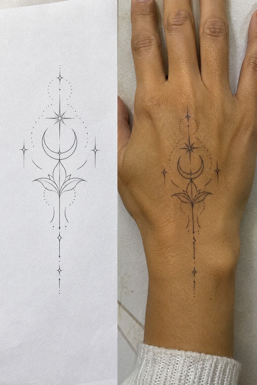
Use a stencil or printed version before your appointment. A raw design can look perfect on flat paper and feel awkward once it crosses a moving hand. The paper placement mockup is worth the few minutes it takes.
Print the paper stencil at the intended size and tape it along the side of your hand for a few hours. Check it while texting, gripping a cup, opening a door, and resting your hand. You’ll notice whether the motif twists, hides, or catches your attention in a way you like.
Ask your artist to check the stencil from the top, side, and with your hand relaxed. Then make one small adjustment at a time. I’d move the whole design before redrawing every line because better placement can solve a drawing problem.
Save the stencil revisions so you can compare each version.
Your hand moves all day, so the tattoo should have flexibility in its visual rhythm. A short curve may look more graceful than a rigid horizontal line. For compact placement ideas, browse fine line tiny hand tattoos and compare how the motifs behave in different positions.
A raw-looking design can still be polished when the edges are intentional. The test is simple: if you notice the placement before you notice the symbol, keep adjusting. Your movement check should end only when both parts feel connected.
11Timeless Details for Side Hand Tattoos
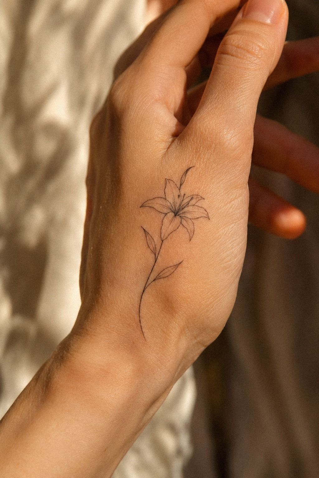
Expressive detail should be chosen with patience. One sharp accent, a small dot cluster, or a slightly irregular curve can give the tattoo character without filling every available space. The accent detail should have a reason to exist.
A sleek design often depends on what you remove. Ask whether the tiny border, second leaf, or extra star adds meaning or only visual noise. If the answer isn’t clear, leave it out.
A haunting symbol can remain subtle when its outline is clean and its placement is deliberate. Before the appointment, review the final stencil in daylight and under indoor light.
You want the design to stay readable in both. Compare the final stencil clarity before approving it.
The Hand Tattoo Choice I’d Make Again
I’m convinced the best first hand tattoo is the one that respects the hand’s movement. I’ve seen people fall for an iconic reference, then lose interest once the stencil covers every narrow edge and crease.
The tattoo looked exciting in the reference. On the skin, it needed more silence.
I’d keep the original tattoo concept focused.
I’d rather choose three small stars, one clean word, or a single botanical stem than force six ideas into one composition. That choice can feel almost too understated at first, especially if you’re used to louder flash. Give it time.
A classic design with open skin around it keeps its shape when you’re typing, driving, or holding your hand under bright light. That’s often better value than paying for detail that disappears when your fingers bend. The long-term readability matters more than a crowded first impression.
The most important conversation is with the artist who will place the stencil. Ask to see healed work, ask how your skin moves, and ask what they’d remove.
A stylish tattoo isn’t maintenance-free, but it can age with character when the original design has enough space. Review the artist’s studio portfolio before booking.
The Questions Worth Answering First
How much does a fine line side hand tattoo usually cost?
A fine line side hand tattoo typically costs about $50 to $100 at a studio minimum, while hourly rates often run around $100 to $250 in the US. Your final price depends on the artist, region, size, detail, and whether the shop applies a minimum.
Are fine line side hand tattoos a good idea for a first tattoo?
Yes, they can be a good first tattoo if you choose a small, readable design and understand hand placement. A clear motif gives you a manageable introduction to tattoo aftercare, though hands can be more sensitive than the forearm or upper arm.
How do I choose a tattoo artist for fine line side hand tattoos?
Choose an artist with clean healed linework, strong hand-placement examples, and clear studio hygiene. A healed portfolio matters more than fresh work.
Ask about their line approach, stencil process, aftercare, and experience working with your skin tone. You can also compare fine-line finger examples before your consultation.
How much do fine line side hand tattoos hurt?
Hand tattoos can hurt more than tattoos on the forearm, thigh, or shoulder because hands have thin skin and bony areas. Pain varies by placement, with ribs, feet, hands, and sternum often feeling sharper than areas with more cushioning.
How long does a fine line side hand tattoo take to heal?
Surface healing usually takes about 2 to 3 weeks, while complete settling can take roughly 2 to 3 months. Gentle aftercare means washing carefully, moisturizing as directed, avoiding pools and direct sun, and never picking at peeling skin.
What’s the best placement for a fine line side hand tattoo?
The side edge or outer finger area can work well for a small design because it creates a narrow, visible path. Placement affects longevity, so ask your artist to check creases, friction, movement, and how much sun the tattoo will receive. The small hand tattoo guide can help you compare compact options.
Where I’d Start First
If I had to pick one step, I’d start with the stencil test. It catches awkward movement before ink is involved, and hand placement can change a delicate design more than extra detail ever will. Save the test version before your appointment.
Hold it on for a few hours, move naturally, and keep the version that still feels personal. That’s the simplest way to protect your budget and choose a tattoo you’ll keep loving. Browse these small fine line hand ideas only after your own placement test feels right.