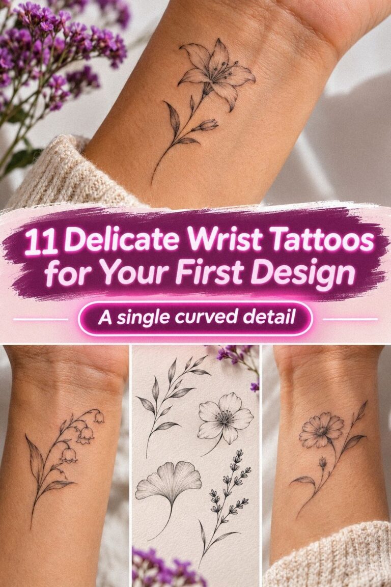
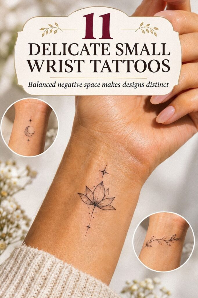
I priced delicate small wrist tattoos around a $300 ceiling, then chose a meaningful fine-line design that stayed under it. My wrist had a clear patch of skin, a strict budget, and too many saved references. I wanted something personal, crisp, and timeless. The smallest choice took the most thought.
Editor’s note: Start with the skin, the crease, and your daily habits. The design comes after.
Here’s what it looked like before:
Before the appointment, my wrist was simply open skin with one narrow patch I kept touching whenever I imagined a design there. I’d saved botanical sketches, crescent moons, tiny lettering, and symbols with no clear connection between them. My skin’s undertone mattered too, because black linework can read differently on cool-pink, olive, golden, and deep brown skin.
I didn’t want a loud piece, but I wasn’t looking for something forgettable either. The goal was a delicate wrist tattoo that would feel personal without taking over my hand. If you’re starting from a blank wrist, save a few tiny small wrist tattoos and small wrist tattoo ideas first, then notice which shapes you keep returning to.
I also looked at my wrist in ordinary positions, not only with my fingers posed for a photograph. A clear patch of skin can look larger when your hand is relaxed and much narrower when you bend it.
The most useful question was simple: would I still want this mark when the trend disappeared? That pushed me toward something striking but not noisy, and toward a design I could understand without explaining it. The smallest choice took the most thought.
- Where Should a Delicate Wrist Tattoo Sit?
- The Olive Branch Shortlist
- Compare Fine Line and Single Needle
- Why Did the Symbol Matter?
- A Crescent Moon, Reconsidered
- Test Lettering Across Your Inner Wrist
- Is Wrist Tattoo Pain Manageable?
- Fine Line Versus Time
- Watch or Wrist?
- Follow Precise Aftercare During Healing
- The Meaning That Stayed
1Where Should a Delicate Wrist Tattoo Sit?
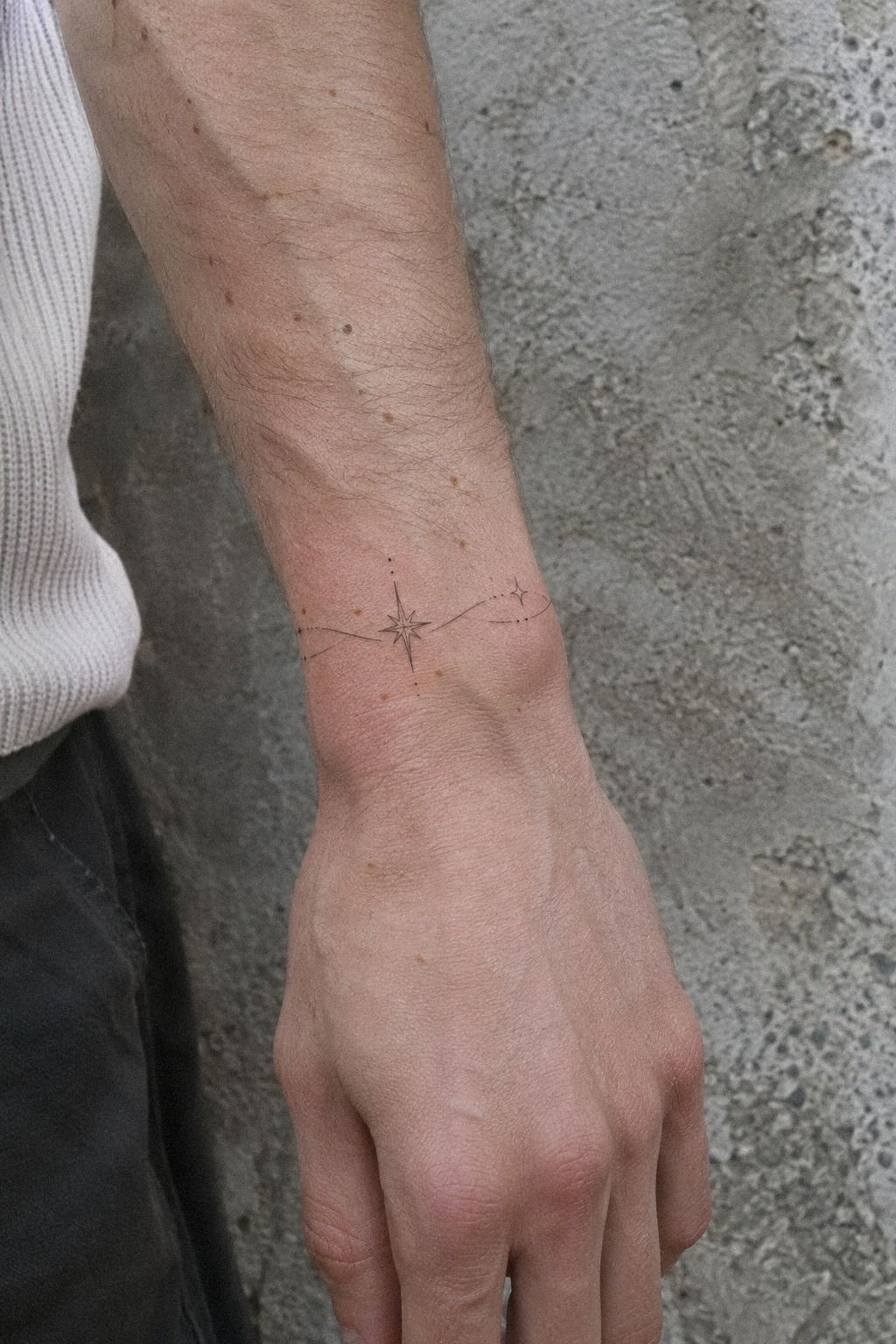
I started with placement because the wrist changes the entire reading of a small tattoo. An inner-wrist design feels intimate and easy to cover, while the side-of-wrist placement gives a sharper, more visible result. I chose a narrow inner placement, slightly above the crease, because I wanted the lines to stay clear while my hand moved.
The deepest inner-wrist placement wasn’t right for my design. It moves constantly, catches friction, and can make tiny details look less stable over time. I’d rather leave a small margin of skin than force every part of the design into the narrowest possible area.
A fine-line design can look elegant on paper, but your artist still needs enough negative space for it to remain legible. I’d skip placing the smallest details directly across the crease. They’ll move, soften, and compete with every bend.
If you’re comparing placements, look through minimalist small wrist tattoos before you commit. I wanted a striking result, but I didn’t want visibility to become the whole personality of the piece. That placement decision shaped everything that followed.
2The Olive Branch Shortlist
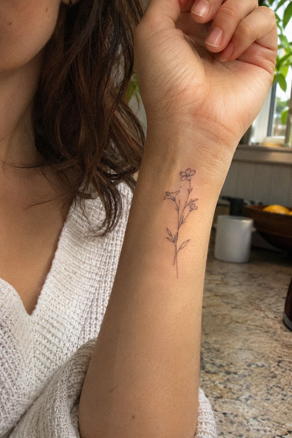
I saved three botanical references before choosing one: a tiny olive branch, a single fern frond, and a thin wildflower stem. The saved designs had open spacing and no heavy shading. Each option felt meaningful, but the olive branch had the most graceful curve when I held my wrist naturally.
My artist redrew it with fewer leaves because the first sketch was too intricate for the small scale. That was the first useful surprise! A single-needle botanical can look elegant when the negative space has room to breathe, but crowded leaves quickly turn into a dark mark.
You’ll want to check the design at actual size, not only on a large phone screen. A branch that looks minimal at four inches wide may become a dense little shape when reduced to the size of your thumbnail.
For a more minimal direction, I’d compare it with these minimalist small wrist tattoos. A dainty branch works better than a tiny bouquet here, because the stem gives your eye one clean path across the skin.
And honestly, three strong references were enough. More would’ve made me second-guess everything. I kept the olive branch sketch that still looked personal after I removed half the decorative details.
The final curve felt graceful, not fussy.
3Compare Fine Line and Single Needle
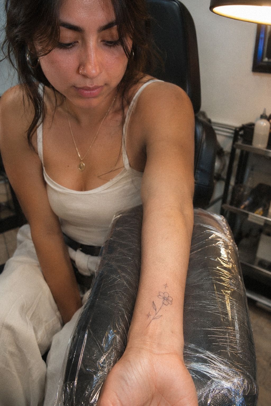
I thought fine line and single needle were two completely separate styles, but the terms overlap depending on the artist. Fine-line style usually describes the visual result: narrow, light-looking marks with restrained contrast. Single needle describes one possible technique for creating those marks.
That distinction mattered because I was focused on the appearance rather than the label. A tattoo can be delicate without using one exact needle configuration, and a single-needle tattoo can still become too dense if the spacing is poor.
I asked to see healed work instead of judging only fresh tattoos. Fresh lines can look crisp and polished under studio lighting, while healed examples reveal whether the artist’s spacing, pressure, and contrast hold up.
My decision came down to the line-weight conversation I had with the artist. We discussed how thin the lines could reasonably be, which details needed to go, and how much open skin the branch required.
I wanted something understated, but I didn’t want to confuse understated with fragile. The final design needed enough structure to stay expressive after the first-day sharpness softened.
4Why Did the Symbol Matter?
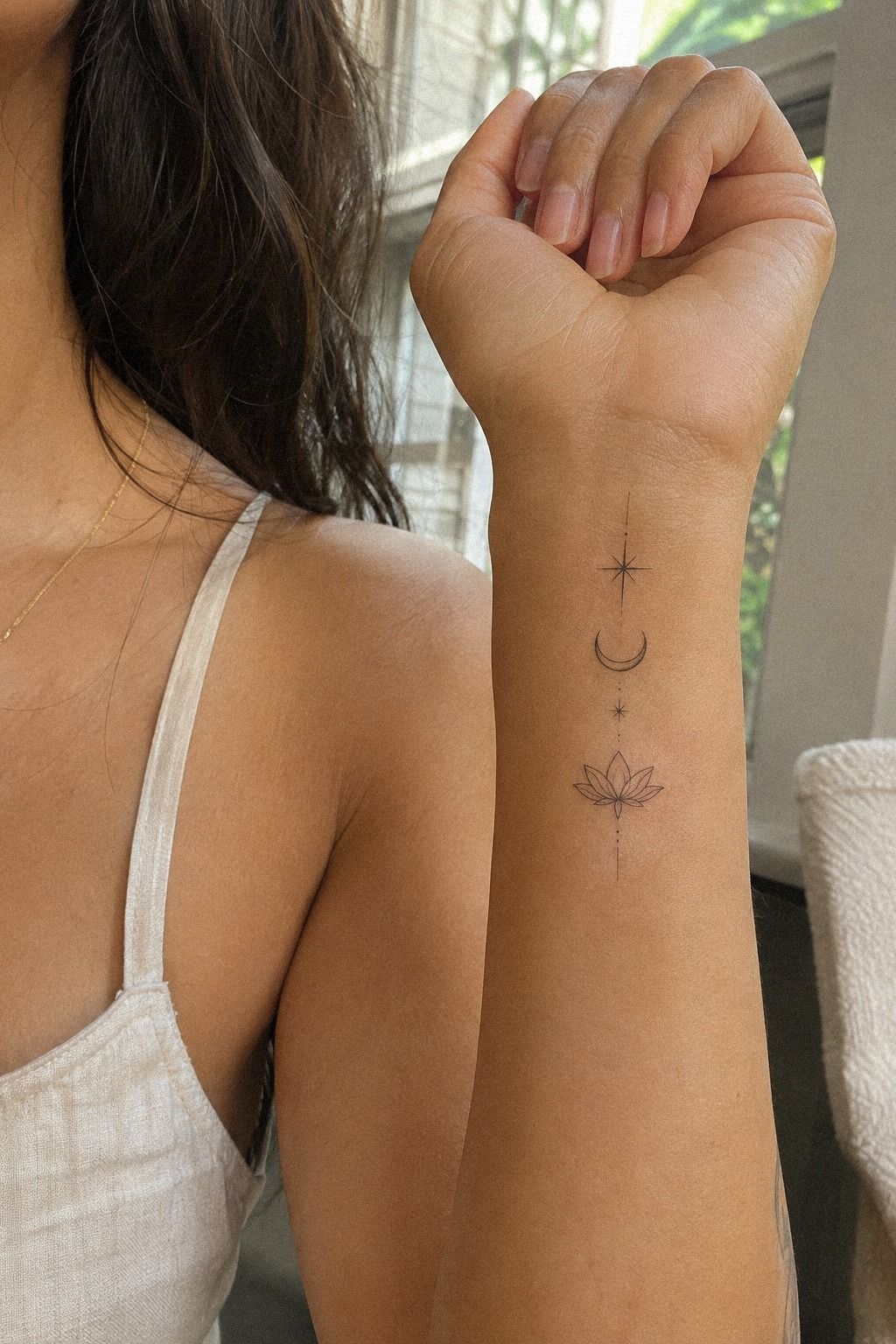
The symbol had to mean something without needing a paragraph of explanation every time someone noticed it. I chose the olive branch because it connected to a family story about starting over, but I kept the shape simple. The branch felt expressive without becoming theatrical.
My first sketch included a date beneath the branch. I removed it. The olive branch symbol made the tattoo feel less literal, while the memory stayed personal.
That was the right decision for me.
A sacred symbol should feel powerful to the wearer first, not perform its meaning for strangers. If you’re choosing between a romantic mark, a fierce emblem, or something purely personal, write down what you want to remember before you browse more designs.
You’ll notice which ideas feel meaningful instead of merely stylish. I’d also read a small tattoos meaning guide if your shortlist includes symbols from a culture or tradition you didn’t inherit. Cultural respect matters before style.
I checked delicate hand wrist tattoos for scale, but I didn’t copy anyone’s exact mark. Cultural respect matters more than a pretty shape, and that kept my meaningful tattoo personal without making it careless.
5A Crescent Moon, Reconsidered
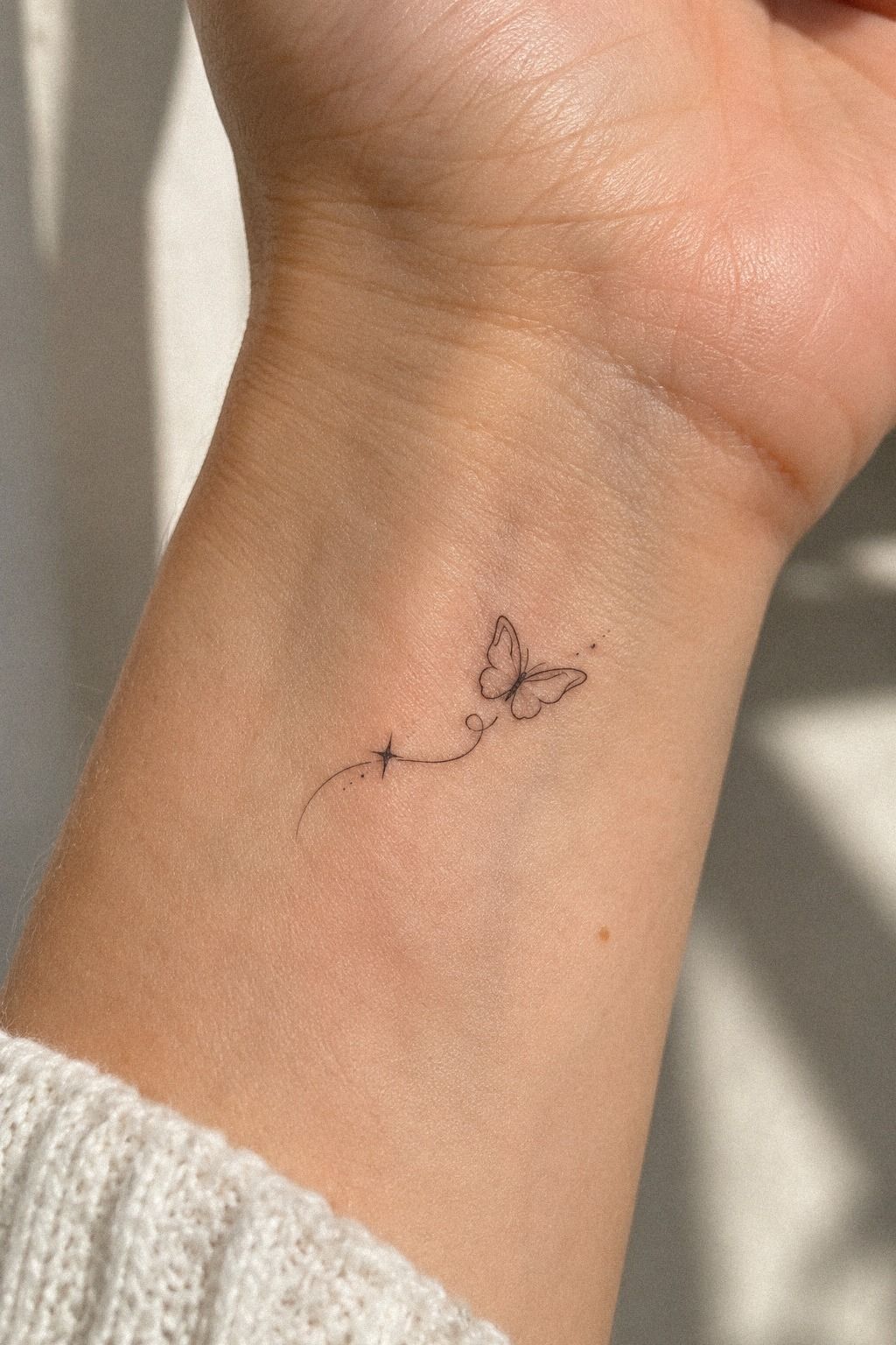
Before settling on the botanical option, I sketched a crescent moon on an old flash sheet. It was bold in a quiet way, and the crescent silhouette looked almost perfect when I drew it large.
The problem appeared when I reduced it to the size I could comfortably wear. The inner curve became cramped, and the points looked sharper than I wanted. A crescent can be symbolic and iconic, but its small internal space still needs room.
I also asked what the moon meant to me beyond its appearance. I liked the design, but I couldn’t connect it to a specific personal meaning as strongly as I could with the branch. That difference made the moon feel stylish, while the branch felt personal.
The crescent moon sketch stayed in my notes, but it stopped being a serious contender. I didn’t reject it because it was common. I rejected it because it asked me to explain why I wanted it.
6Test Lettering Across Your Inner Wrist
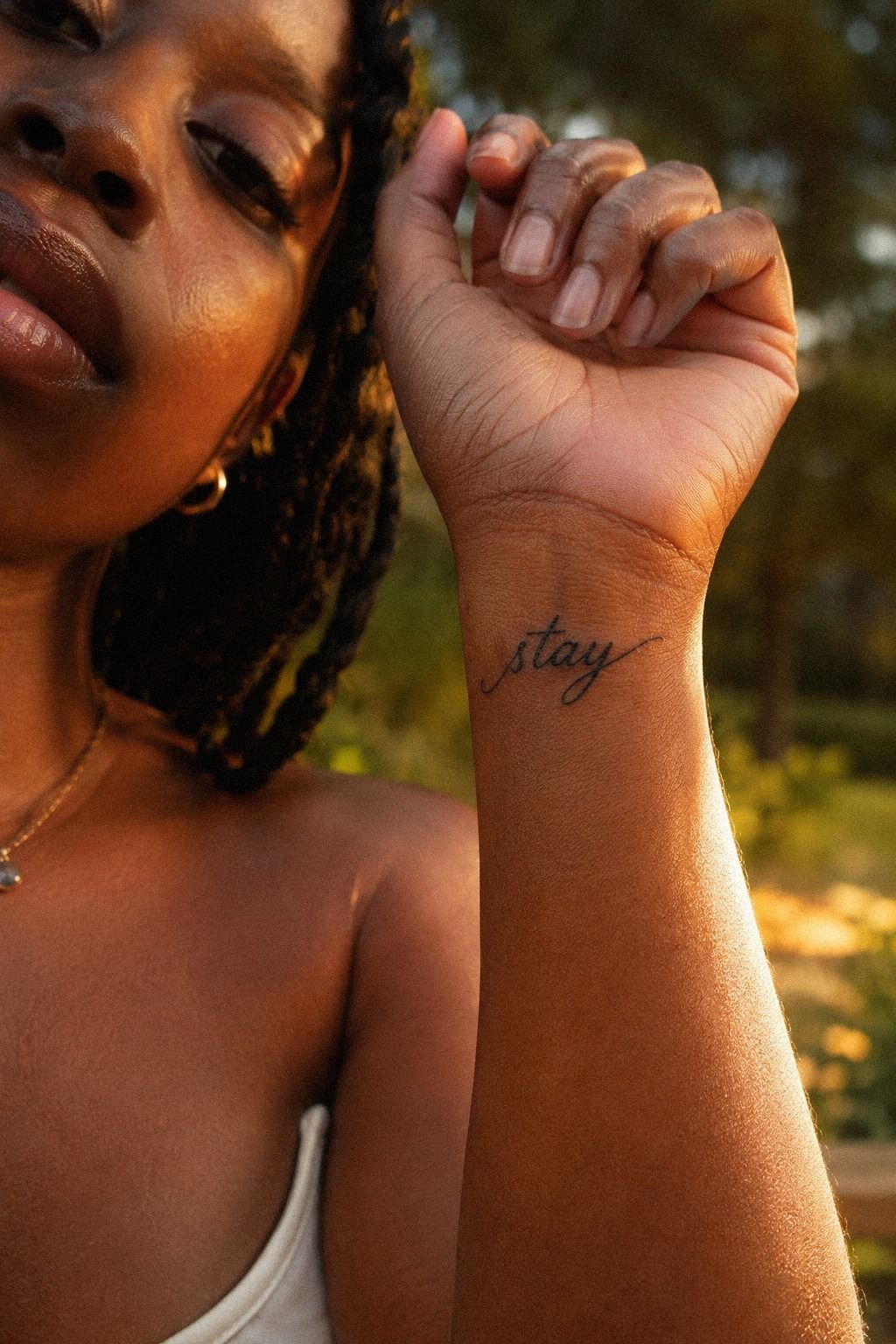
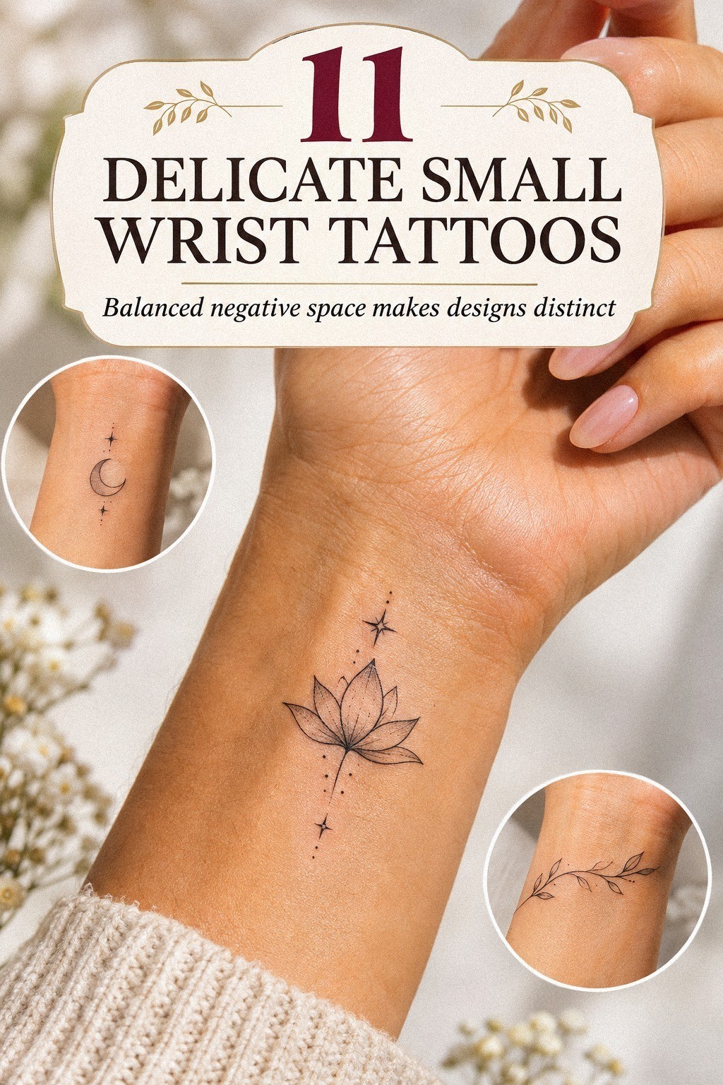
I tested the word “stay” across my inner wrist because lettering looks deceptively simple. On paper, the word looked sleek. Against my wrist, the long loop of the “y” pushed the design too close to the crease.
I tried a compact serif lettering style, a flowing script, and small lowercase lettering. The serif version was sharper and more timeless, but it lost the softness I wanted. I’d skip ultra-thin script if your chosen word has tight loops.
A word may look expressive when it’s fresh, then soften into a blur as the skin changes. The artist should show the lettering at the finished letter size and from a normal viewing distance.
You’ll want to move your wrist, relax your fingers, and check whether the word still reads naturally. That quick movement test exposed a problem I didn’t see while holding my hand still. The normal viewing distance mattered more than the close-up.
If you prefer words to symbols, browse small hand wrist tattoos for references that show how lettering behaves near the hand. I liked the idea, but the branch carried more meaning with less visual pressure.
7Is Wrist Tattoo Pain Manageable?
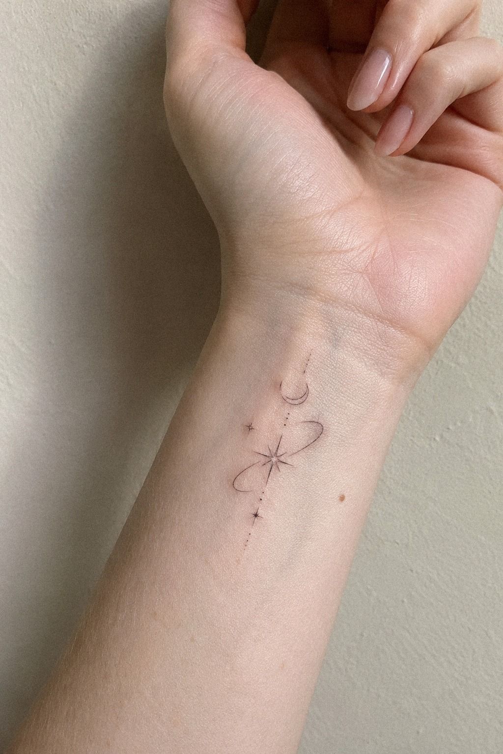
I asked about pain before booking because I didn’t want to build a dramatic story around it. Wrist tattoos can feel sharp, hot, or scratchy, but the experience changes with the exact placement, line weight, session length, and your own pain level.
My artist described the inner wrist skin as manageable, with more sensitivity near the crease and bones. The area felt raw afterward, but the appointment itself was brief and controlled.
I’d rather hear an honest answer than a claim that the appointment will feel like nothing. Ribs, feet, hands, and sternum are often more painful areas, while the forearm, thigh, and shoulder are generally more tolerable. Individual pain tolerance still matters.
You can ask how long the short tattoo appointment should take and whether breaks are normal. A short session is easier to approach when you’re nervous.
You’ll want clean hands before touching the area, especially when the skin feels tender. I planned for the sensation to be noticeable rather than dramatic. My wrist felt raw afterward, but I never felt out of control!
8Fine Line Versus Time
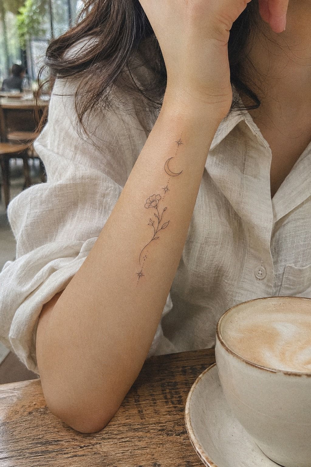
I checked healed reference examples before choosing hair-thin lines. Fresh tattoos are tempting because every edge looks crisp, but a new tattoo is not the final version you’ll live with.
I asked the artist how the lines might soften, where the skin might move most, and which details were likely to need a future adjustment. That conversation changed the design more than another hour of browsing would have.
A delicate mark can remain readable when its open structure is clear. It becomes riskier when the design depends on several tiny enclosed spaces, faint gray shading, or details packed across a crease.
The healed tattoo examples gave me a more realistic reference point. I wanted a graceful result, but I also wanted to understand the compromise: fewer details now could mean a clearer symbol later.
9Watch or Wrist?
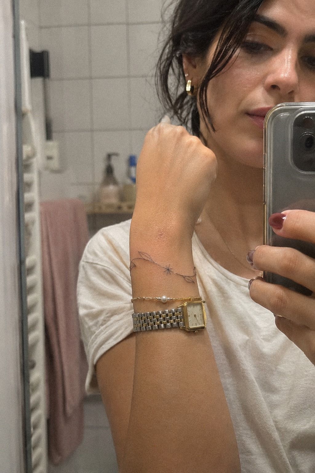
My watch was the practical problem. I wear it on the same wrist most days, and the watch strap sat exactly where I first wanted the tattoo. I didn’t want a bold design competing with the accessory.
I moved the design upward and tested it with my watch, a slim bracelet, and no jewelry. With the watch on, the branch was still visible but didn’t rub directly against the strap. That jewelry test settled the question.
That small adjustment made the placement feel more intentional. My understated linework needed visual space, especially beside a dark band.
Before you book, wear the accessories you use most and mark the possible placement with a cosmetic pencil. You’ll see where pressure, movement, and friction happen during a normal day.
I’d avoid placing a new tattoo directly under a tight band. If you want more placement ideas, these tiny small spine tattoos show how a few centimeters can change the balance of a small design. The right wrist placement should work with your daily habits, not fight them.
10Follow Precise Aftercare During Healing
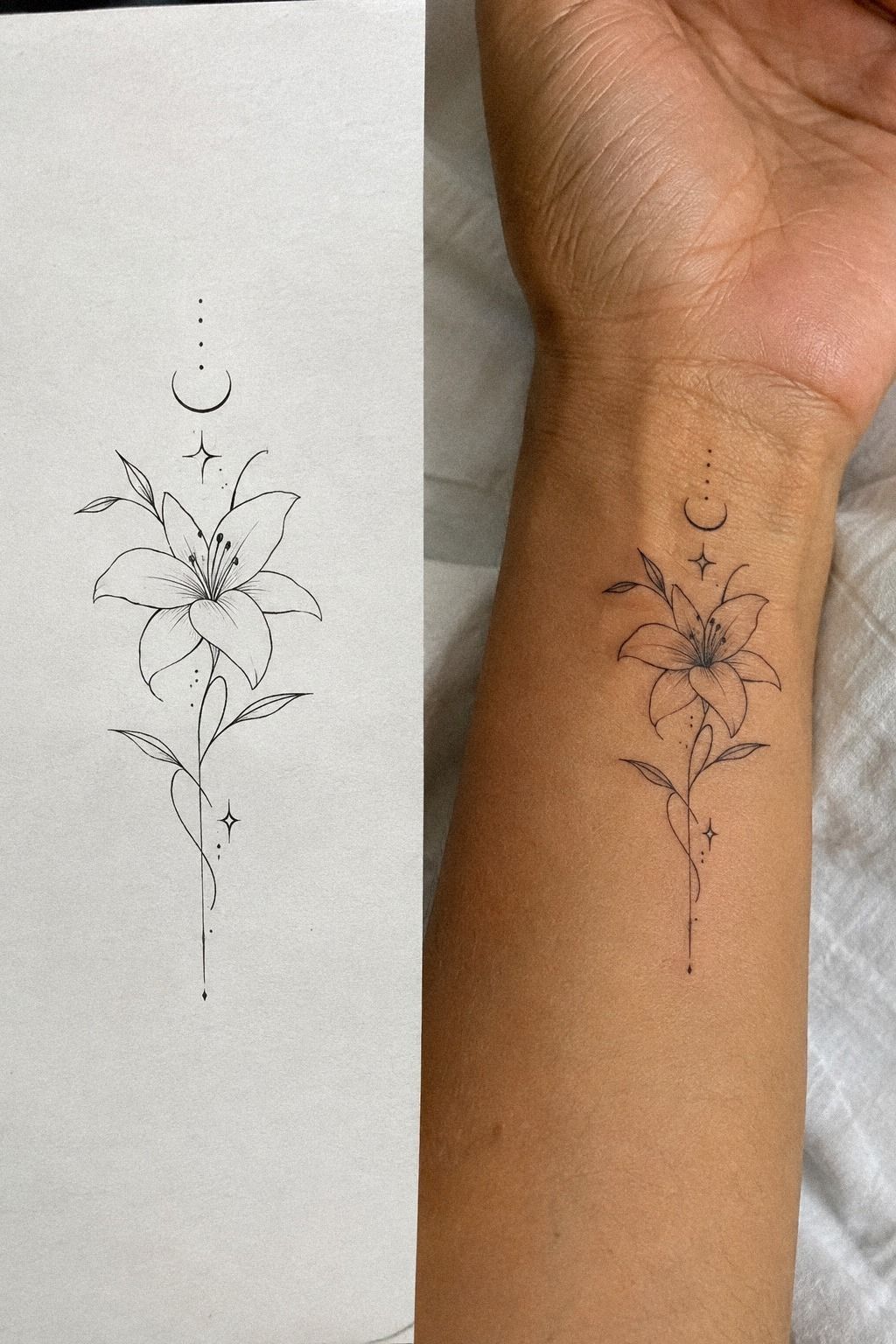
I followed the studio’s aftercare instructions: gentle washing, light hydration, and no picking at flakes. I kept the area away from pools and direct sun while the surface healed.
A typical surface healing period is about 2 to 3 weeks, while complete healing can take roughly 2 to 3 months. Your artist’s advice should take priority if your skin reacts differently.
You’ll want clean hands before touching the healing tattoo, and you shouldn’t cover it with heavy product unless your artist tells you to. Good! Be ruthless about avoiding unnecessary touching.
The itchy stage is annoying. My tattoo looked crisp after the surface settled, but I waited before deciding whether any line needed a future touch-up.
I also kept my watch away from the area until the skin felt settled. That was less convenient, but it reduced rubbing during the most sensitive part of surface healing.
I didn’t judge the final result until the skin looked calm. A future touch-up might be useful for some tattoos, but I didn’t want to make that decision while the lines were still changing.
11The Meaning That Stayed
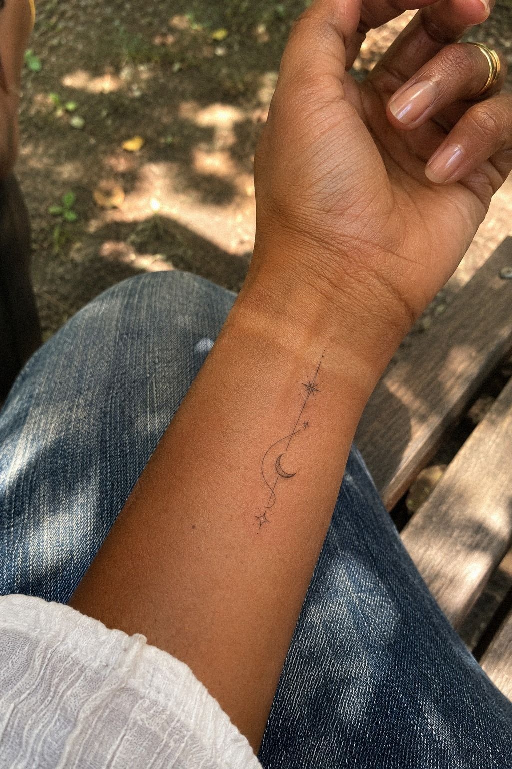
The finished olive branch tattoo was small, with a curved stem and open leaves, placed above the inner wrist crease. On my own wrist, the result looked quiet but unmistakable.
I liked that it didn’t announce its meaning immediately. The branch felt personal when I looked down, while other people simply saw a quiet mark.
That balance was the reason I rejected the larger crescent and the lettering. The final design was feminine in its delicacy, but the personal memory behind it felt strong enough for anyone.
If you’re choosing your own piece, take a photograph with your arm relaxed instead of posed. You’ll see whether the tattoo still looks balanced during an ordinary moment.
I’d also compare delicate hand wrist tattoos before making the appointment. A meaningful design doesn’t need to be loud to feel empowering.
Mine became part of my daily gestures almost immediately. The personal mark felt like a small reminder rather than an announcement.
How Much It Cost
I set a $300 budget before I contacted the studio, and my quote stayed under that ceiling. The exact amount depends on the artist, region, minimum charge, design complexity, and whether the studio bills by time. The studio quote gave me a clear limit.
I asked whether the consultation and stencil adjustment were included in the quote. You should ask too, because a low-looking minimum doesn’t tell you the whole cost.
The studio minimum mattered more than I expected. A simple design may still cost the same as a more detailed one if the shop has a fixed starting price.
I’d rather choose a skilled artist within my range than chase the cheapest appointment. A polished result is worth more than saving a small amount and regretting the linework.
If you’re working with a similar ceiling, compare small wrist tattoo ideas before asking for a quote. A simpler design may fit your budget and age more gracefully.
The Three-Line Wrist Rule
My first rule is simple: the design needs a clear outer shape, a readable internal detail, and enough empty skin around both. I call that the Three-Line Wrist Rule, even though not every tattoo uses exactly three literal lines.
The point is visual restraint. If you’re working at a tiny scale, every mark has a job. The outer shape should still make sense when you glance at it from a normal distance.
The olive branch worked because the stem carried the eye, the leaves created rhythm, and the surrounding skin kept the symbol legible. A dense cluster would’ve looked ornate in the sketch and muddy after healing.
You’ll make a better choice if you remove one detail before adding another. For a small wrist, crisp structure beats ornamental detail every time.
I used minimalist small wrist tattoos as a scale check, not as a template. A minimalist tattoo isn’t empty. It’s intentional.
The Visibility Versus Privacy Test
I tested the tattoo with my arm at my side, palm up, palm down, and resting on a table. That became my wrist visibility test.
Inner-wrist placements are easy to see when you want them visible, but a sleeve or watch can cover them when you need a quieter look. The test helped me choose a direction that worked in more than one position.
The inner-wrist tattoo felt personal without being hidden. A fierce symbol could still work there, but I wanted something more understated for daily wear.
You should decide whether your tattoo needs to speak across a distance or only reward you when you glance down. That answer will guide your scale, direction, and distance from the hand better than a trend will.
If you’re unsure, browse small hand wrist tattoos while moving your own wrist through ordinary gestures. The right visible placement should make sense in motion.
The Soft-Edge Aging Principle
I wanted my tattoo to age into softness without losing its identity. The soft-edge aging principle meant avoiding cramped dots, tiny enclosed shapes, and details that depended on a perfectly sharp first-day line.
I kept the branch open, used black ink rather than pale gray, and left space between the leaves. That gave the open leaf spacing enough room to remain readable.
This isn’t a promise that fine line never changes. Skin changes, sun changes, and lines can spread. But you can give your design a stronger starting structure with deliberate contrast.
If you’re choosing between a sharp, bold symbol and an intricate miniature scene, I’d choose the symbol unless the artist has healed examples of the scene. Your future self deserves a tattoo that still reads clearly.
For more comparisons, revisit small wrist tattoo ideas and pay attention to designs with clear negative space. Be skeptical of details that only work when enlarged.
The intricate miniature scene was tempting, but it asked too much from a small area. I preferred a structure that could remain recognizable after the first-day crispness faded.
The Skin-First Decision Rule
I used to think choosing a wrist tattoo began with the image. It doesn’t. It begins with the skin, the crease, the amount of movement, the jewelry you wear, and how visible you want the mark to be.
Once I looked at those details, half my saved references stopped making sense. That was useful, not disappointing. A tattoo should fit the actual wrist anatomy where it will live.
I also learned that a design can be captivating on a flash sheet and wrong for your wrist. The crescent moon was charming, and the lettering was sleek, but neither carried the same personal weight as the branch.
The serif lettering had a classic mood, while the branch felt more daring because it carried a story without spelling it out. I went back and forth longer than I expected because every option had a different mood.
In the end, the meaningful branch won because I’d still understand it without explaining it. That mattered!
Your budget matters too, but it shouldn’t be the only filter. A $300 ceiling gave me a boundary, while healed work gave me confidence.
I asked about the artist’s technique: hygiene, line choices, and expected healing. I checked the placement with my watch. I looked at the design on my actual skin instead of trusting a large digital mockup.
Those small decisions made the appointment feel calm rather than impulsive. The watch-friction test was especially useful because I wear it almost every day.
If you’re still deciding what a mark should mean, use this small tattoos meaning guide before saving more references.
The best delicate tattoo isn’t necessarily the thinnest, tiniest, or most popular one. It’s the piece whose shape respects your skin and whose meaning survives the trend cycle.
That’s why I’d choose a personal branch over a random symbol, and clean spacing over extra decoration. I wouldn’t rush it! Wait a week and see which idea you keep drawing from memory.
The personal tattoo became the right choice because it felt expressive without demanding attention. It was understated, but it still felt empowering.
What I’d Trade to Stay Under $300
The budget changed my choices, but not in the way I expected. I didn’t have to choose between a meaningful tattoo and a skilled artist. I had to decide which details were worth paying for and which ones only looked impressive on a screen.
I would spend on experience, hygiene, a careful consultation, and healed examples. I wouldn’t spend extra simply to preserve a crowded sketch. More leaves, tighter lettering, and intricate shading would have made the design more expensive without making it more personal.
The hardest compromise was letting go of the date beneath the branch. I worried that removing it would make the story less specific.
Instead, the simpler symbol gave the memory more room. It became something I could carry privately rather than something I had to display literally.
I also accepted that the smallest tattoo might not be the cheapest. A studio minimum still applies to a tiny design, and a short appointment doesn’t mean the artist’s preparation has no value. The quote reflected time I couldn’t see, including the consultation, stencil adjustment, and decisions about scale.
If my budget had been lower, I would have simplified the branch again before choosing a less experienced artist. That’s my firm opinion. A bold, clear, well-planned shape is a better compromise than a detailed design that depends on perfect execution.
The $300 ceiling also stopped me from making an impulsive upgrade. I didn’t add lettering because I felt I had room in the budget. I didn’t expand the branch because the stencil looked too empty.
The limit forced me to ask whether each mark served the memory or merely filled space.
In the end, I traded ornament for clarity, speed for patience, and novelty for a design I could still recognize years later. That felt like a fair exchange.
A Few Things Worth Answering
How much does a delicate small wrist tattoo usually cost?
A delicate small wrist tattoo typically costs about $100 to $300 in the United States, though a shop minimum may be around $50 to $100 and hourly rates may run about $100 to $250. The final quote depends on the artist, region, placement, and design detail.
Are delicate small wrist tattoos a good idea for a first tattoo?
Yes, they can be a strong first choice because the appointment is often short and the placement is easy to observe. A personal design can make the decision easier, especially when you choose something that can age gracefully.
How do I choose a tattoo artist for delicate small wrist tattoos?
Review the artist’s portfolio for clean linework, healed photographs, consistent spacing, and experience with small designs. A hygienic studio and a style match matter more than a low quote. Ask how the artist handles creases, skin tone, and very fine details.
How much do delicate small wrist tattoos hurt?
Wrist tattoos can feel sharp or scratchy, especially near the crease and bones, but pain varies by person. Ribs, feet, hands, and sternum are often more painful, while the forearm, thigh, and shoulder tend to feel more tolerable. A short appointment can make the experience easier.
How long do delicate small wrist tattoos take to heal?
The surface usually heals in about 2 to 3 weeks, while complete healing can take around 2 to 3 months. Gentle aftercare supports the skin, including careful washing, light hydration, and avoiding sun and pools during healing.
Where I’d Start First
If I had to pick one, I’d start with the olive branch. Its open leaves leave room for the lines to settle without losing the story behind them.
Pin this idea for later, print it at size, and see whether you still want it after a quiet week. If the concept still feels right, compare it with tiny small wrist tattoos before booking.
That waiting period helped me separate a stylish impulse from a meaningful choice. The personal wrist tattoo won because I could see myself wearing it through ordinary days, not just admiring it in a saved folder.