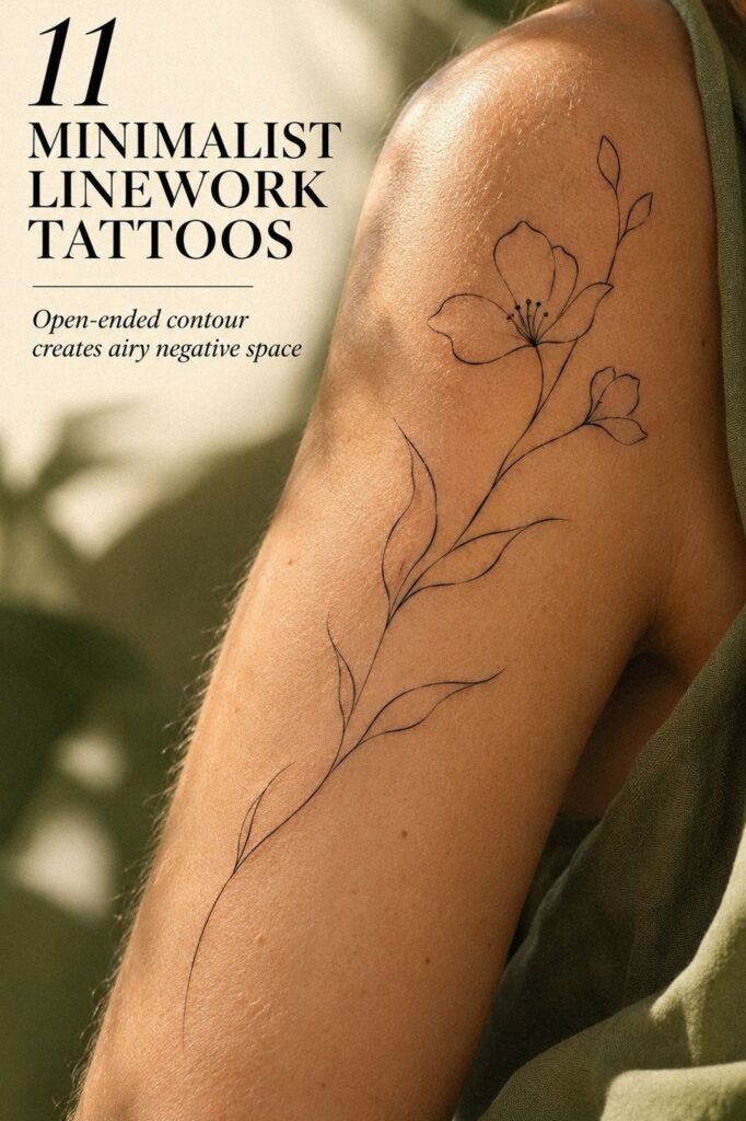
A minimalist linework tattoo can look simple while carrying a surprisingly serious decision. I’ve learned that a crisp idea, sensible spacing, and honest healed references matter more than chasing the thinnest possible needle line. That restraint matters!
The best first tattoo feels personal before it feels fashionable. It might be a striking botanical outline, a symbolic star, or a sleek animal contour that only needs a few marks to speak clearly. You want something meaningful enough to keep explaining to yourself, not something borrowed from a passing trend.
This guide covers concept, cost, body movement, scale, aftercare, and artist selection. You’ll also see where a delicate tattoo benefits from open skin, where a bold accent helps, and when a slightly larger design is the wiser choice. Keep your instincts involved, but give them evidence to work with.
- Start With a Single Botanical Outline
- Choose Symbols That Carry Your Meaning
- Follow Natural Body Curves
- Keep Small Designs Uncluttered
- Plan Matching Tattoos With Variation
- Choose Animals From Simple Contours
- Protect the Smallest Detail
- Use Celestial Curves for Contrast
- Add One Bold Accent
- Preserve Gaps Around Intricate Elements
- Prepare for Long-Term Clarity
1Start With a Single Botanical Outline
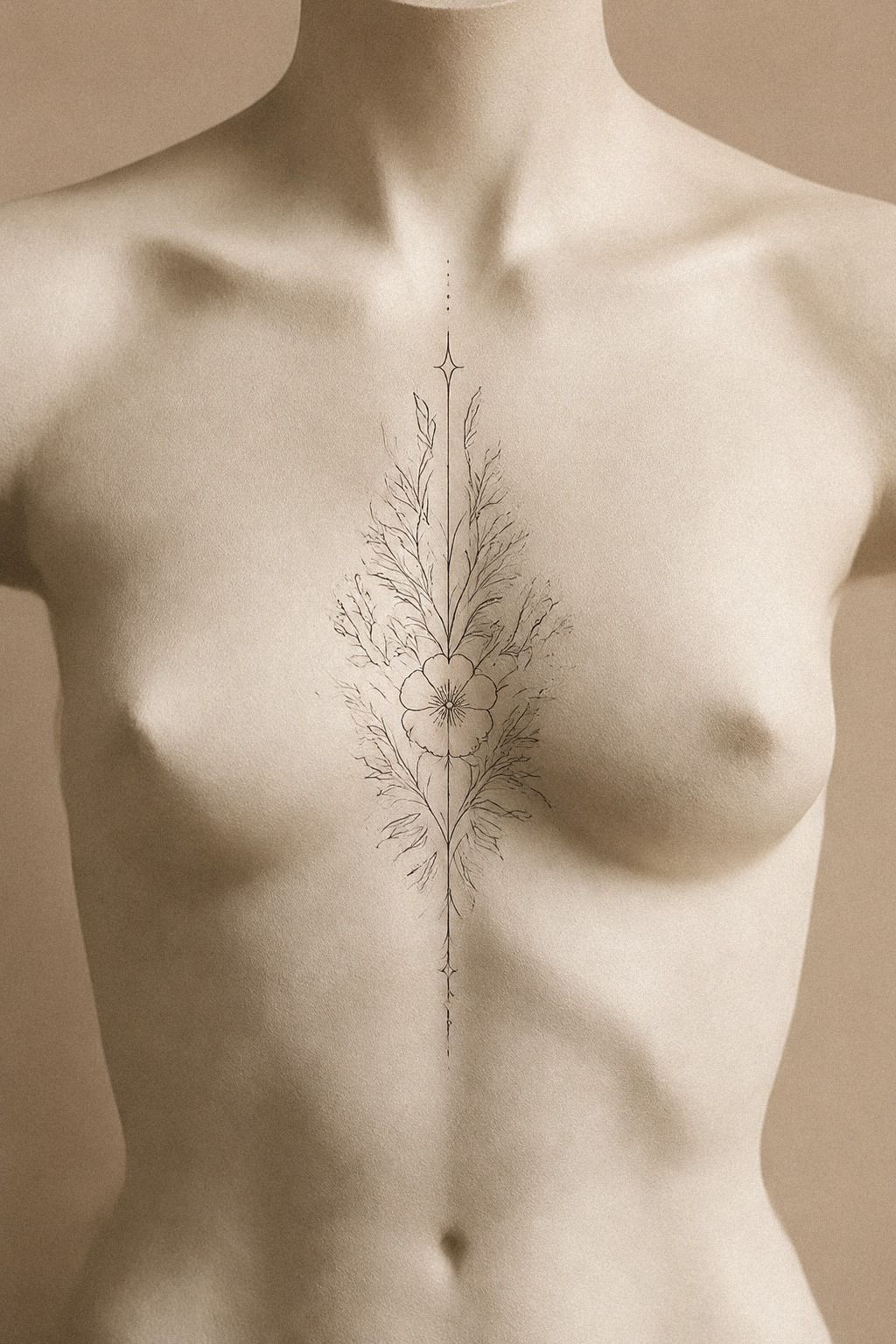
Begin with one clear shape before collecting dozens of minimalist linework ideas. A botanical sprig, a few stars, or one graceful contour can feel striking when every mark has a reason to exist. Your first sketch should work in terracotta, stone, and olive ink alone.
I use a simple rule: choose one main symbol, then give every smaller mark a purpose. A single-needle outline may look elegant on paper, but it needs enough breathing space on skin. Ask your artist to show the design at its intended size in both inches and centimeters.
Your reference set should show crisp edges, clean negative space, and a line that doesn’t wobble. Look through these small linework tattoos before your appointment, but don’t copy a design simply because it looks polished in a reference. Your collarbone moves, stretches, and catches light differently from someone else’s.
The cost conversation belongs here, too. Typical US shop minimums run about $50 to $100, while hourly rates often sit around $100 to $250. A small custom piece may land near $100 to $300, depending on the artist and region.
That’s a starting point, not a promise. Bring your clearest sketch, and don’t let a low quote make the final decision for you!
A lower price isn’t automatically a better bargain. A healed portfolio, careful consultation, and strong hygiene can make the higher cost worth it.
2Choose Symbols That Carry Your Meaning
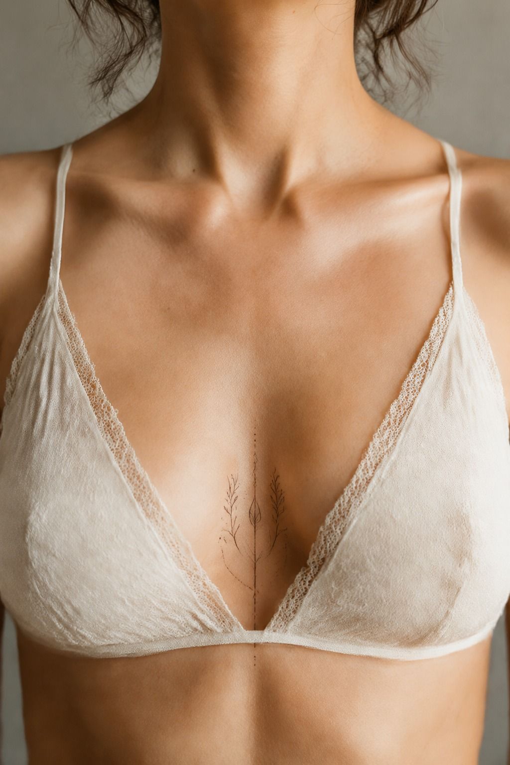
Choose symbols you can explain without needing a caption. A star, crescent, initial, or tiny animal can feel deeply personal when it connects to your own memory. One symbolic detail usually beats five decorative ones.
I’ve seen people choose an ornate symbol because it looked striking in a reference, then lose interest once they realized it belonged to someone else’s story. Your symbol can remain private, even if its shape is recognizable. Write down what it represents, where the memory comes from, and whether you’d still want it if nobody else knew the meaning.
A dainty mark can be expressive without being vague. Search minimalist small wrist tattoos for ideas about proportion, then adapt the visual language to your calf or shoulder. The stencil should show the actual spacing, not just a polished digital mockup.
Don’t confuse minimal with empty. A sleek contour, a tiny gap, or one sharp angle can make a personal symbol feel powerful.
I’d skip text unless the lettering is essential, because miniature words often lose clarity faster than a simple icon. Your first tattoo should feel personal before it feels fashionable.
Can a Minimalist Tattoo Stay Personal?
Yes, it can work beautifully! I’d choose one detail with real emotional weight instead of stacking several symbols that compete for attention. A restrained tattoo can still feel bold, romantic, or empowering when the meaning is specific.
Try writing a one-sentence explanation before approving the design. If the sentence sounds natural when you say it aloud, the idea probably has staying power. If you need a long explanation to make it meaningful, the symbol may not be doing enough work.
3Follow Natural Body Curves
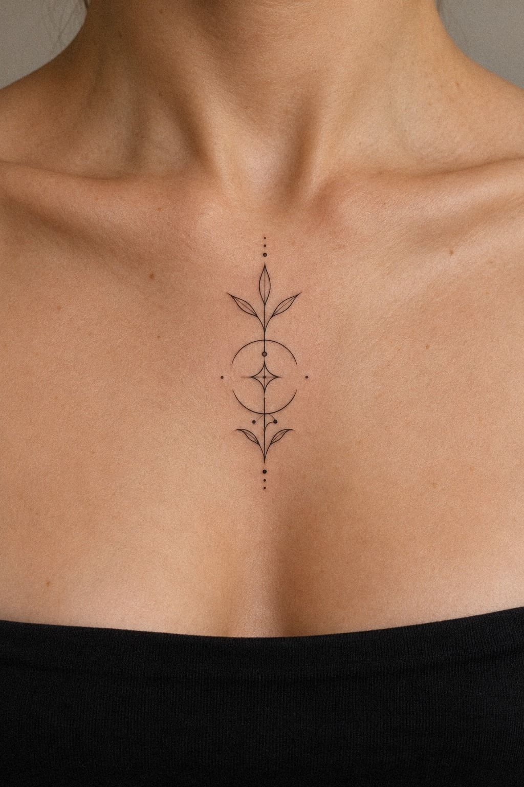
Study the inner forearm as a long surface for hairline details and restrained movement. Flowing linework can follow the arm’s natural direction, while a small break keeps the piece from looking stretched. Your artist should apply the forearm stencil while your arm rests naturally, then check it again when you rotate your wrist.
The body should decide where the design wants to travel. A crisp botanical curve may look graceful on a flat drawing but awkward when it cuts across a tendon.
Ask for a standing check, a relaxed check, and a bent-arm check. You’ll notice problems much sooner than you would in one fixed position.
Use minimalist outline tattoos to compare how different contours handle movement. I’d choose a clean plum line with a few deliberate breaks over a fully continuous strand, especially if your design crosses a crease. The line should feel intentional, not fragile.
Don’t place every meaningful mark along the most visible curve. The chosen body area is easy to admire, yet it also receives regular sun exposure.
Ask how the artist expects the line to age and what aftercare you’ll need. Your chosen body area should support the design, not force it to fight your anatomy.
Black Ink, Open Skin
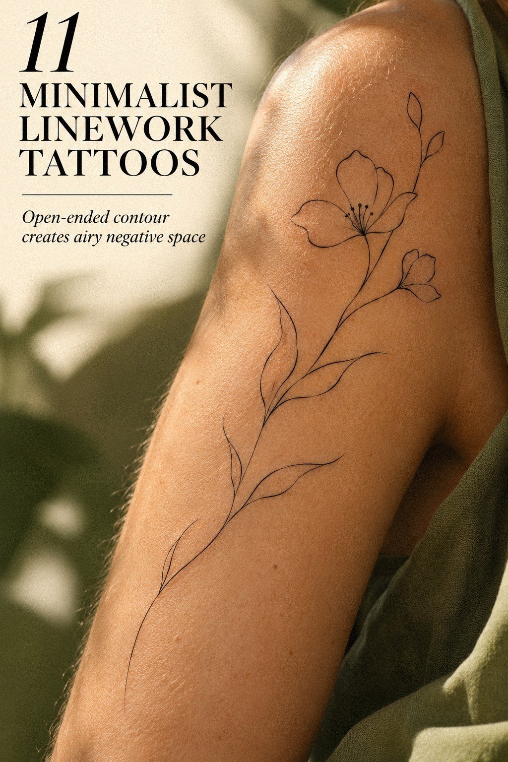
Negative space is part of the tattoo, not unused skin around it. The most stylish designs often rely on a deliberate pause between marks. That pause can make a sharp symbol feel understated instead of unfinished.
Ask your artist to show the actual stencil at normal viewing distance. A delicate line may look perfect when your phone is inches away, then disappear into visual noise from across the room. That simple check can protect both the design and your budget!
4Keep Small Designs Uncluttered
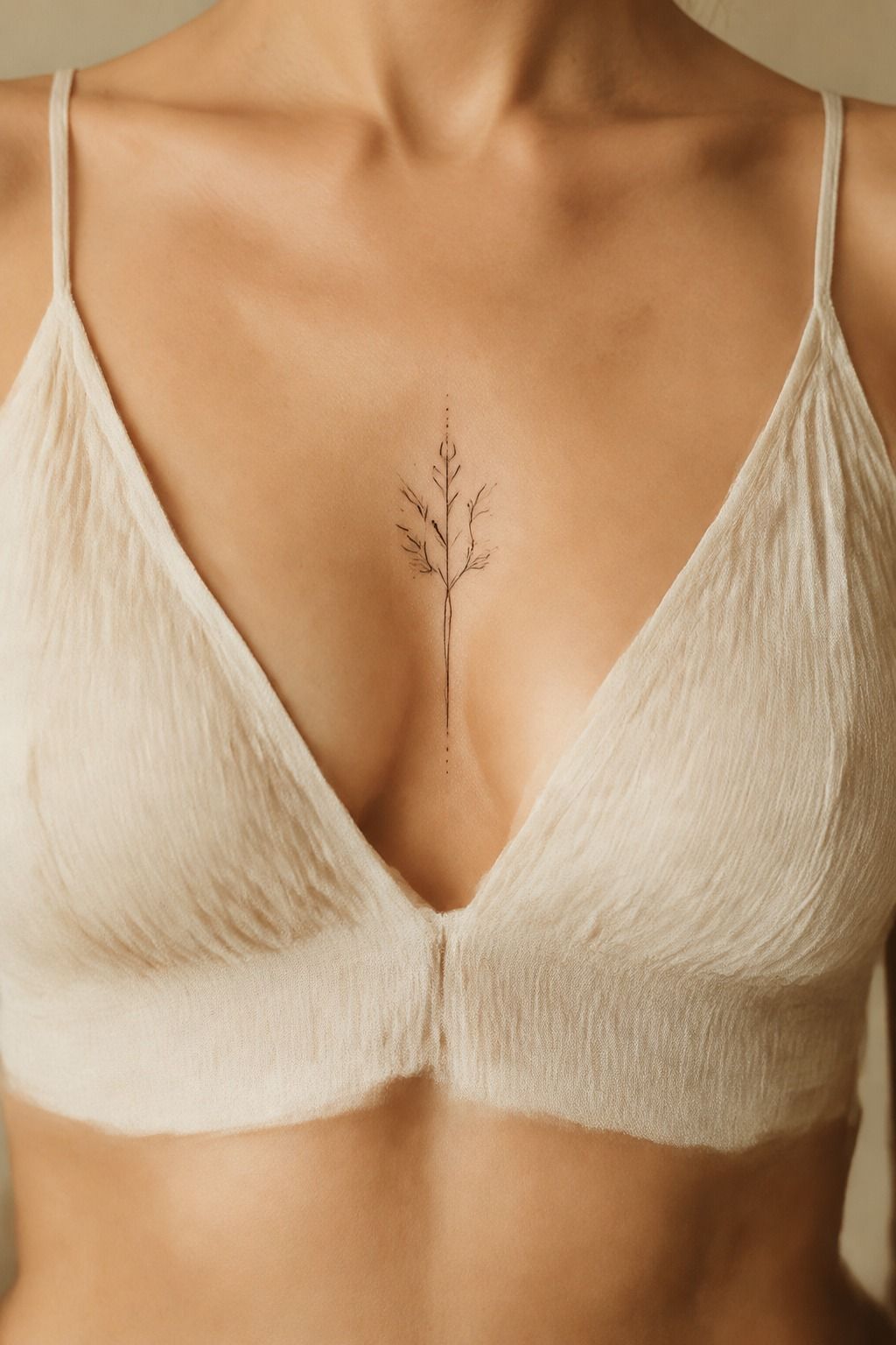
A small design needs open skin around its important details. Start by removing anything that doesn’t improve the silhouette, meaning, or balance. Your final stencil should still read clearly when you squint at it from several steps away.
I call this the Open Margin Test. Cover one detail at a time with your finger.
If the tattoo loses its identity without that mark, keep it. If nothing changes, delete it.
A fine liner can look intricate and polished in a draft, but too many tiny turns may soften as the tattoo settles.
The thigh gives you more visual space than a wrist or finger, so you can use a slightly more expressive contour without making the tattoo feel crowded. You might study small tattoos with meaning for compact compositions, then enlarge one only enough to protect its negative space.
A minimal tattoo isn’t improved by adding every interesting idea. I’d rather see one crisp star, leaf, or animal outline with a confident gap than a busy cluster that needs explaining.
Print the proposed size and live with it for a week. Your reaction after seven quiet days tells you more than a quick burst of excitement.
When Is Fine Linework Worth It?
Fine linework is worth the cost when the design’s identity depends on delicacy, spacing, or a graceful contour. It’s less worthwhile when you’re shrinking a detailed illustration simply to shorten the appointment.
Ask what the artist would remove if the tattoo had to become 10% smaller. Their answer reveals whether the concept is genuinely minimal or merely overcrowded. One clear line can save money and regret!
5Plan Matching Tattoos With Variation
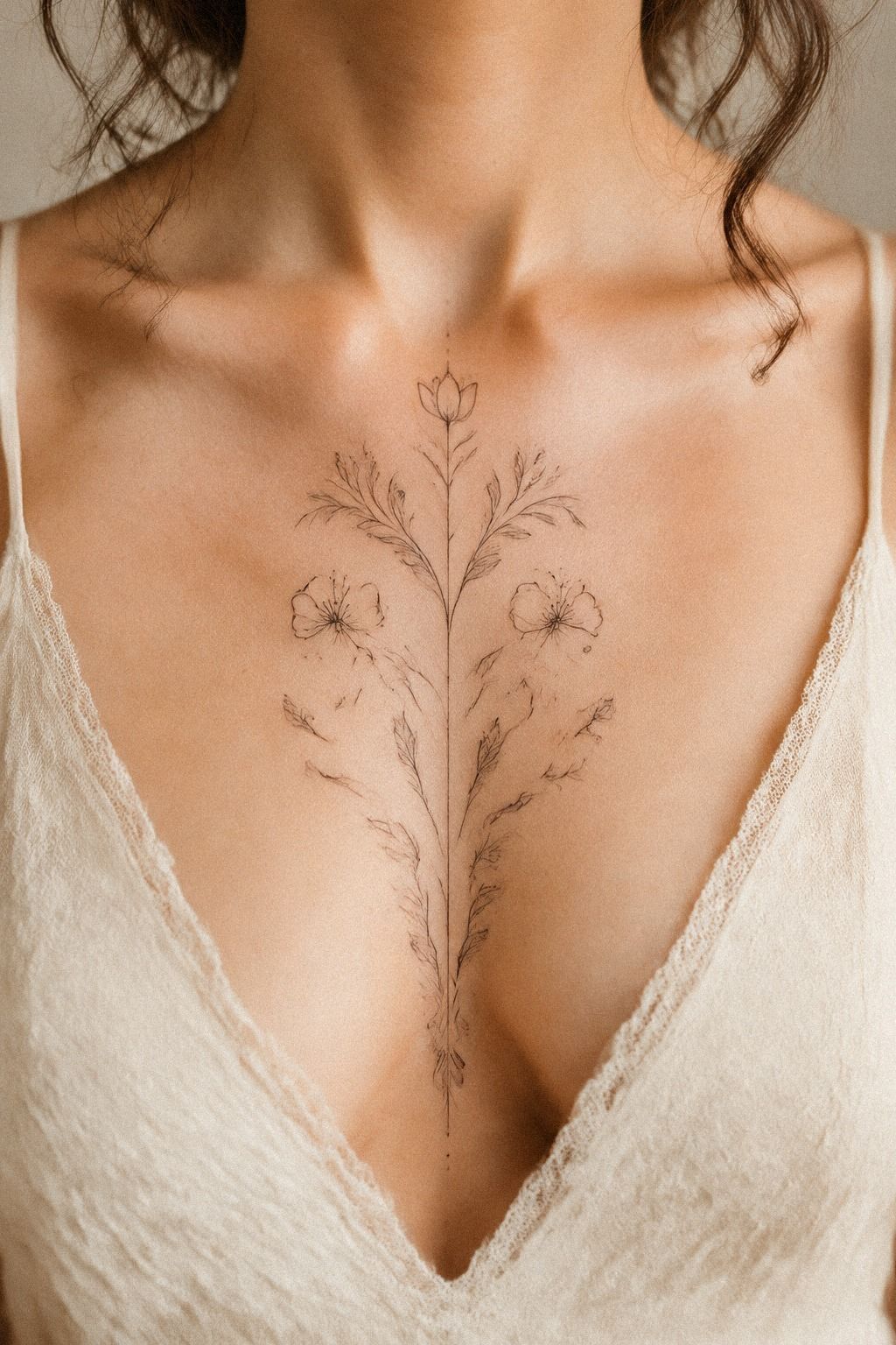
Matching tattoos should share a visual language, not necessarily repeat the same drawing. Two people might choose the same star system, botanical reference, or line weight while changing the body placement and proportions.
That variation keeps each tattoo personal. One person may prefer a dainty crescent, while the other chooses a fierce animal contour. The connection remains clear without making either design feel borrowed.
Talk through the budget together, but don’t force identical complexity. One custom tattoo may need more drawing time than the other, and that difference can still offer equal value. Shared meaning doesn’t require identical execution.
6Choose Animals From Simple Contours
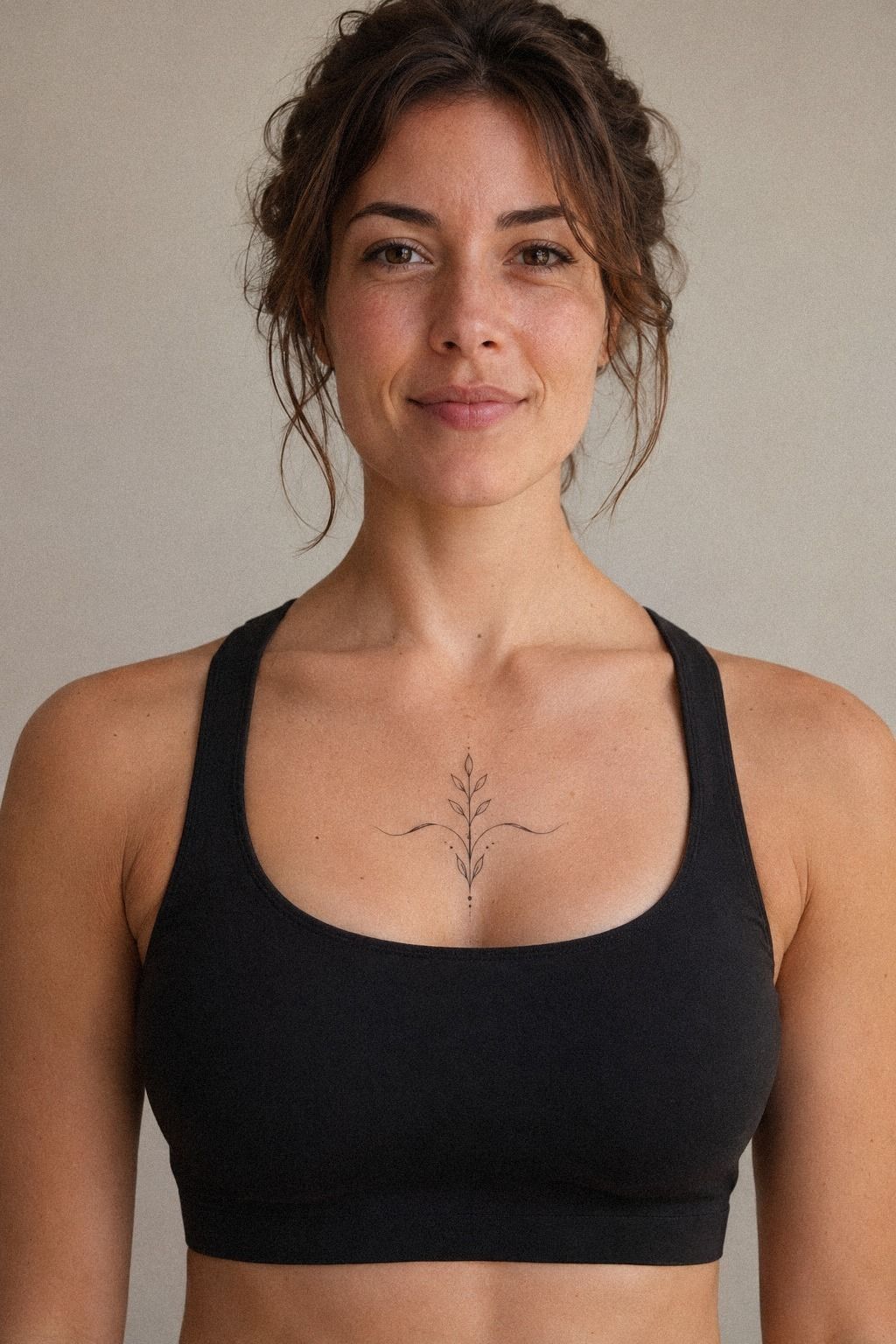
Start with the animal’s outer contour, then choose only the details that make it recognizable. A lifted wing, angled head, or curved tail can create a fierce mood without adding shading.
For compact references, small geometric tattoos can help you study how a few deliberate angles create a readable silhouette. Let the animal’s posture do the emotional work rather than filling every open area.
A Calf Animal or a Quiet Symbol?
A calf gives an animal contour enough length to read clearly, while a smaller symbol may feel more discreet on the wrist or collarbone. Neither choice is automatically better. The right option depends on how much visual presence you want each day.
If you want a fierce design without a large tattoo, let posture carry the emotion. A lifted wing, angled head, or curved tail can feel daring without adding shading. That’s when a bold idea becomes a smart one!
7Protect the Smallest Detail
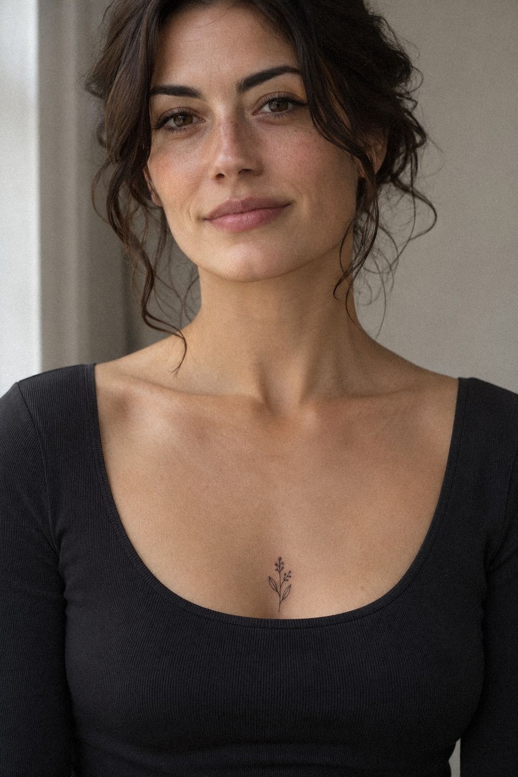
Think about the smallest feature first, not the overall shape. If a dot, curve, or crossing line sits too close to its neighbor, the design may lose its crisp separation over time. Your artist should explain which smallest detail needs more room.
Use the Scale Before Detail method: decide the smallest feature, then build the tattoo outward around it. A charcoal pigment outline may look sharp when freshly applied, but fine lines can spread or soften as skin changes.
That doesn’t mean you need a large tattoo. It means the chosen size should protect what matters most.
Your reference set should include healed examples, ideally from the same artist and a comparable body area. Browse minimalist small spine tattoos to see how spacing affects vertical designs, then return to your forearm idea. You want a composition that reads close up and still has a clear silhouette from farther away.
I’d rather enlarge a delicate design slightly than compress every detail into a smaller mark. That choice can feel less dainty at first, but it often looks more polished later.
Ask what the artist would remove if the design had to shrink. Their answer reveals which parts are essential and which are decoration.
Scale Before Detail
The smallest feature sets the practical limit for the whole composition. If that feature needs more room, enlarging the design may offer better long-term value than paying for a complex correction later.
This matters for dots, tiny lettering, intersections, and enclosed shapes. Your artist should tell you when a crisp idea needs a more generous size. Honest advice is part of what makes a consultation worth the cost.
8Use Celestial Curves for Contrast
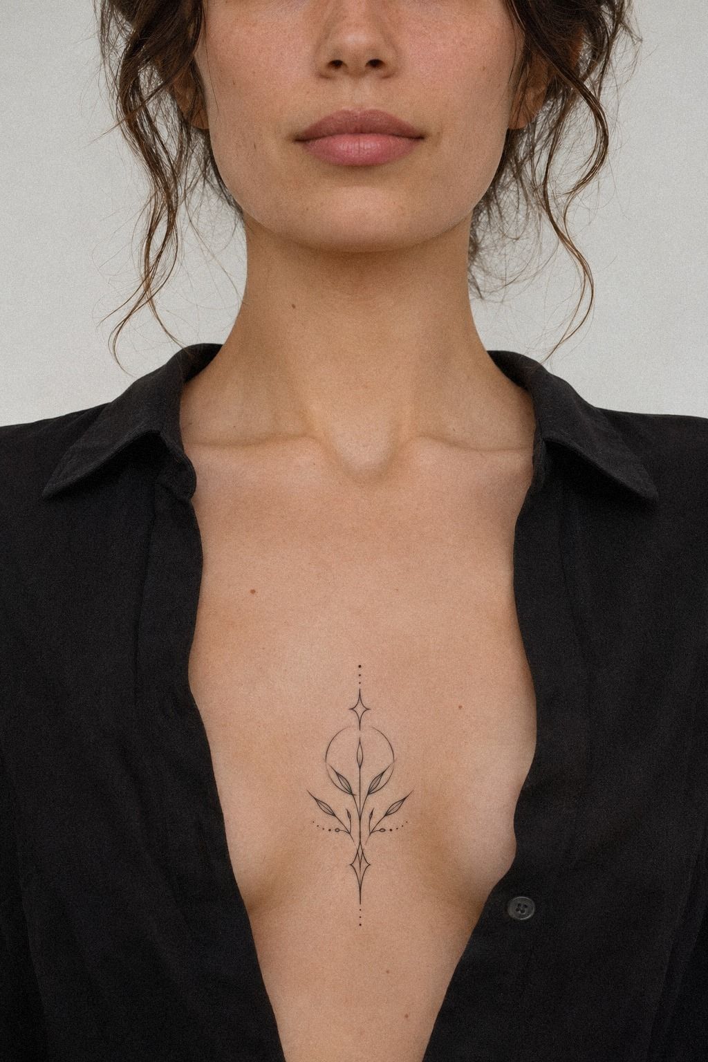
A crescent, star, or orbit can follow the curve of the ribs, while a few open gaps keep the tattoo graceful. Look at the design in several body positions before approving it.
A minimalist outline tattoo can help you compare how an open contour behaves when the body bends. Choose one flowing movement and one clear focal point rather than several competing gestures.
A Crescent Against a Sharp Star
Contrast makes a small celestial tattoo feel expressive. Pairing a flowing curve with one crisp point can create a romantic or haunting mood without adding extra marks.
Consider how the design will look when your body twists or bends. A tattoo that depends on perfect alignment in one position may feel less polished in daily life. Movement should be part of the composition from the beginning.
9Add One Bold Accent
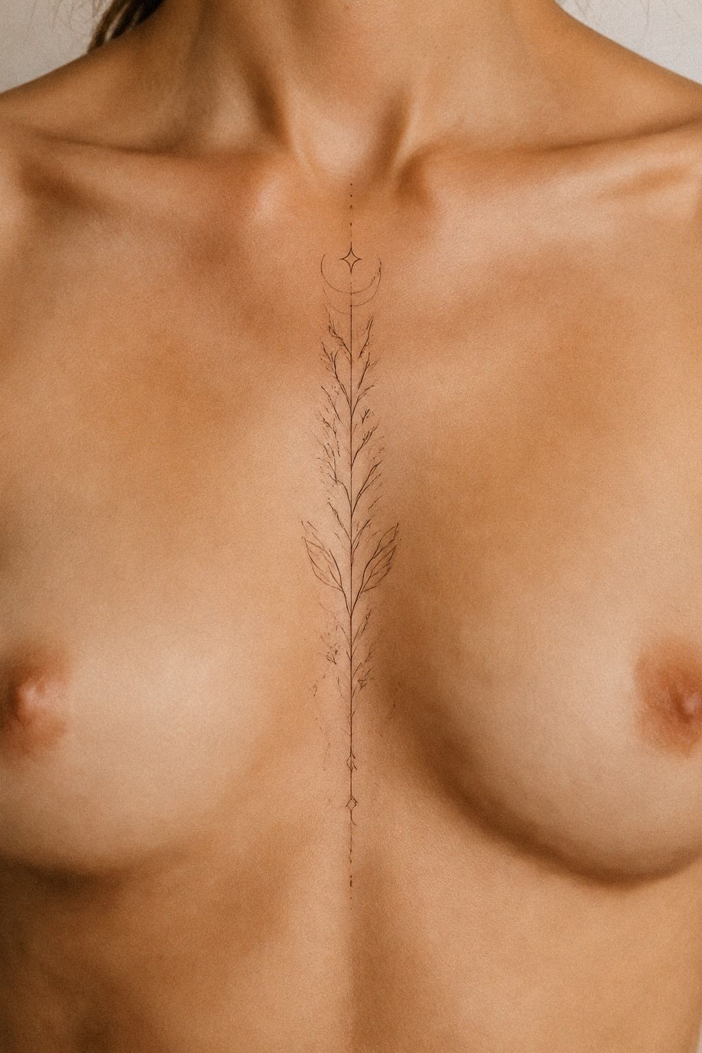
A minimal tattoo can include one bold accent without becoming heavy. The accent might be a solid star, a darker segment, a thicker outer contour, or one intentional interruption.
Keep the accent subordinate to the main idea. If every mark is bold, nothing feels special.
I’d test the design in midnight blue, copper, and ivory first, then decide whether one stronger element gives it enough contrast. A single decisive mark can feel more iconic than a crowded arrangement.
10Preserve Gaps Around Intricate Elements
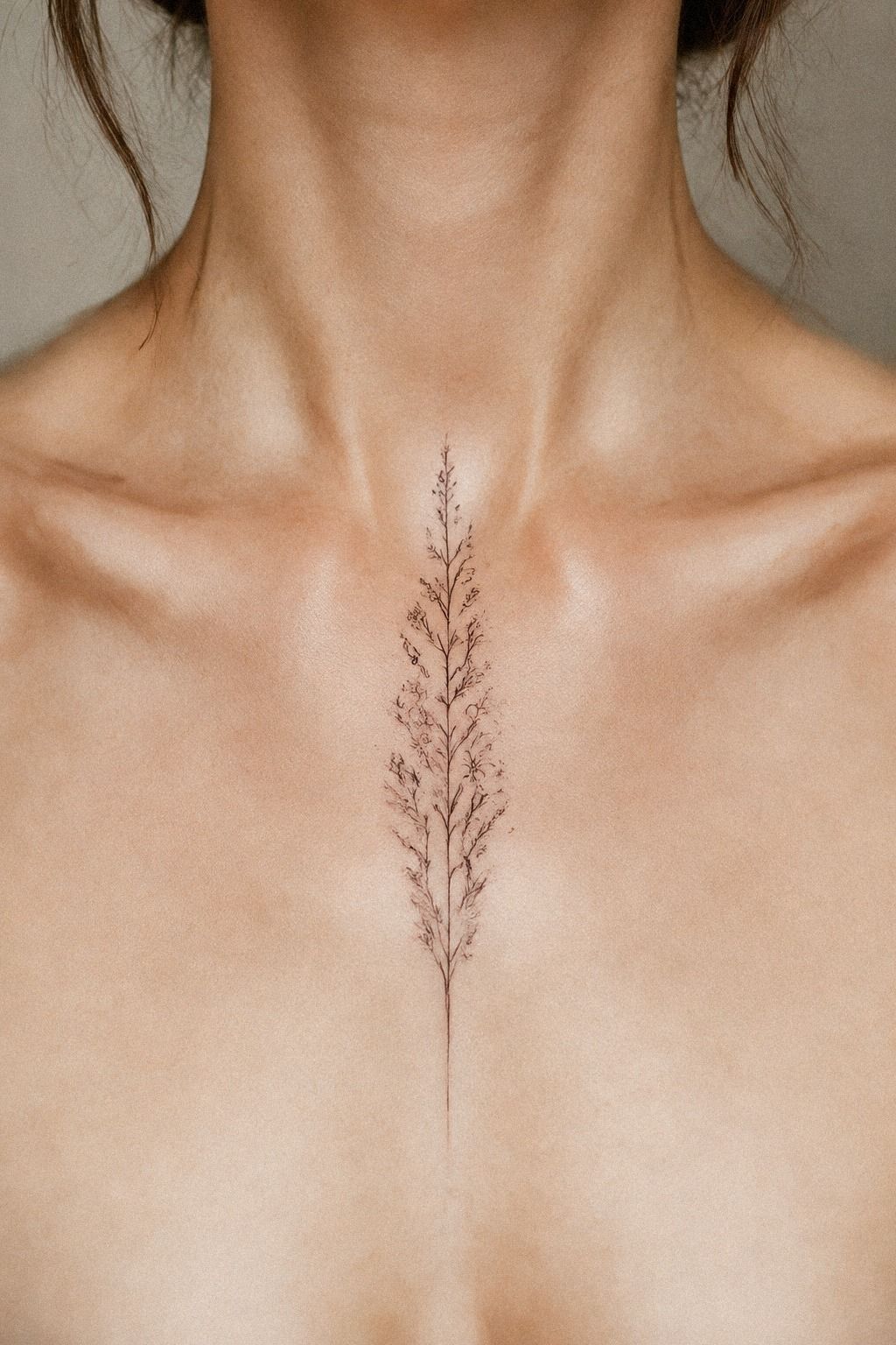
Look at the gaps, not only the lines. Your tattoo needs open areas around intricate elements so the image can remain readable after initial redness fades and the skin settles.
Use the Healed Gap Test before approving the stencil. Ask which spaces may narrow over time and whether any crossing lines should be separated. A clean transfer lets you inspect those distances on your actual skin.
Your body is the final reference, so check the design from normal standing distance.
Pair this step with minimalist finger tattoos if you’re studying compact designs, but remember that fingers experience more friction and fading than many other body areas. I’d skip an intricate cluster if the gaps are already tiny on paper.
Don’t judge a fresh tattoo too quickly. Surface healing usually takes about two to three weeks, while complete healing can take about two to three months.
Follow your artist’s instructions, wash gently, moisturize as directed, and avoid swimming and direct sun while it heals. Your patient version of the design is the one worth evaluating.
The Healed Portfolio Test
Fresh ink can look crisp, saturated, and polished even when the spacing won’t age well. Ask to see healed work at around two to three months, especially for designs that use delicate lines or compact details.
Compare the edges, gaps, and contrast rather than judging only the overall result. A consistent healed tattoo portfolio offers more practical value than a dramatic social-media post.
11Prepare for Long-Term Clarity
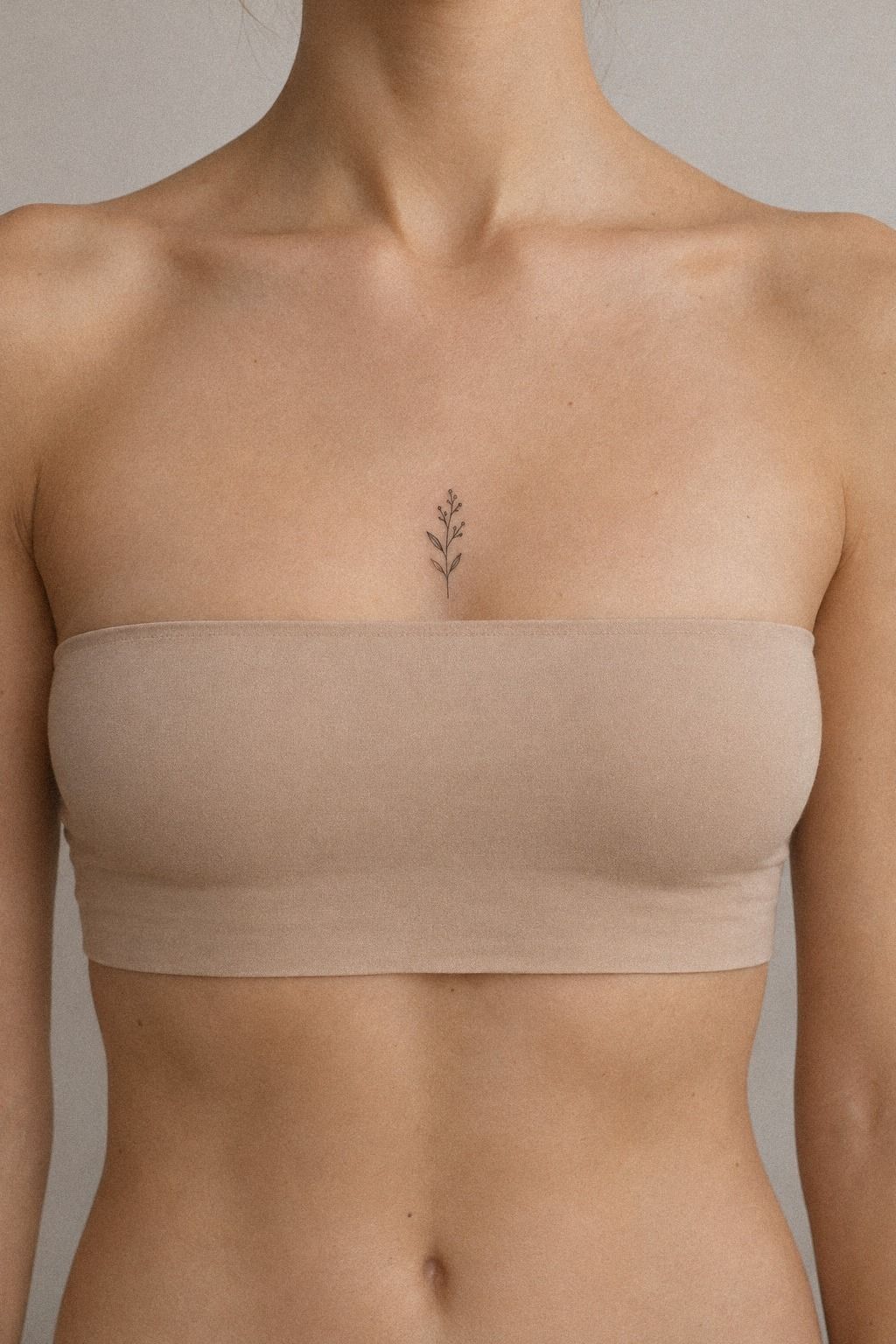
Your final review should include the meaning, body area, size, line character, and healed references. If one of those still feels uncertain, pause before booking. A thoughtful delay is cheaper than a rushed correction.
The Long View Check asks three questions: will you still understand the symbol, will the chosen area suit your daily life, and will the lines have enough room to age clearly? Very fine lines can widen or soften. Terracotta pigment with sound spacing generally holds clarity better, while ultraviolet exposure can speed fading.
For vertical inspiration, browse minimalist small spine tattoos and compare designs that use open skin rather than dense detail. I’d choose a crisp terracotta stencil over a complicated shaded draft for a first tattoo.
Your goal isn’t to predict every future feeling. It’s to make a thoughtful choice with enough evidence.
A good artist will show clean healed work, explain hygiene, and tell you when an idea needs to change. Your consultation should include questions about stencil position, needle groupings, aftercare, expected healing, and what happens if a line needs more room. That conversation may feel less exciting than choosing the symbol, but it’s where a meaningful tattoo becomes a responsible one.
Ask Better Questions Before Booking
If you’re comparing two artists, prioritize the one whose healed work looks clear on body areas and skin tones similar to yours. That evidence usually tells you more than follower counts, dramatic edits, or a low advertised price.
Ask direct questions about stencil placement, needle groupings, aftercare, and realistic longevity. A stylish artist won’t promise that every tiny detail will stay unchanged. They’ll explain the tradeoffs before you commit.
I’d also ask whether the artist has worked with your preferred style recently. Someone experienced with intricate ornamental pieces may not be the right fit for an understated single-line symbol, and the reverse can be true. A strong match makes the artist selection more precise.
What I’d Change After Designing My First One
I used to think the most important decision was the symbol. Now I think it’s the amount of restraint around the symbol. A crisp star, animal, or botanical contour can feel iconic when the shape has room to remain itself.
I’ve also learned that the thinnest possible line isn’t automatically the most refined choice, especially when a design has several close crossings. A slightly stronger line may offer better long-term value without changing the character of the tattoo.
My first mistake would have been approving a fresh result as proof that a tattoo was working. Fresh ink is sharp, saturated, and slightly raised.
Healed work tells you much more. I’d ask to see examples at two to three months, then compare the spacing, edges, and contrast.
The other lesson is to separate personal meaning from visual pressure. A tattoo doesn’t need a complicated explanation to matter, and it doesn’t need to look edgy to feel powerful. Your favorite idea may be a simple crescent on the ribs, a quiet animal on the calf, or three small stars along the collarbone.
If you’re choosing between two artists, I’d prioritize the one whose healed work looks clean on body areas and skin tones similar to yours. Ask about hygiene practices, stencil process, and aftercare guidance.
You’ll learn more from their answers than from a polished social feed. A timeless tattoo begins with a clear conversation, not a rushed appointment.
My Editorial Rule for a First Tattoo
My strongest advice is to let the tattoo become quieter as the decision becomes clearer. Early excitement tends to add details, extra symbols, and clever references.
A few days later, the strongest idea is often the one that still feels meaningful after the novelty fades. That is not a boring result.
It is a personal one.
I’d begin with a single sentence: “I want this because…” Then I’d draw the simplest possible version of the idea and sit with it. If the concept still feels vibrant after a week, test two or three body areas using a temporary stencil. Notice how it looks when you’re dressed, moving, working, and seeing it without deliberately searching for it.
The body matters as much as the symbol. A flowing design may suit the forearm, while a sacred or private mark may feel better on the ribs.
A sharp geometric contour can look powerful on the calf, while an understated crescent may belong near the collarbone. The right answer is not the most visible spot or the most hidden one.
It is the location that supports how you want to live with the mark.
I’d also separate the emotional decision from the technical decision. First decide whether the symbol belongs to you.
Then ask whether its size, line weight, and spacing are realistic for the chosen skin. Mixing those questions too early can make you abandon a meaningful idea or force a technically difficult one into an unsuitable format.
Finally, I’d treat the consultation as part of the design rather than a final formality. The best artist for your first tattoo will listen, make a daring suggestion when needed, and explain a limitation without making you feel foolish.
You should leave with a clear concept, a sensible size, and a calm reason to return. That combination is more valuable than chasing an ethereal fresh-ink result.
The Questions I Get Asked Most
How much does a minimalist linework tattoo usually cost?
I’d budget about $100 to $300 in the US for a small custom piece, while shop minimums often run $50 to $100 and hourly rates commonly reach $100 to $250. I’d treat those numbers as planning ranges because region, drawing time, body area, and artist demand can change the final quote.
Are minimalist linework tattoos a good first tattoo?
I think they can be an excellent first choice when the design has enough space to remain readable. I’d choose one personal symbol, review healed examples, and approve the actual stencil size before booking. A simple tattoo can feel meaningful without overwhelming you or requiring a complicated explanation.
How do I choose an artist for minimalist linework?
I’d look for clean healed work, comparable skin tones, and experience with the body area I’m considering. I’d also ask what the artist would simplify if the design became too small. Their answer shows whether they understand restraint, longevity, and the difference between a fresh result and a settled one.
How much do minimalist linework tattoos hurt?
I’d expect discomfort to vary more by body area than by the tattoo’s size. Ribs, feet, hands, and sternum can feel more intense, while the forearm, thigh, and shoulder are often easier for many people. I’d discuss sensitivity honestly with the artist and choose a calm appointment time.
How long does a minimalist linework tattoo take to heal?
I’d expect surface healing to take roughly two to three weeks, with deeper settling continuing for about two to three months. I’d wash gently, use only the aftercare product recommended by the artist, avoid swimming during early healing, and limit direct sun until the skin has fully settled.
What is the best placement for minimalist linework?
I’d start by comparing the forearm, thigh, shoulder, calf, and collarbone according to visibility, movement, friction, and sun exposure. I’d use minimalist hand and finger tattoos for women only as a reference, since hands and fingers usually demand more maintenance.
Where I’d Start First
If I had to pick one step, I’d start with the healed portfolio review. Fresh ink can hide spacing problems, while settled work shows whether an artist’s delicate lines remain clear months later.
Save one symbol, one body area, and one artist whose work still looks clean after healing. That’s the choice I’d trust.